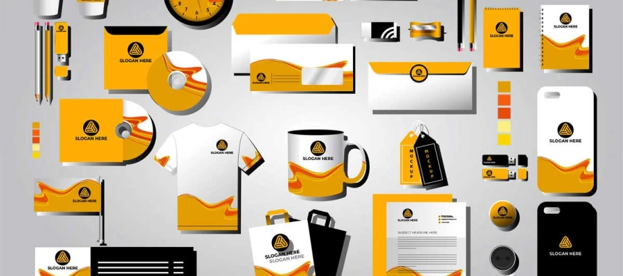
Looking for a quick answer to what is a mood board? Here it is! A mood board is a visual collage of images, colors, typography, textures, and words. It defines a project's look and feel before design begins and helps you catch misunderstandings early, when changes cost little.
Ever left a client meeting thinking you both wanted something "modern and clean"? Then a week later, you find out you pictured two totally different things. Don't worry, you're not alone! Most experienced designers fix this with a humble mood board before they touch a single pixel.
So what is a mood board, and why does it matter so much?
Think about how fast we read pictures. In 2014, MIT neuroscientists found that the human brain can identify an image seen for just 13 milliseconds. Words can't compete with that! When meaning gets lost in words, projects pay for it. PMI's 2014 Pulse of the Profession report found that 47% of failed projects missed their goals because of poor requirements management. No wonder 640 million people now use Pinterest every month (Q2 2026) to collect ideas visually.
Well! Don’t get overwhelmed by the stats. We’ll explain things simply.
This guide covers what a mood board is, what goes on one, its main types, why designers love them, and how to make one, so you can turn fuzzy ideas into a clear visual direction.
So, are you ready to dive in? Let’s keep reading!
What is a mood board?
A mood board is a collage of images, colors, fonts, textures, and words. It shows the look and feel of a project before any design work starts. Designers use mood boards to agree on a creative direction with clients early, when changes are still cheap.
Put simply, it's a set of visual references that sets the tone and style of a project. It answers the question of what this should feel like before anyone opens Illustrator or Figma.
So, this section covers what a mood board is, what it’s not, why it works, where it came from, and who uses it today, so you can decide whether your project needs one and use it effectively.
What a mood board is not
Here's where many people get it wrong. A mood board is not a draft. It isn't a layout or a design concept, and it's definitely not a pile of things the designer likes. It doesn't show the final logo, website, or brochure. It shows the feeling the finished work should carry. Every item on it has to earn its place by serving the brief.
Why does a mood board work so well?
Visuals are faster and much clearer than words. Two people may both say "modern and clean" and mean very different things. One imagines Scandinavian minimalism. The other imagines glossy tech. Put the same board in front of them, and they see the same thing. That shared picture takes the guesswork out of the whole project. Pretty powerful, isn’t it?
Where did mood boards come from?
Long before Pinterest and Figma, mood boards were physical collages. People in advertising, fashion, and interior design made them by hand. They pinned magazine pages, fabric swatches, paint chips and printed photos to foam board. The tools have changed a lot. The idea hasn't changed at all.
Who uses mood boards today?
Pretty much everyone in the creative world! Mood boards show up in graphic design, branding, web and product design, interior design, film, photography, fashion, event planning, and content production. If a project has a "look and feel," a mood board can help.
What goes on a mood board
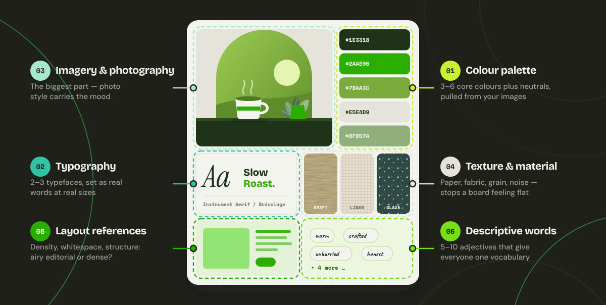
A mood board needs six core ingredients. These are a color palette, typography, imagery and photography, texture and material, layout and composition references, and descriptive words. Together they show a project's look, feel, and tone. Beginners often fill a board with pretty photos and stop there.
This section explains what goes on a mood board and how to use each ingredient, so you can build a board your client can react to with confidence.
Color palette: Use 3 to 6 core colors with a few supporting neutrals. Pull them straight from your reference images so the palette and imagery match. Free tools like Adobe Color and Coolors make it easy to grab a color palette from a photo.
Typography: Show 2 to 3 typeface options as real words at real sizes. Skip the alphabet specimens. Set a headline and a short paragraph so your client sees the real reading experience. Want more on typography? We've covered the laws of fonts and typefaces in detail.
Imagery and photography: These are the biggest parts of any board. Photo style carries mood better than anything else. Lighting, subject, composition and color grading all tell the story at a glance.
Texture and material: Think paper stock, fabric, metal, grain, noise, and gradients. Beginners forget this one all the time. It's often why boards feel flat and lifeless.
Layout and composition references: Look at density, whitespace, alignment, and structure. These show whether the final work should feel airy and editorial or dense and useful.
Descriptive words: Pick 5 to 10 adjectives. This is the only non-visual part, and it helps you defend your board in a meeting. Words like "warm, crafted, unpolished, confident" give everyone the same vocabulary.
Depending on your discipline, you might also add motion references, sound or music references, competitor positioning notes, or target-audience cues.
The main types of mood boards
The main types of mood boards are physical, digital, and collaborative boards. Each can work as a loose internal tool or a polished client-facing presentation. So, which one should you pick? The right choice depends on your discipline, your client, and how your team works.
This section explains the main types of mood boards, including physical, digital, collaborative, and internal vs. client-facing boards, so you can choose the right format for your project from day one.
Physical mood boards
Physical boards use printed images, swatches, and samples pinned to foam board or a pin wall. They're still the standard in interior design, fashion, and packaging. A screen just can't show how a material or texture really feels.
✅ Advantage: true color and hands-on, tactile evaluation.
❌ Limitation: hard to share remotely and slow to revise.
Digital mood boards
You can build a digital mood board in Figma, Canva, Milanote, Adobe Express, or Pinterest. It's quick, easy to share, and simple to update. You can even tweak it live during a client call. No wonder most branding, web, and product work starts here today!
Take a quick look at the most popular mood board tools:
Tool
Best for
Pinterest
Gathering references quickly and discovering new ideas
Milanote
Organized, free-form boards with notes and links
Figma / FigJam
Designers who want the board next to their design files
Miro
Large teams and workshop-style collaboration
Canva / Adobe Express
Quick, template-based boards for non-designers
Looking for more options beyond Canva? Check out our list of Canva alternatives.
Collaborative and interactive boards
Miro, FigJam and Milanote let many people add references and leave comments right on the board. They work well for big groups, since the board also helps everyone agree. Everyone feels heard, and everyone ends up in the same place.
Internal vs. client-facing boards
Internal boards can be loose, messy, and exploratory. Think of them as a thinking tool just for you and your team.
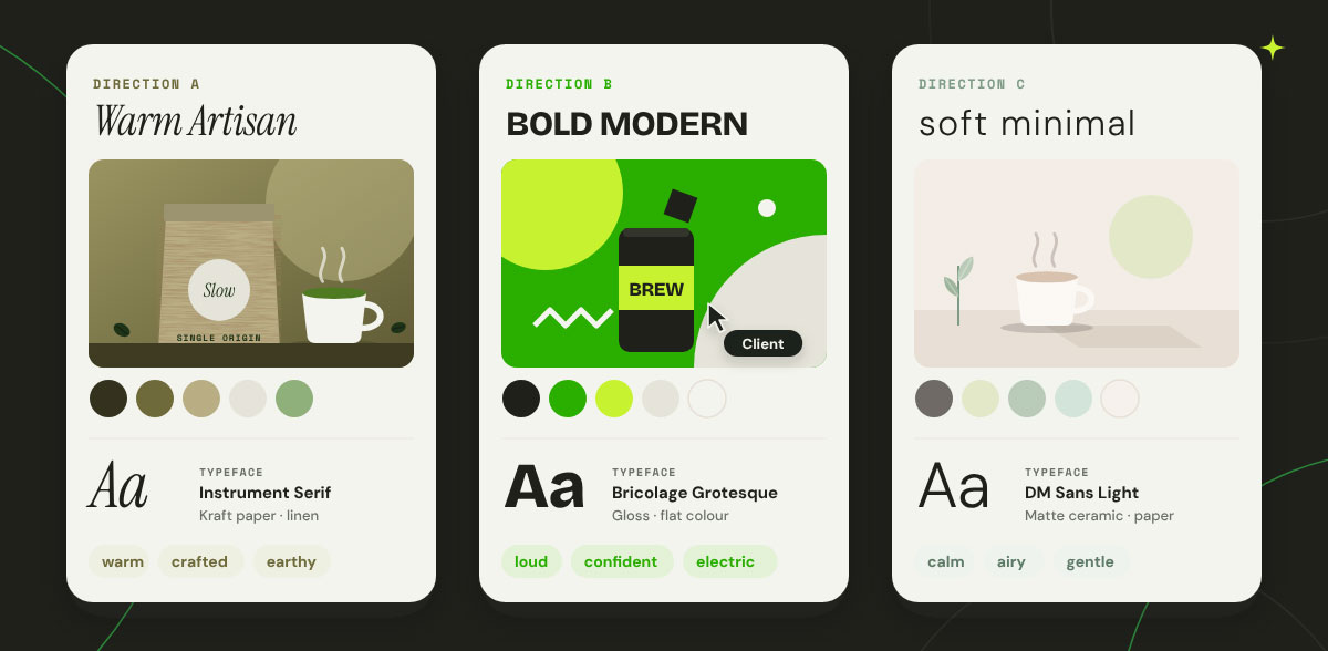
Client-facing boards must be curated, composed, and captioned. Always present 2–3 distinct directions, never just one, so the conversation becomes a choice rather than a verdict.
Why designers use mood boards: 5 practical reasons
Designers use mood boards to manage clients and projects, and to explore ideas too. A board provides both sides with a shared visual reference to check their work against. It protects your time, budget, and client relationship from the first meeting. For freelancers and agencies, that is where the real value lies. Almost every serious project uses one, and skipping it often costs far more than it saves.
This section explains why designers use mood boards, covering alignment, vague briefs, scope control, faster decisions and team consistency, so you can see what a board saves you and make the case for one.
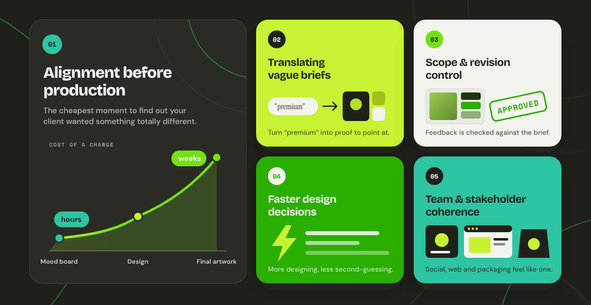
Alignment before production: The mood board stage is the cheapest time to find out your client wanted something totally different. Catching it here costs hours. Catching it after the final artwork costs weeks.
Translating vague briefs: Words like "premium," "fun," or "minimal" mean nothing until you show them. A board turns those words into proof your client can point at.
Scope and revision control: Once approved, the mood board becomes your reference point. Later feedback is checked against the agreed direction rather than someone's taste. That makes "I just don't love it" moments much easier to handle.
Faster design decisions: With the direction set, you stop redeciding the basics on every asset. More designing, less second-guessing!
Team and stakeholder coherence: When several designers work on a project, the board keeps everyone's work looking consistent. Social posts, website, and packaging all feel like one brand.
How to make a mood board in 7 steps
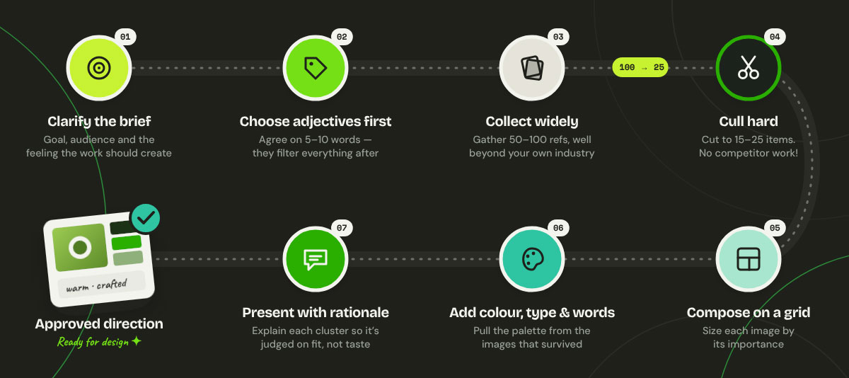
To make a mood board, clarify the brief, choose your adjectives, collect references widely, cull hard, compose on a grid, add color, type and words, and present it with a clear rationale. That is the whole process in seven steps. Each step hides a small trick that separates a professional board from a random Pinterest dump. The process takes a few hours, and most of the value comes from choosing carefully.
This section explains how to build a board that earns your client's approval, whether you are a freelancer preparing a first presentation or a marketer briefing an agency.
Step 1 – Clarify the brief: Write down the project goal, the audience, and the feeling the work should create. Without these, collecting images turns into aimless scrolling. Not sure where to start? Our guide to the graphic design process shows how to clarify the brief before any creative work begins.
Step 2 – Choose your adjectives first: Agree on 5–10 descriptive words with your client before you gather a single image. These words become your filter for everything that follows.
Step 3 – Collect widely and without editing: Gather 50–100 references fast. Look outside your own industry, too. Architecture, product photography, film stills, packaging, and editorial layouts are all goldmines of fresh ideas.
Step 4 – Cull hard: Cut your collection down to 15–25 items. Remove anything you kept only because you liked it. Every piece should serve the brief. The biggest mistake to avoid is dropping competitor work directly onto the board. It leads to copycat results and a brand that blends into the crowd.
Step 5 – Compose deliberately: Arrange on a grid system in graphic design and size each image by importance. A board that looks accidental quietly shakes your client's confidence in the direction you're heading.
Step 6 – Add color, type and words: Pull the palette from the images that survived the cull. Place your typography specimens next, then add your adjective set as a visible caption block.
Step 7 – Present with rationale: Walk your client through why each cluster is there. A board presented silently gets judged on taste. A board presented with reasoning gets judged on fit. Our presentation design tips will help you present with rationale and confidence.
Mood board vs style tile vs style guide vs storyboard
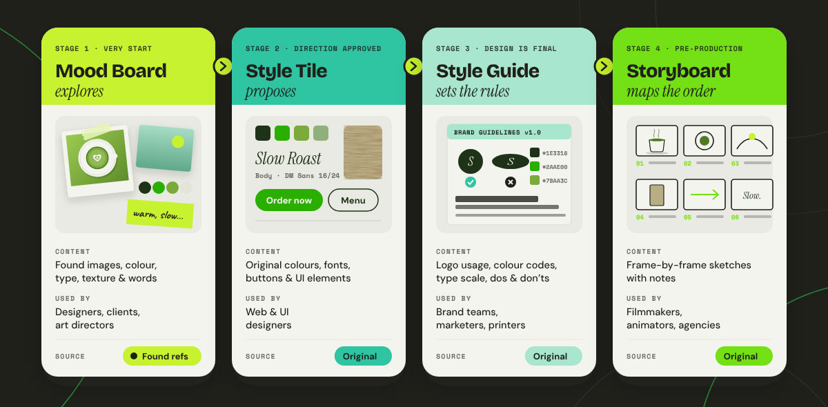
A mood board explores a feeling using found references. A style tile proposes original design elements. A style guide exemplifies the final rules. A storyboard maps out a sequence of scenes. These four terms sound alike, but each is a different deliverable made at a different stage. They answer different questions and serve different people. Mixing them up in client briefs can set the wrong expectations about what you will deliver and when.
Here we differentiate between a mood board, a style tile, a style guide and a storyboard, so you can name the right deliverable and promise it at the right stage.
Feature
Mood board
Style tile
Style guide
Storyboard
Main purpose
Set the feeling and direction
Propose the visual language
Document the final brand rules
Plan a sequence of scenes
Project stage
Very start, before design
After direction is approved
After design is final
Pre-production for video or animation
Content
Found images, colors, type, textures, words
Original colors, fonts, buttons, UI elements
Logo usage, color codes, type scale, dos and don'ts
Frame-by-frame sketches with notes
Found or original?
Found references
Original
Original
Original
Typical users
Designers, clients, art directors
Web and UI designers
Brand teams, marketers, printers
Filmmakers, animators, ad agencies
In short: The mood board explores, the style tile proposes, the style guide sets the rules, and the storyboard maps the order. Web designer Samantha Warren made the style tile approach popular. Storyboarding goes back to Walt Disney Studios in the 1930s.
Mood board FAQs
Clients and designers keep asking the same handful of questions regarding ‘what is a mood board’, and each answer here is short and complete on its own. This section answers the most common mood board FAQs, from purpose to image rights, so you can settle your doubts fast and start your next board with confidence. If you’re struggling with something else, share it with us directly, and we’ll solve your problem with free advice.
A mood board sets the visual direction of a project before design work begins. It turns vague verbal briefs into a shared visual reference. Designers and clients can then check that they mean the same thing while changes are still cheap.
Most mood boards have six parts. These are a color palette, typography samples, reference imagery, textures or materials, layout and composition references, and a short list of descriptive adjectives. The adjectives give everyone shared words for discussing direction.
Aim for 15 to 25 curated items. Collect far more during research, since 50-100 is normal. Then cut hard. Past roughly 25 images, a board stops showing a clear direction and starts to look like a menu of possibilities.
A mood board uses found references to describe a feeling and direction before design starts. Style tiles show original, proposed design elements. These include actual colors, typefaces, and components for that specific brand. The mood board explores, and the style tile proposes.
Yes. Mood boards are still standard in branding, interior design, fashion, film, and product design. The medium has largely shifted from physical collage to digital tools such as Figma, Milanote, and Miro. Their job remains to get everyone on the same page before production.
For internal direction setting, referencing existing work is standard practice. Mood board imagery should never appear in published deliverables without proper licensing, though. Always credit sources on client-facing boards. Swap references for licensed or original assets in the final work. See the Unsplash License for an example of commercial use terms.
Endnote
Finally, we've reached the end of this guide, and it was a pleasure walking you through it.
You now know what a mood board is and how it sets a project's look and feel before design begins. Along the way, you learned the six ingredients every board needs and the main types, from physical to digital and collaborative. You also saw why designers rely on mood boards, how to make one in seven steps, and how it differs from a style tile, a style guide, and a storyboard. Used early, a mood board keeps you and your client on the same page.
Key takeaways
A mood board sets the direction for a project. It shows the feeling the work should have, and the finished look comes later.
Almost every mood board uses six ingredients. These are colour, typography, imagery, texture, layout reference and descriptive words.
Its main job is to get everyone on the same page before production starts. Spotting a wrong direction at this stage costs hours. Waiting until later can cost weeks.
The most common mistake is adding competitor work straight into the board. That tends to give you copycat results instead of something that stands out.
A mood board also differs from a style tile, a style guide or a storyboard. The comparison table above makes those differences clear.
Want experts to build your own mood board? Graphic Design Eye LLC will happily create it and bring the direction to life as a brand identity. Our premium, stress-free design services will make your brand stand out from the crowd. Tell us your vision, and we'll take it from there.
Thank you for reading all the way to the end. Wishing you bright ideas, easy approvals, and projects you love!
Graphic Design Eye LLC is a full-service creative agency built for brands that demand more than design — they demand vision. From strategic branding to complete visual identity, we partner with startups, agencies, and growing businesses as a dedicated creative force. With flexible subscription and project-based models. Let's start with us today!