Brand style guide examples show what a real guide looks like. A template can only describe things. A finished guide shows real choices. This article looks at twelve well-known guides. They range from a 1976 government manual to modern brand portals. It pulls out the patterns they share. These include clear misuse rules, measured color contrast, named type scales, and real examples of the brand in use. You will also get five ways to judge any guide. Plus tips to fit these ideas to your company size. And how to turn what you see into your own guide.
A folder on your desktop has four versions of your logo. One has a drop shadow from an old trade show banner. Another is stretched. One still uses your old brand blue. Even your invoices use a different font than your website.
Nobody remembers who picked what.
Every fast-growing business hits this point. Your brand has grown, but the rules for using it haven't. You don't need more design work. You need one clear document that ties everything together.
That's where a brand style guide comes in.
A good brand style guide gives your team, printer, freelance designer, developer, and sign shop one source of truth. No more guessing which logo to use, which colors are right, or which fonts belong to your brand.
So what should your guide include? The fastest way to find out is to study guides that already work. Not to copy them, but to see how successful brands turn their look into clear, simple rules.
We've collected 12 brand style examples to inspire your own brand. They'll help you build a more recognizable, professional identity.
Keep reading!
12 Brand style guide examples
A template gives you empty boxes for colors and type. It cannot tell you how specific to be, or where to stop. It also cannot predict which rule will get broken next quarter. But complete brand style guide examples can do this, because they record real decisions people were forced to make.
If you want to start with the basics, our companion article explains what a brand style guide contains and why it matters. This section focuses on real-world examples and what you can learn from each one.
Here are the first 12 brand style guide examples at a glance. Each one is worth exploring for a different reason.
#
Example
What it demonstrates
Strongest lens
1
NASA
The 1976 Graphics Standards Manual, and the clearest proof that documenting misuse is worth more than documenting correct use
Prohibition
2
Atlassian
Contrast requirements published on the same page as the palette, with guidance on which pairings are safe to offer
Accessibility
3
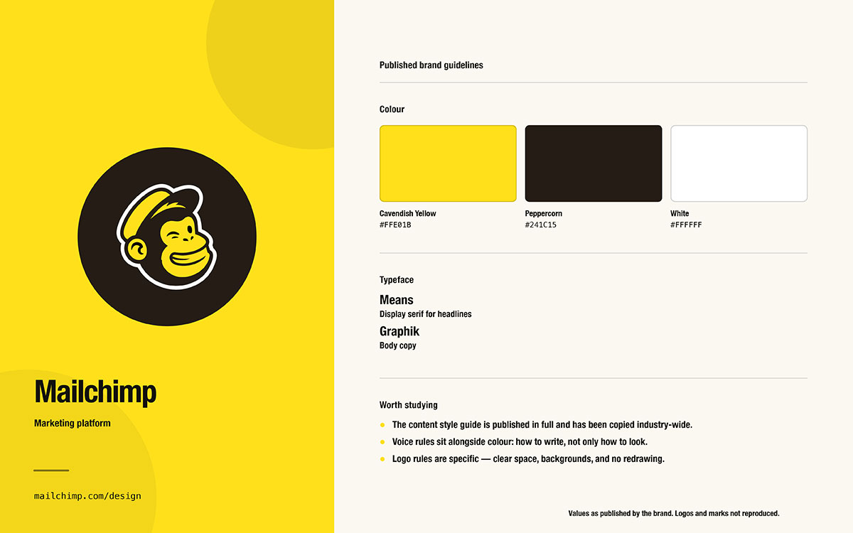
Mailchimp
The verbal identity counterweight: voice, tone by context, grammar, and word choice
Specificity
4
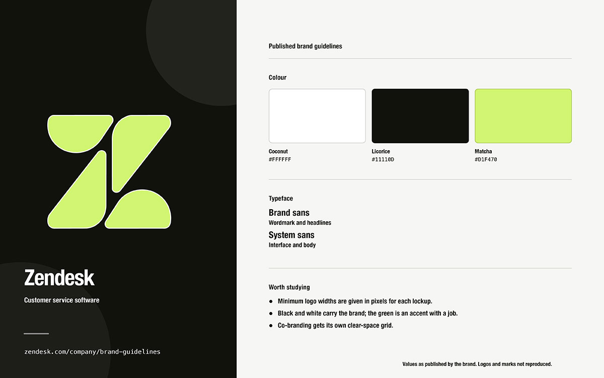
Zendesk
A compact hosted portal covering logo, color, photography, and copy in a navigable format
Application
5
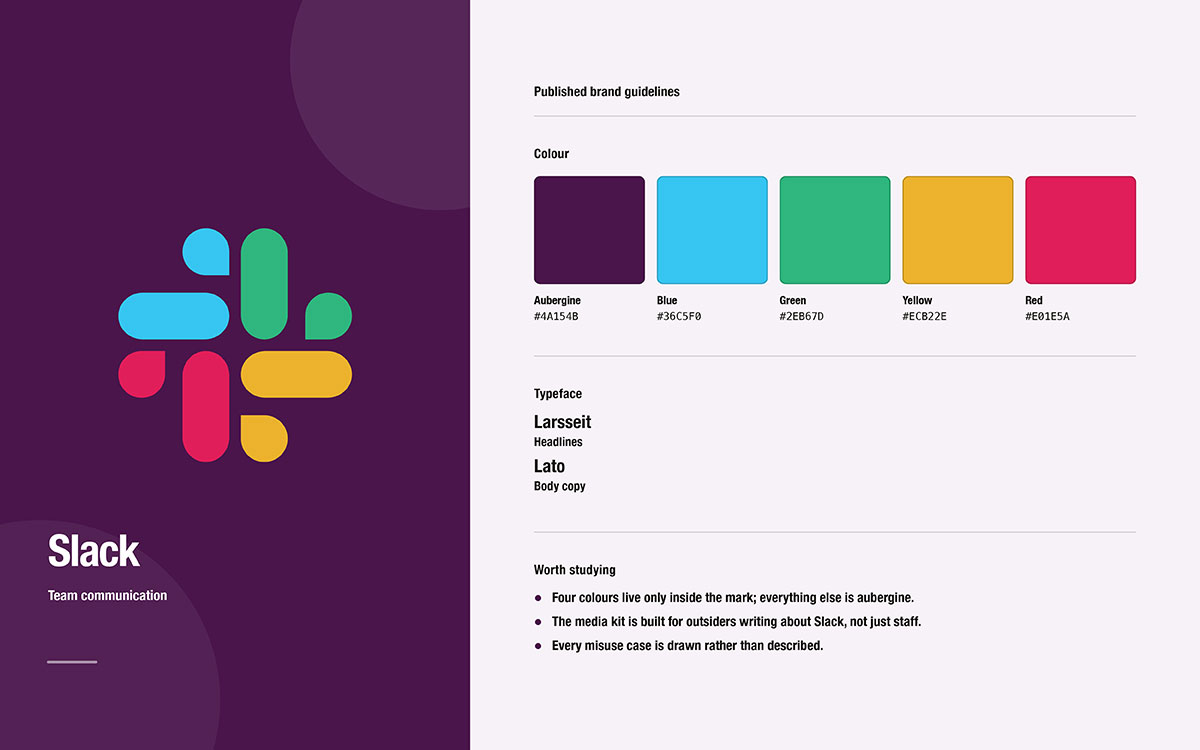
Slack
Design elements and governance kept as two documents, down to the grammar of the brand name
Governance
6
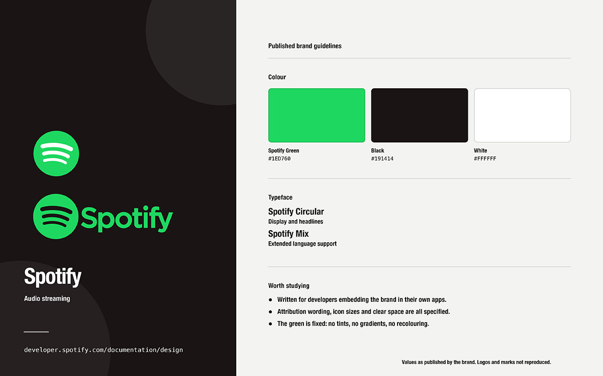
Spotify
Platform-scale rules for how third parties may use the mark, a different problem from internal consistency
Prohibition
7
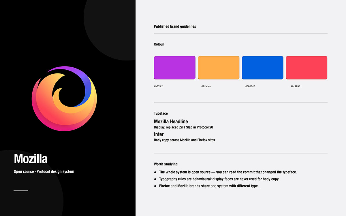
Mozilla
A policy that opens with what anyone may do without asking, then narrows to what needs consent
Governance
8
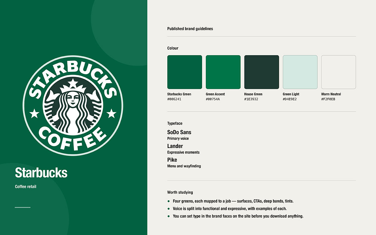
Starbucks
One distinction, functional versus expressive, applied to both design and writing
Application
9
Netflix
Co-branding lockups: which mark, what order, what separator, how much space
Prohibition
10
U.S. Web Design System
Multi-agency governance held together by legal obligation and a staged adoption model
Governance
11
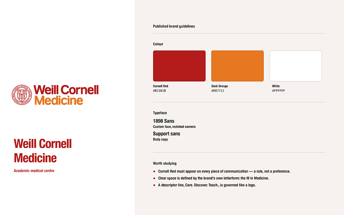
Weill Cornell Medicine
Institutional specifications a mid-sized business can copy directly, including sub-unit lockups
Specificity
12
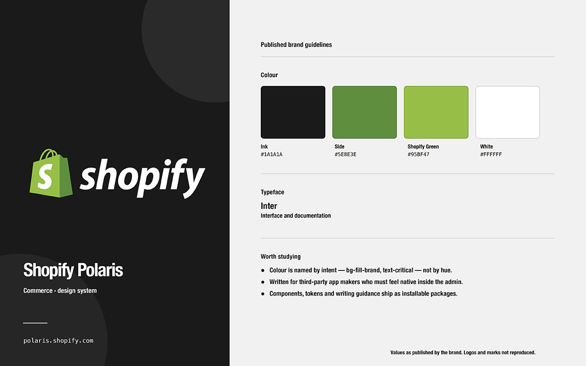
Shopify Polaris
The boundary case, included to show where a style guide ends and a design system begins
Specificity
Every entry below was opened and read before we wrote about it. Availability can change without warning. Check the organization's own site instead of a third-party gallery.
1. NASA
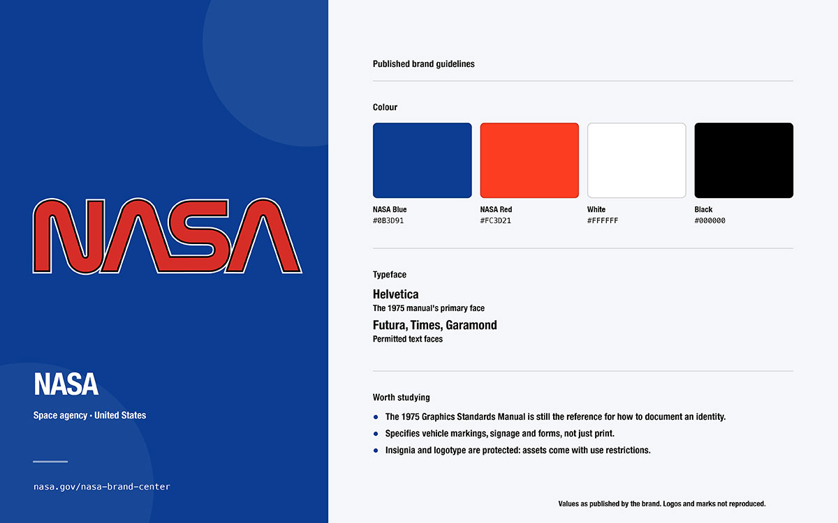
In 1976, a federal agency had thousands of employees and dozens of centers. It had no shared visual style. So it hired two New York designers to create one. The manual they made became the standard every later guide is measured against.
Format: A printed manual from 1976. Now it circulates as a PDF, alongside a current hosted brand center.
Approximate depth: A full manual, about ninety pages in the common PDF version.
Strongest lens: Prohibition
What it does that others do not: It treats misuse as a major topic. Pages of drawn "don'ts" sit next to the correct logo at the same size. The system even covers vehicles, publications, and signage, not just paper.
Where it falls short: It is a historical piece. The worm logo was retired in 1992, and the earlier badge came back. NASA's marks are not public domain. Study the structure, not the artwork.
Steal this: Give your list of "don'ts" its own page, drawn at the same size as the correct usage.
2. Atlassian
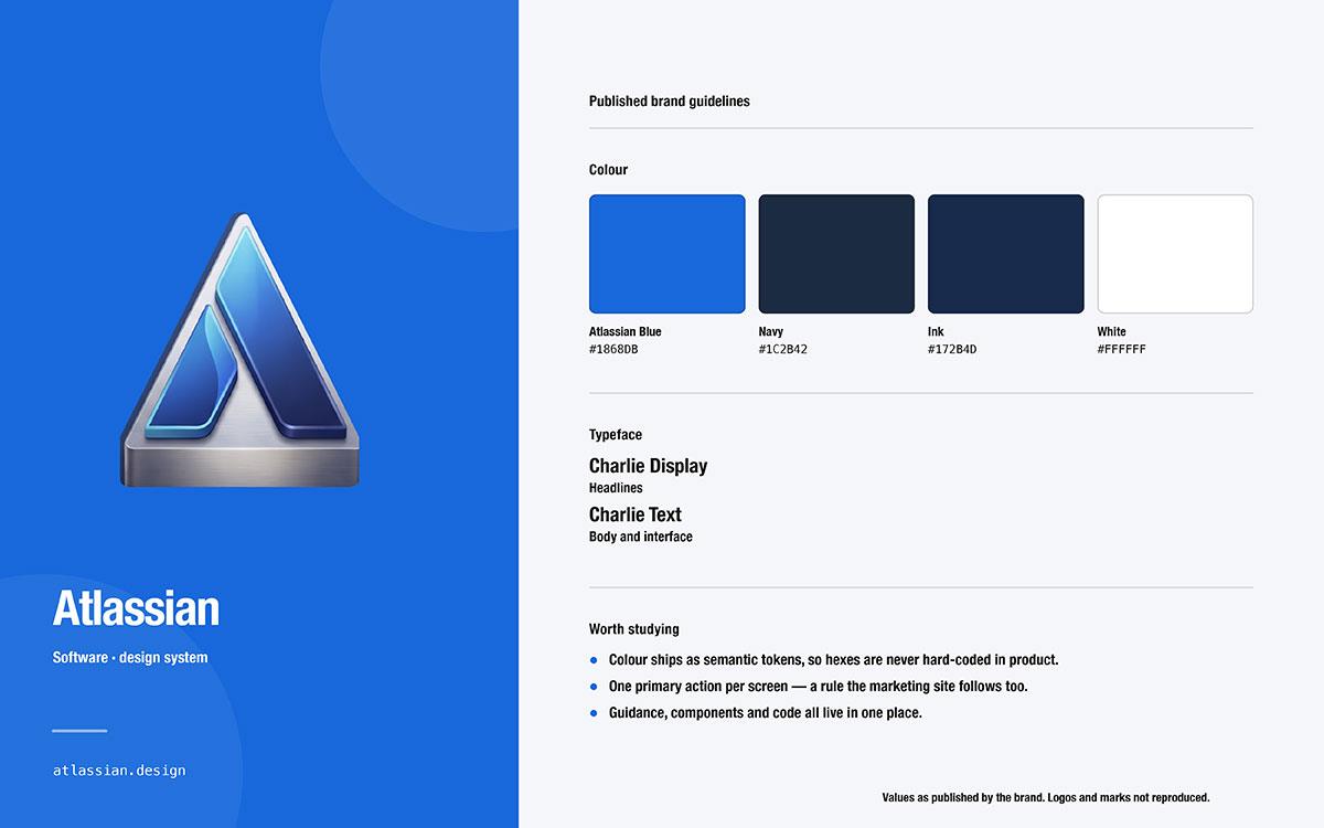
A software company's own documentation seems like an odd place for the clearest thinking about color. But here, legibility is no longer a preference. It becomes a number your team can check.
Format: Hosted, updated documentation that never stops changing.
Approximate depth: Full and detailed.
Strongest lens: Accessibility
What it does that others do not: It puts numeric contrast rules right on the color page. It does not hide them in a separate accessibility section. It also warns against color choices that cannot pair up accessibly.
Where it falls short: It prioritizes the product. Marketing style lives somewhere else. So it only partially fits a small-business guide.
Steal this: Put your contrast rule on the same page as your color palette. Not three sections later.
3. Mailchimp
Almost every guide on this list covers how a brand looks. This one covers how it sounds. More content teams have borrowed this document than any other of its kind.
Format: A hosted content style guide, published openly under a Creative Commons noncommercial license.
Approximate depth: A full guide for writing and voice.
Strongest lens: Specificity
What it does that others do not: It separates voice from tone. It tells writers to consider the reader's mood before choosing a register. Then it backs this up with rules for grammar, mechanics, newsletters, social posts, legal text, and accessibility.
Where it falls short: It is almost entirely about words. There is no visual system here. The license has conditions too. So copy the structure, but write your own words.
Steal this: Make a tone table for different situations. Same voice, but different tone for an apology, a welcome email, and a launch post.
4. Zendesk
This proves a public brand page does not need to cover everything to be useful. Zendesk publishes a short, easy-to-browse front page. It keeps the deep details where they belong.
Format: A hosted brand page with downloadable files.
Approximate depth: A basic core guide.
Strongest lens: Application
What it does that others do not: It gives its colors plain names people can say in a meeting. It also pairs every logo rule with the matching mistake to avoid. So the rule and the failure never get separated.
Where it falls short: It is short. Outside use needs written permission. So what you see publicly is just a summary, not the full system.
Steal this: Name your colors. People protect what they can say out loud.
5. Slack
Slack intentionally splits its guide into two documents. One covers how the brand looks. The other covers what outsiders are actually allowed to do with it. Most businesses write the first one and skip the second.
Format: A hosted media kit hub, a downloadable guidelines file, and separate brand terms.
Approximate depth: A core guide plus legal terms.
Strongest lens: Governance
What it does that others do not: It splits everything into design rules and usage rules. It even covers grammar. The brand name must be used as an adjective, never as a verb or a plural. It also requires certain attribution wording.
Where it falls short: The downloadable file has aged since its last update. Ownership changes also added new corporate terms on top. Check the date before quoting anything from it.
Steal this: Attach a short usage terms page to your visual rules.
6. Spotify
This guide is not written for employees. It targets thousands of developers, advertisers, and hardware partners. They place the logo on screens the company never sees before shipping.
Format: Hosted documentation for developers and partners.
Approximate depth: A focused guide just for partners.
Strongest lens: Prohibition
What it does that others do not: It governs strangers, not employees. Attribution is required. Clear space is set as a fraction of the logo's own height. Minimum sizes are given in both pixels and inches. Artwork cannot be cropped or covered.
Where it falls short: Internal brand style is not the topic here. So there is little about voice, photos, or campaign design.
Steal this: Write rules for people outside your company. They are the ones most likely to misuse your logo.
7. Mozilla
An open source foundation cannot police the community it depends on. So this policy is written backward compared to almost everything else on the list.
Format: A hosted trademark policy on the organization's own legal pages.
Approximate depth: Somewhere between one page and a full core guide.
Strongest lens: Governance
What it does that others do not: It leads with permission. The policy starts by listing what anyone can do without asking. Then it narrows down to what needs consent. This flips the usual order, and it is rare and generous.
Where it falls short: The visual identity pages are scattered around. Older pages also sit on archived subdomains. Treat this policy as the live, current document.
Steal this: Publish a short list of uses that need no approval. This removes most requests you would otherwise have to answer.
8. Starbucks
The most useful idea on this microsite is not a color or a font. It is one clear rule, applied strictly to everything the company writes and designs.
Format: A hosted brand expression microsite.
Approximate depth: A basic core guide.
Strongest lens: Application
What it does that others do not: It sorts communication into functional and expressive styles. It applies this one rule to both design and writing. So signage text and campaign text follow different expectations on purpose.
Where it falls short: It is a high-level overview with no downloads or misuse pages. The site also has not changed much in years.
Steal this: Sort your own writing into functional and expressive before you write a single tone rule.
9. Netflix
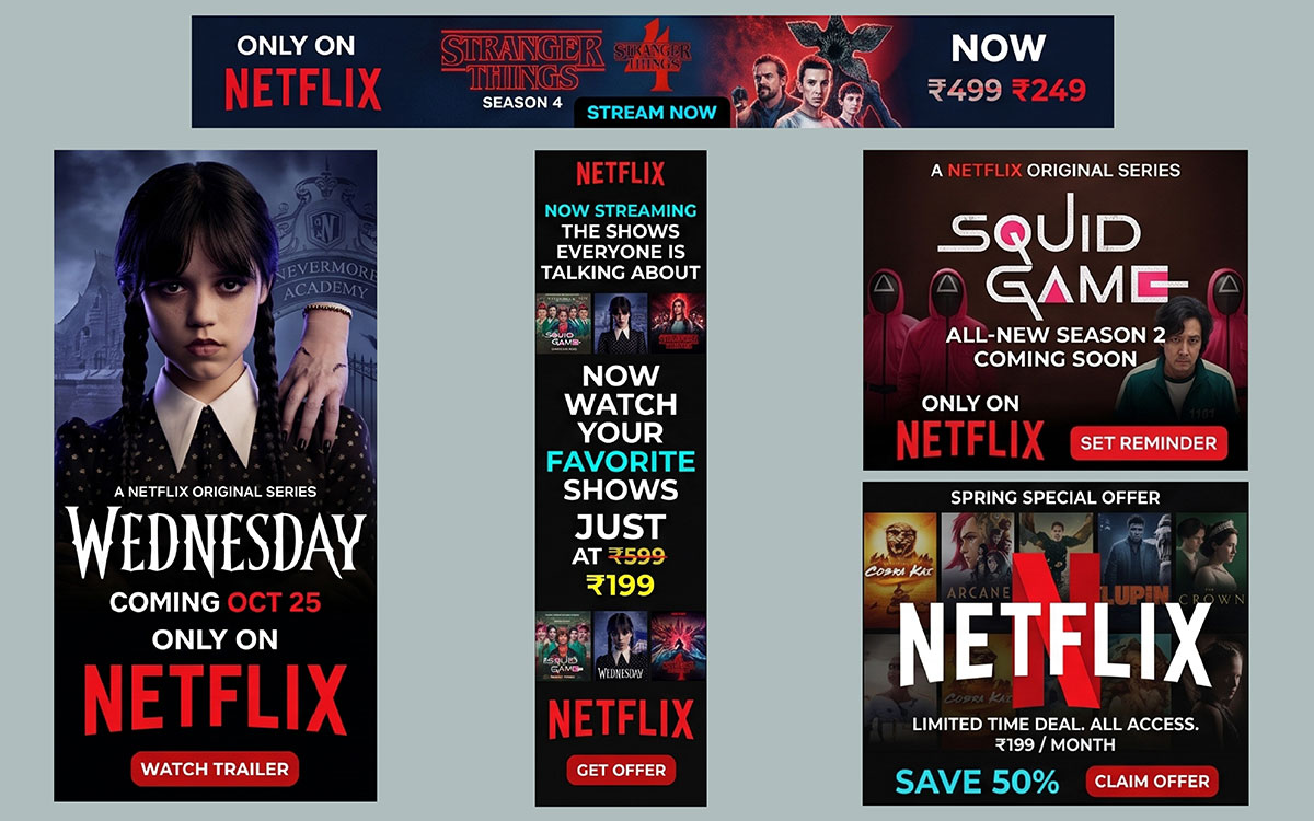
A brand that constantly appears beside other brands needs rules for the pairing, not just the logo itself. This is the clearest public example of that discipline.
Format: A hosted brand asset site for partners and press.
Approximate depth: A basic core guide.
Strongest lens: Prohibition
What it does that others do not: It handles co-branding properly. The mark to use depends on whether the partner leads with a symbol or a full logo. Guidance covers order, the separator between marks, and spacing. It also lists, in plain words, things nobody may do to the symbol.
Where it falls short: It targets partners and press. Product interface and motion guidance are not included here.
Steal this: Write your co-branding rule before a partner asks for one. That request always shows up at the last minute.
10. U.S. Web Design System
Dozens of independent federal agencies share one standard. Nobody has the power to fire anyone who ignores it. If consistency can hold under those conditions, it can hold at your company.
Format: Hosted and open-source, with public-domain code.
Approximate depth: Full and detailed.
Strongest lens: Governance
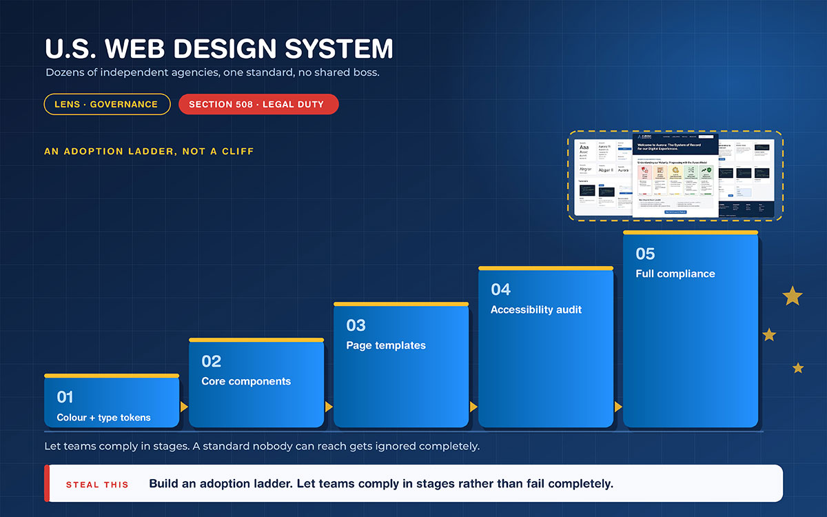
What it does that others do not: It ties consistency to legal duty, including Section 508 accessibility rules. It also publishes a maturity model, allowing a team to adopt the system in stages rather than all at once.
Where it falls short: It governs websites, not identity. Agency seals, logos, and marketing style are handled elsewhere. So it is a system model, not a brand model.
Steal this: Build an adoption ladder. Let teams comply in stages rather than fail completely.
11. Weill Cornell Medicine
A large institution has departments that each want their own identity. This is the exact problem most growing American businesses eventually face, usually around their third office.
Format: A hosted institutional brand site.
Approximate depth: A basic core guide.
Strongest lens: Specificity
What it does that others do not: It publishes real numbers a mid sized organization can copy directly. Clear space is defined against a named part of the mark. A minimum size is stated in inches. There are also rules for department-level lockups under one parent identity.
Where it falls short: It is institutional and permission-based. Some assets sit behind access controls. So you can study the specification publicly, not the full system.
Steal this: Publish minimum sizes in both inches and pixels. Print and screen fail in different ways.
12. Shopify Polaris
This one is included because it is not a brand style guide at all. Understanding why will save you from commissioning the wrong document.
Format: A hosted design system with published code.
Approximate depth: Full and detailed.
Strongest lens: Specificity
What it does that others do not: It marks the boundary line. Polaris ships design tokens, components, and content guidance as working code. At this point, a style guide has become something else entirely.
Where it falls short: There are no pages on logo misuse and no campaign examples. Parts of the published code have also become outdated over time. This reminds us that systems move faster than manuals.
Steal this: Decide which side of that line you are on, before you commission anything.
If your roadmap includes shipping interfaces rather than campaigns, our interface design work sits on that side of the line.
Twelve descriptions in a row would just be a list. What matters is what they share. Everyone documents misuse somewhere, even in the shortest guide. Every one states at least one rule as a real measurement, not just a word. This might be a contrast ratio, a clear space fraction, or a minimum size. Every one shows the identity used in something real. And every one names a way to ask questions, whether that is a brand team inbox, a legal contact, or a written permission process.
They differ in four other ways. Format is the biggest split. The printed manual has mostly given way to the hosted portal, which can be fixed the same day a rule changes. Scope splits next, between guides for employees and guides for strangers. Verbal identity only shows up in a few. Measured accessibility is still the rarest pattern. It shows up where a company ships software or must meet a legal standard. Color shows the split most clearly. The strongest guides do not just list swatches. They give a hierarchy and a stated contrast rule. If you have not yet settled on your colors, start by building a brand color palette.
Here is one honest warning before you borrow anything. These are global organizations with full brand teams.
Your situation
Take this
Leave this
Solo or two people
One page with colors, type, three prohibitions, and file locations
Lockups for each unit, a named owner per unit, and version control
Anything nobody has time to maintain each quarter
Here is the rule behind this table. Build for the number of people who will use the document. Not for the size of company you hope to become.
10 Tips for building a consistent brand
It's easy to admire great brands. But building a consistent one takes hustle.
The good news is you can start with these tips, even without a designer. Each of them comes from a pattern we found in the twelve brand style guides above.
These 10 building a consistent brand tips cover standardizing your logo and setting rules for colors, typography, and visuals. They can help your brand look consistent everywhere it appears.
Write your prohibitions first: Three things nobody may do to the logo prevent more damage than thirty pages of correct usage.
Publish every color in four systems: HEX, RGB, CMYK, and Pantone. Add a usage percentage so the palette has a hierarchy rather than four equal choices.
Measure your contrast before you commit to it: Body text below a 4.5-to-1 ratio, or large text below a 3-to-1 ratio, will be used poorly or quietly dropped. These numbers come from the W3C's accessibility guidelines, not from taste.
Name a type scale, not just a font: Include sizes, weights, line heights, and a web fallback stack. If you are still choosing a logo font.
Define clear space as a ratio of a logo element: This way, the rule survives every resize instead of breaking on the first small use. While you are there, confirm you actually have the logo formats a full suite covers.
Record your font licenses next to the type scale: A rule your team cannot legally follow is worse than no rule at all.
Turn your voice words into a two-column table: One column for what we say, one for what we do not say. Use real sentences in both columns.
Show three real examples: A deck slide, an invoice, and a social post reveal more than any mood board.
Date and version the document on page one: Undated guides get ignored within a year. A guide that no longer matches your true identity is not a small fix. It’s refreshing an existing identity.
Name one owner who can approve exceptions: Write down how to reach them.
Cost is always the next question. A professionally made set of guidelines commonly starts in the low four figures and rises with scope. Read that number as a market range, not a fixed price. Many businesses build the guide as part of a broader brand identity design project rather than buying it separately. Others cover it through a design subscription, which is a different setup, not just a discount on the same thing.
Graphic Design Eye's subscription starts at $499 per month. If you would rather hand off the whole job, we have a list of branding agencies that handle identity work end to end.
Brand style guide example FAQs
These are the brand style guide example FAQs people ask most once they've looked at other guides and started planning their own. The short answers below are what we tell clients before any work begins. For more queries, feel free to knock us anytime. We’d love to clear your confusion.
Many are. They are published as PDFs or hosted on brand portals for partners and the press. Availability can change without notice. Check the organization's own website instead of a third-party gallery. Be careful of mirrored copies, which may be several versions out of date.
Long enough to settle the decisions your team argues about. No longer than that. One page is a real guide if it has the correct colors, typeface, and prohibitions.
In practice, people use these terms interchangeably. When people do draw a line, a brand book leans strategic and covers mission and positioning. A style guide leans tactical and focuses on specifications.
Between one and about twenty-five pages for most businesses. Length should match your number of channels and vendors, not your ambition.
Copy the structure and the logic. Do not copy the wording, layout, or diagrams. These are protected work owned by the organization that made them.
It happens when the guide stops describing rules and starts shipping real components with code and tokens. Most businesses never need to cross that line. Crossing it too early gets expensive.
For small and mid-sized businesses, yes. Splitting them usually means one of the two never gets written.
Market pricing usually starts in the low four figures and rises with scope. Guides built inside a branding project or a design subscription get priced differently. This is a different setup, not a cheaper version of the same thing.
Name an owner. Publish an exception path. Share it next to the asset files, and date it. Enforcement usually fails because of the system, not because of one person.
Endnote
Finally, we’ve come to an end!
Look back across those twelve guides. What they share is not budget, page count, or beauty. Each one records an argument that somebody finally settled. Which green, which weight, what nobody may ever do to the mark. The polish came later, once the decisions stopped moving.
Remember this the next time a hundred-page manual from a global company makes your own situation feel small. That size does not mean you are behind. It means the document grew over years, starting as one page of decisions made by people tired of answering the same question twice.
So make that page now. Open a blank document and write the correct hex value, the correct typeface, and the three things nobody may do to your logo. Date it. Put a name on it. That page is already a working guide. It will prevent more inconsistency this quarter than a hundred-page manual will next year.
The rest gets worked out over time, and that work adds up. The Graphic Design Eye team spends their days on that slower half of the work. We build identity systems for companies that decided, at some point, to stop guessing.
Thanks for reading this far. Now take your time to make a fruitful decision.
Graphic Design Eye LLC is a full-service creative agency built for brands that demand more than design — they demand vision. From strategic branding to complete visual identity, we partner with startups, agencies, and growing businesses as a dedicated creative force. With flexible subscription and project-based models. Let's start with us today!