Looking for a way to make readers see your most important words first? That’s exactly what typographic hierarchy does. It ranks your text with six levers (size, weight, color and contrast, spacing, case and style, and position), so the eye moves in the order you planned. Use two or three levers per level, build sizes from a type scale, and keep your HTML headings in logical order. Simple rules, big difference. Don’t you think so?
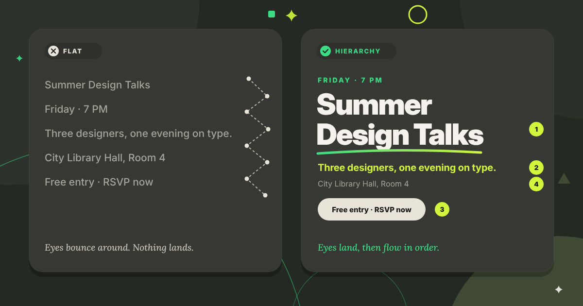
Have you ever opened a flyer, a landing page, or a slide and felt your eyes bounce around with nowhere to land? Everything is bold. Everything is big. Everything is shouting. And so, nothing gets heard.
That’s not a font problem. That’s a hierarchy problem.
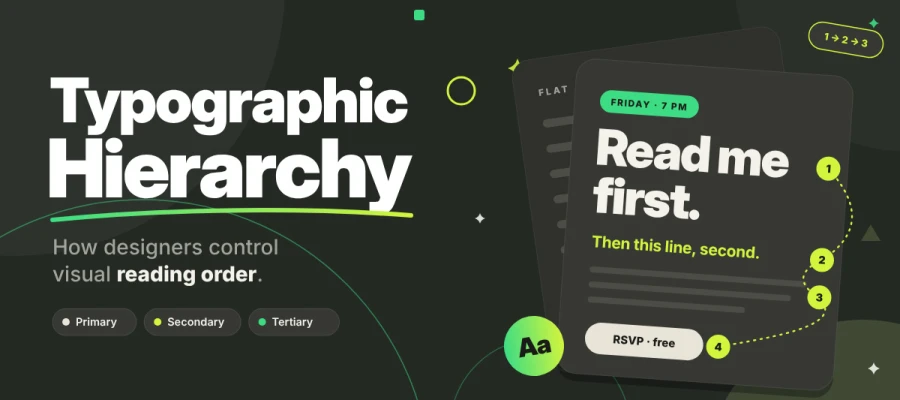
Typographic hierarchy is the way you arrange type to tell readers what to read first, second, and third. Get it right, and people grasp your message in a few seconds, before they finish a single sentence. Get it wrong, and they scroll right past.
Over the years, our design team has fixed more "flat" layouts than we can count. Attractive graphic design fonts rarely solve anything. A smarter system does the job.
This guide explains how typographic hierarchy directs the reader's eye and shows you how to apply the six levers, build a type scale, structure your HTML headings, and test the result.
So, come on in and let’s continue reading together!
What is typographic hierarchy?
Typographic hierarchy is the planned arrangement of type so readers take in information in an order you choose. Designers build it by changing size, weight, color, contrast, spacing, case, style, and position. A strong hierarchy lets a reader spot the most important element within seconds, before finishing even one full sentence.
Most people miss something here. Readers rarely read a page from the top. They scan it first and then decide what deserves their time. Typographic hierarchy gives you, the designer, a way to guide that decision.
It’s also worth knowing where it sits. Visual hierarchy is the big umbrella. It covers images, color blocks, icons, and white space. Typographic hierarchy is the type-only part of it. Same goal, narrower toolbox.
Most layouts need just three functional levels:
Primary: what is this? (the headline or page title)
Secondary: how is it organized? (section headings and subheads)
Tertiary: the supporting detail (body copy, captions, labels)
And here’s the one-line test. If a reader can’t tell what the most important element is within about three seconds, the hierarchy has failed. No doubt about it.
Hierarchy vs. emphasis vs. legibility vs. readability
Hierarchy ranks every element on the page, and emphasis, legibility, and readability each become smaller problems in their own right. Plenty of working designers swap these four words around without noticing. Let's sort them out once and for all.
Term
What it means
Whose job is it?
Legibility
Can individual characters be told apart (like l, I and 1)?
The typeface
Readability
Is long text comfortable to read?
The setting: line length, leading, contrast
Emphasis
Does one item stand out locally, like a bold phrase in a sentence?
A single word or phrase
Hierarchy
Are all elements ranked relative to each other across the page?
The whole layout
In short, a legible font set with poor hierarchy still fails. And a page full of emphasis isn’t hierarchy. It’s noise.
How typographic hierarchy controls visual reading order
Typographic hierarchy controls reading order because the eye goes to the highest-contrast element first, then moves down through the rest in order of prominence, following scanning patterns and grouping. You can't force anyone to read. Still, you get to decide where their eyes go first, and that is a lot of power.
This section explains how typographic hierarchy controls visual reading order, so you can predict where readers will look and arrange your type to guide them.
Scanning comes before reading
People usually scan a page before they read it. Most readers skim first and decide later whether to stick around. Your eyes don't glide smoothly along a line of text. They jump in short hops called saccades and pause briefly in between, and those pauses are called fixations. On screens especially, a reader takes a few quick fixations to size up the page and then makes the call to stay or go.
So where do those first fixations land? They land on whatever your hierarchy makes the loudest. That is why the headline carries so much weight. It works as the front door to your page, and nobody wants to walk through a door that looks like a wall.
Established scanning patterns
Research on how people scan pages shows that weak hierarchy makes for messy, tiring reading, while strong headings make scanning clean and quick.
The F-shaped pattern: Jakob Nielsen and the Nielsen Norman Group documented it in eye-tracking research published in 2006. Readers scan across the top, then across a shorter line lower down, and then drift down the left edge. You see it on text-heavy pages that lack bold, bullets, or subheadings.
The layer-cake pattern: In later work from 2017, NN/g described readers who jump from heading to subheading and skip the text in between. That leaves horizontal bands across the page that look like layers of a cake (a much tastier image than a wall of text).
So here is the takeaway. The F-pattern shows up when hierarchy goes missing. Strong headings swap it for a layer-cake scan, where readers find their section fast and dive right in.
Grouping and proximity
Grouping and proximity decide which pieces of text readers see as belonging together. The Gestalt principles of proximity and similarity state that items placed close together or styled alike are read as one group.
So spacing plays a real role in hierarchy. When a heading is closer to the paragraph above than to the one below, readers will assume it belongs to the earlier section. A tiny gap can lead to a big misunderstanding.
Contrast is relative, not absolute
Contrast depends on what sits next to what. Nothing stands out all by itself, only when it has neighbors to compare against. A 24 px heading looks huge beside 12 px captions and tiny beside a 72 px hero headline.
The golden rule goes like this. If everything is bold, nothing gets noticed. Think of emphasis as a budget. Spend it on the few things that really matter and keep the rest in your pocket.
How many levels of hierarchy do you need?
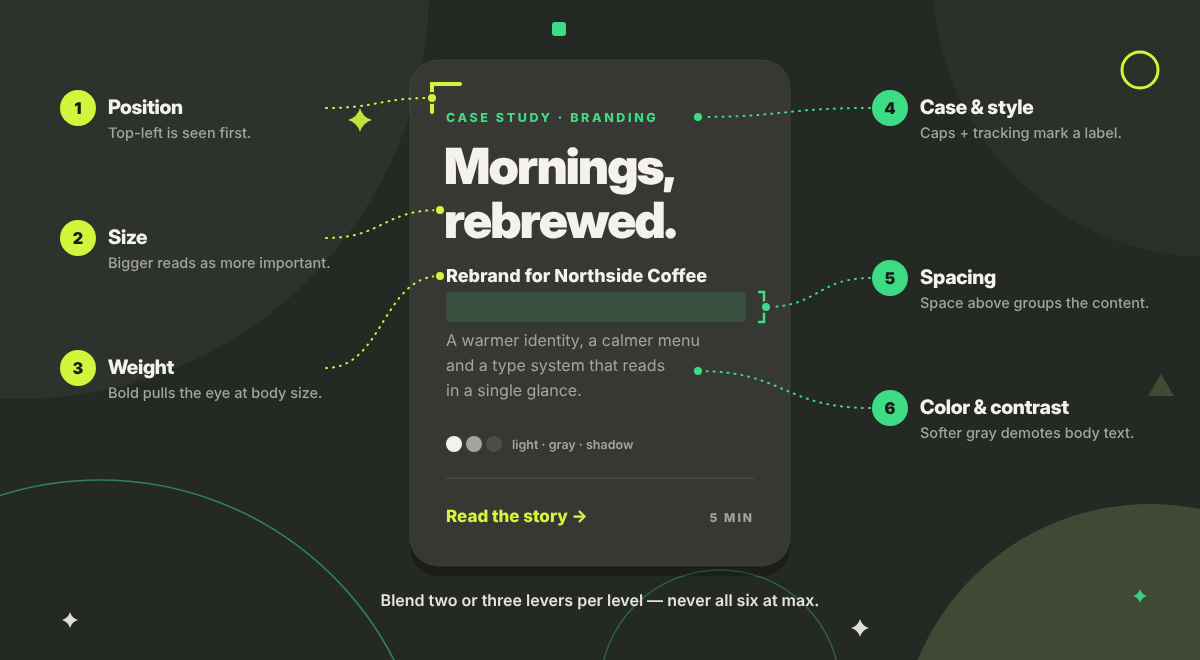
Most designs need three to five levels of hierarchy. Designers build them with six levers: size, weight, color and contrast, spacing, case and style, and position. Think of these six levers as the dials on a mixing desk. You don’t push them all to max. You blend a few.
That idea runs through this whole section. Use two or three levers per level and skip the other three or four. Pile every lever onto one heading, and the page gets loud and confusing.
Here, we explain how many levels of hierarchy you need and which six levers create them, so you can choose the right number of levels for your content and build each one with the right tools.
Lever
How it signals rank
Typical use
Risk if overused
Size
Bigger reads as more important
Headlines, section headings
Oversized headings crowd the layout
Weight
Heavier strokes pull the eye
Labels, subheads, key numbers
Too much bold flattens everything
Color and contrast
Higher contrast promotes, lower demotes
Secondary text, metadata
Failing WCAG contrast; color-only meaning
Spacing
Space above and around isolates and groups
Section breaks, callouts
Floating headings, broken groups
Case and style
Uppercase, small caps and italics mark a text type
Eyebrows, captions, labels
Slow, tiring reading in long runs
Position
Top-left and isolated spots are seen first
Titles, navigation, key messages
Competing focal points
1. Size
Size is the most obvious hierarchy lever, and also the one people lean on too much. Bigger text feels more important. Easy enough.
Still, the difference has to be easy to see. A 2 px gap between two headings will not come across as a new level. Readers will take it for a slip. Rather than choosing numbers at random, build your sizes from a type scale (more on that below).
2. Weight
Weight often does more work than size, especially on dense screens like dashboards and apps. A bold label at body size can easily outrank a bigger heading set in a light weight.
One practical warning to keep in mind. Make sure the weights you pick actually exist in your font family. When software fakes a bold (called "faux bold"), the letters end up smudged and clumsy. Nobody wants that on their screen.
3. Color and contrast
Color and contrast can raise or lower the importance of text in a snap. Stronger contrast moves an element up the ranking, and weaker contrast sends it down. That's why secondary text so often shows up in a softer gray.
Still, a floor exists, and you can't dip below it. WCAG 2.2 Success Criterion 1.4.3 requires a contrast ratio of at least 4.5:1 for normal text and 3:1 for large text at level AA. Large text means 18 pt, or 14 pt bold, which works out to roughly 24 px, or 18.66 px bold.
Color should never be the only signal of importance (SC 1.4.1). Pair it with weight, size, or position so that every reader gets the message, including people who are colorblind.
4. Spacing and position on the page
Spacing works quietly in the background. It builds hierarchy without changing the type at all. Put more space above a heading than below it, and the heading naturally leans toward the content it introduces.
Isolation does the job too. Surround a single line with plenty of white space, and it gets promoted on the spot. The font and size stay the same while the attention grows.
5. Case and style
Case and style let you set labels, eyebrows, and captions apart from the main text. Uppercase, small caps, italics, and extra letter spacing all tell the reader that this text plays a different role.
Keep all-caps short, though. Long uppercase passages lose the familiar word shapes our eyes rely on, slowing reading. A three-word eyebrow label? Great. A full paragraph in caps? Please, no.
6. Position and alignment
Where text sits on a page tells readers how important it is. In cultures that read left to right, the top and the left side get the most attention. Languages like Arabic and Hebrew read right to left, so the same logic flips to match. Indents, shifts in alignment, and thin rules can also signal a new level. Size and weight don't have to change at all for this to work.
How to build a type scale for typographic hierarchy
A type scale is a set of font sizes built from one base size and one ratio, so each level steps up by a predictable amount you can actually see. It gives your typographic hierarchy a solid backbone. The idea has been around for a long while, too. Robert Bringhurst, in The Elements of Typographic Style (1992), likened classic type sizes to the notes of a musical scale. Josef Müller-Brockmann and the Swiss (International Typographic) Style showed that strict, systematic type can still feel bold.
Ready to build your own? This section explains how to build a type scale, so you can set up your own sizes and apply them to any layout.
Choose a base body size: On the web, 16 px is the browser default and a solid place to begin. On mobile, 16 or 17 px keeps text easy to read and stops iOS from zooming into form fields.
Choose a ratio: Popular modular ratios include 1.125 (major second), 1.200 (minor third), 1.250 (major third), 1.333 (perfect fourth), 1.500 (perfect fifth), and 1.618 (the golden ratio).
Know the trade-off: Smaller ratios work well for dense, information-heavy interfaces. Larger ratios are well-suited to editorial and marketing pages that want bold, dramatic headlines.
Round and cap it: The generated values rarely land on tidy figures, so adjust them to practical sizes. Stop at five to seven sizes, because any more and the levels begin to blur together.
Pair each size with a line height: Bigger text looks best with proportionally tighter spacing. Body text feels comfortable somewhere around 1.4 to 1.6.
Make it responsive: A slightly smaller ratio on small screens keeps your headline from taking over the whole viewport.
Save it as typography tokens: Finally, save the scale as typography tokens in your design system. Once they live there, the scale gets enforced across every screen and every designer on the team.
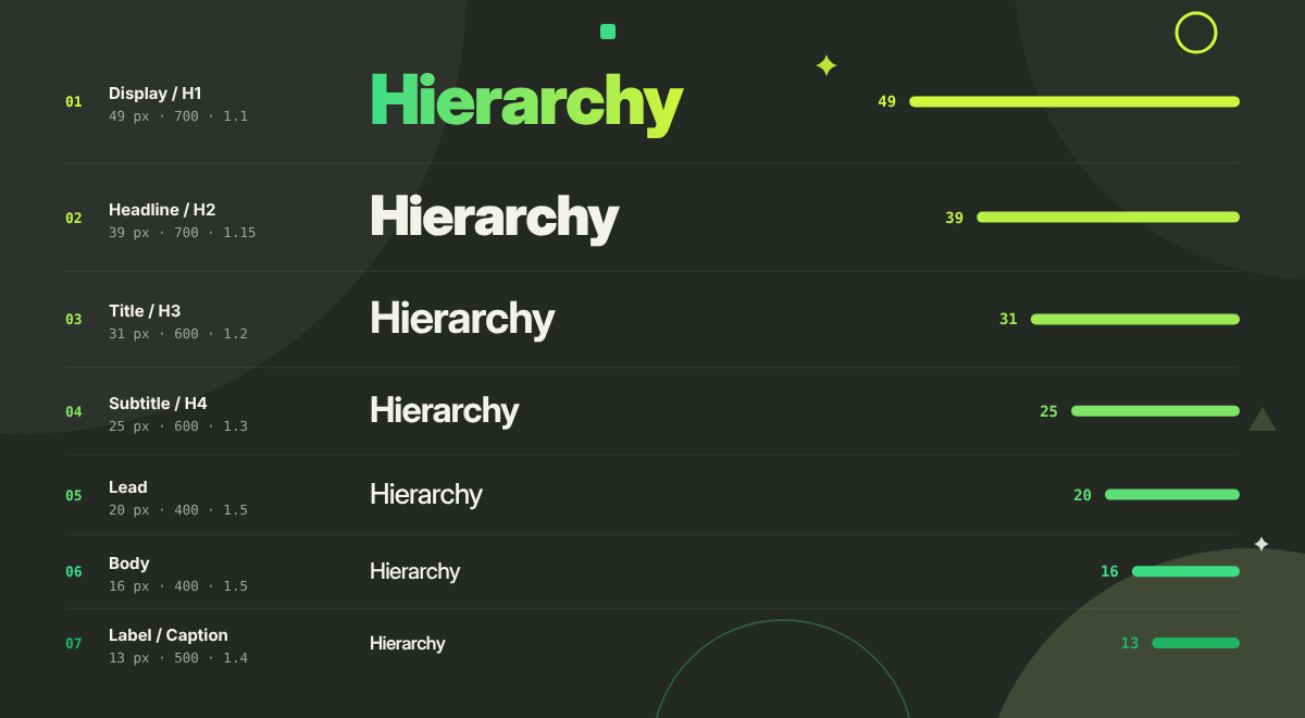
Want a head start? Here’s a real 1.250 (major third) scale from a 16 px base. Copy it, test it, tweak it.
Level
Role
Size (px)
Weight
Line height
Usage
1
Display / H1
49
700
1.1
Page title, hero headline
2
Headline / H2
39
700
1.15
Main section headings
3
Title / H3
31
600
1.2
Subsections
4
Subtitle / H4
25
600
1.3
Card titles, minor headings
5
Lead
20
400
1.5
Intro paragraphs, pull text
6
Body
16
400
1.5
Paragraphs, lists
7
Label / Caption
13
500
1.4
Captions, metadata, form labels
(Exact values: 48.83, 39.06, 31.25, 25, 20, 16 and 12.8 px, rounded for everyday use.)
For a worked example from a big platform, take a look at the Material Design type scale. Google names its roles by function, which gives you Display, Headline, Title, Body, and Label, each in large, medium, and small sizes. Smart move. A role called "Headline" keeps the hierarchy meaningful even when sizes change, which a label like "32 px" can't. Apple's Human Interface Guidelines take a similar approach, with named text styles that scale through Dynamic Type.
Typographic hierarchy in HTML and semantic structure
Semantic heading tags pass typographic hierarchy along to screen readers and search engines, so the heading order needs to stay logical no matter how you style the headings. A beautiful page with a broken heading structure only looks organized on the surface. Assistive technology and Google both see a mess beneath the surface.
This section teaches you how to build typographic hierarchy in HTML with semantic structure, so every heading you style also works for readers, assistive technology, and search engines.
So, let’s go over how to keep your structure honest.
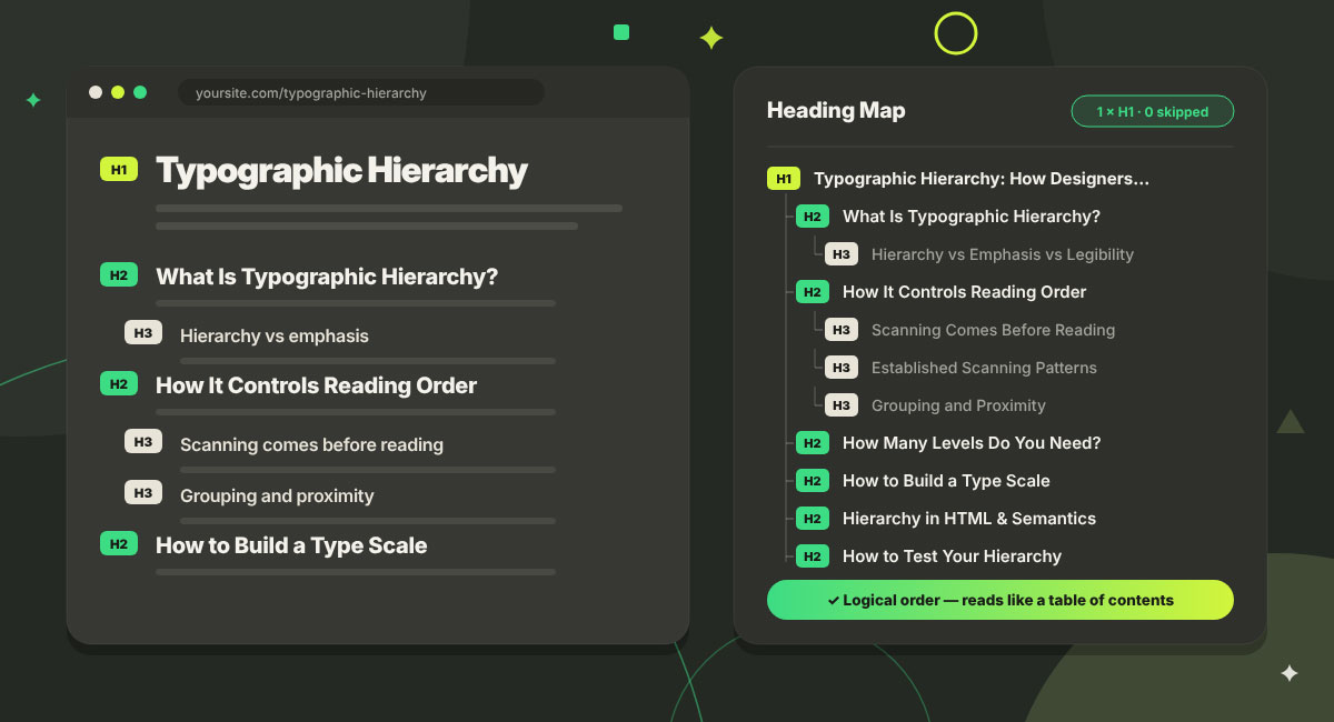
One H1 per page: Use a single H1, then step down through H2 and H3 without skipping levels. Jumping from H2 straight to H4 breaks the document outline.
Pick tags for meaning, CSS for looks: Never choose an H4 just because it “looks the right size.” Style it with CSS instead.
Follow WCAG: SC 1.3.1 (Info and Relationships) says any structure you show visually must also live in the code. Meanwhile, SC 2.4.6 (Headings and Labels) says headings should describe their topic.
Headings are navigation: Many screen reader users jump from heading to heading to move around a page. A good heading structure works as a real navigation system that these readers rely on.
Headings help SEO: Search engines read your heading structure to understand how a page is organized. A clear hierarchy therefore helps your rankings and meets an accessibility requirement at the same time.
No fake headings: A bold paragraph styled to look like a heading stays invisible to assistive technology and to tools that pull out content by headings. Use a real
or
instead.
How to test your typographic hierarchy
The fastest way to test typographic hierarchy is to blur the design, switch it to grayscale, and show it to someone for three seconds. If the headline, sections, and body text still stand apart, the hierarchy works. Most weak layouts fail due to a few recurring mistakes. This section shows how to test typographic hierarchy and avoid common mistakes, so you can fix weak structure before launch.
The squint (blur) test: Squint at the design, or blur it slightly. Can you still pick out the headline, the sections, and the body text? If everything melts into one gray block, add more contrast between the levels.
The grayscale test: Switch the design to black and white. If the ranking vanishes, you were leaning on color alone.
The three-second test: Show the page to someone for three seconds. Then ask what stood out as the most important thing. Their answer should match yours.
The heading-map test: Run a heading outline tool on the live page. The H1, H2, H3 order should read like a clear table of contents.
The contrast and resize test: Check text contrast against 4.5 to 1 and 3 to 1. Then zoom to 200% (SC 1.4.4) and apply the SC 1.4.12 spacing overrides: 1.5 line height, 2× paragraph spacing, 0.12 letter spacing, and 0.16 word spacing. Nothing should break.
Common typographic hierarchy mistakes
Most typographic hierarchy mistakes grow from the same root. There are too many signals and too little system.
Making everything bold, big, or bright, so nothing stands out.
Size changes of only 1 or 2 px between levels make them look like mistakes.
Using four or five typefaces for variety when size, weight, and spacing would do the job.
Leaving the same space above and below a heading, so it floats between sections.
Grey text with too little contrast, which fails WCAG.
Setting long passages in all caps.
Choosing heading tags based on how big they look by default, rather than on what the section means.
Typographic hierarchy FAQs
Most questions about typographic hierarchy land in a few practical areas. People want to know how many levels a layout needs, which scale to pick, and what sizes to set. They also ask how headings affect search rankings and accessibility. Clear answers below make good type decisions faster. These typographic hierarchy FAQs cover everything, so you can build, check, and explain a type system with confidence. If anything is missing below that you were searching for, contact us directly via email.
Typographic hierarchy is how you arrange type with size, weight, color, spacing, case and position so readers take in information in the order you want. It helps people spot the main message first, see how the content is organized, and find details without reading every word.
The three levels are primary, secondary and tertiary. Primary is the headline or page title. Secondary is the section headings. Tertiary is body copy, captions, and supporting detail. Three levels work for most layouts, and you can add one or two more if the content needs them.
Choose a base size and a ratio to build a type scale. Then use two or three levers for each level, usually size, weight, and spacing. Keep it to between three and five levels, and check your work with a squint test and a heading map.
Common ratios are 1.125, 1.200, 1.250, 1.333, 1.500 and 1.618. Smaller ones like 1.125 or 1.200 suit dense layouts such as dashboards and apps. Larger ones like 1.333 or 1.500 suit editorial and marketing pages with big, bold headlines. 1.250 is a safe middle choice.
Visual hierarchy covers everything on a page, including images, color blocks, icons and white space. Typographic hierarchy covers only the text and how size, weight, color, spacing, case and position rank it. The strongest designs make both points of the eye point the same way.
Yes, indirectly but meaningfully. Search engines read heading structure to understand how a page is organized. Clear headings also make content easier to scan, keep people reading, and increase the chance of appearing in featured snippets and AI Overviews.
On the web, 16 px is the browser default and a common minimum for body copy. Mobile usually runs 16 or 17 px. Whatever size you pick, the text should still scale to 200% without losing content or functionality, as required by WCAG Success Criterion 1.4.4.
One or two font families are usually enough. Size, weight, and spacing build hierarchy far more reliably than extra typefaces do. A single family with several weights can carry the whole hierarchy. Want to go deeper on pairing and usage? Read our guide to the law of fonts and typefaces in design and marketing.
Endnote
That brings us to the end of the article, and we hope you leave feeling ready to put it all to work!
Typographic hierarchy gives every layout a clear reading order. You build it with six levers (size, weight, color and contrast, spacing, case and style, and position) and set your sizes with a modular scale. Semantic HTML headings carry the same order to screen readers and search engines, and the squint, grayscale, and heading map tests confirm that it works.
Here are the key takeaways to keep handy:
Typographic hierarchy is the arrangement of type that controls the order in which content is read.
Readers scan before they read, so the eye lands on the highest contrast element first.
Six levers create it: size, weight, color and contrast, spacing, case and style, and position.
Use two or three levers per level, and keep the total number of levels between three and five.
Generate sizes from a modular scale, with common ratios running from 1.125 to 1.618.
Keep semantic heading order correct in HTML, because hierarchy lives in the structure of the code as well as in the styling.
Meet WCAG 2.2 contrast, resize, and text spacing criteria, then test with squint, grayscale, and heading map checks.
Ready to try this on a real project? Our presentation design tips and brochure design tips show typographic hierarchy at work, and our graphic design process guide shows where it fits from brief to final file. If you would rather leave it to a professional designer, the Graphic Design Eye LLC team is ready to help you create layouts that guide readers exactly where you want them to go.
Thank you for reading, and good luck with every page you design. May your next project be your best one yet! 🙂
Graphic Design Eye LLC is a full-service creative agency built for brands that demand more than design — they demand vision. From strategic branding to complete visual identity, we partner with startups, agencies, and growing businesses as a dedicated creative force. With flexible subscription and project-based models. Let's start with us today!