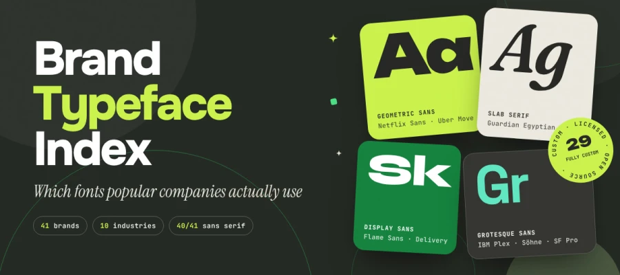
What is the brand typeface index, and which fonts do major brands actually use? It lists the primary typeface of 41 global brands across ten industries, sorted by classification. Each row shows whether the face is custom, licensed, or open source, and whether the brand has switched. Every entry is checked against published brand guidelines, design systems, or foundry case studies, and the index is updated quarterly.
Ever wondered what font Netflix, Airbnb, or Coca-Cola actually uses? The honest answer is rarely the one you'll find on a font guessing forum!
Most "what font does [brand] use" articles are guesswork. Someone squints at a logo, matches it to a lookalike, and the mistake gets copied across a hundred blogs. Meanwhile, the real answers sit scattered across brand guidelines, design systems, and foundry case studies. Some are public, many are buried, and a few hide behind client logins.
That gap is exactly what we set out to close. Our team at Graphic Design Eye LLC built this business typeface index to show you which typefaces major brands use, why they chose them, what the licenses cost, and how to pick the right one for yours.
So, are you ready to see what the world's biggest brands really type with? Keep reading, because the answers might surprise you!
How the brand typeface index is built and verified
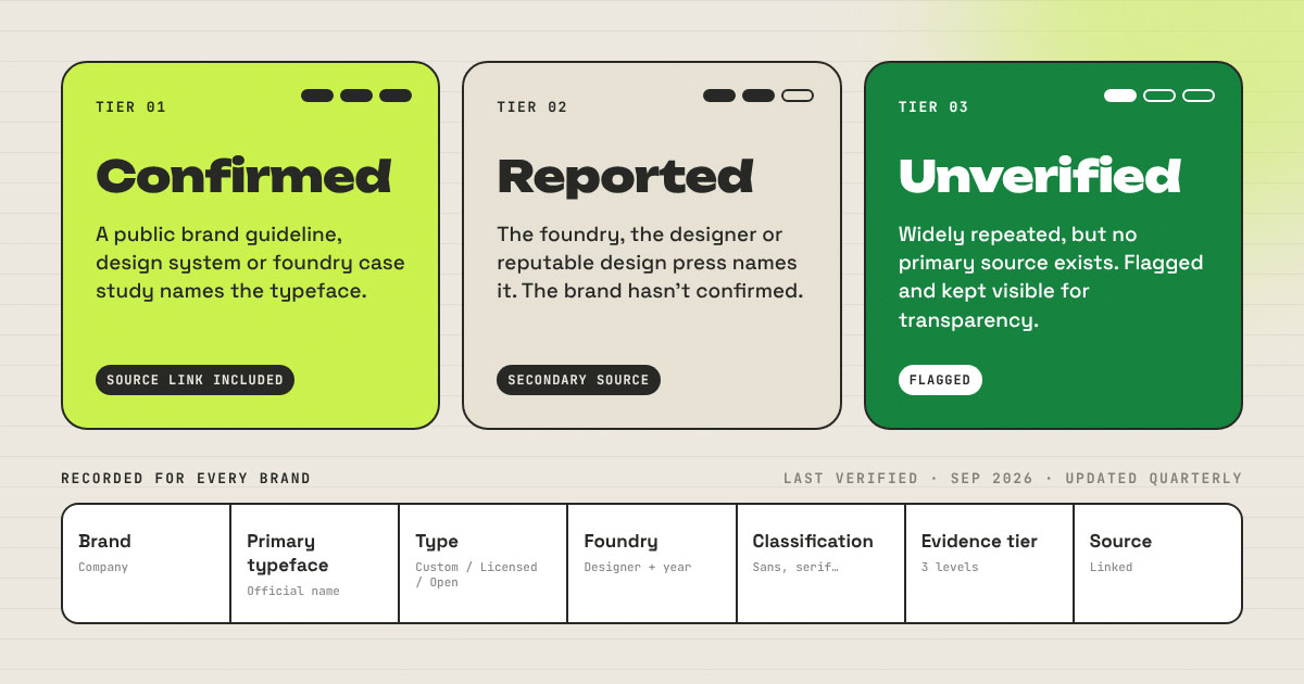
The process starts with matching each brand's primary typeface to a published source. Every entry then receives one of three evidence grades: Confirmed, Reported, or Unverified. Confirmed rows point to a brand guideline, a design system, or a foundry case study. Reported rows point to the foundry, the designer, or reputable design press.
This section explains how the brand typeface index is built and verified, and how you can use that process to check any claim and judge how much weight each row deserves.
Inclusion criteria
Our inclusion criteria keep the sample tight and repeatable. Version 1.0 covers globally recognized brands across ten industries. That includes large public companies and a defined set of high-profile private brands whose identities shape their categories.
Who qualifies: Brands with a public identity system and a primary typeface we can trace to a brand guideline, design system, or foundry case study.
One primary typeface per brand: Each brand has one primary typeface, used for headlines and core communication. Secondary, text, and monospace faces get their own notes and stay out of the primary row.
Coverage: Three to five brands per industry in version 1.0. New brands are added at each quarterly review.
Evidence tiers
Every row in the index is tagged with one of three evidence tiers. The tier indicates how much weight to give the claim.
Confirmed: A public brand guideline, design system, or foundry case study names the typeface. Every Confirmed row includes a source link.
Reported: The foundry, the designer, or reputable design press names the typeface, and the brand has published nothing to confirm it.
Unverified: Many people repeat the claim, yet no primary source exists. We flag these entries and keep them listed, since being open about uncertainty builds trust.
What is recorded per brand
What is recorded per brand stays identical across every industry table, so the data reads the same way for people and for machines:
Column
What it holds
Brand
The company or product brand
Primary typeface
The official name of the face, as the brand or foundry writes it
Type
Custom (commissioned), Licensed (retail), or Open source
Foundry or designer
Who drew it, plus the release year where known
Classification
Neo-grotesque, geometric sans, humanist sans, serif, and so on
Evidence tier
Confirmed, Reported, or Unverified
Source
Link to the guideline, design system, or case study
Known limitations
Every index has known limitations, and naming ours up front saves you from misreading the data.
Wordmarks are often custom lettering, not a font. The Coca-Cola script or the Google logo is drawn artwork. We record the system typeface the brand uses everywhere else and note the difference.
Web fallbacks differ. A brand’s website may fall back to a system font stack that doesn’t match its print and identity typeface.
Regional and sub-brand variations are out of scope for version 1.0.
Brand typeface index by industry
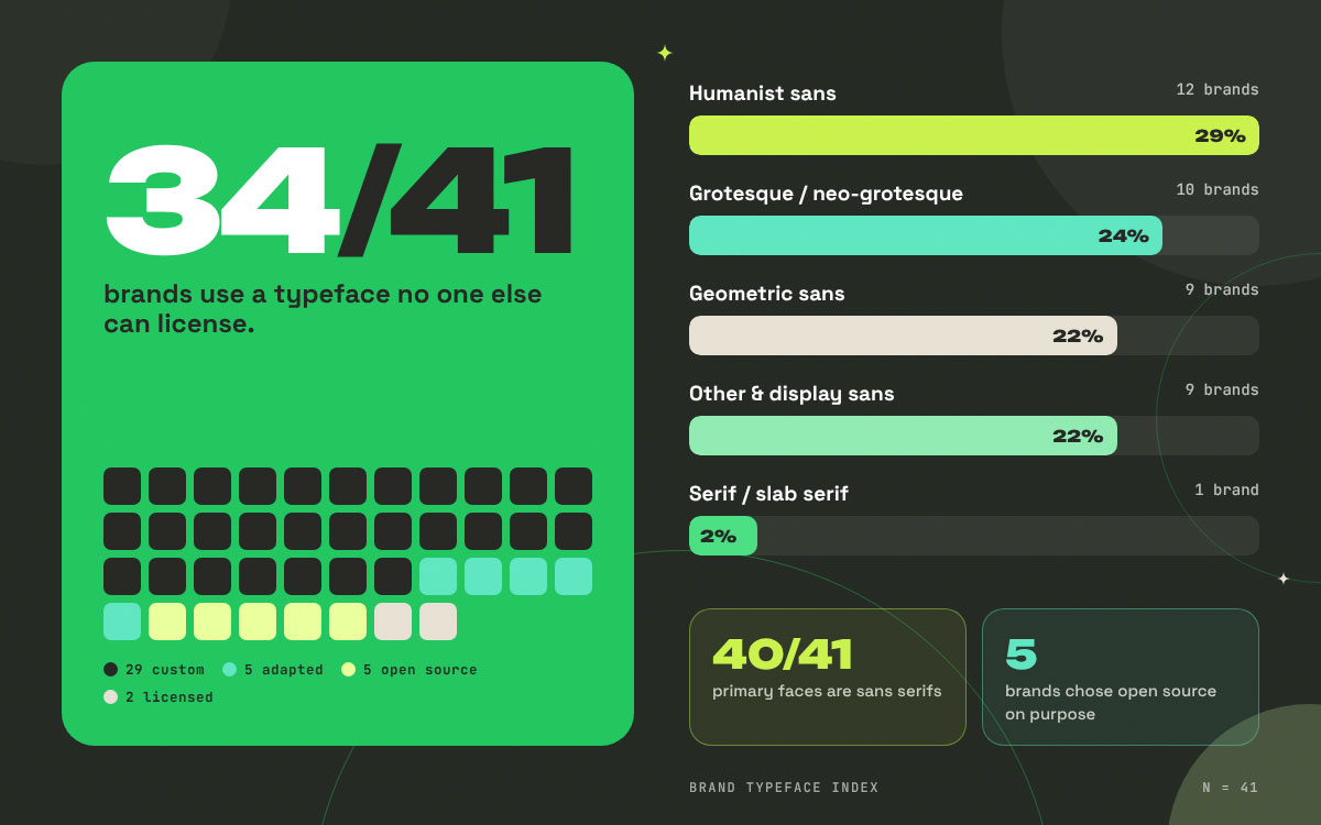
The industry breakdown shows one clear pattern. Of the 41 brands in version 1.0, 29 use a fully custom typeface, and only 2 rent a retail font as is. The rest either adapted a retail family into something exclusive or deliberately chose open source.
This section explains the brand typeface index by industry, so you can see how typeface choices differ across sectors and what each pattern means for your own brand.
Technology and software
Tech and software brands lead the open source movement in brand typography, with three of the five companies here giving their typefaces away for free. The other two build custom faces tied to their operating systems. Across the board, the sector treats its font as product infrastructure and a branding detail all in one!
Brand
Typeface
Type
Foundry or designer
Classification
Evidence tier
Source
Apple
SF Pro (San Francisco family)
Custom
Apple (in-house)
Neo-grotesque sans
Confirmed
Apple Developer: Fonts
Google
Google Sans Flex
Open source (SIL OFL)
Google, 2025
Geometric sans
Reported
9 to 5 Google
Microsoft
Segoe UI / Segoe UI Variable
Custom
Microsoft
Humanist sans
Confirmed
Fluent 2 Typography
IBM
IBM Plex
Open source (SIL OFL 1.1)
Mike Abbink with Bold Monday, 2016–2023
Grotesque sans
Confirmed
IBM Plex on GitHub · Bold Monday
GitHub
Mona Sans
Open source (SIL OFL)
GitHub with Degarism, 2022
Grotesque sans
Confirmed
GitHub Blog
Technology is where open source is strongest. Three of the five tech brands here give their brand typeface away under the SIL Open Font License. Those three are Google, IBM, and GitHub. Why would a company hand over its most recognizable asset? In tech, developers are the audience, and a free font carries the brand into every product built on top of it. GitHub said it best: “We don’t need to be the only ones that have access to the elements that make GitHub, GitHub.”
Apple and Microsoft take the opposite road. SF Pro and Segoe UI are custom fonts associated with their respective operating systems. Apple's license even limits SF Pro to interface mock-ups for Apple platforms. Take a peek at the variable axes too. Mona Sans packs weight, width, and slant into a single file. For tech companies, the brand font works like plumbing that keeps everything running!
Finance, banking and fintech
Finance, banking, and fintech brands are swapping cold corporate type for warmer personality they can call their own. Three of the four brands here use a typeface made just for them. Two of those showed up in 2022 and 2023. Stripe stands apart from the group, showing that a licensed retail font can still feel like a signature.
Brand
Typeface
Type
Foundry or designer
Classification
Evidence tier
Source
Visa
Visa Dialect
Custom
Mucho, 2022
Humanist sans
Reported
TypeRoom
Wise
Wise Sans
Custom (adapted retail)
NaN with Ragged Edge, 2023; built from Parafina
Display sans
Confirmed
NaN case study
Stripe
Söhne
Licensed
Klim Type Foundry
Grotesque sans
Confirmed
Klim: Stripe in use
Santander
Santander Headline / Santander Text
Custom
Created in the 2018 rebrand
Sans (single-story)
Reported
Econsultancy
Finance has traded borrowed authority for a personality of its own. Visa Dialect (2022) and Wise Sans (2023) are both recent commissions, and both feel warmer than the stiff corporate faces banks used to rent. Mucho built Visa Dialect digital first, so it stays legible from a card terminal to a billboard.
Wise took a smart shortcut. Rather than starting from zero, NaN extended an existing retail family called Parafina into an exclusive face, complete with custom currency symbols. That is the "adapted retail" route, and it keeps showing up in this index. Stripe stands apart by licensing Söhne from Klim instead of owning a face. A well-chosen retail font, used with discipline, can still become a signature!
Retail and e-commerce
Retail and e-commerce brands pick their typefaces with reach in mind. Three of the four brands here have an exclusive face, while IKEA bases its entire identity on the open-source Noto. A font in this world has to handle every language, catalog, and checkout page. It also has to sell in every market at once!
Brand
Typeface
Type
Foundry or designer
Classification
Evidence tier
Source
Amazon
Amazon Ember
Custom
Dalton Maag, 2015 (first used 2016)
Humanist sans
Reported
Fonts In Use
IKEA
Noto (replaced Verdana, 2019)
Open source
Google and Monotype
Humanist sans
Reported
It’s Nice That
Walmart
Everyday Sans
Custom (adapted retail)
Built from Antique Olive, with Jones Knowles Ritchie, 2025
Humanist sans
Reported
Marketing Dive
eBay
Market Sans
Custom
Form & with Swiss Typefaces, 2017
Sans (other)
Confirmed
eBay Playbook · Creative Boom
Retail typography comes down to reach. IKEA's 2019 switch shows this well. After ten years with Verdana, the brand moved to Noto because Verdana couldn't handle Asian scripts. Noto covers 800 languages and 100 written scripts, so a single catalog design can now travel almost anywhere.
Amazon and eBay went the custom route. Dalton Maag drew Amazon Ember for Amazon's exclusive use, and it debuted on the Kindle Oasis. The eBay Playbook keeps things tight. Market Sans Bold handles titles, Regular covers everything else, and Poppins and then Arial step in as fallbacks. Walmart's 2025 Everyday Sans has the best origin story of the bunch. It builds on Antique Olive and takes its inspiration from a trucker hat Sam Walton wore. Heritage, turned into a font!
Food, beverage and hospitality
Every food, beverage, and hospitality brand in our index uses a custom typeface, and each one draws on its own history. Coca-Cola's TCCC Unity draws on the company's archive. McDonald's Speedee has its own story to tell. These fonts are built to feel as familiar as the menu itself. In this corner of the world, type has to taste like the brand!
Brand
Typeface
Type
Foundry or designer
Classification
Evidence tier
Source
Coca-Cola
TCCC Unity
Custom
Brody Associates (Neville Brody), 2018
Geometric sans
Reported
Dezeen
McDonald’s
Speedee
Custom
Turner Duckworth with Dalton Maag, 2019
Humanist sans
Reported
It’s Nice That
Burger King
Flame Sans
Custom
Jones Knowles Ritchie, 2021
Display sans
Reported
Dezeen
Starbucks
SoDo Sans (with Lander and Pike)
Custom
Lettermatic (Riley Cran), 2017–2019
Grotesque sans
Confirmed
Starbucks Creative Expression · Lettermatic
Every brand in this category has gone custom, and each one dug into its own history to get there. Coca-Cola waited 130 years for its first own brand typeface. Neville Brody's TCCC Unity draws on the company's archive and American Modernist roots. McDonald's Speedee borrows from the Golden Arches and the 1971 "You deserve a break today" ads.
Burger King's Flame Sans is the loudest of the bunch. Jones Knowles Ritchie shaped it to echo the "natural, organic shapes of food," and you can almost taste the melted cheese! Starbucks went a step further and built a full system. Lettermatic drew four families and 92 fonts, from SoDo Sans for body copy to Pike, an extra narrow face made for menu boards. The lesson here is that a font can carry appetite along with information.
Automotive and mobility
Automotive and mobility brands all have custom typefaces, and a foundry or brand guideline confirms every row. These fonts are built the way the vehicles are, with care and a lot of engineering. They read clearly on a billboard, on a dashboard screen, and inside a ride-hailing app. Automotive and mobility typography is precision design in motion!
Brand
Typeface
Type
Foundry or designer
Classification
Evidence tier
Source
Volkswagen
VW Head / VW Text
Custom
HvD Fonts with MetaDesign, 2015
Sans (other)
Confirmed
HvD Fonts
Toyota
Toyota Type
Custom
Steve Matteson
Geometric sans
Confirmed
Toyota brand guidelines · Matteson Typographics
Audi
Audi Type
Custom
Bold Monday, 2009
Geometric sans
Confirmed
Bold Monday
Uber
Uber Move
Custom
MCKL (Jeremy Mickel) with Wolff Olins, 2018
Geometric sans
Confirmed
MCKL · Typewolf
Automotive is the most engineered category in the index. All four brands use custom type, and all four are Confirmed. That's no accident, since a car brand's font has to read clearly on a billboard and on a dashboard screen at 70 mph. HvD Fonts built VW Head and VW Text as an 11-style system for advertising, editorial, and in-car infotainment.
Audi Type, from Bold Monday, launched for the company's 100th anniversary in 2009. It covers extended Latin, Cyrillic, and Greek. Toyota's guidelines describe Toyota Type as "legible, human and approachable." Uber Move takes Futura era sans serifs and reimagines them "through the lens of transportation fonts from around the world." Turns out movement has a typeface of its own!
Fashion, beauty and luxury
Fashion, beauty, and luxury brands are dividing into two typographic camps. Sportswear and e-commerce names like adidas and Zalando lean on functional sans serifs. Luxury houses such as Burberry are returning to serifs to showcase their heritage. Sephora sits right in the middle, blending sans, serif, and script into one elegant system.
Brand
Typeface
Type
Foundry or designer
Classification
Evidence tier
Source
adidas
adineue PRO
Custom
MCKL
Geometric sans
Confirmed
MCKL
Zalando
Zalando Sans
Open source (SIL OFL 1.1)
Jakob Ekelund, KH Type, 2025
Grotesque sans
Confirmed
Zalando Sans on GitHub
Sephora
Sephora Sans (with Sephora Serif and Script)
Custom
Mucca with Schriftlabor
Sans (other)
Confirmed
Mucca
Fashion splits into two camps. Sportswear and e-commerce brands go functional. The adidas adineue PRO is "rooted in principles of German engineering and the functional aesthetic of the Bauhaus," and Zalando released Zalando Sans as open source in 2025, packing weight, width, and slant axes into one variable family.
Luxury heads somewhere else entirely. In 2023, Burberry dropped the sans-serif wordmark Peter Saville designed in 2018 and introduced a serif that nods to the brand's earlier typefaces (Design Week). That wordmark is a logo, not a system font, so it falls outside the table. Still, it points to the serif comeback we unpack below. Sephora lands between the two camps, with a three-part system of sans, serif, and script built to match its logotype.
Media, streaming and entertainment
Media, streaming, and entertainment brands often commission custom typefaces to get out from under rising license bills. Each brand in this group owns its type, from Netflix Sans to BBC Reith. These fonts also put in more overtime than most. They run from giant billboards down to tiny subtitles across platforms all over the world.
Brand
Typeface
Type
Foundry or designer
Classification
Evidence tier
Source
Netflix
Netflix Sans
Custom
Dalton Maag, 2018
Geometric sans
Confirmed
Dalton Maag
BBC
BBC Reith (Sans, Serif, Condensed, Rounded)
Custom
Dalton Maag, 2017
Humanist sans
Confirmed
Dalton Maag
YouTube
YouTube Sans
Custom
Saffron with URW Type and LetterJuice, 2017
Geometric sans
Confirmed
Google Design
Spotify
Spotify Mix (replaced Circular, 2024)
Custom
Dinamo
Geometric sans
Reported
It’s Nice That
The Guardian
Guardian Egyptian
Custom
Paul Barnes and Christian Schwartz, 2005
Slab serif
Reported
Type.today
Media brands commission custom type for one blunt reason: license bills. The BBC had "multiple typefaces in use" and "rising license costs" before Dalton Maag built the BBC Reith suite. Netflix's brand lead said the same thing plainly. "With the global nature of Netflix's business, font licensing can get quite expensive."
Media fonts also work harder than most. Netflix Sans runs from billboards to "micro scale subtitles" in over 800 languages. YouTube Sans started life as the grid of the old play button, and Google Design calls it the brand's "foremost brand ambassador." Spotify's 2024 switch from Circular to Spotify Mix is the freshest move on the list. Dinamo spent about 18 months on it so the brand could stretch from condensed to extended. The Guardian is the only serif in the entire index. Old school? Maybe. Iconic? Absolutely!
Healthcare and pharmaceuticals
Healthcare and pharmaceutical brands prioritize readability above all else, so humanist sans serifs dominate this category. Three of the four brands here use a humanist face built to feel calm and clear. A typeface in this field has to put patients, carers, and clinicians at ease before a single word gets read.
Brand
Typeface
Type
Foundry or designer
Classification
Evidence tier
Source
NHS
Frutiger (Arial as fallback)
Licensed
Adrian Frutiger (retail family)
Humanist sans
Confirmed
NHS Identity Guidelines
Pfizer
Pfizer Tomorrow (with Pfizer Diatype)
Custom
Pentagram and Pfizer; Diatype by Dinamo with MCKL
Humanist sans
Confirmed
Pentagram
CVS Health
CVS Health Sans
Custom
Not named in the style guide
Sans (other)
Confirmed
CVS style guide
Siemens Healthineers
Bree-SH
Custom (adapted retail)
Type Together (Veronika Burian and José Scaglione), 2017
Humanist sans
Confirmed
Type Together
Healthcare typography has one job above all others, and that is to be readable by everyone. That includes people who are ill, anxious, or older. Humanist sans serifs dominate the field for this reason. The NHS offers the clearest example. Frutiger was originally drawn for airport signage and serves as its core font. Arial steps in for everyday documents where Frutiger isn't available.
Pfizer's rebrand shows how pharma is warming up. Pentagram describes Pfizer Tomorrow as "kind, classic, and humanist." Dinamo's Pfizer Diatype, a 76-style superfamily, does the heavy lifting. Siemens Healthineers took the adapted retail route with Bree-SH, a custom cut of TypeTogether's Bree. Its handwriting-based shapes "bring a human touch while representing stability." Trust, it turns out, can come down to a letterform!
Travel, airlines and logistics
Travel, airline, and logistics brands need typefaces that hold up at tiny sizes and make sense at a quick glance. Every brand in this group went custom to get one. From Airbnb Cereal to Lufthansa's Helvetica replacement, these fonts walk people through apps, airports, and parcel tracking. When you work in travel, airlines, or logistics, legibility makes up the whole journey!
Brand
Typeface
Type
Foundry or designer
Classification
Evidence tier
Source
Airbnb
Airbnb Cereal
Custom
Dalton Maag, 2018
Geometric sans
Reported
Dezeen
Lufthansa
Lufthansa Head / Lufthansa Text (replaced Helvetica, 2018)
Custom
HvD Fonts (Hannes von Döhren), 2018
Geometric sans
Confirmed
HvD Fonts
DHL Group
Delivery
Custom
Dalton Maag, 2018–2021
Sans (other)
Confirmed
Dalton Maag
Travel brands live in wayfinding, apps, and boarding passes, so their fonts have to hold up at tiny sizes and quick glances. Airbnb said it plainly with "We have specific business needs around brand distinction, legibility, and scalability, that no available typefaces were addressing." Cereal's tall x-height answered that call.
Lufthansa tells the boldest story in the whole index. The airline used Helvetica Bold for more than 50 years, going back to Otl Aicher's 1963 corporate design. In 2018, HvD Fonts replaced it with a geometric Head and Text pair. As the foundry puts it, "it was never our idea to create a better Helvetica." DHL Group had a more practical reason for change. The company had "over twenty disparate typefaces in use" until Dalton Maag's Delivery family pulled them all into a single family.
Telecommunications and energy
Telecommunications and energy brands build typefaces for scale, since they talk to entire countries at once. Every brand on this list owns an exclusive face. Two of the five got there by adapting an existing retail family. A font in these industries has to stay clear on a phone screen, on a printed bill, and even inside VR.
Brand
Typeface
Type
Foundry or designer
Classification
Evidence tier
Source
Deutsche Telekom
TeleNeo (replaced TeleGrotesk, 2020)
Custom
HvD Fonts (Hannes von Döhren) with Bernd Volmer, 2020
Grotesque sans
Confirmed
Deutsche Telekom · HvD Fonts
Vodafone
Vodafone (built from InterFace)
Custom (adapted retail)
Dalton Maag, 2009
Humanist sans
Confirmed
Dalton Maag
AT&T
ATT Aleck Sans (with Aleck Slab)
Custom
Interbrand with Dalton Maag
Humanist sans
Reported
Darrin Crescenzi portfolio
Iberdrola
IberPangea / IberPangea Text
Custom (adapted retail)
Fontwerk, from its Pangea family, 2024
Grotesque sans
Confirmed
Fontwerk
Enedis
Enedis Identity Font
Custom
Black [Foundry]
Sans (other)
Confirmed
Black[Foundry]
Telecom and energy brands speak to entire countries at once, so their fonts need to be ready for scale and for whatever comes next. Deutsche Telekom's TeleNeo replaced TeleGrotesk, which had been in use since 1992. It's a two-axis variable font designed for VR, AR, and print. AT&T's Aleck family began as "first for performance in mobile environments" and grew to 38 fonts.
This category also leans heavily on adapted retail fonts. Vodafone uses Dalton Maag's InterFace, tweaked to cover languages around the globe. Iberdrola's IberPangea gives a 20-weight twist to Fontwerk's Pangea. Enedis, the French grid operator, went fully custom with Black[Foundry]. A "thread" runs through the letters to express "the public utility of the ecological transition." Now that is a brand story told in strokes!
Patterns in the data: What the index reveals
Big brands clearly want to own their type, and they lean hard toward sans serifs. Out of the 41 brands in version 1.0, 34 use a typeface that no one else can license. Of those, 29 are fully custom, and 5 were adapted from a retail family. A whopping 40 of the 41 primary faces are sans serifs. On top of that, 5 brands picked open source on purpose.
This section explains the patterns in the data and what the index reveals about why brands choose these typefaces, so you can apply the same reasoning to your own brand.
Classification
Share of index (n = 41)
Typical industries
Representative brands
Humanist sans
12 (29%)
Healthcare, telecom, retail
NHS, BBC, Microsoft, Visa
Grotesque / neo-grotesque sans
10 (24%)
Technology, fintech, energy
Apple, IBM, Stripe, Audi
Geometric sans
9 (22%)
Automotive, media, travel
Netflix, Uber, Lufthansa, adidas
Other and display sans
9 (22%)
Food, retail, logistics
Burger King, eBay, Wise, DHL Group
Serif / slab serif
1 (2%)
Media
The Guardian
The rise of the custom corporate typeface
The custom corporate typeface starts with money. At a global scale, licensing a retail font for every seat, website, app, and territory adds up fast, and the bills keep coming. Commissioning a family of fonts costs more up front, but the brand ends up owning it outright.
Licensing economics: The BBC cited rising license costs due to the use of multiple typefaces. Netflix said font licensing can get quite expensive. DHL Group once had over twenty disparate typefaces in use, which sounds more like a font buffet than a brand.
Legal control: An exclusive face can't show up on a competitor's packaging.
Differentiation: Walmart and McDonald's both dug through their own archives and came back with letterforms nobody else can copy.
Technical control: Owning the files lets a brand specify its own variable axes, scripts, and interface tuning, as Deutsche Telekom did with TeleNeo.
Why the sans serif dominates
The sans serif dominates for a plain reason. It works everywhere. Conventional wisdom says the neo-grotesque rules corporate type, but our data tell a more interesting story. Humanist sans serifs (12 brands) actually edge out grotesques (10) and geometrics (9).
Legibility at small sizes: open apertures and generous x-heights survive app interfaces, subtitles, and signage.
Neutrality across markets: a clean sans travels between cultures without carrying much baggage.
Language coverage: Netflix Sans and BBC Reith both support 800+ languages; IKEA chose Noto for the same reason.
The counter-argument is sameness. When every brand puts on a clean sans, they all start to look like cousins at a family reunion. Luxury "blanding" has taken that exact criticism for years. That's why the next pattern matters.
Serif revival in consumer and luxury brands
Serif fonts are making a comeback in consumer and luxury branding. The trend is still small, but it is real. Serifs carry a sense of heritage, editorial credibility, and premium positioning. A neutral sans simply can't fake those three things.
Heritage: Burberry’s 2023 serif wordmark deliberately references typefaces from the brand’s past.
Editorial credibility: The Guardian’s slab serif remains the only serif primary face in our index.
Expressive accents: Starbucks uses its Lander serif "as an accent for more expressive moments." Sephora pairs Sephora Sans with a Sephora Serif. Apple ships New York as a serif companion to San Francisco.
Variable fonts and design systems
Variable fonts and design systems now go hand in hand. Instead of shipping eight static weights, a brand ships a single file that contains every weight and width in between. That means a lighter page payload, faster loading, and type that adapts to each screen.
Mona Sans covers weight (200–900), width (75%–125%), and slant.
Zalando Sans runs from ExtraLight to Black and Condensed to Expanded.
TeleNeo pairs the weight and width axes, built for VR, AR, and print.
SF Pro uses variable optical sizes, so small text reads like a text face and large text like a display face.
Open source as a deliberate strategy
Making a brand asset open source on purpose sounds strange at first, until you see someone actually does it. IBM, GitHub, Google, and Zalando all released their brand typefaces under the SIL Open Font License. IKEA built its identity on the open source Noto.
Distribution: Every developer who uses IBM Plex or Mona Sans spreads the brand’s look for free.
Developer goodwill: Tech audiences reward generosity, and a free font is a very visible gift.
Partner consistency: Agencies, partners, and sellers can match the brand without needing to buy a license.
What it actually costs to use these typefaces
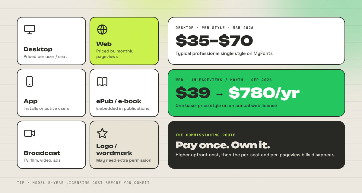
Font licensing costs depend on where and how much you use a typeface. A desktop license covers designers' computers, while websites, apps, e-books, broadcasts, and logos often require their own licenses. On MyFonts, one professional style typically sells for 35 to 70 (as of March 2026). Web use costs extra. No wonder 34 of 41 brands chose to own their type!
This section explains font licensing costs and the commissioning route, so you can budget accurately for your own brand and avoid common licensing mistakes.
Licence types
License types are split by medium, and each one is sold separately:
Desktop: installing the font on computers for designing prints, images, and documents.
Web: serving the font on a website through @font-face.
App: embedding the font inside a mobile, desktop, or web application.
ePub/e-book: embedding the font in digital publications.
Broadcast and advertising: using the font in TV, film, video, and commercial campaigns.
Logo/wordmark: some foundries require extra permission when a font forms a trademark.
How pricing scales
How pricing scales varies by foundry, so always read the specific license:
Licence
Usually priced by
Date example
Desktop
Number of users or seats
Professional single styles typically 35–70 on MyFonts, as of March 2026 (Monotype Foundry Support)
Web
Monthly pageviews and domains
A $39 base-price style at 1,000,000 pageviews a month costs $780, on an annual license, as of September 2026 (Monotype Foundry Support)
App
Number of apps, installs, or monthly active users
Klim prices app licenses by monthly active users or downloads (Klim licenses)
Territory and term
Worldwide or regional; one-off or annual
Klim fees are one-off with no expiry and worldwide use; MyFonts web licenses renew annually
The same font can be a one-off purchase from one foundry and a yearly bill from another. Model it before you commit.
The commissioning route
Commissioning a brand typeface index means paying a foundry to design one that your brand owns or exclusively licenses. It takes more time and money up front. In return, the per-seat and per-pageview bills go away for good.
Typical scope: A typical project covers a core family in several weights and italics. Many also include a condensed or display cut. On top of that come the scripts your markets need, such as Latin, Cyrillic, Greek, and Arabic.
Timeline: Plan for months rather than weeks. Spotify Mix took about 18 months to finish. IBM says Plex "took two years and a lot of work to get here."
What a bespoke brief includes: Brand personality words, the platforms, the smallest sizes the font must hold up in, and the languages it needs to support. It also spells out the weights and widths you want, any variable axis needs, and the licensing model you prefer. Last comes ownership of the final files.
Free and open-source alternatives
Free and open-source alternatives can get you close to many famous corporate styles without a license bill. These are our design team’s suggested substitutes, all released under the SIL Open Font License:
If you like the feel of…
Try this free alternative
Licence
SF Pro, Söhne (neo-grotesque)
Inter
SIL OFL 1.1
Airbnb Cereal, Netflix Sans (geometric)
DM Sans or Plus Jakarta Sans
SIL OFL 1.1
Frutiger, BBC Reith (humanist)
Source Sans 3 or Noto Sans
SIL OFL 1.1
Corporate grotesques with a mono companion
IBM Plex Sans + IBM Plex Mono
SIL OFL 1.1
Wide, expressive grotesques
Mona Sans or Zalando Sans
SIL OFL 1.1
The five most common licensing mistakes
Five licensing mistakes recur, and each can be avoided. Each can also bring a letter from a foundry's lawyer to your inbox.
Using a desktop license on the web. Putting a font on your site takes a web license.
Ignoring pageview tiers. Once your traffic grows past your tier, your license needs to grow with it.
Embedding in an app without an app license. Apps are a separate license at most foundries.
Modifying the outlines without permission. Many licenses forbid editing the font files, even for a logo tweak.
Using a font in a logo without a logo license. Trademark use can call for extra permission, so check before you file.
How to choose a brand typeface
The best way to choose a brand typeface is to settle its practical demands before its personality. Language coverage, smallest display size, and long-term cost decide which fonts qualify, and style then helps you pick among the finalists.
This section sets out a practical framework for choosing a brand typeface, so you can build a shortlist that fits your needs and test it under real-world conditions before you commit.
Define the functional requirements first. List every language and script you serve, the weights you need, your numeral styles (tabular for data and proportional for text), and the smallest size the font must render at.
Audit the competitive typographic field. Take screenshots of your top five competitors and see what they share. If they all lean on a clean geometric sans, a humanist face or a serif accent could be your chance to stand out.
Test in real contexts. Set real copy in your app interface, on packaging, in small print, and in motion. A face that sings in a headline can fall apart in a footnote.
Model total licensing cost over five years. Add up desktop seats, web pageviews, app installs, and territories before you fall in love with a face. Falling for a font and then meeting the invoice is a rough way to spend a day.
Check hinting, screen rendering, and variable-axis support. Look at the font on Windows and on low-resolution screens. If your product needs responsive type, confirm the font ships as a variable font.
Document usage in your design system. Record the type scale, line height, tracking, and pairing rules. eBay's Playbook does this well by calling for Market Sans Bold on titles and Regular on everything else.
Brand typeface FAQs
Questions about brand typeface index usually fall into one of three categories. People want to know which fonts the big brands use, what those fonts cost, and whether they can borrow them. These brand typeface FAQs answer the most common questions about brand fonts, so you can settle your own typeface decisions quickly and with the right facts. If you still have any questions, feel free to reach out to us anytime.
Most large companies use a custom sans serif. In the Brand Typeface Index, 40 of 41 primary typefaces are sans serifs, and 34 are exclusive to the brand. Humanist sans serifs lead with 12 brands, then grotesques with 10 and geometrics with 9. Only The Guardian uses a serif.
Companies commission custom typefaces to cut licensing costs, stand out, and control the font's features. The BBC cited "rising license costs," Netflix said licensing "can get quite expensive," and DHL Group was juggling over twenty typefaces. A custom face also lets a brand choose its own scripts and variable axes.
Cost depends on the medium and scale. As of March 2026, professional single styles on MyFonts cost $35 to $70 for desktop use. Web use is priced by pageviews: as of September 2026, a $39 style at one million monthly pageviews costs $780 a year. Families and apps cost more.
Yes, if the license allows it. Custom faces like Netflix Sans and BBC Reith are exclusive and not for sale. Apple's SF Pro is limited to Apple platform mockups. Open source brand fonts such as IBM Plex, Mona Sans, and Zalando Sans are free under the SIL Open Font License.
A wordmark is the logo lettering itself, while a brand typeface is the font used for everything else. Wordmarks are often drawn by hand, like Burberry's 2023 serif logo, and the typeface is used for headlines, apps, and documents. Many brands base their typefaces on their wordmarks, as Speedee does with McDonald's.
Yes. IBM, GitHub, Google, and Zalando all use open-source brand typefaces, and IKEA built its identity on Noto. Quality open source families offer full weights, italics, variable axes, and broad language support. The downside is that competitors can use the same font, so distinctive usage matters more.
Brands rarely change typefaces, often once a decade or less. Lufthansa kept Helvetica Bold for over 50 years before switching in 2018. Deutsche Telekom used TeleGrotesk from 1992 until TeleNeo arrived in 2020. IKEA used Verdana for 10 years before switching to Noto, and Spotify replaced Circular with Spotify Mix in 2024.
Endnote
Finally, you’ve made it to the end! And you now have a clear view of how the world's biggest brands choose their typefaces.
Our design team dug through brand guidelines, design systems, and foundry case studies to find out which fonts the world's biggest brands really use, and why they chose them. We hope this research helps you understand why brand typeface index matters so much to these brands and how they use it to shape their identity. To them, typography is one of the most valuable assets in an identity and does much more than decorate.
Key takeaways
Ownership wins. 34 of 41 brands use a typeface no one else can license, either fully custom or adapted from a retail family.
Sans serifs rule, but not only neo-grotesques. Forty of the 41 primary faces are sans serifs. Humanists lead with 12, grotesques follow with 10, and geometrics land at 9.
Open source is a strategy, not a shortcut. IBM, GitHub, Google, and Zalando give away their fonts to spread their brands.
Serifs are creeping back. Luxury and consumer brands like Burberry, Starbucks, and Sephora use them to signal heritage and premium quality.
Licensing is the hidden cost. Use on desktop, web, app, and logo is often licensed separately. Map out five years of costs before you choose.
Spot a mistake or want a brand added? This index gets better with every correction. Send us the brand, the typeface, and a link to a primary source, and we'll review it at the next quarterly update.
And if you're ready to build a typographic identity as distinctive as the brands above, Graphic Design Eye LLC is always here to help! Our design team can guide you through everything from logo design to complete brand identity, and we'll help you choose, pair, and apply the right typeface for your business.
Thank you for spending your time with us. Wishing you a creative road ahead, and we hope to see you again soon.
Graphic Design Eye LLC is a full-service creative agency built for brands that demand more than design — they demand vision. From strategic branding to complete visual identity, we partner with startups, agencies, and growing businesses as a dedicated creative force. With flexible subscription and project-based models. Let's start with us today!