Graphic design is a special form of art. It should be the best. Or the worst.
The chances of the latter are more when you get graphic design service from a novice or less experienced.
In fact, graphic design is the key to get attention from your audience group. As a powerful tool for communication, the design should be up to the mark. It should come with a meaningful design.
What’s more, the design should be crisp, clear, and free of common flaws.
However, this post is all about the mistakes in graphic design. We will discuss the most usual mistakes in this process and the ways to deal with them. So, let’s start exploring.
7 Graphic Design Mistakes
Here, we shall discuss the graphic design mistakes. There are several ordinary mistakes which often are overlooked. At times, expert graphic designers are also unable to differentiate between the mistakes and perfection.
So, these facts explained here will help them out.
1. Improper letter spacing
This is the first and one of the leading graphic design mistakes. Many of the designers are unaware of this fact. They place the letters using improper spacing. It is also known as poor kerning.
If the spacing is not right, the message will not be delivered perfectly. Instead, there would be a chaotic environment in the letters that will damage the design severely.
Hence, when you are dealing with letters, make sure there is proper space between or among the letters. Otherwise, the design may look dull.
2. Poor Versatility
The other mistake we will discuss is about the versatility of the design. It means, the design should be versatile for all platforms. But in reality, there are lacking in this particular issue.
Let me explain.
Most of the designers make designs for platforms like desktop users. They think the target audience will always be using desktops to see the designs. But is it true that everyone owns a desktop computer?
Instead, the design should be versatile. It should fit all sizes of screens regardless of size. For instance, the design should be optimized for mobile screens or tablet computers. Because almost everyone uses smartphones and the internet. Thus, you should consider this fact while designing.
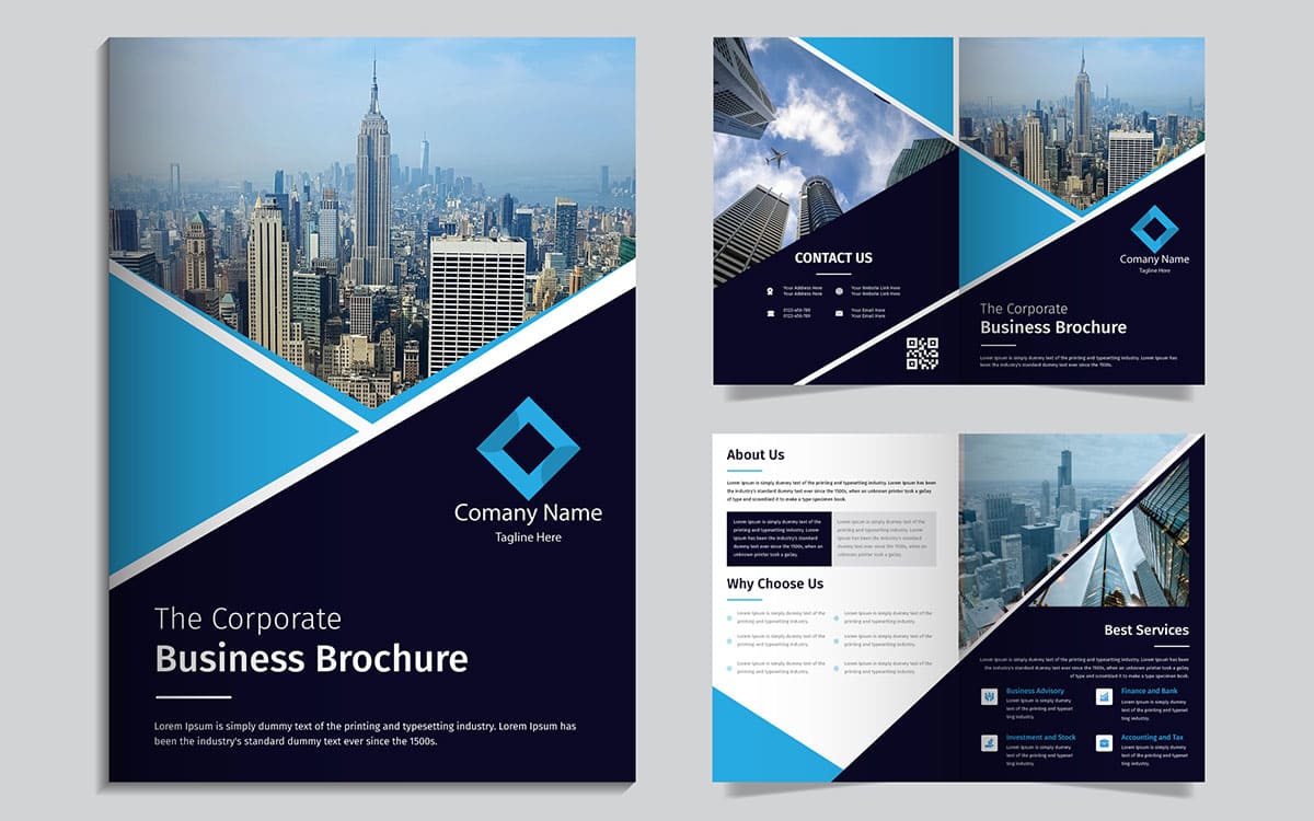
3. Designs overloaded
Further, some of the designers tend to add designs and shapes in a single design piece. But this is one of the most important issues that they ignore. They should keep sufficient space in the design.
For instance, if you get a mug design project for a corporate client, the design should be optimum. There should be ample space in between the design elements. The texts, theme, color – all should match with the overall concept.
And most importantly, there should be plenty of spaces to accommodate all of them. It should not look like a crowd of design.
4. Lack of research
Without some in-depth research, it is not possible to bring out the best. Unfortunately, to cope with the budgeted deadline, the logo designers do not conduct in-depth research.
Consequently, the designs do not look appealing. And they fail to communicate with the audience as they have compatibility issues. The designs do not represent the business theme perfectly. Or at times, they partially match with the theme instead of a complete compatibility.
Thus, it is the best idea to consider the ongoing graphic design trends in the market. Know what your client demands and what is the present scenario of the business. Also, it will help you make some creative and alluring designs.
5. Mind your typography
You can make your design stronger with a proper typography. It is the process of organizing letters in a way that becomes clearly visible and appealing to the audience.
Typography is also about styles and appearance. With the best suited style, it becomes easier to hold attention from everyone. And sending the message becomes easier. In other words, typography is the life of the letters or texts in a design.
But in most cases, there are lots of mistakes in typography. Actually, many of the graphic designers lack ideas about it. Hence, they commit the mistakes and poorly set the typographic setting.
So, when you are using any font on your design, the font needs prior attention. Ensure the typeface suits the design or the design theme. Use larger fonts to deliver the key message and smaller ones for subsidiary information.
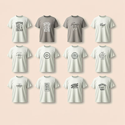
6. Wordy designs
Some of the designers tend to deliver messages to audiences. Hence, they prefer words over images.
You know, an image is worth a thousand words. And you need to select the image appropriately.
But many of the designers ignore this thumb rule. They add more words to describe the product, business or service. If they make a brochure design, they will put words, information and taglines more than images.
However, you can turn the situation upside down by adding the right picture. Don’t be too wordy. Apply photos or visuals to simplify the design.
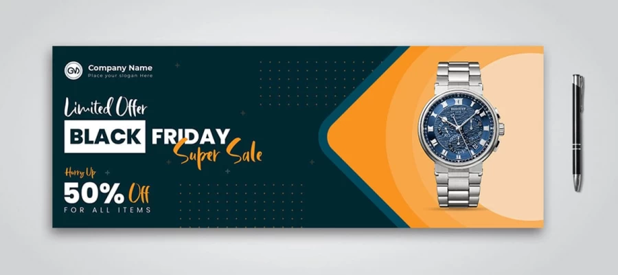
7. Wrong color and theme
At the same time, there are issues with the color and theme. While making a design, the designers need to consider the business theme and color codes.
The color and theme of the design should match with the core of the business. No matter if it is a stationery design. You should focus on the theme of your clients’ business.
If they use lighter color on their business logo, your design should follow that. If the color is darker, you have to consider that type of hue on our design. Otherwise, there will be a mismatch in the overall design. The piece will not explain the business or service to people.
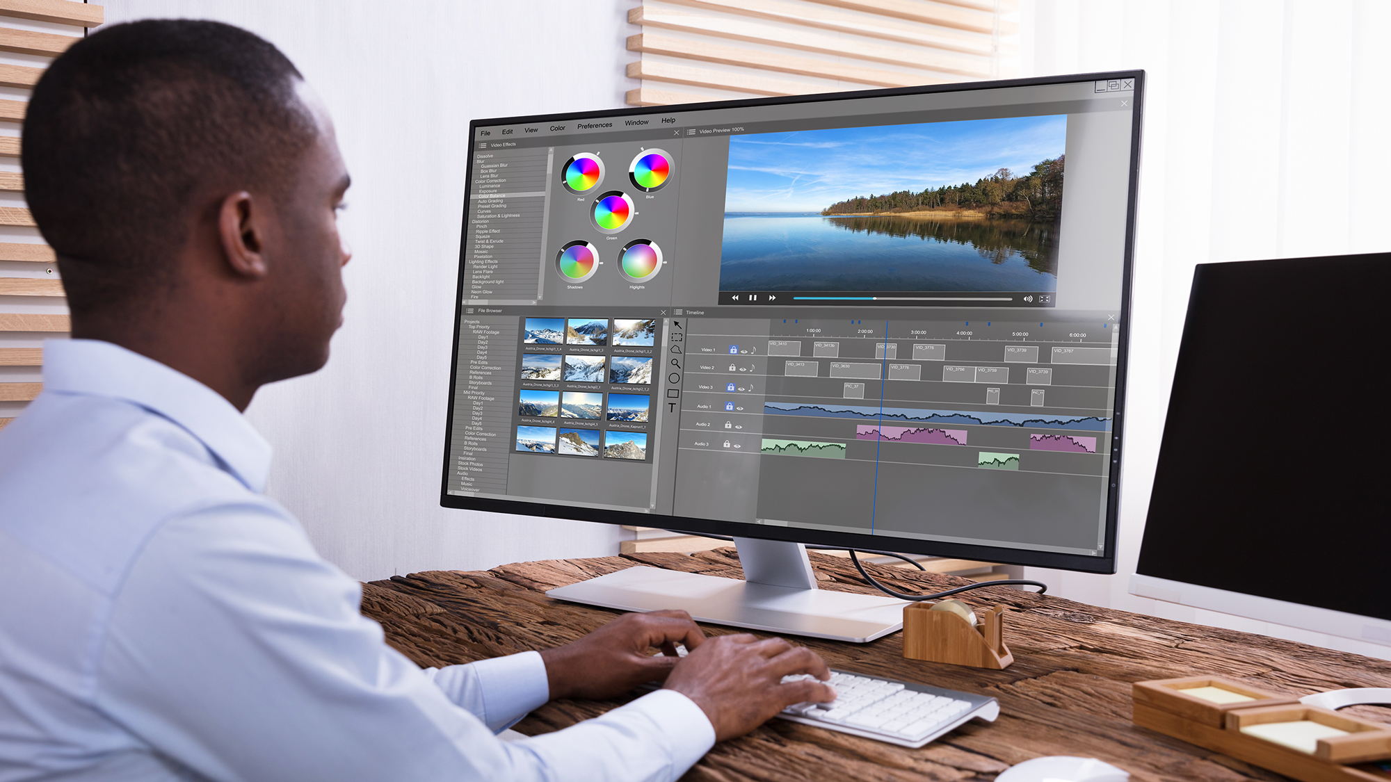
How graphic design works
Prior to moving in to the topic, you must have some brief idea how graphic design actually works. Basically, most people consider it as an ordinary design form. But in reality, graphic design is more expanding.
It adds more value
The first and most important aspect is that graphic design adds more value to your promotions. For instance, if you want to use a promotional billboard for your products, you must get a billboard design. The expert graphic designers will make a creative design for your needs.
They will add special themes, color, font, message and other necessary elements. And the blend of all the elements of the design will make it look more attractive. Ultimately, it will add value in your promotion.
A clear message
Further, graphic design is also about communication. In a communication process, messages are sent to a group of audiences or individuals. Hence, the message needs to be communicative, clear and easy to receive.
Through adding visuals, the graphic design is able to send the message. If you use a business card, it will bear your company name in an exclusive visual format in line with other contact details. When anyone comes in contact with the business card, they get to know you.
In other words, they get the message. Clearly.
Builds your brand
Moreover, when you are using graphic design services like a logo design, it can help build your brand. The logo is a representation of your business even when you are absent.
Typically, logos come with countless features. Some of them portray the business directly, while some others convey a message to audiences. Besides, many of the logos tease the clients to get the service. All the things are completed through graphic design.
And ultimately, the logo sets in the mind of your audience and they start considering your business as a brand.
Endnote
The most common graphic design mistakes are explained. Also, you have the answers in line with the problems.
Now, it’s your turn. If you are a designer, you can consider the matters while making a design, even if you are making a poster design. Remember the mistakes and hopefully, you will be able to make a masterpiece.
However, if you are a graphic design service receiver, you also should know about them so that you can have a flawless design. Nevertheless, if you need a professional graphic design service, you can get support from professionals. They will deliver you the best.
Graphic Design Eye LLC is a full-service creative agency built for brands that demand more than design — they demand vision. From strategic branding to complete visual identity, we partner with startups, agencies, and growing businesses as a dedicated creative force. With flexible subscription and project-based models. Let's start with us today!