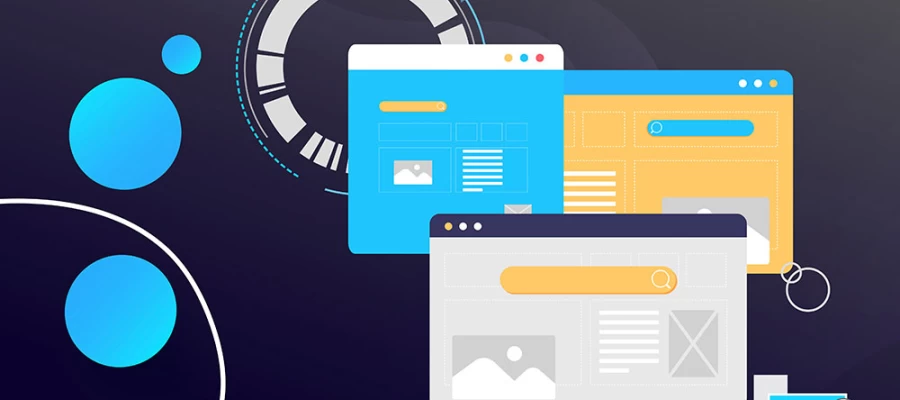
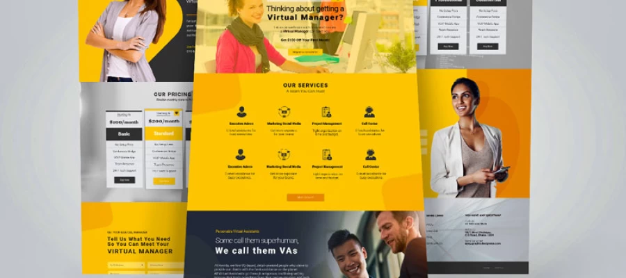
Looking for the real difference in the mockup vs prototype vs comp debate? The choice depends on who the work is for and what it needs to prove. A comp sells a concept to a client, a mockup shows developers exactly how the finished design should look, and a prototype lets real users click through the product to see whether the flow works. Match the deliverable to that purpose, and most of the extra revision rounds disappear.
Have you ever asked a designer for a "quick mockup" and received a clickable demo? Or requested a prototype and got back a beautiful but totally static picture? Don't worry, these three words get swapped around in creative briefs, statements of work, and late-night Slack threads every day. And that tiny confusion can hurt more than you'd think, since it leads to extra rounds of revision, blown timelines, and a budget nobody planned to spend.
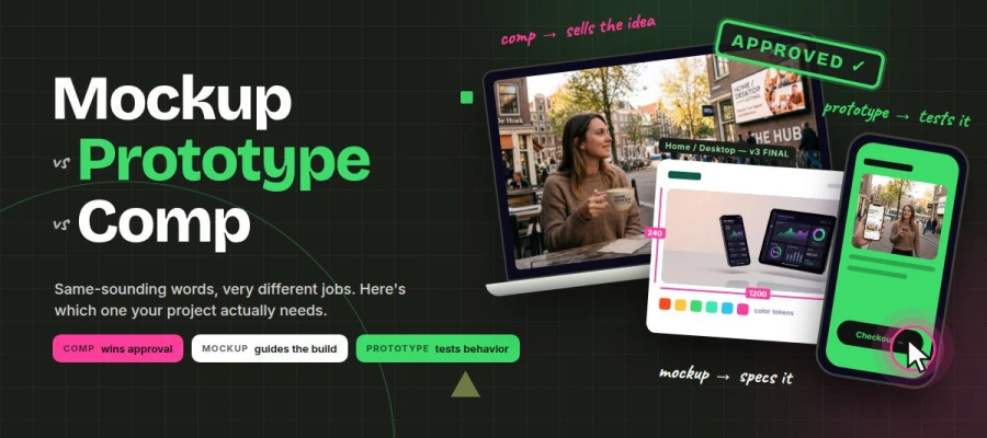
Choosing among a mockup, a prototype, and a comp comes down to a single question: what you are trying to prove. Comps win approval, mockups guide the build, and prototypes test behavior. Getting it right pays off. McKinsey (2018) found that top design performers grew revenue 32 percentage points faster than their industry peers, and Nielsen Norman Group reports that just five test users reveal about 85% of usability problems.
Here we are to clear the fog once and for all!
In this guide, we'll break down each deliverable by covering what it is, who it's for, where it fits in the design process, and how to pick the right one before a single pixel gets pushed.
Ready to speak the same language as your design team? Keep reading!
Mockup vs prototype vs comp
The main difference between a mockup, a prototype, and a comp comes down to purpose. A comp gets a client to approve a concept, a mockup shows a builder exactly how the finished design should look, and a prototype lets users click through to prove it works.
Two of them are static pictures, and only one is interactive. Each also has its own audience, since clients review comps, designers and developers work from mockups, and end users test prototypes. Once you know who the deliverable is for, choosing the right one gets easy.
This section sets out the core differences between mockup vs prototype vs comp, so you can request the right one.
Let’s start from here:
Deliverable
What it is
Interactive
Fidelity
Question it answers
Main reviewer
Mockup
A static, high-fidelity view of a screen or product surface
❌ No
Medium to high
"Is this what it should look like?"
Design lead, developer
Prototype
A clickable simulation of flow, states, and behavior
✅ Yes
Low to high
"Does this actually work for users?"
End users, product team
Comp
A polished, presentation-ready layout of a finished concept
❌ No
High
"Do you approve this direction?"
Client/stakeholder
Not a table person? Here's the plain version. Comps and mockups both show how something looks, but a comp is dressed up to win a "yes" from a client, while a mockup is a working reference for the people who build it. A prototype is the only one of the three you can actually use. It shows how the product behaves when someone taps, scrolls, or types.
💡 Rule of thumb: A comp shows how it looks to a client. A mockup shows how it looks to a builder. A prototype shows a user how it works.
Many teams use these terms loosely. That's why your definitions should go in the project brief and not stay in anyone's head.
Mockup
A mockup is a still, highly detailed picture of how the final product will look. It uses real colors, fonts, images, and spacing. Nothing clicks or moves, so you get an exact snapshot.
In digital work, mockups are usually made in Figma, Adobe XD, or Sketch. Developers get them with specs like sizes, spacing, color tokens, and redlines. In print and merchandise, a mockup can also be a realistic product image, like your shirt design on a model or your logo on a store sign. Tools like Placeit and Canva's Smartmockups make these.
What makes a mockup stand out:
Locks down the visual details before development begins
Acts as the "source of truth" during design review and QA
Quick to change compared to coded screens
✅ Pros
❌ Cons
Clear visual reference for developers
Can't test how anything behaves
Faster and cheaper than a prototype
Stakeholders may mistake it for a working product
Pairs well with design specs for handoff
Hides problems in flow and transitions
Prototype
A prototype is an interactive simulation of the product. You can click buttons, move between screens, open menus, and watch states change. It's the closest thing to the real product without writing production code.
People don’t understand that a prototype doesn't have to be pretty. Even a paper sketch you "click" with your finger counts. So do grey box wireframes linked together in Figma's prototyping mode. The high fidelity version, with mockups wired together using transitions and Smart Animate, is just one end of the spectrum.
Why does this matter so much? Prototypes are how you run usability testing. According to Nielsen Norman Group, testing with just five users uncovers about 85% of usability problems. That's a tiny investment for a huge amount of insight!
What makes a prototype stand out:
The only deliverable that reveals flow friction before launch
Lets real users, investors, and product teams "feel" the product
Catches expensive mistakes while they're still cheap to fix
✅ Pros
❌ Cons
Tests real behavior with real users
Takes the most time and effort to build
Great for investor demos and stakeholder buy-in
Can be over-investment for simple, familiar patterns
Works at any fidelity level
High-fi versions can feel "finished," which discourages honest feedback
Comp
A comp, short for comprehensive layout, is a polished version of a finished concept that's ready to present. It's made to show a client or stakeholder so they can say "Yes, that's the direction!"
The term comes from the golden age of print and advertising. Art directors once rendered marker comps by hand to show clients how a magazine ad, poster, or package would look before costly printing started. Comps are digital today, but the purpose is the same. They sell the idea in its finished context.
That's why comps are often staged. Your logo sits on a coffee cup, the landing page sits in a laptop frame, and the billboard appears over a real street scene. It's art direction for approval and isn't a build spec.
What makes a comp stand out:
Helps non-designers visualize the final result instantly
Speeds up client sign-off
Essential for campaigns, branding and print projects
✅ Pros
❌ Cons
Wins approval faster
Not detailed enough for developer handoff
Shows the concept in a real-world setting
Can over-promise if the staging is too idealized
Perfect for pitching multiple directions
Zero interactivity
The two axes that actually matter
These two terms are not a strict sequence or a ladder. They're positions on two independent axes.
Axis 1: Fidelity. How closely the deliverable resembles the finished product visually.
Axis 2: Interactivity. Whether a viewer can act on it and get a response.
Fidelity / Interactivity
Low interactivity
High interactivity
High fidelity
Mockup · Comp (presentation-framed)
High-fidelity prototype
Low fidelity
Wireframe
Low-fidelity prototype
So why do people mix up mockups and prototypes? A high-fidelity prototype is usually built by linking mockups. It has the same screens and visuals, plus one key layer: behavior. Once you see the two axes, the confusion fades.
Where mockups, prototypes, and comps fit
Every deliverable has a place at the moment a specific decision needs to be made. A comp sits where a client chooses a direction, a mockup where a team commits to a build, and a prototype where a flow needs proof before development begins.
This section shows where mockups, prototypes, and comps fit in the design process, so you can bring in the right one at the right stage and budget only for what your project needs.
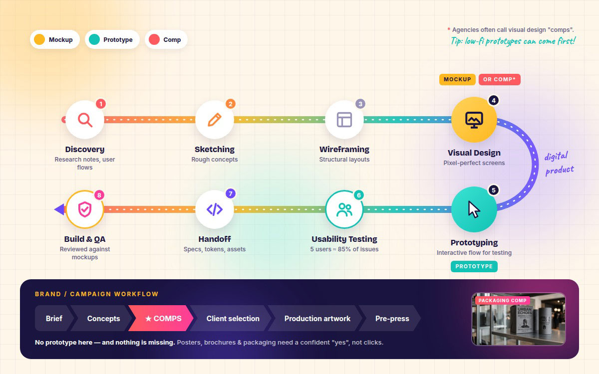
A typical digital product workflow:
Discovery and requirements: research notes, user flows
Sketching: rough concepts
Wireframing: structural layouts (what is a wireframe)
Visual design: mockups (or comps, in agency vocabulary)
Prototyping: an interactive flow for testing (Figma prototyping tutorial)
Usability testing: findings and revisions (usability testing guide)
Brief → concepts → comps → client selection → production artwork → pre-press or ad trafficking
Notice something? There's no prototype here, and nothing is missing. A poster, brochure, or packaging design doesn't need clickable parts. It needs a confident "yes" from the client, and comps get you that.
These sequences aren't set in stone. Many UX teams build low-fidelity prototypes before any visual design exists and test the flow with rough wireframes first. That flips the order, and it's often the smartest move for new products.
How to choose between a comp, mockup, or prototype
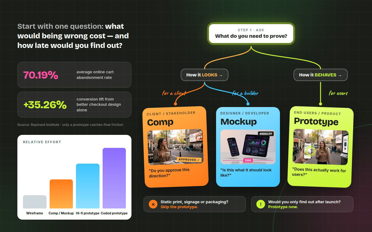
To choose the right deliverable, ask what being wrong would cost. Baymard Institute puts average cart abandonment at 70.19%, and 17% of US shoppers quit because checkout felt too long or complicated. Only a prototype catches mistakes like those. For look-and-feel approval, a comp or mockup is enough.
The same Baymard research found better checkout design alone can lift conversions by 35.26%. That's real money riding on one decision!
This section shows how to choose between a comp, mockup, or prototype by matching it to your goal, your audience, and the risk you can't afford to carry into production.
Do you need approval on how it looks, or evidence about how it behaves? Looks means a comp or mockup. Behavior means a prototype.
Is the final medium static or interactive? Static media such as print, signage, and packaging rarely need a prototype.
Who is the audience: a client, a developer, or an end user? Clients get comps, developers get mockups, and users get prototypes.
What does being wrong cost, and how late would you find out? If you'd only discover it after launch, prototype now.
Has the visual direction already been settled? If yes, skip straight to mockups or prototypes. If not, start with comps.
Decision table
Most projects fall into a small set of recurring situations, and each one has a deliverable that suits it best. This decision table lets you find your project type, see the recommended deliverable, and understand the reason before you write the brief.
Your situation
Best deliverable
Why
Pitching a campaign concept
Comp
Sells the idea in its finished context
Getting sign-off on visual direction
Mockup or comp
Locks look and feel before build effort
Testing a checkout or onboarding flow
Prototype
Only interaction reveals flow friction
Handing off to developers
Mockup + specs
Static reference plus measurable values
Validating information architecture early
Low-fidelity prototype
Fast, cheap and visually unbiased
Showing a physical product
Mockup render
Communicates material and context
Demoing to investors
High-fidelity prototype
Feels real without a real build
Budget and timeline trade-offs
Budget and timeline tradeoffs are simple. The more polished and interactive the work, the more hours it takes. A comp or mockup costs more than a wireframe, and a high-fidelity prototype costs more than both. The smart move? Spend effort only where being wrong is a real risk.
● The patterns are already settled, such as a standard login or a familiar contact form ● The scope is tiny, like a single landing page section ● There's no testable question. If you aren't going to learn anything, don't build it!
When skipping one causes rework:
● You're launching a novel flow (a new checkout, onboarding or booking system) with zero interactive validation. That's where teams burn weeks rebuilding after launch.
Interestingly, McKinsey's Business Value of Design study found that nearly 60% of companies used prototypes only for internal testing late in the development process. The top performers shared early prototypes with real users and kept iterating. Lesson learned!
Mockup, prototype & comp FAQs
Most of the confusion about mockup vs prototype vs comp stems from overlapping terms. The same few questions come up on nearly every project, from which terms overlap to how much detail each deliverable needs. Our mockup, prototype, and comp FAQs settle those points one at a time so you can brief your team and review work with confidence. If you still get a question we missed below, drop it in the comments or contact us directly.
Not exactly. They can look identical but serve different audiences. A comp is ready to present and built to win client approval on a concept. Mockups are built as references for designers and developers. The words often overlap in agencies, so define them in your project brief.
The difference is interactivity. A mockup is a static, high-fidelity picture of how a screen should look. A prototype is a clickable simulation that shows how the product behaves: taps, transitions, states, and flows. Mockups answer "Does it look right?" while prototypes answer "Does it actually work for users?"
No, it doesn't. Paper sketches, grey box wireframes linked in Figma, and rough clickable flows all count as low-fidelity prototypes. Low-fidelity prototypes are often better early on because testers focus on the flow while colors, fonts, and polish stay out of the way.
Rarely. Most projects need only one or two. Print campaigns may need comps and no prototype at all. A simple website redesign might need mockups plus specs. An app with a novel checkout flow needs mockups and a prototype. Match the deliverable to the risk.
Usually, a mockup comes first, since high-fidelity prototypes are built by wiring mockups together. Many UX teams prototype in low fidelity first and test the flow with wireframes before any visual design exists. The answer depends on whether the flow or the visuals carry more risk.
No, though people often mix them up. A wireframe is a low-fidelity structural layout of boxes, lines, and placeholder text that focuses on hierarchy and content. Mockups add the real visual layer of color, typography, imagery, and brand styling. Wireframes decide where things go. Mockups decide how they look.
"Comp" stands for "comprehensive layout" (sometimes "comprehensive dummy"). The term comes from print and advertising, where art directors made polished comps to show clients how a finished ad, brochure, or package would look before expensive production and printing began. Today comps are usually made digitally.
Has the fog cleared through? Hmm, hopefully your answer is yes!
Our design team broke down mockup vs prototype vs comp above to show you what each one really does and when you actually need it. All three deliverables have distinct strengths, but they share the same main goal: to turn an idea into a design everyone agrees on. What's your view? Don't you think so?
As a designer, marketer, or founder, you've already understood that no single deliverable fits every project. A comp wins the client, a mockup guides the builder, and a prototype proves the flow to real users.
Also, you've seen that each one has drawbacks alongside its many pros. So, this blog clears up the confusion and helps you skip the costly revision rounds in your next project.
Don't worry if you think you need consultancy to choose or create the right deliverable for your brand. Graphic Design Eye is always ready to deliver distraction-free, premium graphic design services for your design project. And we'll help you pick the right deliverable from day one.
Time is running out today! Soon, we'll come to another exciting topic to gear up your design game.
Till then, stay with a positive vibe and a refreshed mind!
Graphic Design Eye LLC is a full-service creative agency built for brands that demand more than design — they demand vision. From strategic branding to complete visual identity, we partner with startups, agencies, and growing businesses as a dedicated creative force. With flexible subscription and project-based models. Let's start with us today!