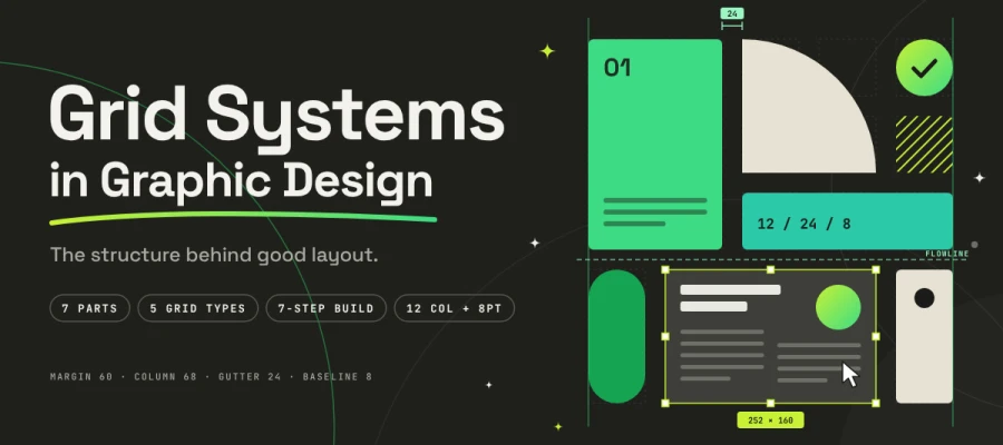
Do you know how grid systems in graphic design take the guesswork out of placing every headline and image? A grid is a set of invisible horizontal and vertical lines that divide a page or screen into margins, columns, and gutters. Designers place text, images, and buttons along these lines. Doing this keeps a layout tidy, easy to follow, and consistent from start to finish.
Ever looked at a magazine spread, a poster or a website and thought, "Wow, this just feels right", without knowing why? Almost every great layout has a skeleton hiding underneath, and you feel it every single time.
That feeling matters more than you might think. Researchers at Carleton University found that people form a visual judgment of a web page in as little as 50 milliseconds (Lindgaard et al., Behavior & Information Technology, 2006). In the Stanford Web Credibility study of more than 2,600 participants, 46.1% of comments about a site's credibility pointed to its visual design, more than any other factor (Fogg et al., 2003).
So, a messy layout loses people before they’ve read a single word. A structured one earns their trust at first glance.
Yeah, the stakes are that high!
That's where the grid comes in. If you're a graphic designer, a UI/UX designer, a design student, or a marketer briefing a creative team, this guide is written for you. Here, we cover grid systems in graphic design, from the seven parts of a grid to the five grid types, so you can build your own and lay out any page with ease.
So, ready to see the skeleton hiding under your favorite layouts? Let's keep reading!
What are grid systems in graphic design?
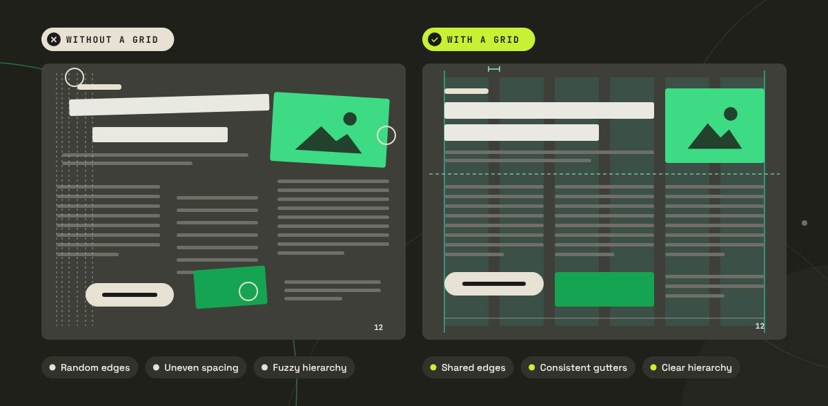
Grid systems in graphic design are frameworks made of columns, rows, margins, and gutters. They tell every element on a page exactly where it belongs. Picture the grid as scaffolding that holds up a building. Nobody sees it in the finished layout, yet it quietly keeps everything standing. Rather than eyeballing where a headline or photo should land, you set it on a line with a clear reason. Your layouts end up looking calm, organized, and professional, and they come together much faster too.
A grid takes the guesswork out of design. Every element lands in a spot you can actually defend, so nothing sits there on a hunch. You end up with three big wins from that.
Consistency: Elements sit in the same places, so readers know where to look. Once they learn the pattern on page one, page ten feels familiar.
Speed: A grid means you don't have to decide placement again on every page. You just fill in a structure that already exists.
Scalability: Teams can extend a layout without the original designer in the room, which is exactly why design systems are grid-based design systems guide.
There's some psychology behind it, too. Grids put the principles of visual perception Gestalt principles in design to work, especially proximity, alignment, and common region. Things that sit close together, share an edge, or live inside the same zone get read as related. That's how a grid builds a clear visual hierarchy in design without a single extra word.
Now let's bust a common myth. "Won't a grid make every design look rigid and the same?" Nope! One 12-column grid can give you a buttoned-up newspaper front page or a wild, airy fashion editorial. The grid sets the rules of the game. How you play is still up to you.
7 Parts of a grid system in graphic design
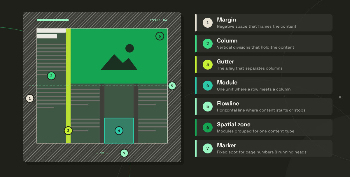
The anatomy of a grid is the set of seven structural parts that define where content sits, how much space surrounds it, and which elements repeat from page to page. Some parts frame the layout, some hold the content, and some keep recurring items in place. Learning how they fit together lets you take apart any layout and see why it works. This section explains the anatomy of a grid and its seven parts, so you can read the structure behind any design and build your own grid with confidence.
The standard reference here is Timothy Samara’s Making and Breaking the Grid (Rockport, 2002), and the table below follows his anatomy.
Part
What it is
Practical note
Margin
Negative space between the content and the edge of the format
Wider outside margins create a sense of quality; thin margins read as cheap or crowded
Column
Vertical divisions that hold content
More columns means more layout flexibility, but they’re harder to manage
Gutter (alley)
Space separating columns
Should be smaller than the margin, or the page loses its edge
Module
The individual unit created where rows meet columns
The building block of the modular grid
Flowline
Horizontal line where content stops or starts
Creates the horizontal rhythm most beginners forget
Spatial zone
A group of adjacent modules reserved for one content type
How you assign image zones versus text zones
Marker
Fixed position for repeating elements
Page numbers, running heads, nav bars and footers
Everything begins with margins. That generous negative space, or whitespace, in design is hardly wasted. It frames your content the way a mat frames a photo. Columns and gutters work as a team, with columns holding the content and gutters giving it room to breathe.
Modules and flowlines take a simple column layout and turn it into a true matrix. Flowlines are the piece most beginners skip, and honestly, I get it. Add them, though, and your headlines, images, and captions suddenly start lining up across the whole page.
Spatial zones and markers bring order to the big picture. Zones show you where images and text live. Markers make sure the small repeating stuff, like page numbers and footers, always turns up in the same spot. Simple, yet powerful!
The 5 types of grids and when to use each
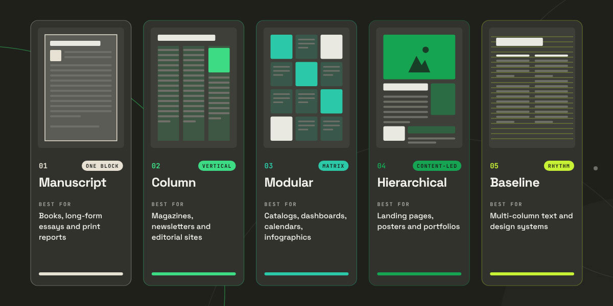
Grid systems come in five core types, which are the manuscript grid, the column grid, the modular grid, the hierarchical grid, and the baseline grid. Every one of them tackles a different layout problem. Think about it for a second. A novel has no use for the same structure as a product catalog, and a poster would look pretty odd built like a dashboard. Choosing the right type of grid system in graphic design gets you halfway to a finished layout.
This section explains the 5 types of grids, and when to use each, so you can choose the right grid system for your next project.
1. Manuscript grid (block grid)
A manuscript grid is a single rectangular block of content that sits within the page margins. It comes from handwritten manuscripts and classic book design, which makes it the oldest grid form around. Simple? Yes. Great for long reading? Absolutely.
Best for: books, long-form essays, print reports and continuous reading.
Monotony is the main risk. Page after page of a single text block can start to feel flat. You can keep things lively with asymmetric margins, pull quotes, and drop caps.
2. Column grid
A column grid splits your content into vertical columns. When you need more room, you can combine those columns into wider fields. Editorial designers lean on it constantly, and for good reason. Two, three, or four columns give you plenty of freedom to mix text, images, and sidebars on the same page.
Best for: magazines, newsletters, annual reports and editorial websites.
One golden rule to remember: aim for 45–75 characters per line typography basics/line length and readability for body text, with around 66 as the classic ideal (Robert Bringhurst, The Elements of Typographic Style). Let that line length shape your column width, and your readers will feel the difference even if they never notice why.
3. Modular grid
A modular grid starts with a column grid and adds horizontal flowlines across it. The result is a matrix of equal modules. Anytime you have lots of content that needs to sit in a tidy, orderly way, this is the structure people reach for. If you love the clean look of Swiss posters, you already love the modular grid.
Best for: complex data, catalogs, product listings, calendars, dashboards and infographics.
Swiss Style made this grid its signature, and designers such as Josef Müller-Brockmann helped make it famous. It’s also the direct ancestor of the CSS Grid layouts that power websites today.
4. Hierarchical grid
A hierarchical grid is an uneven grid shaped around the content itself, with no tidy math behind the divisions. The content makes the decisions here. A big hero image might claim one wide zone, while smaller blocks of text settle into the leftover spaces around it, all following the same alignment logic.
Best for: landing pages, posters, homepages and portfolio sites, anywhere the content dictates the structure.
It’s the hardest grid to execute well. The divisions can be uneven, but the alignment logic must stay consistent.
5. Baseline grid
A baseline grid is a horizontal rhythm grid that gives every line of text a shared, invisible baseline to sit on. You rarely notice it until it goes missing. When text in neighboring columns lines up perfectly, a baseline grid is quietly doing its job.
Best for: multi-column layouts where text must align across columns, plus editorial and design-system work.
A practical way to start is to set the baseline unit to your body copy line height, such as 8pt or 24px. After that, make every other spacing value a multiple of it.
How to build a grid system
To build a grid, start by defining your format and auditing your content. Next, set your type, then work outward to margins, columns, and gutters. Finish by stress testing the result. The order matters a lot! Most broken grids fail because someone drew them before anyone knew what content would live on them.
The following shows how to build a grid system in graphic design, with a detailed 7-step process to create a flexible, reliable grid for any print or digital project.
Define the format: Fix your canvas first: the trim size for print, or the breakpoint range for screen. The grid is derived from the format, never the other way round.
Audit the content: List every element you need to include, such as the headline, deck, body, caption, image, sidebar, and CTA. A grid designed before the content is known tends to fall apart fast.
Set the type first: Choose a body text size and line height, since that gives you a baseline unit. Every bit of vertical spacing will follow from it.
Set the margins: Start generous, at roughly 8 to 12% of the page width for print. Tighten them only when the content truly asks for it.
Choose the column count: Match it to content complexity: 2–3 columns for simple editorial work, 6 or 12 for flexible or data-heavy layouts.
Set the gutter: Tie it to your baseline unit, so your horizontal and vertical rhythm share a common denominator.
Stress-test it: Build three genuinely different layouts on the same grid. If your grid supports only one arrangement, you have a template on your hands rather than a system.
That last step is the one most designers skip, and it’s the one that separates a real system from a pretty one-off. Don’t rush it!
How grid systems work in UI design
Digital product design leans on two standards. The 12-column layout grid handles horizontal structure, and the 8-point system handles spacing. Together, they keep websites and apps looking tidy on everything from a small phone to a wide desktop monitor. Anyone working in UI/UX will use these numbers daily.
This section covers grids in digital product design, including the 12-column layout and the 8-point system, so you can build responsive interfaces that work on any screen and hand off cleanly to developers.
Why 12 columns?
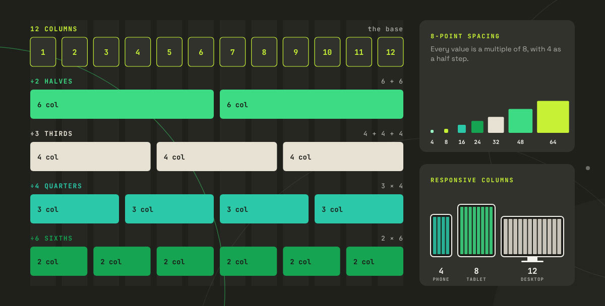
Twelve splits evenly by 2, 3, 4, and 6. That means one grid gives you halves, thirds, quarters, and sixths with no messy leftover widths. A single grid can handle dozens of layouts. Pretty smart setup, right?
How Bootstrap and Material Design use grids
Bootstrap uses a 12-column flexbox grid with a default gutter of 1.5rem (24px), split as 0.75rem of padding on each side of a column (Bootstrap grid docs).
Google’s Material Design responsive layout grid changes its column count by breakpoint: commonly 4 columns on compact phone widths, 8 on medium tablet widths and 12 on expanded desktop widths, all sitting on an 8dp spacing grid (Material Design responsive layout grid).
What is the 8-point system?
In the 8-point system, every spacing, sizing, and positioning value is a multiple of 8, with 4 as a handy half step. So why 8? It scales cleanly across screen densities and divides evenly at 1×, 1.5×, 2×, and 3×. That means your layouts stay crisp on every device you throw them at.
Fixed, fluid or hybrid grids?
When it comes to responsive behavior in responsive web design basics, you’ve got three main options:
Fixed grids keep column widths locked. They’re predictable, but they leave awkward empty space on big screens.
Fluid grids let columns stretch with the viewport while gutters stay fixed. They fill the screen nicely, but line lengths can grow too long.
Hybrid grids mix the two, for example fluid columns up to a maximum content width. This is what most modern sites use.
CSS Grid vs. Flexbox
CSS Grid works in two dimensions, so it handles rows and columns together. Flexbox works in one dimension and lines items up along a single row or column. Most production layouts use both. Grid shapes the overall page, and Flexbox arranges the pieces inside each section. Curious about the finer details? The MDN CSS Grid Layout is the best place to begin.
Grid system FAQs
Most questions about grid systems rise from the gap between theory and daily practice. Designers usually want to know what a grid is for, which kind suits a project, and whether the rules can ever bend. This grid system FAQs section answers the most common questions about grid systems in graphic design and digital product design, so you can clear up any remaining doubts and apply grids with confidence. If the following don’t cover your concern, contact us directly and share what’s on your mind. We’re happy to help.
A grid system organizes content into a repeatable structure of margins, columns, and gutters. It creates alignment, hierarchy, and consistency. It also speeds up layout decisions and lets several designers extend the same design without losing its coherence.
The five types are the manuscript grid (a single text block), the column grid (vertical divisions), the modular grid (columns plus horizontal flowlines), the hierarchical grid (irregular, content-driven divisions), and the baseline grid (a shared horizontal rhythm for type).
Twelve divides evenly by 2, 3, 4, and 6. That means a 12-column grid handles halves, thirds, quarters, and sixths using whole columns. Designers get plenty of layout options from a single system, which is why frameworks like Bootstrap adopted it.
A grid is a flexible framework that supports many different layouts. A template is a fixed arrangement built on a grid. If your grid can only produce a single layout, you've built a template and called it a grid.
Yes, and experienced designers sometimes do for expressive or experimental work. Even so, most successful "gridless" layouts still follow a consistent logic of alignment and spacing. Skipping the grid means making more decisions for every element. Collaboration and scaling also get much harder.
The 8-point grid system sets every spacing and sizing value as a multiple of 8 pixels, with 4 as a half step. UI designers treat it as a standard because 8 scales cleanly across screen densities. Layouts stay crisp at 1×, 1.5×, 2×, and 3×.
Endnote
Finally, we made it to the end of our grid article!
Grid systems in graphic design form the invisible structure behind every layout that just feels right. By now you know how to read one, pick one and build one. We took a deep dive into margins, modules and 12-column math, so how are you feeling about grids? Hopefully a lot more confident.
Great layouts never happen by luck. Behind every clean magazine spread, every poster that grabs your eye and every smooth app screen, a grid quietly does the heavy lifting. From Josef Müller Brockmann's Swiss posters to today's Bootstrap websites, the principle has stayed the same. Structure comes first, and creativity goes on top.
And don’t worry about the grid boxing you in. Once you know the rules, you can break them on purpose, and that deliberate break will look bold. That is the real power of a grid!
So open your next project, pick a grid type, and try the seven-step process. Build three layouts on it and notice how much faster and calmer your design work feels.
Key takeaways
A grid is built from seven parts, including margins, columns, gutters, flowlines, modules, spatial zones, and markers.
Five core grid types exist: manuscript, column, modular, hierarchical, and baseline.
The modern modular grid comes from the Swiss Style of the 1950s and 1960s, and Josef Müller-Brockmann's book Grid Systems in Graphic Design was published in 1981.
Digital design standardized on the 12-column grid, which divides by 2, 3, 4, and 6, along with the 8-point spacing system.
Grids exist to be broken on purpose. A break reads as intentional when a system is clearly present.
Need a hand bringing structure to your brand's brochures, social posts, presentations, or website? The team at Graphic Design Eye is always ready to help with any creative service.
Thanks for reading, and happy designing. Wishing you plenty of beautiful layouts ahead, and we'll see you in the next one! 🎉
Graphic Design Eye LLC is a full-service creative agency built for brands that demand more than design — they demand vision. From strategic branding to complete visual identity, we partner with startups, agencies, and growing businesses as a dedicated creative force. With flexible subscription and project-based models. Let's start with us today!