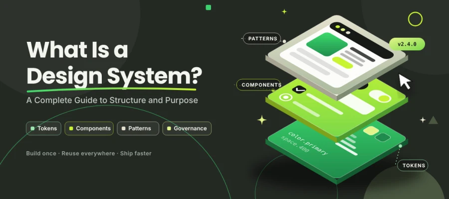
Ever asked yourself what is a design system and why fast-growing teams can't live without one? To put it simply, a design system is a shared kit of reusable components, design tokens, patterns, and written rules that keeps every screen consistent. Say goodbye to ten mismatched buttons. Build once, reuse everywhere, and ship faster.
Let's face it. Every growing product hits the same wall sooner or later. One designer picks a blue. Another picks a slightly different blue. Then a developer codes a third one from memory. Six months later, you've got 14 button styles, 9 greys, and a product that feels stitched together. Sound familiar?
A design system is built to clean up exactly that mess.
In this article, a design system is a documented set of reusable UI components, design tokens, patterns, and standards. Teams use it to consistently design and build products. It links design files with production code, so one change flows everywhere.
No need to worry if that sounds big!
In this guide, we’ll clarify the design system step by step, so you can learn what a design system is and what it isn't, why teams build one, and how it's structured. Along the way, you'll also see which famous brands do it best and how to build your own.
Grab a coffee and settle in, because we're starting with the basics.
What is a design system?
A design system is a documented set of reusable components, design tokens, patterns, and standards. Teams use it as the single source of truth when designing and building products. Hundreds of small design decisions tend to get made again and again, which wears everyone out. A design system turns them into one shared kit that everyone can trust.
Think of it like a LEGO set with its instruction booklet included. The bricks are ready. The rules for putting them together are written down. And someone is in charge of adding new bricks when the product needs them.
This section answers the question ‘what is a design system’ in plain terms and gives you the clarity to explain it to your team and judge whether it fits your product.
Every solid design system has three layers:
The assets (what you use): Think of these as your toolbox. You get colors, fonts, spacing values, icons, buttons, forms, and other building blocks, all ready to go.
The rules (how you use them): Here, the tools come with instructions. When should you reach for a primary button? What tone works for an error message? And how much space belongs between cards? The rules answer questions like these, so nobody has to guess.
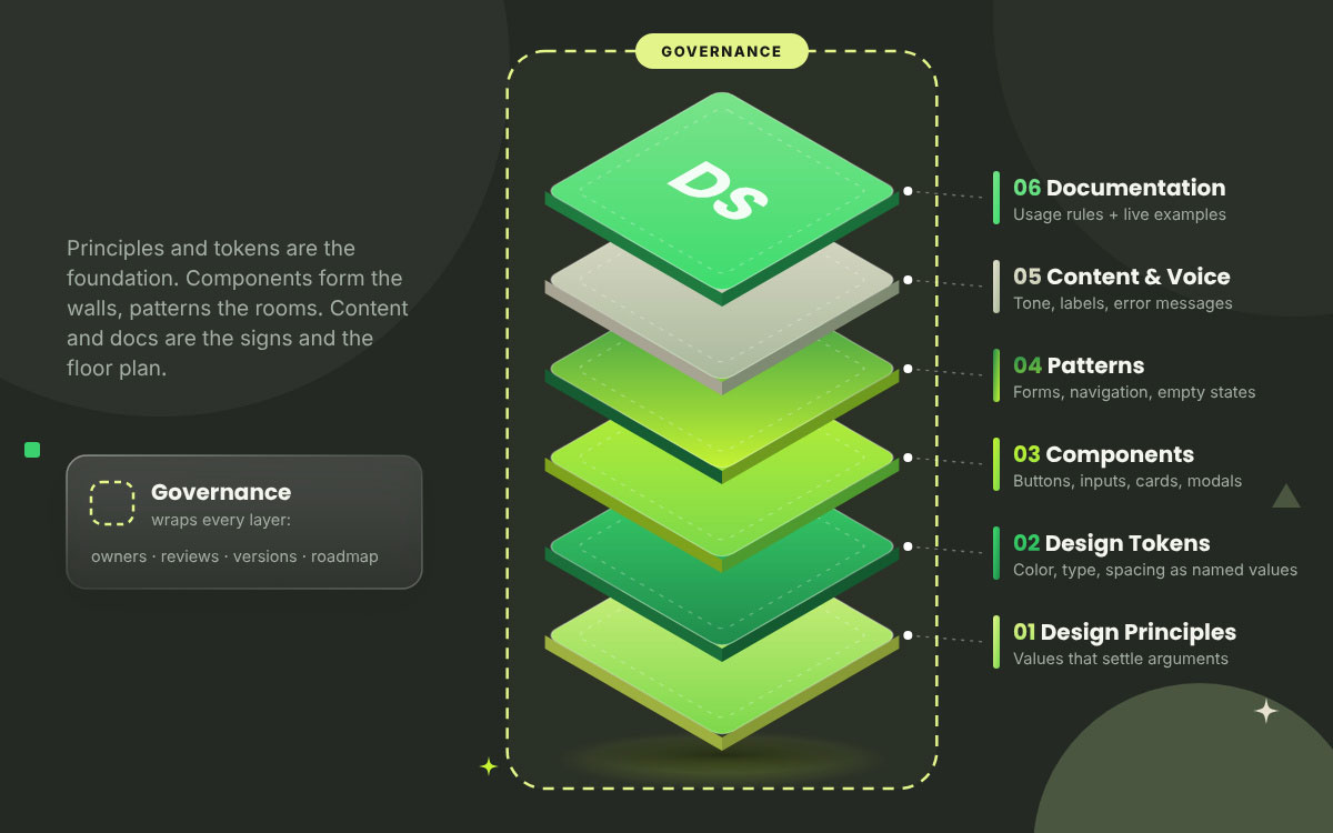
Governance (who decides and how it changes): This part keeps everything in order over time. It covers who owns the system, how changes get reviewed, what the version history looks like, and where the roadmap is headed.
Here's the defining trait. A design system connects design and code. Change a color token or a button component once, and the update flows into every product that uses it. You heard that right. One change, everywhere.
A design system also isn't a one-off PDF collecting dust in a shared drive. It's a living product with owners, version numbers, a changelog, and a roadmap, just like the apps it supports.
So who really needs one? A design system pays off when several people, products, or platforms have to stay consistent. A single designer working on one landing page? Probably not yet. Five squads shipping a web app, an iOS app, and a marketing site? Absolutely.
Not sure where your team sits right now? Our article on scaling design operations walks through each stage, from your first design hire to a full system.
Design system vs style guide vs pattern library vs component library
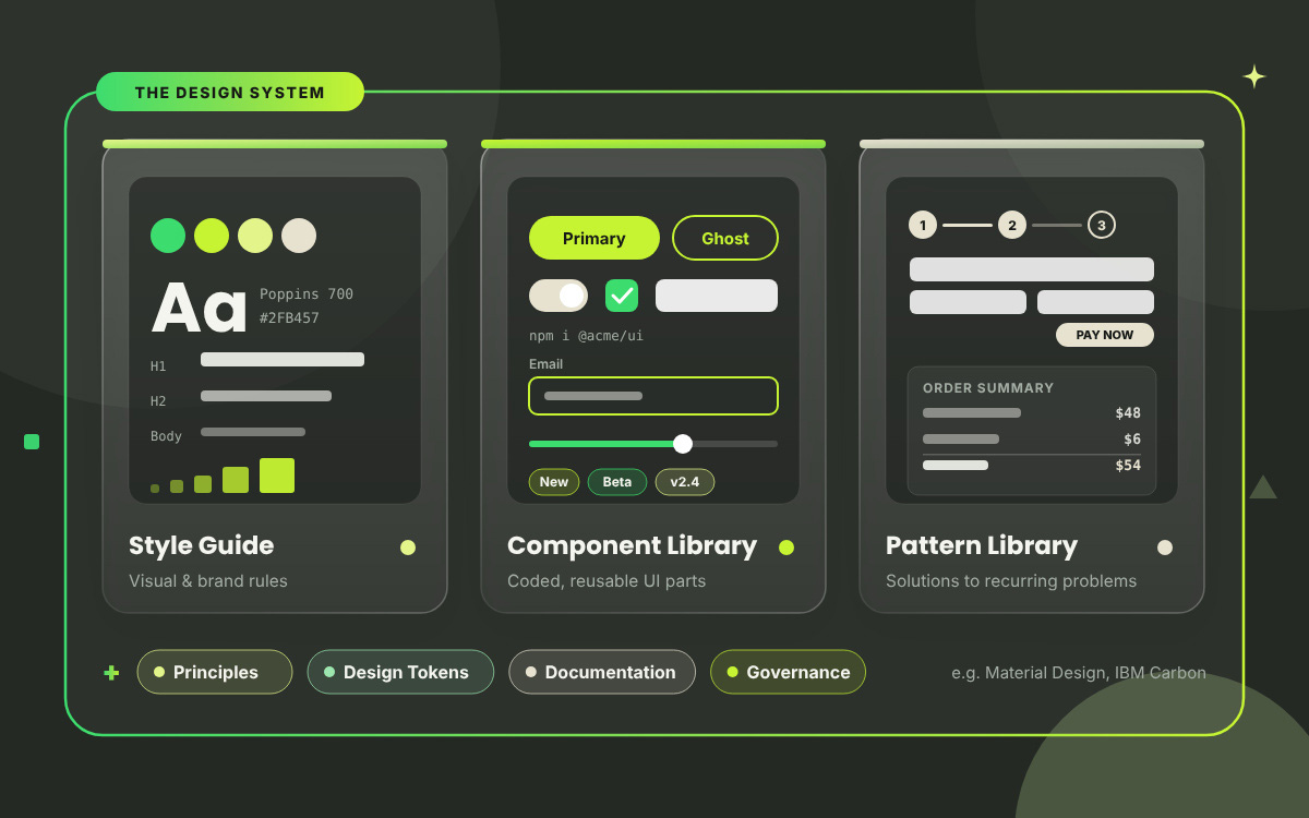
Of the four, the design system is the largest because it holds a style guide, a component library, and a pattern library. On top of those, it adds principles, design tokens, documentation, and governance. The style guide sets the visual rules. Coded UI parts live in the component library. Then the pattern library shows how those parts solve everyday problems, such as a checkout or a sign-up form.
No wonder people mix these terms up all the time! They share some ground, and each one still has a job of its own.
Here's a quick side-by-side look at design system vs style guide vs pattern library vs component library, so you'll never confuse them again.
Term
What it covers
Example
Style guide
Visual and brand rules such as color, typography, and logo usage. A static reference.
"Our primary blue is #1A5CFF; never stretch the logo."
Component library
Coded, reusable UI elements shipped as a package.
Buttons, inputs, and modals installed from npm.
Pattern library
Recurring solutions to recurring problems.
Checkout flows, empty states, form validation.
Design system
All three, plus principles, design tokens, documentation and governance.
Google Material Design, IBM Carbon.
What a design system is not
A design system is more than a Figma file full of screens, and a UI kit you download from a marketplace won't get you there either. Both make handy starting points. Still, neither one has an owner, a set of rules, or any link to your production code.
Here's what else a design system is not:
Not a Figma file of screens or a marketplace UI kit: Take away the code, the docs, and the ownership, and you're left with a pretty file.
Not a replacement for user research, product strategy or accessibility testing: A system gives you good parts. It can't tell you what your users need.
Not a creativity ban: The system takes the boring, repeatable stuff off your plate. That frees your team to spend its best thinking on the new and the novel.
The purpose of a design system: Why teams build one
A design system exists to eliminate repetitive decisions. With fewer of those, teams ship consistent, accessible interfaces faster and keep them running at a lower cost.
Think about it. How many hours has your team lost debating button colors, spacing, or error messages that someone already solved last year? A design system answers those questions once. After that, nobody has to answer them again. The payoff includes a better-looking product and five outcomes you can actually measure.
Let's break down the purpose of a design system and why teams build one, so you can weigh the real benefits and the real costs before you commit.
Consistency: The same patterns show up across products, platforms, and marketing pages, so users don't have to relearn anything. Example: the date picker in your web app and your mobile app behaves exactly the same way.
Speed: Designers build screens from tested components, so nobody redraws the basics. Engineers just install a package and get on with their day. Say a new settings page needs to go live. It takes a few days, since the forms, toggles, and buttons already exist.
Quality and accessibility: Keyboard behavior, focus states, color contrast, and ARIA roles are resolved within each component and then inherited throughout the application. Example: fix the focus ring on one button component, and every screen using it passes the check.
Scale and onboarding: New hires inherit years of design decisions on day one. Example: a new designer ships their first feature in week one, without asking "which grey do we use?"
Easier maintenance: A rebrand or an accessibility fix becomes a token or component update, not a manual sweep across hundreds of screens. Example: switching the brand color means changing one token value.
But wait! It's not all sunshine. Let's be honest about the trade-offs:
Upfront investment: Building the foundations takes real time and budget before the payoff arrives.
Dedicated ownership: Someone has to maintain it. A system with no owner slowly rots.
Adoption risk: If teams don't find it useful or easy, they'll ignore it. An unused design system is a cost, not an asset.
The structure of a design system: Core components
A complete design system has six layers: design principles, design tokens, components, patterns, content guidelines, and documentation. Governance holds all six together.
Think of a building. Principles and tokens sit at the bottom as the foundation. Components form the walls, and patterns become the finished rooms on top. Content guidelines and documentation work like the signs and the floor plan, so everyone can find their way around. Leave out a layer and the whole structure will start to wobble. Ready to take the tour?
This section walks through the structure of a design system and its core components, so you can see what each layer does and what your own system needs to include.
Design principles
Design principles are the stated values that settle arguments before they start. Think "accessible by default" or "clarity over cleverness." When two designers disagree, the principles break the tie.
Aim for three to five of them. Here's a simple test. If a principle can't be used to reject an idea, it's really just a slogan.
Design tokens (foundations)
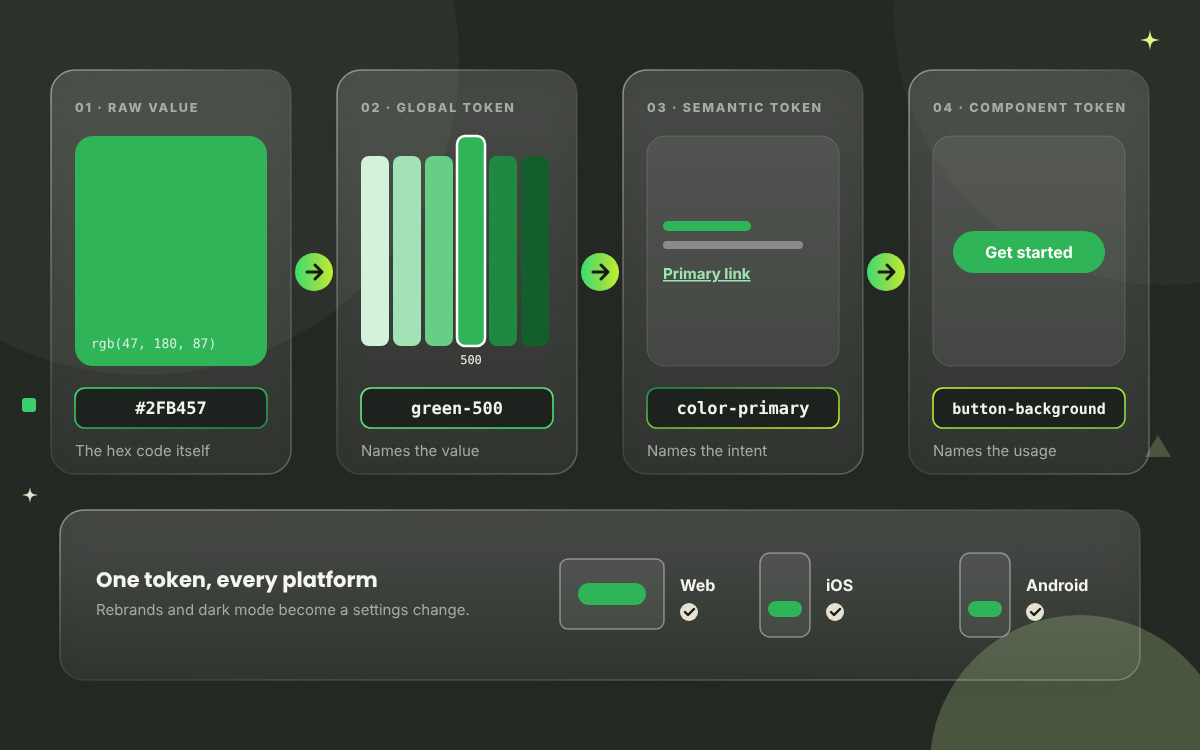
Design tokens are named values that store your design decisions for color, typography, spacing, radius, elevation, motion, and breakpoints. They work on any platform. Your team writes color_primary instead of "#1A5CFF." A spacing value of "16px" becomes space_400.
Why does that matter? Foundations are the layer everything else inherits from. Change color_primary once, and every button, link, and badge updates on web, iOS, and Android. That turns on dark mode and rebrands it as a settings change, which saves you a rebuild. The W3C Design Tokens Community Group, formed in 2019, is working on a shared standard format for exactly this.
Components
Components are the reusable building blocks of a user interface. Think buttons, inputs, cards, and modals, each with defined states, variants, props, and accessibility behavior. They're usually the first thing people picture when they hear "design system."
Many teams sort their components using atomic design, a method created by Brad Frost. He introduced it in an article in 2013 and followed up with a book in 2016. The method organizes everything into atoms, molecules, organisms, templates, and pages.
Every component needs five things documented:
Anatomy: the named parts (label, icon, container).
Patterns are ready-made solutions to recurring problems, and each is built from several components. Picture forms, navigation, search, empty states, error handling, and data tables.
Components handle the look of things. Patterns cover when to reach for each component and how the pieces team up. Say you're building a sign-up form. A pattern would tell you to flag mistakes right beside the field as people type, and to skip the pop-up alert that shows up after they hit Submit.
Content and voice guidelines
Content and voice guidelines are the rules for how your product talks. They cover tone, capitalization, button labels, error messages, dates, numbers, and units. Should a button say "Save changes" or "Submit"? Should an error read "Oops!" or "Something went wrong"? This layer makes those calls.
Honestly, it often has the biggest impact of any layer, and it gets the least attention. A beautiful button with a confusing label is still a confusing button.
Documentation
Documentation is the home of your design system: usage rules, live examples, code, a changelog, a contribution guide and a support channel. Tools like Storybook are popular for showing live, coded components next to their usage notes.
One warning, though. If your documentation is hard to search, your design system is effectively invisible. People won't use what they can't find.
Design system examples from real products
Some of the best-known design system examples are Google Material Design, Apple Human Interface Guidelines, IBM Carbon, Salesforce Lightning, Shopify Polaris, and Atlassian Design System. Better still, every one of them is public. You can dig into their components, tokens, and guidelines without paying a cent. Think of a free masterclass taught by the biggest product teams around. Each system has its own superpower, whether that's theming, accessibility, or content design.
Below, you'll find design system examples from real products, so you can see how leading teams apply the ideas in practice and pick up lessons worth borrowing for your own system.
System
Owner
Best known for
Best lesson to borrow
Material Design
Google
Theming and cross-platform token structure
Build a token structure that can theme any brand
Human Interface Guidelines
Apple
Platform conventions and guidance
Explain the why, not just the what
Carbon Design System
IBM
Open-source code and accessibility docs
Write accessibility notes for every component
Lightning Design System
Salesforce
Popularising design tokens at enterprise scale
Tokenise foundations before building components
Polaris
Shopify
Content and voice built into components
Treat words as part of the design system
Atlassian Design System
Atlassian
Clear contribution model and public changelog
Make it easy to contribute and see what changed
1. Google Material Design
Who doesn't know about Material Design? Google first released it in 2014, and today it's the most widely referenced public design system around. Android, web, and Flutter teams all rely on it, as do thousands of third-party products. Theming is where it really shines. Its color, type, and shape tokens let a single system wear many brands.
Lesson to steal: Structure your tokens so that a new brand theme can be swapped in quickly and saves you from a full rebuild.
2. Apple Human Interface Guidelines
Apple's Human Interface Guidelines work a little differently. They lean on guidance and skip the downloadable component package. Anyone designing for iPhone, iPad, Mac, Apple Watch and beyond can use them, and they explain platform conventions beautifully.
Lesson to steal: Give the reasoning behind each rule. People follow rules they understand.
3. IBM Carbon Design System
Carbon is IBM's open source design system, built on the IBM Design Language. It supports IBM's extensive product family and has earned a strong reputation for its accessible documentation, which sets the bar for others.
Lesson to steal: Make accessibility notes a required part of every component page.
4. Salesforce Lightning Design System
Salesforce Lightning made design tokens popular for enterprise-scale interfaces. It powers Salesforce's own apps and the huge partner ecosystem that builds on its platform.
Lesson to steal: Set up your foundations as tokens first, and everything after that gets easier.
5. Shopify Polaris
Polaris serves the merchants and app developers who work inside Shopify's admin. So what makes it stand out? Its content and voice guidelines live right alongside the components, making it a great model for the content layer.
Lesson to steal: Put your button label rules on the button page.
6. Atlassian Design System
Atlassian's design system powers Jira, Confluence, and the rest of the family. Teams love its open contribution model and a public changelog that shows exactly what changed and how anyone can pitch in.
Lesson to steal: Publish your changelog and show people how to contribute.
How to build a design system
Start your design system by auditing the UI you already have. Then agree on a few guiding principles, define your tokens, build the components people use most, and write down how each one works.
After that, push for adoption and keep an eye on how it goes. That might sound like a mountain of work, but relax. Nobody builds the whole thing in one sitting. The smartest teams begin small and prove the value on a single product. From there, they let it grow. Treat it like a product you launch and keep improving, because a design system never really reaches a finish line. Short on hands? Our UI/UX design service can take on the design work, from user research and wireframes to a developer handoff with component specs.
Here’s how to build a design system, step by step, so your team can move from scattered interface patterns to a shared system that people adopt and keep using.
Run an interface inventory: Take a screenshot of every button, input, color, and type style currently in production, then group the duplicates. The duplication count becomes your business case.
Agree on principles and secure support: Write three to five design principles. After that, get an executive sponsor and a named owner, since a system without an owner won't survive for long.
Define foundations and tokens before components: Set your color palette, type scale, spacing scale, radius, elevation, and motion as design tokens. Every component inherits from these, so getting them right first saves you a lot of pain later.
Build components by frequency and pain: Skip alphabetical order. Begin with the parts used most often and broken most often, which usually means buttons, inputs, selects, modals, and tables.
Bake in accessibility: Test each component against WCAG 2.2, covering visible focus, keyboard operation, target size, and color contrast. Solve it once inside the component, and every screen benefits.
Ship design and code together: Release Figma components and coded components as matching pairs, versioned with Semantic Versioning (SemVer). Designers and engineers then stay on the same page.
Document every component: Cover anatomy, states, when to use it, when to leave it out, code, and accessibility notes. Keep it all in one searchable place.
Drive adoption on purpose: Start with a pilot team, write a migration guide, hold office hours, and publish a clear path for contributions. Adoption never happens by accident.
Measure, deprecate, and iterate: Track how many products and screens use the system. Retire old components on a published schedule and keep improving on a regular release cadence.
Design system FAQs
Most design system questions land in one of three groups. People usually start with the basics and ask, what is a design system? Then they want to know whether their team needs one, how to get one started, and how to keep it healthy. Designers, developers, and founders tend to ask at different stages of a project. Each design system FAQ below works on its own, so you can read just the one you need. If you don't see your answer, contact us directly with your concern.
In simple terms, a design system is a shared kit of reusable parts and rules. Components, design tokens, patterns, and documentation all live inside it. A team can use it to build consistent products without redesigning the same button, form, or color choice again and again. Build once, reuse everywhere.
A style guide documents visual rules such as color, typography and logo usage. Design systems contain a style guide, plus coded components, design tokens, patterns, usage documentation and governance. The big difference? A style guide is a static reference, while a design system is maintained as a living product.
A design system has six main components, which are design principles, design tokens, UI components, patterns, content and voice guidelines, and documentation. Governance holds them all together. It decides who owns the system, how changes get approved and how new versions are released, so everything stays up to date.
Design tokens are named variables that store design decisions, such as colors, spacing, and type sizes. Instead of hardcoding "#1A5CFF" in fifty places, your team uses a token like colorPrimary. Change that one token, and every product and platform that references it updates automatically.
Honestly, a small team usually doesn't need a full design system on day one. Start with design tokens, a type scale, and a handful of core components. The bigger investment makes sense when multiple people, products, or platforms need to stay consistent with one another.
That depends on your team size and product. A usable foundation of tokens and core components typically takes a few months. Full coverage and adoption keep going well beyond that. A design system is never really "done" because it gets maintained and improved all the time, just like your product.
The best examples of design systems include Google Material Design, Apple Human Interface Guidelines, IBM Carbon, Salesforce Lightning, Shopify Polaris, and Atlassian Design System. All of them are publicly documented and free to study, which makes them perfect inspiration for building your own.
Endnote
Finally! We've made it to the finish line!
It was a bit of a long ride through tokens, components, and famous design systems. However, do you feel ready to tame those 14 button styles? Hmm, hopefully your answer is yes!
So, what is a design system, really? Let us wrap it up simply. A design system gives your team a way to stop answering the same small questions over and over. That frees you to pour your creativity into the problems that really matter. Making every screen look the same was never the goal.
Key Takeaways
A design system is a documented single source of truth that brings together components, tokens, patterns, standards, and governance.
Its purpose is to remove repeated decisions so teams can ship consistent, accessible interfaces faster.
Its structure is layered, covering principles, tokens, components, patterns, content guidelines, and documentation.
Design tokens make theming, dark mode, and rebrands a configuration change rather than a manual rewrite.
Governance decides whether a system survives contact with real product teams.
Adoption is the real success metric, and a design system that nobody uses becomes a cost rather than an asset.
Need a hand building a consistent brand identity or a design system your team will actually love using? Our design team at Graphic Design Eye is always ready to help. Get in touch today, and let's build a great design system together!
That's all for today, friends! Another brand-boosting topic is on its way, so stay tuned. Until then, stay inspired, keep your mind refreshed, and let your creativity shine!
Graphic Design Eye LLC is a full-service creative agency built for brands that demand more than design — they demand vision. From strategic branding to complete visual identity, we partner with startups, agencies, and growing businesses as a dedicated creative force. With flexible subscription and project-based models. Let's start with us today!