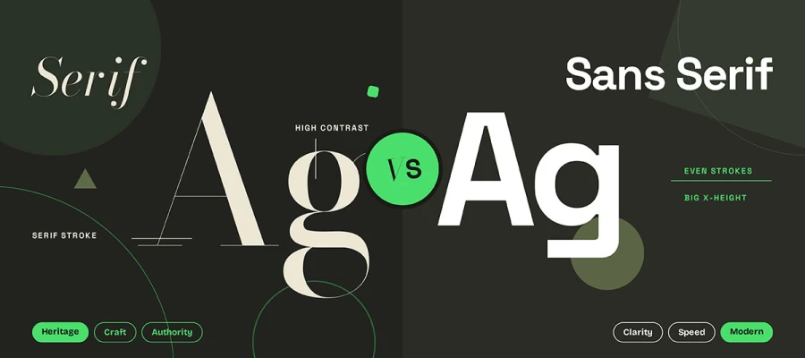
If you're looking to compare serif vs sans serif for brand typography, know that neither one wins on its own. Serif typefaces suggest heritage, craft, and authority, while sans serif typefaces feel clear, fast, and modern. Look at where the type will appear, the smallest size it must stay readable at, and the license cost. Then pick a specific typeface instead of settling for a category.
You are staring at two typeface options.
One is set in a beautiful serif with high contrast. It looks expensive, as though it has been around for a hundred years, even though your company is eleven months old.
The other is a clean geometric sans. It looks fast, confident, and ready for an app icon.
Both look right. That is exactly the problem, and it is why the serif vs. sans serif question for a brand typeface stalls so many branding projects at the finish line.
Neither serif nor sans serif is better or worse than the other. Each makes a different set of promises to your customer. A serif says we have been here, we know things, we take care. Sans serif says we are clear, we are current, we will not waste your time.
Your decision rests on the specific typeface, the context it lives in, and the license you can afford, rather than on the category.
In this guide, we will walk through serif and sans serif options for your brand typeface. With real research, real brand examples, and a practical framework you can take straight into your next stakeholder meeting.
So, keep reading!
Serif vs sans serif for brand typography
Serif fonts give a brand a feeling of heritage and trust. Sans serif fonts feel simple and modern. Your choice shapes the first impression before a customer reads a single word.
This breakdown of serif vs sans serif for brand typography helps you match typeface structure to the personality your brand wants to project.
Let's get into it!
What is a serif typeface?
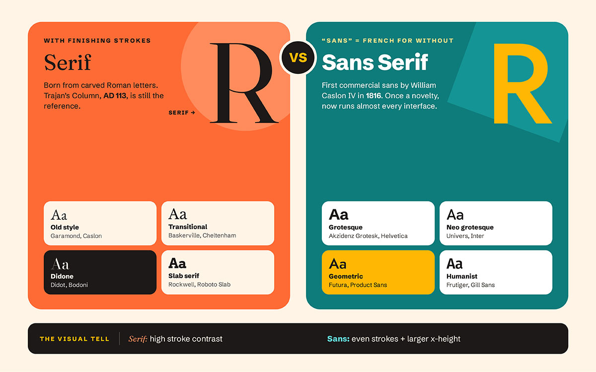
A serif is the small finishing stroke at the end of a letter's main stroke, and any typeface that has them is a serif typeface. Simple as that.
The form comes from the lettering on Roman inscriptions. Carved letters on Trajan's Column in Rome, completed in AD 113, are still the standard reference point taught in type design programs today. That is nearly two thousand years of visual memory built into a letter shape, and your customer feels it even if they cannot name it.
Substyles worth knowing:
Old style: Garamond, Caslon. Warm, with gentle contrast and slightly angled stress.
Transitional: Baskerville, Cheltenham. Sharper, more upright and more refined.
Didone/modern: Didot, Bodoni. Dramatic contrast between thick and thin strokes. The luxury look.
Slab serif: Rockwell, Roboto Slab. Heavy rectangular serifs that feel sturdy and loud.
The visual tell: serifs usually have higher stroke contrast, meaning a clear difference between the thick and thin parts of a single letter.
What is a sans serif typeface?
"Sans" is French for "without." A sans serif has no finishing strokes at the ends of its letters.
William Caslon IV created the first commercially released sans-serif in Latin type in 1816 and, confusingly, marketed it as "Two Lines English Egyptian." Nobody took it seriously. For decades it was treated as a novelty display face before anyone dared to set body text in it.
Think about that for a second. The style that now runs almost every interface started life as a curiosity.
Substyles worth knowing:
Grotesque: Akzidenz Grotesk, Helvetica. Neutral, slightly quirky and foundational.
Neo grotesque: Univers, Inter. Cleaner, more systematic and friendly to screens.
Geometric: Futura, Product Sans. Built from circles and straight lines. Optimistic and modern.
Humanist: Frutiger, Gill Sans. Based on the rhythm of handwriting. Warmest of the four.
The visual tell: more even stroke weight and a larger x height, which is the height of a lowercase "x" and controls how big the type feels at any given size.
Serif vs sans serif side by side comparison
Serif vs sans serif for brand typography differ across eight measurable factors, including stroke contrast, small-size legibility, and interface performance, and neither outperforms the other in reading speed. Match your choice to context rather than preference alone. This serif vs sans serif side-by-side comparison lays out those eight factors so you can weigh them at a glance.
Attribute
Serif
Sans Serif
Defining feature
Finishing strokes at the ends of letters
No finishing strokes
Typical stroke contrast
Medium to very high
Low to none
Common associations
Heritage, authority, craft, editorial
Clarity, efficiency, modernity, neutrality
Behavior at small sizes
High-contrast serifs thin out and break up
Generally holds weight better
Behavior at large sizes
Detail and character become an asset
Can look generic without customization
Typical language coverage
Narrower in many families
Broader, with more Cyrillic and Greek support
Typical interface use
Headlines and editorial body copy
Interface labels, buttons, data, forms
Proven reading speed advantage
None
None
One terminology note that will make you sound like a pro
A typeface is the design, and a font is one specific version of that design. "Garamond" is a typeface, while "Garamond Bold 12pt" is a font. Designers use either term in casual conversation, and that is fine, but knowing the difference is a small credibility signal in a client meeting.
One more, because it separates current knowledge from recycled knowledge. The longstanding Vox ATypI classification system, the one many of us learned in school, was formally withdrawn by ATypI in 2021 for being too narrow and too focused on the Latin alphabet. If someone brings the old chart to your branding session, that is your gentle correction.
Does serif or sans serif actually read better?
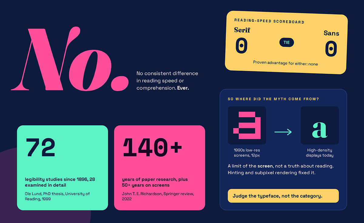
No. Reading research has never found a consistent, meaningful difference in reading speed or comprehension between serif and sans serif typefaces. The belief that one beats the other is one of the most stubborn myths in design, and it has cost brands real money in unnecessary rebrands.
This section on whether serif or sans serif reads better separates that myth from what the research actually shows.
The foundational study
Ole Lund's 1999 PhD thesis at the University of Reading's Department of Typography and Graphic Communication is the definitive review. Lund identified 72 typeface legibility studies going back to 1896 and examined 28 of them in close detail. His conclusion was uncomfortable. Studies contradicted each other, many had flawed methods, and a century of research had produced no reliable theory.
The modern confirmation
In 2022, Springer published John T. E. Richardson's open-access review, The Legibility of Serif and Sans Serif Typefaces: Reading from Paper and Reading from Screens. It covers more than 140 years of research on paper reading and over 50 years of research on screen reading. The pattern holds, with no consistent legibility advantage for either category.
So where did the myth come from?
Low-resolution screens. In the 1990s and early 2000s, a fine serif really did fall apart at 12 pixels because there simply were not enough pixels to draw it. That was a limit of the screen rather than a truth about reading. High-density displays, font hinting, and subpixel rendering removed that limit.
Here is what this means for you. Stop arguing about the category. A well-drawn serif and a well-drawn sans serif will both read beautifully, and a badly drawn one of either will not. Judge the typeface rather than the family it belongs to.
What does each style say about your brand?
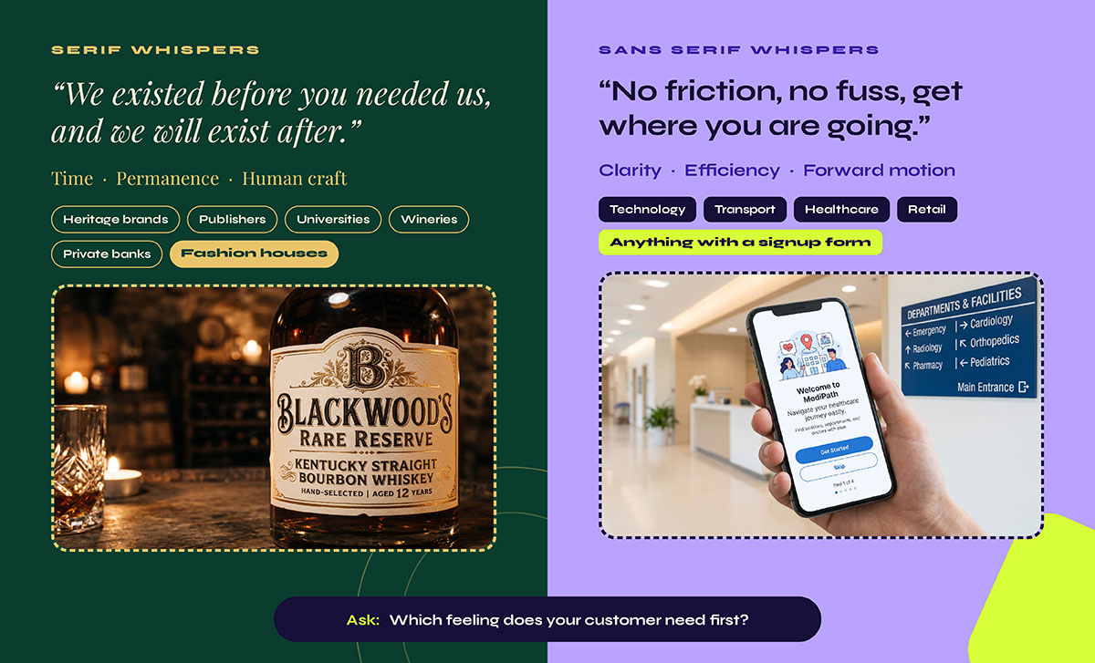
Serif letterforms link your brand to time, permanence and human craft. Sans serif letterforms link it to clarity, efficiency and forward motion. Neither association is objectively "true" since both are learned through exposure, but both are real and start working on your customer within milliseconds.
This is where emotion enters the decision, and where many founders get it wrong by treating type as decoration.
Think about the last law firm letter you opened. Now think about the last software onboarding screen you saw. You could probably guess the typeface style of each without seeing them. No coincidence there. A century of category convention has taught American consumers what to expect.
Serif whispers, "We existed before you needed us, and we will exist after." It is the language of heritage brands, publishers, universities, wineries, private banks and fashion houses.
Sans serif whispers, "No friction, no fuss, get where you are going." It is the language of technology, transport, healthcare, retail and anything with a signup form.
The strategic question is which feeling your customer needs when they first meet you, rather than which feeling is better. A hospital wayfinding sign and a bourbon label solve completely different emotional problems.
Which industries use serif and which use sans serif?
Luxury and finance usually choose serif for heritage and trust, while technology and healthcare use sans serif for clarity and speed. These patterns act as conventions rather than fixed rules, so departing from them should be deliberate. This section on which industries use serif and which use sans serif maps those patterns to their reasoning, so you can decide when to follow the pattern and when to break it.
Sector
Typical Direction
Reasoning
Luxury and fashion
Serif, often Didone
High stroke contrast signals refinement and heritage
Publishing and editorial
Serif body text, sans for supporting elements
Long form reading convention and masthead tradition
Law, finance, insurance
Serif or humanist sans
Signals permanence and institutional credibility
Technology and SaaS
Sans serif
Interface first, dense data, wide language coverage
Healthcare and public sector
Humanist sans
Legibility under stress, accessibility procurement rules
Now for the part your stakeholders will actually remember. Real brands, real decisions.
Burberry: The pendulum swing
In 2018, Burberry replaced its serif wordmark with a simplified geometric sans. It felt inevitable at the time because almost every luxury house was following the design trends.
In 2023, under a new creative director, Burberry returned to a serif treatment and brought back its Equestrian Knight.
This is the clearest proof available that neither direction is permanently correct. Typography follows brand positioning, and when the positioning moves, the letterforms move with it.
Apple: When you stop licensing and start drawing
In 2015, Apple replaced Helvetica Neue with San Francisco, a typeface its own team drew specifically for screen legibility at every size Apple ships, from a watch complication to a billboard.
The lesson for growing brands is straightforward. At a certain scale, the typefaces already on the market are no longer good enough, and commissioning your own becomes cheaper than compromising.
Google: The tech convention, confirmed
Google introduced its geometric Product Sans wordmark in 2015 and retired its serif logo. Netflix commissioned Netflix Sans in 2018, and Airbnb commissioned Airbnb Cereal the same year.
Notice the pattern. Technology brands moved to sans serif, then to custom sans serif. Both moves were about control over rendering, licensing costs, and ownership.
Vogue and The New York Times: When not to change
Vogue and The New York Times both retain high-contrast serif mastheads that would fail almost every modern usability test on their own.
They keep them because the brand equity sits in the letterforms themselves. Those shapes are the brand asset, and redrawing them would destroy more value than any legibility gain could recover.
The takeaway is simple. Protect your letterforms if they are already recognized. If they are not, you are free.
Where will the typeface actually be used?
Start with the use case rather than the mood board. Most arguments about serif vs sans serif for brand typography are really arguments about context that nobody has bothered to write down yet. A typeface that must live inside forms, tables, and dashboards has very different requirements from one that only ever appears in a headline, and those requirements usually settle the serif or sans question before looks get a vote.
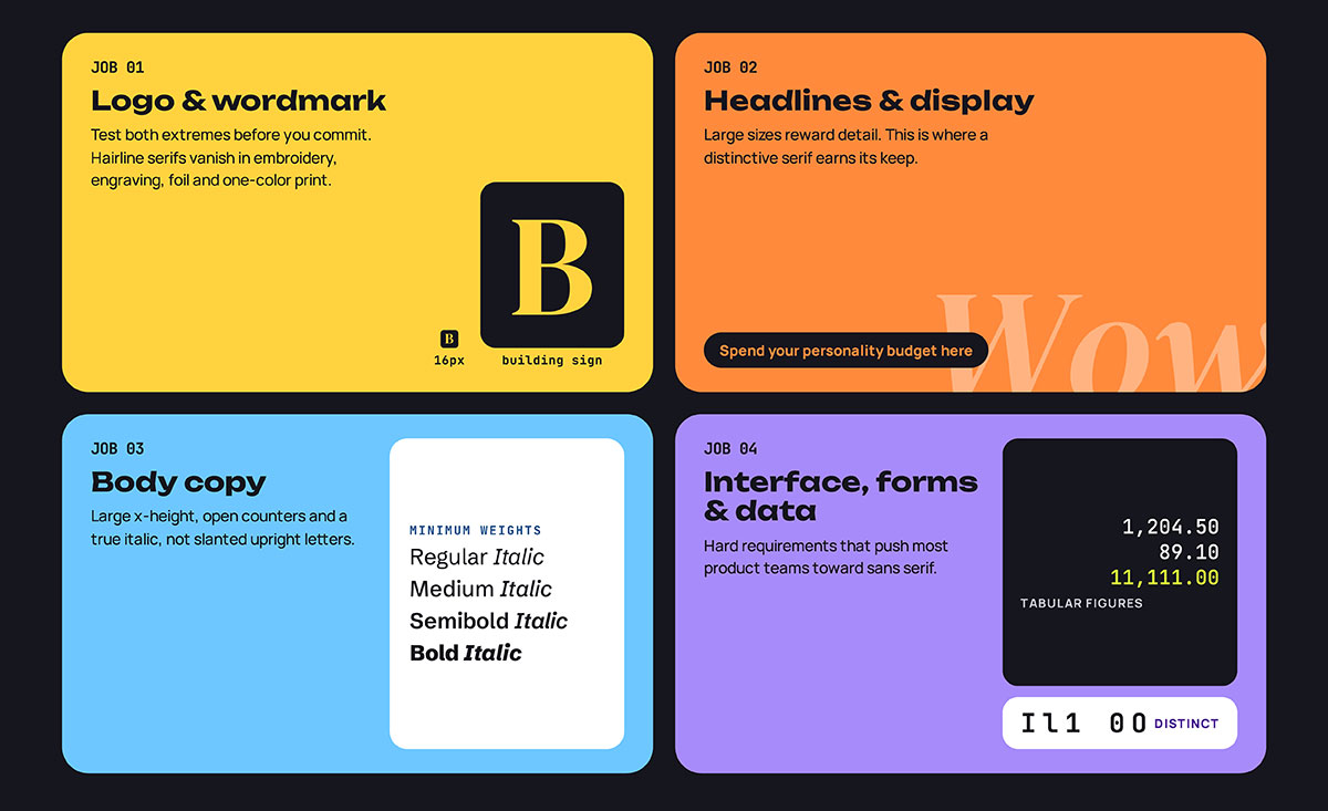
Break your brand's typography into four jobs.
Logo and wordmark
Your logo gets reproduced at truly extreme sizes, from a 16px browser favicon at one end to a building sign at the other. Test both ends before you commit, never after.
And remember the physical world. Fine serifs and hairline strokes disappear completely in embroidery, engraving, foil stamping and single-color print. If your brand will ever appear on a polo shirt or an etched glass door, this constraint decides the matter.
Headlines and display
This is where character matters most, and where a distinctive serif truly earns its keep. Large sizes reward detail. If you want one place to spend your personality budget, spend it here.
Body copy
Prioritize a large x-height, open counters, which are the enclosed spaces inside letters like "o" and "e," and a true italic rather than upright letters that have simply been slanted.
Then count the weights. You need at least regular, medium, semibold, and bold, each with a matching italic. With fewer than that, your designers will start faking it, and your brand consistency will quietly collapse.
Interface, forms and data
This one has hard requirements:
Tabular figures, meaning numerals of equal width, so figures line up in columns
Clearly distinct I, l, 1 and 0, O, so nobody misreads a confirmation code
A wide numeral set, including old style and lining figures if you publish data
These requirements alone push most product teams toward sans serif, whatever their brand positioning. If your brand lives inside a dashboard, accept that early and pair typefaces strategically instead of fighting it.
What does a brand typeface cost?
Brand typeface costs can range from free open-source families to tens of thousands of dollars for custom commissions. Retail licenses often cost hundreds to a few thousand dollars, while web licenses can become expensive when they are priced by pageviews. This breakdown of what a brand typeface costs covers all four pricing options and the pitfalls of each, so you know what to watch for before you commit.
Route
Typical Cost
Best For
Watch Out For
Open source
Free
Startups, product teams, anyone shipping fast
Download sites that host fonts without valid rights
Retail license
Hundreds to low thousands
Established brands that want to stand out
Web tiers priced by monthly pageviews
Subscription
Monthly or annual fee
Agencies and teams running several brands
Losing your rights the moment you stop paying
Custom commission
Tens of thousands and up
Brands at national scale
Long lead times and scope creep
Most open-source families, including Inter, Source Serif, IBM Plex, and Roboto, are released under the SIL Open Font License, which allows commercial use, web embedding, and modification at no cost. Read the actual license file, though. Free download sites often host fonts without valid commercial rights, and that becomes your legal problem rather than theirs.
The one number to remember: price your web tier at three times your current monthly pageviews. Brands outgrow their font license faster than they expect, and renegotiating while you are still growing is where the surprise invoices come from.
How to choose a serif or sans serif typeface
Choosing between serif vs sans serif for brand typography comes down to placement, minimum size, category conventions, language coverage, licensing costs, and weight range. Answering all six typically narrows any typeface shortlist to two finalists. This guide on how to choose a typeface, serif or sans serif, gives you a checklist you can use to assess any option before you sign off on it.
Where will this type appear most often? If the answer is a screen interface with forms and data, lean toward sans serif. For packaging, editorial or environmental use, serif is fully on the table.
What is the smallest size it must survive? Anything under 12px, or any embroidery, engraving, or single-color print, rules out high-contrast serifs. Test it rather than assuming.
What does your category already look like? Match the convention to signal that you belong, or break it deliberately to signal that you are different. Both are valid strategies, so just be certain which one you are choosing.
How many languages and scripts must it cover? Confirm coverage before you fall in love with a family. Adding Cyrillic or Greek support two years into a brand is painful and expensive.
What license do you need, and what will it cost at your projected traffic? Price the web tier at three times your current pageviews, and check whether app embedding is included.
Does the family have enough weights and a real italic? A brand needs a system rather than a single style. Four weights with true italics is the working minimum.
Serif vs sans serif FAQs
These FAQs answer the specific questions teams encounter as they start applying the framework, covering logo choice, screen legibility, font pairing, licensing, and accessibility. This serif vs sans serif FAQ section gives you direct answers you can drop straight into a brief or brand guidelines document. For further questions, reach out to us directly anytime without hesitation.
Neither is universally better for a logo design. Serif suits brands selling heritage, craft or authority, while sans serif suits brands selling clarity, speed or technology. The practical constraint usually decides it. If the logo must reproduce at small sizes, in one color, or in embroidery, choose letterforms with lower contrast.
Not measurably, on modern displays. The old rule came from low-resolution screens that could not render fine serifs. High-density displays, font hinting, and subpixel rendering removed that limitation. Reading studies find no consistent speed differences between categories on screen and on paper.
A typeface is the shared letterform design across all styles, while a font is a specific version of that design at a given weight, width, and style. Garamond is a typeface, and Garamond Bold Italic is a font. People use the terms interchangeably in casual speech.
Yes, a brand can use both, and most established brands do. The standard system pairs one family for headlines with another for body and interface text. Pairs work best when the contrast is obvious. Superfamilies such as IBM Plex or Source offer matched serif and sans versions under a single license.
Two families is the working standard, with one for display and one for text. Three is the practical maximum. Beyond that, the system becomes impossible to enforce across teams and channels, and consistency — the whole point of brand typography — starts to break down.
Generally yes, if they are licensed under the SIL Open Font License, which covers most of Google Fonts. The OFL allows commercial use, web embedding, and modification at no cost. Always read the specific license file, because free download sites often host fonts without valid commercial rights.
No accessibility standard requires either category. WCAG 2.2 covers contrast, resizing, reflow and text spacing, and says nothing about serifs. Choose any well-drawn typeface with a large x-height, open counters and clearly distinguishable I, l and 1. The British Dyslexia Association recommends plain sans serif faces.
Open source families cost nothing. Retail licenses for a single family typically run from the low hundreds to a few thousand US dollars, with web licenses often tiered by monthly pageviews. Custom commissioned typefaces start in the tens of thousands and scale with the character set you need.
Endnote
That brings us to a conclusion!
You’ve covered serif vs sans serif for brand typography, looking at decades of research on reading speed, and seen what each style can signal about a brand. You’ve also explored where different industries use them, what a typeface license can cost, and a six-question framework for choosing between the two. Finally, you’ve got answers to the questions that come up in branding conversations.
If you’d rather leave the decision to a team that treats typography as a system, Graphic Design Eye branding design services can help. Whatever you choose, give yourself time to get it right and enjoy the process. Good design takes time, and the right typeface can make all the difference.
Graphic Design Eye LLC is a full-service creative agency built for brands that demand more than design — they demand vision. From strategic branding to complete visual identity, we partner with startups, agencies, and growing businesses as a dedicated creative force. With flexible subscription and project-based models. Let's start with us today!