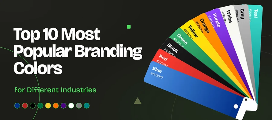
The most popular branding colors are blue, red, black, green, yellow, orange, purple, white, grey, and teal. Blue leads because it signals trust, so it dominates tech, finance, and healthcare. Red, yellow, and orange own food and retail. Black and white rule luxury and fashion. Green anchors wellness and sustainability. Choose a color that sets your brand apart from competitors, regardless of your personal taste, and ensure it has enough contrast.
Suppose a founder sits at her laptop at 1 a.m. Two swatches glow on her screen, a calm navy and a daring coral. She picks navy because it “feels right.” Six months later, her logo sits on a comparison page beside eleven competitors. Every one of them is navy.
This happens across America every week. Most color palette decisions start with personal taste and are later defended. The result is a brand that looks professional but feels invisible.
This guide covers 10 popular brand colors, explains why brands choose them, and provides a 6-step checklist to help you choose the right one with accessibility in mind.
Keep reading!
10 Most popular branding colors
Popular branding colors fall into three groups. Warm hues like red, yellow, and orange drive appetite. Cool hues like blue, green, and teal build trust. Neutrals like black, white, and grey signal status.
This section covers the 10 most popular branding colors and what each one communicates, so you know which suit your industry. Let’s start with the ten colors at a glance.
Color
Hex code
Core associations
Industries
Example brands
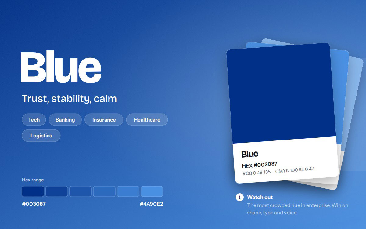
Blue
#003087 – #4A90E2
Trust, stability, calm
Tech, banking, insurance, healthcare, logistics
IBM, Ford, PayPal, Samsung
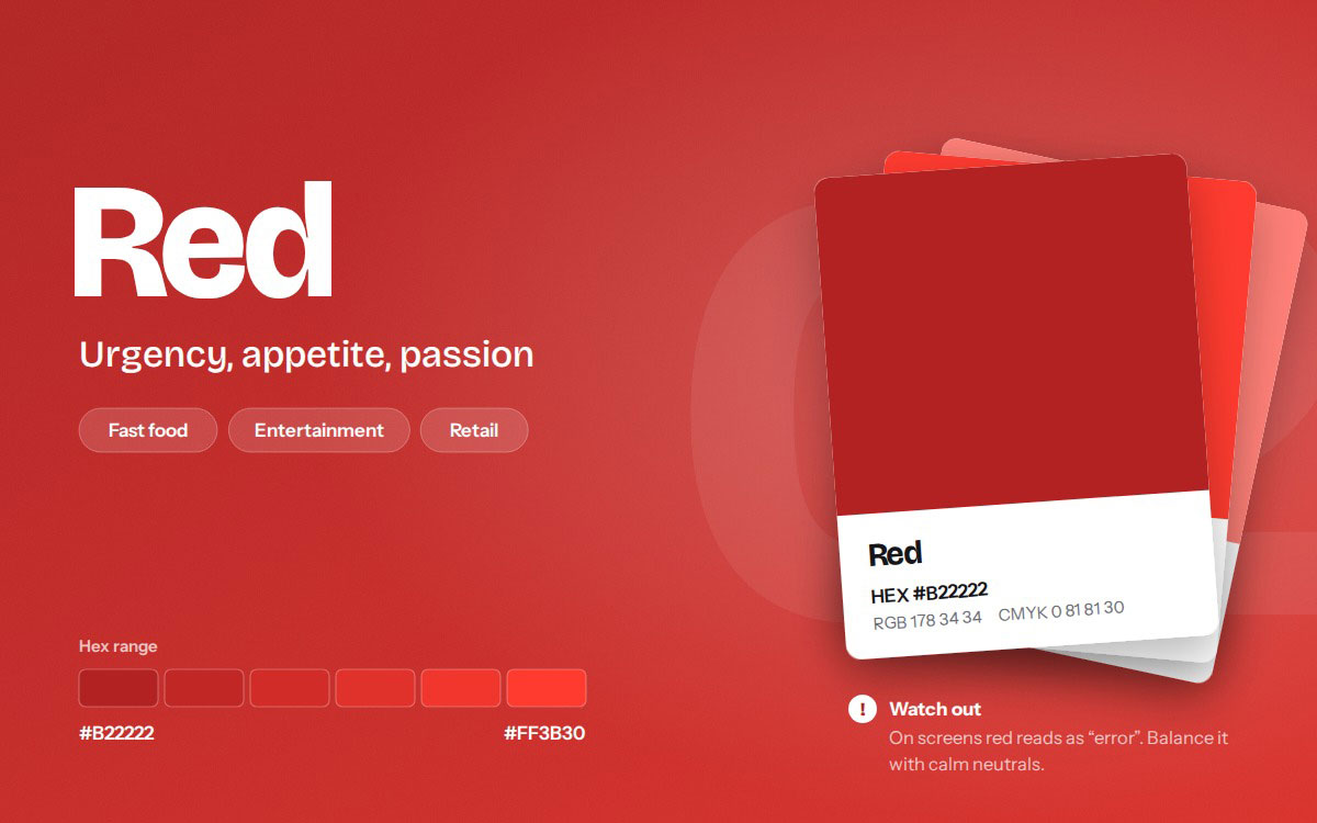
Red
#B22222 – #FF3B30
Urgency, appetite, passion
Fast food, entertainment, retail
Coca-Cola, Netflix, YouTube, Target
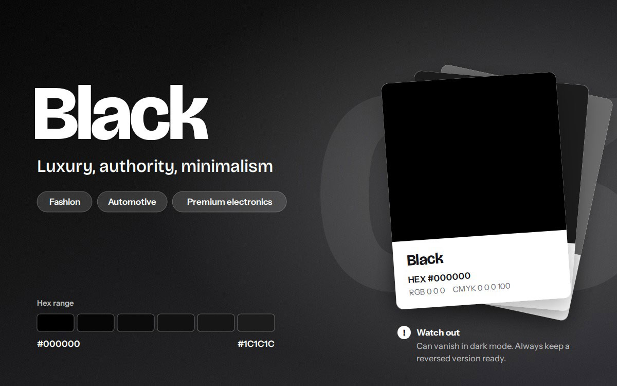
Black
#000000 – #1C1C1C
Luxury, authority, minimalism
Fashion, automotive, premium electronics
Chanel, Nike, Prada, Sony
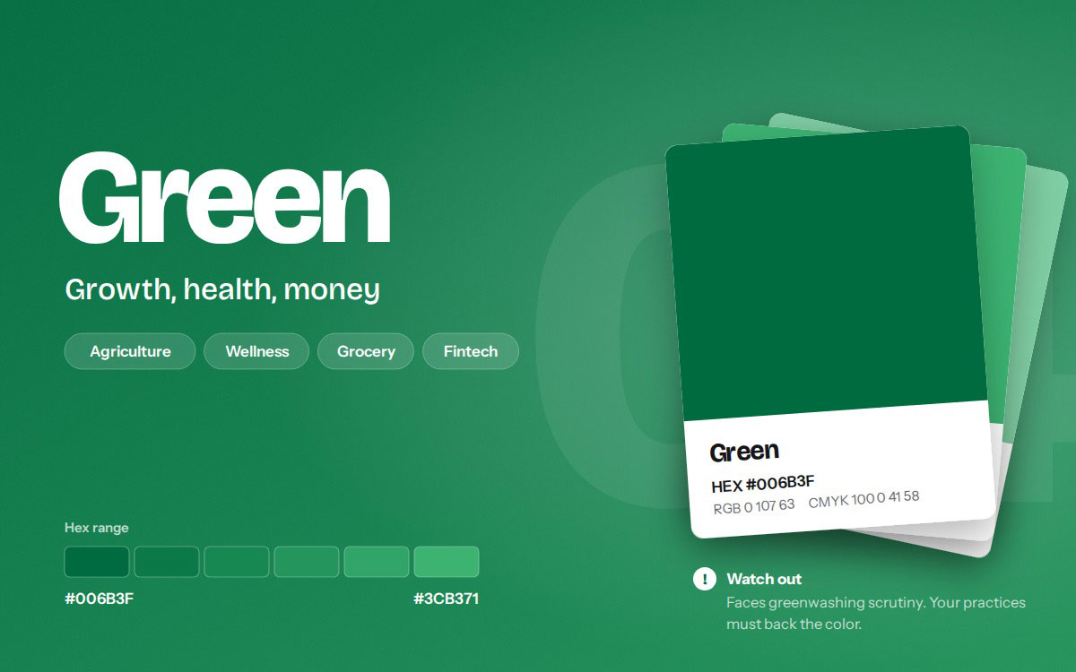
Green
#006B3F – #3CB371
Growth, health, money
Agriculture, wellness, grocery, fintech
John Deere, Starbucks, Whole Foods, Spotify
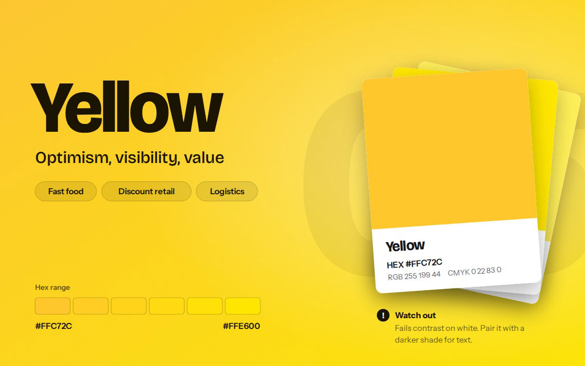
Yellow
#FFC72C – #FFE600
Optimism, visibility, value
Fast food, discount retail, logistics
McDonald's, IKEA, DHL, Snapchat
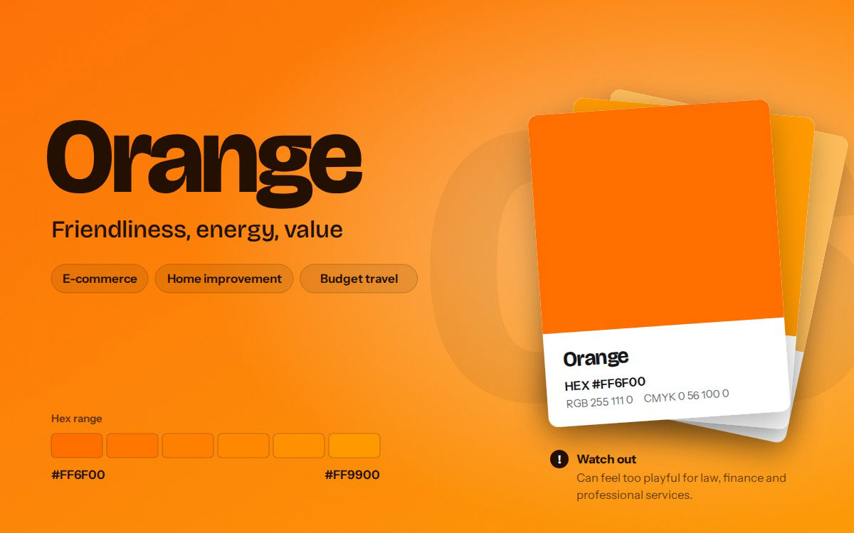
Orange
#FF6F00 – #FF9900
Friendliness, energy, value
E-commerce, home improvement
Amazon, The Home Depot, Nickelodeon
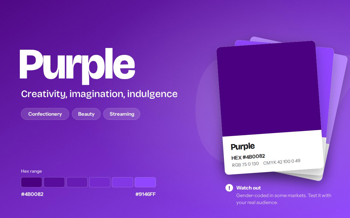
Purple
#4B0082 – #9146FF
Creativity, imagination, indulgence
Confectionery, beauty, streaming
Cadbury, Twitch, Hallmark
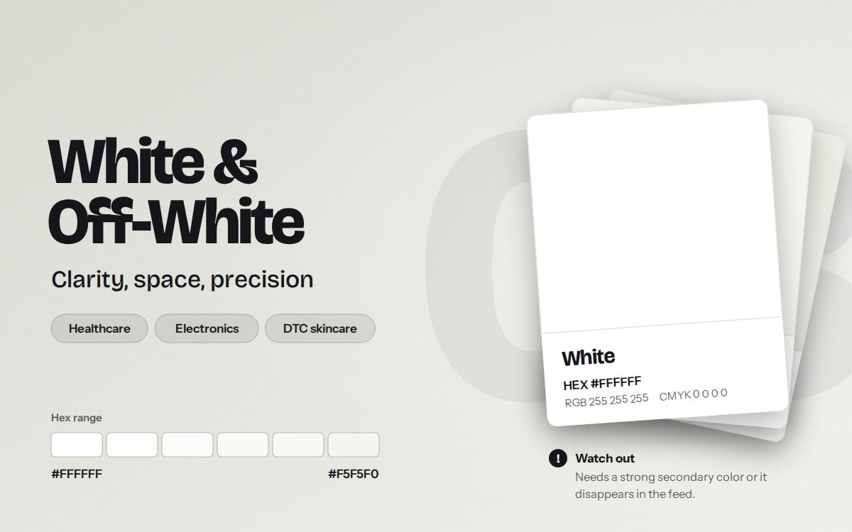
White/off-white
#FFFFFF – #F5F5F0
Clarity, space, precision
Healthcare, electronics, DTC skincare
Apple, minimalist retail
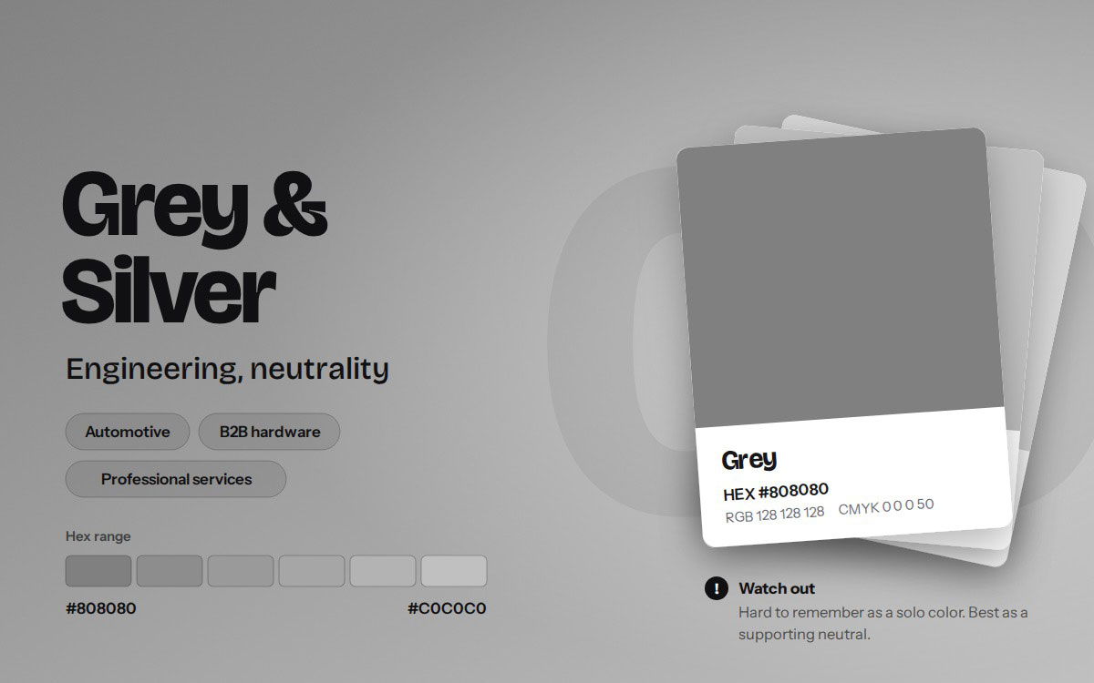
Grey/silver
#808080 – #C0C0C0
Engineering, neutrality
Automotive, B2B hardware, professional services
Mercedes-Benz, Nissan, Wikipedia
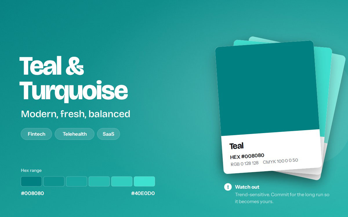
Teal/turquoise
#008080 – #40E0D0
Modern, fresh, balanced
Fintech, telehealth, SaaS
Tiffany & Co.
Now, let's see each color one by one and discover what makes it work.
1. Blue
Blue is the default color of trust. It shows stability, competence, and calm. That's why tech, banking, insurance, healthcare, and logistics use it so much. When people hand over money, data, or their health, they want to feel safe. Blue does that without saying a word.
IBM has used blue for so long that it's nicknamed "Big Blue." Ford, PayPal, Meta, and Samsung use it too.
Watch out: Blue is the most crowded color in almost every enterprise category. If you pick it, stand out with typeface, shape, and tone of voice.
2. Red
Red stands for urgency, appetite, and boldness. It lifts energy and grabs the eye faster than almost any other color. Fast food, entertainment, and clearance retail are full of it, where quick decisions matter.
Coca-Cola's red is one of the most recognized colors on earth. Netflix, YouTube, and Target have each made red their signature, and customers spot it in a split second.
Watch out: In apps and websites, red usually means "error" or "alert." Too much red can make users feel something went wrong, so pair it with calmer neutrals.
3. Black
Black stands for luxury, authority, and minimalism. It feels timeless and confident, and it never begs for attention. Premium buyers love that restraint. Black dominates fashion, cars, and high-end electronics.
Chanel and Prada use black to whisper exclusivity. Nike's black swoosh feels athletic and bold. Sony's black wordmark feels precise and well made.
Watch out: True black needs care on screens. In dark mode, a black logo can disappear, so always make a light or reversed version.
4. Green
Green stands for growth, health, sustainability, and money. People link it to nature and renewal right away. It dominates agriculture, wellness, grocery, and increasingly fintech.
John Deere's green and yellow are part of American farm culture. Starbucks uses green to convey freshness and a sense of welcome. Whole Foods and Spotify show green works in both natural and digital spaces.
Watch out: Green now faces "greenwashing" scrutiny. If your brand looks eco-friendly but your practices don't back it up, customers will notice, and the color will hurt you.
5. Yellow
Yellow feels optimistic, visible, and affordable. It's the brightest color the eye can see, so it grabs attention from far away. Fast food, discount retail, and logistics are full of it.
McDonald's golden arches, IKEA's blue-and-yellow stores, DHL's delivery vans, and Snapchat's ghost all use yellow to look cheerful and easy to spot.
Watch out: Yellow fails contrast tests against white more than any other color. Never use it for text on a light background without a darker version.
6. Orange
Orange feels friendly, energetic, and good value. It mixes red's excitement with yellow's warmth, so brands feel approachable. E-commerce, home improvement, and budget travel rely heavily on it.
Amazon's orange smile hints at a happy delivery. The Home Depot's orange says "let's get to work." Nickelodeon's orange feels playful and fun.
Watch out: Orange can feel childish in professional services. A law firm or wealth manager may lose trust if it's the main color.
7. Purple
Purple stands for creativity, imagination, and premium indulgence. Once tied to royalty, it feels special and a little unexpected. It dominates sweets, beauty, and streaming or creative tools.
Cadbury's purple feels rich and indulgent. Twitch uses a bright violet to stand out in gaming. Hallmark's purple crown adds warmth and sentiment.
Watch out: Purple is strongly gender coded in some markets. Test it with your real audience before you commit.
8. White and off-white
White means clarity, space, and clinical precision. Products and messages get room to breathe. It dominates healthcare, consumer electronics, and direct-to-consumer skincare.
Apple is the classic example. Its white packaging, stores, and product photos made "clean" feel expensive. Minimalist retail brands follow the same idea.
Watch out: White needs a strong secondary color. Without one, your brand disappears into social feeds and white web pages.
9. Grey and Silver
Grey and silver suggest engineering, neutrality, and industrial credibility. They feel mechanical, measured, and serious, and they dominate the automotive, B2B hardware, and professional services sectors.
Mercedes-Benz uses silver to echo polished metal and German engineering. Nissan's refreshed logo went flat grey and silver. Wikipedia's grey puzzle globe feels neutral and trustworthy.
Watch out: Grey is hard to remember as the only brand color. It works best as a supporting neutral instead of the hero.
10. Teal and Turquoise
Teal and turquoise are the modern challenger colors. They sit between blue's trust and green's freshness. More fintech, telehealth, and SaaS brands use them to stand out from the crowded blue field.
Tiffany & Co.'s robin's egg blue (Pantone 1837) shows how powerful this family can be when a brand owns it for decades. Many young startups now pick teal to look modern and calm at once.
Watch out: Teal goes in and out of design trends. It may pin your brand to the 2020s unless you stick with it for the long run.
Those are the ten colors behind most logos you see every day. But color never works in a vacuum. Its meaning changes with where it appears.
How to choose a brand color: A six-step checklist
Start by checking your competitors’ colors, then choose a distinct color that fits your message and check its contrast. Then build a full palette around it. This section shows how to choose a brand color step by step, so you end up with a color that fits your brand and stands apart from rivals.
Map the competitive color field: Screenshot each direct competitor's logo and group them by hue on one page. You'll quickly see which colors are crowded and which are open.
Define the one attribute your palette must communicate: Pick just one. Is it trust, energy, calm, luxury, or fun? A palette that tries to say everything says nothing.
Pick a primary that is distinctive within the field: A beautiful blue is useless if eleven competitors already own it. Distinctive beats pretty every time.
Build a functional system: You need a primary, a secondary, a neutral ramp (light to dark greys), and states for success, warning, and error. This keeps websites and apps consistent.
Test for accessibility before approval: Fixing contrast after launch is expensive and embarrassing. Test early, while changes are still cheap.
Document tolerances: Record hex, RGB, CMYK, and Pantone values for each color, along with approved contrast pairings. This protects your brand across print, web, and packaging.
A brand color only works if everyone can see it. In the United States, accessibility is an ethical duty and a legal concern for many businesses.
The Web Content Accessibility Guidelines (WCAG 2.2) set clear minimums at Level AA. Normal body text needs a contrast ratio of at least 4.5:1 against its background. Large text and meaningful elements like icons and input borders need at least 3:1.
Some colors struggle more than others. Yellow, light green, and cyan primaries almost always need a darker version for text. Plan that shade into your system from day one.
Never use color alone to show meaning. About one in twelve men has some form of color vision deficiency. Pair color with an icon, label, or pattern. A red error message should also have an icon and clear words.
Use a contrast checker (such as WebAIM's Contrast Checker) and a color blindness simulator (such as Coblis) during design reviews. Design tools like Figma also have accessibility plugins that instantly flag weak pairings.
With a clear checklist and built-in accessibility, your color becomes a working asset that performs everywhere your brand appears.
Popular branding colors FAQs
Most branding color questions have one short answer. It depends on what your industry expects and what your competitors already own. These FAQs on the most popular branding colors provide quick and practical answers to common questions, so your next choice is based on facts. After reading the answers below, if you still have something to clarify, contact us directly via email. We’re available for you 24/7.
Blue is the most popular logo color. Studies of top global brands find it in more logos than any other color. It signals trust, stability, and skill, so tech, banking, insurance, and healthcare brands play it safe with it. Its popularity is also a weakness, since blue brands often struggle to stand out.
Banks and tech companies use blue because they ask customers to trust them with money and data. Blue is linked with calm, reliability, and security. It also feels neutral across cultures and genders. In industries where risk aversion is high, blue eases worry and makes brands feel established.
Most strong palettes use one primary color, one or two secondary colors, and a neutral ramp of greys or off-whites. Digital brands also add colors for success, warning, and error. Fewer colors make a brand easier to recognize and use consistently across print, web, and packaging.
Food brands should usually avoid grey, dull blue, and muddy brown as main colors. Grey feels lifeless, and blue is rare in natural food, so it can reduce appetite. Murky tones can suggest staleness. Warm reds, yellows, oranges, and fresh greens generally work better on menus, packaging, and signage.
Yes. Consistent color is one of the fastest cues people use to recognize a brand. Customers often spot Coca-Cola red or Tiffany blue before reading any text. Recognition grows through repetition, so the key is using the exact same color values at every touchpoint for years.
The best color for a startup is the one its rivals don't use. Map your category first. If rivals are all blue, consider teal, violet, coral, or a deep green. Prefer a color that fits your core attribute, passes contrast tests, and can be owned as you grow.
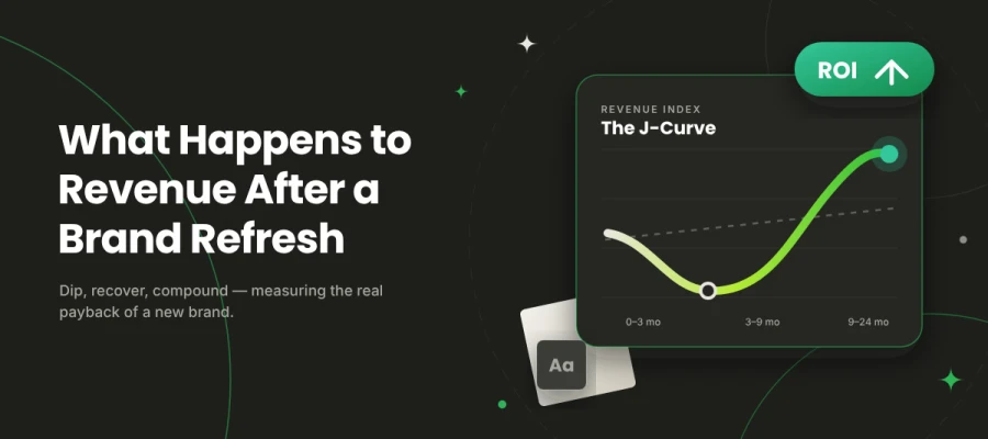
Brands shouldn't change their core color often. A light refresh every five to ten years keeps a palette current on modern screens. Save a full color change for a real repositioning, merger, or major strategy shift, because it resets the recognition customers have built.
Endnote
Finally, we've reached the end of our colorful journey!
Color is the silent storyteller of every brand. Before a customer reads your name, your color has already whispered who you are, what you stand for, and whether they can trust you.
Just keep these things in mind:
The most popular branding colors are ranked as: Blue, red, black, green, yellow, orange, purple, white, grey, and teal.
Blue leads for a reason: It signals trust, so tech, finance, and healthcare use it, and those fields get crowded.
Industries have their own color language: Warm hues drive food and retail, monochrome defines luxury, and greens anchor wellness and sustainability.
Distinctive beats prettiness: People remember brands that learned their category's rules and then bent them with purpose.
Accessibility is a must: Meet WCAG 4.5:1 for body text and 3:1 for large text and key graphics, and never use color alone to carry meaning.
If you're not sure your palette is working, a professional audit is the smartest next step. Our branding design team at Graphic Design Eye can map your competitors, test your colors for accessibility, and build a palette your audience will remember.
No more today! Good luck finding the color that tells your brand's story!
Graphic Design Eye LLC is a full-service creative agency built for brands that demand more than design — they demand vision. From strategic branding to complete visual identity, we partner with startups, agencies, and growing businesses as a dedicated creative force. With flexible subscription and project-based models. Let's start with us today!