Look at 25 famous food advertisement examples and explain why some campaigns still sell decades later while most ad ideas disappear after one season. From Coca-Cola's glowing Christmas trucks to Burger King's rotting Whopper, each entry breaks down the creative idea behind the campaign and the lesson your own brand can borrow.
Think back to the last time you bought a snack you didn't really need. You weren't hungry. But somewhere, a jingle played in your head, a red truck rolled across a screen, or a single line of copy made you smile. That's the quiet power of food advertising. It doesn't sell calories. It sells a craving, a memory, a moment.
Food is the most photographed product on earth. Every feed, menu, and billboard is packed with glossy burgers and perfect pours. So, the ads that truly break through are almost never the prettiest ones. They're the boldest ones: an old lady shouting at a bun, a gorilla playing drums, a Whopper rotting for 35 days.
That's why we've gathered these famous food ad examples in one place. You'll see 25 legendary campaigns, the creative thinking behind each one, and a one-line lesson you can borrow for your restaurant, food truck, or packaged food brand.
So, grab a snack (you'll probably want one soon), and let's dive into the stories behind these iconic ads!
What is a food advertisement? A food ad is any paid message that gets people to buy, try, or remember a food or drink brand. This includes TV spots, print ads, billboards, social posts, and packaging. The best ads sell a feeling or an idea. They do more than just show a photo of the product.
25 Famous food advertisement examples
Great food advertising opens with a feeling, a sound, or one stubborn idea that survives decades of competition. Wendy's blunt catchphrase and Skittles' bold color story prove the pattern. These 25 famous food advertisement examples break down exactly why each campaign worked and what you can learn from it.
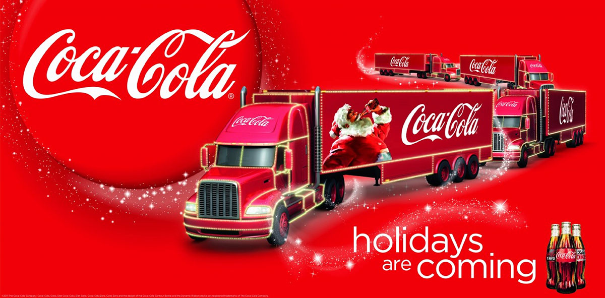
Coca-Cola • Format: TV + outdoor • Era: 1995 to present.
This builds on the Haddon Sundblom Santa pictures Coca-Cola first made in 1931.
Coca-Cola wasn't just selling a drink. It was claiming a whole season. The glowing red trucks, twinkling lights, and the famous "holidays are coming" sound made a soda feel like the true start of Christmas for many families.
For many Americans, seeing those trucks each year feels like a small tradition. That feeling matters more than any claim about taste.
Lesson: A food brand can own a moment in time. Pick one spot on the calendar. Return to it every year with the same colors, sound, and shape.
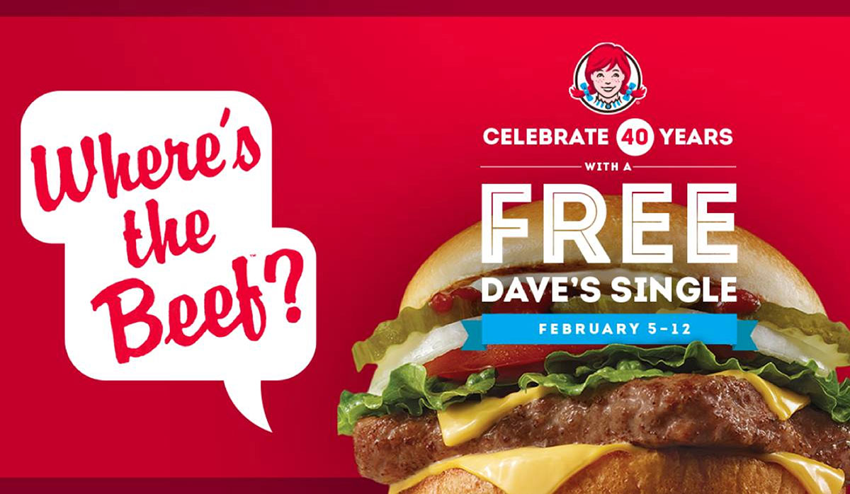
2. Wendy's — "Where's the beef?" (1984)
Dancer Fitzgerald Sample • Format: TV • Star: Clara Peller.
Picture a tiny old woman staring at a huge fluffy bun. Inside sits a sad little patty. She asks, "Where's the beef?" That was the whole ad. It attacked competitors in just three words.
The line jumped off the TV screen fast. It showed up on shirts, in songs, and even in the 1984 presidential debates. Few food ads ever get that famous.
Lesson: One strong line beats a page of claims. Write the tagline first. Then build the ad around saying it.
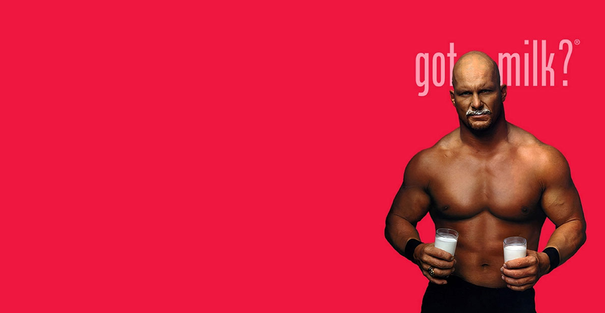
3. California Milk Processor Board — "Got milk?" (1993)
Goodby, Silverstein & Partners • Format: TV, print, and later the sign-off for the national celebrity milk mustache ads.
Most food ads show plenty. "Got Milk?" showed the opposite. The first ad featured a history buff who finally won a radio contest. His mouth was full of peanut butter. He had no milk to wash it down.
This is deprivation marketing. Each ad showed the painful moment when you need milk and don't have any. The two-word question became one of the most parodied lines in American advertising.
Lesson: Show the moment your food is missing. Scarcity makes a stronger creative social media design brief than plenty.
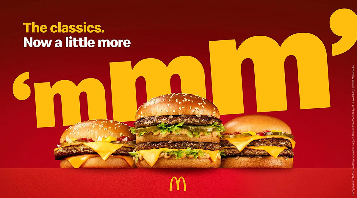
4. McDonald's — "I'm lovin' it" (2003)
Heye & Partner (Germany) • Format: Global TV, radio, packaging • Jingle vocal: Justin Timberlake.
McDonald's made a five-note sound logo, "ba da ba ba ba." It works in every language. You can hum it, whistle it, or print it on a cup. This was McDonald's first global campaign. It still runs today, over twenty years later.
The idea works because the sound travels anywhere. It reaches radio, podcasts, and TikTok, places the Golden Arches can't.
Lesson: Build a sound alongside your logo. Sound reaches radio, social video, and stores where a logo can't.
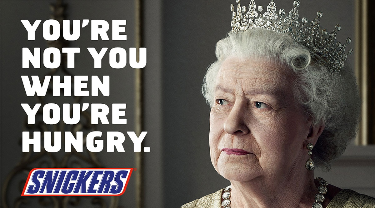
5. Snickers — "You're not you when you're hungry" (2010)
BBDO New York • Format: TV, launched at Super Bowl XLIV • Cast: Betty White and Abe Vigoda.
We all get "hangry." Snickers turned that into comedy. Betty White gets tackled on a muddy football field. Then she turns back into a young player after one bite. Pure joy.
This ad became legendary because the format works with any celebrity. Each year, a new star can play your "hungry" self. The idea stays fresh.
Lesson: Build a platform, not just one ad. If the idea can fit a new celebrity every year, it will outlast its creative team.
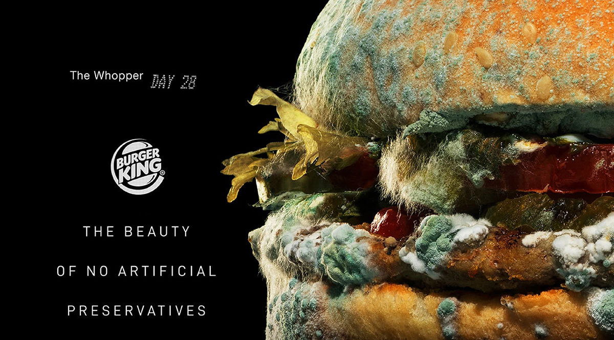
6. Burger King — "Moldy Whopper" (February 2020)
INGO Stockholm, DAVID Miami, and Publicis Bucharest • Format: Film, print, outdoor, digital • Recognition: Won Best of Show at The One Show 2020 with 18 Gold Pencils, and won an Outdoor Grand Prix at Cannes Lions in 2021.
Burger King did something bold. It filmed its burger rotting over 35 days. The line read, "The beauty of no artificial preservatives." Viewers felt shocked at first. Then they got the point. The One Show case entry says sales rose 14%. It also earned 8.4 billion impressions.
Lesson: Break the usual rules everyone follows. Food ads usually look perfect and shiny. So the ugliest photo became the most memorable one.
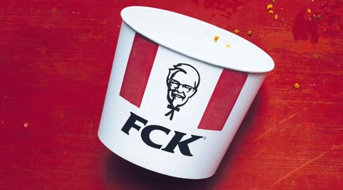
7. KFC — "FCK" apology ad (February 2018)
Mother London • Format: Full-page press ads run during the UK chicken supply shortage.
Picture a chicken restaurant that ran out of chicken. Hundreds of KFC stores shut down. Customers were angry. Instead of a stiff statement, KFC printed an empty bucket with its letters rearranged to spell "FCK."
It said what everyone was already thinking. The honesty and humor turned anger into admiration almost overnight.
Lesson: In a crisis, humor and honesty rebuild trust faster than a corporate statement. Keep your packaging recognizable even when you mess it up.
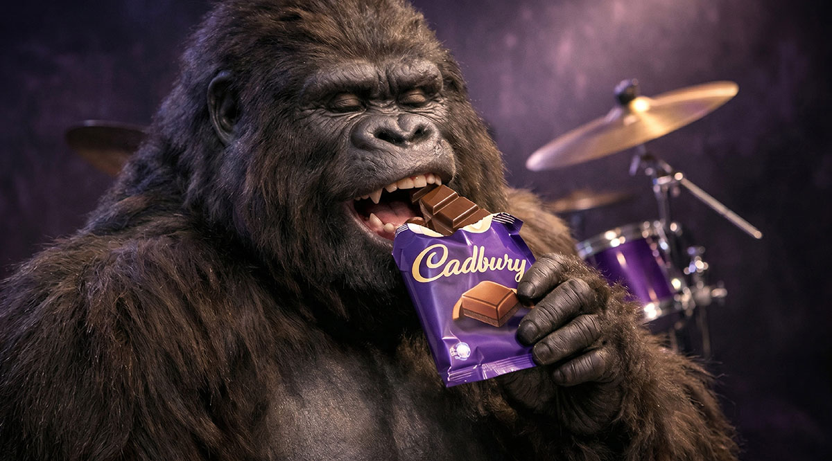
8. Cadbury — "Gorilla" (2007)
Fallon London • Director: Juan Cabral • Track: Phil Collins, "In the Air Tonight."
A gorilla sits at a drum kit for 90 seconds. He waits. Then the famous drum break hits. He plays with total abandon. No chocolate shows up until the last frame.
The brief asked for joy, not chocolate sales. That's exactly what happened. People watched it again and again. Cadbury's purple color did the identifying.
Lesson: You can sell a feeling and hold back the product. But it works only if your color identifies you.
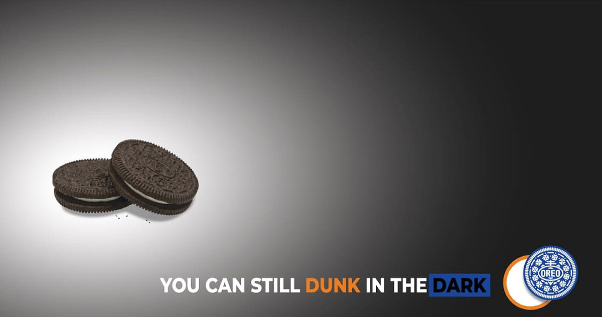
9. Oreo — "You can still dunk in the dark" (February 2013)
360i • Format: One social post shared during the Super Bowl XLVII blackout.
When the lights went out in the Superdome, Oreo's team acted fast. In minutes, they posted a simple image: an Oreo in dim light with the line "You can still dunk in the dark."
It became one of the most talked-about moments of the game. It didn't cost a single Super Bowl ad dollar.
Lesson: Real-time marketing needs a ready template and a designer on standby. Speed is the creative idea.
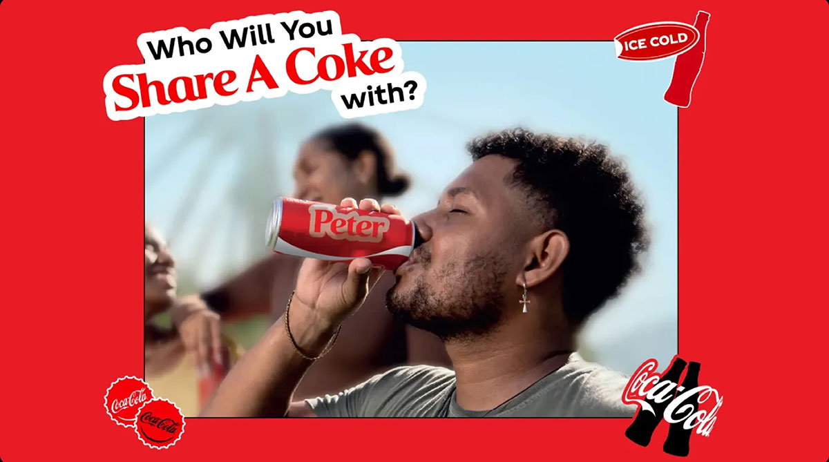
10. Coca-Cola — "Share a Coke" (Australia, 2011)
Ogilvy • Format: Packaging as media • Later spread to the UK, the US, and many other countries.
Coca-Cola swapped its famous logo for 150 common first names. Every bottle became a personal gift. People searched shelves for their name, their kids' names, and their friends' names.
The bottle became a social post before anyone opened it.
Lesson: Packaging is the cheapest ad space you already have. Break a brand rule if it gets people involved. Our packaging design service can help you try ideas like this.
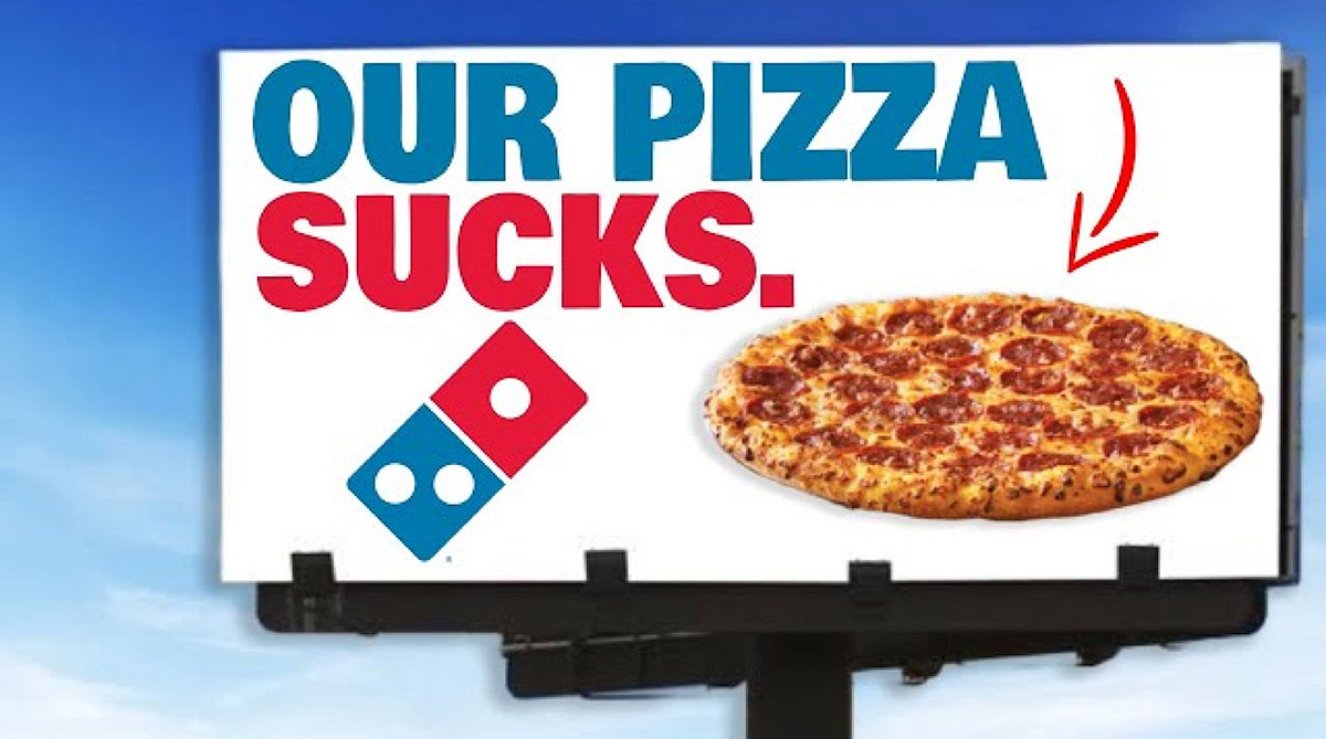
11. Domino's — "Pizza turnaround" (2009–2010)
Crispin Porter + Bogusky • Format: A documentary-style film, TV ad, and a live feedback microsite.
Domino's did something brave. It showed real customer insults on screen. "Crust tastes like cardboard." "Sauce tastes like ketchup." Then it filmed chefs rebuilding the recipe from scratch.
Watching a brand admit its flaws felt moving. It felt human. This made people want to try the new pizza.
Lesson: Being honest first is a creative strategy. Show the criticism first, and people will believe the fix.
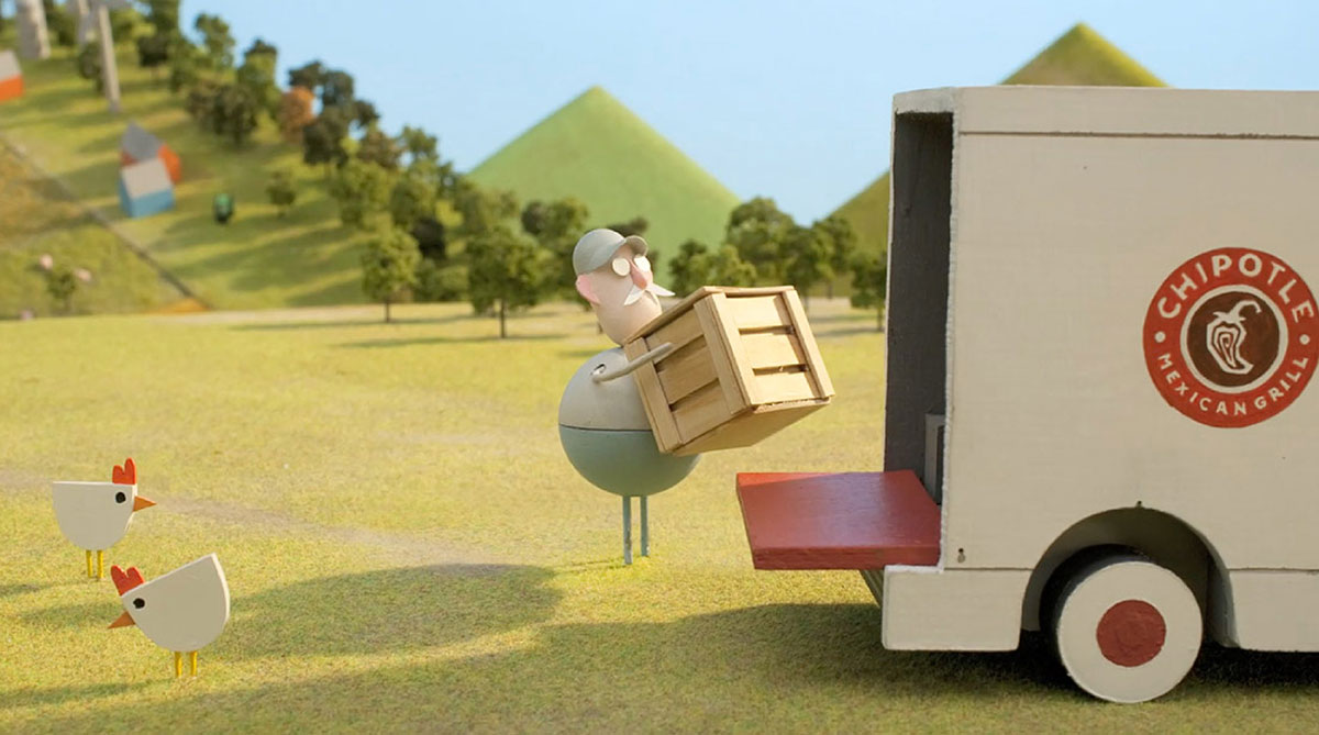
12. Chipotle — "Back to the start" (2011)
Stop motion animated film • Music: Willie Nelson covers Coldplay's "The Scientist" • First aired at the 2012 Grammy Awards.
A small farmer turns his family farm into a factory. Then he sees what he lost and returns to sustainable practices. It's a two minute story told through animation. You never see anyone eat a burrito.
Many people said it made them cry. That feeling made Chipotle's values stick in their minds.
Lesson: Values in the supply chain can be told as a story. Animation lets you show a hard truth about food without ugly footage.
13. Skittles — "Taste the rainbow" (1994)
D'Arcy Masius Benton & Bowles • Format: TV, print, and packaging · Still running today.
Skittles ads are strange on purpose. A man touches things and they turn into Skittles. One beard grows candy. These odd stories rest on one sensory promise and one bold color system.
The strangeness makes them stick. Its rainbow makes them easy to spot.
Lesson: Color can carry a whole brand. If your product is naturally colorful, build your art around it and let the weirdness speak.
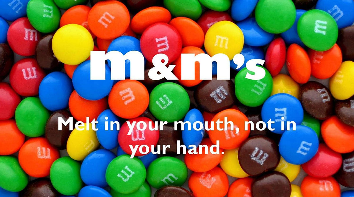
14. M&M's — "Melts in your mouth, not in your hands" (1954)
Mars • Format: Print and TV · One of the longest-running taglines in food ads.
The candy shell is the whole story. M&M's took a simple benefit, no sticky chocolate fingers, and turned it into a line you can't forget.
For parents in the 1950s, that meant cleaner kids and cleaner couches. It still makes sense today.
Lesson: Find the one thing your product does that no rival can claim. Then say only that for fifty years.
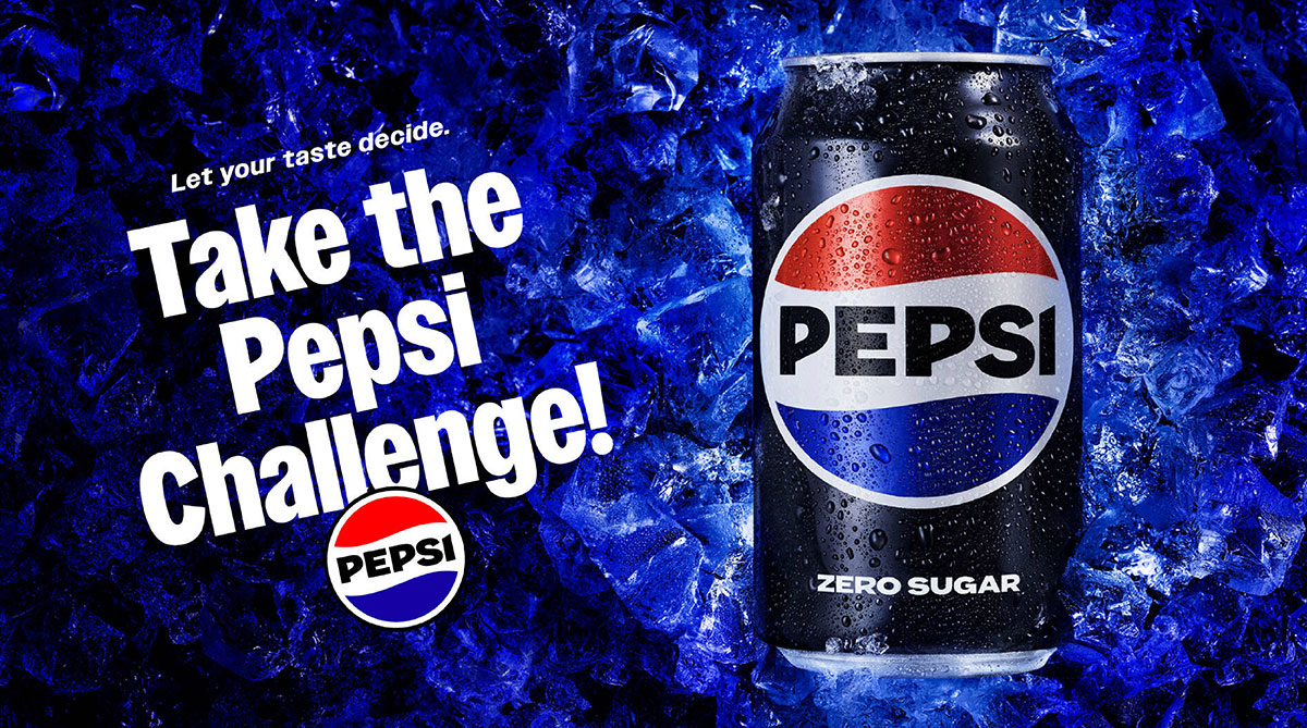
15. Pepsi — "The Pepsi challenge" (1975)
Filmed blind taste tests in shopping malls, later on national TV • Many say it sparked the "cola wars."
Pepsi had real shoppers taste two unmarked colas and pick a favorite on camera. When they picked Pepsi, the surprise was real.
The ad felt like proof. It didn't try to persuade anyone. That made it believable.
Lesson: A demonstration beats an adjective. If your product truly wins a side-by-side test, film the test.
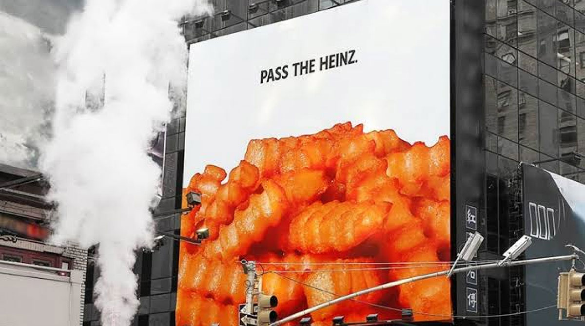
16. Heinz — "Pass the Heinz" (2017)
DAVID • Format: Print and outdoor • Idea first pitched by fictional Don Draper in Mad Men.
Three photos: fries, a burger, a steak. No ketchup in sight. Just the words "Pass the Heinz." Your brain fills in the red right away.
The story behind it is fun too. Heinz turned a fake 1960s pitch into a real ad, decades later.
Lesson: Negative space works in food photos. Leaving out the product makes people picture it themselves.
17. Burger King — "Whopper detour" (December 2018)
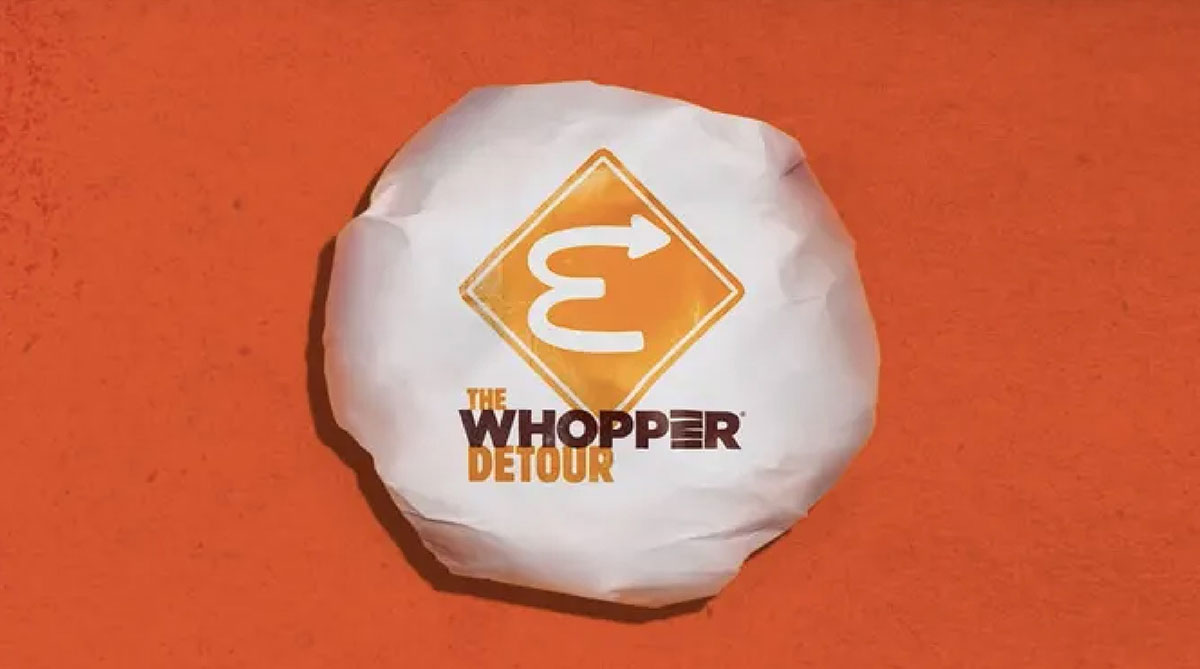
FCB New York • Format: A geofenced app promo offering a penny Whopper, unlocked only near a McDonald's.
Burger King turned thousands of McDonald's spots into its own ad network. Drive near a McDonald's, open the app, and order a Whopper for one cent.
It was cheeky, playful, and smart. This also won top honors at Cannes Lions in 2019 and pushed the app to the top of download charts.
Lesson: Ads don't have to be a poster. A mechanic can be the idea, turning a rival's turf into your billboard.
18. McDonald's — "Follow the arches" (2018)
Cossette (Canada) • Format: Outdoor billboards • Widely awarded, including at Cannes Lions.
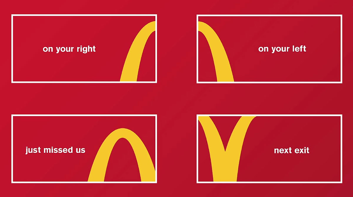
McDonald's cropped parts of its Golden Arches into curves and arrows. Each billboard pointed drivers to the nearest restaurant, with no words needed.
Only a brand with a truly iconic logo could pull this off. That's the whole point.
Lesson: A strong food logo can be cut apart and stay clear. Test if a piece of your mark still works alone.
19. KitKat — "Have a break, have a Kit Kat" (1957)
J. Walter Thompson • Copywriter: Donald Gilles • Format: TV and print, still in use.
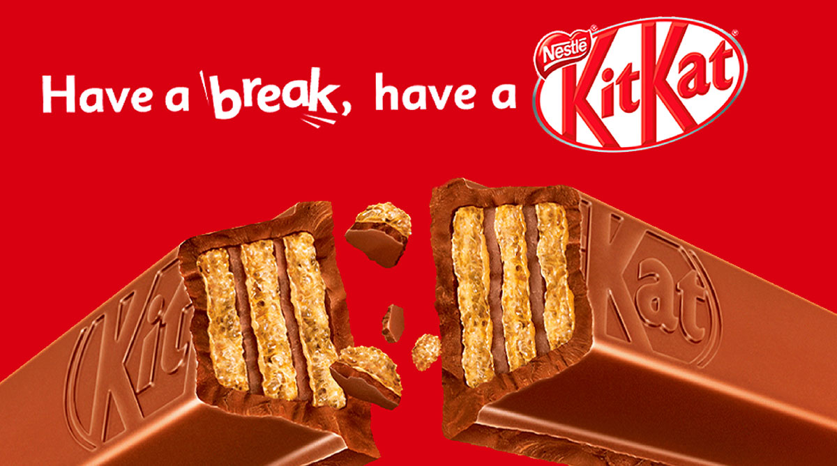
Kit Kat didn't talk about taste. It tied itself to a daily habit, the work break. The snap of the wafer became the sound of a well-earned pause.
Almost seventy years later, "have a break" still belongs to Kit Kat.
Lesson: Attach your food to a habit people already have. That habit does the reminding for you.
20. Marmite — "Love it or hate it" (1996)
BMP DDB • Format: TV and print • Still the brand's main platform.
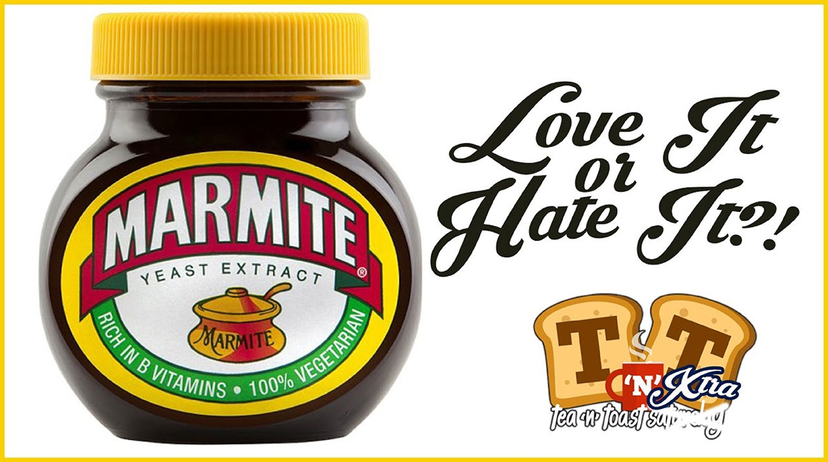
Marmite admitted something most brands never would: half of people hate it. Then it made that the whole campaign.
The honesty felt refreshing. Fans became proud defenders, and the phrase became part of everyday British speech.
Lesson: Polarizing taste is an asset. Naming the complaint out loud turns your fans into defenders.
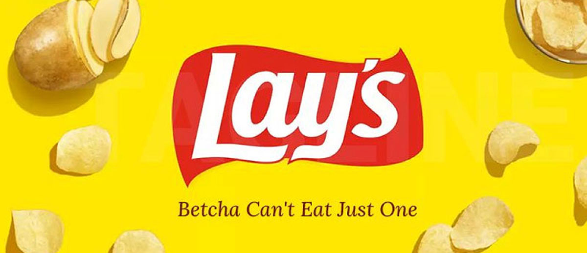
21. Lay's — "Betcha can't eat just one" (1963)
Brand: Frito-Lay • Format: TV • Star: Bert Lahr (the Cowardly Lion from The Wizard of Oz).
The idea: Lay's turned its tagline into a friendly dare. It spoke straight to you and dared you to stop at one chip. You never could. That fun tension kept the line alive for decades.
Lesson: Talking directly to you invites participation. A challenge spreads faster than a description.
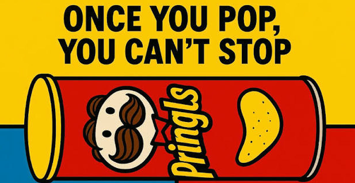
22. Pringles — "Once you pop, you can't stop" (1990s)
Pringles • Format: TV and packaging • Later remixed as "Once you pop, the fun don't stop."
Pringles turned the pop sound of opening its tube into a brand asset. That pop is a tiny moment of excitement. The ads put it front and center. This shows packaging can be part of the story, beyond just a container.
Lesson: A distinctive sound or gesture in your packaging is free sensory branding. Put it in the ad.
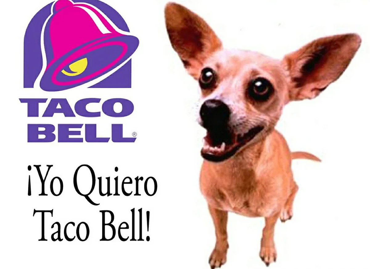
23. Taco Bell — "Yo quiero Taco Bell" Chihuahua (1997)
TBWA\Chiat\Day • Format: TV • Character: a talking Chihuahua.
A tiny dog with a big attitude carried one line. The Chihuahua played the customer, craving Taco Bell as you do. The mascot became a pop culture sensation. It grew bigger than the food, and the campaign ended.
Lesson: A character sticks in memory better than a product shot. But plan an exit before the mascot outgrows the food.
24. Doritos — "Crash the Super Bowl" (2006–2016)
Frito-Lay • Format: User-generated Super Bowl spots chosen by public vote • Ran for about a decade.
Doritos gave its fans the most expensive ad slot in America. Every day, people made commercials. The public voted. Winners aired during the big game.
Imagine a college student seeing their homemade ad play to 100 million viewers. That dream fueled the campaign for years.
Lesson: Co-creation earns attention twice, once during the contest and once when the ad airs. Give creators a tight format and a clear prize.
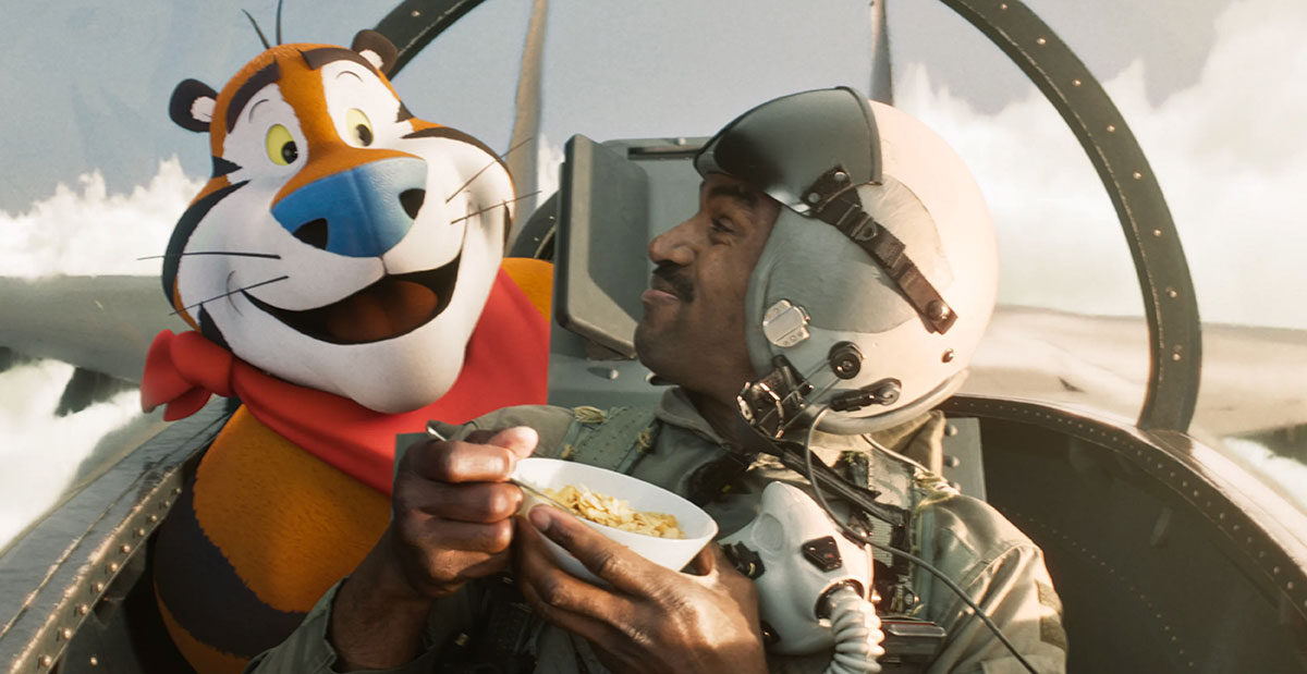
25. Kellogg's Frosted Flakes — Tony the Tiger, "They're gr-r-reat!" (1952)
Leo Burnett • Original character design: Martin Provensen • Format: Packaging, TV, and print.
Tony was designed for the cereal box first, the commercial second. His friendly face and growl in the tagline made him a breakfast table companion for generations of kids.
More than 70 years later, he still greets shoppers from the cereal aisle.
Lesson: Design characters for the shelf. If a mascot reads from arm's length in a store aisle, it will read anywhere.
Every one of these ads proves the same thing. One brave idea beats a thousand perfect food photos. Now let's see what patterns they share.
What creative patterns do the most famous food ads share?
Famous food advertisements choose one lever, whether it’s an occasion, tagline, demonstration, honest message, character, or mechanic, and use it consistently for years. Coca-Cola's Christmas trucks and Domino's public apology sit at opposite ends of that spectrum. The following chart shows the creative patterns the most famous food ads share, helping you identify which one fits your brand and what to watch out for.
Creative Pattern
Examples From This List
Best For
Watch Out For
Own an occasion
Coca-Cola Christmas, Kit Kat break
Brands with a natural "moment"
Needs years of consistency
Repeatable tagline
Where's the Beef?, Got Milk?, Betcha Can't Eat Just One
Challenger brands
Weak lines won't spread
Demonstration
Pepsi Challenge, M&M's shell
Products with a provable edge
You must actually win the test
Radical honesty
Moldy Whopper, Domino's, KFC FCK, Marmite
Brands fixing trust or perception
Must be backed by real change
Character or mascot
Tony the Tiger, Taco Bell Chihuahua
Family and snack brands
Mascot can outgrow the product
Mechanic or participation
Whopper Detour, Share a Coke, Doritos
Digital-savvy audiences
Requires tech and legal planning
10 Lessons you can apply to your own food advertising
Famous food ads all follow the same ten habits. Pick one idea. Stick to one color. Write lines people want to repeat. Treat packaging like free advertising. Coca-Cola and Domino's show that opposite methods can both work. These are the ten lessons you can apply to your own food advertising, starting with your very next campaign:
Pick one idea and hold it for years: Being consistent beats being new in food, since people buy often but barely notice ads. Coca-Cola's Christmas trucks and M&M's slogan show that repeating an idea builds love over time.
Make the product the hero, or cut it out completely: There's no middle ground. Cadbury's Gorilla ad and Heinz's missing ketchup bottle prove bold absence works. A weak product shot just looks like stock photography.
Own a color before you own a slogan: People spot color faster than text, even from far away or in a tiny thumbnail. Think of Cadbury purple or the Skittles rainbow. Check our guide to logo color combinations for ideas.
Write for the ear as well as the eye: Say your line out loud. "Where's the Beef?" and "I'm Lovin' It" work because they're fun to say. If a line feels awkward to speak, no one will repeat it.
Design for the smallest screen first: Most food ads now get seen at thumbnail size in a social feed. If your headline and image don't work on a phone, they won't work anywhere.
Use your packaging as media you already paid for: Every unit on a shelf gives you a free impression. Share a Coke and Pringles turned their containers into the ad itself.
Admit the flaw before your customers do: Domino's and KFC have shown that honesty can be a creative format, not just a PR move. That honesty makes people root for you.
Tie the product to a ritual: The work break, game day, road trip, or Friday pizza night. Kit Kat proves a habit reminds people about you better than any ad.
Give people something to finish: A dare, a gap, a missing ketchup bottle. Lay's and Heinz show that when people take part, they remember.
Build a system instead of one ad: Create templates, a type scale, a post color palette, and a steady alt text style so your campaign can grow without you. That's how Oreo could post in minutes.
These lessons are the "why." Next comes the "how," a simple checklist you can follow for your very next food ad.
How to design a food advertisement
A polished food ad is designed through a message, format, photography, type, color, sizing, compliance, and testing, followed in order every time. Skipping a step is why most campaigns fall apart. Here's how to design a food advertisement step by step, so your next campaign holds up from first draft to final scale.
Define one message: Taste, price, freshness, convenience, or values. Choose only one. Every famous ad above says a single thing clearly.
Choose the format: Social, print, menu, packaging, billboard, or video. Each has different crop and readability rules. A billboard gets only a few seconds of attention, so keep it to seven words or fewer.
Shoot or source the food properly: Use natural light, shallow depth of field, real texture, and props that don't compete with the food.
Set the type: Use one display font and one text font, with enough contrast to stay readable over a busy photo.
Lock the color palette: Pick two brand colors plus one appetite accent, such as red, orange, or yellow. Stick with them across every placement.
Export at the right sizes: Feed posts, stories, billboards, and print all need different aspect ratios and resolutions.
Check compliance: Review nutrition and health claims, allergen statements, "serving suggestion" labels, and rules for advertising to children. Rules vary by market, so confirm the current regulations wherever your ad will run.
Test, then scale: A/B test your hero image and headline with a small budget first. Put your money behind the winner.
Follow these eight steps, and your ad will share the same foundation as the famous food advertisement examples above.
Food advertisement example FAQs
Food ad FAQs include which ads became famous, what makes a campaign work, and brands' spending habits. In 2022, food and drink brands spent $7.5 billion on ads. These FAQs answer the top questions people ask before creating famous food advertisement examples. If your question is none of these, reach out to us directly with your question. We’re happy to answer.
No single ad wins this. But three names come up most often. Coca-Cola's Christmas campaign, "Got Milk?", and Wendy's "Where's the Beef?". Each earned its spot through decades of fame. They made a cultural mark beyond ads. And they had a simple idea people still quote today.
An effective food ad delivers one clear idea. It sparks an emotion or craving. And it's instantly recognizable as your brand. Strong visuals help. But famous ads succeed through a memorable concept. Think of a catchphrase, ritual, or surprising honesty. Photography alone isn't enough.
The main types include TV and streaming video, print, and billboards. Digital and social media, packaging, in-store displays, and influencer deals also count. Most successful brands mix several types. They use one core idea across every channel. This way each placement backs up the others.
Food brands spend billions each year in the US. Statista reports that food, beverage, and candy media spending totaled about $7.5 billion in 2022. Restaurants added roughly $9 billion more. Small businesses can start smaller, though. A few hundred dollars a month on local social ads works fine.
Red, orange, and yellow are the top colors in food ads. They link to energy, warmth, and appetite. Green suggests freshness and health. Brown and cream suggest comfort and craft. Pick the color your brand can own consistently.
The best fonts are bold, readable, and true to your brand. Chunky sans serifs suit fast food. Rounded fonts feel friendly for snacks and kids' brands. Elegant serifs or scripts fit bakeries and fine dining. Always test readability at thumbnail size.
Start with great phone photos, an eye-catching menu, and consistent social posts. Use your truck, storefront, and packaging as free ad space, and encourage customers to share photos. Our food truck branding guidelines and menu design service can help you look professional fast.
Yes. In the US, food ads must be truthful under FTC rules. The FDA regulates health and nutrient claims on labels. Allergen disclosure rules apply to packaged foods too. Ads aimed at children face extra scrutiny. Always check current rules with your market's regulator before publishing.
Endnote
Finally, we've reached the end of our delicious journey!
Every one of these famous food advertisement examples traded perfect polish for one owned idea. A rotting burger, a drumming gorilla, a three-word question. Simple ideas, told with courage.
A great food ad does more than sell a meal. It creates a memory people carry for years. It turns a snack into a ritual, a brand into a friend, and a customer into a storyteller. Before anyone takes a bite, your ad has already started to work its magic.
So, now it's your turn. Grab a notebook and sketch the single idea your food brand could own. Maybe it's a moment, a sound, a color, or a bold truth. Then, share it with a team that can bring it to life. Our experts at Graphic Design Eye offer a creative advertising design service for food brands like yours. Just get in touch and tell us your story.
Good luck creating a mouthwatering food ad that people will remember for years to come!
Graphic Design Eye LLC is a full-service creative agency built for brands that demand more than design — they demand vision. From strategic branding to complete visual identity, we partner with startups, agencies, and growing businesses as a dedicated creative force. With flexible subscription and project-based models. Let's start with us today!