Are you searching for the best social media post design ideas but unsure which ones actually move the needle for your brand? The posts that perform are built around intentional visual decisions, not guesswork, trends, or template luck.
The difference between a post that stops the scroll and one that disappears into it is not timing, budget, or luck. It is the design. Posts with visual content generate up to three times more engagement than text-only posts, and on every major platform, the visual is processed before the caption, the hashtags, and the call to action. If the design does not earn attention in the fraction of a moment it has available, nothing else about the post matters.
Social media post design is the intentional arrangement of layout, colour, typography, imagery, and branding to create compelling, on-brand graphics across platforms. Every visual decision serves a specific commercial purpose.
This guide is for creators, business owners, marketers, and social media managers who want their content to work harder. The ten ideas below are the ones the highest-performing brands use consistently to earn engagement, reach, and conversion from organic social content.
Creative Design Services
Graphic Design Eye LLC can help you create beautiful graphic designs. Fast, simple & affordable.
These 10 social media post design ideas are rooted in how people process visuals and how algorithms reward real engagement. Each one is ready to use; no design experience or big budget needed.
Design Idea
Top Platforms
Best For
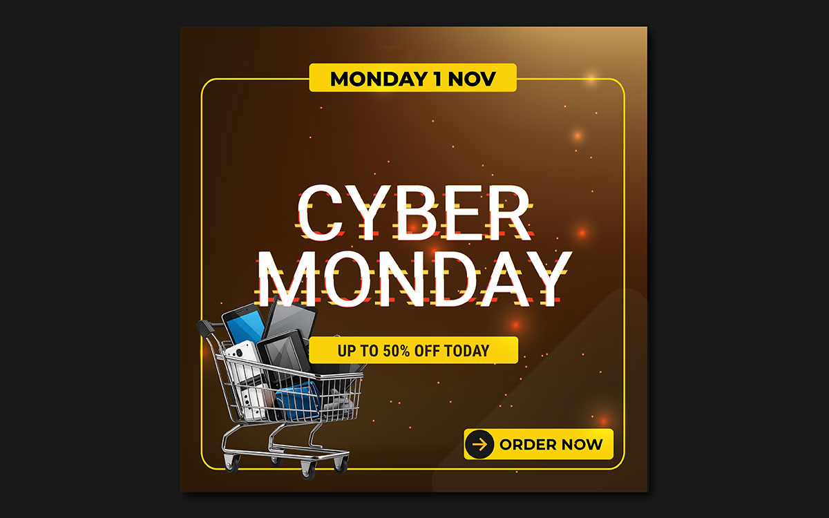
01. Bold Typography-First
Instagram, Pinterest, LinkedIn
Quote posts, announcements, stat callouts
02. Branded Colour Palette
All platforms
All posts requiring brand recognition
03. Carousel Layouts
LinkedIn, Instagram
Educational content, frameworks, step-by-step
04. Minimalist White-Space
Instagram, Pinterest
Luxury, coaching, finance, wellness, tech
05. Infographic Data Posts
LinkedIn, Facebook, Pinterest
Stats, comparisons, timelines, how-to steps
06. UGC Repost Frames
Instagram, Facebook, TikTok
Reviews, testimonials, customer photos
07. Behind-the-Scenes Aesthetic
Stories, TikTok, LinkedIn personal
Process content, day-in-the-life, team moments
08. Gradient Backgrounds
Instagram, Pinterest, Facebook
Brand posts, product launches, quotes
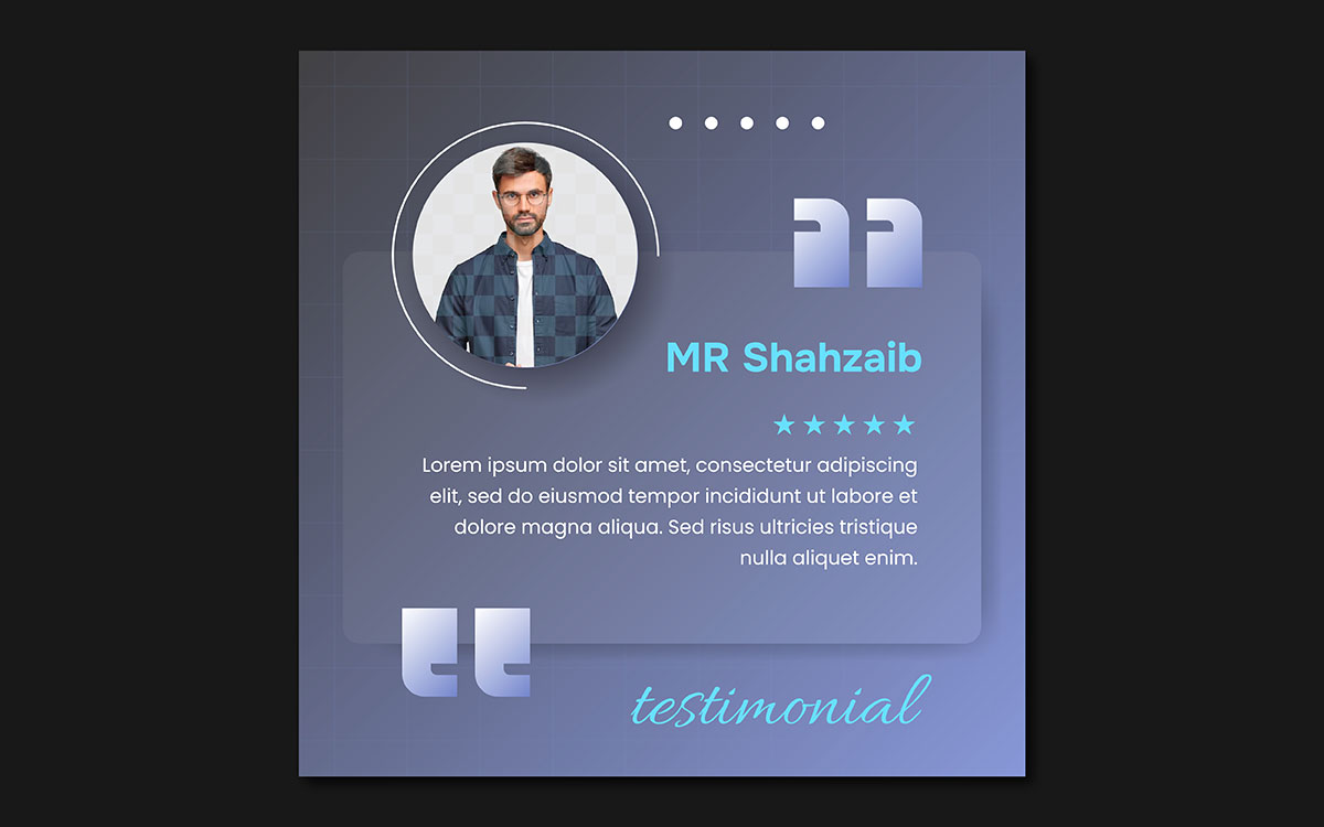
09. Quote & Testimonial Cards
Instagram, Pinterest, Twitter/X
Inspirational content, client results
10. Interactive Poll-Prompt
Stories, LinkedIn, Twitter/X
Engagement-first, community building
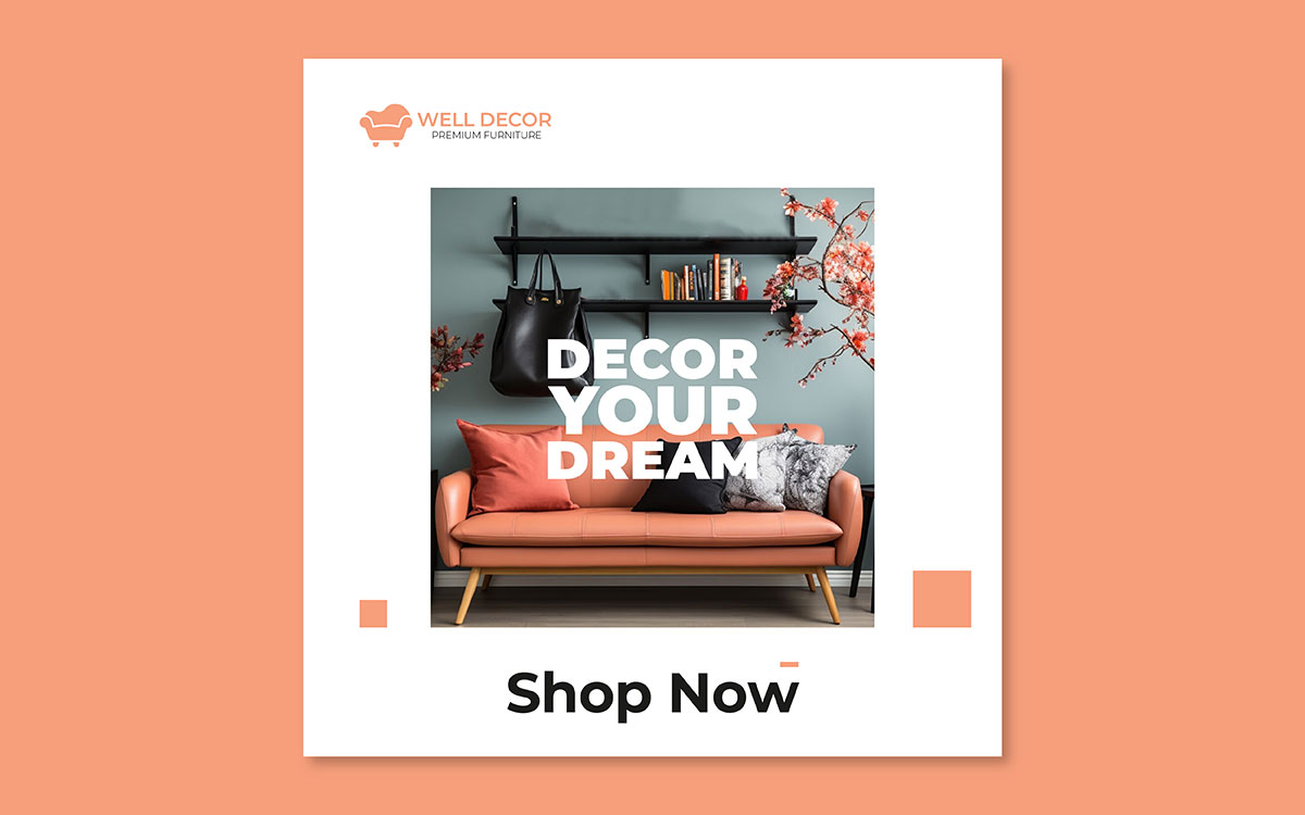
01. Bold typography social media post
Every brand's social media account hits a wall eventually. The photos run out, the video budget dries up, and all you have left is something to say. For brands that know how to work with typography, that moment is an opportunity.
Bold, type-first design puts large, expressive text front and center with little or no imagery. The words become the visual. When done well, this approach produces some of the most shareable, save-worthy content on Instagram, Pinterest, and LinkedIn. It delivers a complete thought in the time it takes to glance at a post.
What it is
A post built around typography uses oversized letterforms, bold font weight, and intentional spacing to create visual impact from text alone. The type is not a caption layered over an image. It is the image.
When to use it
Quote posts, announcements, motivational content, key statistics, product launches, and any message where the words speak for themselves.
How to execute it well
Font pairing is the most important technical decision. Use one display font paired with one clean, highly legible body font, and stick to that combination throughout your post. Contrast ratios matter too: WCAG AA requires a minimum of 4.5:1 for body text and 3:1 for large text against its background. Recommended tools include Canva, Adobe Express, Figma, and Picsart.
Quick tip: If it takes more than two seconds to read and understand, simplify. Cut every word that does not serve the central idea.
02. Branded colour palette consistency
Before a viewer reads a single word of a social media post, they have already registered its colour. Colour is the fastest form of brand communication available, and it is the one most brands use inconsistently, which is the same as not using it at all.
Why colour consistency builds recognition
Research consistently shows that consistent brand colour increases recognition by up to 80 percent. The most recognisable brands on social media have built that recognition through disciplined, repeated use of the same colours over time. Every time someone encounters those colours, the association between them and the brand grows stronger.
How to build a three-colour social palette
Primary colour: The dominant brand tone that appears most frequently across posts and backgrounds.
Secondary colour: A complementary shade used for section breaks, graphic elements, and supporting visuals.
Accent colour: Reserved for calls to action, highlights, and contrast. Used sparingly, so it immediately catches the eye whenever it appears.
03. Carousel and swipeable post layout
Carousels are one of the most underused formats in social media. As a swipeable multi-image post, they drive active engagement rather than passive scrolling, leading to longer dwell time, more saves, and more shares than nearly any other static format. According to LinkedIn data, carousels can generate up to three times more reach than single-image posts.
Recommended carousel structure (5 to 7 slides)
Hook: A bold claim or question that grabs attention and sparks enough curiosity that the viewer has to keep reading.
Problem or context: Why this topic matters to the viewer and what they risk by ignoring it.
Solution: The insight, framework, or steps that deliver on what the hook promised.
Evidence: A stat, case study, or real result that backs up the solution.
Call to action: One clear action for the viewer to take, visually distinct so it stands out from the other slides.
Design tips: Use a consistent slide template throughout for visual cohesion. On the first slide, show the edge of the next slide to signal that there is more to swipe through. The final slide should always include a call to action, styled distinctly to set it apart from the content slides before it.
04. Minimalist white-space social media post idea
Every element you add to a design competes for the viewer's attention. Every element you remove focuses it. This is the logic behind minimalist design, and why the brands most associated with premium quality are also the ones most associated with restraint.
The principle of negative space
White space is the area around and between design elements. Far from being empty, it gives the eye direction, naturally drawing attention toward isolated content. It improves readability, signals quality, and reduces the cognitive load that makes viewers scroll past busy designs.
When minimalism works best
This style works best for luxury brands, coaching and consulting businesses, financial services, technology companies, wellness brands, and personal branding. In these categories, visual restraint signals confidence; the brand does not need to shout to be heard.
Rule of thirds composition
Divide the canvas into a 3x3 grid and place the key visual element or primary text at one of the four intersection points. It creates natural visual balance and guides the viewer's eye through the composition in a way that central placement simply cannot.
Common mistakes to avoid
Overcrowding a minimalist design with too much text or competing visuals defeats the whole point. Low contrast text on a white background is hard to read and visually ineffective. Inconsistent margins and padding across posts break the clean aesthetic that makes minimalism work. Minimalism demands more discipline than complexity, not less.
05. Infographic-style data social media post
Data is inherently credible. A brand that communicates through data demonstrates research depth, subject matter expertise, and accountability. Visual data posts are three times more likely to be shared than text-only posts, and they consistently generate the saves and bookmarks that signal to algorithms that the content has genuine, lasting value.
Types of infographic formats
Comparison chart (A vs B): Two options, features, or approaches placed side by side with clear visual differences.
Timeline: Events or stages arranged in chronological order with a consistent visual flow.
Flowchart or decision tree: Branching paths that guide viewers to an outcome based on their situation.
Stat callout: One big number, one supporting statement; the most shareable single-insight format.
How-to steps: A numbered sequence of actions meant to be followed in order.
How to design one well
Pick one key insight. Choose the visual format that best represents it. Keep all labels under five words. If a label needs more than five words to make sense, simplify the data point before you start designing the infographic.
06. User-generated content repost frames
No design a brand creates about itself will ever be as persuasive as something a real customer created independently. User-generated content carries a quality that professional brand design cannot replicate: it was not paid for, not directed, and not produced with a commercial objective. UGC repost frames are the design approach that makes this authenticity usable at scale.
What UGC design involves
Framing real customer photos, reviews, or testimonials inside a branded template that looks polished without losing the authenticity of the original content. The goal isn't to make UGC look like brand content; it's to make it feel cared for and intentional while preserving the genuine customer experience.
Why does it build trust?
According to Nielsen, 92% of consumers trust peer recommendations more than brand content. UGC repost design combines the credibility of real customer voices with the visual quality of brand design, producing content that is both trustworthy and visually coherent.
How to design a repost frame
Use a branded border that draws from the colour palette without overpowering the customer's original content.
For logo placement, position it in the bottom-right corner at 10-15% opacity for established brands, or at full opacity in a small, contained format for brands still building recognition.
For testimonial overlays, make the pull quote the largest typographic element, with smaller attribution text below it and the brand handle as the smallest element.
Important; permissions
Always get explicit permission before reposting user-generated content. DM the creator directly, tag them visibly in the repost, or use a UGC rights management platform like TINT or Stackla to document consent. Reposting without permission creates legal risk and damages the community trust that makes UGC valuable in the first place.
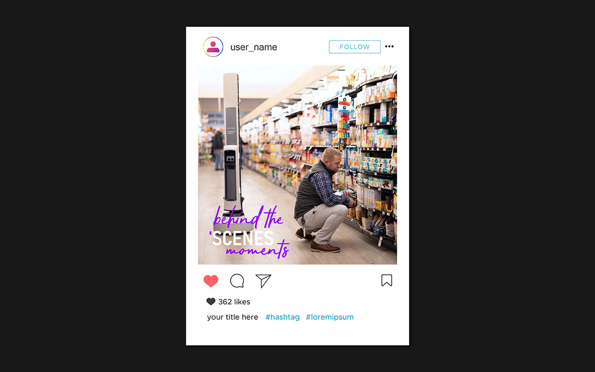
07. Behind-the-scenes and raw aesthetic
There's a paradox at the heart of social media in 2026: polished, produced content consistently underperforms raw, authentic content on the metrics that matter most to algorithms. Comments, saves, and shares come most reliably from content that triggers a genuine emotional response, and genuine emotion is triggered far more reliably by authenticity than by production value.
Why authenticity performs
Raw, unpolished content creates emotional relatability. When viewers see a real working environment, a real person, or a genuine moment in the brand's process, the psychological distance between brand and viewer shrinks. That shift drives engagement: people comment, save, share, or follow because the content feels personally relevant.
Design tips for candid posts
Natural window lighting beats artificial lighting for authentic content as it looks less staged. Plain fonts with no drop shadows and rough text placement reinforce that sense of authenticity.
Slightly off-centre compositions and visible real environments create the documentary feeling that makes behind-the-scenes content genuinely feel like behind the scenes.
Balancing authentic and branded
Add a subtle, consistent marker to every BTS post: a small watermark logo in the corner, a signature tonal filter, or a specific text style applied across all content in this category. This creates visual coherence without making individual posts look overly produced.
Best platforms: Instagram Stories, TikTok, and LinkedIn personal profiles.
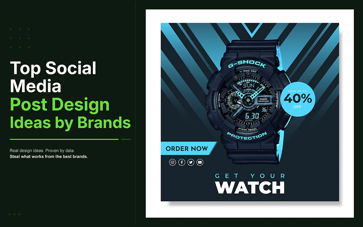
08. Gradient and colour wash background
After years of flat design dominance, gradients made a comeback in social media design between 2017 and 2019, partly driven by Instagram's logo redesign and the rise of mesh gradients and duotones. In 2026, well-executed gradients remain some of the most visually striking backgrounds available, as long as they're used with restraint and a clear understanding of what makes them work.
How to use gradients without looking dated
Stick to two or three complementary hues from the same color family as the brand palette.
Avoid rainbow gradients and neon combinations unless the brand identity specifically calls for them.
Use soft, fully blended transitions rather than abrupt color stops, which tend to look dated no matter how good the colors are.
Text legibility on gradients
Place a solid color overlay at 40 to 60 percent opacity between the gradient and the text layer, or use white text on a dark to medium gradient. Always test readability on a mobile screen and in low ambient light before publishing. Contrast ratio must meet the WCAG AA minimum of 4.5:1 for body text.
Recommended tools: CSS Gradient Generator (cssgradient.io), Canva gradient backgrounds, Figma gradient fill tool, and dedicated mesh gradient generators for more complex background treatments.
09. Quote and testimonial social media post
The quote card is one of the most enduring formats in social media design because it addresses a fundamental audience need: a thought, insight, or validation that can be absorbed in under three seconds and shared as a reflection of the viewer's own values or expertise. Inspirational quote posts drive saves and shares because they carry portable meaning; content people want to return to, and content they want others to associate with them.
Anatomy of a well-designed quote card
Pull quote: The main text, large and visually prominent, is designed to be read before anything else on the page.
Attribution: The person's name and title or source, in a smaller font directly below the quote and secondary to it.
Logo or handle: A small brand marker in the corner or bottom centre, visible enough to identify the brand but not competing with the quote.
Background: A solid brand colour, gradient, or light texture that adds visual interest without pulling attention away from the text.
Typography hierarchy
Quote body: 24 to 32 points, readable at thumbnail size.
Attribution text: 12 to 14 points, visually subordinate but clearly legible.
Brand handle or logo text: 10 to 12 points, the smallest typographic element in the composition.
Platform-specific formats
Platform
Recommended Format
Ideal Use
Instagram Feed
1:1 Square (1080×1080px)
Main grid posts
Pinterest / Facebook
4:5 Vertical (1080×1350px)
Maximum feed real estate
Twitter / X
16:9 Horizontal (1200×675px)
Timeline cards
LinkedIn
1.91:1 (1200×627px)
Article and post headers
10. Interactive social media post design
Passive consumption kills algorithmic reach. In 2026, social media platforms prioritize content that drives active engagement: comments, poll votes, shares, saves, and direct replies. Interactive and poll-based designs bake the invitation to participate right into the post itself.
What makes a design interactive on social media
Poll prompts, this or that graphics, fill-in-the-blank captions, question boxes, and choose your side visuals all explicitly invite a response or action. They aren't simply content to be consumed; they are conversational openings designed to look like content.
Design principles
The question or prompt should be the most visually dominant element on screen.
Option text must be at least 24 points, large enough to read at a glance.
Option A and Option B should each have their own distinct social media post color combinations, with enough contrast between them to make the choice instant and clear.
Platform-specific applications
Instagram Stories: Native poll sticker, quiz sticker, and slider.
LinkedIn: Native poll feature, up to four options, up to two weeks duration.
Twitter/X: Native poll feature, up to four options, up to seven days.
Static feed posts: Comment-A or B design prompts built into the graphic itself.
A well-executed this-or-that post can generate five to ten times more comments than a standard advertising post. Comment signals, poll votes, and saves are among the most heavily weighted engagement metrics on every major platform.
Social media post design idea FAQs
The answers below address each question directly, covering design quality, free tools, platform dimensions, template refresh cycles, and the five elements every effective graphic requires.
A good social media post design has a clear focal point, readable typography, a consistent colour palette, and one actionable message. It communicates the key idea in under three seconds and looks consistent across every platform. If the viewer's eye has no clear starting point, simplify the design.
The best free design tools for social media are Canva, Adobe Express, VistaCreate, and Picsart. All four offer templates, drag and drop editors, and brand asset storage at no cost. Canva is the most popular choice among non-professional designers, and VistaCreate stands out as the top free option for animated and video content.
Here are the recommended dimensions for 2026:
Instagram Feed: 1080×1080px
Stories & TikTok: 1080×1920px
Twitter/X: 1200×675px
LinkedIn: 1200×627px
Pinterest: 1000×1500px
Facebook Cover: 820×312px
Always design at the largest recommended resolution and scale down. Uploading the platform specs below forces upscaling, which reduces sharpness.
Full template redesigns make sense every six to twelve months, with minor updates quarterly. But the most reliable signal is performance, not the calendar. If engagement on template-based posts has dropped consistently over two consecutive months, the template has fatigued and needs updating, regardless of when it was last refreshed.
A strong social media graphic comes down to five things: a single dominant focal point, legible typography that fits your brand, a colour palette that stays on brand with enough contrast, a subtle logo or handle, and one clear call to action. Get all five working together, and the graphic performs.
Endnote
The best social media post design ideas don’t require you to post more. They require intention, consistency, and a clear understanding of what earns attention on each platform. Every idea in this guide exists because a brand applied it deliberately, and the results spoke for themselves.
The gap between knowing what works and executing it consistently is where most brands lose ground. Templates drift, palettes become inconsistent, and a visual identity that was sharp six months ago starts to feel like it belongs to a different brand. Considered design closes that gap.
If you are ready to move beyond one-off improvements, Graphic Design Eye LLC builds the design system and ongoing execution that makes consistency automatic rather than effortful. That is exactly what our social media design service is built to deliver.
Start with one idea from this guide and redesign one post this week. Then decide whether you want to scale that quality across every platform, every format, and every piece of content your brand produces.
Your audience is scrolling past someone else's content right now. Make sure yours is the reason they stop.
Graphic Design Eye LLC is a full-service creative agency built for brands that demand more than design — they demand vision. From strategic branding to complete visual identity, we partner with startups, agencies, and growing businesses as a dedicated creative force. With flexible subscription and project-based models. Let's start with us today!