How to design a nonprofit sponsorship proposal that a corporate decision maker actually reads past the cover? The answer is more structural than most organizations expect. Proposal design follows a fixed sequence of eight sections. Those are a personalized cover, an impact story, an audience profile, a visual tier menu, a benefits table, sponsor testimonials, a specific ask, and a preview of the reporting. Each one earns the reader's attention before the next section asks for more of it.
Most nonprofits treat the proposal like a formality. Just something wrapped around the real mission work. But people don't read a sponsorship proposal like a grant application. They don't read it like a donor letter either. It lands on a desk next to media kits and ad packages from companies whose whole job is winning marketing budgets. It gets judged by that same standard.
This guide shows what proposals earn a meeting instead of a polite no. You'll learn how to build each of the eight sections. You'll see what a five-tier sponsorship structure should look like at every investment level. You'll spot where most proposals lose the reader before the ask even comes.
By the end, you'll have a template you can personalize in minutes.
How to design a nonprofit sponsorship proposal
If you long to learn how to design a nonprofit sponsorship proposal, you must follow eight sections in a specific order: cover page, organization story, audience profile, tiered menu, benefits table, social proof, the ask, and reporting preview.
This order builds credibility first, then makes the marketing case, then closes with clear next steps sponsors can act on.
01. Cover page
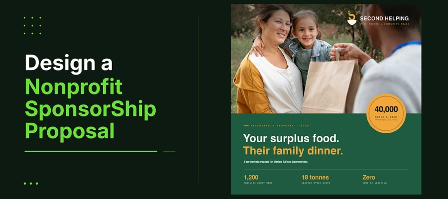
What it contains: The org name and logo, event name and date, the prospect's name and brand mark, personalized for each recipient, plus one great photo of the organization's best work.
Why it wins sponsors: The cover is the first big design moment. Within seconds, the decision-maker judges the organization's credibility. That judgment shapes how they read everything else. A cover with the prospect's logo shows personalization, research, and real interest in that partner. A generic cover with only the nonprofit logo shows mass distribution. And the mass distribution shows no one considered whether this company belongs in the partnership.
The cover also carries the heaviest load for the organization's visual identity. That's why a clear nonprofit branding strategy makes every future proposal faster to build and more consistent to receive.
DESIGN TIP
Design a unique cover for each major prospect. Put the prospect's logo next to the nonprofit's logo at the top. Use a full bleed photo as the background. Add a see-through overlay in the event colors. Set the title in large text: "[Company Name] Partnership Opportunity, [Event Name] [Year]". This takes five minutes per cover. But it creates a first impression a generic cover can't match.
02. Organization story in data and human impact
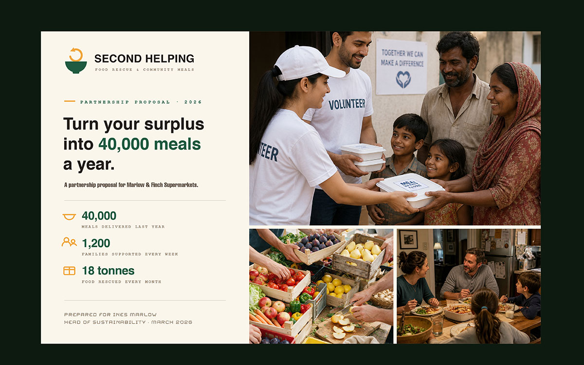
What it has: A two-page spread. The right page shows key stats visually. These include people served, years running, reach, and results. The left page has one beneficiary story, about 150 words, with a photo.
Why sponsors love it: Companies check two things here. First, does the group create real, measurable impact? The data proves that. Second, can they connect to this cause emotionally? Can they share it with their own stakeholders? The story proves that. Both must be there. Both must be readable in under a minute. Data alone reads like a report. Story alone reads like a plea.
Make the data page look like a visual, not a paragraph. Use icons, big numbers, and short labels instead of sentences. Add a small source note under each stat.
The story page needs a photo covering at least 40 percent of the page. Show the beneficiary's first name in large type. Write the story as one paragraph.
End with a line linking that one story to the bigger need.
03. Audience profile that speaks to marketing objectives
What it contains: One page showing who attends your events and supports your cause, in terms marketers care about: age, income, job sector, location, and social media reach. Audience profile is an important element you should master when learning how to write a nonprofit sponsorship proposal.
Why it wins sponsors: Sponsors are making a marketing choice with a charity angle. This page answers what the marketing team asks first: does this audience match our customer or brand goals? Skip this, and you have missed the most important part of the pitch. Mission talk elsewhere will not make up for it.
Media reach is one of the strongest numbers a proposal can show. It grows each year for groups that know how to get media attention, since every new round of coverage adds to this number.
DESIGN TIP
Show audience data visually. Use demographic bars, a geographic map, and reach figures instead of paragraphs. Include follower counts and average engagement rates for main platforms.
If past events have media coverage data, include estimated reach with attribution. Frame every number in marketing terms. Call attendees potential brand impressions.
04. Tiered sponsorship menu
What it contains: A two-page spread showing four to five sponsorship tiers. Each has a name, an investment amount, and a short list of benefits. The tiers are laid out clearly. Each one looks different from the others.
Why it wins sponsors: This menu is the money part of the proposal. It has to show the value clearly right away. A decision maker should glance at this page and get the tiers, the price range, and how the benefits differ. All in under thirty seconds, without reading the text. Good visual design makes that happen. A plain table with equal rows makes the reader figure out the hierarchy on their own. People in a hurry will not do that work.
DESIGN TIP
Design the menu as tiers, not one flat table. Put the presenting tier on top. Make it bigger and stand out more. Use the event colors, but treat each tier differently. Mark the top or most popular tier with a badge. Give each tier one exact price, not a range. A clear number removes room for haggling. It also shows transparency.
05. Benefits table in business language
What it includes: A table that turns every sponsorship benefit into real business terms. Logo placement comes with material type and audience size. Social media mentions come with follower counts. Speaking slots come with estimated audience size. Email mentions come with list size and open rate.
Why sponsors like it: Most nonprofit benefit tables just list what they offer. They don't show its value. "Logo on event materials" only tells you what you get. "Logo on 500 event programs distributed to an audience with a median household income of $85,000" tells you what that's worth. The table should translate value, not just list what's offered. That difference turns a request into a real offer.
A proposal is meant to persuade. It carries a business argument. So it needs the same care as a presentation and pitch deck design: one idea per page, clear structure, and no page that exists just out of habit.
DESIGN TIP
Add a third column called Estimated Marketing Equivalent Value. For each benefit, look up what similar exposure would cost through paid ads. For example, what do 500 premium print impressions cost in direct mail? What does a spot in a 2,000-person email list with a 35 percent open rate cost in email marketing? Label the column clearly as an estimate. Done honestly, this shows the sponsorship is good value compared to paid options.
06. Social proof section
What it contains: Two or three quotes from past sponsors, with their name, company, and job title. A photo from a past event showing sponsor branding. A summary from a past report showing real results.
Why it wins sponsors: Proof from others is the most convincing part of any sponsorship pitch. It answers the question every new sponsor secretly asks: will this group actually deliver? Past sponsors who got what they were promised, and say so publicly, give the strongest proof there is. Nothing the organization says about itself matters as much as one line from a company that already paid.
That photo only works if the sponsor display looked good enough to photograph. That gets decided way earlier, when the event materials are designed.
DESIGN TIP
Ask every sponsor for a testimonial after each event. Ask for two sentences about their experience. You'll use these in future partnership proposals. Keep testimonials current. An old testimonial from three years ago hints recent sponsors weren't excited enough to give one. Add a photo of the sponsor logo on the recognition display or step and repeat.
07. Specific ask and next steps
What it contains: One page. It shows the recommended tier for this prospect, the total cost, the deadline to sign, and two or three next steps with named contacts and how to respond.
Why it wins sponsors: Most proposals end with a vague invite to talk. That's the weakest ending. A proposal that names the tier, states the price, sets a real deadline, and gives clear steps on how to design a nonprofit sponsorship proposal to remove doubt. That doubt is often why interested prospects wait, then miss the deadline. Being unclear isn't polite. It's usually why a good conversation goes quiet.
DESIGN TIP
Recommend a specific tier based on research done before the proposal. State it clearly: "Based on [Company Name]'s CSR priorities and our event's audience, we believe Gold Partnership best fits your goals." Add a real deadline. Give two contact options, phone and email, each with a specific person's name.
08. Post-partnership reporting template preview
What it contains: A one-page preview of the report the organization sends every sponsor within 30 days. It includes attendance numbers, media reach, social media stats, logo impression estimates, and photos of sponsor branding in action.
Why it wins sponsors: Most proposals skip this part, but it works well. If a sponsor sees exactly what report they'll get, they trust the organization more. They believe promises will be kept and proven. That trust lowers the risk they feel. And feeling less risk is what turns a hesitant sponsor into a committed one.
The report itself is a multi-page document. It gets shared inside the sponsor's company. So it should be designed properly, not thrown together in a word processor at the last minute.
DESIGN TIP
Design the preview as a one-page sample. Use placeholder data from a past event. Show the format, not real numbers. Add an icon for each metric type. Cover attendance, reach, impressions, and coverage. Include one sample photo of sponsor branding in use. The section sends one message. We've done this before. We track what we deliver. This is what accountability looks like.
5 Tier nonprofit sponsorship structure
A standard nonprofit sponsorship proposal template structure uses five tiers: Presenting Sponsor ($10,000+), Gold ($5,000 to $9,999), Silver ($2,500 to $4,999), Bronze ($1,000 to $2,499), and Community Partner ($500 to $999). Each tier pairs an investment range with matching benefits and design treatment, from full colour logo placement at the top tier to name-only recognition at the entry level.
Name
Investment Range
Key Benefits
Design Treatment
Presenting Sponsor
$10,000+
Logo on all materials, banner presence, social posts, speaking slot, VIP table
Full-colour logo at the largest placement, named in the headline as "Presented by [Name]"
Gold Sponsor
$5,000 to $9,999
Logo on program and event signage, 2 tickets, social mention
Large logo, prominent program placement, dedicated sponsor page in the program
Silver Sponsor
$2,500 to $4,999
Logo on program and website, 1 ticket, social mention
Medium logo, program section footer, website sponsor gallery
Bronze Sponsor
$1,000 to $2,499
Name in program, website listing
Name set in text, website listing, thank-you acknowledgment at the event
Community Partner
$500 to $999
In-kind or small cash support, community acknowledgment
Name in program, social thank-you post
Nonprofit sponsorship proposal design FAQs
This FAQ answers eight common questions teams ask about how to design a nonprofit sponsorship proposal. It covers how to structure the document. What sections to include. The ideal length. How to build sponsorship tiers. Why proposals get rejected. How sponsorship differs from a donation. When to send it. And whether to send a PDF or a printed copy.
Make a personalized cover with the prospect logo. Show your impact with visual data and one human story. Add an audience profile in marketing language. Build a visual tier menu. Turn benefits into business value. Include recent testimonials. End with a clear ask and deadline.
It needs eight parts: a personalized cover, your story told through data and human impact, an audience profile in marketing terms, a tiered menu with investment amounts, a benefits table showing marketing value, sponsor testimonials, a clear ask with a deadline, and a reporting preview.
Aim for 8 to 12 pages, cover and reporting preview included. Corporate reviewers often skim for just a few minutes at first. Every section must build the business case. Longer proposals risk getting set aside before reaching the ask.
Use four or five named tiers. Give exact investment amounts, not ranges. Make the difference between each tier clear. The presenting tier should stand out visually. Base amounts on the real marketing value of the benefits, not round numbers.
Usually the design fails to build credibility. Benefits get listed as deliverables instead of business value. The audience profile is missing. Or the ask is too general, not tailored to the prospect. Most failures happen in design and framing, before anyone even reads the content.
No. A donation comes from the philanthropy or CSR budget and gets judged on mission fit. A sponsorship comes from the marketing budget, counts as a marketing expense, and gets judged on audience reach and brand exposure. Mixing the two up sends your proposal to the wrong department.
Send it four to six months before the event. Go earlier for large companies, since their budgets are set yearly. Arriving just eight weeks out means competing for money already spent. Ask each prospect when their budget cycle closes, then plan for next year around that.
Send a designed PDF first. It moves easily between marketing, finance, and leadership. Save a printed copy for in-person meetings with named prospects, where a polished document has more impact than a screen. Design both from the same file to keep them consistent.
Endnote
Understanding how to design a nonprofit sponsorship proposal comes down to a single shift in thinking. The document is a marketing deliverable long before it is a mission statement, and it earns a reader's trust in that order.
Agreeing with this shift is easy. Doing it alone is hard. Small teams without a design person struggle most.
Each of the eight sections needs real design skill, from a personalized cover to a benefits table with real value. Most in-house teams can't deliver that regularly. That's the gap Graphic Design Eye LLC's nonprofit creative subscription plan fills. You get our dedicated designers who turn a prospect's CSR priorities into a personalized cover and tier recommendation in a day.
If your last proposal went quiet after the cover page, the mission probably wasn't the problem. The document usually was.
Rebuild it once, properly. Every prospect after gets the version that actually gets read.
Graphic Design Eye LLC is a full-service creative agency built for brands that demand more than design — they demand vision. From strategic branding to complete visual identity, we partner with startups, agencies, and growing businesses as a dedicated creative force. With flexible subscription and project-based models. Let's start with us today!