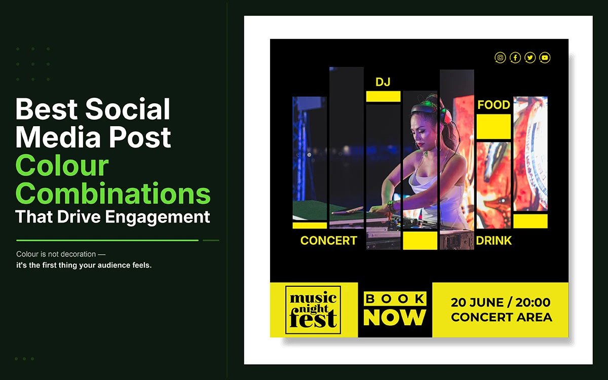
Are you struggling to choose the best color combinations for social media that make your brand impossible to scroll past? The answer lies in color psychology. Once you understand it, every post you design will work harder for your brand.
Before anyone reads a single word of your post, before the caption registers or the call to action lands, the brain processes the color and decides whether the content is worth attention. That judgment takes roughly 90 milliseconds.
Research from the University of Winnipeg found that up to 90 percent of snap judgments about products are based on color alone. A separate study in the journal Management Decision found that color boosts brand recognition by up to 80 percent.
Yet most brands treat color as an afterthought, picking shades based on personal taste or vague aesthetics rather than deliberate strategy. The result is posts that look polished in isolation but fail to communicate. For a deeper foundation, our guide to color psychology in marketing is worth reading before you go further.
This guide covers 25 proven combinations used by today's top-performing brands. Each one includes hex codes, the psychological mechanism behind it, the content types it suits best, the platforms where it performs most reliably, and specific application guidance.
Here's what actually works.
Creative Design Services
Graphic Design Eye LLC can help you create beautiful graphic designs. Fast, simple & affordable.
The following best color combinations for social media are built on color psychology, platform behavior, and real brand performance. Each includes hex codes, content types, platform fit, and brand tips. Whether you are building a new visual identity or refining an existing one, every palette here is ready to apply today.
#
Combination
Identity
01
Coral + Navy Blue
The Bold Authority
02
Yellow + Black
The Attention Magnet
03
Purple + Gold
The Premium Signal
04
Teal + White
The Clean Authority
05
Orange + Deep Blue
The Dynamic Contrast
06
Hot Pink + Black
The Bold Disruptor
07
Sky Blue + Cream
The Serene Trust
08
Red + White
The Urgency Classic
09
Charcoal + Lime
The Urban Edge
10
Earthy Tan + Forest Green
The Organic Authority
11
Indigo + Peach
The Dreamy Creative
12
Amber + Dark Brown
The Heritage Warmth
13
Mint + Blush Pink
The Fresh Romance
14
Slate + Bright Orange
The Professional Pop
15
Black + Gold
The Luxury Standard
16
Lavender + Charcoal
The Elegant Contrast
17
Neon Green + Black
The High-Energy Disruptor
18
Rose Gold + White
The Aspirational Minimal
19
Deep Teal + Coral
The Vibrant Duo
20
Electric Blue + Yellow
The Sportswear Classic
21
Burgundy + Cream
The Refined Authority
22
Sage Green + Off-White
The Organic Calm
23
Dusty Pink + Navy
The Soft Power Combo
24
Burnt Orange + Dark Brown
The Autumn Warmth
25
Cobalt Blue + Gold
The Prestige Pairing
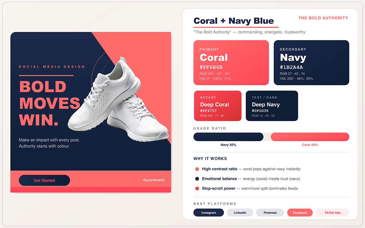
01. Coral + Navy Blue — The Bold Authority
When a brand needs to communicate warmth and authority at the same time, Coral and Navy Blue is one of the most reliable combinations in social media design. It carries the emotional depth of a luxury brand and the visual impact of a direct response ad; a rare and powerful combination.
Why It Works
Coral's warmth grabs attention instantly, while navy blue provides a trustworthy, authoritative backdrop. The high contrast between a warm tone and a cool, deep neutral creates a visually striking tension that works across all content formats, from square posts to wide ads. Physiologically, coral activates emotional centers tied to warmth, enthusiasm, and approachability; navy signals stability, depth, and institutional trust.
Best Content Types
Quote cards, product shots, carousels, infographics, sale announcements, and thought leadership content.
Brand Tip: Brands like Airbnb and Glossier use coral tones to balance energy with trust. For better click-through rates, keep body text in navy, use coral for CTAs and headlines, and let white space breathe between the two tones. Avoid splitting them 50/50; the 60-30-10 rule works really well here.
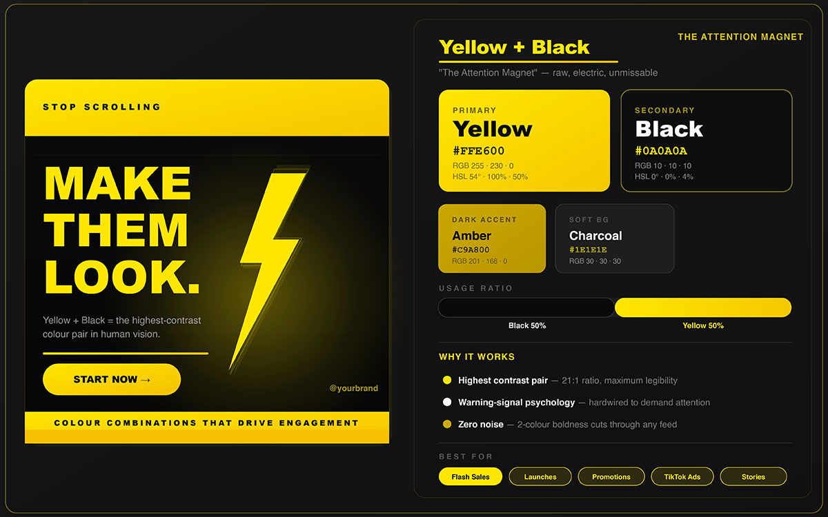
02. Yellow + Black — The Attention Magnet
There's a reason this combination appears on warning signs, high-visibility workwear, and the world's most recognizable brands. Yellow and black isn't subtle; it's engineered to be seen. For social media posts meant to drive immediate action, this is your most reliable visual weapon.
Why It Works
Yellow and black is the highest contrast warm and neutral pairing in design. Yellow triggers the brain's alertness response while black grounds it with authority; a combination used in warning signs worldwide precisely because it's impossible to ignore. The contrast ratio between pure yellow and pure black is among the highest achievable in any two-color design system, ensuring legibility even at thumbnail scale.
Brand Tip: Used heavily by Snapchat and IKEA. For social posts, make yellow the dominant background (60%) with black text and icons. This ratio gives you the best legibility and memorability. Avoid using yellow as a text color; it reads poorly at small sizes against anything other than pure black or dark navy.
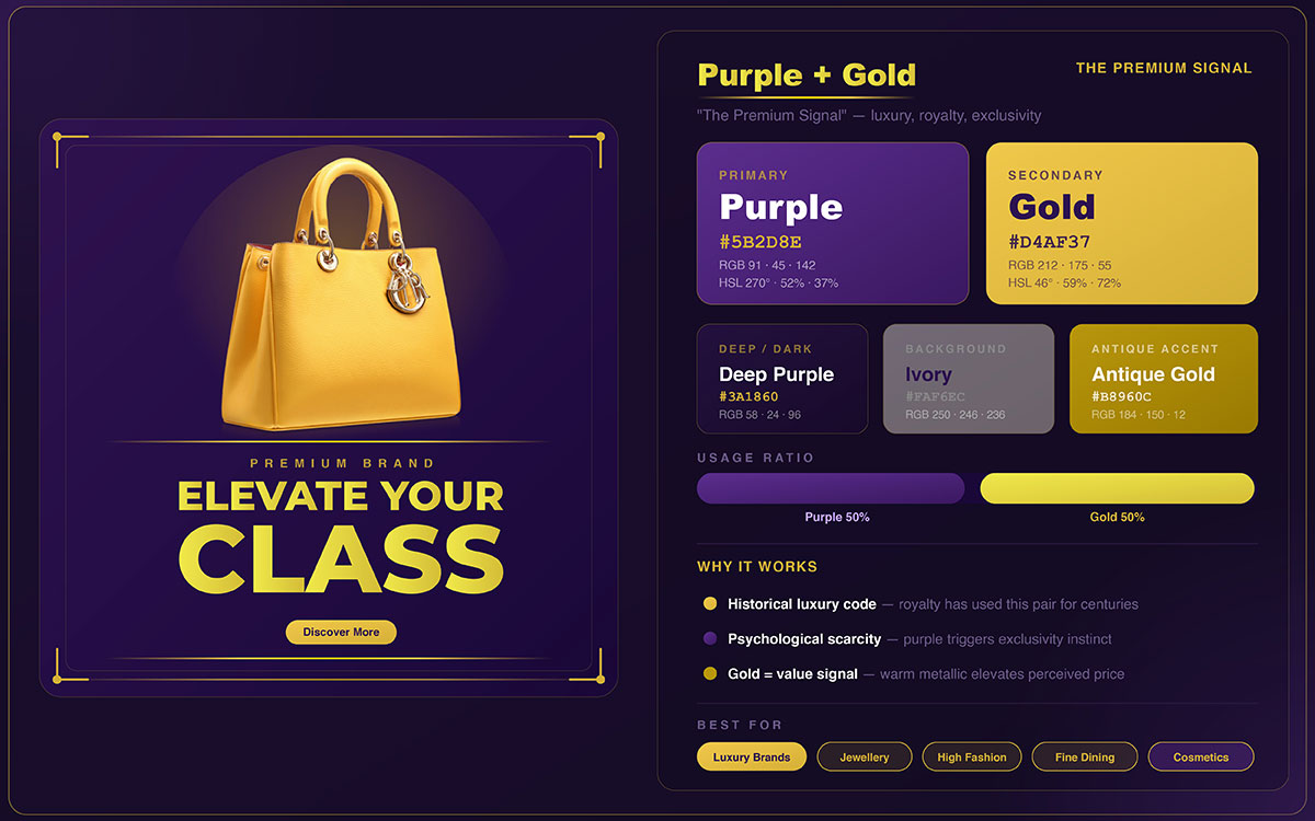
03. Purple + Gold — The Premium Signal
Some color combinations speak for themselves. Purple and gold is one of them. From ancient kingdoms to modern luxury brands, this pairing has signaled premium quality for centuries, and it still does the same on social media feeds today.
Why It Works
Purple has long symbolized royalty and exclusivity across nearly every major civilization, while gold signals wealth, achievement, and lasting value. Together, they create a powerful sense of prestige that sparks aspiration in viewers. The combination works because it hits two notes at once: status through gold, and exclusivity through purple.
Best Content Types
Award announcements, luxury product reveals, milestone posts, motivational quotes, course and program launches.
Brand Tip: This combination works best for coaches, course creators, and luxury service brands. Cadbury and Hallmark both use purple as a core signal of premium value. When applying this palette, stick to true gold tones in the #D4AF37 to #C9972A range rather than bright yellow; the difference between gold and yellow is the difference between luxury and budget.
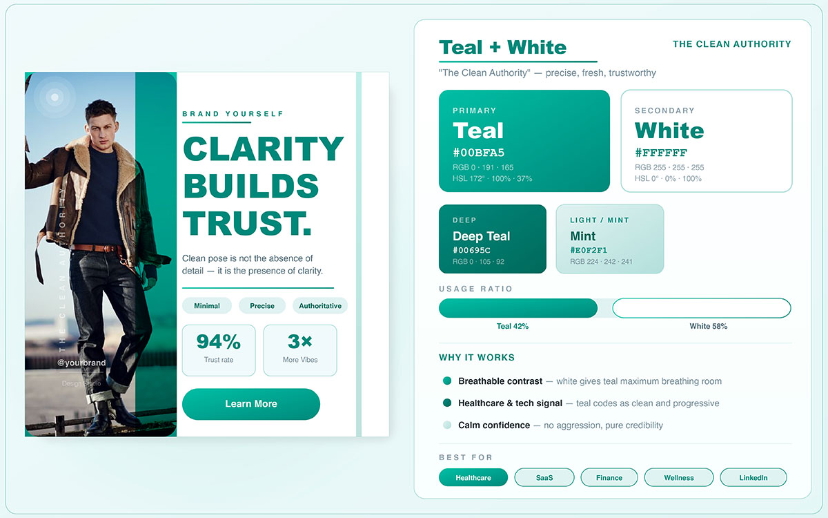
04. Teal + White — The Clean Authority
If your brand needs to show expertise, credibility, and modern professionalism without the coldness of corporate blue, Teal and White is your most efficient palette. It feels trustworthy, fresh, and approachable all at once; a balance that is hard to pull off with just two colors.
Why It Works
Teal blends the trust of blue with the energy of green, making it feel both reliable and forward-thinking. White adds breathing room and clarity, letting teal stand out without being overwhelming. Together, they create a look that feels modern, credible, and fresh; exactly what health, tech, education, and finance brands need in their social content.
Best Content Types
Infographics, data visualizations, educational carousels, thought leadership content, tips posts, and professional announcements.
Brand Tip: Brands like Robinhood and Canva use teal as their primary brand color. It works especially well for educational content where trust and clarity matter most. To add depth, pair your main teal with a 10% deep teal accent (#006D6F); this creates dimension without disrupting the clean look.
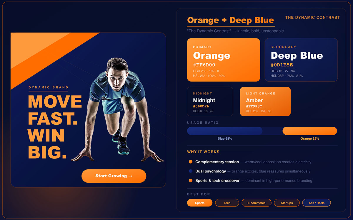
05. Orange + Deep Blue — The Dynamic Contrast
Orange and deep are one of the best color combinations for social media. They don't just complement each other; they compete for attention in a way that makes every post feel alive. This combination is made for brands that want to stand out while still communicating authority and trust.
Why It Works
Orange and deep blue sit directly opposite each other on the color wheel, so they naturally create a bold, energetic contrast. Orange feels urgent, enthusiastic, and approachable; deep blue feels reliable, grounded, and authoritative. That tension between the two is exactly what makes them work so well together. The eye keeps moving between them, generating the kind of visual engagement that social algorithms tend to reward.
Best Content Types
Product launches, sports and fitness content, motivational posts, event promotions, campaign launches, and deadline-driven CTAs.
Brand Tip: Amazon and Firefox both use this exact combination as their core brand identity. Research consistently shows that complementary color pairs are among the most attention-grabbing choices in consumer-facing design. Use orange for CTAs, headlines, and focal points, with deep blue as the structural background. This ratio drives strong click-through rates in paid social environments.
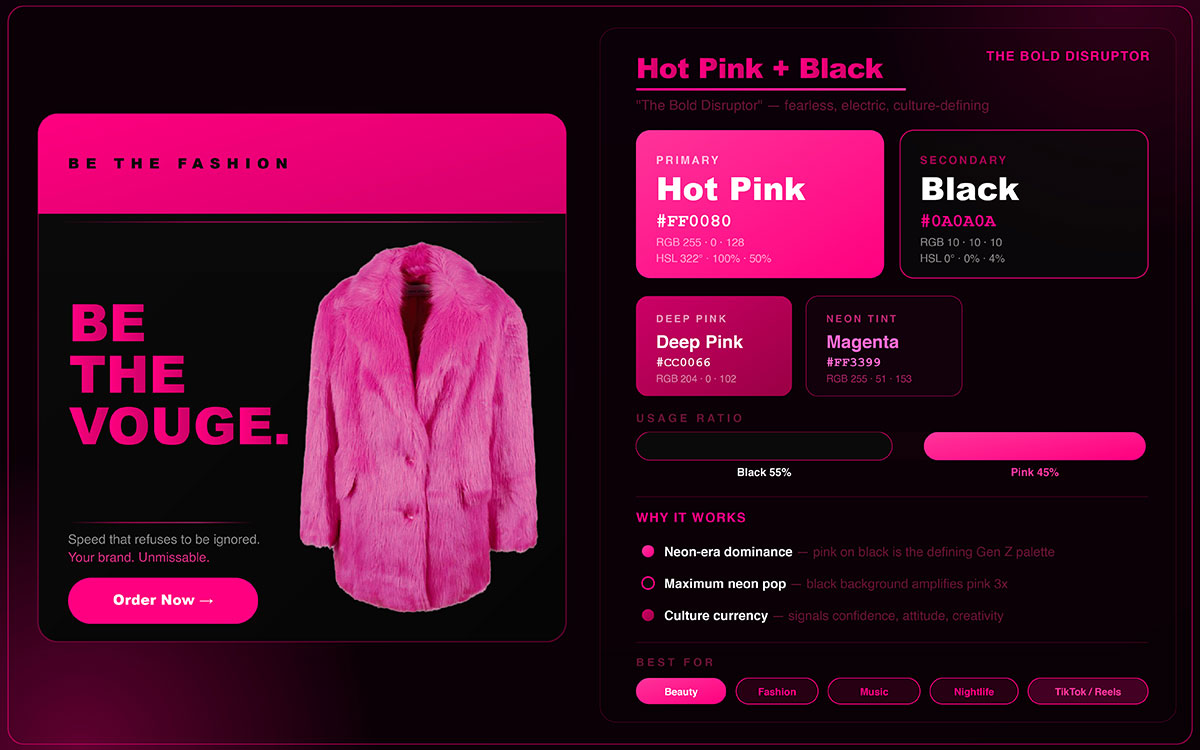
06. Hot Pink + Black — The Bold Disruptor
This combination doesn't apologize for existing. Hot Pink and Black isn't meant to fit in; it's built to shatter the visual monotony of every feed it enters. For brands targeting younger, trend-forward audiences, it's one of the most culturally powerful color signals available.
Why It Works
Hot pink on black is a bold, unapologetic combination. It communicates confidence and creativity, making it a natural fit for brands targeting younger, trend-forward audiences. The high contrast keeps it readable at any size, and its cultural ties to bold expression give it an emotional impact that goes well beyond the visuals alone.
Best Content Types
Fashion reels, bold quote cards, product drops, nightlife and event content, Gen Z targeted campaigns, beauty content.
Brand Tip: Barbie's viral 2023 cultural moment showed just how powerful this combination can be at scale; it became one of the most recognized brand aesthetic moments in recent marketing history. This works best when hot pink is used as a precise accent (20 to 30%) against a dominant black background, rather than an equal 50/50 split. Equal distribution can feel overwhelming; asymmetry is what makes it elegant.
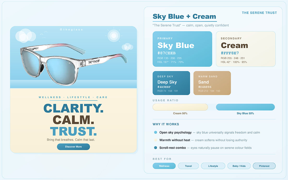
07. Sky Blue + Cream — The Serene Trust
Not every social media post needs to be loud. Some of the most saved and shared content on Instagram and Pinterest earns its engagement through something quieter: warmth, safety, and genuine care. Sky Blue + Cream is designed for exactly that.
Why It Works
Sky blue brings a sense of openness, calm, and clarity, while cream adds warmth that keeps the combination from feeling cold or impersonal. Together, they create a safe, welcoming aesthetic that people naturally associate with reliability, comfort, and honest communication. This makes the pairing especially effective for brands centered around personal care, family, education, and wellness.
Best Content Types
Wellness and mental health content, educational carousels, morning routine posts, parenting and family brands, self-care guides, and nutrition content.
Brand Tip: Avoid pure white as the lighter tone in this pairing; cream is the deliberate choice that gives the combination its warmth and sets it apart from a colder, more clinical blue and white look. This palette tends to drive exceptionally high save rates for how-to and tips content, especially in the wellness and parenting spaces.
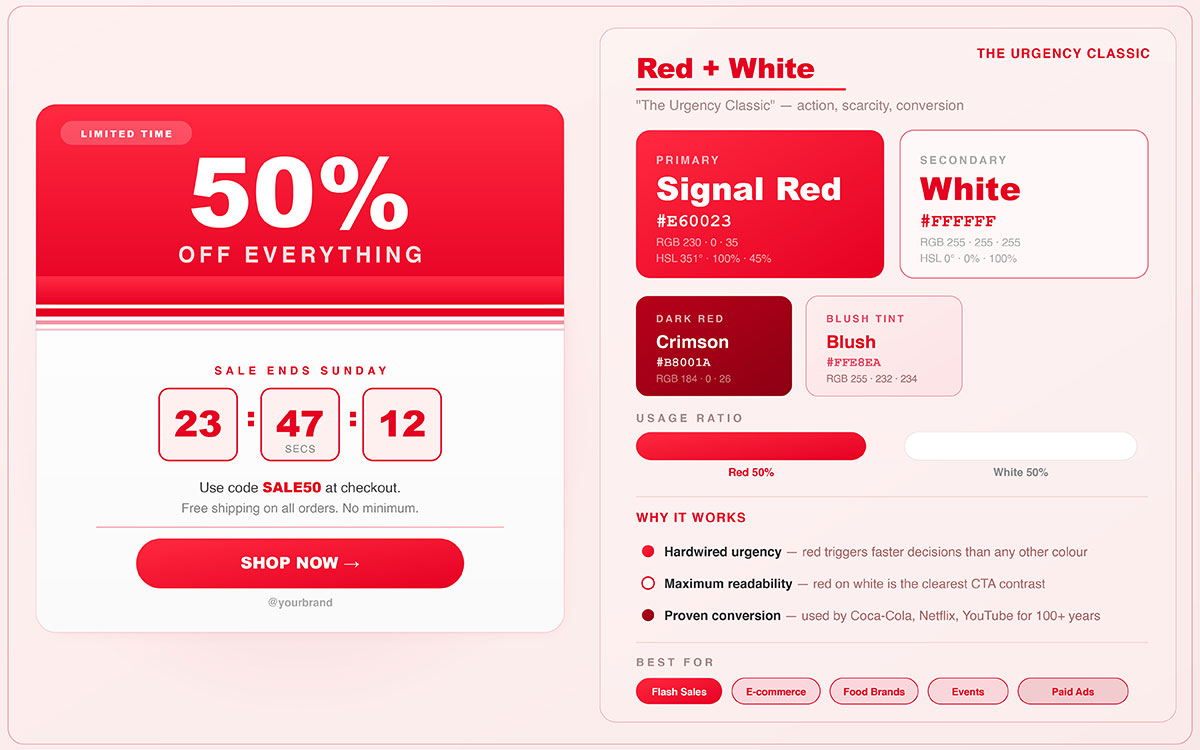
08. Red + White — The Urgency Classic
Red and white isn't a trend. It's a proven system, grounded in psychology, that drives attention and action. Decades of marketing research and real-world brand performance back it up. When your content needs urgency, this combination is the standard.
Why It Works
Red is the most attention-grabbing color in the world. It raises heart rates, creates urgency, and speeds up decision-making. White maximizes contrast and clarity, making the message easy to read even in fast-scrolling feeds. Together, they communicate immediacy, importance, and clear action in a single frame.
Best Content Types
Sale and promotion posts, limited-time offers, food and beverage content, breaking news, alerts, and event countdowns.
Brand Tip: Coca-Cola, YouTube, and Netflix all use red and white as their primary palette; three of the most recognized brands in consumer culture. In A/B testing, red and white consistently drive the highest click-through rates for promotional content. For best results, use red as a border, background block, or CTA button rather than full bleed; strategic placement beats saturation every time.
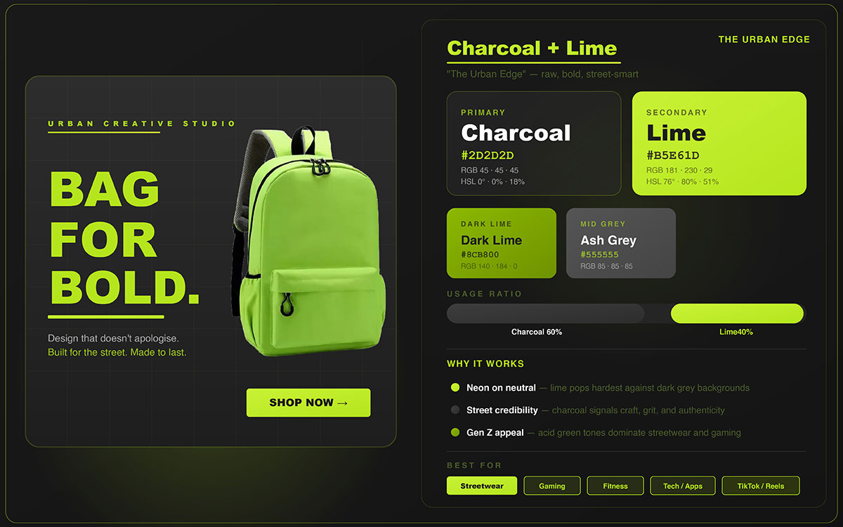
09. Charcoal + Lime — The Urban Edge
Charcoal and lime are a bold, unapologetic combination. It's the visual signature of brands that live at the crossroads of sophistication and disruption, and it has steadily become a defining palette in tech, fitness, and sustainable fashion.
Why It Works
Deep charcoal brings a sophisticated, almost architectural neutrality, while lime green delivers a jolt of unexpected energy. The pairing feels futuristic, urban, and self-assured, standing out sharply from the pastel-heavy, warm-toned aesthetic that floods most lifestyle feeds. The contrast between a deep, cool neutral and an electric warm green creates a visual tension that reads as confident and contemporary.
Best Content Types
Tech content, fitness and performance posts, sustainability campaigns, streetwear and urban fashion, gaming content, and innovation narratives.
Brand Tip: This palette is trending in sustainable fashion, urban fitness, and tech startup spaces. Use charcoal as the dominant base tone (around 70% of the visual space) and treat lime strictly as an accent to avoid visual fatigue. Lime works best in small doses; a headline, a border, a CTA button. It loses its impact fast when overused.
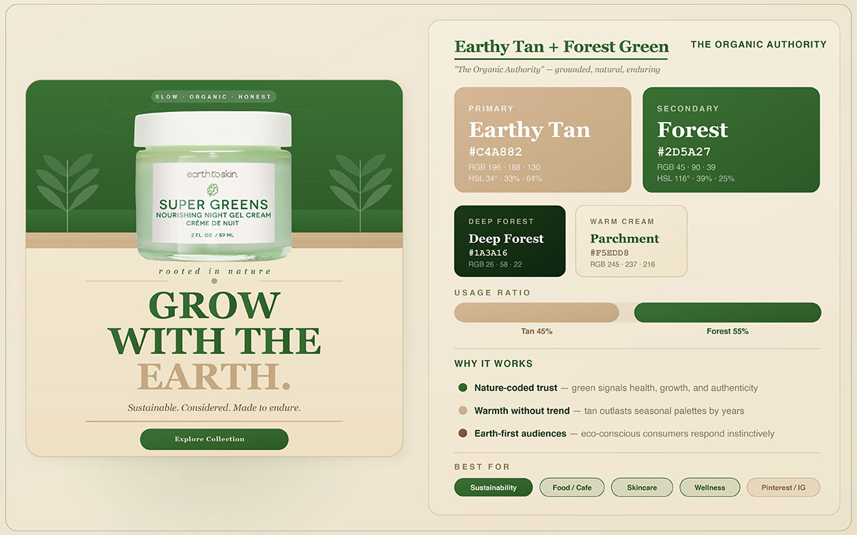
10. Earthy Tan + Forest Green — The Organic Authority
As consumer culture shifts toward conscious consumption, the brands winning on the best color combinations for social media are those whose visual identity reflects values. Earthy Tan and Forest Green are the palette that does this most naturally.
Why It Works
This pairing comes straight from nature: tan calls to mind soil, stone, and raw fiber, while forest green brings to mind trees, growth, and living systems. Together, they create an organic aesthetic that resonates with eco-conscious audiences and positions brands as genuine voices in the sustainability conversation, not just trend followers.
Best Content Types
Food and ingredient photography, sustainability campaigns, outdoor and adventure brands, travel and nature content, wellness and nutrition.
Platform Fit: Instagram, Pinterest, TikTok.
Brand Tip: Whole Foods, Aesop, and Patagonia all build on variations of this earth green palette as their visual foundation. This combination consistently drives high save rates on Pinterest, especially for recipe, product, and nature content. It works best for brands centered on sustainability, natural ingredients, or environmental stewardship.
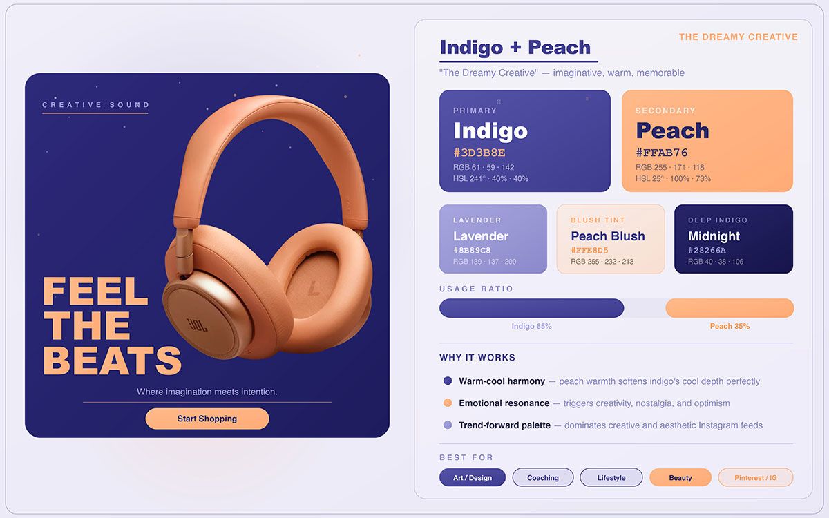
11. Indigo + Peach — The Dreamy Creative
Not every color combination on social media works through bold contrast. Some, like Indigo and Peach, create something quieter; an unexpected pairing of depth and softness that draws viewers in and makes them linger. For brands built around creativity, individuality, and crafted beauty, this palette stands out as one of the most distinctive choices available.
Why It Works
Indigo's depth and mystery balance perfectly with peach's softness and warmth. This unexpected pairing creates a dreamy, creative aesthetic that feels both sophisticated and genuinely inviting, something rare in social media design, where most palettes lean heavily in one direction. The tension between indigo's introspective depth and peach's outward warmth mirrors the creative process itself.
Best Content Types
Beauty and skincare content, independent creator portfolios, art and design posts, morning inspiration content, podcast cover graphics, boutique product launches.
Platform Fit: Instagram, Pinterest, Facebook.
Brand Tip: A consistent favorite among independent creators and boutique beauty brands. This palette photographs exceptionally well in flat lay compositions. Use peach as the dominant background tone and indigo for typography, graphic elements, and accents. The combination looks beautiful in both square and portrait formats.
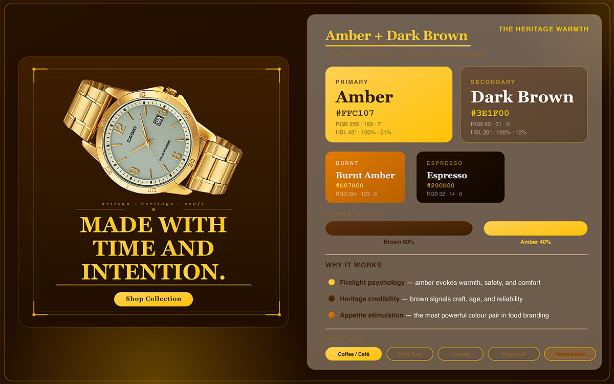
12. Amber + Dark Brown — The Heritage Warmth
Some color combinations feel fresh and modern. Others communicate something more powerful: heritage, craft, and the reassurance of proven quality. Amber and dark brown belong firmly in that second category, making them an extraordinary asset for brands built on artisanship and authenticity.
Why It Works
Amber's warm glow and dark brown's deep earthiness come together to suggest craftsmanship, heritage, and authenticity. The combination stirs feelings of nostalgia, quality, and intentional making; associations that work especially well for artisanal, food, and heritage brands in markets where provenance and process matter just as much as the product itself.
Best Content Types
Coffee and cafe content, food photography, recipe posts, artisan product shots, seasonal autumn campaigns, whisky, chocolate, and craft food brands.
Platform Fit: Instagram, Pinterest, Facebook.
Brand Tip: This palette is widely used by craft coffee roasters, premium chocolate makers, and whisky labels around the world. It performs especially well in Q3 and Q4 seasonal content calendars. Natural light photography brings out the warmth of this combination beautifully; controlled artificial lighting tends to flatten the amber tones and reduce their emotional impact.
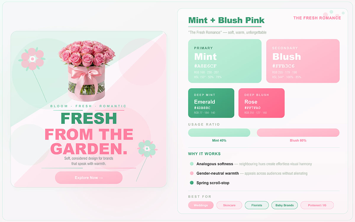
13. Mint + Blush Pink — The Fresh Romance
Mint and blush pink is one of the most versatile soft palettes in social media design; gentle, fresh, and broadly appealing without feeling generic. It holds a distinct emotional space, at once modern and romantic, making it just as effective for beauty launches as it is for seasonal lifestyle content.
Why It Works
Mint and blush are soft, approachable tones that together create a fresh, gentle, and romantic feel. The pairing looks modern and feminine without being overwhelming, which makes it appealing to a wide range of people. The two colors work well together because both carry positive associations; mint evokes freshness, cleanliness, and lightness, while blush brings warmth, tenderness, and care.
Best Content Types
Beauty and skincare launches, Valentine's Day and seasonal romantic content, self-care and wellness posts, wedding and celebration content, and lifestyle product reveals.
Platform Fit: Instagram, Pinterest, TikTok.
Brand Tip: This palette has been a consistent trend in beauty and lifestyle for years, and it shows no signs of fading. It performs especially well in Reels and Stories. Keep mint as the dominant background tone (60%) and use blush as the accent; this balance keeps the look fresh and light. Flipping the ratio can make the aesthetic feel too sweet.
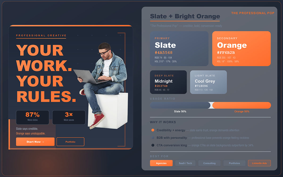
14. Slate + Bright Orange — The Professional Pop
Standing out on LinkedIn without losing professional credibility is a constant challenge in B2B social media design. Slate and bright orange solve this problem well; they combine the authority of a calm, professional palette with just enough energy to make sure your content gets noticed.
Why It Works
Cool slate and bright orange work well together. The slate brings maturity and professionalism, while the orange adds a precise, energetic lift. Together, they strike the right balance between credibility and personality; exactly what professional service and B2B brands need to stay trustworthy and genuinely engaging on social media.
Best Content Types
B2B content, thought leadership, tech product posts, webinar promotions, and professional portfolio highlights.
Platform Fit: LinkedIn, Twitter/X, Instagram.
Brand Tip: Highly effective for SaaS branding color palettes, consulting firms, and professional service brands seeking to differentiate on LinkedIn without compromising authority. Orange CTAs on slate backgrounds consistently drive strong click-through rates in professional content. This palette also works especially well at banner and cover image scale.
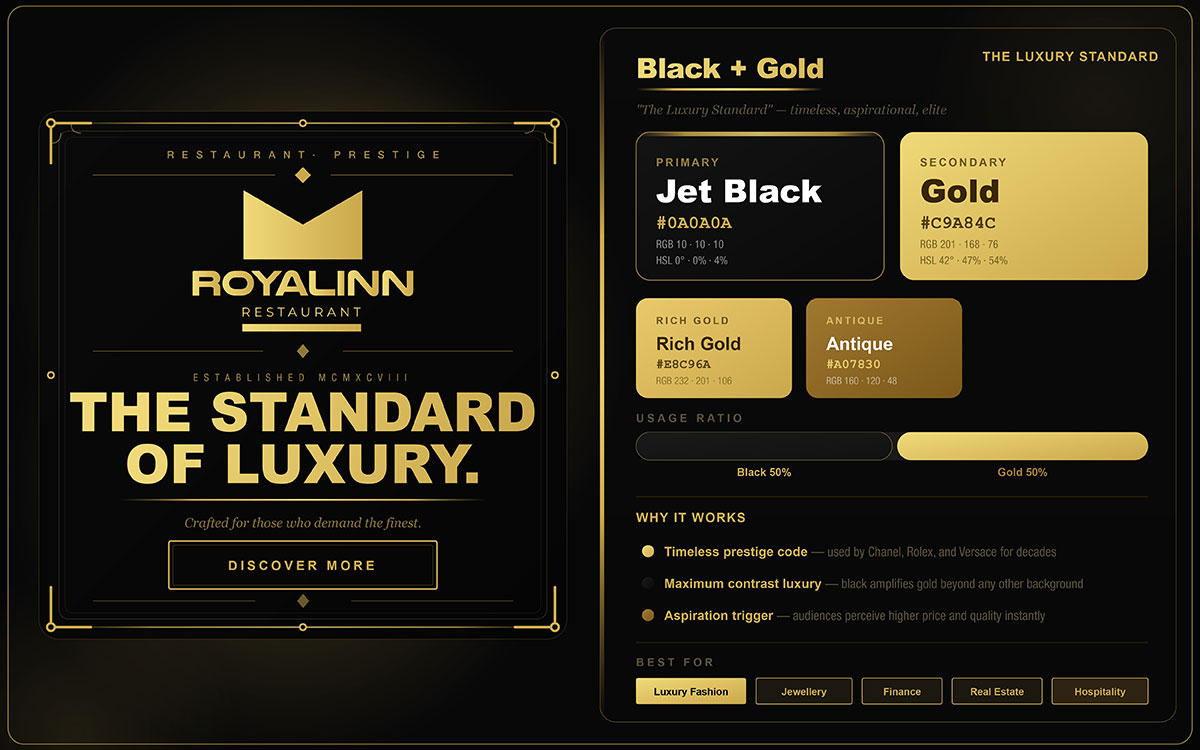
15. Black + Gold — The Luxury Standard
Black and Gold is one of the best color combinations for social media, as they endured centuries of luxury branding, from royal seals to haute couture to the world's most coveted financial institutions. Black and gold don't just suggest premium positioning; they announce it with complete authority. When your brand needs to communicate the highest level of quality and exclusivity, this is the definitive palette.
Why It Works
Black and gold is the definitive luxury combination, used across high-end fashion, finance, and hospitality worldwide. Black brings a sophisticated, uncompromising elegance that draws attention without demanding it, while gold signals exclusivity and premium quality at a glance. Together, these two tones carry centuries of cultural association with wealth, mastery, and distinction.
Best Content Types
Luxury product reveals, prestige brand announcements, award and milestone content, premium service promotions, and high-value offer launches.
Brand Tip: Chanel, Rolex, and leading financial institutions all use this as their primary palette. This combination looks best in controlled lighting; natural light can shift gold tones toward yellow and weaken the luxury feel. Stick to true gold tones in the #D4AF37 to #B8860B range rather than bright yellow. Less is more with gold; keeping it to 15–20% of the visual space reads far more luxurious than using it at 50%.
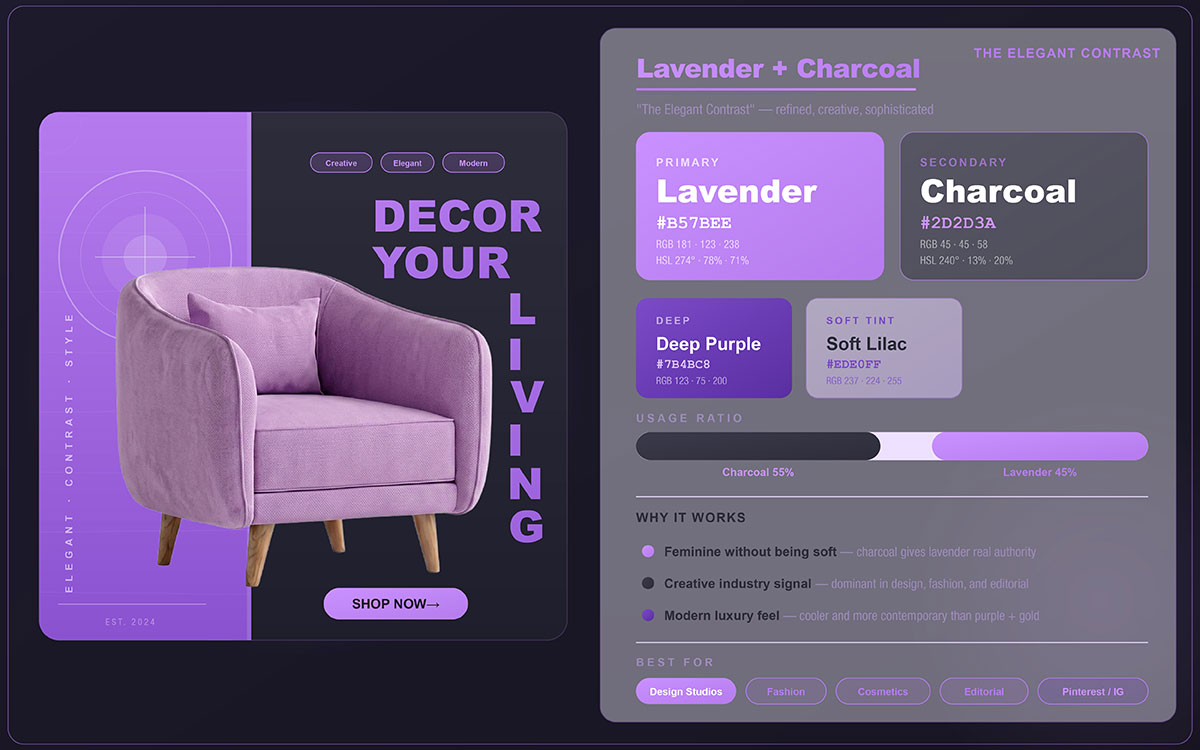
16. Lavender + Charcoal — The Elegant Contrast
The most sophisticated combinations often look effortless. Lavender and charcoal are exactly that: surprisingly strong together, consistently elegant, and easy to read across any content format.
Why It Works
Soft lavender paired with deep charcoal makes for a luxurious yet highly readable combination. The purple undertones in lavender bring creativity, calm, and a sense of thoughtful refinement, while charcoal adds the weight and seriousness that keeps the palette from feeling frivolous. Together, they read as creative intelligence rather than pure aesthetics.
Best Content Types
Wellness coaching content, inspirational quote cards, Instagram Story covers, beauty brand posts, therapy and mental health content, and coaching and personal development.
Platform Fit: Instagram, Pinterest, TikTok.
Brand Tip: Works especially well for wellness coaches, therapists, breathwork facilitators, and boutique beauty brands. Lavender backgrounds with charcoal typography are highly legible and perform well in Story format CTAs. Choose charcoal over pure black; the subtle warmth keeps the look soft and approachable, which is exactly what makes this combination so effective.
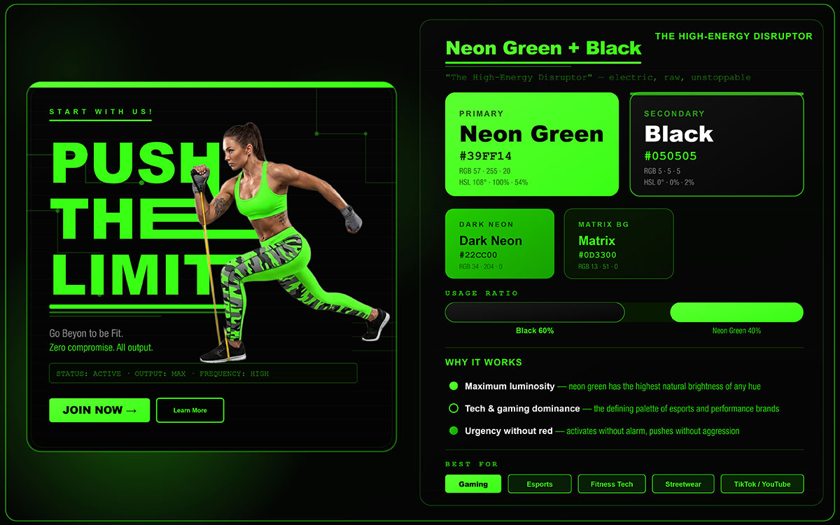
17. Neon Green + Black — The High-Energy Disruptor
This combination doesn't just follow social media trends; it sets them. Neon Green and Black are the visual language of digital native culture, gaming, and a generation raised on high contrast, always-on media. For brands targeting Gen Z and younger millennials, it's one of the most culturally precise signals you can use.
Why It Works
Neon green against black is about as high contrast as it gets, and it works in both light and dark settings. The combination triggers an instinctive alertness that stops scrolling more reliably than almost any other pairing. It holds up across OLED, standard LCD, and print, making it a versatile and genuinely disruptive palette.
Best Content Types
Technology and app launches, gaming content, streetwear and sneaker drops, fitness and performance challenges, Gen Z targeted campaigns.
Brand Tip: This palette is trending strongly in tech, gaming, and Gen Z brand communities. The most important rule: use neon green as a strict accent, covering only 10 to 20% of visual space, never as a dominant color in text-heavy posts. At high saturation, neon green causes rapid eye fatigue and turns actively unpleasant within seconds. Its impact depends entirely on restraint.
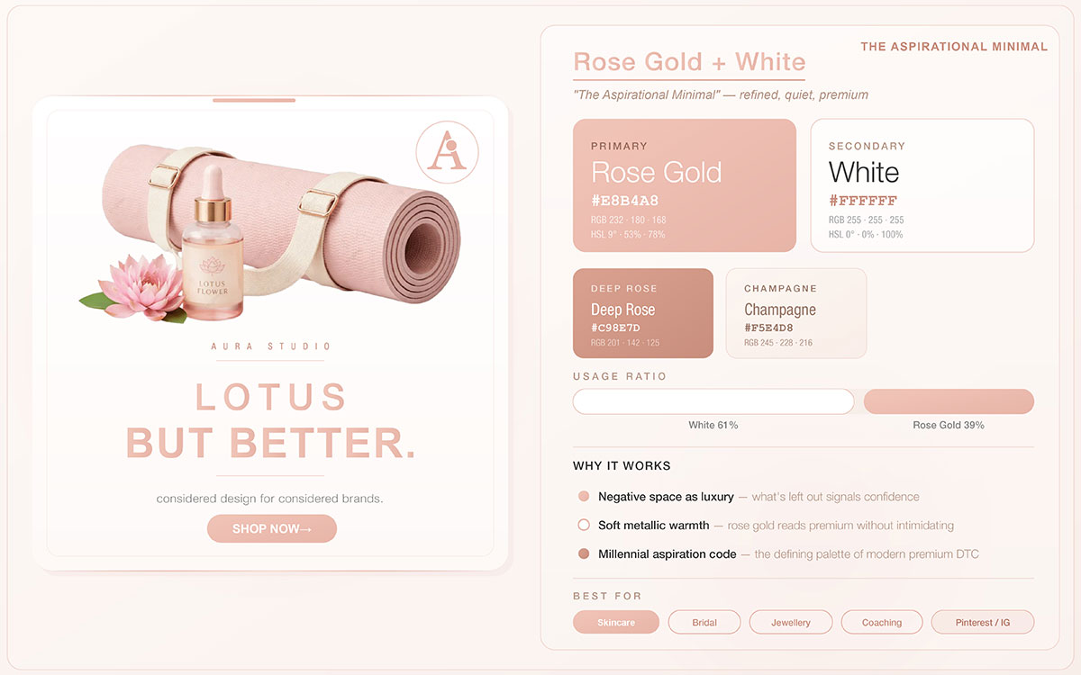
18. Rose Gold + White — The Aspirational Minimal
Some color combinations capture a cultural moment, and others outlast it. Rose Gold and White defined an era and have since grown beyond trend status into a lasting visual standard for premium personal brands, beauty, and lifestyle content.
Why It Works
Rose gold is timeless, premium, and beloved across all kinds of people. It holds a unique place psychologically, sitting between warmth and sophistication; it signals quality without the coldness of silver or the flashiness of yellow gold. Against white, it feels aspirational yet accessible, luxurious yet personal. That balance is exactly what gives this combination such lasting appeal.
Best Content Types
Beauty and skincare product posts, wedding and celebration content, jewelry and accessories promotions, personal brand content, and aspirational lifestyle posts.
Platform Fit: Instagram, Pinterest, Facebook.
Brand Tip: A sustained performer throughout the 2020s on Instagram, this palette continues to deliver above-average engagement in beauty, personal brand, and lifestyle categories. Use white as the dominant background (60%) with rose gold as the accent in typography, frames, borders, and decorative elements. This ratio keeps the look clean and premium, exactly what makes the combination work at its best.
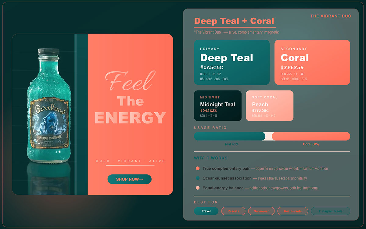
19. Deep Teal + Coral — The Vibrant Duo
Some color combinations are beautiful. Others are strategically powerful. Deep Teal and Coral are both. It's a true complementary pairing that creates immediate visual excitement while staying elegant, balanced, and broadly appealing across content categories and platforms.
Why It Works
A true complementary pair sits directly across from each other on the color wheel. The warm and cool tension between coral's vibrancy and deep teal's depth creates natural visual excitement; dynamic and energetic without tipping into chaos. Their color wheel relationship means each tone actively boosts the other's saturation and luminosity, making both appear more vivid together than apart.
Best Content Types
Travel and destination content, food and restaurant photography, lifestyle and experience posts, service business promotions, seasonal campaign content.
Platform Fit: Instagram, Pinterest, TikTok.
Brand Tip: This is one of the most naturally eye-catching color pairings in the visible spectrum. Travel, hospitality, and food brands tend to see strong engagement with it. Use deep teal for large areas like backgrounds, frames, and text blocks; reserve coral for focal points, CTAs, and accents. That balance creates a clear visual hierarchy that guides the viewer's eye straight to the action you want them to take.
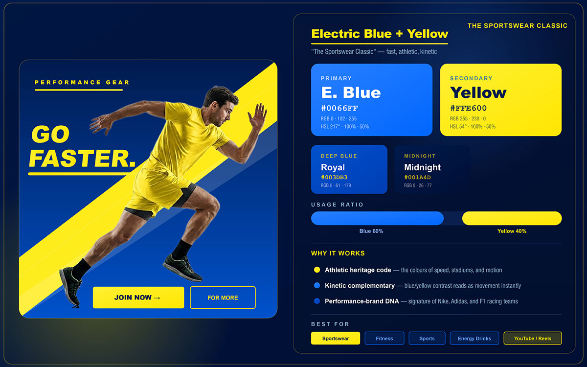
20. Electric Blue + Yellow — The Sportswear Classic
Bold, immediate, and built for speed. Electric Blue and Yellow have been the best color combinations for social media in sports, performance, and innovation for decades. Its continued dominance in social media content is not nostalgia; it is consistent, proven performance driven by our hardwired response to high contrast complementary colors.
Why It Works
Bold and energetic, this combination has been used by major sports and technology brands around the world for decades. The high contrast between the two colors ensures strong readability at any size or format, while their psychological associations communicate speed, innovation, confidence, and forward momentum. The visual tension between electric blue's cool authority and yellow's warm energy is precisely calibrated for content designed to inspire action.
Best Content Types
Sports and fitness content, performance challenges, tech product announcements, motivational training posts, and competitive campaigns.
Brand Tip: Used by IKEA and multiple Premier League clubs, this combination consistently punches above average in paid social. Electric blue backgrounds with yellow typography outperform standard blue and white in measurable CTR, especially in feed ad placements on Instagram and Facebook.
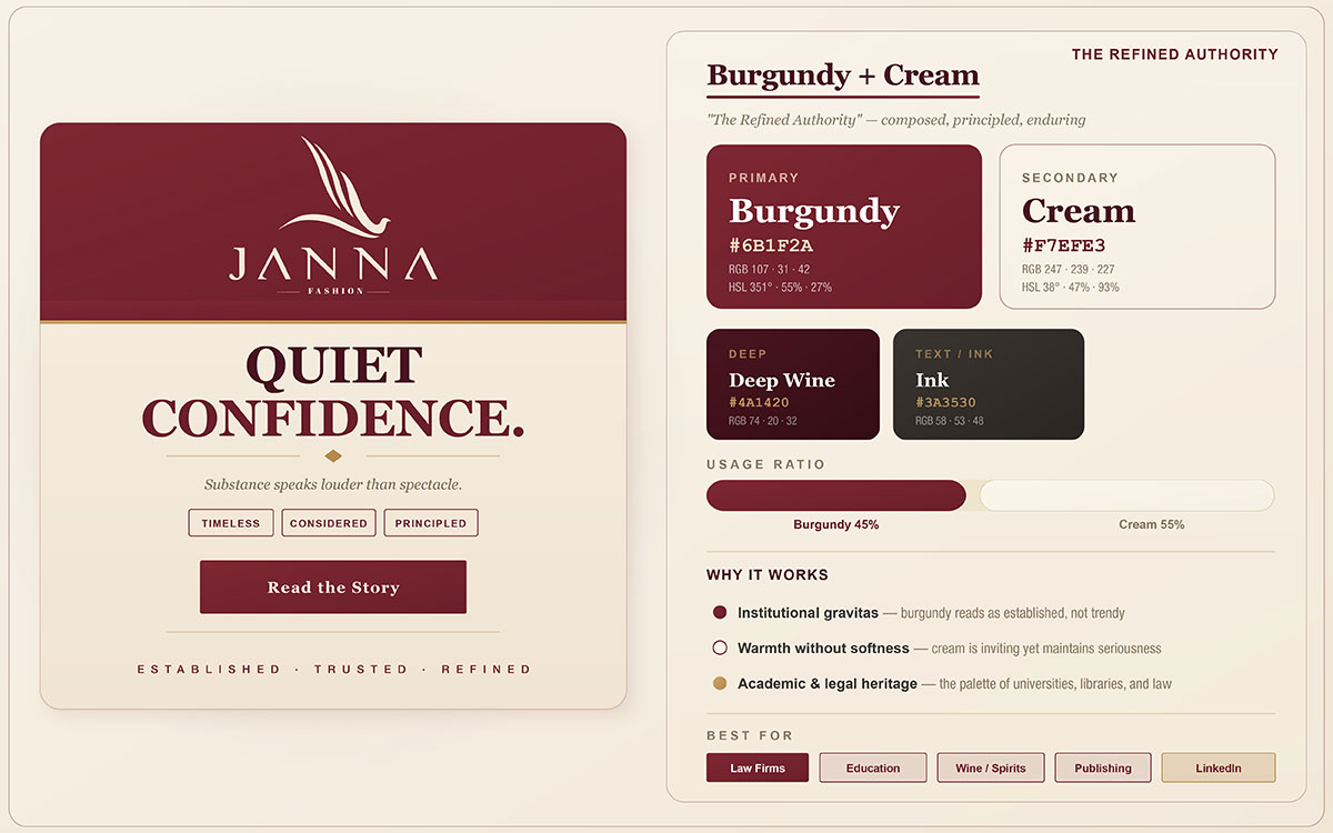
21. Burgundy + Cream — The Refined Authority
In social media design, authority doesn't always make itself known loudly. The most credible content aesthetics often work through restraint, depth, and quiet elegance. Burgundy and Cream is the palette of brands that have earned their authority and want their visual identity to reflect it.
Why Burgundy + Cream Works
Deep burgundy signals confidence, heritage, and intellectual authority, while cream softens it with warmth. Together, they communicate premium positioning without the aggression of pure red or the severity of black, creating a space where sophistication and approachability meet. The warmth in both tones builds cohesion, and the contrast between deep and light keeps readability sharp.
Best Content Types for Burgundy + Cream
Professional services content, editorial and publishing content, wine and fine dining, luxury brand announcements, and long-form carousel articles.
Platform Fit: LinkedIn, Pinterest, Facebook.
Brand Tip: A consistent staple in the visual identity of finance, law, publishing, and premium hospitality brands. The key distinction is the choice of cream over pure white; cream adds a warmth that white would undermine. That warmth is exactly what gives this combination its approachability without sacrificing authority. This palette performs particularly well for long-form carousel content on LinkedIn.
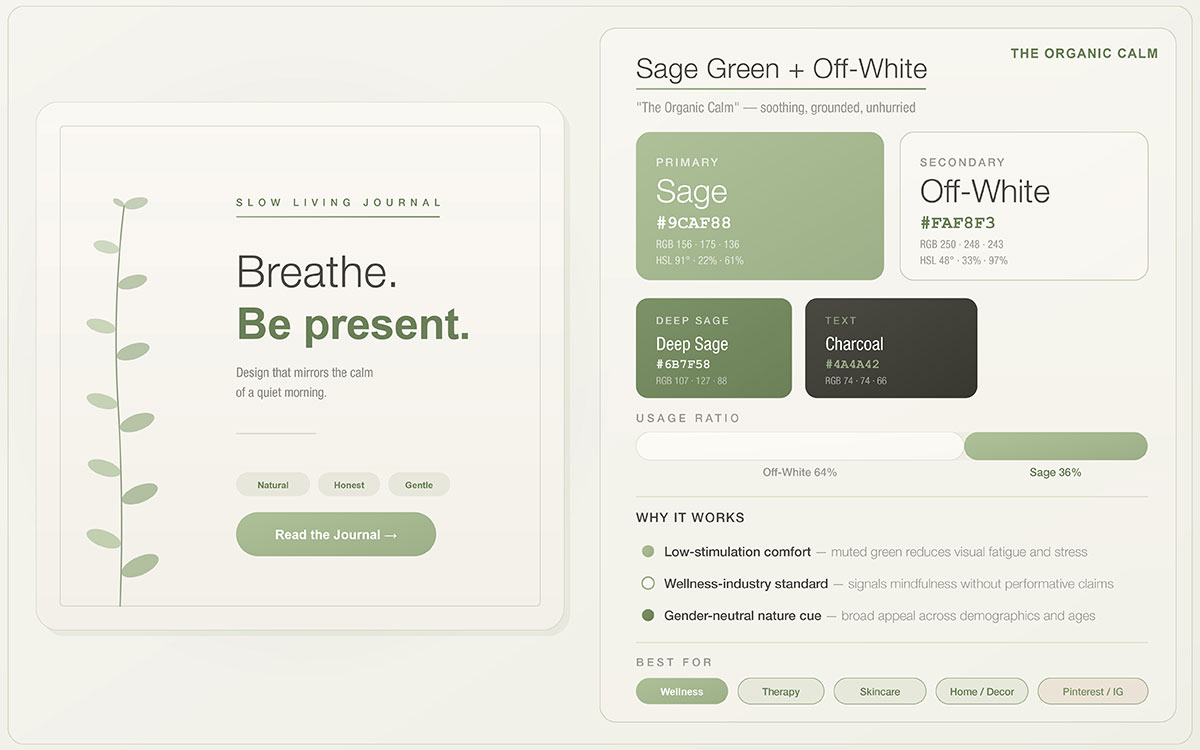
22. Sage Green + Off-White — The Organic Calm
In a feed full of loud color, a restrained palette stands out precisely because it doesn't try to. Sage green and off-white have become the visual foundation of wellness, conscious living, and slow beauty, not because they demand attention, but because they signal something these audiences deeply value: authenticity without performance.
Why It Works
Earthy, grounding, and one of the most heavily trending palettes in wellness and sustainable branding. Sage's muted, desaturated green feels genuine rather than loud; it reads as an honest color rather than a curated one, which is exactly the signal that eco-conscious and wellness audiences have learned to trust. Off-white adds natural warmth that white would strip away, preserving the organic integrity of the combination.
Best Content Types
Wellness and mindfulness content, clean beauty and skincare, sustainable brand posts, recipe and nutrition content, slow living and intentional living narratives.
Platform Fit: Instagram, Pinterest, TikTok.
Brand Tip: This palette consistently dominates the wellness, clean beauty, and slow living aesthetic categories across platforms. It drives exceptionally high save rates on Pinterest and Instagram, especially for tips, recipes, and product content. For maximum resonance with your audience, pair it with natural textures in photography: linen, wood, raw ceramics, and dried botanicals.
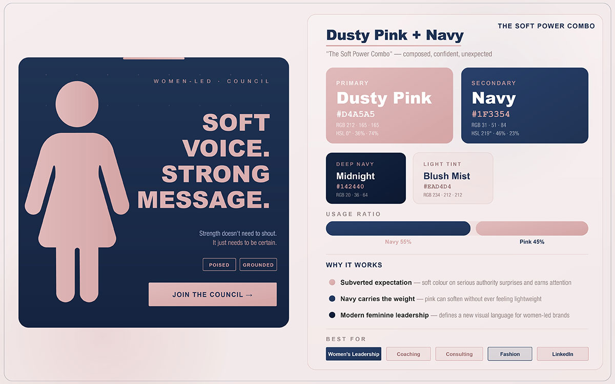
23. Dusty Pink + Navy — The Soft Power Combo
Some color combinations don't just describe a brand, they embody a kind of intelligence. Dusty Pink + Navy is the visual expression of soft power: the ability to lead, influence, and communicate with equal warmth and authority. For brands built around professional women, leadership, and human-centered business, this professional branding color palette is uniquely powerful.
Why It Works
Muted, sophisticated pink softens the stiffness of navy blue, creating a distinctive blend of warmth and institutional authority. For brands targeting professional audiences, this combination is especially powerful; it signals that credibility and human connection can coexist. The dusty quality of the pink matters: it reads as mature and considered.
Best Content Types
Executive coaching and leadership content, HR and people operations brands, professional lifestyle posts, personal brand content for executive audiences, and business coaching services.
Platform Fit: LinkedIn, Instagram, Pinterest.
Brand Tip: Popular among female founders, executive coaches, and human-centered professional service brands. Navy keeps the combination credible on professional platforms like LinkedIn, while dusty pink adds the warmth that makes content feel personal rather than institutional. Avoid bright or hot pink; the muted, dusty tone is what makes this palette work.
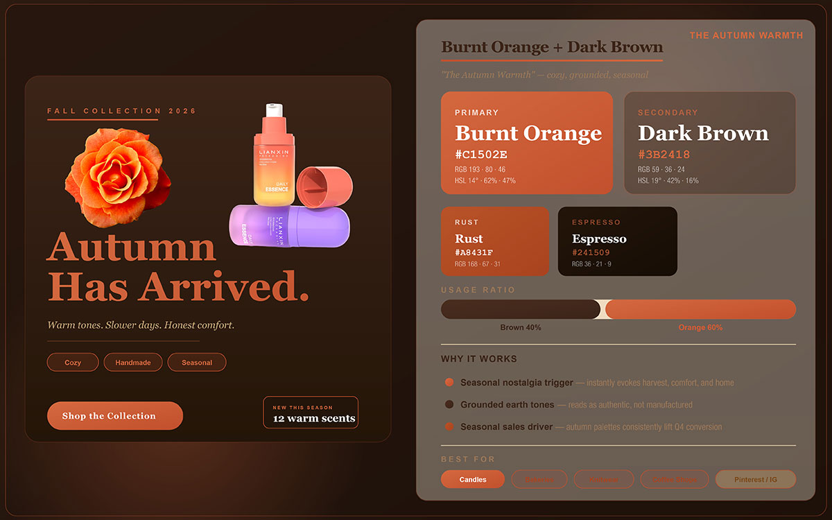
24. Burnt Orange + Dark Brown — The Autumn Warmth
Color is not just a visual choice; it's a temporal one. Certain palettes carry seasons within them, triggering emotional memories and sensory associations that run deeper than conscious preference. Burnt Orange and Dark Brown is the definitive autumn palette, and for brands with seasonal content strategies, it's one of the highest-performing combinations in Q3 and Q4 content calendars.
Why It Works
Rich, earthy, and deeply seasonal, this combination works well in autumn content because it taps into real sensory associations: harvest, warmth, craft, and the particular quality of October light. Burnt orange brings harvest energy and creative vitality, while dark brown grounds the palette with natural authenticity and a sense of material depth.
Best Content Types
Autumnal food content and recipe posts, artisan and craft product posts, seasonal campaign launches, coffee and warm beverage brands, harvest and farm-to-table narratives.
Platform Fit: Instagram, Pinterest, Facebook.
Brand Tip: This is one of the strongest seasonal color palettes for Q4 content. Food brands, craft businesses, and artisan producers consistently see higher engagement with this combination during autumn. Pair it with natural material backgrounds, such as raw linen, reclaimed wood, and terracotta, for a more authentic feel. Natural light photography brings out the warmth of this palette far better than artificial lighting.
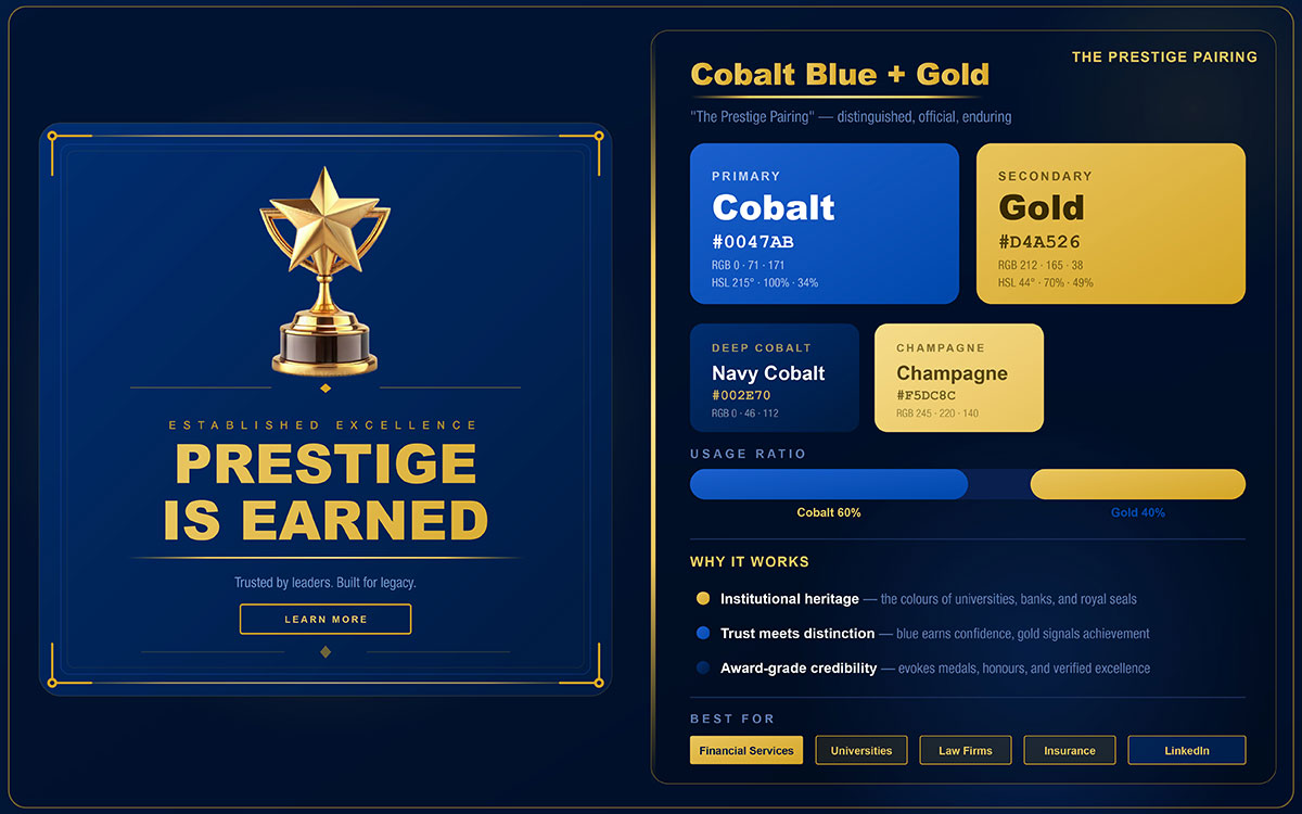
25. Cobalt Blue + Gold — The Prestige Pairing
The final best color combinations for social media in this guide have earned their place through centuries of institutional authority, financial excellence, and global prestige. Cobalt Blue and Gold is more than a color pairing; it is a visual language that communicates achievement, trust, and the highest standards of professional excellence. For brands operating at the intersection of authority and aspiration, it remains the most powerful pairing in this collection.
Why It Works
A classic prestige combination seen across luxury retail, financial services, and institutional branding worldwide. Cobalt blue conveys deep, unwavering trust and reliability, the kind built over decades, while gold speaks to achievement, exclusive value, and recognized excellence. Together, they create an immediate signal of authority that needs no supporting copy to land.
Best Content Types
Awards and recognition posts, luxury service promotions, financial and investment content, institutional milestone announcements, premium certification, and achievement posts.
Platform Fit: LinkedIn, Instagram, Facebook.
Brand Tip: Consistently used by leading financial institutions, luxury hospitality brands, and professional awards bodies worldwide. This combination signals instant authority and exclusivity; it is the visual equivalent of a luxury social media design system or gold embossed letterhead. Use gold sparingly (10 to 15%) as text accents, borders, icons, and decorative elements against a cobalt background for peak impact. More gold does not mean more luxury; restraint is the true signal of prestige.
How to Apply These Color Combinations Effectively
To apply the best color combinations for social media effectively, follow the 60-30-10 rule: use your dominant color for 60% of the design, your secondary color for 30%, and an accent color for 10%. This creates visual hierarchy, directs attention to your call to action, and prevents competing tones from undermining clarity.
The 60-30-10 Color Rule
The 60/30/10 rule is the foundation of balanced multi-color design. It started in interior design but has since been validated across graphic and digital design as well. For a deeper look at how it applies across formats and platforms, check our dedicated guide to the 60-30-10 color rule in design.
Here's how it works in social media post design:
60%: Dominant color (background, large shapes, primary visual areas)
30%: Secondary color (text, structural elements, frames, supporting graphics)
10%: Accent color (CTA buttons, highlights, icons, the single most important element)
This ratio creates visual hierarchy and prevents color conflict when two or more tones compete equally for attention. The 60% dominant tone sets the emotional mood of the post; the 30% secondary adds structure and readability; the 10% accent guides the viewer's eye to the one action you want them to take.
Applying this to the palettes above: with Red + White, use white at 60% for a clean background, red at 30% for structural elements and headlines, and a deep charcoal or brand color at 10% for body text and CTA details. Treat the rule as a guideline, not a fixed law. Departing from it is fine, but only with a deliberate reason, not just personal preference.
Design Consistency Across Posts
The most powerful color strategy on social media is applying that palette consistently across all content until your visuals become instantly recognizable before anyone reads a single word.
Define a brand palette of 3 to 5 colors, no more. Too many colors create visual noise that hurts recognition and makes your feed look inconsistent.
Alternate primary and secondary color combinations across your content grid. This builds variety and rhythm without chaos; think curated gallery, not a random mix of unrelated images.
Lock your palette into your design tools. Save brand color codes in Canva's Brand Kit, Adobe Express, or Figma's color styles. For a practical walkthrough.
Test before you commit. Mock up a 9-post grid in your palette before publishing. Evaluate how the colors read together as a visual identity, not just as individual posts.
Common Color Mistakes to Avoid
Knowing how to use color well only matters when you also know what to avoid. For a full picture of how typography works with your palette, our guide to the best fonts for social media posts covers the design decisions that support your color strategy. Here are the most common and most damaging color mistakes to watch out for:
Using more than 3 colors in a single post. Beyond three tones, the eye loses hierarchy, and engagement drops. The exception is data-heavy infographics, where extra colors can serve a functional purpose.
Ignoring contrast ratios. Low contrast text kills readability, no matter how good the color combination looks. Body copy must meet the WCAG AA minimum contrast ratio of 4.5:1.
Using pure white on Pinterest. Pure white backgrounds blend into Pinterest's interface and make your post invisible in the feed. Always use off-white, cream, or a light-tinted background on this platform.
Ignoring cultural color associations. Color meaning varies across cultures. Red signals luck in Chinese culture but danger in Western markets. White represents purity in many Western contexts but mourning in parts of East Asia. Always check your palette against your target audience's cultural context.
Treating every platform the same. Instagram rewards aesthetic coherence; TikTok rewards visual disruption; LinkedIn prioritizes credibility. Adapt how you apply your palette to each platform's visual language, not necessarily the palette itself.
Social Media Post Color Combinations FAQs
These questions come from the most searched queries on Google, ChatGPT, and AI search engines. Each answer is written to give you a clear, accurate value on the best color combinations for social media. For visual guidance on specific platforms, our Instagram aesthetic guide shows how color strategy shapes a cohesive feed identity.
Warm tones like coral, orange, and yellow tend to grab attention and drive higher initial engagement. Cool tones like teal, sage green, and pastels perform better for saves and shares. High contrast pairs like red with white or yellow with black work best for ad click-throughs.
There is no single best combination since it depends on your brand and audience. That said, Navy and Coral, Black and Gold, and Teal and White consistently perform well. Red with White and Orange with Deep Blue tend to work best for paid ads.
Avoid low contrast and muted color combinations, and steer clear of colors that blend into platform interfaces like Facebook blue or plain white backgrounds. Try not to use more than three colors in one post since it reduces clarity and hurts engagement.
Yes, indirectly. Color influences engagement like clicks, saves, and shares, and strong, high-contrast choices improve those signals early on, which prompts platforms to distribute the content more widely.
Stick to two or three colors. Two keeps things clean and simple. Three works well when you follow the 60/30/10 rule: a base, a secondary, and an accent. More than three usually weakens focus and reduces impact.
Start with the emotion you want your brand to convey, then use color psychology as a guide: blue for trust, red for energy, and so on. Add a contrasting secondary color for balance, and always check how the palette looks at small thumbnail sizes across different posts.
For Facebook and Instagram feed ads, the top-performing combinations are Red and White for urgency, Orange and Deep Blue for launches, Yellow and Black for promotions, and Teal and White for trust-based services. Avoid Facebook's native blue (#1877F2) since it blends into the interface and reduces visibility.
The biggest color trends for 2026 include Sage Green and Off White, Charcoal and Lime, Dusty Pink and Navy, Deep Teal and Coral, and Cobalt Blue and Gold. These palettes reflect wellness, tech, lifestyle, and premium branding directions. Neon accents on dark backgrounds are also popular for high-impact content.
Endnote
By now, you've seen how the best color combinations for social media quietly shape your content. And most brands don't struggle with choosing colors. They struggle with keeping them consistent. One post feels strong, the next feels slightly off, and the feed stops reading as a single identity.
At that point, knowing good combinations isn't the problem. The real challenge is holding them steady across constant content production.
The fix is simple in theory. Choose a small set of combinations that genuinely reflect your brand. Use them repeatedly until recognition builds naturally. Avoid constant visual shifts that reset your audience's memory every few weeks.
Once that's clear, the question arises, who's actually making sure consistency holds over time? Graphic Design Eye LLC turns color choices into a consistent visual system across ongoing content. Rather than isolated designs, we focus on keeping a unified look so your feed stays recognizable and structured at every stage of growth.
Maintaining visual discipline across daily content rarely works without structure. It takes more than design effort. It requires continuity, control, and a real understanding of how brand identity translates across formats and platforms.
If you're building your social media identity from scratch, a project-based package gives you a clear starting point with defined social media designs and structured color use. If your brand is already active, subscription pricing keeps your design output consistent over time without repeated decisions or loss of alignment.
Color is your brand's first word. Make it one worth remembering.
Graphic Design Eye LLC is a full-service creative agency built for brands that demand more than design — they demand vision. From strategic branding to complete visual identity, we partner with startups, agencies, and growing businesses as a dedicated creative force. With flexible subscription and project-based models. Let's start with us today!