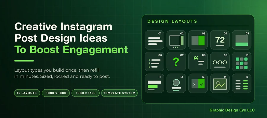
Instagram post design ideas fall into 15 core layout types, including the single-statement card, educational carousel, before-and-after split, and data-point poster, each built for a specific content goal. Effective designs use the correct dimensions (1080 x 1080 or 1080 x 1350 pixels), minimal on-image text, and a locked template system to ensure consistent and fast production.
Some people design every post from scratch, treating each one as its own project. This makes some great posts. But it also brings a lot of inconsistency and too much work, especially once the week gets busy.
Instagram needs lots of content. A brand posting three to five times a week makes about 15 to 20 posts a month. It includes static posts, carousels, Stories, and Reels covers. At that pace, designing each post from scratch isn't realistic or smart. Inconsistent posts can make your feed less recognizable, which can hurt brand awareness on social media.
In this post, we've published 15 Instagram post layout design ideas, and each is built to be reusable. Choose a layout once in your own brand style, then just refill it with new photos and captions. Same look, new content, a fraction of the time.
So let's get into it!
15 Instagram post design ideas
The most effective Instagram post design ideas include the single-statement card, educational carousel, before-and-after split, data-point poster, and save-worthy reference card, as well as testimonial frames, process diagrams, and comparison cards. Each format matches a specific content goal, from quotes to tutorials to social proof.
To learn all ideas, keep scrolling.
1. Single statement card
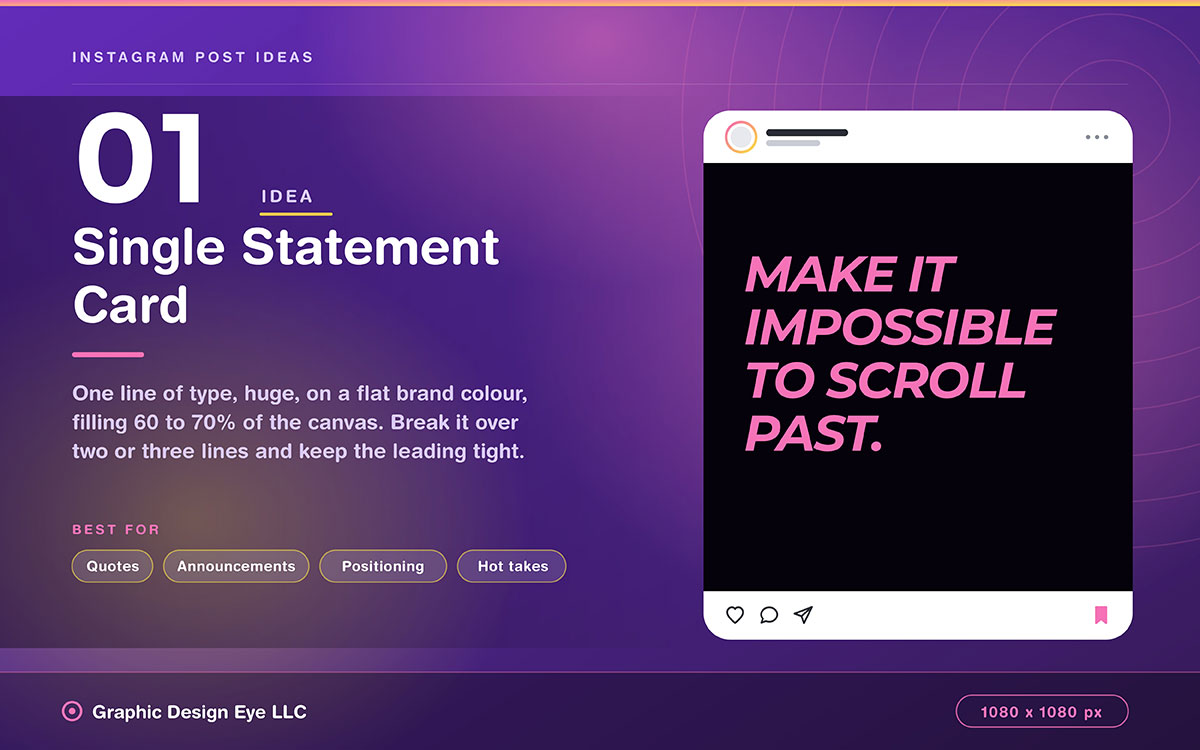
One line of text, huge, on a flat brand color. No image or logo, just a small corner mark. No decoration. Text fills 60-70% of the canvas.
Design note: Use your display font. Break the text across two or three lines. Keep the leading tight. Make the contrast strong enough to read as a thumbnail.
Best for: Quotes, announcements, positioning statements, hot takes.
2. Educational carousel
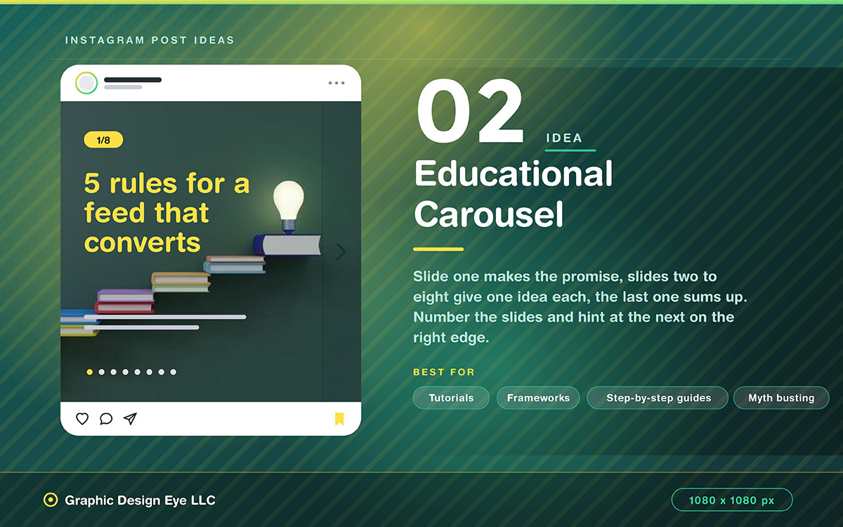
Slide one asks the question or makes the promise. Slides two to eight each give one idea. The last slide sums up and gives a call to action.
Design note: Number each slide so viewers see the length. Add a visual hint on the right edge to show there's more. This boosts swipe rate.
Best for: Tutorials, frameworks, step-by-step guides, myth busting.
3. Before and after split
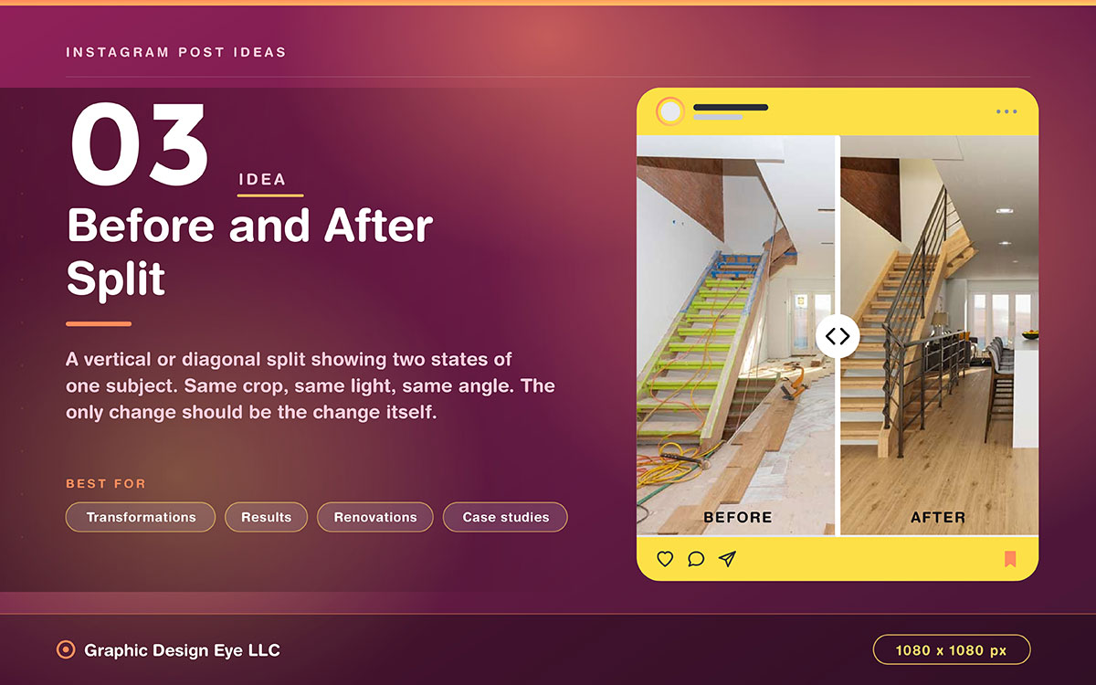
A vertical or diagonal split showing two states of the same subject. Use minimal labels, no explanations.
Design note: Keep both halves the same crop, lighting, and angle. The only change should be the change itself.
Best for: Transformations, results, renovations, design work, case studies.
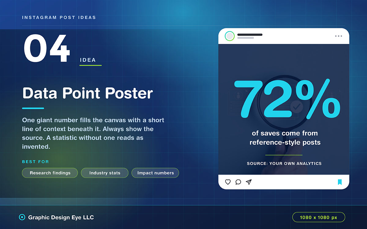
4. Data point poster
One giant number fills most of the canvas. A short line of context sits below it. The source appears in small text at the bottom.
Design note: Always show the source clearly. A statistic without a source looks made up. That hurts the post's credibility.
Best for: Research findings, industry stats, impact numbers.
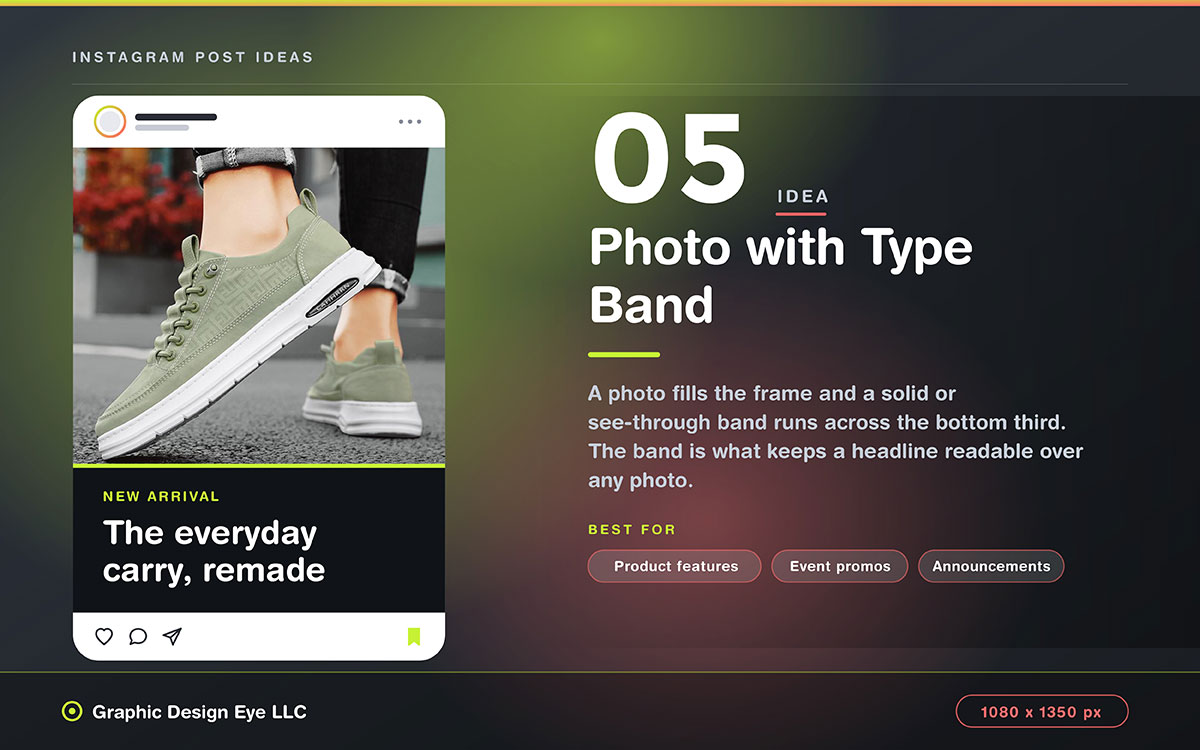
5. Photo with type band
A photo fills the frame. A solid or see-through color band runs across the bottom third, alongside the headline.
Design note: The band keeps text readable over any photo. This is a key social media graphic design tip for every template. Without it, text on busy photos gets hard to read.
Best for: Product features, event promos, announcements over photos.
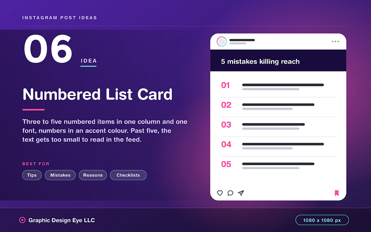
6. Numbered list card
Three to five numbered items stacked in a column, same font. Numbers in an accent color, text in body weight.
Design note: Keep it to five items per card. More than that, text gets too small to read in the feed.
Best for: Tips, mistakes, reasons, checklists.
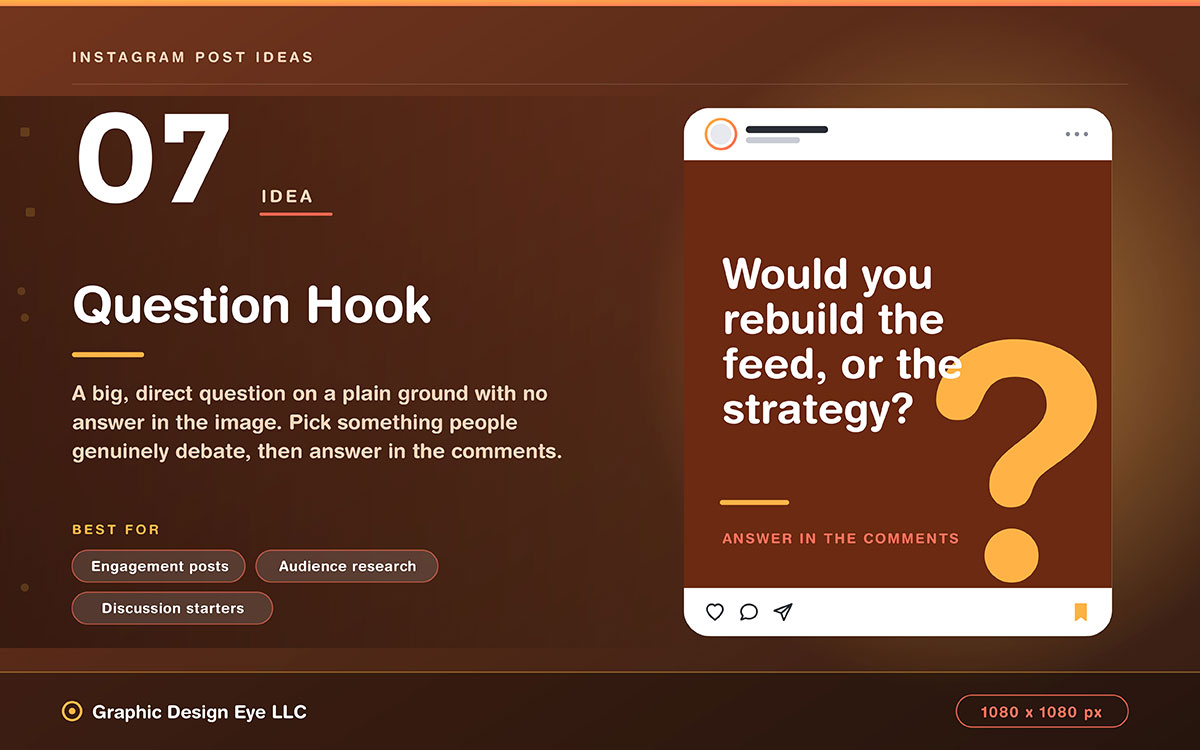
7. Question hook
A big, direct question on a plain background. No answer in the image. The answer goes in the caption or comments.
Design note: Pick a question people actually debate. An obvious question won't get comments.
Best for: Engagement posts, audience research, discussion starters.
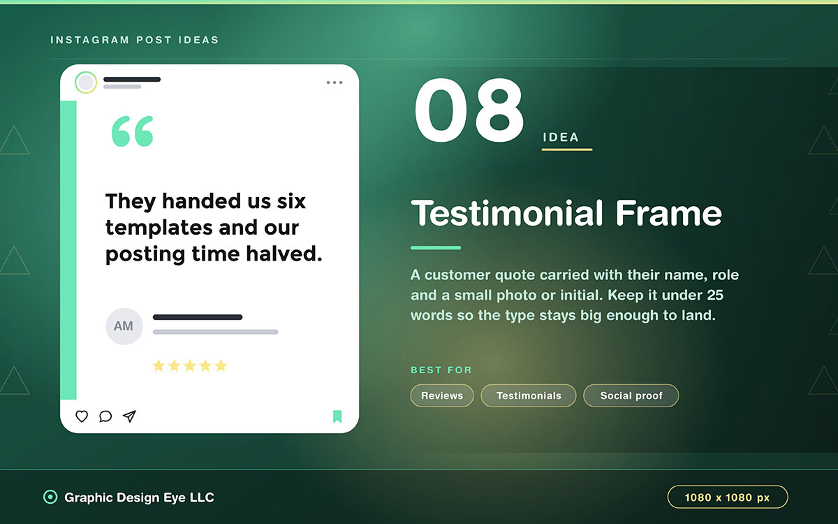
8. Testimonial frame
A customer quote in quotes, with their name, role, and a small photo or initial below it.
Design note: Keep quotes under 25 words. Longer ones need tiny text and lose impact in feeds.
Best for: Reviews, testimonials, social proof.
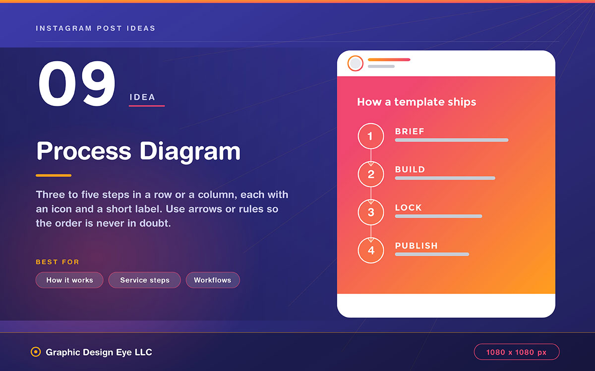
9. Process diagram
Three to five steps in a row or column. Each has an icon and short label.
Design note: Use arrows or lines to clearly indicate the order. Unclear flow direction is the biggest mistake here.
Best for: Showing how something works, service steps, workflows.
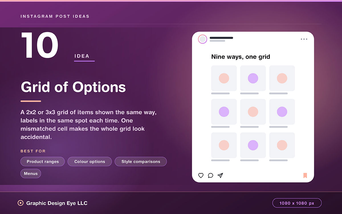
10. Grid of options
A grid (2x2 or 3x3) of items shown the same way, with labels in the same spot each time.
Design note: Every cell must match. Different lighting or cropping makes the grid look thrown together rather than designed.
Best for: Product ranges, color options, style comparisons, menus.
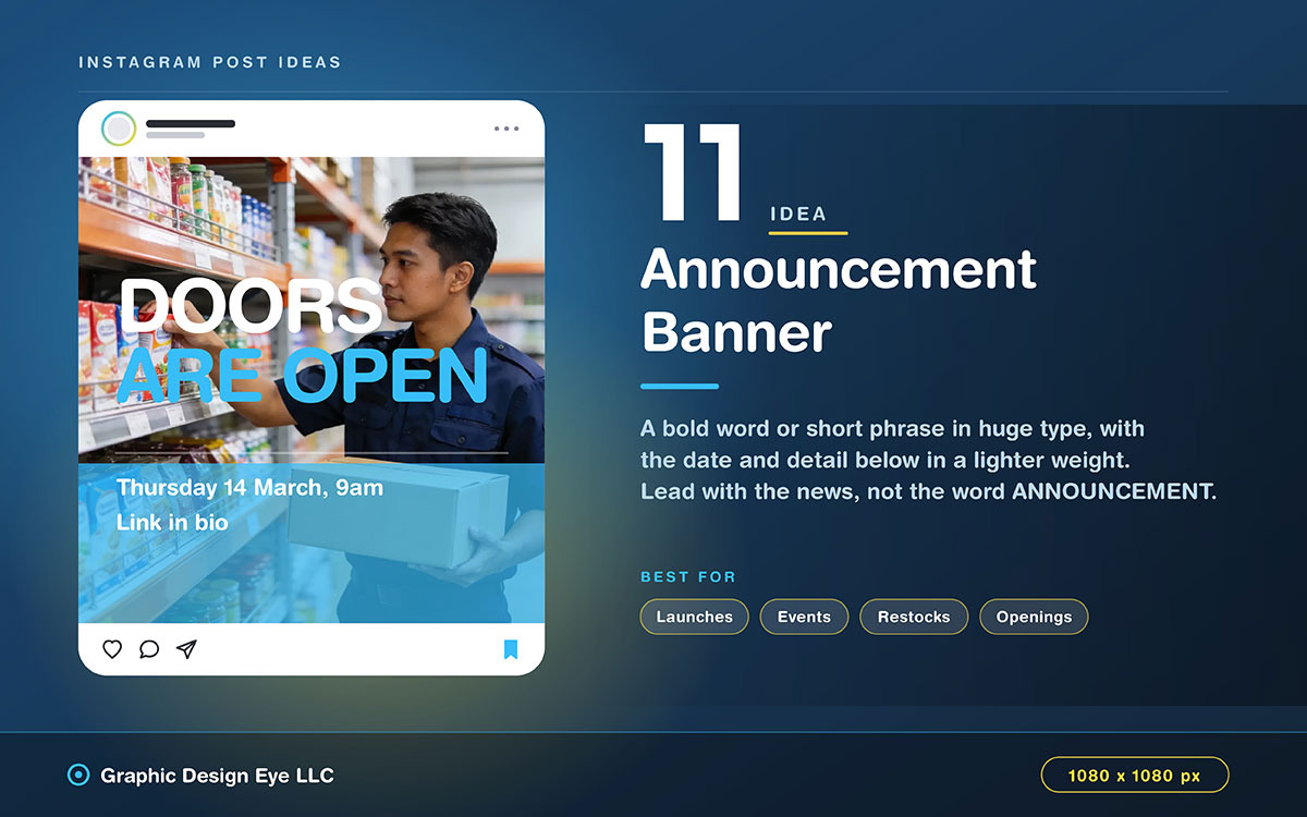
11. Announcement banner
A bold word or short phrase in huge text, with date and details below in a different weight.
Design note: Lead with the news, not the word ANNOUNCEMENT. The actual news is what grabs attention.
Best for: Launches, events, restocks, openings.
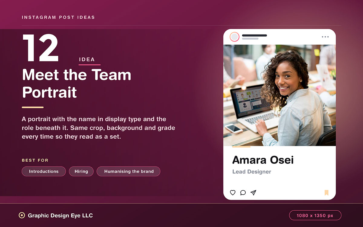
12. Meet the team portrait
A portrait with the same style throughout. Name in display type. Role below in light weight.
Design note: Use the same crop, background, and grade for every portrait. This makes them look like a set rather than a random collection of photos.
Best for: Introductions, hiring, humanizing the brand.
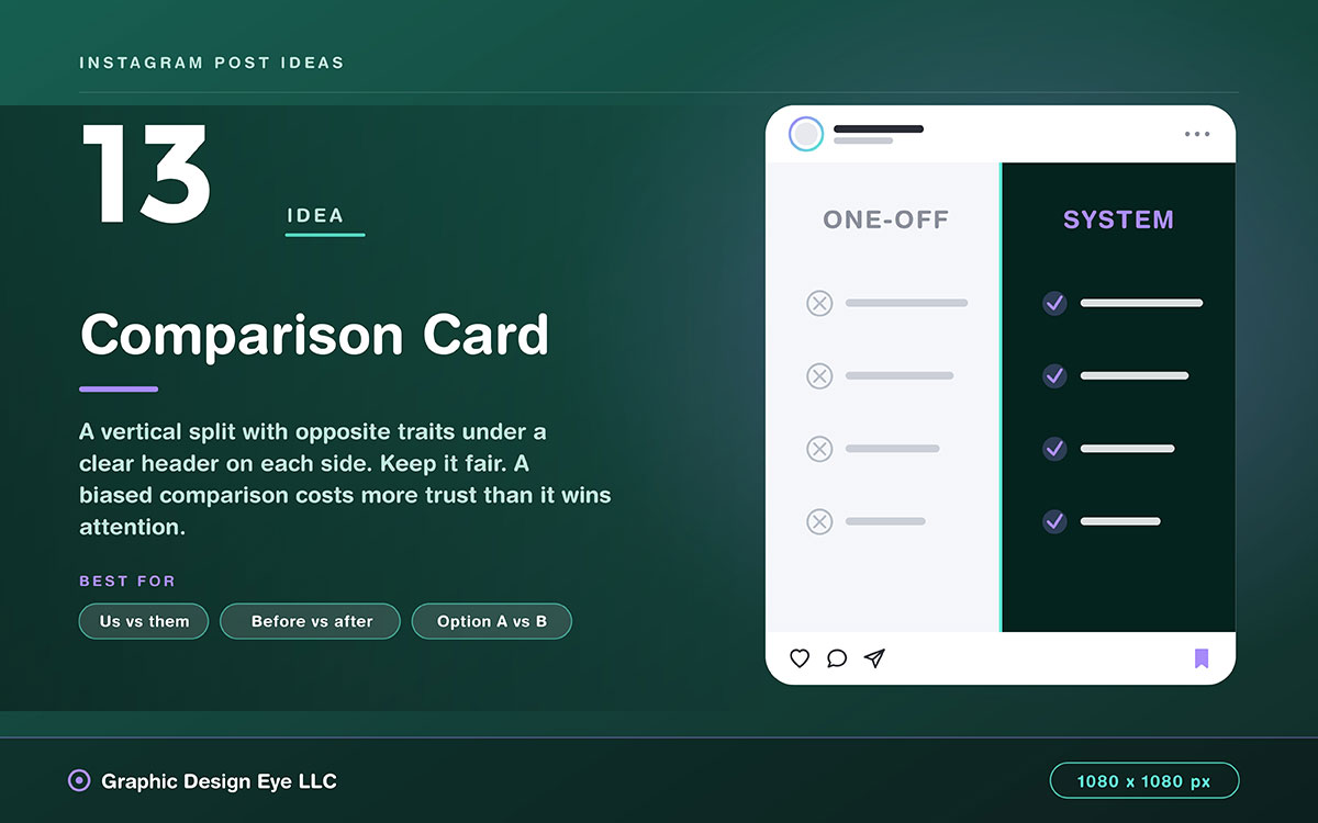
13. Comparison card
A vertical split. Each side lists opposite traits under a clear header.
Design note: Keep it fair. A biased comparison hurts trust more than it helps you stand out.
Best for: Us vs. them, before vs. after, option A vs. B.
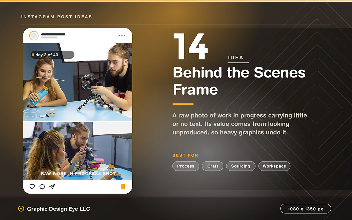
14. Behind the scenes frame
A raw photo of work in progress. Little or no text on it. Context goes in the caption.
Design note: Don't over-design this. Its value comes from looking unproduced. Heavy graphics ruin that.
Best for: Process, craft, sourcing, workspace.
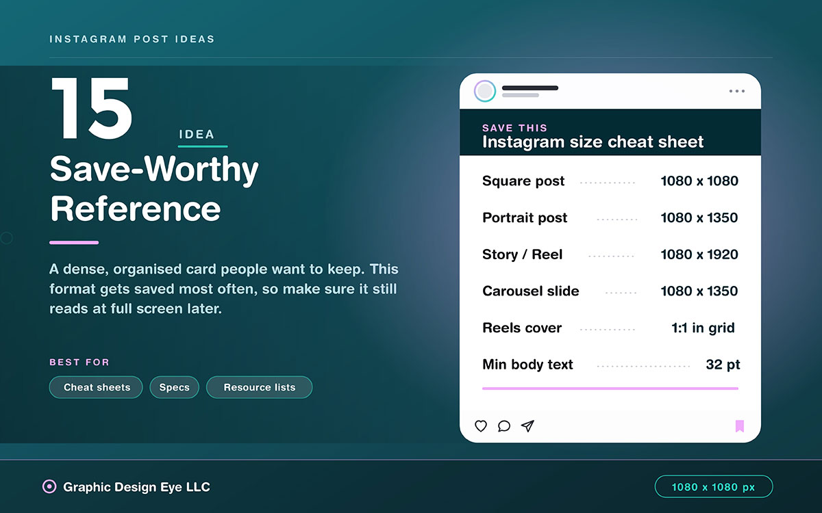
15. Save-worthy reference
A dense, organized reference card people want to save. It could show dimensions, conversions, definitions, or a checklist.
Design note: This format is saved most often. Make sure the info stays readable when viewed later at full screen.
Best for: Cheat sheets, specs, resource lists.
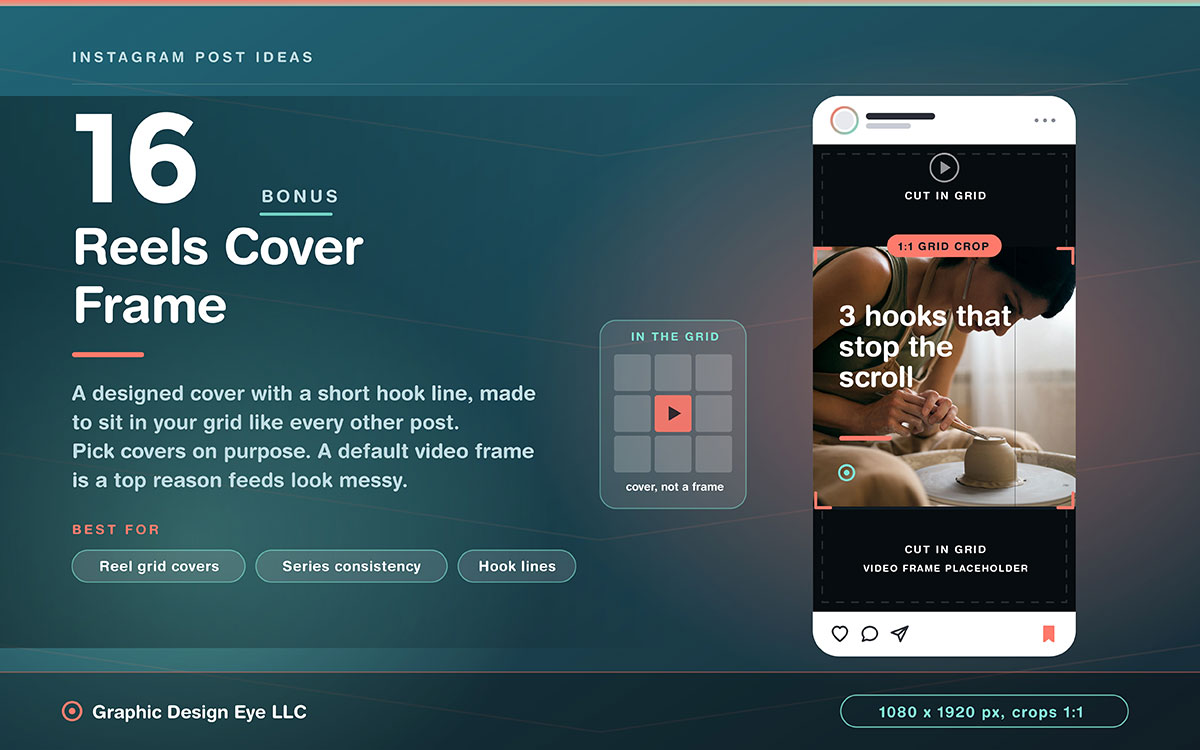
Bonus: Reels cover frame
A custom cover with a short hook line, made to fit your grid like your other posts, not just a random video frame.
Design note: Pick covers on purpose. A default video frame breaks the grid's look and is a top reason feeds seem messy.
Best for: The image that shows a Reel in your grid.
Turning these layouts into a template system
These fifteen Instagram post design ideas are just options. A system is the few you pick, build well, and lock in. Then anyone can make on-brand posts fast. A professional social media design set does this, and these 5 steps make it happen.
Choose six to eight templates, not fifteen
Select only the layouts that match content you genuinely produce regularly. A system of six well-built Instagram post templates that get used can beat fifteen that mostly sit unopened.
Build each one twice, square and portrait
Produce 1080 x 1080 and 1080 x 1350 versions of each template so the format decision never requires a redesign. Portrait usually works better. Square is safer for carousels.
Lock the colors and fonts inside the file
In Canva, Figma, or Adobe Express, lock the colors and fonts so no one changes them by accident. Only text and images should be editable. Set your brand colors first to avoid having to redo work later.
Include a designed reels cover template
Reels covers usually break grid consistency, since the default is a random video frame. A designed cover template fixes this for good.
Name templates by content type, not by design
Name them "Educational Carousel" and "Testimonial Card" rather than "idea 3" and "idea 7". The person producing the post is thinking about content, not about design numbering.
Instagram post design FAQs
The questions below cover what teams most often ask about Instagram post design ideas, from correct dimensions to which formats drive the most engagement. Each answer is written to stand on its own for quick reference. For any further queries, feel free to reach out to us anytime to clear up any confusion at no cost.
Use 1080 x 1080 pixels for a square post. Portrait uses more feed space and often does better. Stories and Reels should be 1080 x 1920 pixels. Instagram carousel design slides need the same ratio. Reels covers crop to 1:1 on your profile grid.
Try a single statement card for quotes. Try an educational carousel for tutorials. Try a before-and-after split for transformations. Try a data point poster for research. Try a save-worthy reference card for cheat sheets. Posts made to be saved beat posts made just for likes.
Use one headline plus a short line. Body text should be at least 32 points on a 1080-pixel canvas. This keeps it readable in the feed. Put longer explanations in the caption instead. There, people can read and select the text.
Carousels get the most engagement and saves. People spend more time on multiple slides. Reels reach and get discovered the most. Most business accounts should aim for three to four Reels, two to three carousels, and one to two static posts each week. This grows your Instagram business page.
Yes, templates help a lot. Instagram needs lots of content, and designing each post individually isn't sustainable. A locked template keeps your look consistent without relying on willpower. It also significantly reduces your design time without limiting your message.
Endnote
Finally, we've come to the end!
Instagram post design ideas only work if you build them consistently. A feed that builds real brand recognition also needs structure. Chasing trends won’t always work.
Switching from designing post-by-post to designing as a system is hard when running a business. That's where Graphic Design Eye LLC's social media service helps. Our team builds six to eight core templates in both square and portrait orientations. We lock in your brand colors and fonts and design a clean Reels cover for your grid. Then we hand your team a system they can use right away. When your templates fit your aesthetic Instagram feed, your posts look more connected.
If your feed feels like it starts from zero every time, that's a systems problem. And it's easy to fix.
Reach out to us to turn your strongest concepts into reusable templates. A feed built on systems looks consistent and it builds trust, post by post.
Graphic Design Eye LLC is a full-service creative agency built for brands that demand more than design — they demand vision. From strategic branding to complete visual identity, we partner with startups, agencies, and growing businesses as a dedicated creative force. With flexible subscription and project-based models. Let's start with us today!