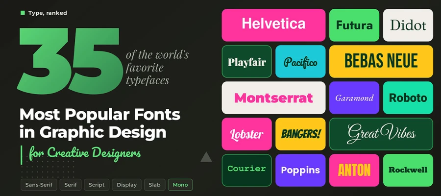
The most popular fonts in graphic design aren't popular by accident. Each one earned its place through decades of use, and each has its own personality that your audience reads before your copy does. This list breaks down graphic design fonts by category, origin, and ideal use case for digital and print projects.
Have you ever noticed how some brands look right the moment you see them? Nine times out of ten, the font is the reason.
Your design software holds thousands of fonts, and only a handful will ever earn a permanent spot in your toolkit. With so many choices and so little guidance on which one belongs where, it's hard to know where to start. Sound familiar?
That's exactly why we publish this list. Here, we introduce 35 popular font types explained for logos, branding, apparel, web, and print projects. Once you've read them all, you’ll stop guessing and choose fonts that match your brand, medium, and message.
So, are you ready to meet the fonts that shape the world around you? Let's get started!
35 Most popular fonts in graphic design
Popular fonts include clean sans serifs, classic serifs, flowing scripts, and bold display faces. Each earned its spot through real projects, from Helvetica's quiet authority to Bebas Neue's loud boldness. Some are centuries old. Others are barely a decade old. All keep showing up in professional design because each solves a real problem, like legibility, personality, or sheer visual weight.
This list of the 35 most popular fonts in graphic design shows each font's origin and best use, so you can choose the right one for your web and print projects.
Font Category
Defining Trait
Use Cases
Example Fonts (from this list)
Sans Serif
No serifs, with clean, modern strokes
Digital UI, branding, body text
Helvetica, Roboto, Montserrat
Serif
Small strokes (serifs) at letter ends
Print, editorial, formal branding
Garamond, Georgia, Baskerville
Script
Cursive, flowing letterforms
Invitations, packaging, feminine branding
Pacifico, Great Vibes, Dancing Script
Display
Bold, attention-grabbing, stylized
Headlines, posters, apparel
Bebas Neue, Anton, Impact
Slab Serif
Thick, blocky serifs
Industrial branding, tech headlines
Rockwell, Roboto Slab, Arvo
Monospace
Equal character width
Code, typewriter, technical branding
Courier New
Casual/Novelty
Rounded, informal, hand-drawn feel
Children's content, casual or ironic design
Comic Sans MS
Now let's look at each of these famous fonts one by one, including when to use them and when to leave them on the shelf.
1. Helvetica
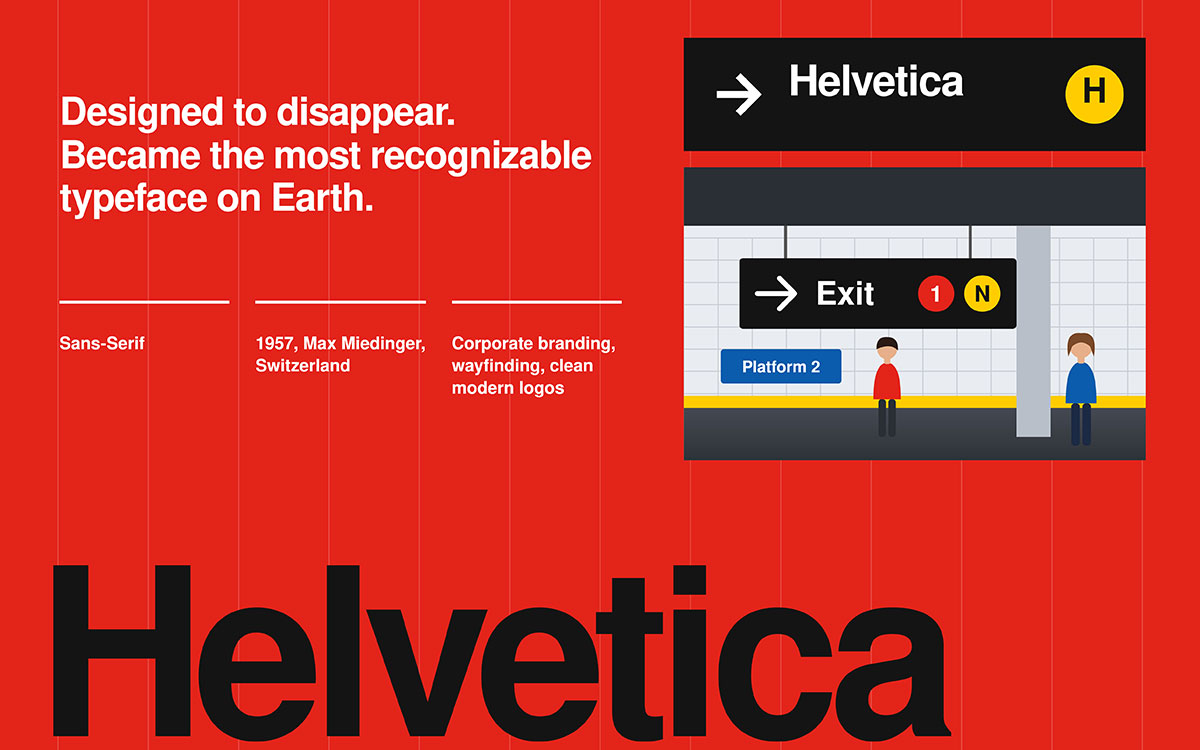
Helvetica needs no introduction. Ask any designer to name the most influential typeface ever created, and this is usually the first name you'll hear. It was born in Switzerland in the late 1950s and designed to be invisible, a font so neutral that the message takes center stage. Decades later, it's everywhere, from street signs to logos to corporate identities around the world. Something built to disappear became the most recognizable typeface on Earth.
Category: Sans Serif • Origin: Designed 1957 (Max Miedinger, Switzerland)
Key features:
Uniform stroke width with minimal contrast
Tall x height for strong legibility at a distance
Neutral, almost invisible personality
When to use it: Reach for Helvetica when your brand needs to feel confident, modern, and unmistakably clean. Corporate identities, transit signage, and minimalist logo designs all thrive on it.
When to avoid it: Skip it if you want a font with a strong personality of its own. Helvetica is so common that overusing it can make a brand feel generic.
Best for: Corporate branding, wayfinding, and clean modern logos.
2. Arial
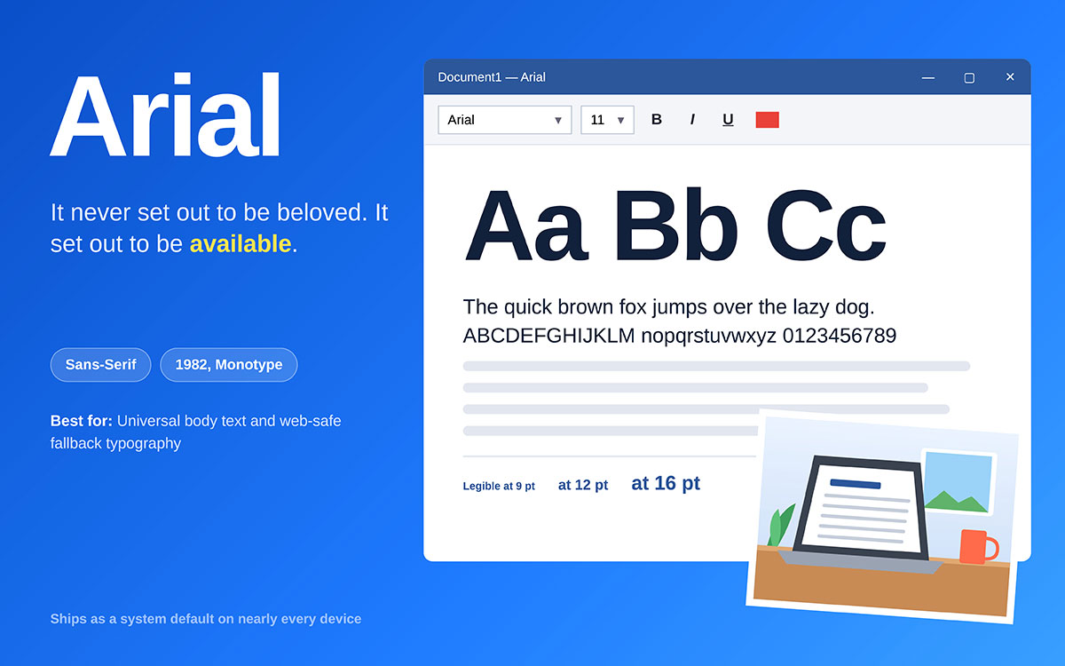
You've read this font a million times without realizing it. Arial became one of the most used typefaces in human history simply by being everywhere Microsoft was. Built in 1982 as a practical stand-in for Helvetica, it was meant to be available everywhere, and that mission worked a little too well.
Category: Sans Serif • Origin: Designed in 1982 (Monotype)
Key features:
Rounded terminals with slightly wider spacing than Helvetica
Comes as a system default on nearly every device
Extremely high legibility at small sizes
When to use it: Arial works well for everyday business documents, forms, and web copy where familiarity and universal compatibility matter more than flair.
When to avoid it: Don't use it for branding or logo work. It reads as a default and rarely helps a brand stand out.
Best for: Universal body text and web-safe fallback typography.
3. Futura
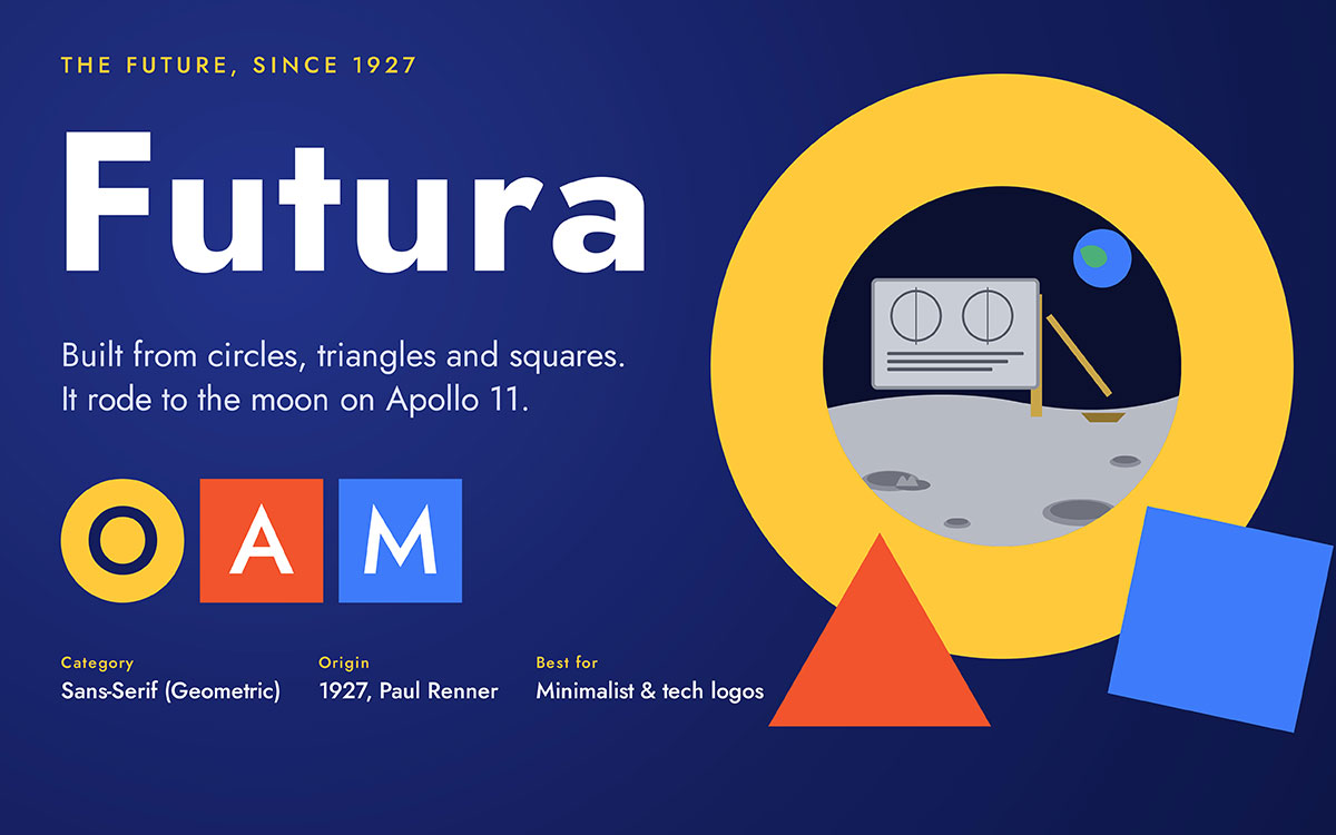
Want a font that once traveled to the moon? Futura rode along on the Apollo 11 plaque, and it still looks like it belongs on a spaceship today. Designed in 1927 during the Bauhaus movement, it was built almost entirely from pure geometry, using circles, triangles, and squares with everything unnecessary stripped away. Nearly a hundred years later, it still feels like it comes from the future.
Category: Sans Serif (Geometric) • Origin: Designed 1927 (Paul Renner, Bauhaus era)
Key features:
Perfectly circular "O" and geometric letterforms
Wide, confident tracking
Strong presence in both display and body sizes
When to use it: Choose Futura for brands that want to feel precise, innovative, and a little bit ahead of the curve.
When to avoid it: It can feel cold for warm, personal, or handcrafted brand stories, so pair it carefully or choose something friendlier instead.
Best for: Minimalist branding, tech logos, and forward-facing product design.
4. Montserrat
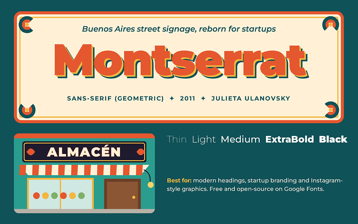
Montserrat is the font of a whole generation of startups. The design grew out of something surprisingly nostalgic: the old hand-painted signs in the Montserrat neighborhood of Buenos Aires. Its designer, Julieta Ulanovsky, wanted to preserve that vintage urban charm before it disappeared, and she ended up creating one of the most used typefaces of the 2010s. Looking backward can build something so forward-facing.
Category: Sans Serif (Geometric) • Origin: Designed 2011 (Julieta Ulanovsky, Google Fonts)
Key features:
Wide range of weights, from thin to black
Balanced letterforms that scale beautifully
Free and open source through Google Fonts
When to use it: Montserrat is a top choice for startup logos, social media headers, and modern web headings that need to feel current and approachable.
When to avoid it: It's so popular that it can feel a bit too common in the startup world, so pair it with a distinctive color palette or a secondary font to stand out.
Best for: Modern headings, startup branding, and Instagram-style graphics.
5. Roboto
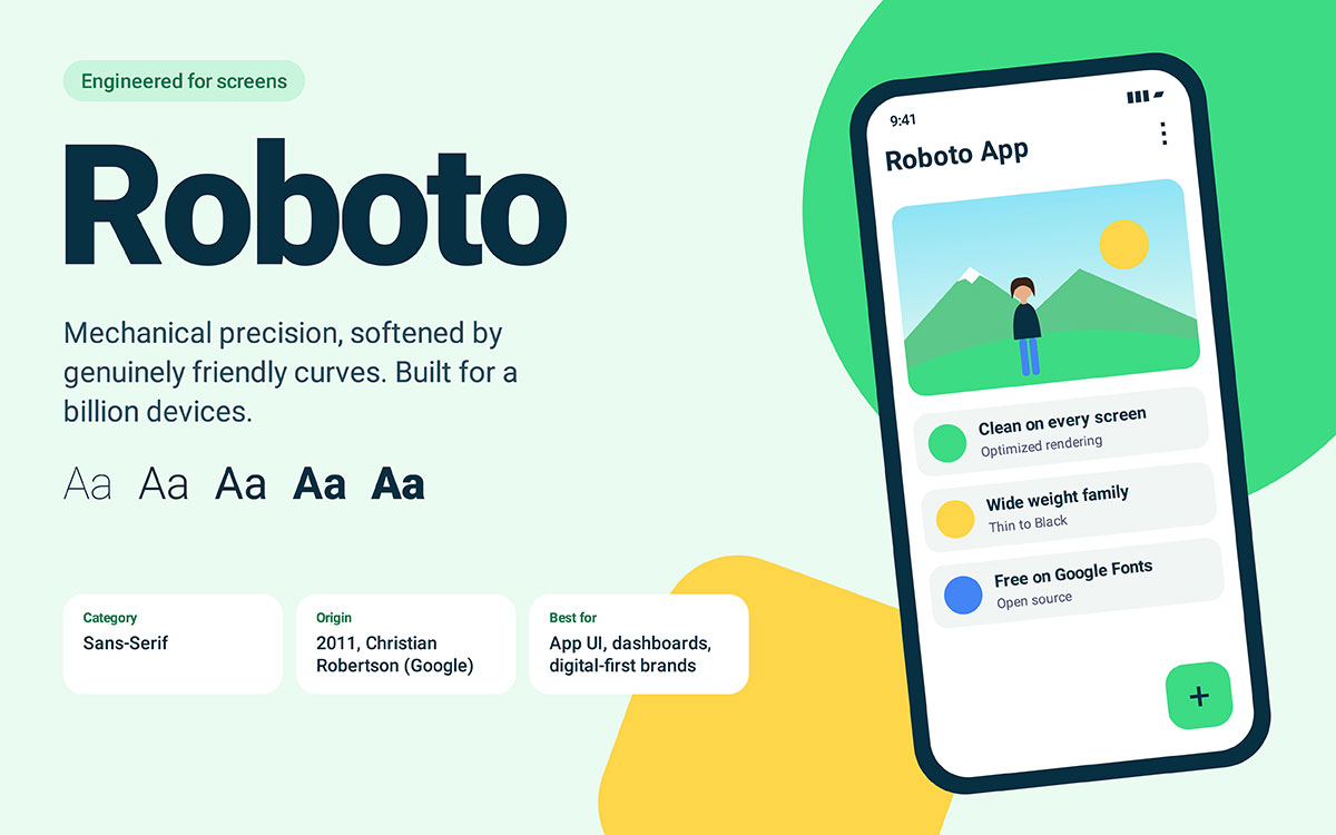
If you own an Android phone, you're looking at this font right now. Google engineered Roboto specifically for screens, at a time when most typefaces weren't built with digital pixels in mind. It had to work at every size, on every resolution, across a billion devices. That's no small task, but Roboto pulled it off with mechanical precision softened by friendly curves.
Category: Sans Serif • Origin: Designed 2011 (Christian Robertson, Google)
Key features:
Mechanical skeleton with friendly, open curves
Optimized for rendering on screen
Wide family of weights and widths
When to use it: Roboto is an easy choice for app interfaces, dashboards, and any digital-first brand that needs flawless legibility on screens.
When to avoid it: It can feel flat in print or luxury branding contexts where a font needs more personality.
Best for: App UI, Android interfaces, and digital-first branding.
6. Open Sans
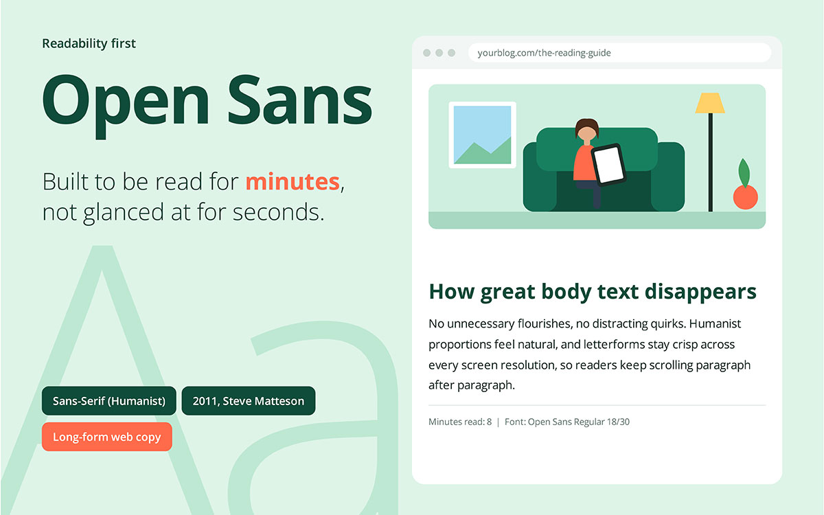
Readability was the only mission here, and Open Sans nailed it. Designed with one clear focus on legibility, it strips away anything that might slow a reader down. There are no unnecessary flourishes and no distracting quirks, just clean, comfortable letterforms built to be read for minutes at a time.
Category: Sans Serif (Humanist) • Origin: Designed 2011 (Steve Matteson, Google Fonts)
Key features:
Humanist proportions that feel natural to read
Neutral but friendly tone
Excellent performance across screen resolutions
When to use it: Use it for blog content, long-form articles, and any web project where readers will be scanning paragraphs.
When to avoid it: It isn't built to grab attention, so skip it for hero headlines or logo work that needs visual punch.
Best for: Long-form web copy and highly legible body text.
7. Proxima Nova
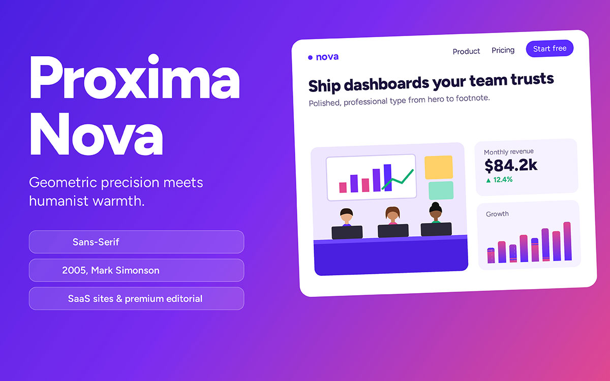
Proxima Nova found the sweet spot that so many fonts miss. It blends the precision of a geometric sans serif with the warmth of a humanist one, and that balance is why premium SaaS brands keep using it. Since its launch in 2005, it has become one of the internet's most widely licensed fonts, appearing on everything from startup dashboards to glossy digital magazines.
Category: Sans Serif • Origin: Designed 2005 (Mark Simonson)
Key features:
Balanced geometric structure with humanist warmth
Excellent readability across weights
Polished, professional tone
When to use it: Proxima Nova is a strong pick for SaaS landing pages, premium editorial spreads, and brand systems that need to feel trustworthy and modern.
When to avoid it: It's a licensed font, so factor cost into commercial projects before committing your brand system to it.
Best for: SaaS marketing sites and premium editorial layouts.
8. Gotham
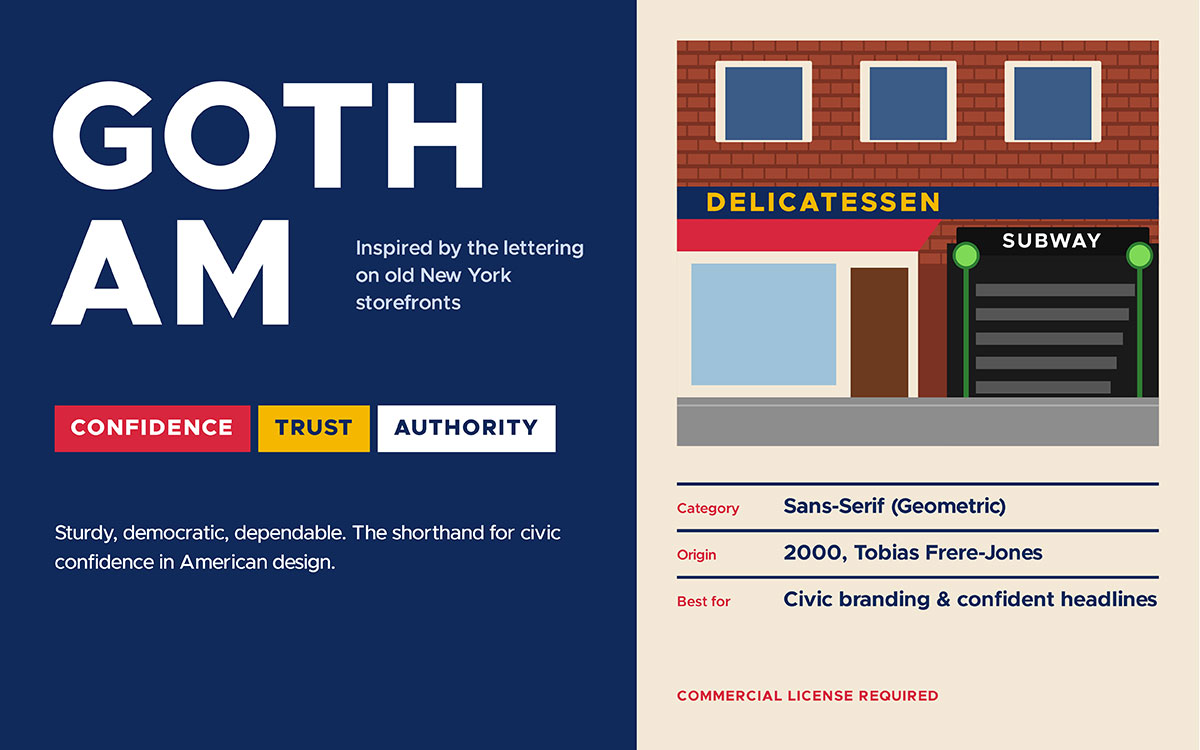
Remember 2008? Gotham became the face of a presidential campaign that year, and it has carried an air of civic confidence ever since. Inspired by midcentury New York City signage, the kind stamped onto old storefronts and subway entrances, it feels sturdy, democratic, and dependable. No wonder it became shorthand for trust in American design.
Category: Sans Serif (Geometric) • Origin: Designed 2000 (Tobias Frere-Jones)
Key features:
Inspired by midcentury New York City signage
Wide, geometric letterforms with strong presence
Reads as sturdy and dependable
When to use it: Reach for Gotham when a brand needs to project authority, trust, and straightforward confidence. Civic campaigns and bold headline work are good examples.
When to avoid it: It requires a commercial license, and its political associations may not suit every brand identity.
Best for: Political and civic branding, confident headline typography.
9. Avenir
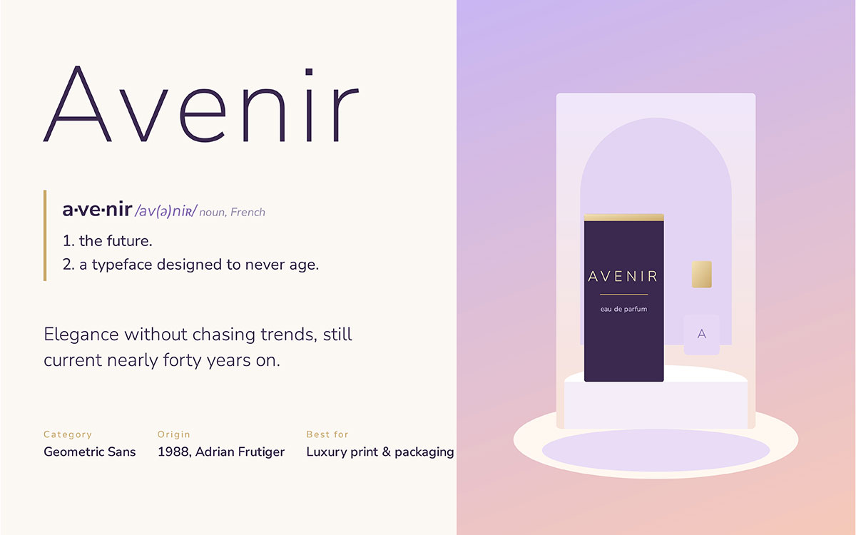
The name says it all. Avenir means "future" in French, and Adrian Frutiger designed it to earn that name. He wanted a typeface that wouldn't chase trends, wouldn't age, and wouldn't need replacing in a decade. Nearly forty years later, Avenir still looks elegant and current, which shows how well that mission worked.
Category: Sans Serif (Geometric) • Origin: Designed 1988 (Adrian Frutiger)
Key features:
Geometric base softened with humanist touches
Smooth, elegant letter spacing
Reads well at both large and small sizes
When to use it: Avenir suits luxury packaging, timeless print branding, and any identity that wants elegance without feeling trendy.
When to avoid it: Licensing costs can add up for larger commercial projects, so budget accordingly.
Best for: Elegant, timeless branding across print and packaging.
10. Poppins
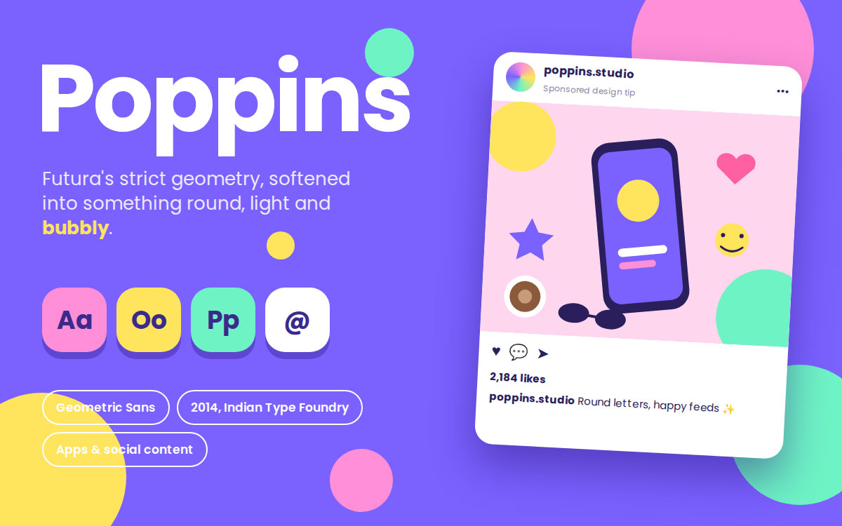
Poppins has personality built right into its curves. It takes the strict geometry of popular fonts like Futura and softens it into something playful and round, almost bubbly. The typeface became a favorite the moment social media and app design began to crave fonts that felt light, friendly, and instantly modern.
Category: Sans Serif (Geometric) • Origin: Designed 2014 (Indian Type Foundry)
Key features:
Nearly perfect circular letterforms
Friendly, rounded terminals
Free through Google Fonts
When to use it: Perfect for app branding, social graphics, and youth-focused identities that want to feel light and modern.
When to avoid it: Its popularity on Instagram and Canva templates means it can feel overused in crowded niches.
Best for: Youthful, rounded branding for apps and social content.
11. Lato
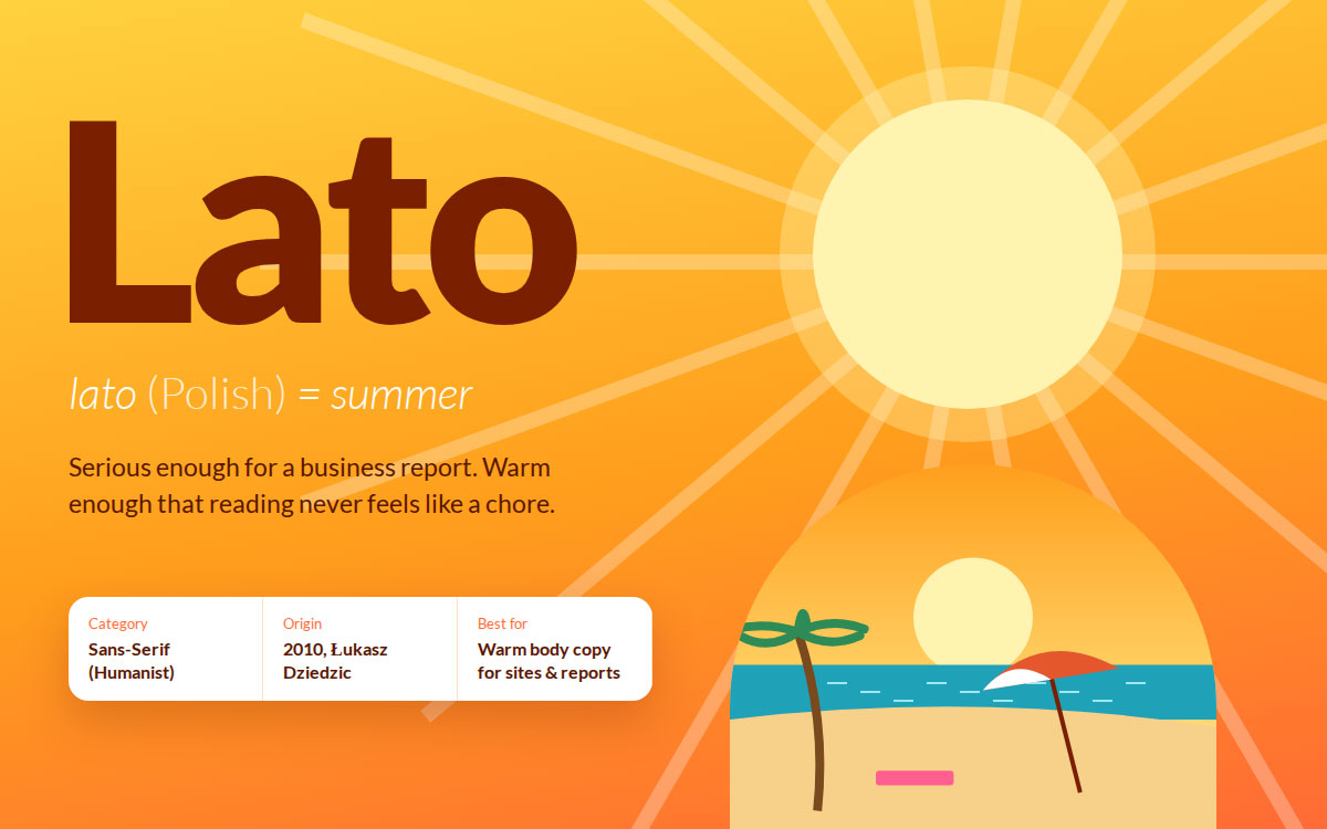
"Lato" means summer in Polish, and the font carries that same warmth. It walks a careful line, serious enough for a business report and friendly enough that reading it never feels like a chore. That balance is rare, and it's why Lato became one of the internet's most dependable typefaces.
Category: Sans Serif (Humanist) • Origin: Designed 2010 (Łukasz Dziedzic)
Key features:
Slightly rounded details that soften a sans serif structure
Excellent readability in body copy
Broad weight range for flexible hierarchy
When to use it: Ideal for business reports, websites, and body text that needs to feel both professional and warm.
When to avoid it: It lacks a strong personality for headline or logo work, so pair it with a bolder display font.
Best for: Friendly, warm body copy for websites and reports.
12. Calibri
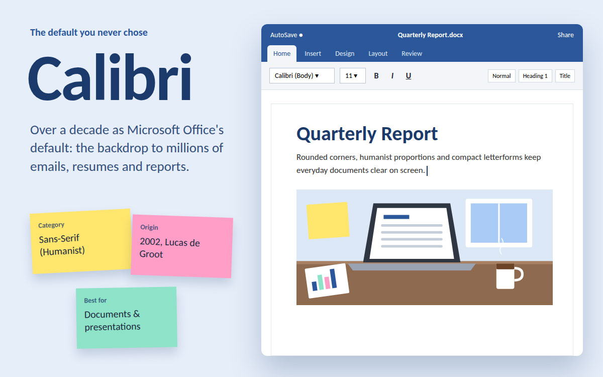
Chances are you've typed a hundred documents in this font without ever choosing it. Calibri served as the default typeface in Microsoft Office for over a decade, becoming the invisible backdrop to millions of emails, resumes, and reports. It became famous simply because it was the first thing everyone saw when they opened a blank page.
Category: Sans Serif (Humanist) • Origin: Designed 2002 (Lucas de Groot)
Key features:
Rounded corners with humanist proportions
Designed for screen clarity
Compact, space-efficient letterforms
When to use it: Stick with Calibri for internal documents, presentations, and reports where familiarity and neutrality matter most.
When to avoid it: Never use it for branding. Its link to default office documents makes it feel unpolished for logos or marketing.
Best for: Business documents, presentations, and office communication.
13. Times New Roman
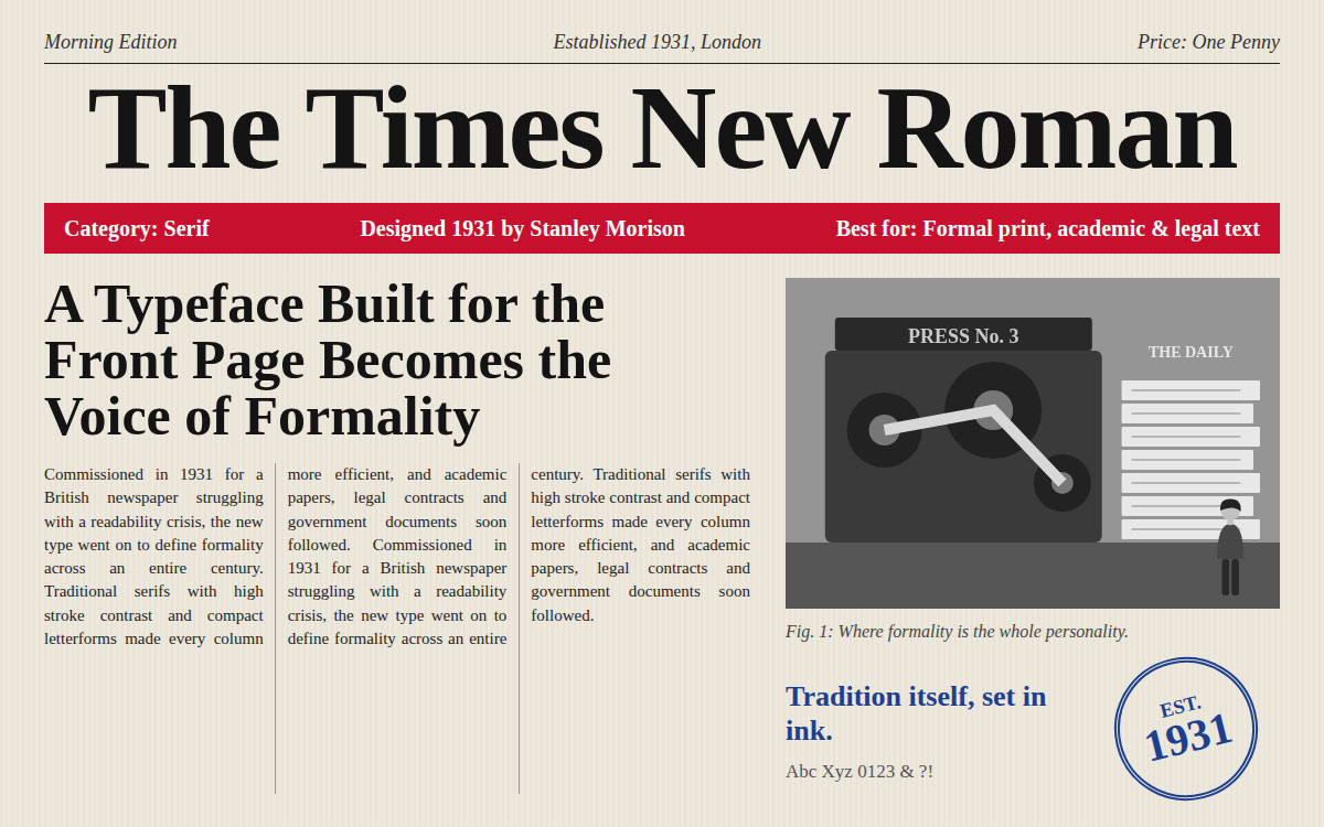
Times New Roman is the font of tradition itself. Commissioned in 1931 for a British newspaper struggling with a readability crisis, it went on to define formality across an entire century, from academic papers to legal contracts to government documents. It might feel a little old-fashioned today, but that is exactly the point. Formality is its whole personality.
Category: Serif • Origin: Designed 1931 (Stanley Morison)
Key features:
Traditional serifs with high stroke contrast
Compact letterforms for space efficiency
Deep association with formality and tradition
When to use it: It's the natural choice for legal documents, academic papers, and formal correspondence.
When to avoid it: Avoid it in branding or marketing. Outside formal documents, it reads as generic and dated.
Best for: Formal print documents, academic papers, and legal text.
14. Garamond
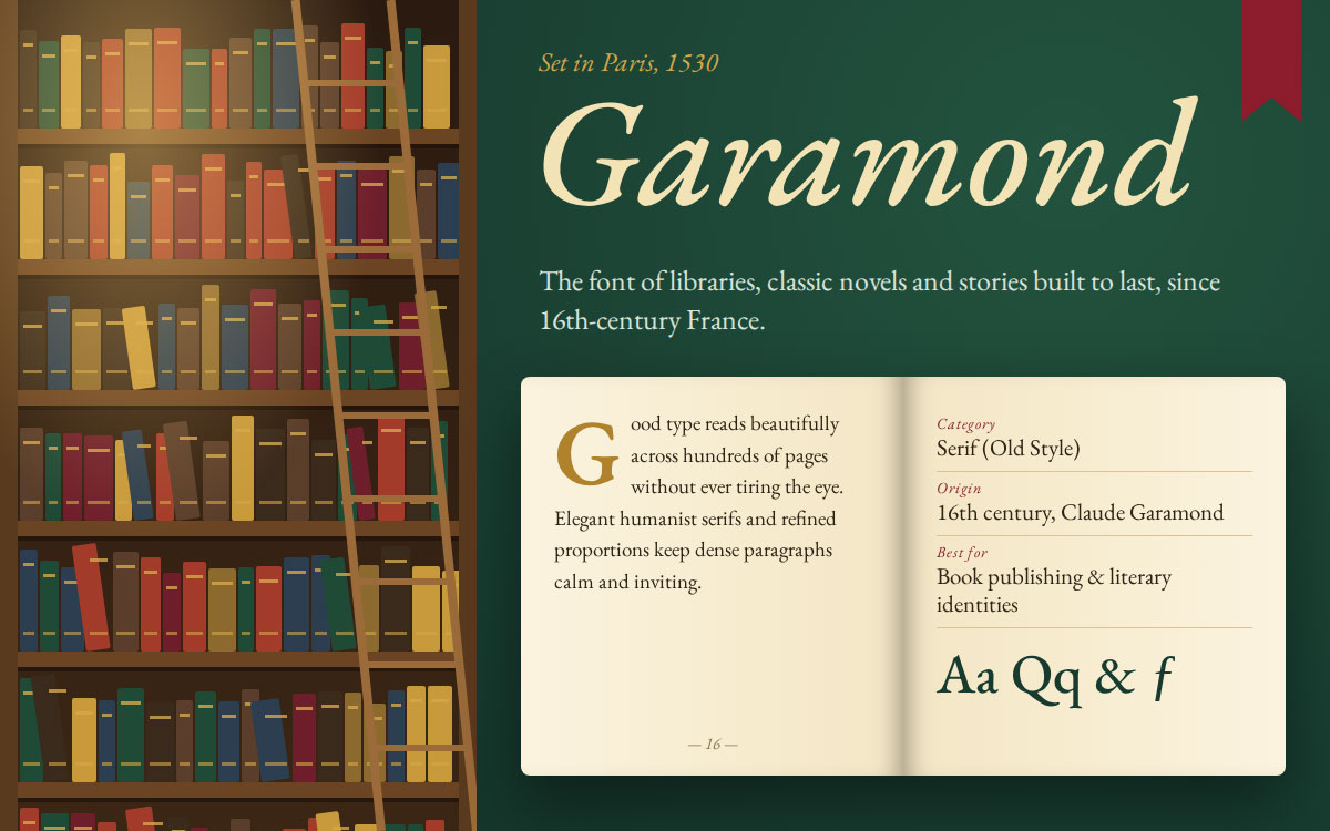
Few fonts carry as much literary weight as Garamond. The typeface dates back to 16th century France, and publishers have trusted it ever since because it reads beautifully across hundreds of pages without tiring the eye. This is the font of libraries, classic novels, and stories built to last. That's a beautiful legacy for a typeface to carry.
Category: Serif (Old Style) • Origin: Designed in the 16th century (Claude Garamond)
Key features:
Elegant, humanist serif structure
Excellent readability in dense paragraphs
Timeless, refined character
When to use it: Use it for book interiors, literary branding, and identities that want to feel classic and intellectual.
When to avoid it: At small screen sizes, its delicate strokes can lose clarity, so test carefully for digital use.
Best for: Book publishing and classic, literary brand identities.
15. Georgia
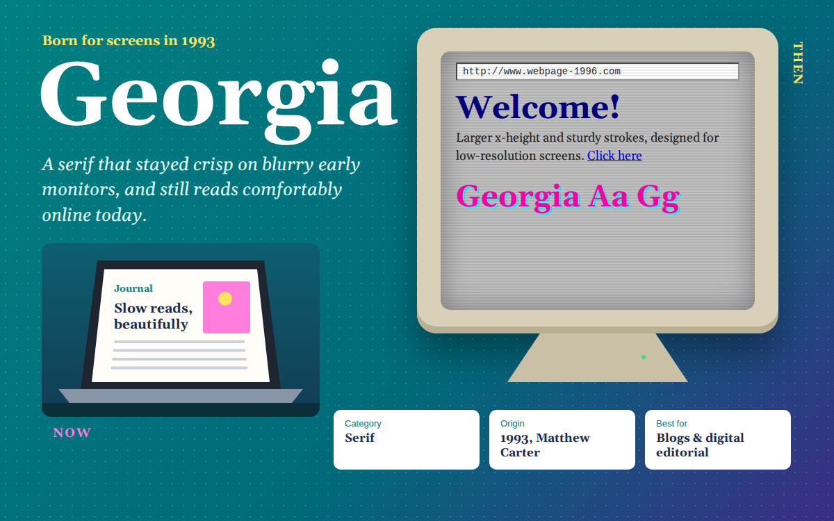
This serif was born for screens back when almost none of them were. Designed in 1993 by Matthew Carter, Georgia solved a problem most designers hadn't even noticed yet. Traditional serifs looked blurry and cramped on early computer monitors. Decades later, it's still one of the most comfortable serif fonts to read online, a rare feat for a typeface of its era.
Category: Serif • Origin: Designed 1993 (Matthew Carter)
Key features:
Larger x-height than traditional serifs
Sturdy strokes designed for low-resolution screens
Warm, approachable serif character
When to use it: Georgia shines in blog posts, digital editorial layouts, and any long-form web content that wants a serif feel without sacrificing readability.
When to avoid it: It can feel dated in ultra modern brand systems that lean fully sans serif.
Best for: On-screen readability for editorial and blog typography.
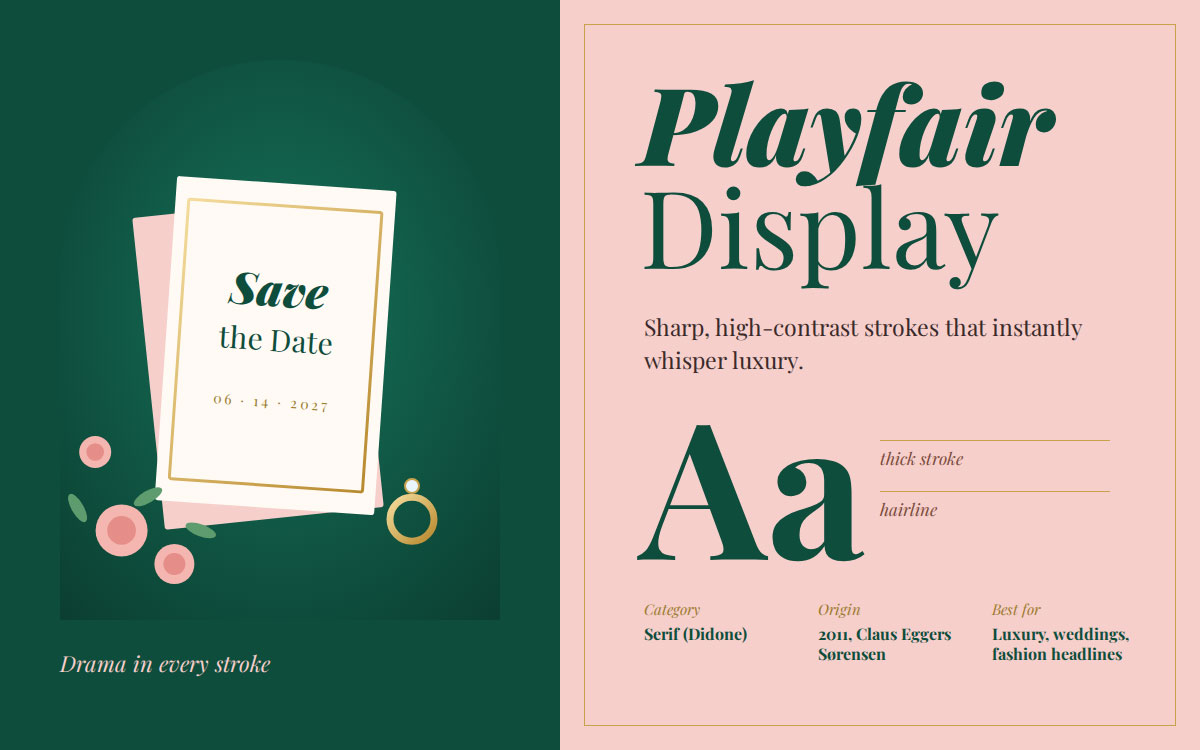
16. Playfair Display
You can feel the drama the moment you see it. Playfair Display has sharp, high-contrast strokes that instantly whisper luxury, which is why fashion houses and wedding brands reach for it again and again. Released in 2011, it's a modern typeface that borrows its elegance from classic editorial serifs, giving new brands an old-world sense of glamour.
Category: Serif (Didone) • Origin: Designed 2011 (Claus Eggers Sørensen)
Key features:
Sharp contrast between thick and thin strokes
Refined, editorial character
Strong presence at large display sizes
When to use it: Perfect for fashion headlines, wedding stationery, and luxury brand identities that want instant sophistication.
When to avoid it: Its delicate hairlines lose legibility at small sizes, so reserve it for headlines and keep it out of body copy.
Best for: Luxury branding, wedding invitations, and fashion headlines.
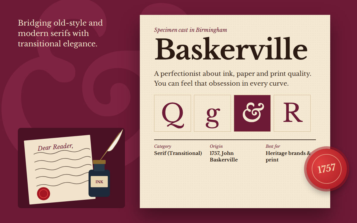
17. Baskerville
This font sits in a beautiful in-between space. Designed in 1757, Baskerville bridges the gap between old-style serifs and the sharper modern ones that came after, giving it a transitional elegance that heritage brands still lean on today. John Baskerville was famously a perfectionist about ink, paper, and print quality, and you can feel that obsession in every curve.
Category: Serif (Transitional) • Origin: Designed 1757 (John Baskerville)
Key features:
Moderate stroke contrast
Classic, refined proportions
Strong sense of tradition and craftsmanship
When to use it: Ideal for heritage branding, print publications, and identities built around legacy and trust.
When to avoid it: It can feel overly formal for youthful or casual brand identities.
Best for: Sophisticated print design and heritage brand storytelling.
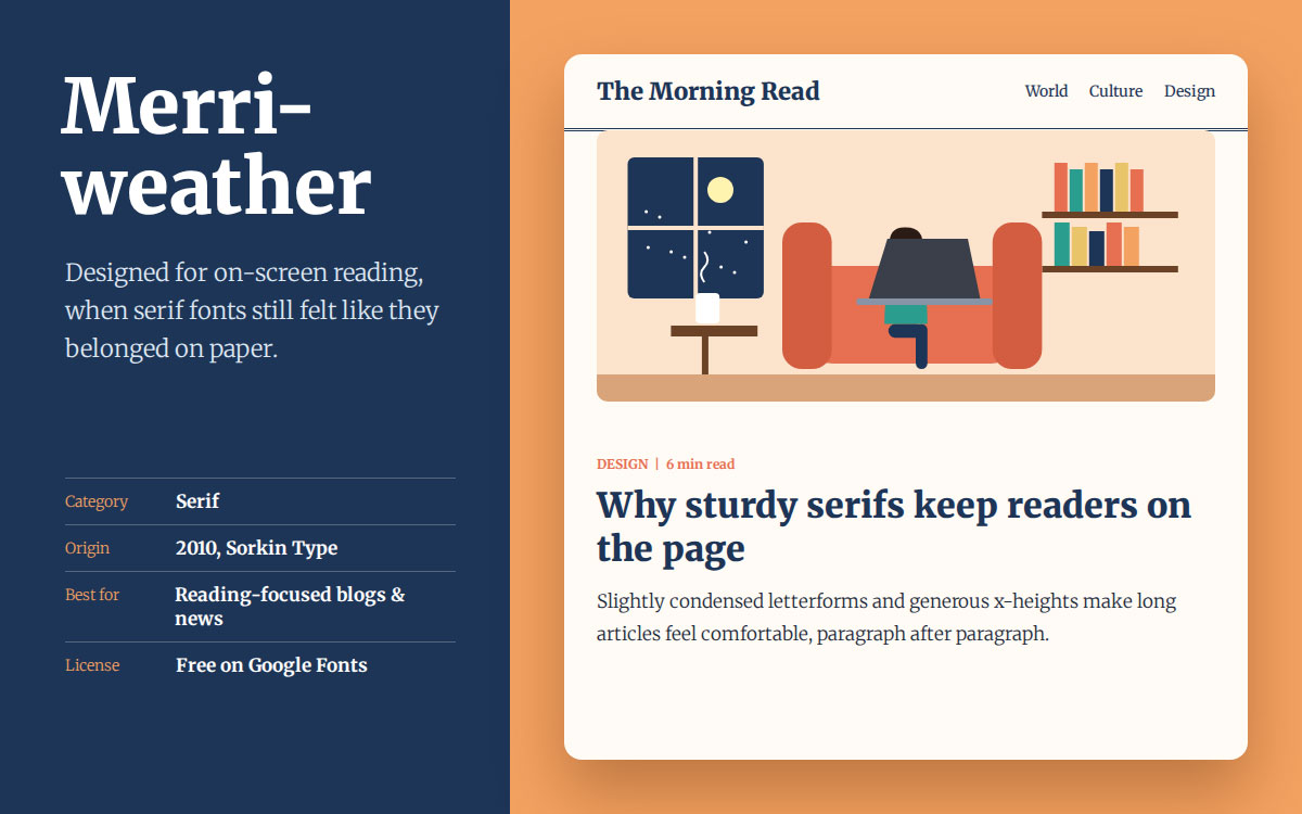
18. Merriweather
Comfort was the whole point here. Merriweather was designed specifically for reading on screen, at a time when most serif fonts still felt like they belonged on paper. That focus paid off. It's now one of the most trusted serif choices for blogs and news sites where readers spend real time with the words.
Category: Serif • Origin: Designed 2010 (Sorkin Type, Google Fonts)
Key features:
Sturdy, slightly condensed letterforms
Designed for extended screen reading
Free through Google Fonts
When to use it: Great for blogs, news sites, and long-form content where readers spend real time with the text.
When to avoid it: Its condensed structure can feel cramped on very large displays.
Best for: Reading-focused blogs and content-heavy web pages.
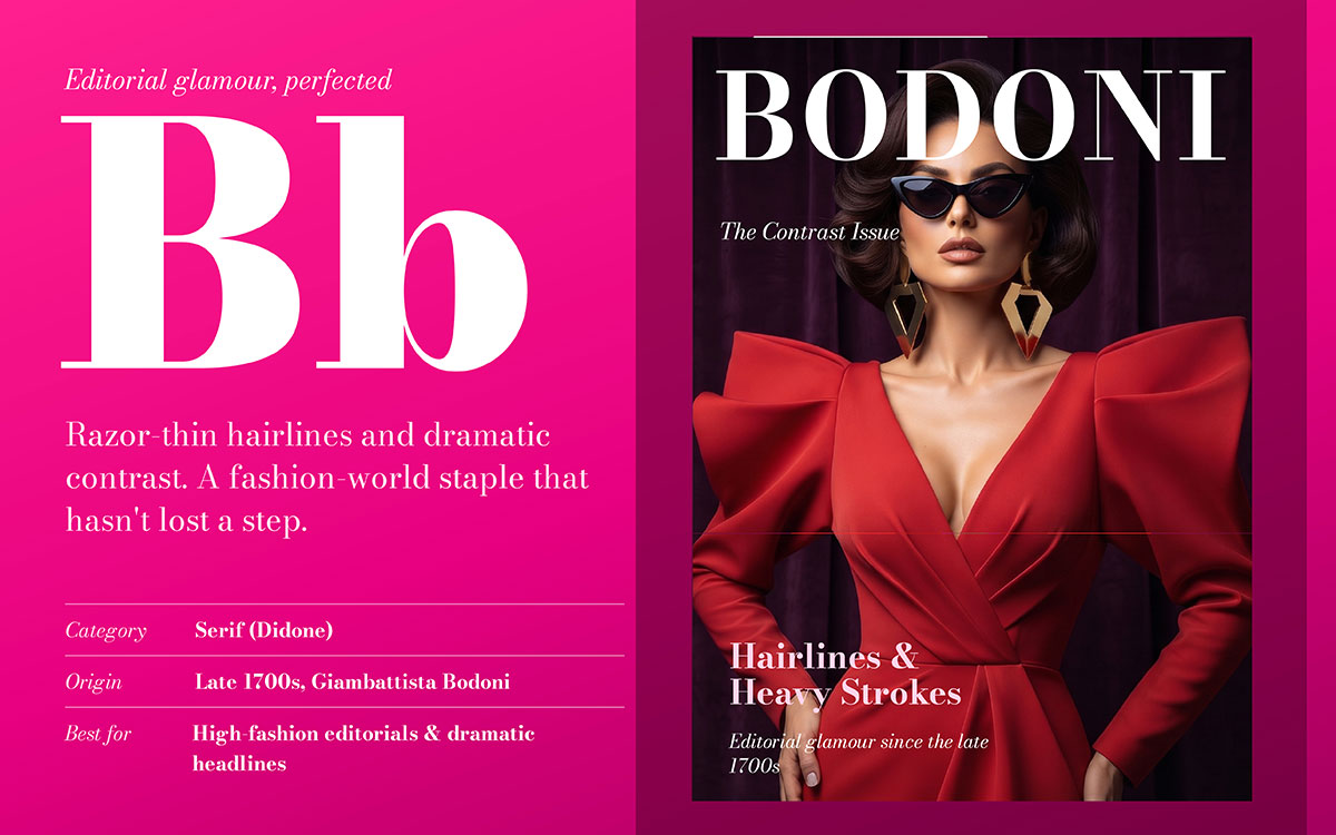
19. Bodoni
This font practically defines editorial glamour. Bodoni's razor-thin hairlines and dramatic contrast have made it a fashion world staple since the late 1700s, and it hasn't lost a step. Giambattista Bodoni was chasing pure visual perfection when he cut these letterforms, and that obsession still shows in every headline set in his typeface today.
Category: Serif (Didone) • Origin: Designed late 1700s (Giambattista Bodoni)
Key features:
Extreme stroke contrast
Vertical, geometric axis
Instantly recognizable editorial character
When to use it: Reserve it for fashion magazine headlines, luxury editorials, and dramatic display type.
When to avoid it: Never use it for body text or small sizes. The hairlines simply disappear.
Best for: High fashion editorials and dramatic, high contrast headlines.
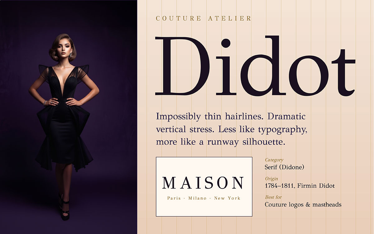
20. Didot
Didot is couture typography. The style is practically synonymous with high fashion, and Vogue's own masthead has leaned on it for decades. Its impossibly thin hairlines and dramatic vertical stress feel like a runway silhouette rendered in ink.
Category: Serif (Didone) • Origin: Designed 1784 to 1811 (Firmin Didot)
Key features:
Ultra-thin hairline serifs
Dramatic vertical stress
Refined, couture aesthetic
When to use it: Perfect for fashion logo designs, magazine titles, and luxury identities chasing that editorial glamour.
When to avoid it: Like Bodoni, it's unreadable at small sizes, so keep it to display use only.
Best for: Vogue-style fashion branding and couture logo design.
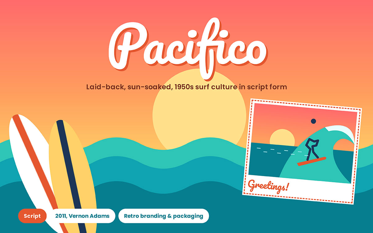
21. Pacifico
Close your eyes, and this font sounds like a beach. Inspired by 1950s American surf culture, Pacifico brings a laid-back, sun-soaked energy that's hard to replicate. Vernon Adams designed it to feel as if it were written in the sand, and that easygoing charm hasn't faded one bit.
Category: Script • Origin: Designed 2011 (Vernon Adams)
Key features:
Bold, rounded script strokes
Retro, hand-drawn feel
Free through Google Fonts
When to use it: Great for casual product branding, packaging, and playful social graphics that want warmth and personality.
When to avoid it: Avoid it for formal branding or long text. Scripts like this are meant for short, punchy phrases.
Best for: Playful, retro branding and casual product packaging.
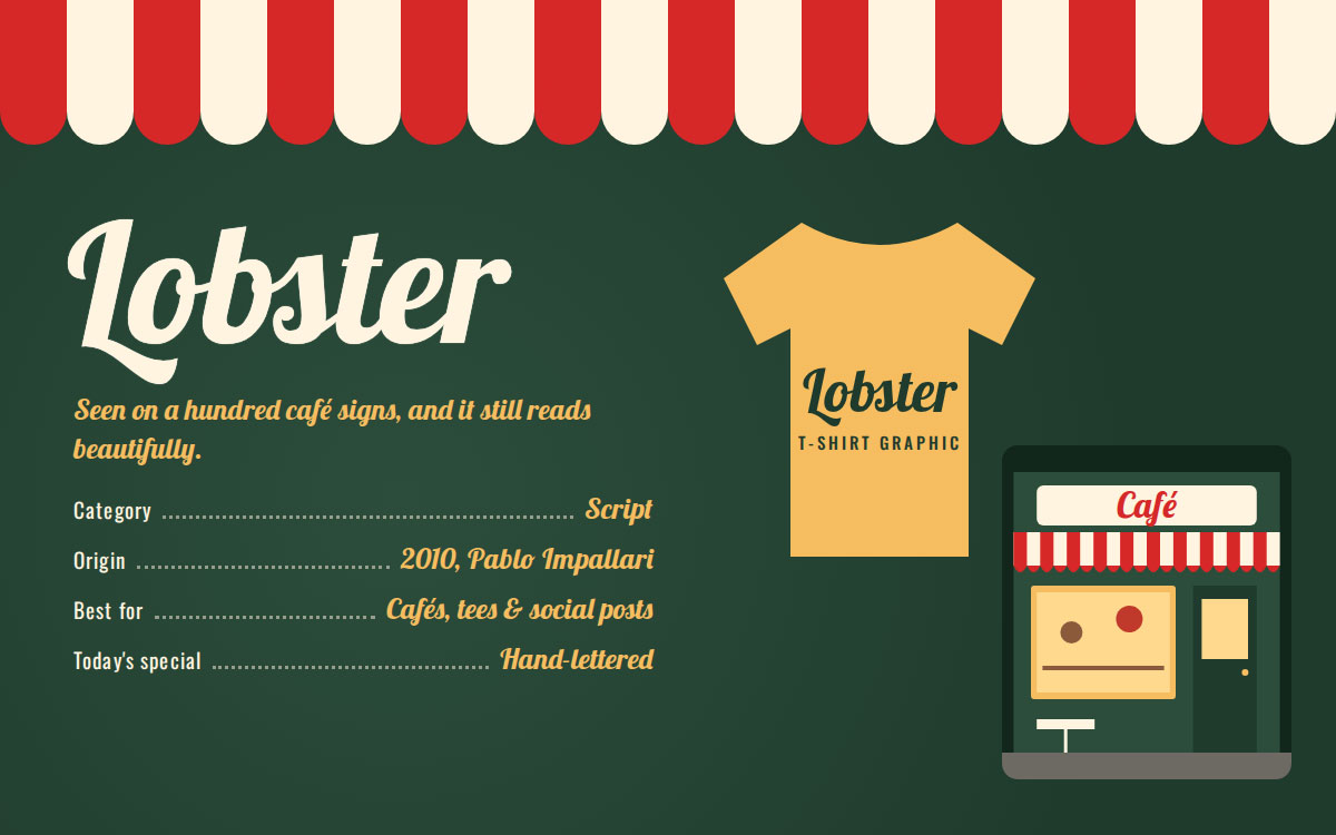
22. Lobster
You've seen this font on a hundred café signs already. Lobster took off as one of the most-downloaded script fonts of its decade, thanks to a bold, chunky charm that remains legible. It shows that a script font can add personality without sacrificing readability.
Category: Script • Origin: Designed 2010 (Pablo Impallari)
Key features:
Thick, confident script strokes
High legibility for a cursive font
Versatile across digital and print
When to use it: Perfect for café branding, T-shirt graphics, and casual logos that need a warm, approachable script.
When to avoid it: Its widespread popularity can make it feel a little overused in saturated niches.
Best for: Bold, friendly branding for cafés, T-shirts, and social posts.
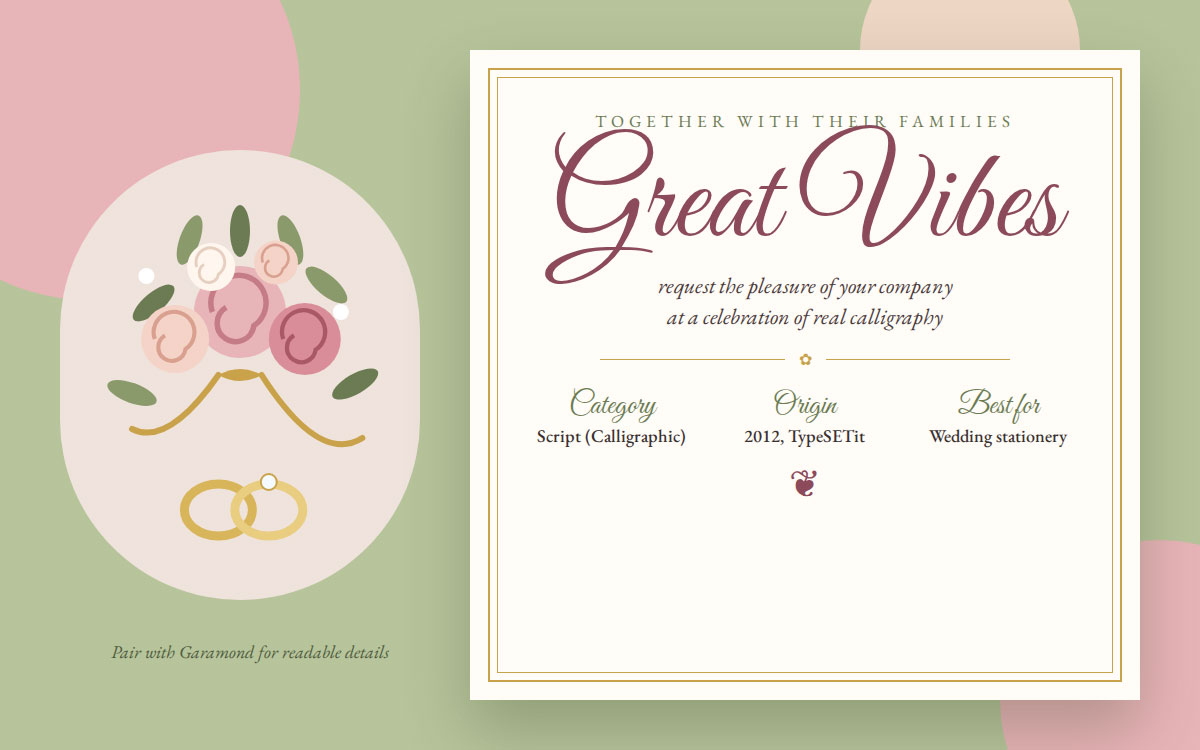
23. Great Vibes
This is real calligraphy. Great Vibes brings genuine hand-lettered elegance into digital design, connecting each letter in one continuous, flowing gesture. It's no surprise the wedding industry fell in love with it almost instantly, since few fonts feel this personal and intimate.
Category: Script (Calligraphic) • Origin: Designed 2012 (TypeSETit)
Key features:
Flowing, connected calligraphic strokes
Elegant, feminine character
Free through Google Fonts
When to use it: Ideal for wedding invitations, elegant packaging accents, and feminine brand identities.
When to avoid it: Its intricate strokes make it difficult to read in long passages or at small sizes.
Best for: Wedding stationery and elegant, feminine branding.
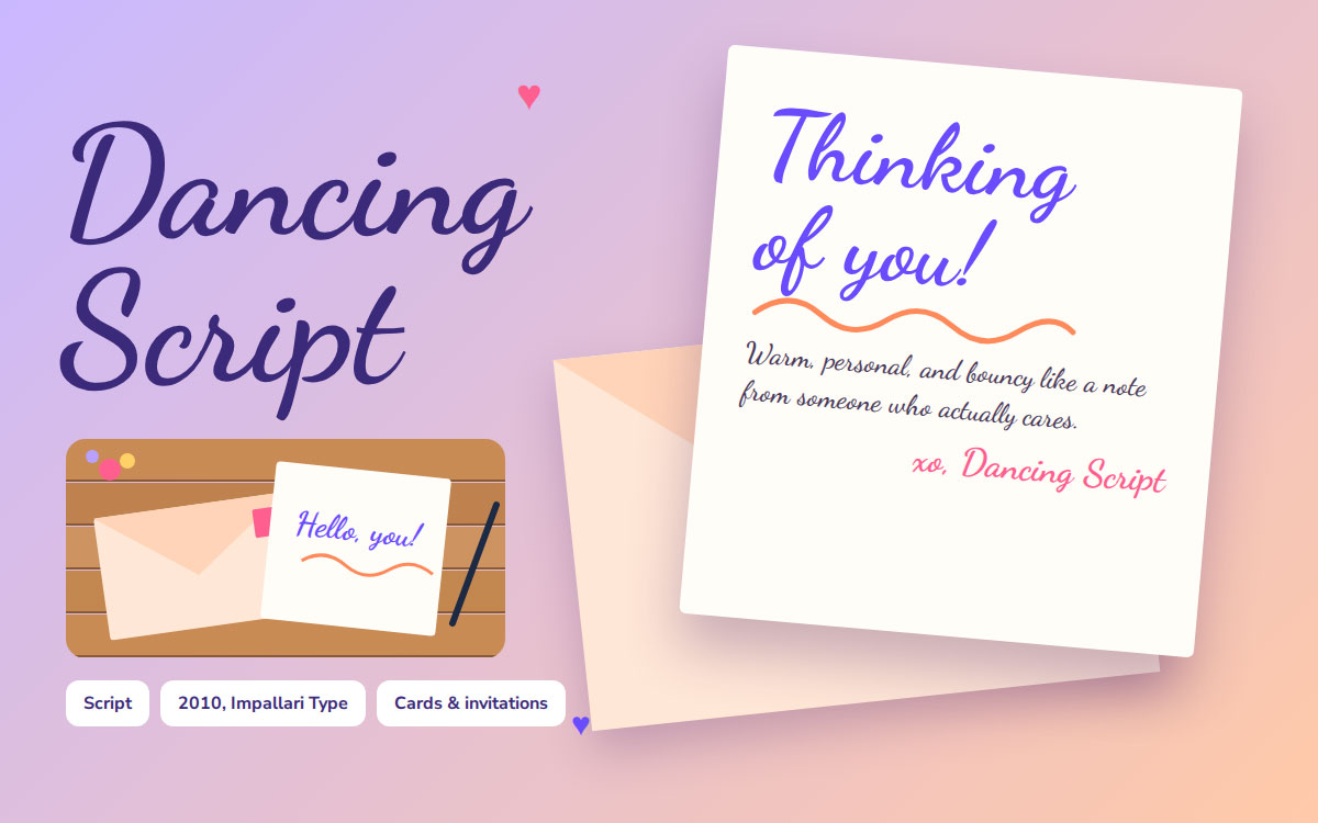
24. Dancing Script
This font feels like a genuine handwritten note. Dancing Script has a bouncy, casual rhythm that reads as warm and personal. It's the kind of typeface that makes a greeting card feel like it came from someone who truly cares.
Category: Script • Origin: Designed 2010 (Impallari Type)
Key features:
Bouncy, casual baseline
Warm, handwritten character
Highly legible for a script font
When to use it: Great for greeting cards, casual invitations, and brand touches that want a personal, human feel.
When to avoid it: It's too casual for corporate or formal brand identities.
Best for: Warm, handwritten style headlines and invitations.
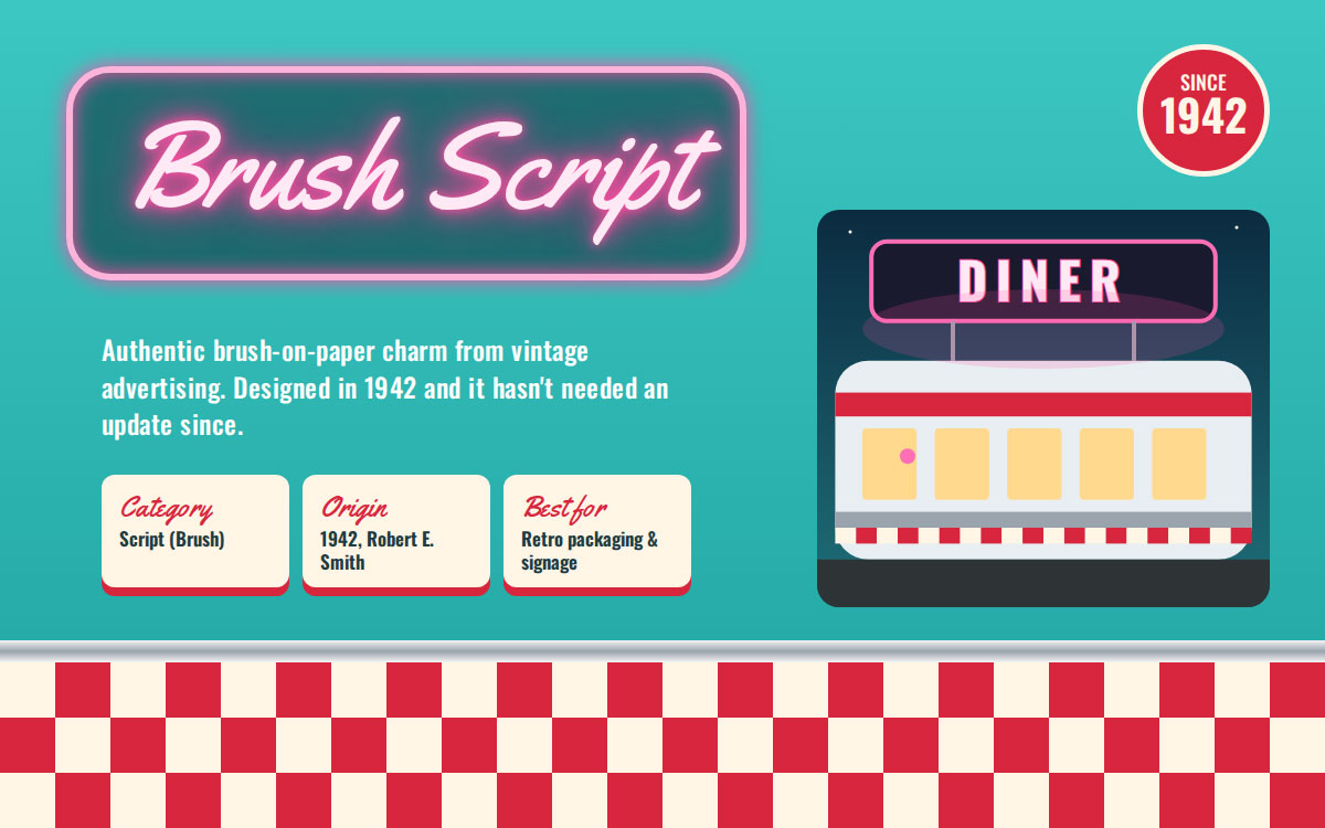
25. Brush Script MT
This one smells like a 1950s diner sign. Brush Script has been a top choice for vintage advertising since the mid 20th century, capturing an authentic hand-lettered, brush-on-paper charm that designers still chase today. Robert E. Smith designed it back in 1942, and it hasn't needed a single update since.
Category: Script (Brush) • Origin: Designed 1942 (Robert E. Smith)
Key features:
Brush stroke texture and flow
Vintage advertising character
Bundled with most operating systems
When to use it: Perfect for retro packaging, vintage-inspired signage, and nostalgic branding moments.
When to avoid it: It comes on nearly every computer, which can make it feel like a default choice.
Best for: Vintage advertising and hand-lettered signage looks.
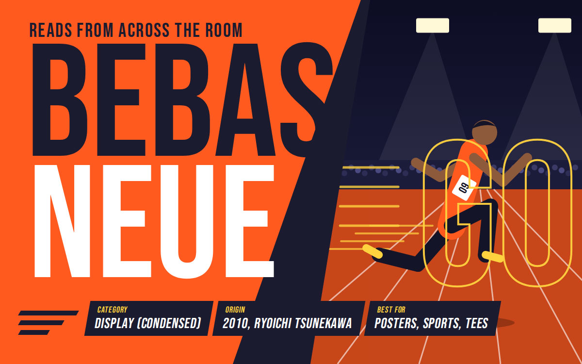
26. Bebas Neue
This font reads from across a room. Bebas Neue is a condensed, all-caps powerhouse built for immediate impact, with no subtlety and no hesitation, just bold letters that grab your eye and hold it. It's no wonder it became a staple for sports branding and apparel graphics that need to make a statement in half a second.
Category: Display (Condensed Sans) • Origin: Designed 2010 (Ryoichi Tsunekawa)
Key features:
Tall, condensed, all-caps structure
Bold visual impact at any size
Free for personal and commercial use
When to use it: Ideal for poster headlines, sports branding, and T-shirt graphics that need to be read in a single glance.
When to avoid it: It only comes in caps, so it doesn't suit long text or body copy.
Best for: Poster headlines, sports branding, and bold T-shirt text.
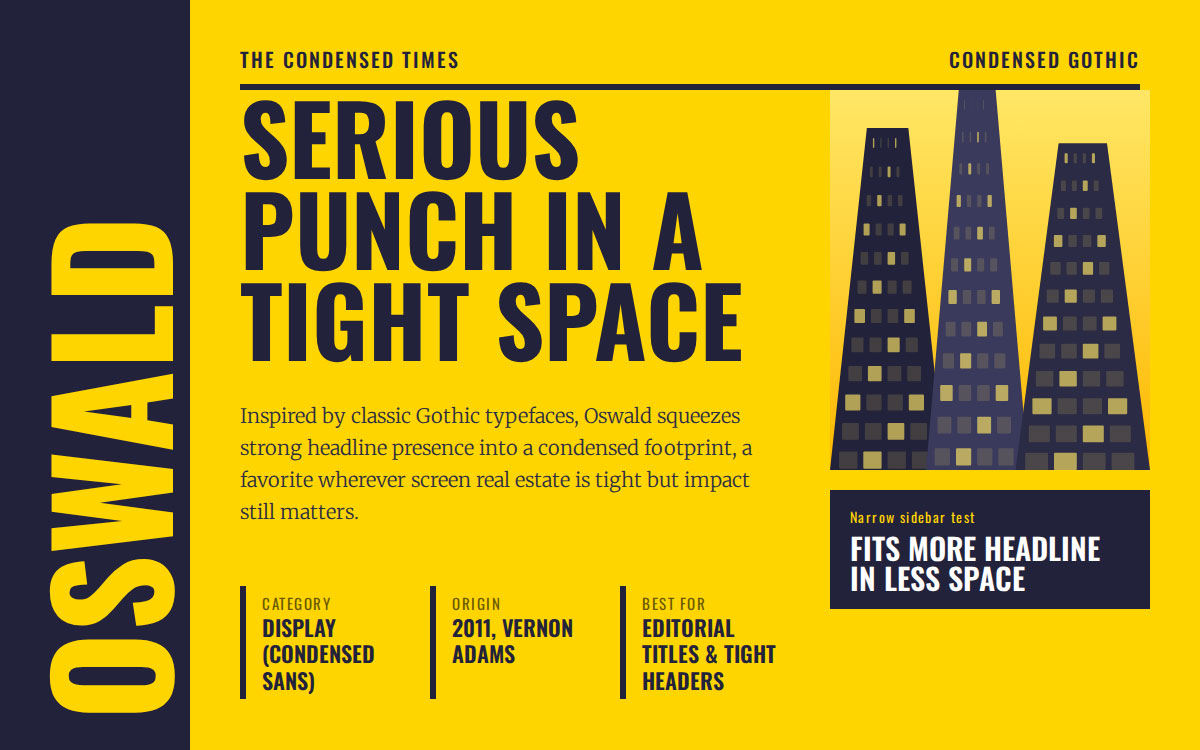
27. Oswald
This font packs a serious punch into a tight space. Inspired by classic Gothic typefaces, Oswald squeezes strong headline presence into a condensed footprint, making it a favorite wherever screen space is tight, but impact still matters. Vernon Adams built it to work hard in small spaces, and it delivers every time.
Category: Display (Condensed Sans) • Origin: Designed 2011 (Vernon Adams, Google Fonts)
Key features:
Condensed, Gothic-inspired structure
Multiple weights for flexible hierarchy
Free through Google Fonts
When to use it: Great for editorial titles, tight header spaces, and modern web typography.
When to avoid it: Its condensed nature can feel cramped for longer headline phrases.
Best for: Space-saving headlines and modern editorial titles.
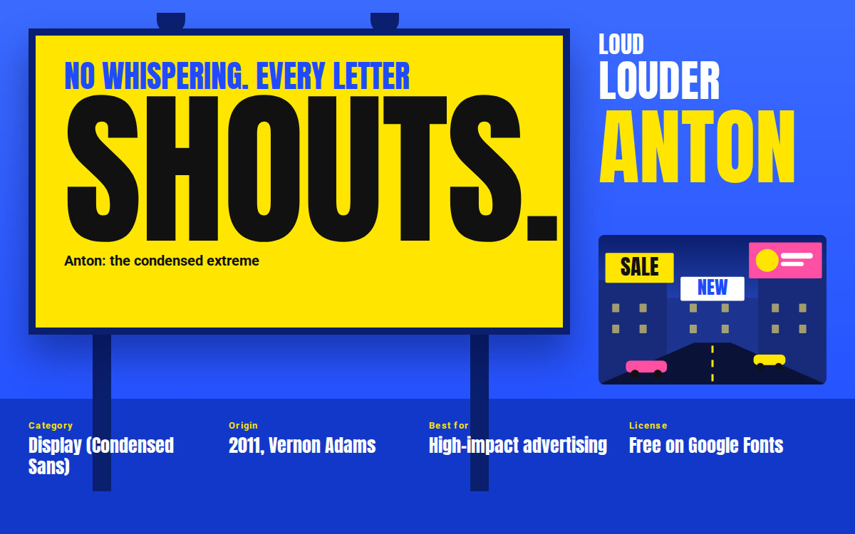
28. Anton
Subtlety was never the plan here. Anton takes condensed, bold typography to its absolute extreme, and that's exactly the point. There is no whispering with this font. Every letter shouts, which makes it a favorite for advertising campaigns that need to dominate a page in an instant.
Category: Display (Condensed Sans) • Origin: Designed 2011 (Vernon Adams)
Key features:
Extremely heavy, condensed weight
Maximum visual impact
Free through Google Fonts
When to use it: Use it when your headline needs to shout, such as in advertising campaigns, bold statement graphics, and attention-grabbing posters.
When to avoid it: It's far too heavy for body text or subtle brand moments.
Best for: Ultra bold headlines and high impact advertising.
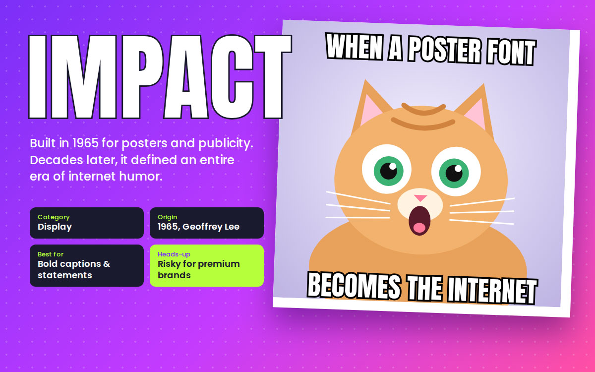
29. Impact
This font became a cultural phenomenon almost by accident. Impact's bold, condensed letterforms found new life through internet meme culture, decades after Geoffrey Lee first designed it in 1965 for posters and publicity materials. It's funny that a typeface built for advertising ended up defining an entire era of internet humor.
Category: Display • Origin: Designed 1965 (Geoffrey Lee)
Key features:
Extremely heavy, condensed weight
Minimal spacing between letters
Instantly recognizable at any size
When to use it: Effective for bold captions, poster text, and high-visibility statements that need to dominate the page.
When to avoid it: Its meme associations make it a risky choice for premium or serious brand identities.
Best for: Meme text, bold statements, and attention-grabbing captions.
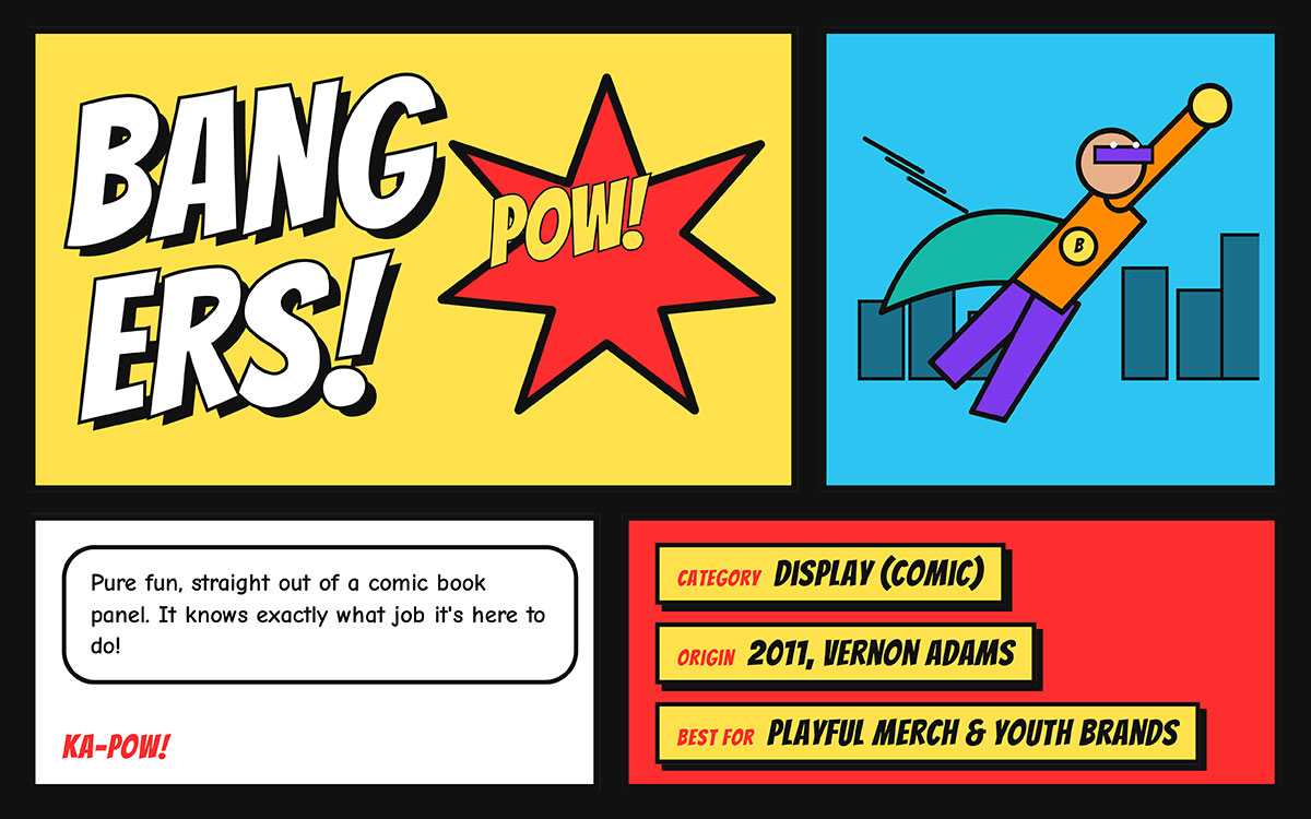
30. Bangers
This font jumped straight out of a comic book panel. Bangers channels classic comic book lettering, complete with rounded corners and energetic, chunky strokes that practically bounce off the page. It's pure fun, and it knows exactly what job it's here to do.
Category: Display (Comic) • Origin: Designed 2011 (Vernon Adams)
Key features:
Bold, rounded comic style letterforms
High energy and playful tone
Free through Google Fonts
When to use it: Great for comic-themed branding, playful merchandise, and youth-focused product graphics.
When to avoid it: Its playful tone doesn't suit serious, professional, or luxury branding.
Best for: Comic style branding, playful merchandise, and youth brands.
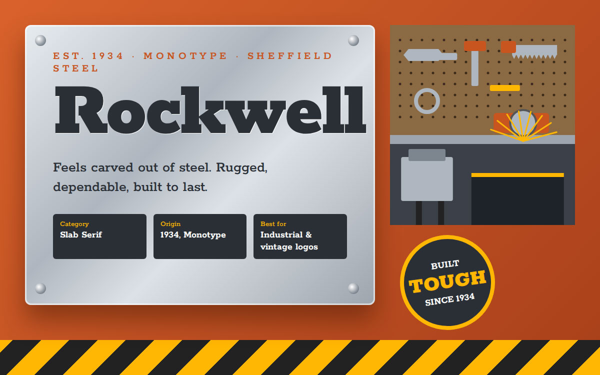
31. Rockwell
This font feels like it was carved out of steel. Rockwell's thick, geometric slabs give it a sturdy, industrial personality that has held up for nearly a century without losing its edge. Monotype designed it in 1934, and it still shows up wherever a brand wants to feel rugged, dependable, and built to last.
Category: Slab Serif • Origin: Designed 1934 (Monotype)
Key features:
Thick, blocky slab serifs
Geometric letter structure
Strong, sturdy presence
When to use it: Ideal for industrial branding, rugged product lines, and vintage-inspired logo marks.
When to avoid it: Its heavy weight can feel overpowering in delicate or minimalist brand systems.
Best for: Industrial, rugged branding and vintage-inspired logos.
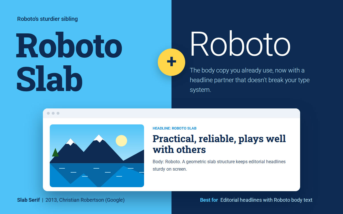
32. Roboto Slab
Roboto Slab is Roboto's sturdier sibling. The font extends the popular Roboto family into slab serif territory, giving digital-first brands an easy pairing partner without breaking from their existing type system. It's practical, reliable, and plays well with others.
Category: Slab Serif • Origin: Designed 2013 (Christian Robertson, Google)
Key features:
Geometric slab structure
Pairs naturally with Roboto sans serif
Free through Google Fonts
When to use it: Great for editorial headlines on websites already using Roboto for body copy.
When to avoid it: On its own, it lacks a distinctive personality compared to more characterful slab serifs.
Best for: Modern editorial headlines paired with Roboto body text.
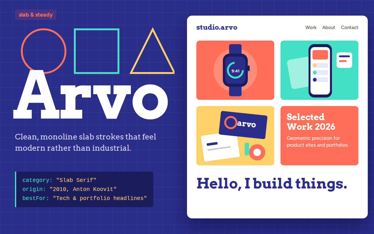
33. Arvo
This font brings geometric precision to a category that's usually all about weight. Arvo has clean, monoline slab strokes that feel modern, which is why tech-forward portfolios and product sites reach for it. Anton Koovit designed it in 2010, and it has stayed a favorite for its contemporary edge ever since.
Category: Slab Serif • Origin: Designed 2010 (Anton Koovit)
Key features:
Geometric, monoline slab strokes
Clean, modern character
Free through Google Fonts
When to use it: Suits tech branding, portfolio headlines, and modern web projects that want a slab serif with a contemporary edge.
When to avoid it: Its geometric coldness may not suit warm, artisanal, or heritage brand stories.
Best for: Geometric slab headlines for tech and portfolio sites.
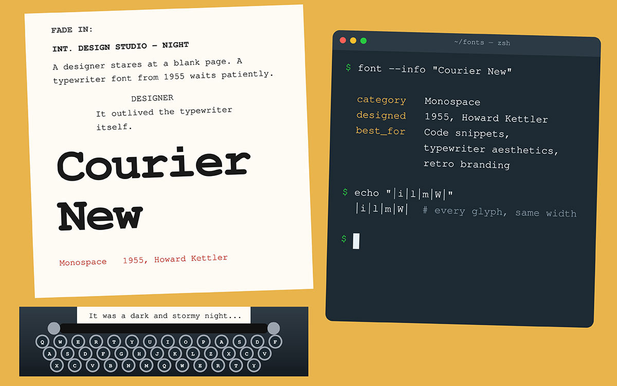
34. Courier New
You know this font from every screenplay and every terminal window ever. Originally designed for IBM typewriters in 1955, Courier New's fixed-width letterforms became the internet's default shorthand for "code" or "document" long before most of us even knew what monospace meant. Howard Kettler couldn't have guessed his typewriter font would outlive the typewriter itself.
Category: Monospace • Origin: Designed 1955 (Howard Kettler)
Key features:
Fixed width, monospaced letterforms
Strong typewriter association
Excellent for code and tabular alignment
When to use it: Use it for code snippets, screenplay formatting, and retro typewriter style branding.
When to avoid it: Its fixed spacing makes it inefficient and visually flat for general branding or marketing copy.
Best for: Code snippets, typewriter aesthetics, and retro branding.
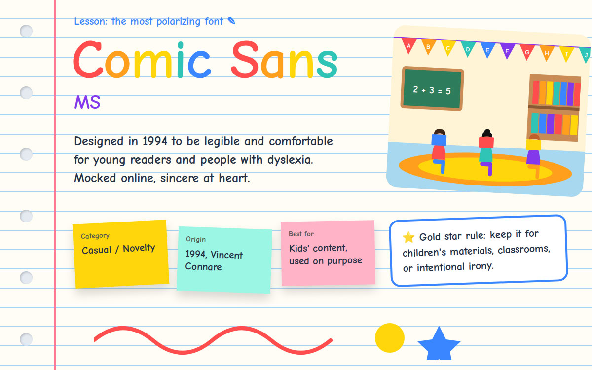
35. Comic Sans MS
We saved the most polarizing font for last. Comic Sans is arguably the most mocked typeface in design history, and one of the most genuinely useful. Vincent Connare designed it in 1994 to be legible and comfortable for young readers and people with dyslexia, a thoughtful mission that got lost somewhere along the way to internet infamy. It's funny that the world's most ridiculed font might also be one of its most sincere.
Category: Casual/Novelty • Origin: Designed 1994 (Vincent Connare)
Key features:
Rounded, casual, hand-drawn letterforms
High legibility for young or struggling readers
Instantly recognizable, for better or worse
When to use it: Appropriate for children's materials, casual classroom content, or intentionally ironic design choices.
When to avoid it: Avoid it almost everywhere else. Its reputation as an unprofessional default choice is hard to shake.
Best for: Informal, kid-friendly content (used sparingly and intentionally)
How to choose the right graphic design font
Choose a font by deciding who will read the design and where they will see it. The best match feels natural to that audience in that setting, so nobody stops to notice the type. Here, choosing the right font for your creative project gives you five steps to make that call with confidence.
Match font category to project type
Once you know the categories, the next step is choosing the one that fits your project. Use this table as a shortcut by matching your project type on the left to the font style that will work for it.
Creative Project
Recommended Font Style
Example Fonts
Why It Works
Logo & brand identity
Geometric sans serif or custom slab
Futura, Gotham, Rockwell
Scales cleanly across sizes and platforms
Website body copy
Humanist sans serif or web-optimized serif
Open Sans, Lato, Georgia
Prioritizes legibility on screen
Editorial/blog headlines
Serif or slab serif
Playfair Display, Roboto Slab
Adds authority and reading rhythm
T-shirt & apparel graphics
Bold display or script
Bebas Neue, Lobster, Bangers
Reads instantly at a glance and on fabric
Wedding & event stationery
Calligraphic script paired with serif
Great Vibes + Garamond
Balances elegance with readability
Presentations & pitch decks
Clean geometric sans serif
Montserrat, Calibri, Poppins
Stays legible on screens and projectors
Prioritize readability over trend
Choose readability over trend, since a trendy font nobody can read isn't doing its job. Before you finalize anything, ask yourself these questions.
Is it legible at small and large sizes?
Does it perform consistently across print, screen, and fabric?
Have you avoided overly decorative fonts for body text?
Limit font pairings
Stick to two or three popular fonts per project at most. Pair one display or script font with a clean sans serif or serif for contrast, and let each one do its job without competing for attention.
Check licensing before commercial use
Check licensing before commercial use, because not every font on this list is free. Google Fonts entries like Roboto, Montserrat, Open Sans, and Oswald are free for commercial use. Fonts like Proxima Nova, Gotham, and Avenir need a commercial license before you build a business identity around them, so always confirm before you commit.
Test in context (mockups)
Test fonts in context by previewing them on the actual medium (screen, packaging, or apparel) before you finalize anything. A font can look perfect on your monitor and fall flat on a T-shirt or printed brochure.
Graphic design font FAQs
Questions about the most popular fonts usually have short, practical answers that any designer can apply right away. Getting them right saves time, prevents costly rework, and keeps your typography consistent and professional across every project. Scroll the graphic design font FAQs below to find the answer you need before you start designing. If you don’t find the answer below, contact us anytime for a discussion.
Helvetica, Montserrat, Roboto, Playfair Display, and Bebas Neue rank among the most popular fonts in graphic design today. They dominate current design work because they cover the full range of needs, including clean corporate branding, modern digital interfaces, editorial elegance, and bold display type, all while staying highly legible and versatile across media.
A serif font has small decorative strokes at the ends of its letters, while a sans-serif font has none. Serifs tend to feel traditional and formal, and sans-serifs tend to feel modern and clean.
Futura works well for minimalist, forward-facing logos because of its clean geometric shapes. Gotham suits logos that need to project confidence and authority. Montserrat is a strong choice for modern, startup-style branding thanks to its balanced, versatile letterforms.
Yes, Google Fonts are free for both personal and commercial use, with no licensing fees. The fonts on this list available through Google Fonts include Montserrat, Roboto, Open Sans, Lato, Merriweather, Pacifico, Great Vibes, Oswald, Anton, Bangers, Roboto Slab, and Arvo.
Use two to three fonts in one design at most. This limit keeps your visual hierarchy clean and stops your design from feeling cluttered or unprofessional.
Roboto is the closest free alternative to Helvetica. It shares a similar neutral, modern sans serif structure and is completely free for commercial use through Google Fonts.
Endnote
We've reached the end of the list, and your brand's next design decision starts here.
You've just met the 35 most popular fonts in graphic design, organized by category and matched to creative projects you're actually working on. The right font shapes how your brand is perceived before a single word gets read. It's a quiet decision that carries the loudest impact!
Still not sure which font fits your brand? That's exactly what we're here for. Reach out to Graphic Design Eye for expert font pairing and branding guidance tailored to your business.
Go pick your font, because your brand's first impression is waiting on it! 🙂
Graphic Design Eye LLC is a full-service creative agency built for brands that demand more than design — they demand vision. From strategic branding to complete visual identity, we partner with startups, agencies, and growing businesses as a dedicated creative force. With flexible subscription and project-based models. Let's start with us today!