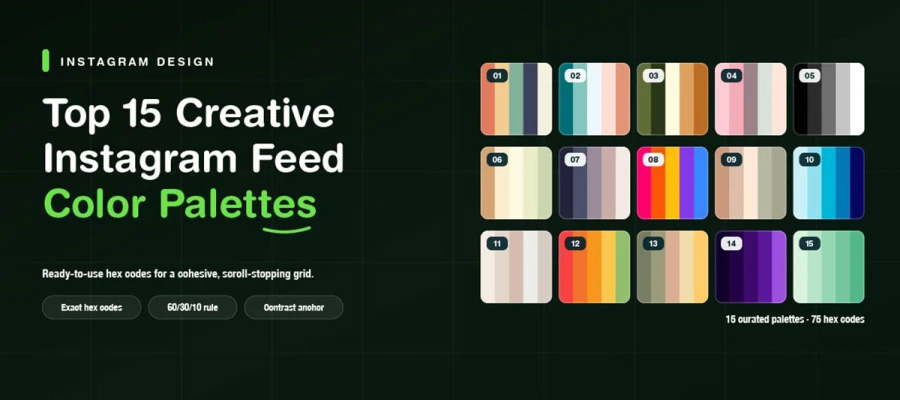
All the creative Instagram color palettes use five colors or fewer. You must apply them the same way on every post. Why? Because people judge a feed as a grid first. This guide provides 15 palettes with hex codes and shows which brands each suits best. It also gives exact proportions and contrast rules. These keep a grid looking planned rather than thrown together.
A palette can look great on a mood board. Then it fails once you add a caption or product label. The same low contrast that makes it cohesive can make it hard to read. That gap between pretty and usable is where feeds go wrong. This guide closes that gap.
Beyond the 15 Instagram color combinations, you'll get a proportion rule that stops bold palettes from feeling chaotic. You'll also get some social media post design ideas to help you choose a palette that fits your brand and photos.
So, stay tuned to find the palette that holds your feed together, and the small changes that make it work.
Top 15 Instagram color palettes
The top Instagram color palettes use five matching hex codes. They pair clear text and background colors that meet accessibility standards. These 15 palettes range from warm and organic to neutral to bold and dark. Each suits specific brands, like wellness, tech, or luxury. They include usage rules for grids, accents, and readable text. Keep reading.
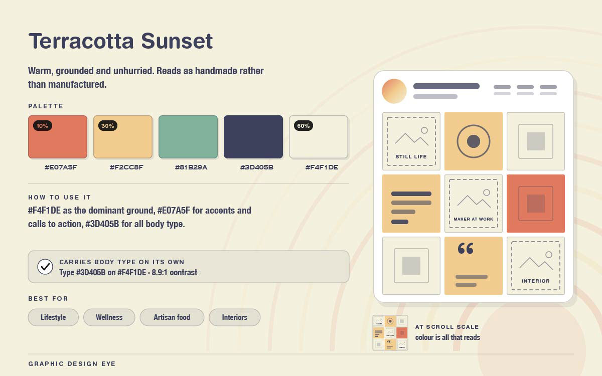
Mood: Warm, grounded, unhurried. Feels handmade, not manufactured.
How to use it: Use #F4F1DE as the main background. Use #E07A5F for accents and buttons. Use #3D405B for all text. The type contrast is 8.9:1, which is very high for such a warm palette.
Best for: Lifestyle, wellness, artisan food, interiors
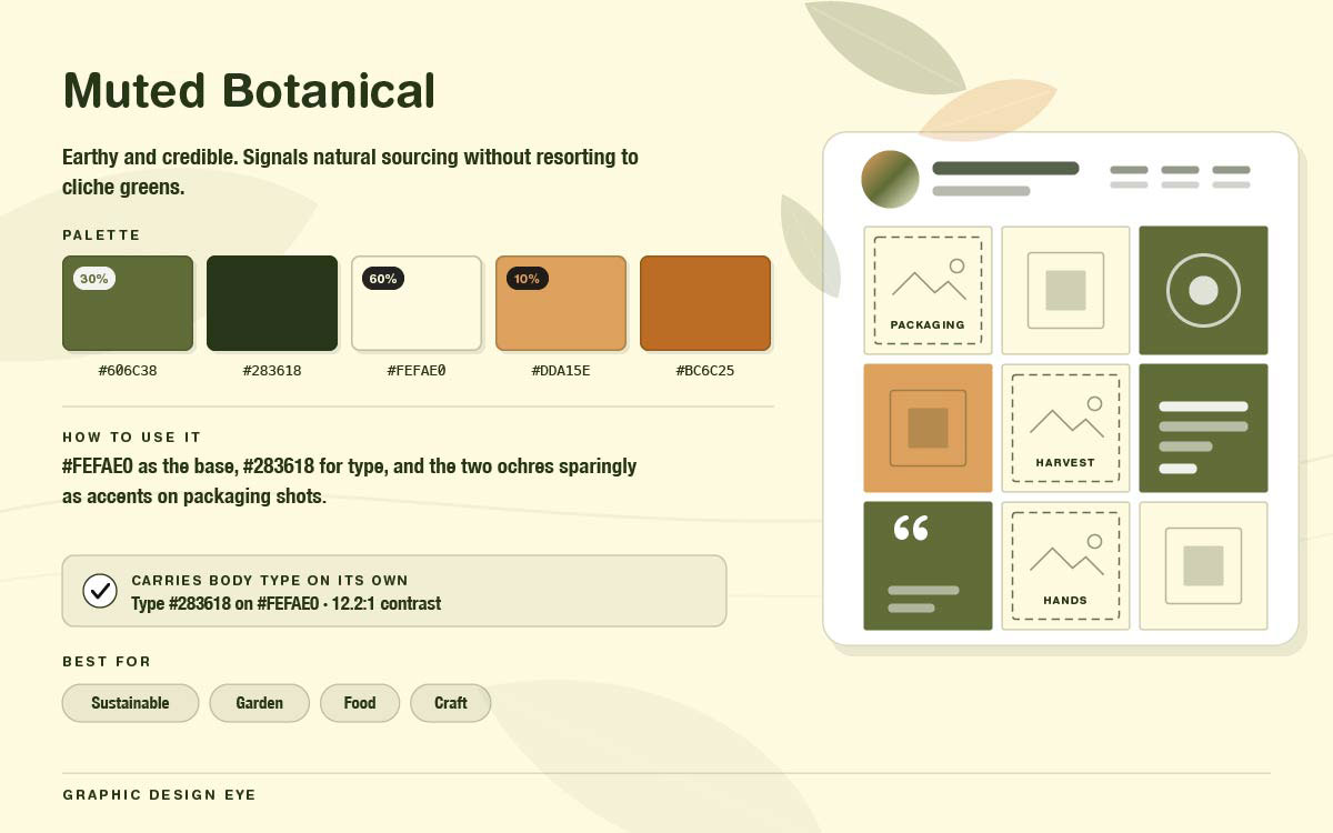
Mood: Earthy and trustworthy. Feels natural without using cliché greens.
How to use it: Use #FEFAE0 as the base. Use #283618 for text at 12.2:1. Use the two ochres sparingly as accents in packaging shots. This palette needs no extra contrast anchor.
Best for: Sustainable brands, garden, food, craft.
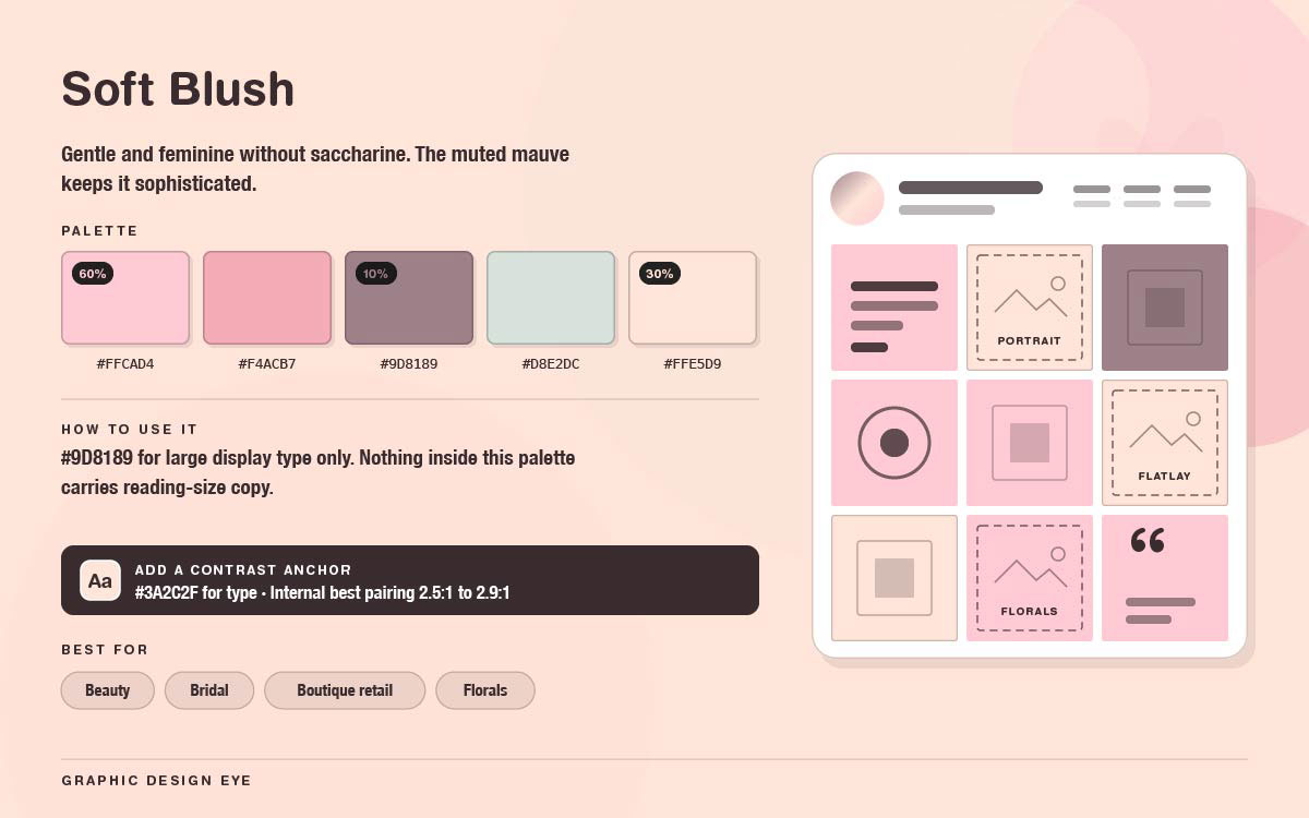
Mood: Soft and feminine, not too sweet. The muted mauve keeps it classy.
How to use it: No colour pair here meets the accessibility minimum for body text. #9D8189 on the pale tones only hits about 2.5:1 to 2.9:1. Use #9D8189 only for large display text. Add a deep charcoal like #3A2C2F for regular reading text.
Best for: Beauty, bridal, boutique retail, florals.
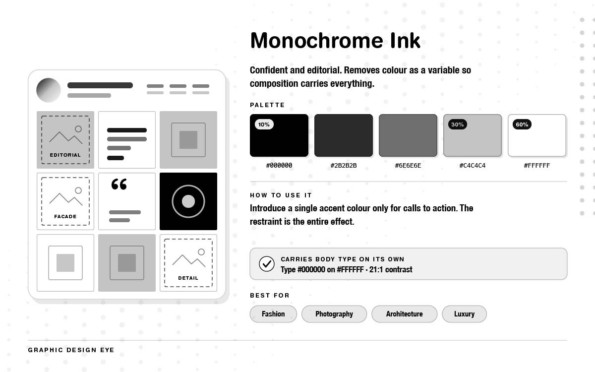
Mood: Bold and editorial. Colour is removed so composition does the work.
How to use it: Add one accent colour just for calls to action. Restraint is the whole effect. Dilute it, and it's gone. Contrast is never an issue here. That's part of why it lasts.
Best for: Fashion, photography, architecture, luxury.
A black-and-white grid leaves no room for excuses. Only the photos and crops are used to verify the account. This style rewards consistent photo retouching most. Any difference in exposure or tone between posts stands out fast. There is no colour left to hide it.
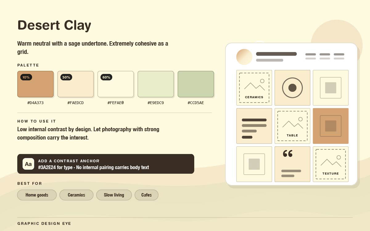
Mood: Warm and neutral, with a hint of sage. Very cohesive as a grid.
How to use it: This palette is intentionally low-contrast. No pair here works for body text. Use strong photos for visual interest. Add deep brown or charcoal for all text.
Best for: Home goods, ceramics, slow living, cafés.
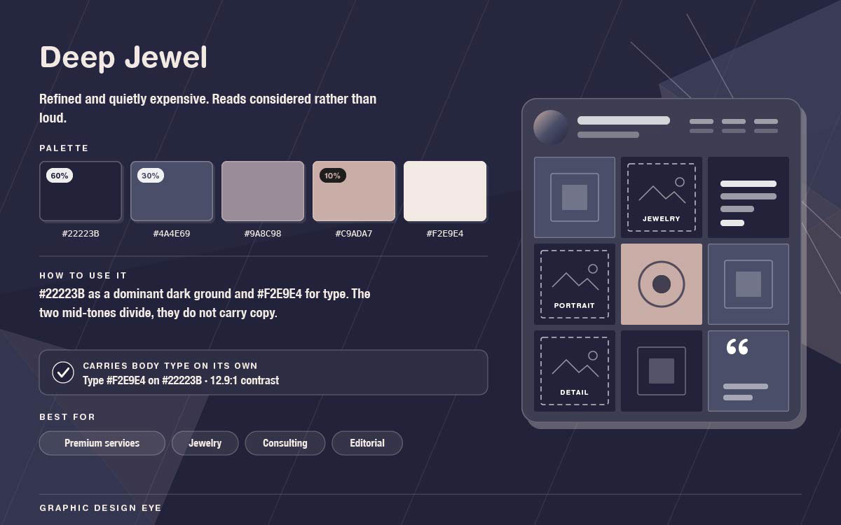
Mood: Refined and quietly expensive. Feels considered, not loud.
How to use it: Use #22223B as the main dark background and #F2E9E4 for text. This pairing measures 12.9:1. The two mid tones work as dividers and small elements, not text.
Best for: Premium services, jewelry, consulting, editorial.
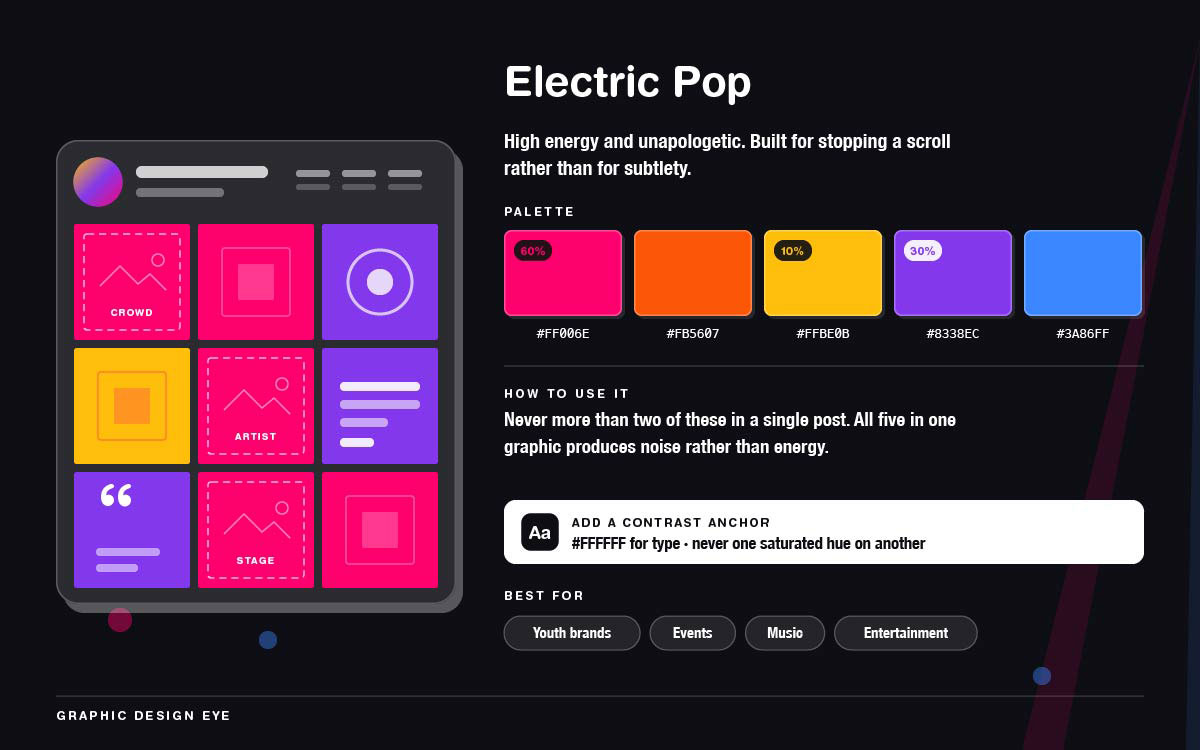
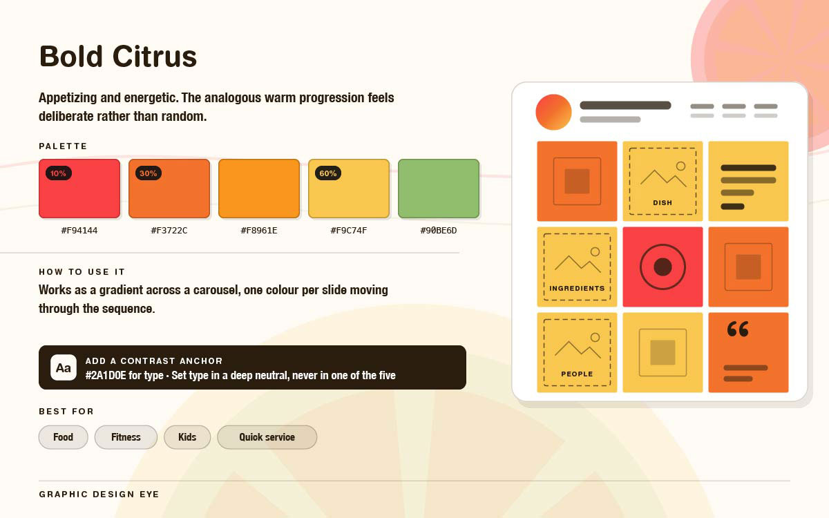
Mood: Bold and loud. Made to stop a scroll, not to be subtle.
How to use it: Use only two of these per post. All five together look messy. Text should be white or near-black on these colors; never one bright color on another.
Best for: Youth brands, events, music, entertainment.
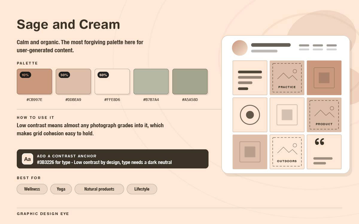
Mood: Calm and natural. The easiest palette to use for user posts.
How to use it: Low contrast means most photos can easily match this palette. Grids stay consistent. But you'll need a dark neutral so the text stands out.
Best for: Wellness, yoga, natural products, lifestyle.
Saturated palettes like this often get used inconsistently. There are five strong colours with no clear hierarchy. Fixing the proportions in a written rule keeps it energetic rather than chaotic. This is the same discipline covered in social media branding guidelines.
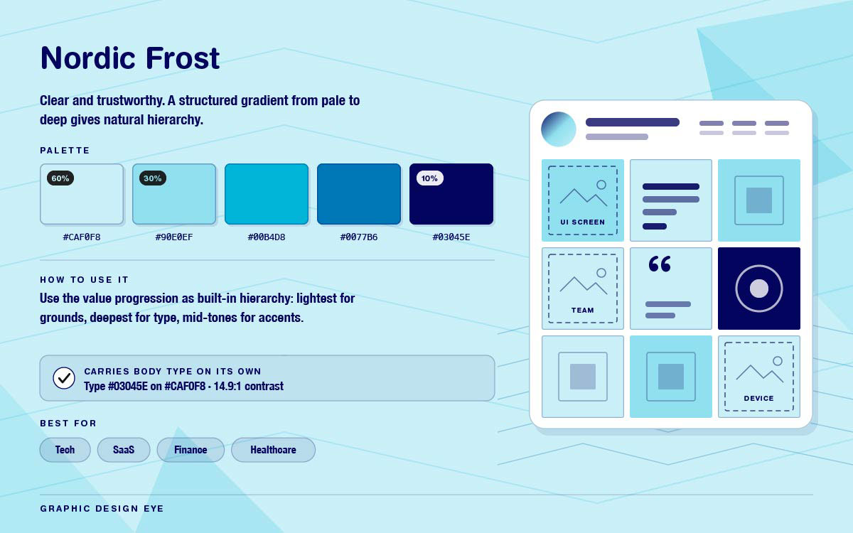
Mood: Clear and trustworthy. A gradient from light to dark gives natural hierarchy.
How to use it: Use the color range as hierarchy. Light for backgrounds, dark for text, middle tones for accents. #03045E on #CAF0F8 is the strongest text pairing.
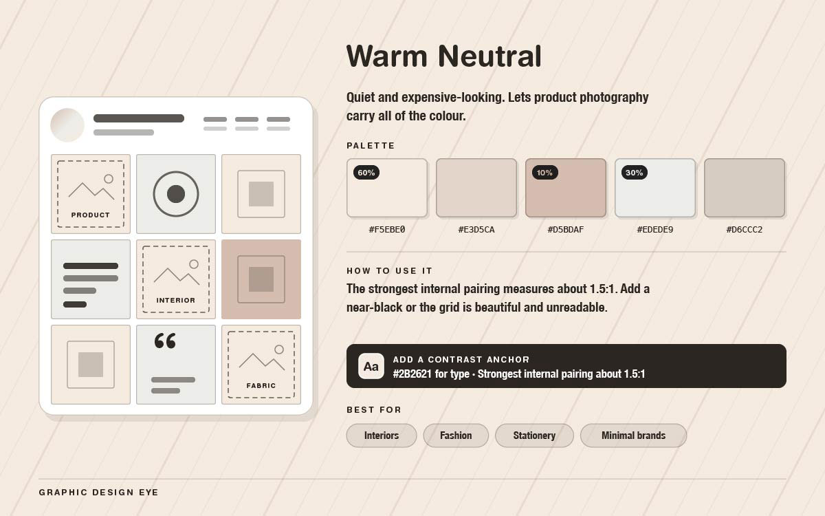
Mood: Quiet and pricey looking. Let's make product photos bring all the color.
How to use it: Contrast is the big risk here. The strongest pairing is only about 1.5:1. Add a near-black for text, or the grid looks nice but is unreadable.
Best for: Interiors, fashion, stationery, minimal brands.
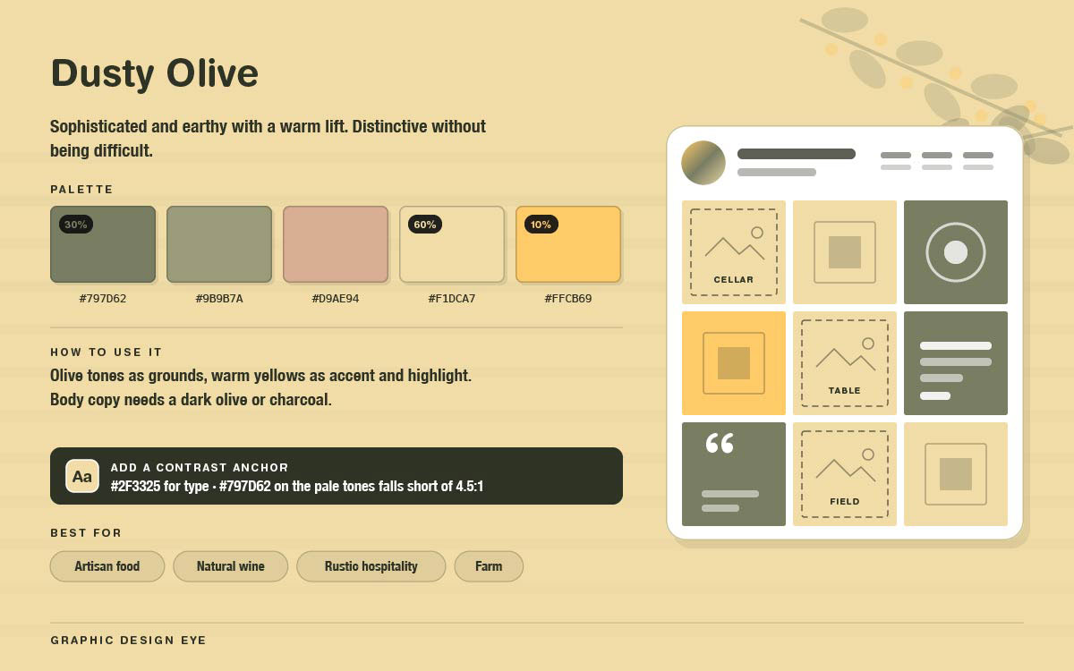
Mood: Classy and earthy with a warm touch. Unique but not hard to use.
How to use it: Use olive tones for backgrounds. Use warm yellows for accents and text highlights. For body text, use dark olive or charcoal instead of #797D62 on pale colors.
Best for: Artisan food, natural wine, rustic hospitality.
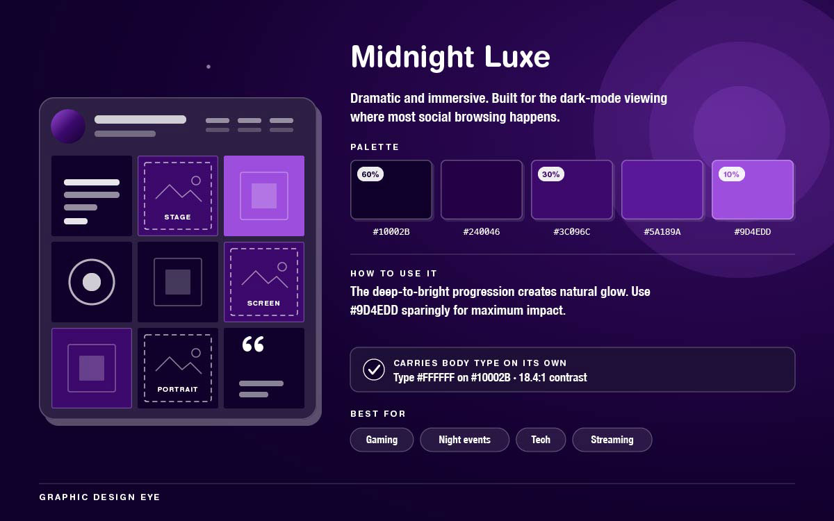
Mood: Dramatic and moody. Great for dark mode, where most people scroll social media.
How to use it: The dark-to-bright shades give a natural glow. Use #9D4EDD sparingly for big impact. Use white or near-white text, since even the brightest purple is too dark without it.
Best for: Gaming, night events, tech, streaming.
Dark palettes reward motion more than light ones. Glow effects make them work, and glow is hard to fake in a still image but easy with a few seconds of animation. So light motion design pays off fastest here.
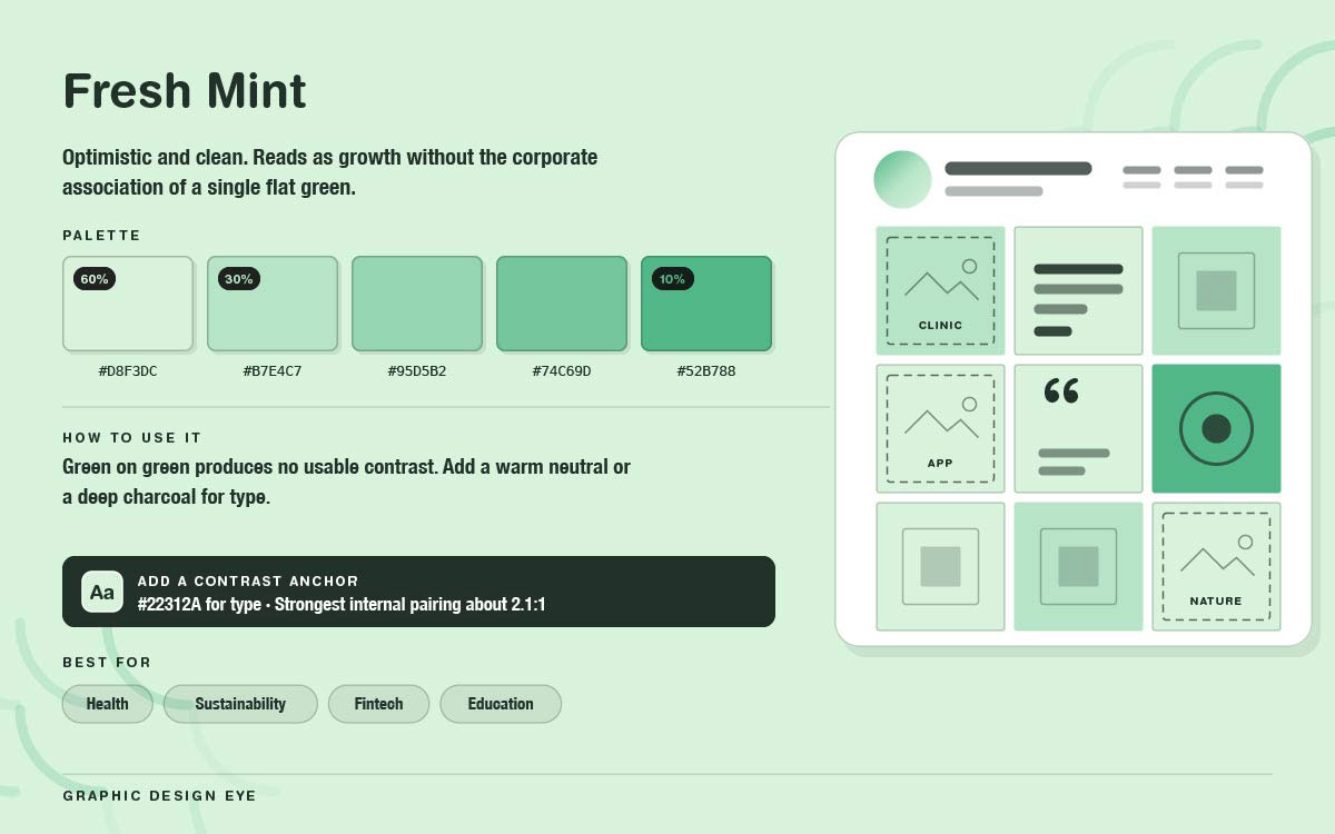
Mood: Optimistic and clean. Feels like growth, not flat corporate green.
How to use it: Add a warm neutral or deep charcoal for text. Green on green gives poor contrast. Best pairing hits only about 2.1:1.
Best for: Health, sustainability, fintech, education.
How to choose a color palette for Instagram
Choosing Instagram color palettes comes down to four simple steps. Start with your existing brand colors. Match them to the feeling you want your audience to get. Test them with your real photos. Finally, make sure the text is easy to read with a contrast ratio of at least 4.5:1.
Start from the brand colours you already have
Select Instagram aesthetic colors from your brand's existing style, not new ones. If your Instagram looks unrelated to your website, it confuses people instead of helping them recognize you. Most brand guides only give two or three main colors. That's not enough for a full feed. So don't replace them, build on them. Add lighter and darker versions, plus one or two neutral colors that match your brand.
Match the register, not the trend
Every palette here has a feeling before it has a color. Muted earth tones feel calm and slow. That suits a ceramics studio, not an events brand needing urgency. Bright palettes grab attention but hurt a premium feel. Pick the feeling your audience should get first. Then choose a palette that gives that feeling. Don't just pick what looks trendy now.
Test it against your actual photography
A palette only works if it fits your existing photos. Take nine recent photos. Apply the palette as backgrounds and overlays. Lay them out in a grid. If the palette clashes with your photos, it will keep losing. Photos are harder to change than palettes.
Confirm it can carry text before you commit
This question decides if a palette actually works. Most nice-looking palettes fail it. Eight of the fifteen above cannot hold body text in their own colours. That is not a flaw. It happens because of what makes them cohesive. Check the strongest pairing against the 4.5:1 minimum first. If nothing passes, add a near-black colour to the palette. It will never appear on a mood board, but you still need it.
How to apply a palette across a feed
Choosing the Instagram color palettes is the smaller half of the work. Applying it consistently across dozens of posts produced over months, often by more than one person, is where grids come apart. The four rules below are what hold it together, and the third does more work than the other three combined.
Use the 60/30/10 rule per post
In each post, about 60 percent should be your main colour. 30 percent should be the second colour. 10 percent should be the accent. The accent goes on the one thing that needs the most attention: a call to action, a key number, or a highlighted word. Use it on three things, and it stops being an accent.
Rotate the dominant across the grid
If every post uses the same main colour, the grid looks flat and boring. Change the colour that leads from one post to the next. Keep the same palette though. This creates rhythm without looking messy. It's the difference between a designed grid and a repetitive one.
Grade photography into the palette
Photos from different sources have different colour tones. Apply one fix, like a warmth shift, slight desaturation, or lifted shadows, to every photo before posting. This step helps Instagram grid colors unity more than anything else. It's why two accounts with the same palette can still look totally different. If photos show products or people against different backgrounds, use background removal and a single, fixed palette colour instead.
Always add a contrast anchor
Most aesthetic palettes use mid tones and pastels. These can't carry readable text. Add a near black or deep neutral color for text, even if it's not in your main palette. It won't show up on the mood board, but it will appear on every post with text. Design that can't be read has failed.
Instagram color palette FAQs
Got questions about building the perfect Instagram color palettes for your Instagram feed? Below, we've answered the most common questions to help you choose colors that reflect your brand, keep your grid cohesive, and make your content stand out on the scroll.
If you have more questions, contact us for any information you need.
An Instagram color palette should contain five colors or fewer, structured around one dominant color, one or two secondary colors, and one accent color. More than five creates visual noise and removes hierarchy. Add a near-black color separately for type legibility if the palette does not already include one.
To make an Instagram feed look cohesive, use a palette of 5 colors or fewer, apply it to every post, grade all photography with a single consistent adjustment, rotate which color dominates from post to post, and keep typography to 2 typefaces. Photographic grading consistency has the largest effect.
No color reliably drives more engagement on Instagram in isolation, since performance depends on contrast against the surrounding feed rather than on hue. High-contrast, high-saturation palettes stop scrolls more effectively, while muted palettes create a premium impression. Consistency matters more than the colours chosen.
Yes, an Instagram palette should be derived from your brand colors, though it may extend them. Brand guidelines typically define only two or three core colors, too few for a varied feed. Add tints, shades, and one or two supporting neutrals drawn from the existing palette, rather than unrelated colors.
The 60/30/10 rule allocates roughly 60 percent of a post to the dominant color, 30 percent to the secondary color, and 10 percent to an accent reserved for the element needing attention. It creates reliable hierarchy and prevents the flat, competing look of equally weighted colors.
Most aesthetic palettes are built from midtones and pastels too close in lightness to carry text. Pastel-on-pastel pairings often range from 1.5:1 to 3:1, with a minimum of 4.5:1 for body copy. Add a near black or deep neutral purely for type, even if it never reaches the mood board.
Rarely, and never for novelty. A palette needs months of consistent use to build the recognition it exists to create, so changing it resets that progress. Change only when brand positioning genuinely shifts, and transition over several posts rather than switching abruptly midway through the grid.
No, use the same palette with different proportions. Stories and Reels display full-screen against a dark interface rather than as grid tiles, so the dominant color can run deeper, and the accent can cover more area than the 10 percent typically suited to a feed post. Only the ratios change.
Endnote
Instagram color palettes only do their job when they outlast the excitement of choosing them, which means the real work starts after you close this guide, not while you are reading it. A palette picked with care and then applied inconsistently produces the same scattered grid as if no palette were used at all.
The next move is to stop testing colors in isolation and start building them into your actual content, checked against real photos and real captions rather than a mood board.
If putting this into practice feels like more than your week has room for, Graphic Design Eye LLC's unlimited design subscription can help. Our experts will apply the palette you have chosen across your templates, carousels, and post layouts, ensuring proper contrast and a consistent grid long after the initial excitement of picking colors fades.
Explore our design services to see how an unlimited subscription keeps your feed cohesive month after month. It is worth comparing other social media design agencies to see who can maintain that consistency across your entire brand.
Build the nine squares, choose the palette that fits who you already are, and give it the time it needs to become recognizable, because that recognition is the only return a palette was ever meant to deliver.
Graphic Design Eye LLC is a full-service creative agency built for brands that demand more than design — they demand vision. From strategic branding to complete visual identity, we partner with startups, agencies, and growing businesses as a dedicated creative force. With flexible subscription and project-based models. Let's start with us today!