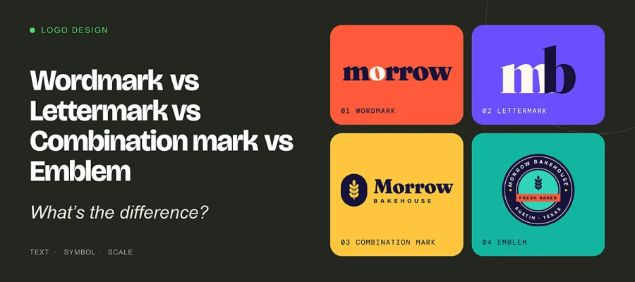
The wordmark vs lettermark vs combination mark vs emblem choice depends on text, symbol, and scale. A wordmark spells your full brand name; a lettermark uses only initials; a combination mark pairs text with a separable symbol; and an emblem locks text inside a badge or crest. Choose a wordmark for short names, a lettermark for long ones, a combination mark for flexibility, and an emblem for heritage.
Think of a bakery owner in Austin, Texas. She spent three years of early mornings building her dream. Today her designer sends over four logo concepts. One spells out the bakery's full name in warm, custom letters. Another uses only her initials. A third pairs the name with a small wheat sheaf icon. The last wraps everything inside a round, vintage badge. All four look beautiful, yet she has no idea which one fits her brand.
If you've felt that same doubt, you're at the point of choosing between a wordmark, lettermark, combination mark, and emblem. Remember, a wordmark spells the full name, a lettermark uses initials, a combination mark pairs text with a symbol, and an emblem locks the text inside the symbol.
The type you pick shapes how customers remember you, how your logo looks on a phone screen, and how far your brand can grow.
Today, we’ll explain the differences among a wordmark, a lettermark, a combination mark, and an emblem, so you can pick the right one for your brand with a simple five-step framework.
So, keep reading!
Wordmark vs lettermark vs combination mark vs emblem
These four logo types differ in how much work the mark can do on its own. Some name your brand, some rely on recognition, and some carry a symbol. Every option looks promising until you picture it on your storefront, your app icon, and your team’s T-shirts.
This side-by-side comparison of wordmark vs lettermark vs combination mark vs. emblem logos shows where each fits best, so you can spot the right fit for your brand in seconds.
Let's dive in with a quick side-by-side look at all four.
Factor
Wordmark
Lettermark
Combination Mark
Emblem
What it uses
Full brand name
Initials/acronym
Text + symbol
Text inside a shape
Symbol included?
No
No
Yes
Yes (frame/badge)
Separable parts?
No
No
Yes
No
Small-size scalability
Medium (depends on name length)
High
High (icon alone)
Low–Medium
Builds name recognition
Very high
Low at first
High
Medium–High
Versatility
Medium
Medium
Very high
Low
Personality
Modern, clean
Formal, established
Flexible
Traditional, authoritative
Best business stage
New or established
Established
New or growing
Established / heritage
Ideal name length
Short (1–2 words)
Long names
Any
Any (short fits better)
Famous examples
Google, Coca-Cola, FedEx
IBM, HBO, CNN
Adidas, Lacoste, Amazon
Harley-Davidson, Porsche, BMW
Now let’s walk through each logo type, one story at a time.
What is a wordmark logo?
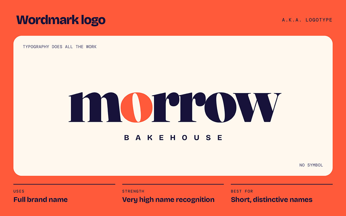
A wordmark, also called a logotype, is a logo composed solely of the brand name in custom type, with no symbol. The letters become the identity.
Characteristics of a wordmark
Typography does all the work: Letterform shape, spacing, and weight carry the brand’s personality.
Instant name recognition: People don’t have to decode a symbol, so the name sticks faster.
Horizontal shape: A wide layout can feel cramped in square spaces, such as social media profile photos.
Wordmark examples
Google: In 2015, Google moved to a custom geometric sans-serif called Product Sans. The friendly, rounded letters made a tech giant feel approachable across billions of screens.
Coca-Cola: The flowing Spencerian script has been in use since the 1880s, making it one of the longest-running wordmarks in commerce. It proves that great lettering alone can carry a brand across generations.
FedEx: Designed by Lindon Leader in 1994, the negative space between the “E” and “x” forms a hidden forward-pointing arrow, a quiet promise of speed and precision. Once you see it, you can never unsee it.
Visa, Canon, Sony, and eBay: These type-only identities rely purely on lettering.
When a wordmark is the right choice
Short name: Your name is short, distinctive, and easy to pronounce.
New brand: Your business is new and needs its name seen, not decoded.
Refined industry: Your field rewards typographic restraint, such as fashion, publishing, or professional services.
Wordmark limitations
Weak at small sizes: It is a poor fit for app icons, favicons, and social avatars without a separate secondary mark.
Long-name problem: Long names become illegible on packaging and merchandise.
Harder to protect: Generic names (for example, “Quality Plumbing”) gain little distinctiveness from type alone and are harder to trademark.
What is a lettermark logo?
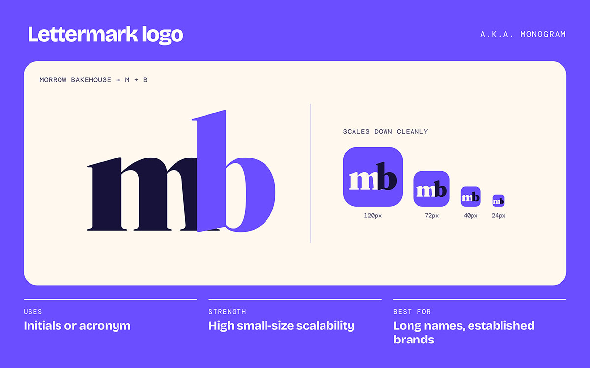
A lettermark, or monogram logo, uses the initials of a brand name, usually two to four letters. It leaves out the full name.
Characteristics of a lettermark
Compact and square: It scales down better than any other text-based logo type.
Relies on recognition: Your audience must already connect the initials to the brand, or you need heavy exposure to build that link.
Works inside a system: Many brands use the lettermark for small spaces and the full wordmark for primary use.
Lettermark examples
IBM: Short for International Business Machines. Legendary designer Paul Rand introduced the eight-stripe version in 1972, and it still signals trust in enterprise technology.
NASA: NASA retired its sleek 1975 "worm" logotype in 1992, and design lovers mourned it for decades. In 2020, NASA brought it back for select uses. It showed how deeply people can bond with a few letters.
HBO, CNN, HP, P&G, and LG: These acronym-driven identities span media, tech, and consumer goods.
When a lettermark is the right choice
Long name: Your legal name is long, multi-word, or hard to say aloud.
Established brand: Your business already has recognition and can carry an abbreviated form.
Tiny placements: Your identity must survive embroidery, stamps, app icons, and machinery.
Lettermark limitations
Low early recall: New brands get near-zero recognition from initials alone.
Trademark crowding: Two- and three-letter combinations are crowded in trademark registers, raising the risk of conflict.
Needs support: It usually requires a tagline or wordmark in early-stage marketing.
What is a combination mark logo?
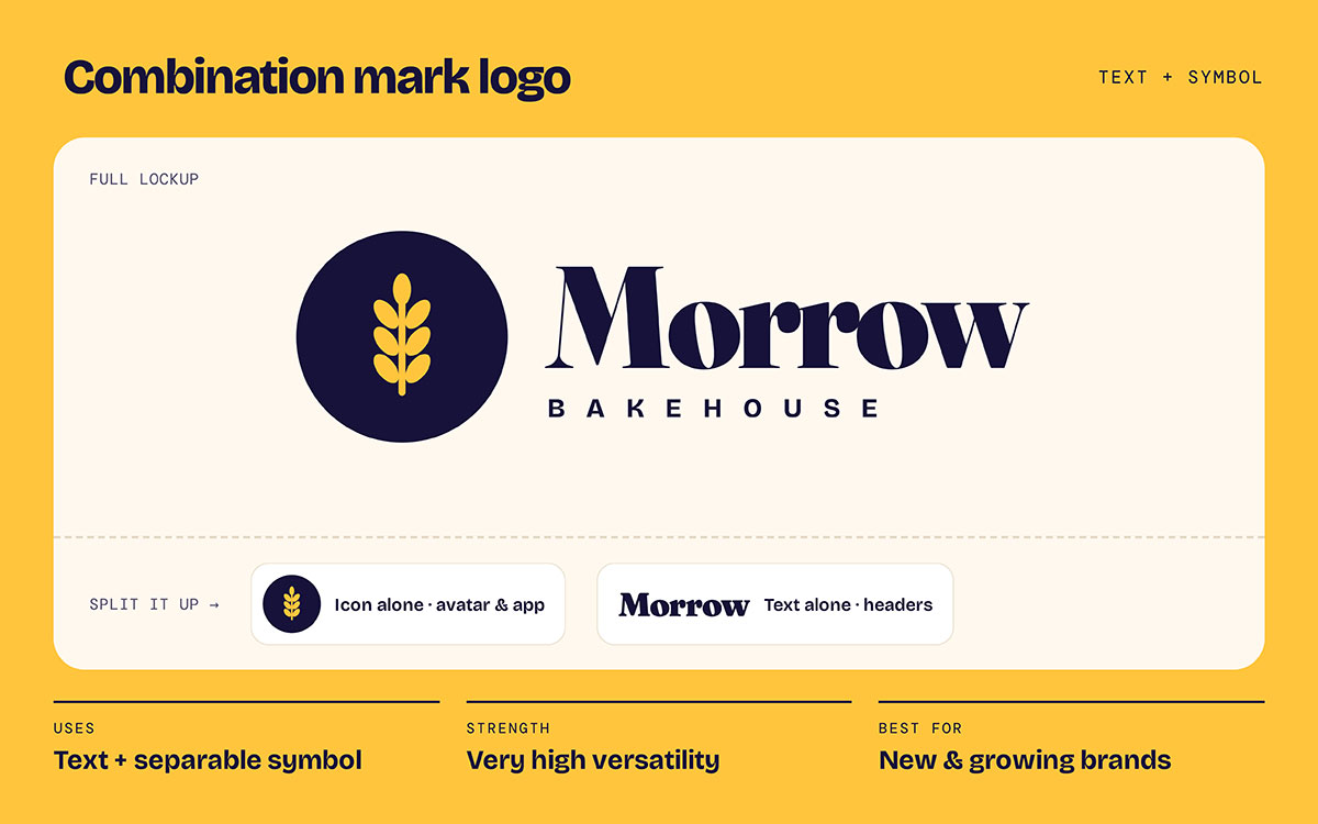
A combination mark pairs a wordmark or lettermark with a picture, abstract shape, or mascot. The two parts can be split up and used on their own.
Characteristics of a combination mark
Most flexible type: One design delivers a full lockup, a text-only version, and a standalone icon.
Multiple layouts: It supports stacked and horizontal lockups for different placements.
Teaches the symbol: A young brand can build recognition for its icon while the name does the identification work.
Combination mark examples
Adidas: The three-stripe mark sits above the wordmark, and the stripes live on their own across sneakers and apparel.
Lacoste: The crocodile pairs with the wordmark in advertising, then appears alone on the chest of the iconic polo shirt.
Doritos, Puma, Burger King, and Slack: These brands use separable name-plus-symbol systems.
When a combination mark is the right choice
Works everywhere: Your brand needs one identity for a storefront, an app icon, and a social avatar.
Room to grow: Your plans include product lines or sub-brands that will reuse the symbol.
Crowded category: Your market is visually competitive, and a symbol adds differentiation that type alone cannot.
Combination mark limitations
Higher cost: It costs more to design because two elements and multiple lockups must be resolved.
Clutter risk: It can look busy if the symbol and type compete for attention.
Needs guidelines: It requires clear brand rules covering spacing, minimum size, and approved lockups.
What is an emblem logo?
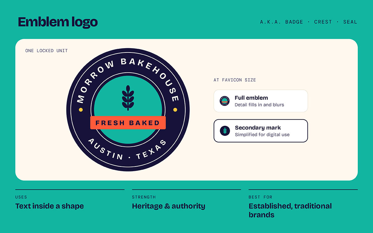
An emblem places the brand name inside a shape such as a badge, crest, seal, or shield. The text and symbol become one unit that can't be separated.
Characteristics of an emblem
Built-in authority: It signals heritage, craft, and institutional trust.
One fixed form: The text and shape cannot be split, so the mark has only one version.
High detail: It carries more detail than any other type, which is its main technical constraint.
Emblem examples
Starbucks: For decades, the siren sat inside a circular emblem ringed with text. The 2011 redesign removed the outer text ring and let the siren stand alone, a perfect story of an emblem simplifying as a brand becomes famous.
Harley-Davidson: The bar-and-shield emblem dates back to around 1910. It lives on motorcycles, leather jackets, and even tattoos, a level of loyalty few logos ever earn.
BMW, the NFL, and Warner Bros: They share the emblem style with university logos, police and fire departments, and craft breweries across America.
When an emblem is the right choice
Tradition matters: Your brand sells heritage, provenance, or official standing, like schools, agencies, breweries, and motorcycle or outdoor gear.
Large placements: Your mark will mostly appear at generous sizes, such as signage, apparel, vehicle livery, and packaging.
Vintage positioning: A classic or artisanal aesthetic is central to your brand.
Emblem limitations
Breaks at small sizes: Fine detail fills in or disappears at favicon and app-icon sizes, and in single-color printing or embroidery.
Rigid proportions: Its fixed shape is awkward in wide spaces such as website headers and email signatures.
Extra design work: It usually needs a simplified secondary mark for digital use, which is effectively a second design job.
Key differences between the four logo types
Lettermarks and combination marks hold up best at small sizes. Combination marks also rearrange most easily. Wordmarks suit brands still building recognition, and emblems carry the most heritage but shrink worst. This section covers the key differences between the four logo types, so you know which trade-offs to weigh before you commit.
Criteria
Wordmark
Lettermark
Combination Mark
Emblem
Small-size legibility
Moderate
Excellent
Excellent (icon)
Poor
Works as app icon/favicon
No
Yes
Yes
Rarely
Layout flexibility
Low (horizontal)
High
Highest
Lowest
Name recognition needed
Low
High
Low
Low
Conveys heritage
Low
Low
Moderate
High
Typical design cost
Low
Lower
Higher
Higher
Best-fit stage
Early to mature
Mature
Any stage
Heritage / institutional
A quick note on terms. Designers often use different names for the same thing. Logotype means wordmark, and monogram means lettermark. Badge and crest are other words for emblem. A brand mark usually means the symbol on its own. So if your designer uses a term you don't know, it likely matches one of these four.
Beyond this comparison, you'll also find pictorial marks (like Apple's apple), abstract marks (like the Pepsi globe), and mascots (like KFC's Colonel). They deserve their own guide, but most start as or grow out of a combination mark.
Which logo type should you choose for your brand?
Your logo's smallest usable size and your brand name's length usually guide the choice. Your stage, industry, and growth plans settle the choice when those factors point in different directions. This section explains which logo type to choose for your brand by walking through five practical checks, and it ends with a cheat sheet you can use in a minute.
Step 1: Check your brand name length
If your name is short and distinctive, choose a wordmark. If it’s long or multi-word, a lettermark or combination mark will serve you better.
Step 2: Consider your brand’s stage and recognition
New brands do well with a wordmark or combination mark, because both show the full name. Established brands can use a lettermark or emblem, since people already know them.
Step 3: Match your industry and personality
Tech and SaaS: Choose a wordmark or combination mark.
Food, beverage, automotive, and education: Choose an emblem or combination mark.
Step 4: List where the logo will appear
Write down every place your logo will live, including your website header, app icon, Instagram avatar, delivery van, tee, invoice, and storefront sign. App icons, favicons, and social avatars need a mark that reads at very small sizes. Merchandise and signage can handle more detail.
Step 5: Think about trademark and future growth
In the United States, the USPTO offers two main ways to register. A standard character mark protects the words themselves, whatever the font. Special form (design) marks protect the specific stylized design. Many businesses file both. This is general information and not legal advice. Talk to a trademark attorney before finalizing or filing.
Also picture your brand ten years from now. If you dream of new product lines, a symbol that can stand alone will grow with you.
Quick decision cheat sheet
“My name is short and unique”: Choose a wordmark.
“My name is long or hard to say”: Choose a lettermark.
“I’m new and need flexibility everywhere”: Choose a combination mark.
“I want a classic, heritage feel”: Choose an emblem.
And our Austin baker? A new brand, a two-word name, and plans to sell packaged cookies next year. She chose the combination mark, with the full lockup for her storefront and the little wheat sheaf for her Instagram avatar and cookie boxes. Problem solved.
Logo type FAQs
Most people are concerned with three things. They ask how the mark works at small sizes, what it costs to design, and how well it can be protected. These logo type FAQs cover each one briefly, plus the terminology and rebranding questions that follow, so you can clear up doubts fast. But if you have other concerns regarding the topic, share them directly with us via email. We’re happy to clear any confusion you’re going through.
A wordmark spells out the entire brand name, while a lettermark uses only the initials. Google is a wordmark; IBM is a lettermark.
Yes. Designers use both terms for a logo made only of the brand name in distinctive type.
A combination mark's text and symbol can be used separately. An emblem's cannot. Lacoste's crocodile can stand alone, but Harley-Davidson's bar-and-shield text cannot.
A combination mark is best for most small businesses. One design gives you a full lockup for signage and a standalone icon for social media and apps.
Emblems have fine detail that gets lost at 16-32 pixels. Lines merge, text fills in, and the mark turns into a smudge. That's why emblem brands usually make a simpler secondary icon.
Yes. Most mature brands pair a main combination mark or wordmark with a lettermark or icon for small sizes.
Not always. Custom letterforms make the logo more distinctive and can strengthen trademark protection for the design.
Wordmarks and lettermarks usually cost the least, since only one element needs to be designed and refined.
It started as one. Carolyn Davidson designed the Swoosh in 1971, and it first appeared with the Nike name. Today the Swoosh is widely used on its own as a pictorial mark.
Lettermarks and the icon part of a combination mark scale best. Detailed emblems scale worst.
Yes. Many brands evolve, as Starbucks did. Plan the change carefully so you keep the recognition you've earned.
Being distinctive matters more than logo type. An original mark that isn't descriptive is easier to protect than a generic one, whatever its type. Ask a trademark attorney about your specific brand.
Endnote
Now, we’ve reached the end of our side-by-side comparison!
A logo is the heart of your brand, and the right logo type determines how well it works wherever your brand appears.
Here are the four types; remember them:
Wordmark: Your full brand name in distinctive typography.
Lettermark: Your initials shaped into a compact monogram.
Combination mark: Text plus a symbol that can also stand alone.
Emblem: Text enclosed inside a badge, crest, or seal.
Skip the logo design trends this month when you pick your logo type. Look at your name length, the smallest size your logo must work at, how well people know you, and every place it needs to live. Get those right, and your logo can serve your brand for decades.
You can design your logo yourself or work with a professional graphic designer. Either way, choose the type that fits your brand. If you want expert help, Graphic Design Eye LLC can craft a logo that tells your story and create brand guidelines to keep it consistent everywhere. Get a quote today!
You’re all set now. Good luck creating your perfect logo!
Graphic Design Eye LLC is a full-service creative agency built for brands that demand more than design — they demand vision. From strategic branding to complete visual identity, we partner with startups, agencies, and growing businesses as a dedicated creative force. With flexible subscription and project-based models. Let's start with us today!