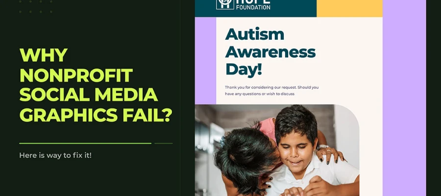
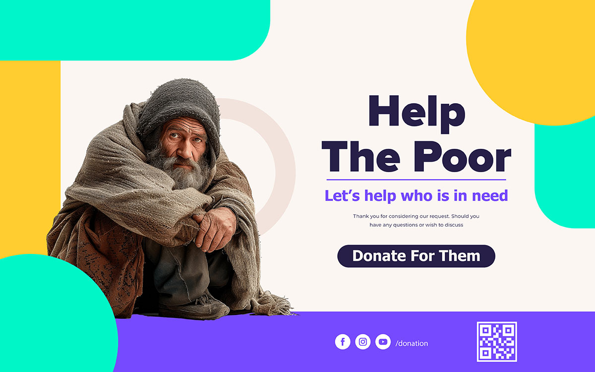
Nonprofit social media graphics usually fail for six main reasons: cluttered layouts, inconsistent branding, missing calls to action, poor mobile optimization, hard-to-read colour contrast, and generic stock photos. Each one costs donor trust and cuts engagement before anyone reads a word.
Your charity does vital work. You feed families, shelter lives, and change the conversation on issues that matter. But when your posts get no response, the problem can be the design.
The graphics are the first impression people get of your mission. In under eight seconds, people decide whether your cause deserves their attention. If those graphics are cluttered, inconsistent, or don't connect emotionally with your audience, they turn down the trust your organisation has spent years building.
The thing is, your charity isn't competing with the charity next door. It's competing with every polished ad, celebrity post, and algorithm-picked piece of content in the same feed. Without professional strategic graphics, your message will lose that fight, no matter how powerful your cause is.
This article explains why nonprofit social media graphics fail and gives your team clear steps to fix them. You won't need a big budget or a full-time designer to start. You'll just need clarity, consistency, and the courage to hold your visuals to the same standard as your mission.
Why Nonprofit Social Media Graphics Fail
Before looking at what goes wrong, understand what's at stake. Social media isn't just an extra way for nonprofits to communicate anymore. For many causes, it's the main place where donor trust gets built, campaigns succeed, and communities come together. The visual quality of your graphics matters strategically, not just cosmetically.
The same mistakes show up again and again across nonprofits of every size, from small community charities to major international NGOs. Each one has a real emotional cost, and each one can be fixed.
01. Cluttered Layouts That Bury the Message
When a graphic has too many things going on, like several images, different fonts, clashing colours, and thick blocks of text, the brain can't tell what to focus on first. So the viewer just looks away. A donor scrolling past your post in under two seconds will see a messy layout as disorganised, not urgent. You lose the click before they even read your message.
02. Inconsistent Branding Across Posts
Every post that looks like it's from a different group breaks your audience's chance to recognize and trust you. Brand recognition builds up over time through repeated exposure. When your colors, fonts, and design style change post to post, you reset that recognition each time. Donors who can't instantly spot your organization in a busy feed won't stop to engage.
03. Weak or Missing Calls to Action
A graphic that looks great but doesn't tell people what to do is a wasted chance. The call to action on a nonprofit social media graphic isn't just decoration. It's what turns someone scrolling by into a donor, volunteer, or supporter.
Vague phrases like 'Support Us' or 'Learn More' get fewer clicks than specific, emotional ones. The design should make the next step feel clear and easy to take.
04. Ignoring Mobile-First Design
Over 79% of social media content gets viewed on mobile devices, according to DataReportal 2024. A graphic made on a desktop monitor and never checked at phone size will often end up with text you can't read, key parts cropped out, and CTAs too small to tap.
This isn't a small technical glitch. It's a wall between your message and most of your audience. Mobile-first design isn't a trend. It's the standard now.
05. Poor Colour Contrast and Accessibility Failures
Low contrast between text and background makes your graphics hard to see for the estimated 300 million people worldwide with colour vision problems, as well as older viewers reading content in bright sunlight.
Beyond these practical issues, there's also a moral side to this: nonprofits exist to serve communities, and graphics that leave out members of those communities go against their core values. Accessibility isn't just a design choice. It's a responsibility.
06. Generic Stock Photography That Distances Donors
People today understand visuals better than many organisations think. They can spot a fake smile, a plain office background, or a generic handshake photo that could fit any company in any field. When your visuals look like a corporate newsletter, donors feel cut off from the people your cause actually helps.
That feeling of distance is the biggest block to emotional connection, and emotional connection is what makes people give.
Great nonprofit social media graphics are built on deliberate choices about colour, typography, layout, and messaging. This section covers the five design fundamentals that separate high-performing visuals from ones that get ignored. Apply them consistently and your graphics will build trust, communicate urgency, and turn attention into donations.
1) Colour Psychology for Cause-Driven Organisations
Colour is the first thing that grabs people's emotions in any design. For nonprofit social media graphics, picking colours is both a strategic and scientific choice. It should match what your cause wants people to feel, not just your personal taste or whatever palette your designer suggested first.
Colour
Emotion Triggered
Nonprofit Use Case
Blue
Trust, safety, reliability
Disaster relief, humanitarian aid, health organisations
Green
Hope, growth, renewal
Environmental causes, mental health, community gardens
These emotional connections come from cross-cultural colour psychology research and should be a starting point, not a strict rule. Your cause's specific story, existing brand reputation, and target audience will shape the final choices, and proven social media post color combinations can guide where to start.
2) Typography That Communicates Before It Is Read
Typography in nonprofit social media graphics works on three levels, and each one needs its own thought before the design is done.
The first level is hierarchy. A viewer's eye should move through your graphic in a set order: from the most important element to the supporting detail to the call to action. You create hierarchy through size, weight (bold versus regular), and placement. When everything is the same size and weight, nothing stands out, and nothing gets remembered.
The second level is legibility. When someone scrolls past on their phone at arm's length, a headline font smaller than 24px becomes hard to read instead of inviting. Body text that looks clear on a 27-inch monitor turns into a blur on a 6-inch phone screen. Every font choice and size needs to be checked at real mobile size before a graphic goes live.
The third level is personality. Typography carries emotional tone. A serif font like Merriweather feels authoritative, traditional, and serious, which suits healthcare charities, legal aid groups, and causes needing institutional trust. A rounded sans-serif feels warm, friendly, and hopeful, which suits youth programmes, mental health initiatives, and community groups. These associations come from decades of typographic conditioning in the audiences you're trying to reach.
For nonprofit social media graphics, two solid font pairings are Montserrat for headlines with Open Sans for body text, and Lato for headlines with Merriweather for body text. Both combos give strong contrast between heading and body weights while staying easy to read on any device or in print.
3) Designing for Mobile First
Mobile-first design is a permanent fact about how people use social media, not a passing social media trend. Designing for desktop first and then squeezing it onto mobile is backwards, and it leads to compromises. Designing for mobile first and then scaling up for desktop creates graphics that work where most of your audience actually is.
The Five-Step Mobile-First Checklist
Start with the right size: Design at 1080x1080px minimum for square posts. Use 1080x1920px for Stories and Reels. These sizes make sure your graphic looks sharp on every screen.
Stick to the safe zone: Keep all important text, your logo, your CTA, and your main image inside the central 80% of the canvas. The outer 10% on each edge often gets cropped or hidden on different devices and screens.
Check it at phone size: Before scheduling a post, shrink the graphic preview down to how it will actually look on a 6-inch phone screen. If your headline is hard to read at that size, redesign it.
Stick to minimum font sizes: Headlines should be at least 24px. Body text or smaller text should be at least 16px. Smaller than this, and it gets hard to read on mobile.
Get tap targets right: If your graphic has something tappable, like a button, link, or QR code, make sure that area is at least 44x44px. This is Apple's minimum size for touch targets, and it applies to all mobile content.
4) Writing a Call to Action That Actually Works
The call to action is the most important part of any nonprofit social media graphic, but it's also the one people design worst. A CTA isn't a polite suggestion. It's a direct message between your organization and a possible supporter who's deciding whether your cause is worth their support.
Strong nonprofit CTAs have four parts: an action verb that tells the viewer exactly what to do, an emotional benefit that explains why it matters, a sense of urgency that gives a reason to act now, and a cue that makes the action feel small, safe, and easy.
Before vs After: Nonprofit CTA
Before: "Support Us"
After: "Donate Now: Feed a Child This Week"
The second CTA has a clear action (Donate Now), an immediate emotional payoff (Feed a Child), and urgency (This Week). It converts better because it removes guesswork and connects the donation to a real human outcome.
How your CTA looks matters just as much as what it says. The button or text holding your CTA needs to stand out clearly from the background, sit in the F-pattern reading zone (top or left middle area), and be big enough to notice while scrolling. If a CTA is hidden in the bottom right corner of a busy graphic, it basically doesn't work as a CTA. The same placement principles carry into full fundraising campaign design, where every visual has to earn the donation.
5) Human Photography vs Stock Photography
At its core, photography is about authenticity. And authenticity is what drives people to engage with nonprofits.
The Stock Photo Problem
Stock photos feel fake without people even realizing why. Donors and volunteers can spot the signs: the staged handshake, the oddly diverse boardroom, the smiling kid in front of an obviously fake backdrop. These images tell a story that's been used a thousand times by all kinds of organizations for reasons that have nothing to do with your cause.
Stock photos put distance between viewers and the real human issues your mission is about. That distance costs you engagement, trust, and donations.
The Human Story Solution
Real photos of your beneficiaries, volunteers, staff, and communities, taken with clear consent, dignity, and creative thought, get much more social engagement than stock photos. Studies on nonprofit digital communication show that real images get two to three times more engagement than stock photography.
If budget limits make regular photo sessions hard, invest in one annual photo day instead. Plan it carefully, tell a photographer what content you need, and build a library of images that can carry your visual storytelling for a full year. Pairing that library with professional photo editing keeps every image crisp and consistent across platforms.
When to Invest in Professional Nonprofit Graphic Design
Many nonprofit leaders hesitate to talk about hiring professional graphic designers. They worry it will be hard to justify the cost to their boards, donors, or grant funders. That hesitation makes sense, but it ignores the real cost of bad design.
DIY In-House Design
Professional Design Service
Low direct cost
Higher direct cost; lower total cost of lost engagement
Time-intensive for non-designers
Fast turnaround: 24 to 48 hours per deliverable
Inconsistent quality across platforms
Platform-optimised, brand-consistent output every time
Restricted to available templates
Custom, mission-specific visual identity built for your cause
No strategic creative input
Creative strategy and direction included as standard
Professional social media design isn't just for organisations with big budgets anymore. Subscription-based nonprofit design services, including ones built for charity budgets, let organisations get consistent, professional social media graphics for a steady monthly cost. That cost is usually lower than paying a part-time in-house designer by the hour.
6 Signs Your Nonprofit Needs Professional Design Help
Most nonprofits reach a point where doing design in-house costs more than it saves in time, donor trust, and results. If any of the signs below sound familiar, your organisation has probably outgrown DIY visuals and is ready for professional graphic design support built for nonprofits.
Your graphics look different every time you post, so people can't recognize your brand.
You or your team spend over four hours a week making social media visuals, time your mission can't spare.
Your visual posts get less than 2% engagement, meaning your graphics aren't grabbing attention in the feed.
Less than 1% of people who see your social posts click through to your donation page, meaning your CTAs aren't working.
You're getting close to a big fundraising campaign, annual gala, or programme relaunch that needs top-quality visuals.
You're rebranding or launching a new programme and need a visual identity that matches how ambitious the work is.
Graphic Design Eye creates professional social media graphics for nonprofits, from strategy to perfectly designed posts, starting at a monthly price your board will approve.
Nonprofit Social Media Graphics FAQs
Nonprofit social media graphics can raise awareness, boost donations, and build trust with supporters, but only if they're designed with a clear purpose. Weak visuals cost charities real engagement and real money. These FAQs cover the questions nonprofits ask most about social media graphic design:
Nonprofit social media graphics often get low engagement because of cluttered layouts, weak calls to action, inconsistent branding, and poor mobile optimisation. These problems prevent donors from connecting emotionally with the cause. Better visual hierarchy, colour contrast, and CTAs improve engagement.
Nonprofit social media graphics should use 1080x1080px for Instagram and Facebook feed posts, 1200x630px for Facebook link previews, 1080x1920px for Stories and Reels, and 1200x628px for LinkedIn. Design mobile-first since 79% of social content is viewed on phones.
Canva suits nonprofits well, especially small teams on tight budgets, with an 85% discount through Canva for Nonprofits. For high-stakes work like year-end fundraising or rebranding, professional designers with branding design expertise produce better donor conversion and brand authority.
Nonprofits should post three to five times a week on Facebook and Instagram, once or twice daily on Twitter/X, and three to four times a week on LinkedIn. Consistency matters more than frequency, as irregular posting reduces organic reach.
Colour choice depends on the cause: blue builds trust for health and disaster organisations, green signals hope for environmental causes, and red creates urgency for emergency appeals. All colours need a 4.5:1 contrast ratio for mobile accessibility.
Nonprofits get a lot out of professional graphic design, especially for fundraising campaigns, annual reports, and social media branding. Consistent branding can boost audience trust by up to 23% (Lucidpress). Design agencies offer nonprofit subscription plans with no long-term contracts.
Endnote
Your organisation's work is a commitment to communities, causes, and the belief that the world can be better. Every post you share carries that commitment into public view. It's a moment where you ask someone to pause in a busy world and choose your cause.
If your nonprofit's social media graphics look messy, inconsistent, or unrelated to your work, it's time for a change. Graphic Design Eye LLC creates branded post templates, campaign banners, and impact graphics using your logo and colours, so every post matches your cause. Designs come with unlimited revisions and a 24-hour turnaround, with flexible plans and no hidden fees.
Fixing your graphics means giving your visuals the same care your team gives its daily work. Start with brand consistency. Design for mobile first. Choose colours with purpose. Write calls to action that give clear direction. And when you're ready to go beyond what your team can do alone, bring in professional design support to turn good work into real impact.
Your mission deserves graphics that speak up, not whisper. Let them speak as boldly as your cause does.
Graphic Design Eye LLC is a full-service creative agency built for brands that demand more than design — they demand vision. From strategic branding to complete visual identity, we partner with startups, agencies, and growing businesses as a dedicated creative force. With flexible subscription and project-based models. Let's start with us today!