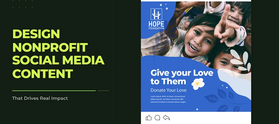
Knowing how to design nonprofit social media content that drives real impact begins with one decision: choosing to treat design as a strategic tool, not an afterthought. This guide provides visual brand identity, format-by-format design strategy, and platform-specific guidance, everything a nonprofit needs to build a social media presence that earns attention, inspires trust, and converts that trust into sustained community action.
Almost every nonprofit has a gap in its communication. It's the gap between the real impact of their work and how many people actually hear about it, care about it, and act on it. This usually isn't a strategy or mission problem. It's a design problem.
A nonprofit's social media visuals are often the first impression it makes on a potential donor. If that first impression doesn't show credibility, a clear mission, and human connection all at once, people keep scrolling. The story never gets told.
Organic reach for nonprofits on social media has dropped a lot in recent years. Platforms increasingly favor paid posts, and ad costs have gone up sharply. Because of this, good organic content design matters more than ever.
This guide covers everything you need to close that gap: content strategy, visual brand identity, design tips, storytelling principles, platform-specific advice, and ways to measure performance. All built for nonprofits with tight budgets, small teams, and big missions. Read on to see how it all comes together.
How to Design Nonprofit Social Media Content by Format
Knowing how to design nonprofit social media content well means treating each format on its own terms. This is the core of any content strategy. Different formats serve different purposes as people move through their journey with your audience. What makes a static graphic work is very different from what makes a short video work. Each format below is its own design discipline.
01. Static Graphics and Quote Cards
Static graphics are still the most common content type nonprofits use on social media. When designed well, they can get strong organic reach through shares and saves. The key rule behind every effective static graphic is one message, one visual focus, one action. If a graphic makes viewers process too many competing elements, it asks too much in the two seconds they give it.
A) Apply the one-message rule without exception
Every static graphic should share one idea. The headline is that idea. Everything else, the photo, the color block, the logo, should support the headline, not compete with it.
B) Meet WCAG 2.1 AA color contrast ratios
Text must stand out clearly against its background to meet accessibility standards. Adobe Color's free contrast checker at color.adobe.com checks any color combo against WCAG 2.1 AA in real time. Accessibility is a design responsibility, not just a constraint.
C) Design for the thumbnail, not the full-size view
Most people see your graphic as a small thumbnail before deciding to tap it. If the main message can't be read at 200 pixels wide, redesign it.
Infographics, quote cards, and other eye-catching static graphics get shared the most on social media. A share is the most valuable free action a nonprofit can get, since it puts the message in front of a whole new audience at no extra cost.
02. Short-Form Video, Reels, TikTok, and YouTube Shorts
Short videos get more organic reach than any other content type, and platforms push them harder than static posts. For nonprofits, this means they can tell emotional stories in the format people already spend the most time watching.
The design rules for short-form nonprofit videos are:
You have to grab attention in the first 1 to 2 seconds. If the algorithm doesn't see people engaging early, it stops showing your content before most of your audience even sees it.
Captions aren't optional. Studies show 85 percent of people watch social videos with the sound off. Captions should be designed well, not just typed out like a transcript.
Behind-the-scenes content usually gets more engagement than polished, produced content. Authentic content with a clear visual structure and a strong hook almost always beats content that just looks polished.
Design text overlays separately for vertical (9:16) and square (1:1) formats. Don't just scale one layout to fit both.
Short videos put a donor right inside the story. This builds trust on a large scale.
03. Carousels and Multi-Slide Posts
Carousel posts perform best for nonprofits on Instagram and LinkedIn. Each swipe counts as a small commitment. When someone swipes to slide two, they've shown interest, and the algorithm rewards that by showing the post to more people. The following structure works consistently for nonprofit carousels:
Slide 1: The hook, a headline strong enough to stop a scroll and get a swipe
Slides 2 to 6: The story, the problem, the impact evidence, and the organization's role
Slides 7 to 9: The solution or the call to action
Slide 10 (if included): A branded closing slide with the nonprofit's name and website
The main rule is one idea per slide. A slide packed with too many text blocks, data points, or visuals breaks the swipe rhythm and makes people spend less time on the content.
04. Stories and Ephemeral Content
Stories create urgency that permanent posts can't match. A 24-hour fundraising update on Instagram Stories, with a countdown sticker and donation link, pulls people in emotionally in a way a static feed post never could.
Design strategies for nonprofit stories:
Use countdown stickers tied to fundraising deadlines. They're one of the highest-converting interactive elements in the format.
Poll stickers and question boxes boost the engagement signals algorithms reward, and they also collect data on how your community feels.
Donation link stickers let supporters give directly from a Story, skipping the link-in-bio step. They're available to eligible nonprofit accounts in supported countries through Facebook's charitable giving tools. Check current eligibility at facebook.com/donate, since requirements vary by country and account type.
Behind-the-scenes Stories with little design effort often beat highly produced ones. The format rewards immediacy.
05. Infographics and Data Visualization
Annual impact reports, program stats, and community data are some of the most trustworthy content a nonprofit can share, but also some of the least engaging in raw form. Infographics close this gap by turning credible data into something people connect with emotionally.
Design principles for nonprofit infographics:
Tie every data point to a real outcome. "83 families" hits harder than "83 beneficiaries." "One in three children" hits harder than "33 percent."
Design for mobile, vertically. 1080x1350px is the best size for Instagram feed infographics.
Keep each infographic to three or five data points. More than that overloads the reader and makes it less shareable.
WHAT THIS MEANS FOR YOUR NONPROFIT
If your nonprofit publishes an annual impact report, it already has enough material for 12 or more social media posts. One statistic, one story, one result each becomes a post. The real design work is turning these into posts, not coming up with new content.
Platform-Specific Design Guidance for Nonprofit Social Media
Every platform a nonprofit uses has its own look, content style, and audience behaviour. A post that does well on Instagram because it's emotional and visually polished might not work on LinkedIn, where people trust professionalism and data more. Knowing how to design nonprofit social media content is key to creating content that works across a multi-platform strategy shaped by current social media trends.
Instagram, Emotional Storytelling and Visual Consistency
Instagram rewards good visuals and emotional impact more than anything else. For nonprofits, that makes it perfect for beneficiary stories, behind-the-scenes Reels, impact infographics, and community spotlights. The feed should work like a gallery: each post should stand on its own but also fit into a bigger visual story. A clean profile look, consistent colours, and a recognisable design style all build follower trust, turning casual visitors into a real community.
LinkedIn, Authority, Credibility, and Professional Community
LinkedIn is where a nonprofit builds trust with institutional donors, corporate partners, foundations, and professional volunteers. The content that works best here is data-driven, focused on results, and delivered with real authority on the subject. Annual impact data, program outcome stats, and thought leadership posts from organization leaders all beat purely emotional appeals on this platform.
Carousel posts are one of the top-performing formats for nonprofits on LinkedIn. They combine depth with social media post design ideas in a format the platform actively promotes.
Facebook, Community Engagement and Recurring Donor Retention
Facebook is still the biggest social media platform by active users worldwide, and it's still the main place nonprofits use for community groups, local giving, and talking to regular donors. It's where nonprofits are most likely to reach their existing supporters, and where event promotion, fundraising campaigns, and community group discussions get the most engagement over time.
Note: Facebook's built-in donation buttons, birthday fundraisers, and fundraiser posts are among the most effective, low-cost ways for nonprofit social media managers to raise money.
How to Improve Your Nonprofit's Social Media Content Design Performance
The process of how to design nonprofit social media content is ongoing. Performance data shapes future design choices, audience behavior shows which content earns the most meaningful action, and consistent measurement ensures the organisation optimises for real outcomes, not vanity metrics.
The metrics that matter most for nonprofit social media content are:
1) Engagement rate (not follower count)
Engagement rate is the percentage of people who saw your content and took action. It tells you much more about how content is performing than follower count does. A small group of genuinely engaged supporters matters more to a nonprofit than a large but passive following.
2) Link clicks and conversion events
For content meant to drive a specific action, like a donation, volunteer sign-up, or event registration, click-through rate and conversion completions are the main success metrics. Track these separately from general engagement.
3) Save rate on static graphics and carousels
Saves show high-value content, the kind people want to come back to instead of just noticing once. A high save rate on an infographic or educational carousel means the design is genuinely useful.
4) Video completion rate
For short videos, the percentage of viewers who watch to the end (or nearly the end) is the best sign of good design and storytelling. Low completion rates almost always point to a problem in the first three seconds.
5) Reach on shared content
When followers share your content, it reaches new audiences organically. Tracking which content gets shared most shows what your community finds worth passing on, and that's as much design data as content strategy data.
Nonprofit Social Media Content Design FAQs
When you approach learning how to design nonprofit social media content, it brings up questions that general marketing guides don't really answer. What formats work on tight budgets, how often a small team can realistically post, and when professional design help actually makes a difference.
Below are the answers to what nonprofit communicators ask most before deciding on their content strategy, tools, and design resources.
To design nonprofit social media content that drives real impact, define content pillars around mission, awareness, community, and fundraising. Build a consistent visual brand identity with templates, prioritise authentic human stories, and tailor each format to its platform.
The best content formats for nonprofits are short-form video for emotional storytelling, carousels for educational content, infographics for impact data, and Stories for time-sensitive fundraising campaigns. Each format needs a design approach suited to its platform's style.
A nonprofit should post as often as it can sustain consistent quality, typically three to five times a week across its main platforms. Consistency matters more than volume, since algorithms reward sustained engagement over raw posting frequency.
To design nonprofit social media graphics on a small budget, use a free tool like Adobe Express for branded templates and quick resizing. Build a reusable template system for each content pillar to produce consistent, on-brand posts without a professional designer.
A nonprofit social media post stands out through a clear message, an authentic human photograph, bold typography, and a specific call to action. Posts that lead with a real person's story, rather than a statistic, earn higher engagement and shares.
A nonprofit can use storytelling by centring each post on a real person affected by its mission, making the impact statement the primary visual element, pairing it with authentic photography, and structuring carousels around a problem, journey, and outcome arc.
Nonprofits should use professional design services once the consistency, quality, or scope of their content outgrows what an internal team can reliably produce. Graphic Design Eye LLC offers specialist nonprofit design through subscription, contract, and package models, without the cost of a full-time hire.
Endnote
No organization ever changed the world without people believing in it first. Belief starts with perception, and perception starts with design. Directing how to design nonprofit social media content isn't a small detail next to a nonprofit's actual work. It's how that work gets seen by the people who need to see it.
Real stories about staff, volunteers, the people helped, and supporters build trust better than polished sales language. But those stories need design that shows professionalism, purpose, and care. When someone sees a nonprofit's social media for the first time, they're deciding whether it deserves their trust, time, and money.
Designing nonprofit social media content well isn't just a skill for professional designers. Any nonprofit can do it if they invest in a visual brand, reusable templates, a content plan built on real stories, and a way to measure whether each design choice serves the mission.
For nonprofits ready to bring their social media design to a professional level, Graphic Design Eye LLC offers full creative services built around what mission-driven organizations actually need and can afford. Design comes with unlimited revisions, a 24-hour turnaround, and flexible plans with no hidden fees.
Your cause is already worth believing in. Let your design say so, too!
Graphic Design Eye LLC is a full-service creative agency built for brands that demand more than design — they demand vision. From strategic branding to complete visual identity, we partner with startups, agencies, and growing businesses as a dedicated creative force. With flexible subscription and project-based models. Let's start with us today!