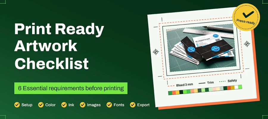
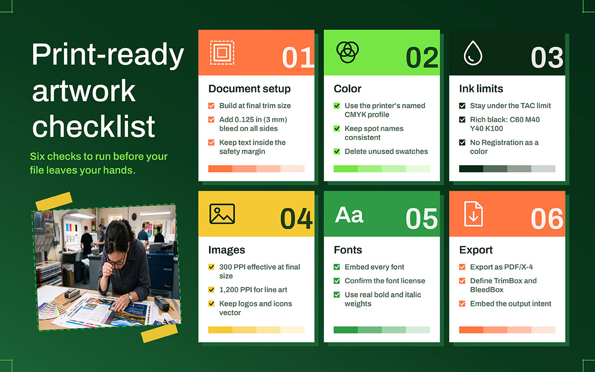
A print-ready artwork checklist really comes down to six requirements — document setup, color, ink, images, type, and export. Build at final trim size with 0.125 in (3 mm) bleed on all sides, plus a matching safety margin. Convert to your printer's named CMYK profile, keep spot colors consistent, and stay under the ink limit. Supply images at 300 PPI at final size, embed every font, and export as PDF/X-4 with trim and bleed boxes defined. Get these six right, and your file won't bounce back.
The box arrives on a Tuesday. It holds five thousand business cards. You open the wrap like a gift, proud of the design. Then you spot it. A thin white line runs along the bottom of every card. No one across a room would notice. But you notice. Now you can't stop seeing it.
Nobody approved that white line. The designer didn't draw it. Nor did the printer add it. It appeared in the gap between file and press, where assumptions live. This checklist closes that gap.
This is the checklist you run before a file leaves your hands. It's written for the person who ordered the artwork rather than the one who built it. Each rule pairs with the failure it prevents, so you'll know exactly what you're protecting against and why it matters. A rule you understand is a rule you remember next time.
This print-ready checklist covers essential requirements to ensure your file is properly prepared before printing.
Ready to see how? Keep reading!
Print-ready artwork checklist
A print-ready checklist is really just proof that your file is actually ready to print, not just ready to look at on your screen. It checks trim size, bleed, color profiles, and ink limits. It confirms your images are sharp, your fonts are embedded, and your export format is clean. Meet every point, and you remove all the guesswork for your printer, no back and forth, no bounce backs, no surprises on press day.
Sound like exactly what your next file needs? Follow the print-ready artwork checklist below to verify each requirement before you send your file!
Document setup: Trim size, bleed, and safety margin
Three terms do three different jobs. Most problems with print-ready artwork checklist start when someone assumes they all mean the same thing.
Trim size is the finished size of the piece after cutting.
Bleed is artwork that extends past the trim line. That way, a slightly off-cut still lands on ink rather than paper.
Safety margin, also called the live area, is the space inside the trim line. All text and key elements must sit inside it. This keeps them from being cut off or crowded at the edge.
Guillotines and die cutters work within a tolerance. Paper stacks shift under the knife as the blade presses down. The cut never lands in the exact same spot twice. Bleed exists to absorb that movement. Without it, that small shift becomes your white line.
That tolerance also explains why folded and bound formats behave differently from flat ones, and why folded formats behave differently matters for panel widths on a roll fold too. The table below gives typical starting points.
Bleed and safety by product type
Bleed size isn't fixed. The finishing method changes it. Binding also affects the safety margin more than people expect. Use these numbers as a starting point, then confirm them with your printer's spec sheet.
Product
Typical bleed
Typical safety margin
Note
Business cards, postcards, flyers
0.125 in / 3 mm
0.125 in / 3 mm
Small trim tolerance relative to size; keep text well inside
Brochures and folded leaflets
0.125 in / 3 mm
0.1875 in / 5 mm
Add allowance at folds; panels are not equal widths on a roll fold
Saddle-stitched booklets
0.125 in / 3 mm
0.1875 in / 5 mm
Creep pushes inner pages outward; ask the printer for a creep allowance
Perfect-bound books and catalogs
0.125 in / 3 mm
0.5 to 0.75 in / 12 to 19 mm at the spine
Gutter allowance grows with page count and paper bulk
Posters and large format
0.125 to 0.4 in / 3 to 10 mm depending on finishing
0.4 in / 10 mm and up
Mounted or stretched work needs far more; confirm the wrap allowance
Packaging and labels
Set by the die line, commonly 0.125 in / 3 mm
Set by the die line
Bleed follows the die, not the bounding box
Treat these numbers as typical ranges. Perfect-bound gutters and large-format allowances vary among vendors. The only number that matters is the one your printer gives you. Ask for it in writing before you open your layout.
The gutter deserves a closer look, because it surprises people. A 48-page catalog and a 240-page catalog don't need the same inside margin. Paper bulk pushes pages apart at the spine. The binding also claims part of the inner edge. A photo that crossed the gutter nicely in the PDF can lose its subject into the glue. Anyone ordering multi-page print work such as catalogs should agree the gutter allowance with the printer at the brief stage, before proofing. Fixing it late means reflowing the whole book.
Trim box, bleed box, and media box inside the PDF
This section separates a file that looks right from a file that is right. The page boxes are metadata. They tell the RIP, the raster image processor, where your page really is. A document can have correct dimensions and still fail if the metadata is wrong.
PDF page boxes
A PDF carries five page boxes. Only three matter to a commercial printer. Here's what each one declares, and the common mistake with it.
Box
What it defines
Common failure
MediaBox
The full sheet the page is drawn on, including marks
Set to the trim size, so marks and bleed have nowhere to live
TrimBox
The finished page after cutting
Missing entirely, which makes most preflight profiles fail the file
BleedBox
Trim plus the bleed allowance
Present but set equal to TrimBox, meaning no bleed exists in the file
CropBox
The visible area when the PDF is opened
Confused with TrimBox; it has no production meaning
ArtBox
The meaningful artwork extends
Rarely relevant to commercial print; ignore unless the printer asks
You can see all five values in Acrobat. Go to Tools, then Print Production, then Set Page Boxes. Open your file and check now, before you send it.
Here's a trap worth naming clearly. A document exported at 8.75 by 11.25 inches for an 8.5 by 11 inch page isn't the same as one with a correct TrimBox. The oversized page leaves a quarter inch of mystery around it, and the RIP can't tell which part is the page and which is the bleed. A correct TrimBox tells the press exactly where the knife goes.
Color: CMYK, spot inks, and the profile that governs both
Here’s what most guides leave out. "Convert to CMYK" alone is incomplete advice.
CMYK covers many different printing conditions. Each one uses an ICC profile for the press, ink, and paper. Converting to a generic CMYK looks different from converting to your printer's actual profile, even when using the same file.
RGB to CMYK conversion loses some color and shifts it. Saturated blues, oranges, and greens shift the most. Four inks on paper can't fully reproduce them. This is normal, and it doesn't mean your file is flawed.
The output intent is the profile embedded in the PDF. It names the printing condition the file was made for. It travels with the document and tells the RIP how your colors should look.
Spot inks are separate physical channels rather than CMYK mixes. Naming matters a lot here. Spelling one swatch two different ways creates two plates, and two plates mean two charges.
Delete unused spot swatches before export. They can create empty separations, confuse the operator, and add costs nobody planned for.
Common printing conditions and their profiles
Profile names look interchangeable in a dropdown menu. But each one maps to a specific press. This table shows which condition each profile belongs to, so you'll recognize the answer when your printer gives it.
Printing condition
Profile commonly specified
Where it applies
Sheetfed offset, coated, North America
GRACoL 2006 Coated1v2, or the CRPC6 characterization
Most US commercial sheetfed work
Web offset publications, North America
SWOP 2006 Coated3v2
Magazine and publication printing
Offset, coated, Europe (ISO 12647-2:2004)
Coated FOGRA39
Long-established European default
Offset, coated, Europe (ISO 12647-2:2013)
PSO Coated v3, FOGRA51
Accounts for optical brighteners in modern papers
Offset, uncoated, Europe (ISO 12647-2:2013)
PSO Uncoated v3, FOGRA52
Uncoated stock, higher dot gain
Digital press or wide-format inkjet
Device-specific, supplied by the vendor
Do not assume an offset profile transfers
The one instruction that matters: Ask the printer which profile to use, and use that one. Every other rule in this section is downstream of that single answer. If a printer cannot name a profile when you ask, that is useful diagnostic information about the vendor.
Some formats need more than ink on paper. Printing onto board, film, or metal changes how color behaves before a single plate is made. That's why packaging work carries extra color constraints that a flyer never faces. Think substrate first, profile second, artwork third.
Ink limits, rich black, and the registration trap
Total area coverage, also called TAC, is the sum of the four CMYK values in one area. All four inks at 100% add up to 400%.
Go over the press limit and real problems happen. Wet ink can transfer to the sheet stacked above it. That's called set off. Drying slows down. Fibers can lift off the paper, a process called picking. On heatset web presses, trapped moisture can blister the coating. None of this shows on your monitor. All of it shows on the delivery pallet.
Typical total area coverage limits
Every press-and-stock combination has its own ceiling. Uncoated paper sits well below coated paper. These are the ranges you'll meet most in commercial work.
Process and stock
Typical TAC limit
Sheetfed offset, coated paper
300% to 340%
Heatset web offset, coated (magazines)
300% to 320%
SWOP web offset specification
300%
Non-heatset web offset, uncoated (newsprint)
240% to 260%
Digital and inkjet
Device-dependent; commonly set lower, confirm with the vendor
These are typical ranges, and vendors disagree on exact figures. Confirm the number for your press and stock rather than treating a single value as fixed.
Rich black vs. flat black vs. registration
Flat black (K100) is right for body text and fine rules. On large areas, it can look washed out or slightly gray, since one ink layer only absorbs so much light.
Rich black adds process ink under the black to deepen it. A common build is C60 M40 Y40 K100, totaling 240%, which fits comfortably inside a sheetfed coated limit. Use it only on large solid areas.
Registration is C100 M100 Y100 K100. That's 400%, well past every press limit. It belongs only on crop-and-fold marks. Using it as a design color is one of the most common and damaging pre-press mistakes, and it's just one click away in every swatches panel.
Small text should never be set in rich black. Four plates must align perfectly to hold the letterforms. Any misalignment shows up as colored fringing on every character. Set small type in a single ink, and it can't go wrong.
How to check ink coverage yourself
Acrobat: Go to Tools, then Print Production, then Output Preview. Turn on Total Area Coverage and set your limit. Anything over the threshold highlights on screen.
InDesign: Go to Window, then Output, then Separations Preview. Set the view to Ink Limit and enter your target percentage.
Photoshop: Open the Info panel and set one readout to Total Ink. A sigma symbol shows the coverage under your cursor as you move it.
Image resolution and effective PPI
Let's correct the most common myth in print advice. 300 DPI depends on the size at which a file is placed.
An image is a fixed grid of pixels. Shrink it, and the pixels crowd together into fine detail. Enlarge it, and they spread out. The number in the file's metadata stays the same when you scale it. But the density on paper varies widely.
Effective PPI is the number that matters: A 300 PPI image scaled to 200% in your layout becomes 150 PPI on press.
InDesign shows two values in the Links panel: Actual PPI and effective PPI. Read the second one, since that's the only one the press sees.
Upscaling adds pixels without adding real detail: AI upscaling can make an image look better by inventing texture. But it can't recover detail that was never captured. Say this clearly to anyone who wants to enlarge a web-sized photo for a poster.
Resolution targets
Different content types need different resolutions. Photography is the only one where 300 PPI is right. Find the row that matches your asset before you place it.
Content type
Target
Why
Continuous-tone photography
300 PPI at final size
Matches typical offset screen rulings for commercial work
Line art and 1-bit scans
1,200 PPI at final size
Hard edges alias badly at photographic resolutions
Logos, type, icons, diagrams
Vector wherever possible
Resolution-independent; scales without penalty
Large format viewed at a distance
Scaled down against viewing distance
A billboard at 30 PPI can look sharp; the eye resolves less at a distance
Newsprint and coarse stock
Often lower than 300 PPI
Coarser screens; confirm with the printer
Resolution is only half the story. A photo can hit 300 PPI and still print flat, muddy, or wrong in the shadows. Screen files are made for backlit glass rather than absorbed ink. Ordering images that have been retouched and color-corrected for print is a different request than asking for web assets, so say it clearly when you order.
Fonts: Embedding, outlining, and licensing
Type is one of the four things in this print-ready artwork checklist. It deserves more than one line of advice, because font failures are quiet. A missing glyph or swapped weight throws no error. It just prints.
Embed or outline
Both approaches solve the same problem, but each costs you something different. This comparison lays out what you gain and lose either way.
Approach
Advantages
Costs
Use when
Embed
Text stays selectable, searchable, and editable; smaller files; accessible PDFs; required by PDF/X
Requires an embeddable license; a printer editing the file could reflow text
Default for almost all commercial print
Outline (convert to paths)
No font dependency at all; guarantees glyph fidelity
Text is no longer text, so no editing, no accessibility, no searching; very small type can thicken slightly
Logos, one-off display type, or when a printer explicitly asks
The licensing question most guides skip
Desktop licenses usually allow embedding for print, but not all do. Some block embedding outright. Others block outlining. A few limit the number of workstations that can use the font. When a font refuses to embed, check the license first, since that's usually the real cause. The fix is legal rather than technical.
Free-for-personal-use fonts are a common risk in commissioned work. They look just like licensed fonts until someone reads the terms. Ask your designer to name the license for every typeface delivered. It's a fair question, and a professional will have the answer ready.
Typographic minimums for print
Avoid faux bold and faux italic. Use the real weight from the font family. Synthesized styles can render inconsistently at the RIP.
Fine serifs and hairline weights break up in reverse type, meaning white text on a dark background. They suffer even more on uncoated stock, where ink spreads into the fibers. Increase the weight or size instead of hoping for the best.
Hairline rules set to 0 pt can render as a single pixel. That's nearly invisible on press. Set a real measurement instead, commonly 0.25 pt at minimum for offset.
Small reverse type on a four-color build is the classic misregistration victim. Set it over a single ink wherever the design allows.
None of this means you should design timidly. It means choosing typefaces that survive the press rather than typefaces that only survive a retina display.
Overprint, knockout, and trapping
Knockout is the default behavior. An object on top removes the ink beneath it, so the two colors never mix.
Overprint is the alternative. The top object prints on top of the ink beneath it, and the two combine. Used on purpose, overprint is a useful tool. Left on by accident, it causes one of the most alarming failures in print, a white object set to overprint. It looks fine on screen, but in CMYK, white ink doesn't exist. The object vanishes, and whatever sits behind it prints straight through.
Small black text is often set to overprint on purpose. That way, slight misalignment leaves no white halo around the letters. This is the good version of the same behavior.
Trapping is a slight, deliberate overlap between adjacent colors. It's usually the printer's job in a modern RIP workflow. Don't trap manually unless asked to.
Check all of this in Acrobat's Output Preview with Simulate Overprinting turned on. Your design app's preview isn't reliable for this. Neither is the rendering in a browser or a mail client.
Transparency, effects, and flattening
Drop shadows, blend modes, feathering, and anything under 100% opacity count as live transparency. Older print workflows can't process live transparency. They flatten it at export instead, splitting overlapping areas into opaque pieces that approximate the original look.
Watch for these flattening artifacts
Thin white lines where flattening split the artwork
Color shifts where transparent objects overlapped
Rasterized patches with visible edges next to vector art
File sizes that grow for no clear reason
A PDF/X-4 workflow keeps live transparency and lets the RIP resolve it at full resolution. That's why it's the preferred standard for design-heavy work. If a printer requires flattening, use the high resolution preset. Check the result at 400% zoom before sending anything.
Die lines, spot finishes, and special layers
Packaging, labels, and finished print carry information that isn't ink. A cut line instructs one machine, and a foil area instructs another. Both need to travel within the artwork without being printed as part of the artwork.
Element
How it should be supplied
Die line/cut line
On its own layer, as a spot color set to overprint, named exactly as the printer specifies (commonly "CutContour" or "Die")
Crease and fold marks
Separate spot swatch, dashed, on the same technical layer
Spot UV, foil, emboss
A separate spot channel at 100% coverage, shown as a solid wherever the effect applies
White ink (on clear or metallic substrates)
Its own named spot channel; never a white CMYK object
Varnish-free zones
Marked explicitly; never assume the printer will infer them
Tell your designer this clearly, since it's counterintuitive. Technical layers must be visible in the PDF but non-printing in ink. Do this by setting them to spot colors with overprint, instead of hiding the layer. A hidden layer is one the printer can't find.
Getting this right is most of the work in label design built around a supplied die line, since the shape arrives from the converter before design even starts.
Choosing an export standard: PDF/X-1a or PDF/X-4
PDF/X is a limited version of PDF, defined by the ISO 15930 standards. It removes features that would force a RIP to guess. Think of it as an agreement about what a file can't contain, more than a file format.
PDF/X comparison
Two standards dominate commercial print, mainly separated by how they handle transparency and color. This comparison shows where each one still belongs.
PDF/X-1a
PDF/X-4
Standard
ISO 15930-1 (2001) and ISO 15930-4 (2003)
ISO 15930-7:2010
Base PDF version
PDF 1.3
PDF 1.6
Transparency
Must be flattened
Live transparency preserved
Color
CMYK and spot only
Color-managed; CMYK, gray, RGB, and spot supported
ICC output intent
Required
Required and embedded; PDF/X-4p references an external profile instead
Layers/optional content
Not supported
Supported
Best for
Legacy workflows, and printers who ask for it by name
Modern design-heavy work; the current default recommendation
Every PDF/X type needs embedded fonts, a declared output intent, and defined page boxes. None allow encryption, JavaScript, form fields, or multimedia.
In practice, choose the PDF/X-4 preset with the most recent year in your software. Leave the General and Compression settings alone unless your printer says otherwise. Set bleed and marks in the Marks and Bleeds panel.
If the printer names a standard, use theirs. A printer asking for PDF/X-1a in 2026 is usually working around an older RIP that still runs well. Arguing about it costs more than just complying.
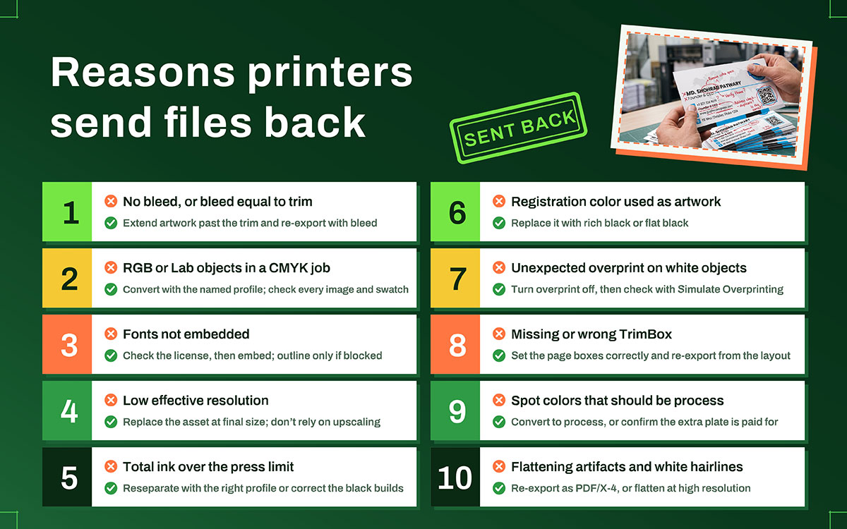
10 Reasons printers send files back
Printers send files back because of predictable setup mistakes, not creative errors. These issues span color, fonts, resolution, and file structure, and most are avoidable with a quick preflight check. Understanding these 10 Reasons Printers Send Files Back shows you exactly what to check before you submit:
Rejection reason
The fix
No bleed, or bleed equal to trim
Rebuild the document at trim size, extend artwork past the edge, re-export with bleed
RGB or Lab objects in a CMYK job
Convert using the named profile; check every placed image and every swatch
Fonts not embedded
Check the license first, then embed; outline only if the license blocks embedding
Low effective resolution
Replace the asset at final size; do not rely on upscaling
Total ink over the press limit
Reseparate with the correct profile, or correct the black builds by hand
Registration color used as artwork
Replace with rich black or flat black as appropriate
Unexpected overprint on white objects
Turn overprint off on those objects, then re-check with Simulate Overprinting
Missing or wrong TrimBox
Set the page boxes correctly and re-export from the layout file
Spot colors that should have been process
Convert to process, or confirm the extra plate is intended and paid for
Flattening artifacts and white hairlines
Re-export as PDF/X-4, or flatten at high resolution and inspect closely
Each of these can be fixed if you catch it early. The pressure rises when the schedule has no slack, which is why teams running event print runs where a reprint is not an option often build a preflight day into the calendar rather than just trusting the file is fine.
Artwork checklist FAQs
Print buyers usually ask the same questions on every job. They often ask last minute, with no time to search. Common topics include bleed size and CMYK conversion. They also cover font embedding, resolution, and ink limits. These print-ready artwork checklist FAQs answer each question directly. If anything is missing here, contact us through our email before you get back to your file.
Print ready means the file needs no extra work before plate or press. That means the correct trim size with bleed, defined page boxes, an embedded output intent, CMYK or spot color throughout, embedded fonts, sufficient effective resolution, and ink coverage within the press limit. The printer should have no questions left.
Start at 0.125 in (3 mm) on all four sides. That's the general standard for most commercial print, covering cards, flyers, postcards, brochures, and booklets. Large format, mounted work, and die-cut packaging often need more. The bleed table above gives typical figures by product. Confirm with your printer.
It's almost always one of ten recurring issues. Missing bleed, RGB objects, unembedded fonts, low effective resolution, ink over the limit, registration used as a color, accidental overprint, a missing TrimBox, unintended spot plates, or flattening artifacts. The rejection table above pairs each with its fix. None require starting over.
For offset, yes, using the profile your printer names instead of a generic CMYK. Some digital presses and wide-format workflows accept RGB and convert it internally. This often gives better results than a manual conversion, since their RIP knows the device. Ask before you convert.
Embed by default. Embedding is required by PDF/X, keeps text selectable and accessible, and makes smaller files. Only outline when the font license forbids embedding, or the printer asks for it. Outlining destroys the text layer for good, taking accessibility, searchability, and last-minute typo fixes with it.
Photography needs 300 PPI at final size. Line art and 1-bit scans need 1,200 PPI at final size. Logos, icons, and type should stay vector whenever possible. Large format is judged by viewing distance instead, so a billboard can look sharp at a resolution that would be unusable on a business card.
Screens emit light and cover a wider color range than four inks on paper. Paper absorbs ink, and dot gain slightly spreads the halftone dots, darkening midtones. A calibrated monitor, soft proofing with the correct profile, and a physical proof will significantly narrow the gap. They won't close it completely.
Some printers accept them for simple, low-risk jobs. Neither reliably produces true bleed, correct page boxes, spot channels, an embedded output intent, or controlled ink builds. Both may also hand off RGB color. If the piece matters, ask your printer what they accept before you start designing.
Total ink coverage, or TAC, is the sum of the four CMYK percentages in one area, up to a maximum of 400%. Typical limits run around 300-340% for sheetfed offset on coated stock, and lower on uncoated stock. Going over the limit causes set off, slow drying, and picking. Confirm the figure with your printer.
Endnote
At the end of our discussion on the print-ready artwork checklist!
Bleed, trim, color space, embedded fonts, real resolution, ink limits, registration, overprint, correct boxes, spot plates, clean flattening, you've got every piece now. Fifteen minutes running through this list catches almost everything that sends a file bouncing back. Not bad for fifteen minutes, right?
One more thing before you open that layout file: ask your printer for their specs first. Every step gets easier once you know what you're building toward.
Here's the truth behind all of this — the same discipline runs through how the team at Graphic Design Eye LLC handles production work, whether it's print, brochures, packaging, or brand collateral. The specification is agreed upon before a single file gets built. That's really the whole difference between teams who commission print collateral produced to spec and teams who commission print and just hope for the best.
So, if your next project deserves that kind of care from day one, you already know where to start.
Get the specification first! Run the list! Then open the box on Tuesday and enjoy what you find! 🙂
Graphic Design Eye LLC is a full-service creative agency built for brands that demand more than design — they demand vision. From strategic branding to complete visual identity, we partner with startups, agencies, and growing businesses as a dedicated creative force. With flexible subscription and project-based models. Let's start with us today!