A design handoff checklist lists everything a finished design needs. Designers need tokens, states, breakpoints, files, and edge cases. Print vendors need trim, bleed, CMYK color, and clear images. Images should be 300 DPI at full size. Fonts must be embedded, and the PDF must be checked. This article covers one checklist for both. It shows the spec tables for each audience and where the two paths split. It also shows what a missing detail costs.
A good checklist saves your work from costly mistakes. It tells the other person exactly what you meant, from token names to bleed size. Nothing gets guessed. Nothing gets invented. Nothing gets reprinted at your cost.
The stakes differ on both sides. A missed hover state costs a designer one afternoon. A missed bleed setting ruins the whole print run. The same small mistake brings a very different bill.
Let’s say It’s 4:40 on a Friday. A designer zips a folder, attaches it to an email, types “here you go,” and hits send. The work is good. The client approved it two days ago. Everyone goes home.
On Monday, a designer opens the file. They find a button with no hover state and quietly invent one. A week later, a printer opens another file. They find no bleed on a business card and stretch the artwork 2% to cover the gap. Neither one calls. Both are just trying to help.
Nobody notices. That’s exactly the problem.
Every design leaves its creator at some point. That moment is the most fragile step in the whole graphic design process. Today we’ll walk you through the design handoff checklist. It covers screens and print both.
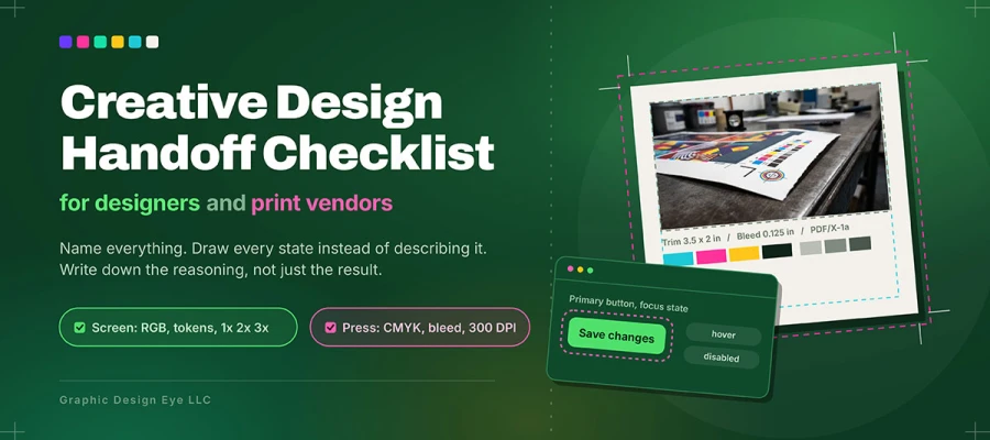
Before the lists, remember three ideas. Name everything. Draw every state instead of describing it. Write down your reasoning as well as your result. Everything below builds on these three ideas.
So, let’s get started!
Creative design handoff checklist
A design handoff checklist verifies that a file is complete before it leaves a designer's hands, catching the specs a designer or print vendor would otherwise have to guess under deadline pressure. Start with the designer handoff checklist for the two destinations below:
Designer specs in detail
Four items get left incomplete more than all the others combined. They deserve extra explanation. “Incomplete” here rarely looks incomplete. It looks finished.
Specification
What incomplete looks like
What complete looks like
Breakpoints
A desktop frame and a mobile frame
A named breakpoint set with agreed pixel sizes. It documents what stacks, hides, or truncates at each one.
States
Default state only
Default, hover, focus, active, disabled, loading, and error. Focus is stated, not left to inherit.
Edge cases
Screens populated with ideal content
Empty, loading, error, long content, short content, and permission versions. Truncation rules are stated.
Tokens
A color swatch on a page
Named tokens with values and agreed names. A map your dev team can use directly.
Here’s what ties all four together. Every gap gets filled eventually. A designer fills it, under deadline pressure, without asking you. That designer isn’t careless. They’re blocked, and they fix it the only way they can.
Each result alone is invisible. Together they’re obvious. You get a product that feels almost right. Nobody in the review meeting can quite name why.
For designers
This is the list your designer wishes came with every file. Work through it before you share the link. Most Monday questions never get asked. Check what applies. Skip what doesn’t. Add a note for anything left open.
File hygiene
Current version marked. Old drafts removed. File shared with the right permissions.
Layers and frames named clearly. Components used throughout, not detached copies.
Design tokens
Color tokens named and exported. Spacing and type scales documented, with sizes, weights, and line heights.
Border radius and elevation values listed. Token names agreed with the dev team beforehand.
Typography
Font families and weights named. Web font source and license confirmed.
Fallback stack specified. Line height and letter spacing given for every style.
Component states
Default, hover, focus, active, disabled, loading, and error, for every interactive element.
Focus states stated clearly, not left to the browser.
Responsive behavior
A defined breakpoint set with agreed values. More than just a desktop and mobile frame.
Behavior documented at each breakpoint. What reflows, stacks, hides, or truncates, plus minimum and maximum widths.
Edge cases
Empty, loading, and error states drawn, not just described.
Long content with truncation rules. Short content that won’t leave layout looking unfinished.
Zero, one, and many items shown for every list, plus permission-restricted versions.
Assets
Icons exported as SVG. Raster assets supplied at 1x, 2x, and 3x.
File sizes optimized. A consistent export naming rule used.
Illustration source files included wherever they’ll need editing later.
Motion
Transition duration, easing, and which properties animate.
Behavior defined for reduced motion, for users who ask for it at the system level.
Accessibility
Text contrast measured against WCAG AA levels. 4.5:1 for body text and 3:1 for large text.
Focus order documented. Touch target minimums stated.
Alt text intent for meaningful images. Form labels and error messages specified.
Content
Real copy, not placeholder text, with character limits per field.
Date, number, and currency formats. Plus plural rules and any translation needs.
Documentation
Intent noted for every unclear decision. Fixed decisions kept separate from open ones.
Known limits flagged. A named contact given for questions.
Print specs in detail
Print guides often assume you already know these terms. Most designers learn them the hard way, by getting a file rejected. So here they are, in plain words, with the reason for each. The reason helps you judge a job that doesn’t match the standard.
Specification
Standard practice
Why it exists
Bleed
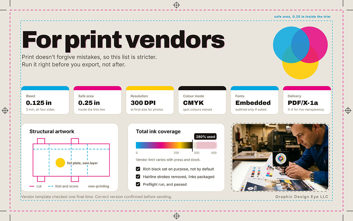
Usually 0.125 in (3 mm) on all four sides. More for large format and cover work.
Cutting machines are never perfectly exact. Without bleed, a shifted cut leaves a thin white edge on the piece.
Trim
The final size after cutting
The size the piece is sold and listed at.
Safe area
Commonly 0.25 in inside the trim line
Keeps text and logos clear of cutting errors.
Resolution
300 DPI at final size for photos. Much higher for line art.
Below this level, detail softens and edges look blocky up close.
Color mode
CMYK for process printing. Spot colors named where an exact match matters.
Screens mix light and show more colors than ink can. Some screen colors can’t be printed at all.
Total ink coverage
A stated maximum. It varies by vendor and paper stock.
Too much ink on soft paper causes smearing, slow drying, and muddy shadows.
Font handling
Embedded, or outlined if the vendor needs that.
Stops font swaps and layout shifts on the vendor’s system.
Delivery standard
PDF/X-1a works with most presses. PDF/X-4 when native transparency is supported.
Forces embedding, color space, and flattening. Nothing behaves oddly on press.
Read that table as common practice, not strict law. Bleed rules, ink limits, and PDF standards change by vendor, press, and material. A spec right for a short digital run on coated paper can be wrong for offset on uncoated paper.
One more thing. This doesn’t scale down. Designers often apply real care to a packaging run, but less to a one page handout. They assume simple work carries less risk. That assumption is wrong. Simple jobs run in higher volumes, on tighter deadlines, with fewer proofs. Even routine print work, like flyers, needs the same discipline. Confirm the trim. Apply the bleed. Check the ink limit. Run preflight. Send the right version.
For print vendors
Print doesn’t forgive mistakes, so this list is stricter. Almost every item exists because someone skipped it and paid for a reprint. Run it right before you export, not after.
Document setup
Final trim size checked against the vendor’s template.
Bleed applied on all four sides. Safe area respected.
Crop marks included if requested. Page count and order correct for multi-page work.
Color
Converted to CMYK for process printing. Spot colors specified and named correctly.
The vendor’s ICC profile applied, or removed, exactly as asked.
Rich black set on purpose, not by default. Total ink stays within the vendor’s limit.
Resolution
Photos and continuous tone images at 300 DPI at final size.
Line art at the higher resolution the vendor wants. No stretched low-res images. Vector art used wherever possible.
Fonts
All fonts embedded, or text turned to outlines if the vendor needs that.
License allows embedding. No letters went missing during conversion.
Structural
Dieline on its own layer, marked non-printing.
Fold, score, and perforation lines marked. Grain direction noted where it matters.
Finishing
Separate plates or layers for foil, spot varnish, emboss, or deboss.
Finishing artwork drawn at 100% black on its own layer. Minimum detail sizes respected.
Delivery file
Exported to the PDF standard the vendor wants, usually PDF/X-1a or PDF/X-4.
Transparency flattened if the standard needs it. Hairline strokes removed.
Proofing
Digital proof reviewed and approved
Hard copy or press proof requested when color accuracy matters. Expectations agreed in advance for colors ink can’t match.
Packaging
Linked images packaged with the file whenever source files are supplied.
A job spec sheet listing stock, finish, quantity, and delivery date. A named contact and an approval signature.
Before submitting
Preflight run and passed
Vendor template checked one final time
Correct version confirmed before sending
Formatting note for publication: Render both lists with real checkboxes, not bullets. Give each its own link. Make the section printable. This is the part readers save, print, and pin above their desk. It’s the strongest part of the article for earning outside links.
Where the two handoffs split
Designer and print handoffs follow the same discipline. But they share almost none of the same technical rules. Color space, file format, units, and even how you fix mistakes differ by destination. Check the designer vs. print handoff comparison below. It shows exactly where the two handoffs split.
Concern
Designer handoff
Print vendor handoff
Color space
RGB, with hex values and tokens
CMYK, with spot colors when matching matters.
Color fidelity
Varies by display and calibration
Varies by ink, stock, and press. Proofing is the only reliable check.
Vector format
SVG, optimized
Vector PDF or EPS, with fonts handled
Raster requirement
Optimized for load speed at 1x, 2x, 3x
Optimized for detail at 300 DPI at final size
Units
Pixels and relative units
Inches, millimeters, and points
Variability handled
Screen size, input method, content length
Cutting tolerance, ink absorption, stock behavior
Failure mode
Fixable after release with a deployment
Fixable only by reprinting
Cost of a late fix
Designer hours
The entire print run
Reversibility
High
None
Text handling
Live and selectable
Embedded or outlined
Accessibility concern
Contrast, focus order, screen readers
Readability at a distance. Contrast on the chosen paper.
The two workflows share almost no technical rules. But they share one thing fully. Both punish the same mistake, an unstated assumption.
That’s the whole point in one line. A designer assumes disabled means 50% opacity, since nobody said otherwise. A printer assumes 0.125 in of bleed, since most jobs use that. Neither is wrong to assume. Both assume because you left a gap. A gap always gets filled by whoever finds it first.
What a missing detail costs
A missing checklist item can cost you an afternoon of work. Or it can ruin a whole print run. It depends on which detail gets skipped. Digital mistakes are usually fixable. Print mistakes are rare.
See what a missing detail costs for the exact cost of each mistake:
Omission
Digital consequence
Print consequence
No focus states
Keyboard and screen reader users get lost. Accessibility fixes come later.
None
No edge cases
Layout breaks on real customer data after launch
None
No breakpoint behavior
Inconsistent responsive choices across the team, found in QA.
None
Wrong version sent
Rework of completed development
An entire run was printed with the old design.
No bleed
None
White edges along the trim, on the whole batch.
Low resolution images
Blurry images on high-density screens.
Clearly pixelated print. Can’t be fixed after the run.
RGB left unconverted
None
Unpredictable color shifts, usually in brand colors.
Fonts not embedded
None
Substituted type, reflowed layout, missing glyphs
Ink limit exceeded
None
Smearing, slow drying, muddy shadow detail.
No preflight
None
Rejection and delay, or a problem found on press.
Read down both columns and the difference jumps out. Almost everything in the digital column can be fixed. In web design and build work, a missed state means a ticket, a deployment, and one afternoon. That costs real money, but it’s limited. The fix reaches every user at once.
Nothing in the print column can be fixed. There’s no patch for five thousand brochures. The file goes to press. The press runs. The pallets ship. Your mistake becomes a real object sitting in a warehouse with your client’s name on it.
That’s why print handoff needs more discipline. It’s also why designers trained only on screens often underestimate it. It’s not carelessness. Their instincts just formed in a place where mistakes cost little. A design handoff checklist isn’t paranoia. It’s simple math. Five minutes of checking always costs less than the mistake it prevents.
Design handoff checklist FAQs
A design handoff checklist stops the same questions from coming up on every project. See the handoff checklist FAQs on releasing files below for direct answers. If you still have questions beyond those covered in the design handoff checklist, feel free to contact us anytime. We’re happy to clear up any confusion and help ensure a smooth handoff.
A full checklist covers four things. The final approved files. Exported assets each place needs. The specs behind the design. And notes on intent and known limits. For designers, that means tokens, states, breakpoints, and edge cases. Print vendors need trim, bleed, color mode, resolution, fonts, and a checked file.
Design tokens. A full set of component states. Breakpoints with clear behavior. Assets at the right scales. Edge case screens. And a note on what's fixed and what's open. Modern tools generate most measurements automatically. But someone still needs to write the rules and reasoning.
A file ready for print, made on the vendor's template. It needs the right trim size with bleed, correct color space, high-resolution images, and embedded or outlined fonts. Printers also need a job spec. That means stock, finish, quantity, delivery date, and a contact who can approve a proof.
A print-ready file is artwork that your vendor can print without changes. It needs the right trim and bleed, the right color space, and the right ICC settings. Images must be full size and clear. Fonts must be embedded or outlined. There should be no hairline strokes. Ink should stay within limits. It must export to the PDF standard your vendor wants.
Usually 0.125 in (3 mm) on all four sides. Some formats, materials, and vendors need more. Always check the vendor’s template before building the file. Don’t add bleed only at export.
Photos and continuous-tone images should be 300 DPI at the final size. Line art usually needs much more, depending on the job and press. If you’re unsure where your files stand, our guide to image size requirements walks through it. And remember, stretching a low-resolution image doesn’t add detail. It only adds pixels.
Embedding is usually better. The text remains editable and searchable, and small fixes are still possible. Outline only if the vendor needs it. Check that your license allows whichever route you pick. Embedding rules vary by foundry. Read the law of fonts and typefaces in design and marketing before you assume you’re covered.
PDF/X-1a works with the most presses and forces flattening. PDF/X-4 keeps native transparency on systems that support it. That gives cleaner results for soft shadows and blend modes. Ask the vendor which they prefer. Don’t assume.
Preflight is an automatic check. It inspects your file against production rules before it reaches a press. It catches missing fonts, low-resolution images, wrong color spaces, hairline strokes, and ink limit problems. Those failures are cheapest to fix before you send, and most expensive to find later.
Rarely, without converting it. The two destinations differ in color space, units, resolution, and file format. Build from one set of design decisions, so the brand stays consistent. Then export separately and carefully for each destination.
It depends entirely on the agreement. Final files and editable source files are often treated separately. Font and stock licenses don’t transfer automatically. Confirm this in writing before the project starts, not after someone asks for a file you thought you still had.
Sending the wrong version. Every other item here is a spec problem. This one is a process problem, and it’s the most costly. The work gets done perfectly against the wrong design, and nobody notices until it’s finished.
Endnote
So we’ve reached the end of the article!
We started with a designer hitting send on a Friday afternoon. That’s where we’ll finish too.
Handoff is the moment your design stops being an idea and becomes an instruction. Ideas can flex. Instructions can’t. They’re only as good as the confusion they clear up.
A checklist doesn’t really protect your files. Files are the easy part. They transfer in seconds, and any skilled professional can open them. What needs protecting is your reasoning.
Hand someone a file, and they can do the work. Hand them your reasoning, and they can do it well. Better still, they can call you when your instruction is about to fail against a limit you didn’t know about. That phone call is worth more than any spec sheet.
If you take one habit from this, take this one. Assume nothing obvious to you is obvious to anyone else. Then write down the three things you almost left out because they felt too basic. Those three are the ones that come back to bite you.
Let’s be honest about how work really goes. Nobody finishes a forty-eight-point list at 4:40 on a Friday. That was never the goal. The goal is to know which items you skipped and what each might cost. Then if something comes up on Monday, it’s a choice you made, not a detail you lost.
That habit is the whole craft. Finish the thinking along with the artwork. Whether you run the list yourself or bring in a professional graphic designer, ensure your design arrives exactly as you drew it. It’s the standard Graphic Design Eye works to, across both digital and print work. The same brand ships to a browser and a press in the same week. It has to land intact in both.
So, good luck with your next handoff. May it come back with zero questions!
Graphic Design Eye LLC is a full-service creative agency built for brands that demand more than design — they demand vision. From strategic branding to complete visual identity, we partner with startups, agencies, and growing businesses as a dedicated creative force. With flexible subscription and project-based models. Let's start with us today!