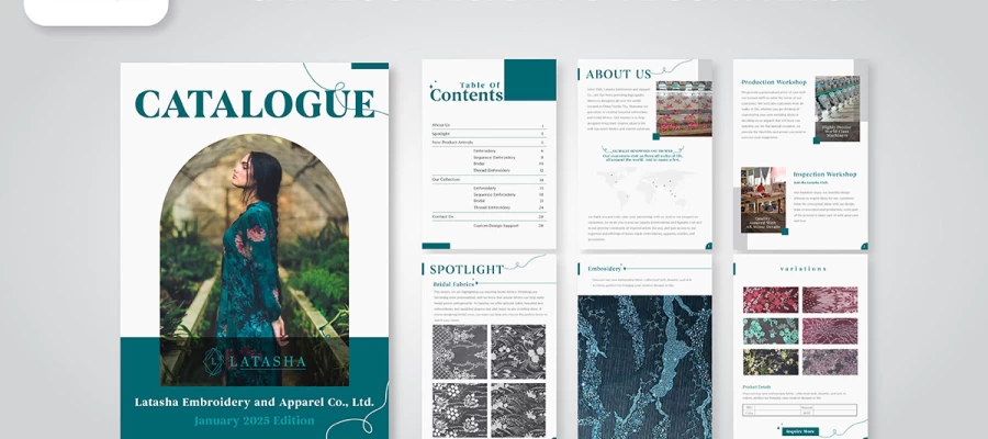
Creative catalog design ideas work when they make products easier to notice, understand, and remember. Strong layouts guide the eye, editorial storytelling creates interest, and distinctive imagery, typography, colour, and print treatments give the catalog a stronger identity. The best choice depends on the products, audience, brand, and job the catalog needs to do.
A catalog can start as a product list and end as something a reader actually wants to explore.
One page introduces the collection. The next gives a product room to breathe. A strong image catches the eye, a clean layout makes the information easy to follow, and suddenly the reader is turning pages without thinking about it.
That is the point of a creative catalog. It gives the reader a reason to keep going when a basic product grid would have been easier to produce.
The challenge is knowing which creative choices are worth making. A bold cover may attract attention, but a crowded inside spread can lose it. A striking product image may look impressive, but it still needs the right layout, typography, and supporting information around it. The best ideas solve a communication problem first and make the catalog look better as a result.
This matters because catalogs have different jobs. A fashion brand may need editorial pacing. A furniture company may need large product photography and generous space. A technical supplier may need to organise hundreds of specifications without making the pages exhausting to scan. The same design idea will not serve every catalog equally well.
So the goal is not to collect beautiful references and copy what catches your eye. It is to find creative directions that make your products easier to notice, understand, compare, and remember.
In this article, we bring together 20 creative catalog layout ideas, explaining what each one does, why it works, who it suits, and what you should consider before putting it into production.
Let’s start with us!
20 Catalog design ideas
Good catalog design ideas change what happens when a reader reaches the page. One layout can make a crowded product range easier to follow. Another can give a key product the space it deserves. The best choices make the page feel worth stopping at, not simply different.
But a beautiful idea still has to work for the catalog in front of you. The twenty ideas below show what each approach can do, who it suits, and how much production effort it takes. The effort is colour coded, so you can see what a creative direction asks of the project before falling in love with the finished look.
Let’s see which layout ideas can make your pages worth turning.
#
Idea
Best suited to
Format
Effort
1
Lifestyle-led opening spread
Home, fashion, furniture
Print and digital
Medium
2
Modular grid with a repeating product cell
Large SKU counts, industrial
Print and digital
Low
3
Full-bleed photography with minimal overlay
Premium and luxury
Print and digital
Medium
4
Colour-coded category dividers
Multi-category retail
Print and digital
Low
5
Asymmetric layout with generous white space
Design-led and boutique brands
Print and digital
Medium
6
Seasonal lookbook narrative
Apparel, accessories, homeware
Print and digital
High
7
Behind-the-scenes maker spreads
Craft, food, artisan goods
Print and digital
Medium
8
Customer story pages
B2B, equipment, services
Print and digital
Medium
9
Founder letter opening page
Family and heritage brands
Print and digital
Low
10
Shop-the-set styled bundles
Homeware, beauty, gifting
Print and digital
Medium
11
Oversized display typography as a graphic device
Youth, streetwear, events
Print and digital
Low
12
Duotone or brand-tinted photography
Corporate, tech, services
Print and digital
Low
13
Illustration and photography hybrid
Toys, food, lifestyle
Print and digital
High
14
Silhouette cutouts on a clean field
Hardware, parts, electronics
Print and digital
Medium
15
Infographic specification panels
Technical and B2B catalogs
Print and digital
Medium
16
QR codes and personalised URLs
Any print catalog with an online store
Print
Low
17
Die-cut, foil and tactile finishes
Luxury, gifting, launches
Print
High
18
Gatefold or centrefold hero feature
Flagship product launches
Print
High
19
Uncoated and recycled stock as a statement
Sustainable and outdoor brands
Print
Low
20
Shoppable digital flipbook with hotspots
eCommerce and wholesale
Digital
Medium
1. Lifestyle-led opening spread
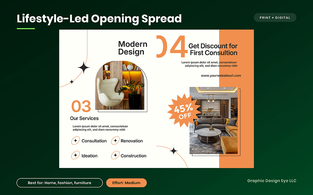
A reader opens the catalog and sees a room, not a product cutout. A chair sits beside a window. A jacket hangs where someone might actually wear it. The product already has a place in someone's life before the reader sees its price. That first impression can change how the pages that follow are received.
What it is: A double-page opening that places your products in a lifestyle setting instead of showing them on a plain white background. Keep the copy to one short line and leave prices for later pages.
Why it works: The opening gives the reader a reason to connect with the product before asking them to compare prices. It creates context first, then introduces the commercial details when the reader is ready to consider them.
Execution note: Photograph the room and the products together. Plan one styled location shoot and capture enough variations to reuse the images across social media, email, and your website.
Best for: Home, furniture, fashion, and other categories where seeing a product in context helps the customer understand its value.
2. Modular grid with a repeating product cell
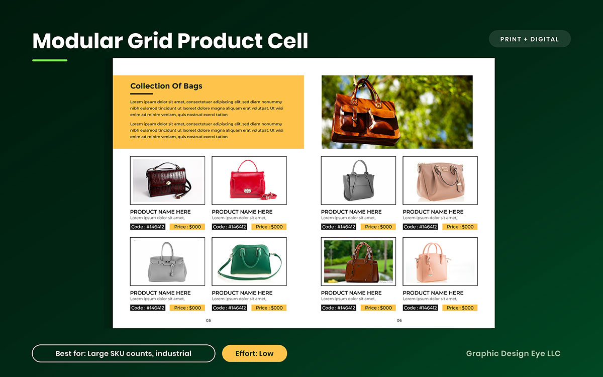
Now imagine opening a catalog with two hundred products to compare. If every page places the image, name, specifications, code, and price in a different spot, even simple browsing becomes tiring. A repeating structure removes that problem. Once readers learn where the information sits, they can move through the range with less effort.
What it is: A fixed product cell containing the image, name, specifications, product code, and price, repeated across a consistent four-, six-, or eight-column grid.
Why it works: Familiarity makes comparison easier. After readers understand one product cell, the same structure carries them through the following pages. That makes a large range easier to scan without giving every product a completely different layout.
Execution note: Build the product cell as a reusable style and connect it to your product data where possible. When a price or specification changes, updates can then be made without retyping the information across every page.
Best for: Large product ranges, especially wholesale, distribution, trade, and industrial catalogs with hundreds of SKUs.
3. Full-bleed photography with minimal overlay copy
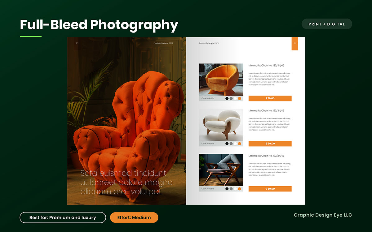
Sometimes the strongest product page gives the reader very little to read. A photograph fills the spread from edge to edge, while a small product name sits almost unnoticed in one corner. There is room to look before there is anything to compare. For a product with a strong visual presence, that pause can make the image do the work.
What it is: A full-page or double-page photograph that runs to the edges, with a small product name or short line of copy. Move specifications, pricing, and other details to the facing page or a separate caption area.
Why it works: Removing competing text gives the photograph greater visual impact. The approach also borrows from editorial and luxury print layouts, where large imagery and restrained typography often create a more premium presentation.
Execution note: Add at least 3 mm of bleed and keep important text inside the safe margin. Check the text against both light and dark areas of the photograph to make sure it stays readable.
Best for: Premium, luxury, fashion, furniture, and other hero products where strong photography can communicate the product before the specifications do.
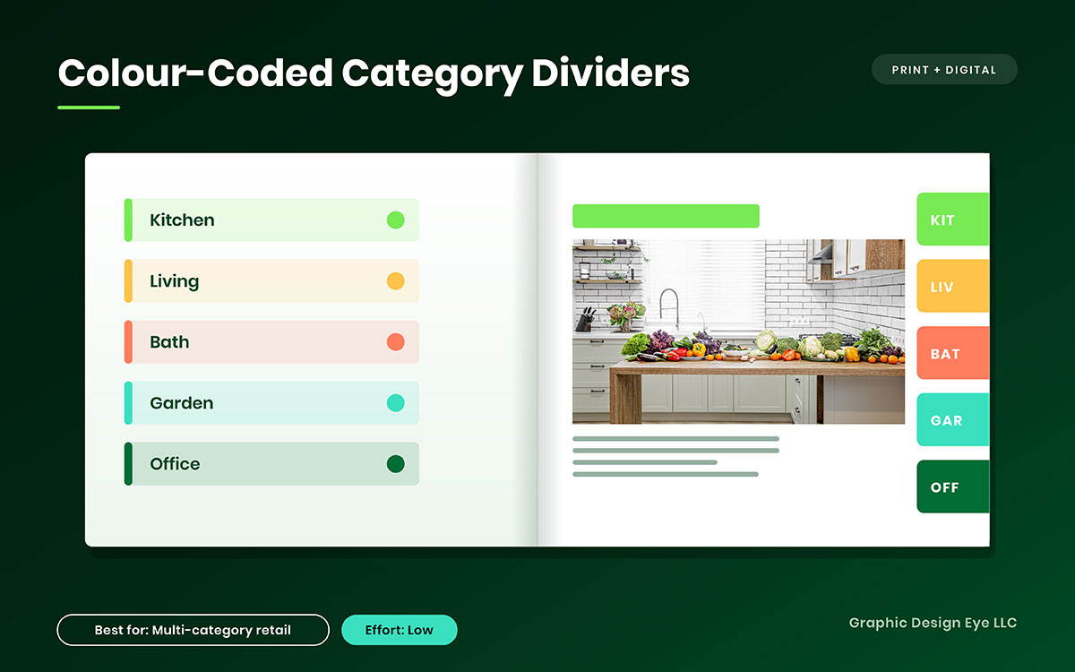
4. Colour-coded category dividers
Picture a buyer flipping through a catalog with dozens of product categories. They are looking for plumbing supplies, outdoor equipment, or a particular product range. If every page looks the same, finding that section takes work. A simple colour system gives each category its own visual marker, so the reader can find the right section faster.
What it is: A distinct colour assigned to each product category and repeated across section dividers, headers, page numbers, or edge tabs.
Why it works: Repeated colours create visual landmarks throughout the catalog. Readers can recognise a category without reading every heading, making a large catalog easier to navigate and scan.
Execution note: Start with your existing brand palette instead of adding a completely new set of colours. Check contrast for every combination, especially where text or page numbers sit on coloured backgrounds.
Best for: Multi-category retail, wholesale, distribution, and supply catalogs where readers need to move between several product sections.
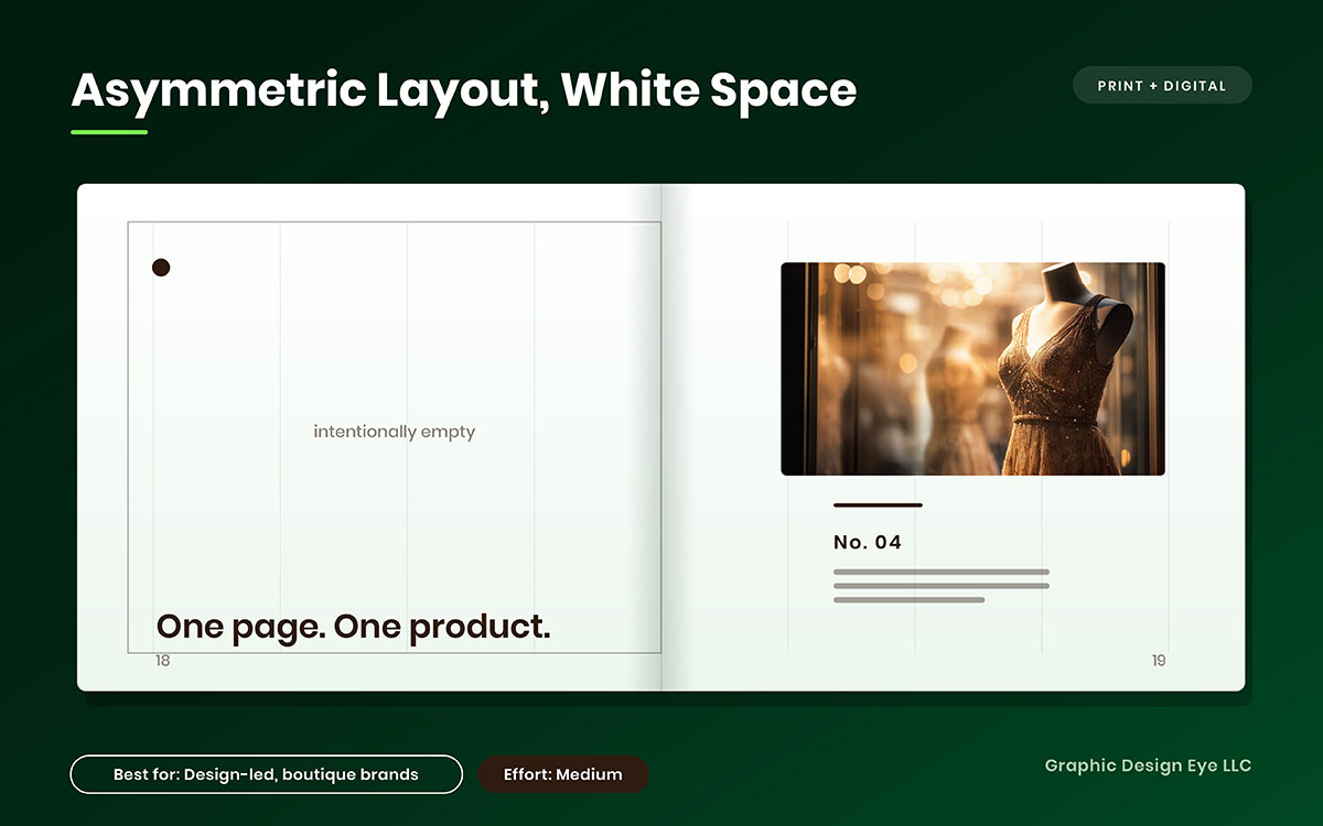
5. Asymmetric layout with generous white space
A crowded page asks the reader to look everywhere at once. An asymmetric layout does the opposite. One product may sit to the side with a large area of open space around it, giving the page a slower rhythm and making the product feel deliberately placed rather than squeezed into a template.
What it is: A deliberately unbalanced composition where products sit off-centre and generous areas of the page are left open.
Why it works: White space creates contrast and gives important products room to stand out. The open areas also give the reader a place for their eyes to rest, which can make the page feel more refined and easier to take in.
Execution note: More open space can mean more pages, which increases print costs. Check the resulting page count and print signatures before using this approach throughout the catalog.
Best for: Boutique, design-led, and premium brands with a focused product range.
Structure needs to be settled before the first page is designed. The grid, page count, and product data structure should be agreed during the early planning stage, not after layout production has started. Otherwise, later design changes can turn into unnecessary rework. If you are at this stage now, planning the build stage by stage can help you organise the project before production begins.
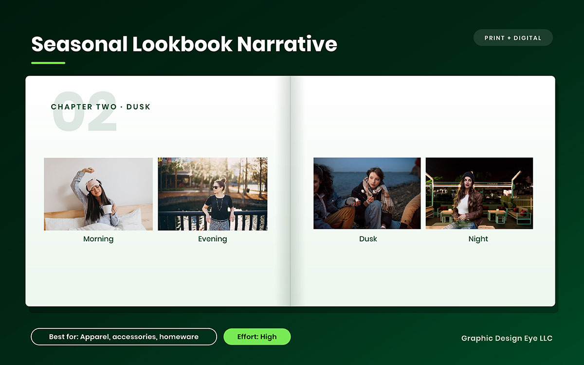
6. Seasonal lookbook narrative
A seasonal catalog does not have to feel like a list of products divided into categories. It can move like a collection itself. The first pages might introduce the season, the middle pages can build its mood and product range, and the final pages can bring the story to a natural close. The reader has a reason to keep turning the pages.
What it is: A catalog organised around a seasonal or visual story rather than a standard product-category structure. The chapters might move from morning to evening, indoors to outdoors, or one stage of a seasonal experience to the next.
Why it works: A clear narrative creates a natural flow between products. It also gives you more control over where featured or higher-priority products appear, allowing them to become part of the story instead of being placed wherever the category structure requires them.
Execution note: Write the chapter outline before creating the photography shot list. Once the narrative is clear, the photography can capture the settings, products, and transitions needed to support it.
Best for: Apparel, accessories, homeware, seasonal collections, and gifting catalogs.
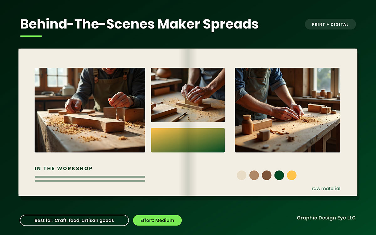
7. Behind-the-scenes maker spreads
The finished product tells the reader what you made. The workshop can show them how it came together. A pair of hands working with raw material, tools on a worn bench, or a close-up of the production process can give the product a sense of origin and care that a polished product shot may not capture.
What it is: One or two spreads showing the workshop, raw materials, people, tools, and production process behind a featured product.
Why it works: Process photography gives readers more context about how a product is made. It can help communicate craftsmanship, material quality, and the work involved, particularly when those details matter to the buying decision.
Execution note: Keep the photography natural and documentary-led. Available light, working tools, and genuine production scenes can feel more credible than heavily staged images. Avoid polishing every detail until the workshop no longer looks like a working space.
Best for: Craft, food, furniture, artisan, handmade, and heritage brands.
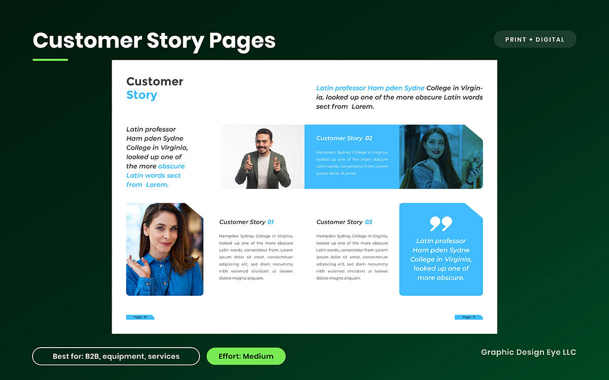
8. Customer story pages
A product specification tells readers what a product can do. A customer story shows how it was used. When someone with a similar need explains the problem they faced, the product they chose, and what happened afterward, the catalog gives readers something concrete to consider alongside the specifications.
What it is: A full page or spread featuring a customer, the problem they faced, the product or products they used, a short quote, and a specific result where one is available.
Why it works: A customer story adds context to product claims and gives readers evidence from an actual use case. It can be especially useful for products that require more consideration because buyers want to understand how the product performs in a situation similar to their own.
Execution note: Get written permission before publishing the customer's name, image, company details, or quote. Keep the story focused and use specific results where you have permission to share them. One credible figure can communicate more than a page of broad praise.
Best for: B2B, equipment, industrial, technical, and product ranges that include installation, support, or other services.
9. Founder letter opening page
Before a reader moves deep into a catalog, they may want to know who is behind the products and why the collection matters. A short note from the founder can answer that early. It gives the catalog a person’s voice and creates a natural introduction to the company before the reader reaches the product pages.
What it is: A short, signed letter on page two or three that introduces the company’s values, highlights what has changed this year, or explains the thinking behind the current collection.
Why it works: A founder’s voice can make a catalog feel more personal and give readers context for the products they are about to see. It works especially well when the company has a clear history, philosophy, or point of view.
Execution note: Keep it under 180 words and use the founder’s actual signature. Write it in the founder’s natural voice rather than turning it into polished corporate copy.
Best for: Family businesses, heritage brands, and companies with a distinctive origin story.
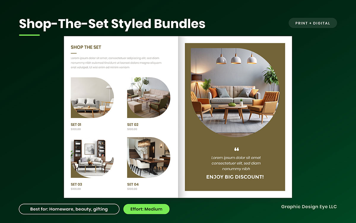
10. Shop-the-set styled bundles
A reader may see a table setting, a bathroom shelf, or a complete outfit and think, “I want that whole look.” A styled bundle helps answer the next question: which products created it? Instead of asking readers to build the combination themselves, the catalog can connect the scene to each individual product.
What it is: A styled scene with numbered callouts that identify every product used in the setting, with each number linked to the product code, name, and price.
Why it works: Showing products together gives readers a clearer sense of how they can be combined. It can also encourage multi-item purchases by presenting complementary products as part of one complete setting.
Execution note: Keep the callout numbers easy to spot and repeat them in the caption strip or product list. The reader should be able to move from the scene to the corresponding product without searching across the page.
Best for: Homeware, beauty, gifting, fashion, and lifestyle products.
Every idea in this group depends on photography that can carry the layout at a large scale. High-quality product images give each spread a stronger visual foundation. A soft, poorly lit, or badly cropped image can weaken an otherwise well-planned page, especially when the photograph occupies most of the spread.
11. Oversized display typography as a graphic device
After several pages filled with product details, the reader needs a visual change. A huge word across a divider page can provide that break without adding another photograph or illustration. Letting the type extend beyond the page edge creates a strong transition between sections and gives the catalog a different pace.
What it is: Category names, season titles, or single words set at a very large size, sometimes cropped by the page edge and used as standalone divider pages.
Why it works: Large typography creates contrast against dense product pages. It gives the eye a visual pause while making section changes easy to recognise. The approach can also give a catalog a stronger graphic identity without relying on additional imagery.
Execution note: Keep the type system simple by choosing one display typeface and one text face. Check licensing for both print and digital use before finalising the design, especially if the catalog will also be published online.
Best for: Youth, streetwear, events, fashion, and campaign-led catalogs.
12. Duotone or brand-tinted photography
When a catalog brings together photographs from different shoots, the images can vary in lighting, colour, and overall mood. A consistent tint can bring those differences closer together. It gives the catalog a shared visual language while allowing the product photography to retain its original colour.
What it is: Non-product imagery treated with two brand colours or a consistent brand tint, while product photography remains in full colour to create contrast.
Why it works: A consistent treatment can make images from different shoots feel like part of the same catalog. Keeping product images in full colour also creates a clear visual distinction between supporting imagery and the products themselves.
Execution note: Test the treatment in the final CMYK colour profile before approving it. Some colours that look clean on screen can reproduce differently in print. If exact colour matching matters, check whether a spot ink is needed.
Best for: Corporate, technology, professional services, and brands working with photography from multiple sources or production periods.
13. Illustration and photography hybrid
A photograph shows the product as it exists. Illustration can add something the camera cannot, such as a handwritten note, a drawn connection between products, or a small visual detail that guides the reader's attention. Used consistently, those elements can give otherwise familiar photography a more recognisable character.
What it is: Hand-drawn or vector elements layered over photographs to annotate products, add visual details, or connect different parts of a spread.
Why it works: Illustration gives the catalog another visual language alongside photography. It can add personality, direct attention, and create a consistent look that is specific to the brand rather than relying on photography alone.
Execution note: Create the illustration elements as a reusable visual library instead of producing them separately for every page. This keeps the style consistent and makes it easier to carry the system into future editions.
Best for: Toys, food, lifestyle, children's products, craft, and other categories where a more expressive visual style suits the brand.
14. Silhouette cutouts on a clean field
Not every catalog reader is looking for atmosphere. Sometimes they need to compare twelve similar fittings and quickly see how one differs from another. Removing the background puts the focus back on the product. Keep the scale consistent, and the reader can compare shape, proportions, and details without distractions.
What it is: Products cut from their backgrounds and arranged on a white or flat-colour field, often at a consistent scale so similar products can be compared more easily.
Why it works: Removing background clutter keeps attention on the product's form. Consistent sizing also makes differences between similar variants easier to spot, which is useful when the catalog is being used for selection rather than browsing.
Execution note: Use clean, precise clipping paths and check the edges at final print size. Rough edges, halos, or leftover background pixels become especially noticeable when multiple cutouts appear together on a page.
Best for: Hardware, parts, electronics, tools, fittings, and other ranges with similar-looking products.
When a range reaches hundreds of products, background removal can become a substantial production task for an in-house team. Clean editing of product images can help keep that work consistent across a large catalog while the design team focuses on the layout.
15. Infographic specification panels
A technical buyer may not need another paragraph explaining a product. They may need its dimensions, material, compatibility, or performance information at a glance. A well-structured specification panel puts those details in predictable places, so readers can find what matters without working through dense copy.
What it is: Dimensions, materials, compatibility, performance data, and other technical details presented through icons, scales, tables, or comparison charts instead of relying entirely on paragraphs.
Why it works: Visual grouping makes technical information easier to scan and compare. Readers can identify key specifications quickly while still having access to the detailed information needed for a purchase decision.
Execution note: Create one consistent icon set and chart style, then use the same visual rules throughout the catalog. Keep icon weights, labels, units, and spacing consistent so the specification panels remain easy to read.
Best for: B2B, industrial, appliance, equipment, and technical catalogs.
The visual system matters as much as any individual catalog idea. Once a treatment is introduced, changing it halfway through an edition can create extra design and production work. Choose a system that suits the product range, then apply it consistently from the opening page to the final spread.
16. QR codes and personalised URLs
A printed catalog can create interest, but the next step often happens somewhere else. A reader may want to watch a product video, check current availability, place an order, or request a quote. A QR code or personalised URL gives them a direct route from the printed page to that next step.
What it is: A scannable QR code or personalised URL placed beside a product, category, or campaign page. It can lead to a product page, video, reorder form, quote request, or another relevant online destination.
Why it works: It connects the printed catalog with your digital experience and can make campaign activity easier to track. When each code uses a unique tracked destination, you can see which catalog sections generate scans and online visits.
Execution note: Give each code a unique destination and test it at the final printed size before sending the catalog to press. Keep enough clear space around the code and make sure the destination works well on mobile.
Best for: Print catalogs connected to an online store, product database, ordering system, quote form, or other digital experience.
17. Die-cut, foil and tactile finishes
A catalog does not have to communicate through sight alone. A textured cover, embossed title, foil detail, or die-cut window gives the reader something to notice when the catalog is in their hands. Used selectively, these finishes can make an important cover or section feel different from an ordinary printed page.
What it is: Special finishing applied to a cover or divider, such as a die-cut window, foil stamping, spot gloss over matte, embossing, or soft-touch lamination.
Why it works: Physical finishes add texture, contrast, and visual detail that standard printing cannot provide on its own. They can also help distinguish a premium edition, product launch, or special collection.
Execution note: Get a detailed printer quote before finalising the design. Each finish can add setup, production, and material costs, so confirm the number of passes and the effect on the cover budget before committing.
Best for: Luxury, gifting, product launches, premium editions, and limited print runs.
18. Gatefold or centrefold hero feature
There is a small pause when a reader has to unfold a page. The catalog asks them to interact with it rather than turn to the next spread, and that extra movement can give a featured product or collection more presence. Used in the right place, a gatefold can turn a familiar catalog page into a memorable reveal.
What it is: A fold-out panel, often placed at the centre of the catalog, that opens into a panoramic view of a flagship product, collection, or wider scene.
Why it works: The unfolding motion creates a physical reveal and gives the featured content more space than a standard spread. It works particularly well when the product or collection benefits from being seen at a larger scale.
Execution note: Discuss the fold with your printer during the concept stage. Panel widths may need to step down slightly so the folded piece closes neatly without buckling or catching.
Best for: Flagship launches, collections that benefit from a wide visual presentation, and annual or special-edition catalogs.
19. Uncoated and recycled stock as a statement
The paper is part of the catalog experience before the reader has studied a single product. A rougher texture can make a craft collection feel different from a glossy fashion book, while recycled stock can support a brand message around material choices. The important part is making sure the paper suits both the product and the design.
What it is: Printing on uncoated, recycled, or certified paper stock and allowing its texture and natural appearance to contribute to the catalog's visual language.
Why it works: Paper choice can reinforce the character of a brand and support sustainability-related messaging when those qualities are relevant to the business. It also gives the catalog a different physical feel from standard coated stock.
Execution note: Uncoated paper absorbs more ink, which can reduce contrast and change colour reproduction. Ask for a proof on the actual stock and adjust images and colour settings for the expected ink spread and dot gain.
Best for: Sustainability-focused, outdoor, wellness, craft, handmade, and material-led brands.
20. Shoppable digital flipbook with hotspots
A digital catalog can keep the browsing experience of a printed book while giving readers a direct route to the information they need. A reader can open a product from the page, check its size, watch a video, or move to checkout without leaving the catalog to search for the item separately.
What it is: A digital catalog with clickable hotspots placed over products or other page elements. A hotspot can open a product page, add an item to a cart, show a size guide, play a video, or lead to another relevant destination.
Why it works: Interactive elements connect product discovery with the next action. They can also provide useful engagement data, such as clicks on individual products or pages, when the platform supports that tracking.
Execution note: Plan the digital layout alongside the print version rather than treating it as an afterthought. Check both landscape and portrait screen sizes, make hotspots easy to tap, and connect each product to a current, mobile-friendly destination. Keep the product pages indexable if search visibility is part of the goal.
Best for: eCommerce brands, wholesale ordering, product distributors, and businesses serving customers across multiple markets.
The interactive layer still depends on the product information behind it. Keeping product data accurate across every catalog edition helps prevent a common problem: a polished hotspot leading to an outdated price, unavailable product, or broken page. A useful digital catalog should make the next step easier, not send the reader looking for the correct information elsewhere.
How to choose the right catalog design idea
Choose the right catalog design idea by looking first at how your customers use the catalog, then at what the project can support. A reader who browses for inspiration needs a different experience from someone checking specifications or placing a repeat order.
Once that behaviour is clear, the budget becomes the second filter. Some ideas depend mainly on design decisions, while others bring photography, special production, or added costs across the print run. The sections below help you narrow twenty possibilities into a few directions that make sense for both the reader and the project.
Let’s narrow the choices down.
Match the idea to buying behaviour
Buying behaviour is the most honest filter available, because it describes what your reader already does rather than what you hope they will do one day. Before choosing between the twenty concepts, decide whether your customer arrives to browse, to compare, to reorder or to justify a purchase to somebody else.
The table below maps each of those patterns to the ideas that serve it best.
If your buyer...
Prioritise these ideas
Reason
Browses for pleasure before buying
1, 6, 7, 10, 17
Emotional and tactile ideas extend dwell time
Compares specifications before buying
2, 14, 15, 20
Structure and clarity reduce comparison effort
Reorders the same items regularly
2, 4, 16, 20
Navigation and shortcuts matter more than atmosphere
Needs internal approval before buying
8, 15, 18
Evidence and shareable pages support the internal case
Buys on brand values
7, 9, 19
Provenance and materials carry the message
Match the idea to your budget
Cost is never a reason to abandon ambition. It is simply a reason to sequence it. Sorted by investment, the catalog design ideas in this guide fall into three tiers.
Low investment, high return: Ideas 2, 4, 9, 11, 12, 16 and 19 can all be delivered within a standard design and print budget, and several of them cost nothing beyond design time. Begin here, always.
Worth a targeted spend: Ideas 1, 6, 7 and 10 require photography, which is usually the largest single line in a catalog budget and also the line with the widest reuse across email, social and product pages.
Reserve for flagship editions: Ideas 17 and 18 add cost to every unit across the entire run, so they belong to a hero cover or a limited edition rather than a general catalog.
Catalog design idea FAQs
Choosing a catalog design idea can bring up a few practical questions, especially when you are deciding what will work for your products and your audience. We have answered some of the questions that come up most often below. If yours is not here, feel free to contact us. We are happy to help.
A catalog design is creative when it helps readers use the pages better. It can guide attention, make products easier to understand, or encourage readers to keep browsing. Decorative elements mainly improve appearance. If removing a design choice makes the catalog harder to use, that choice has a useful purpose.
Most commercial catalogs have between 16 and 64 pages, although larger catalogs can be much longer. Printed catalogs usually use page counts in multiples of four because of binding and printing requirements. The final count should follow your product range and content rather than adding pages simply to reach a number.
Yes, print catalogs can still be worthwhile when customers browse products before buying. They give readers something they can keep and revisit, while QR codes and trackable URLs can connect printed pages to online stores. Whether they make financial sense depends on your audience, distribution, production cost, and sales process.
A catalog presents a product range with details such as prices, specifications, and product codes. A lookbook focuses mainly on visual style and brand mood, while a brochure usually explains one product, service, or company. A catalog can use lookbook-style visuals, but its product information still needs to remain clear and accessible.
Simple layout changes are usually the cheapest catalog design ideas to implement. A modular grid, category dividers, better typography, and clearer product grouping mainly require design time rather than new production costs. QR codes are also inexpensive to add when you want readers to move from printed pages to digital content.
No, the digital catalog does not need to match the print layout exactly. Both versions should share the same brand language, photography, and product information, but digital pages need screen-friendly typography, spacing, navigation, and links. Adapting the layout makes the catalog easier to read and use on different devices.
Endnote
Finally, we have reached the last article! So, which idea is still sitting in your head?
That is probably the one worth exploring. Creative catalog design ideas only work when they give the product something useful, whether that means making a new collection feel exciting, helping a small range breathe, or giving a familiar product a reason to be noticed again. Creativity has a job here. It should make the catalog easier to remember without making it harder to use.
Think back through the ideas you have just seen. Which one suits your products? Which one fits the number of pages you have? Which one could you carry across the whole catalog without losing its effect? Choose that one, then give it room to work. A good idea becomes much stronger when the rest of the design knows when to step aside.
And if you would rather have a design team develop that creative idea with your business, Graphic Design Eye can work on the innovative catalog concept, cover, page layouts, product images, and supporting design, helping you take a promising direction from the first spread through the finished catalog. You can also explore the wider company work at Graphic Design Eye to see how the team approaches different print and digital catalogs.
Already have a product range and a few creative catalog design ideas in mind? Tell us which direction you are considering, and let’s see where it can go.
Now, choose your idea and give it a good reason to stay! 😊
Graphic Design Eye LLC is a full-service creative agency built for brands that demand more than design — they demand vision. From strategic branding to complete visual identity, we partner with startups, agencies, and growing businesses as a dedicated creative force. With flexible subscription and project-based models. Let's start with us today!