How to tell your nonprofit story visually so donors actually care comes down to five things. One real face leads every touchpoint. A before and after arc lands in under five seconds. One visual identity stays consistent across every channel. The design's emotion matches the story's tone. And the donor sees their own role built into the story itself.
You already know your mission matters. You've watched the transformation happen firsthand. But knowing your story and designing it so a stranger feels it in five seconds are two very different skills. Most nonprofits lean on statistics, logos, and polished mission statements, proof of why graphic design matters for nonprofits getting sidelined by good intentions. Donors don't give to statistics. They give to people.
The rest of this guide walks through each element in depth. Every channel gets the same story, carried without losing its pull. Quiet mistakes are costing nonprofits real donations, and this guide names them. Scenarios ahead make the difference impossible to miss. Keep reading to explore more.
How to tell your nonprofit story visually
To learn how to tell your nonprofit story visually, center one real human face. Build a before and after arc that lands in five seconds. Keep one consistent visual identity across the campaign. Match the design's emotion to the story's tone. Show the donor's role in the story itself.
These five elements build visual nonprofit stories that move donors to act. Use all five in every campaign, every piece of content, and every touchpoint in the donor journey. Read on.
Element 1: One human face. Not a symbol. Not a crowd.
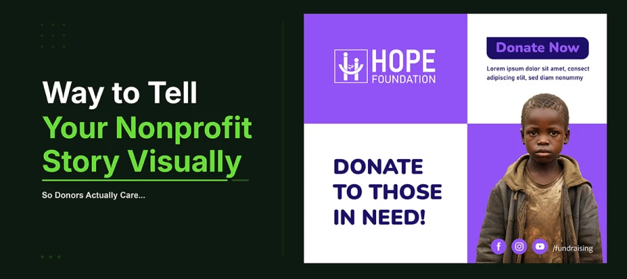
The single most powerful choice in any nonprofit story is to center one real person. Not a symbol. Not a group photo. Not a stock photo of someone unrelated to the cause.
Here's why. The Identifiable Victim Effect, studied for decades by psychologist Paul Slovic and others, shows that empathy works best when it's focused on one specific person. When we see one face, we connect. When we see a crowd, we calculate. A photo showing ten people gets less emotional response than a photo showing one. A symbol like a clasped hand, a sunrise, or a stock photo just represents the cause. It doesn't give viewers a person to care about.
The point is simple but demanding. Your campaign needs a real person at its center. Someone tied to your organization's actual work. Someone whose face, name, and story can ground the visual in real human detail, the kind that turns a viewer from someone just watching into someone who cares. That's the base everything else in the visual story stands on.
How to apply it
Pick one real person whose story shows what this campaign does. Get their permission to share it and use a photo of their face. Put that face front and center everywhere: the main image, the email header, the social post. Their eyes should show. Their expression should match the story's feeling: hope, strength, joy, or dignity.
Donors give to people. So give them a person to give to.
Element 2: A before and after arc the donor can feel in five seconds
Every strong nonprofit story has a before and an after. A real problem. A change. A new reality made by someone who chose to act. Most nonprofit visuals struggle here. The story takes too long to tell. Or it only shows the before, with no clear, satisfying after.
Design for the five-second test. Show your main visual, whether it's one image, a before and after pair, or a short video, to someone who knows nothing about your group. Ask what the story is about, and what the donor's role is. If they can't answer both in five seconds, the story isn't clear enough. It won't work in a social feed, an email, or a busy event program.
Before and after work because our brains want closure in a story. When we see a problem get solved, we feel that resolution, even if it happened to someone else. That feeling is what drives giving. A visual that shows both the before and after, in one frame or a quick sequence, does more than tell a story. It creates a feeling. And feelings are what make donors give.
How to apply it
Show a before image on top and an after image on bottom. Or use two images: one showing the problem, one showing the fix. Give each image a one-sentence caption.
The before caption names the problem. The after caption names the change. It also credits the donor's specific support for that change.
The story isn't done when the problem ends. It's done when the donor sees their part in ending it.
Element 3: A consistent visual identity that builds recognition across every channel
A nonprofit story spread across many channels with a mismatched look isn't one story. It becomes several separate impressions that never add up to recognition. Recognition builds trust. Trust leads to giving, the same principle behind building nonprofit brand recognition from scratch. If the Instagram post, email, and website all look different, the donor doesn't see one campaign. They see scattered pieces.
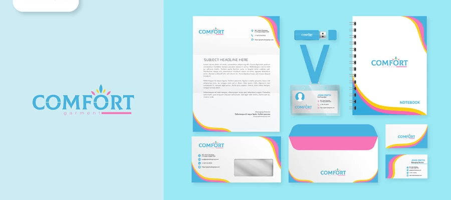
A campaign's visual identity isn't the whole brand system. But it must fit inside your nonprofit's branding strategy. It's a set of visual rules made just for the campaign: one color palette of two or three colors with exact hex codes, one display font and one body font, one photo style used for every image, and a campaign hashtag built into every graphic, not just captions. Used everywhere without exception, these four rules build the recognition that turns a donor who's seen the story once into someone who spots it by the third time, and feels the trust that comes with it.
The test is simple. Put every piece of campaign content side by side. Do they look like they belong together? Could you hide the logo and still know it's from this campaign, just by the look? If either answer is no, the visual identity isn't consistent enough to build the recognition the story needs.
How to apply it
Before making any campaign asset, write down four things: the campaign colors with exact hex codes, the two allowed fonts, the image style with a sample, and the hashtag that goes on every graphic. Share this one-page style guide, the same kind of foundational branding design work that protects a nonprofit's recognition long after the campaign ends, with everyone making content for the campaign. Follow it every time.
Consistency isn't repetition. It's recognition. And recognition is where trust begins.
Element 4: Design that matches the story's emotion to its visual treatment
Every nonprofit story has its own emotional feel. An emergency appeal feels different from a year-end celebration. A campaign about the environment feels different from one about children's education. The visuals, colors, fonts, images, and layout all need to match that feeling. If they don't, the message feels off, and donors sense it even if they can't explain why.
Color shows emotion before it shows brand. Deep blue means trust and stability. Warm amber and gold mean hope. Bold red means urgency. Earthy greens and browns mean nature and connection. Picking a campaign color isn't just about looks. It tells donors how to feel. A campaign about food poverty using pastel colors sends two clashing signals at once.
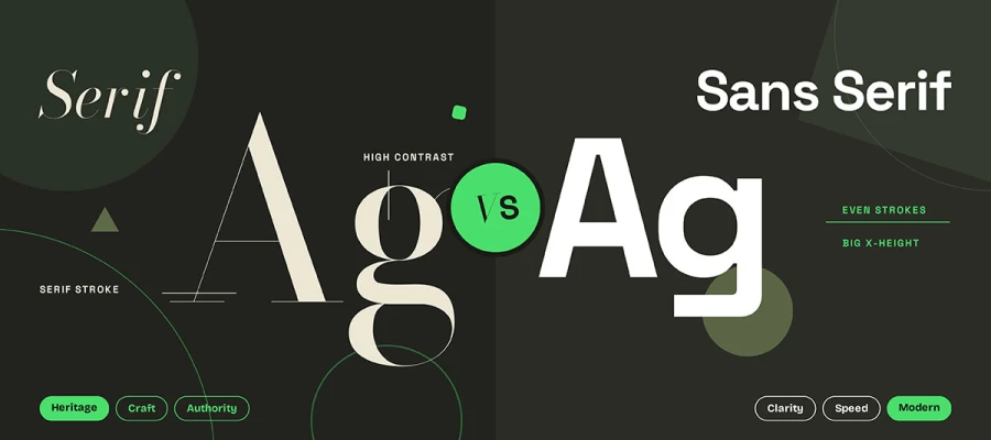
Font weight shows a story's energy. Heavy, bold type feels urgent and strong. Light, open serif fonts feel dignified and thoughtful. A headline's style isn't just about being readable. It prepares donors emotionally. They read the tone of the font before the words themselves. That happens in a split second and shapes how they feel about everything after.
How to apply it
Map your campaign story's emotional tone before picking any visual. Is it urgent or hopeful? Is it about celebrating a win or raising awareness of a crisis? Is it personal or broad and systemic? Pick colors, fonts, and image tone that match this tone. Show the design to three outsiders and ask what emotion it shows, without reading any text. If their answer matches your story's intent, the design works.
Good design does not show the emotion. It creates it.
Element 5: A clear donor role embedded in the story itself
Nonprofits often tell a beautiful story about the people they help, but never show donors their own role in it. A donor reads about a child who got clean water. They feel moved. Then the story ends. There's no clear link between what they just felt and what they can do about it.
Donors who see their exact role in a story give more, give more freely, and tell more people about the cause. Behavioral economics backs this up. People act when the action is specific, tied to a real outcome they can picture, and makes them feel like part of the story, not just a donor to a vague cause.
The donor's role shouldn't show up only at the end as a call to action. It should run through the whole visual story from the start. The before picture shows the world without the donor's help. The after picture shows the world with it. The person helped is the hero. The donor is the one who made that hero's story possible. Every part of nonprofit storytelling, in images and words, from the first photo a donor sees to the thank-you email after they give, should show this.
How to apply it
Redesign every CTA in your campaign using the donor-as-character framework. Instead of "Donate Now," try "Give a child clean water today." Instead of "Support our mission," try "Be the reason Maria goes to school." Name the exact outcome the donor's action creates. Name a real person or situation when you can. Frame the action as the donor's role in the story, not the organization's need for money.
The donor isn't just reading your story. They're the main character in it. Make sure they can tell.
Visual storytelling formats that work on every channel
The story stays the same across channels. Only the format changes. A story that works in a 90-second video won't automatically work in a 1080x1080px Instagram graphic. A campaign email that moves readers to tears won't automatically get the same reaction on a TikTok Reel.
Here's how to tell your nonprofit story visually for each channel without losing its emotional core.
Instagram and Facebook: The single-image story
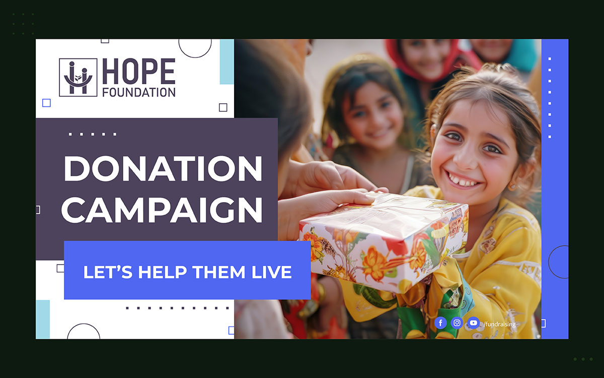
One face. One sentence. One action. Social media feeds aren't for reading. They're for feeling. The image has to show the story's emotion before anyone reads the caption. Use a before photo with the after result in the caption, or make a two-slide carousel: the first slide shows the problem, the second shows the fix. Put the story's impact statement right on the image, big and bold, so it reads even at low brightness in daylight. Build the hashtag into the graphic, don't just drop it in the caption.
Instagram stories and reels: The 15-second arc
Show the before. Show the after. Name the donor's role. Fifteen seconds can hold a full story. Just use every second well. The first three seconds must earn the rest. Start with a real person, not a title card or logo. Show their eyes. Keep the expression real. Add the caption within two seconds, for viewers with no sound. End with one clear action and one clear reason: "Give today. One meal for one child."
Email: The 200-word story
The subject line is the story's first frame. It's a hook, not a headline. It borrows emotional pull from a real name: "Maria waited three years for this." The email opens with the hero image above the fold, sized for mobile, the fundamentals good email template design gets right by default. Body text stays under 200 words: before, after, donor's role, one CTA button. The CTA is the boldest thing below the image. It skips "Donate." It names the outcome: "Feed Maria for a month."
Donation landing page: The story that converts
The landing page is where all other traffic ends up, the final stop in a content marketing funnel that started with the story itself. Everything that worked in the social post and email must still work here, at the moment of decision.
The hero image sits above the fold. You can see the story's progress, how much has been raised toward the goal, without scrolling. Specific impact amounts replace generic donation tiers: “$25 feeds a family for a week, $50 funds a month of school meals, $100 gives clean water for a year.”
No navigation menu. One exit. One action. The story ends when the donor finishes the gift and gets a confirmation naming what their amount will do.
Print and event materials: The story that stays
Print and event materials bring the story into physical spaces. There are no digital distractions there. The emotional weight of the story can land harder.
The same visual rules still apply. Use one dominant face. Show the before and after arc. Show the donor's specific role. Keep a consistent visual identity. This connects the print piece to the digital campaign the donor already saw.
The QR code links the physical story to the digital action. It should point to the campaign's donation page, not the homepage.
If the campaign is strong enough to be newsworthy, the same visuals can work for your press materials too. A story this well designed is what gets media attention, when journalists come looking for something worth covering.
5 Visual storytelling mistakes that make donors scroll past
The five rules above on how to tell your nonprofit story visually work. But these five mistakes ruin them. Each is common and fixable. Each costs the campaign real donations.
Mistake 1: Using statistics instead of a face as the hero of the story
What happens: The campaign starts with a number. "1 in 5 children here go hungry." The stat is true, and it matters. The donor reads it, nods, then scrolls on.
The truth: Stats speak to the thinking brain. Faces speak to the feeling brain. Giving comes from feeling, then gets justified with logic. A campaign that leads with data asks the thinking brain to make a call only the feeling brain can make.
The fix: Lead with a face. Use the stat to back up the feeling, not create it. The face opens the door. The data seals the deal.
Mistake 2: Telling the organization's story instead of the beneficiary's story
What happens: The campaign lists what the group has done. Programs it ran. Years it's been open. Staff who care about the mission. Donors read about a solid, well-run group. They feel calm, but not moved.
The truth: Donors don't give to organizations. They give to people. The organization is just the way the help travels. The person helped is the real story. When the group takes center stage, donors have no face to connect with.
The fix: Swap every claim about the group's work for a story about someone it helped. Instead of "We served 10,000 meals this year," say "Maria got a hot meal at school every day this year because of donors like you."
Mistake 3: Showing the problem without showing the resolution
What happens: The campaign shows the problem powerfully. The images hit hard. The story of hardship feels real and specific. Then it ends. No clear picture of what changes when someone donates.
The truth: Showing only the problem, with no fix, causes compassion fatigue. The viewer feels overwhelmed and helpless. They can't see how their gift would help. They feel worse, not better. So they leave.
The fix: Always show the after. Even if it's partial or depends on donations coming in, show donors where their giving leads. That after image is the reward that makes giving feel worth it.
Mistake 4: Producing beautiful content that has no consistent visual identity
What happens: Every piece of campaign content looks great on its own. The Instagram post is beautiful. The email header looks professional. The printed appeal letter is clean. But none of them look like they belong to the same campaign.
The truth: Great content without visual consistency can't build recognition. Recognition is what makes the third impression stronger than the first. Without it, every touchpoint starts from zero. The donor relationships that come from repeated storytelling never form.
The fix: Lock in your campaign's visual identity before making the first asset. One color palette. Two fonts. One image style. One hashtag on every graphic. No exceptions.
Mistake 5: Ending the story at the donation without a follow-up that shows the impact
What happens: The donor gives. They get an automated receipt. Then they never hear how their gift helped the story that moved them. The next message they get is another donation ask.
The truth: The story doesn't end when the donor gives. It ends when the donor sees the impact of their gift. The follow-up that closes the story, showing Maria eating her school meal or the river running clear again, is the most important retention tool nonprofits have, skip it, and you're back to the reasons donors keep forgetting your nonprofit in the first place.
The fix: Make the post-donation follow-up part of the campaign story, not an afterthought. Within 30 days of the gift, send every new donor one image and 200 words that close the story they opened when they gave.
Nonprofit visual storytelling FAQs
Nonprofits all face the same questions about visual storytelling, whether the campaign budget is $500 or $50,000. Below are answers to the most common questions: how to tell your nonprofit's story visually, what makes donors respond, and which formats work best.
To tell a nonprofit story visually: show one real face first. Build a before and after that hits in five seconds. Keep the same visual style across every channel. Match the design's mood to the story. And show the donor's role right from the start.
Nonprofit storytelling works best when it focuses on one real person, not groups or numbers. It should show a clear before and after. It should say what part the donor played in the outcome. And it should use the same design each time, so people recognize the story wherever they see it.
Donors often ignore nonprofit campaigns. Usually it's because the campaign opens with numbers instead of a real person. It shows the problem but not a clear fix. The visuals change too much, so people never recognize the brand. And it never tells donors exactly what to do to help.
The best visuals for nonprofit fundraising show real photos of real people. Their expressions should match the story's feeling. Before and after photos also work well. They show the impact of giving. Campaign graphics need one clear impact statement. Use big, bold text that's easy to read on phones.
A donor story just needs enough to show the before, the after, and the donor's part in it. On social media, that's one image and one sentence. In an email, it's one image and 200 words. On video, the best nonprofit stories run 60 to 90 seconds.
Endnote
How to tell your nonprofit story visually is never really a question about talent or budget. It is a question about whether the design choices behind your story let a donor feel what you feel.
That feeling does not happen by accident, and it rarely happens on the first attempt. It takes a real face, a clear arc, a consistent look, and a role for the donor to step into.
If your team already has the story but not the design hours to give it the visual weight it deserves, Graphic Design Eye turns that story into campaign visuals built around these exact principles, so your next appeal reaches donors with the same clarity and pull it already has in your own mind.
Your cause has earned a visual story that matches its impact. Explore what that looks like at creative services for nonprofits & charities, and give the next donor a reason to stop scrolling and start giving.
Because a story this important should never have to wait to be felt.
Graphic Design Eye LLC is a full-service creative agency built for brands that demand more than design — they demand vision. From strategic branding to complete visual identity, we partner with startups, agencies, and growing businesses as a dedicated creative force. With flexible subscription and project-based models. Let's start with us today!