Are you stuck deciding between brand guidelines vs design system work for your business? You're not alone! Here we give a short answer. Brand guidelines protect who you are everywhere: print, packaging, social, and signage. A design system helps you build digital products faster with reusable code. Most growing brands need guidelines first. If you ship software, you need the system next. And you'll get the best results with both.
Let’s say your marketing team sends out a flyer in "brand blue." Your developers ship an app screen in a slightly different blue. And your agency makes a social ad in a third blue. Sound familiar, right? No doubt, you've seen it happen.
This small mess is more costly than it looks. The Lucidpress State of Brand Consistency report (2019) found that 81% of companies deal with off-brand content, and that consistent branding can lift revenue by up to 33%. The product side has a similar story. In a study by Figma's data science team, designers using a design system finished their work 34% faster than designers without one.
This article breaks down brand guidelines and design systems side by side, so you walk away knowing exactly which one your team needs and why.
Let's look at the key differences, where the two overlap, and exactly when your team needs each one!
So, keep reading!
Brand guidelines vs design system
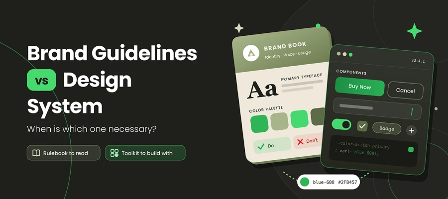
Brand guidelines and a design system solve different problems. Guidelines keep your identity consistent across every channel. A design system keeps your product interfaces consistent and easy to build. One is a rulebook, the other a toolkit. Mixing them up wastes time and money.
Here's a side-by-side breakdown of brand guidelines vs design system differences, so you know exactly which document governs which decision.
Let's have a look!
Dimension
Brand Guidelines
Design System
Primary purpose
Protect and communicate a consistent identity
Build consistent digital interfaces at scale
Scope
Every medium: print, packaging, digital, events, voice
Digital product UI, primarily web and app
Core output
Rules, examples, and dos and don'ts
Design tokens, components, patterns, and documentation
Contains code?
No
Yes, that is the point
Primary audience
Marketers, agencies, partners, printers, new hires
Living documentation site plus design and code libraries
Change frequency
Rarely, usually at a rebrand
Continuously, through versioned releases
Nature of the work
A project with an end date
A product with ongoing maintenance
Success measure
Brand consistency and recognition
Component adoption and reduced UI rework
In short: Brand guidelines cover your whole identity across every channel and rarely change. A design system covers only digital product interfaces, contains real code, and keeps changing. One keeps your brand recognizable. The other keeps your product consistent and quick to build.
💡 Rule of thumb: Brand guidelines are a rulebook people read. A design system is a toolkit people build with.
Let's clear up the most common mix-up right away: these two are not alternatives. They work together. The guidelines come first and hold the identity. The design system turns that identity into code for your screens.
So, which one do you need? Here's the honest answer by organization type:
Your Organization
Brand Guidelines
Design System
Why
Solo founder or small local business
✅ Necessary
❌ Not yet
You need a recognizable identity, not a component library
E-commerce store on a template (Shopify, Etsy)
✅ Necessary
❌ Usually not
The theme already handles the UI for you
Marketing-led company with a simple website
✅ Necessary
⚠️ A lightweight style kit is enough
A few web styles cover your needs
Startup with one app and a small product team
✅ Necessary
⚠️ Start small: tokens and core components
Build the foundations before you scale
SaaS company with several products or platforms
✅ Necessary
✅ Necessary
Many teams build UI at once, and drift gets expensive
Enterprise or multi-brand group
✅ Necessary
✅ Necessary, with formal governance
Scale needs clear owners and versioning
Primary purpose
Brand guidelines protect your identity. They keep your logo, colors, and voice recognizable everywhere people see you. A design system helps teams build digital interfaces fast and consistently, so no one has to rebuild a button from scratch on every screen.
Scope
Brand guidelines cover everything, business cards, packaging, trade show booths, email signatures, even the tone of your Instagram captions. A design system focuses mainly on web and app interfaces. If it doesn't show up on a screen your product team builds, it usually sits outside the system.
Core output
Brand guidelines provide rules, examples, and dos and don'ts, such as "never stretch the logo." A design system gives design tokens (named style values like color primary), components (ready-made buttons, forms, cards), patterns (proven fixes for common problems like checkout flows), and documentation to explain it all.
Contains code?
Brand guidelines have no code. A design system does, and that's the whole point. Its components live in a Figma library for designers and in real code for developers, often shown in a tool like Storybook. The design and the code match, so what designers draw is what gets built.
Primary audience
Brand guidelines are for marketers, agencies, printers, partners, and new hires, basically anyone who represents the brand. A design system is for product designers, front-end engineers, QA testers, and content designers, the people building and shipping software every week.
Typical format
Brand guidelines usually show up as a PDF, a printed brand book, or an online brand portal. A design system lives on a documentation site linked to design and code libraries. Google's Material Design, IBM's Carbon, Shopify's Polaris, and the GOV. The UK Design System is a well-known public example you can explore today.
Change frequency
Brand guidelines rarely change. Most brands update them only during a rebrand. A design system changes constantly. New components, bug fixes, and accessibility improvements ship in versioned releases, much like a software product.
Nature of the work
Creating brand guidelines is a project with a clear finish line. You write them, approve them, and roll them out. A design system never really finishes. It's an internal product that needs a team, a roadmap, and ongoing care to stay useful.
Success measure
You judge brand guidelines by consistency and recognition. Can customers spot your brand fast across every channel? You judge a design system by adoption and efficiency. How much of your UI uses it, and how much rework has it saved?
Where brand guidelines and design systems overlap
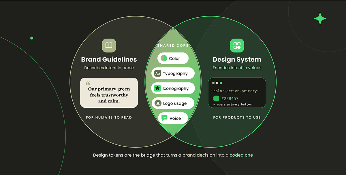
Brand guidelines and design systems overlap in the core visual basics, including color, typography, iconography, logo usage, and voice. Both documents care deeply about these elements, yet they treat them very differently.
Guidelines describe intent in prose. They say something like "Our primary blue feels trustworthy and calm." Systems encode intent in values and components. They say color-action-primary: #1A56DB, applied to every primary button. So when you look at where brand guidelines and design systems overlap, you're really looking at the same brand decisions written in two languages. One is for humans to read, and the other is for products to use.
Here's where brand guidelines and design systems overlap, so you can spot exactly where a brand decision needs to become a coded one.
Design tokens are the bridge
Design tokens are how a brand choice moves from a PDF into a live app. They're named variables that store design decisions, like colors, font sizes, and spacing, in a format that both design tools and code can read. The W3C Design Tokens Community Group released the first stable version of its design tokens spec in October 2025, giving tools a shared format to work with.
Let's follow one color along the chain:
Brand palette value: The brand book says "Eye Blue, #1A56DB."
Primitive token: blue-600 = #1A56DB (the raw value, with a name).
Semantic token: color-action-primary = {blue-600} (the value's job).
Component property: The Button component uses color-action-primary for its background.
Rendered UI: Every "Buy Now" button in your app shows Eye Blue.
Diagram: Brand palette → Primitive token → Semantic token → Component → Product UI. Alt text: "Design tokens bridging brand guidelines vs design system, from brand color to primitive token, semantic token, component, and live UI"
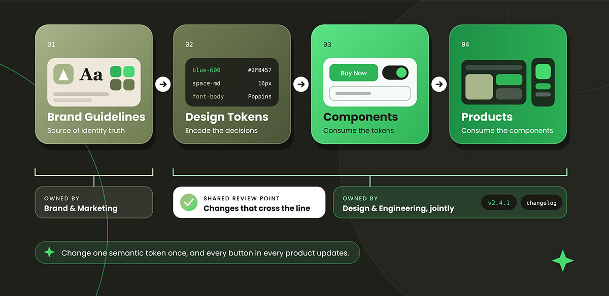
This is where the magic happens! Change the semantic token once, and every button in every product updates together. No hunting through thousands of files.
Where they conflict in practice
Of course, it isn't always smooth. Brand guidelines are often written with print in mind, and screens play by different rules. Here are the conflicts we see most often:
Brand colors that fail accessibility: WCAG 2.2 (a W3C rule since October 2023) says normal body text needs a contrast ratio of at least 4.5:1 at Level AA. Many soft, trendy brand colors fail this test on screen.
Typefaces with no web licensing: Your beautiful brand font might only be licensed for print. Your developers may have no legal web or variable version to use.
CMYK-first palettes: A palette made for print can look different once converted to RGB for screens. A rich orange can turn muddy.
No motion or interaction guidance: Most brand books skip hover states, loading animations, error messages, and disabled buttons. Products need all of these.
The fix: Don't quietly override the brand in code. Instead, extend the brand palette with accessible digital versions, like a slightly darker "Eye Blue, Digital" that passes 4.5:1. Write these down in both the brand guidelines and the design system. This keeps everyone on the same page.
How brand guidelines flow into a design system
Brand guidelines and design systems work best as a chain. The guidelines set the identity, and the design system turns that identity into reusable parts for your products. Neither replaces the other. They pass the baton.
When teams treat them as separate worlds, the product drifts away from the brand. A brand decision made in a meeting room reaches every screen without guesswork once the two are connected. That's why the smartest answer to the brand guidelines vs design system debate is usually "connected."
Here's how the two work together in practice, so you can build a process that lasts beyond launch day.
A practical integration model
Here's the simple flow we recommend:
Brand guidelines (source of identity truth) → Design tokens (encode those decisions) → Components (consume the tokens) → Products (consume the components)
Each layer only takes from the one above it. Your developers never pick a hex code by eye. They use a token that traces straight back to the brand book. This is what people mean by a single source of truth.
Ownership and governance
Governance simply means deciding who can change what, and how. Keep it clear:
Brand or marketing owns the identity: They approve logos, core colors, typefaces, and voice.
Design and engineering jointly own the system: They manage tokens, components, and releases.
Create one shared review point: Any change that crosses the line, such as a new palette color or a typeface swap, gets reviewed by both sides.
Name one accountable owner for each artifact: "Everyone owns it" usually means no one does. Shared ownership is the most common reason these documents decay.
Versioning and change management
A design system is software, so manage it like software:
Use semantic versioning (for example, 2.4.1) so teams know if an update is a small fix or a big change. Publish a changelog with every release.
Write a deprecation policy that explains how old components are retired, and how much warning teams get.
Plan ahead for a brand refresh. If your tokens are set up well, a new brand color should flow through the semantic tokens without a full rebuild.
Measuring whether it worked
You can't improve what you don't measure! Track these signals:
Component adoption rate: the share of your UI built from system components.
Design-to-code drift: mismatches between the design file and the shipped product, spotted in review.
Accessibility defect rate: before and after adoption.
Time to build a new screen: it should drop over time.
Brand compliance audit results: across web, print, social, and product channels.
Brand guidelines vs. design systems: cost, timeline, and team
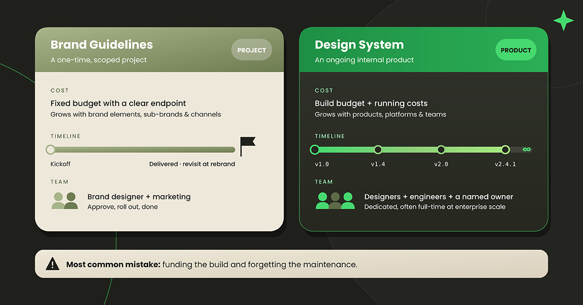
Brand guidelines are a one-time project with a clear endpoint. A design system is an ongoing internal product with running costs. That's the biggest practical difference when you're budgeting.
Brand guidelines are a scoped project. Effort grows with the number of brand elements, sub-brands, and channels you need to cover. A small business with one logo and a simple palette needs far less than a multi-brand company. Once the guidelines are delivered, you'll mostly revisit them during a rebrand.
A design system needs a named owner and a long-term budget. A small startup can begin with a few tokens and a handful of core components. Enterprise systems often require a dedicated design system and a creative director working on them full-time. The effort rises with the number of products, platforms, and teams that depend on it.
⚠️ The most common mistake: funding the build and forgetting the maintenance. An unmaintained design system quickly falls out of date, and teams quietly stop using it. If you can't commit to caring for it over time, start smaller.
Design system readiness checklist
You're likely ready if you can tick most of these:
You have approved brand guidelines (or you're finishing them)
You ship at least one digital product, not just a marketing site
More than one designer or developer is building UI at the same time
You keep rebuilding the same components (buttons, forms, modals)
You've spotted visual drift between screens, apps, or platforms
Someone can own the system and keep it maintained
Leadership understands this is an ongoing investment
*When you don't need one yet:* if you run a small business on a website template, sell mostly offline, or have a single designer handling everything, a design system is overkill. Invest in strong brand guidelines and a simple web style sheet instead. Honestly, that's the smarter use of your budget!
Brand guidelines & design system FAQs
Confusion about brand guidelines and design systems usually stems from the same few questions: what each covers, which comes first, and who updates them. Founders and product owners run into these issues early in the planning phase, before real work starts. Below are clear answers to the most common questions about brand guidelines vs. design systems, so you can settle them before they slow down your project. If none of the following questions apply to you and you’re dealing with something else, feel free to reach out to us for a free consultation.
No. A style guide is just one piece of a design system. It covers visual rules like colors and fonts. A full design system does more. It adds design tokens, coded components, interaction patterns, usage docs, and governance. Every design system includes a style guide, but a style guide alone isn't a design system.
No. A design system covers digital product interfaces. Brand guidelines cover everything, including print, packaging, signage, ads, and voice. Your printer, sign maker, and PR agency won't touch your component library. You still need brand guidelines to protect your identity everywhere customers see you outside a screen.
Brand guidelines come first. The design system turns brand decisions like colors, fonts, and voice into tokens and components. Without a defined identity, there's nothing solid to build on, and you'll end up rebuilding once the brand is set. Settle the brand first, then build the system on top.
Usually not. Most small businesses run on website templates or platforms like Shopify, where the interface is already handled. Strong brand guidelines and a simple style sheet give you consistency without much effort. A design system is worth it once you're building custom software with several people designing and coding simultaneously.
Design tokens are named variables that store design choices, such as colors, font sizes, spacing, and shadows, in a format both design tools and code can read. For example, color-action-primary might hold your brand blue. Change the token once, and every component using it updates automatically across your products.
Design and engineering should own it together, with one named person responsible. Brand or marketing is in charge of identity decisions, such as core colors and typefaces. Set up a shared review for changes that touch both sides. Unclear ownership is the main reason design systems fall out of date.
That depends on your scope, team size, and number of products. A starter system with core tokens and a few components takes far less time than a full enterprise system across platforms. A design system is never really "done." Plan for ongoing maintenance, versioned releases, and updates, not just the first build.
A true design system does. Coded components are what set it apart from a style guide or a Figma library. Without code, developers rebuild every element by hand, and drift between design and code creeps back in. Some teams start with a design-only library, but the full benefits only appear once design and code align.
Endnote
That brings this article to a close.
We've covered the full picture. Brand guidelines protect your brand identity wherever it appears, while a design system helps your team build consistent digital products at scale. The debate over investment isn't really a debate once you see that each one does a job the other can't.
Well, that was quite the deep dive! Before you go, here are the key points worth remembering:
Brand guidelines protect your identity across every channel. A design system helps you build consistent digital products at scale.
Brand guidelines are a rulebook people read, while a design system is a toolkit people build with.
The two are complementary, not alternatives, and the guidelines always come first.
Design tokens are the bridge that carries brand decisions from the page into live products.
Screen realities, such as WCAG's 4.5:1 contrast ratio, may require accessible digital variants of your brand colors.
A design system is a product, not a project, so budget for maintenance as well as the build.
Small businesses on templates usually need great brand guidelines, not a design system.
Also, you've seen that brand guidelines and design systems each have their own role, and neither one can take over the other's work.
So this blog answers the brand guidelines vs design system question and also helps you fill in the gaps before they cost your brand.
Don't worry if you think you need consultancy, a design system readiness check, or a complete brand guidelines book to make your brand shine. Graphic Design Eye is always ready to deliver premium design system development and branding services to help you achieve ultimate success.
Time has run out for today!
Stay creative, stay consistent, and keep an eye out for our next post!🎉
Graphic Design Eye LLC is a full-service creative agency built for brands that demand more than design — they demand vision. From strategic branding to complete visual identity, we partner with startups, agencies, and growing businesses as a dedicated creative force. With flexible subscription and project-based models. Let's start with us today!