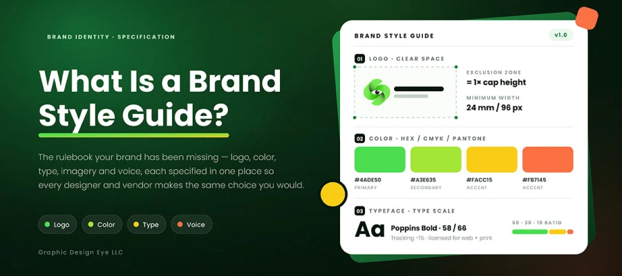
Curious to know what is a brand style guide? It's a rulebook that shows how your brand should look, sound, and act everywhere. It covers everything from a business card to a billboard to a product screen. A good guide covers your logo, colors, fonts, images, icons, and voice. It sets rules for each one. This way, every designer, printer, developer, and marketer makes the same choices you would.
Yes, most businesses think they already have one. What they really have is a logo folder. Plus a hex code someone remembers. And a lot of good intentions.
Then, a sales lead opens the pitch deck twenty minutes before the call. The logo on slide one is stretched to fit a box. The blue on slide four does not match the blue on slide one. And the headline uses a font nobody at the company ever licensed.
She fixes what she can and sends it anyway. The client never says a word. That is the part that stings. Nobody complains. The deck just feels a little less convincing than it should. No one can say why.
But nobody in that story did anything wrong. The designer who built the template left months ago. The person who updated it did not know which blue was correct. There was no document showing what correct looked like. So, eleven people each invented their own version of "correct".
In this blog, we share what a brand style guide should include. Also, we’ll explore how long yours should be, what it costs, and who writes it. Plus why so many end up abandoned in a folder nobody opens.
Now let's start from the beginning!
What is a brand style guide?
A brand style guide is a document that companies write. It keeps their identity consistent everywhere. If you ask ‘what is a brand style guide’, here's the answer.
A brand style guide is a set of rules. These rules show how a brand looks and sounds. They apply across every platform.
The names for this get confusing fast. People use terms like brand guidelines, brand book, and brand manual. They also say brand standards or identity system. Most agencies mix these terms together in one talk.
Sometimes there's a real difference between them. That difference is about depth. A brand book focuses on strategy and story. It often starts with the mission and values. It explains the idea behind the logo.
A style guide focuses on details instead. It gives exact rules, like logo spacing in millimeters. Most businesses actually need a style guide. Yet they often ask for a brand book.
It also helps to say plainly what a brand style guide is not:
It is not the brand itself.
It is not a logo file.
It is not a marketing strategy.
It is not how customers feel about your company.
It is the instruction manual for the assets, nothing more and nothing less.
The most useful way to think about this isn't glamorous. A brand style guide exists to answer questions. Otherwise, those questions would interrupt someone's work. Every rule you write saves time. It's a Slack message that never gets sent. It's a printer email that never needs an answer. It's a revision round that never happens.
Question
Answer
In one sentence
A documented set of rules specifying how a brand's visual and verbal identity is applied across every medium and touchpoint.
From one page to well over 100 pages, depending on how complex the business is.
Who maintains it
Marketing or brand leadership, with design authorship. In bigger companies, a named brand owner.
Primary output
Consistency and all the rework that consistency saves you.
12 Components a complete brand style guide contains
Imagine you get a recipe with ingredients but no measurements. Flour, sugar, butter, eggs. All correct, all useless. Two cooks follow it. They end up with two totally different cakes.
That's exactly how most brand style guides fail. Listing the parts is easy. Giving exact details is the hard part. Those details are what actually matter.
Read the third column below as your working standard.
Component
Weak version
Specification-grade version
Logo suite
One PNG of the primary logo
Primary, secondary, stacked, horizontal, and icon-only lockups, each supplied in EPS, SVG, and PNG, in full color, single color, and reversed
Clear space
Not specified
Exclusion zone defined as a ratio of a logo element, so it scales correctly at any size
Minimum size
Not specified
Separate minimum widths for print (mm) and screen (px), tested for legibility
Logo misuse
Absent, the most common omission
Visual do-not examples: stretched, recolored, rotated, outlined, drop-shadowed, placed on a busy image, or crowded
Color palette
Hex codes only
HEX, RGB, CMYK, and Pantone per color, plus primary, secondary, and neutral roles, plus a usage ratio such as 60-30-10
Color accessibility
Absent
Measured contrast ratios for every text-on-background pairing, marked pass or fail against WCAG AA at 4.5:1 for body text and 3:1 for large text
Typography
Two font names
A named type scale with weights, sizes, line heights, letter spacing, and fallback stacks for web, plus license coverage
Imagery direction
A mood board
Written criteria for subject, lighting, composition, treatment, and crop rules, with approved and rejected examples
Iconography
Absent
Stroke weight, corner radius, grid size, and export format, so icons drawn two years from now still match
Voice and tone
Three adjectives
Voice attributes with a we-say and we-do-not-say column, plus tone shifts by context such as support, sales, and error messaging
Layout and grid
Absent
Grid, margin, and spacing rules with a documented spacing scale
Application examples
Absent or decorative
Real touchpoints rendered correctly: stationery, signage, packaging, email, social, and web
Notice the pattern here. Weak and strong brand style guides rarely differ in components. Both have a logo section. The real difference is specification quality. Two designers working separately should produce the same result.
That's the only test that matters. Almost no template passes it.
Your logo section needs a suite, not a file
A single PNG is not a full logo suite. A real suite plans for every situation your logo will face. This includes a horizontal version for email signatures. It also needs a stacked version for square avatars. You need an icon-only mark for favicons. A reversed version works for dark footers. Don't forget a single-color version for embroidered polos.
Writing down the range of logo types a suite can contain is very important. It stops someone from cropping your wordmark badly. This often happens late on a Friday. Someone needs something square and does it fast.
Color fails in one very specific way
A brand style guide that only lists hex codes works fine at first. Then someone tries to print something. The printer asks for CMYK or a Pantone number. All they get is a shrug.
Every color in your palette needs all four values. Each color also needs a clear role and usage ratio. Without proportions, every layout becomes a fresh fight.
WCAG AA requires a contrast ratio. Body text needs at least 4.5:1. Large text needs at least 3:1. These numbers are measurable. They are not up for debate.
Publish the measured ratio for every text and background pair. Mark each one pass or fail. A palette that cannot carry text clearly will still get used for text. And it will look bad.
Typography deserves a scale, not two names
Two font names don't make a system. A real type scale needs more.
It needs heading and body families. It needs specific weights, sizes, and line heights. It needs letter spacing where that matters. It also needs a fallback stack for the web.
Add the license terms right next to this. A brand guide that picks a font your team can't legally use has made a legal problem. It hasn't solved a design one.
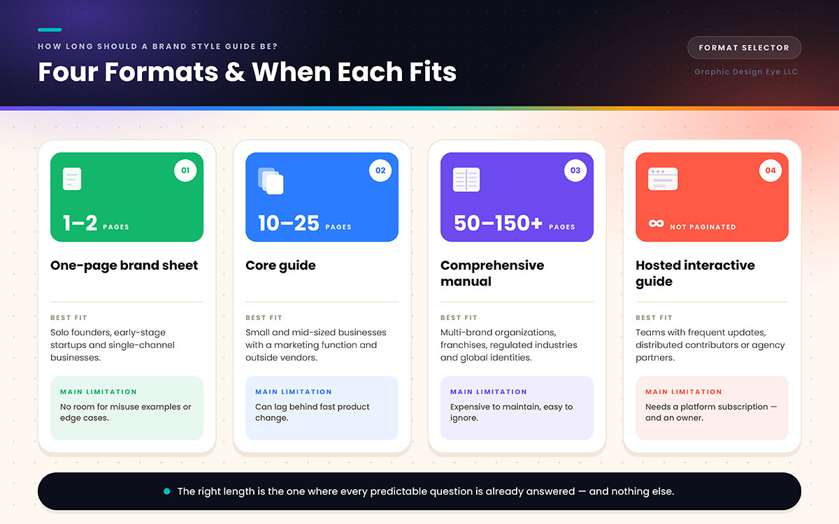
How long should it be? Four formats and when each fits
A brand style guide can run one page or over a hundred. The right length depends on your team size, brand complexity, and how often things change. No fixed page count fits every business.
See the table below to find the format that matches your situation.
Format
Typical length
Best fit
Main limitation
One-page brand sheet
1 to 2 pages
Solo founders, early-stage startups, single-channel businesses
No room for misuse examples or edge cases
Core guide
10 to 25 pages
Small and mid-sized businesses with a marketing function and outside vendors
Can lag behind fast product changes
Comprehensive manual
50 to 150+ pages
Multi-brand organizations, franchises, regulated industries, global identities
Expensive to maintain, easy to ignore
Hosted interactive guide
Not paginated
Teams with frequent updates, distributed contributors, or agency partners
Requires a platform subscription and an owner
Length shows how complex a company is. It's not about quality. A restaurant with one location doesn't need what a huge franchise needs. A hundred-page manual for a four-person company isn't thorough. It just goes unread.
History proves this point too. NASA's 1976 Graphics Standards Manual was only sixty pages. Designers still study it fifty years later. That's because it showed wrong uses as clearly as right ones. Sixty pages worked for an agency covering rockets, buildings, uniforms, and publications. That same length would be wrong for most small businesses.
The way guides get delivered is changing too. Static PDFs are losing ground to hosted guides at a web link. A PDF gets outdated the moment something changes. A hosted page doesn't have that problem. This isn't a proven statistic, just a trend you can check yourself. Somewhere in your inbox sits version four of a brand style guide. Meanwhile, version seven is sitting on a server nobody shared.
Here is the practical test:
Write down every question your team and your vendors actually asked in the last year.
Answer those questions in the guide.
Stop.
The right length is the length at which every predictable question is already answered, and nothing else is included.
What a brand style guide costs and what drives the price
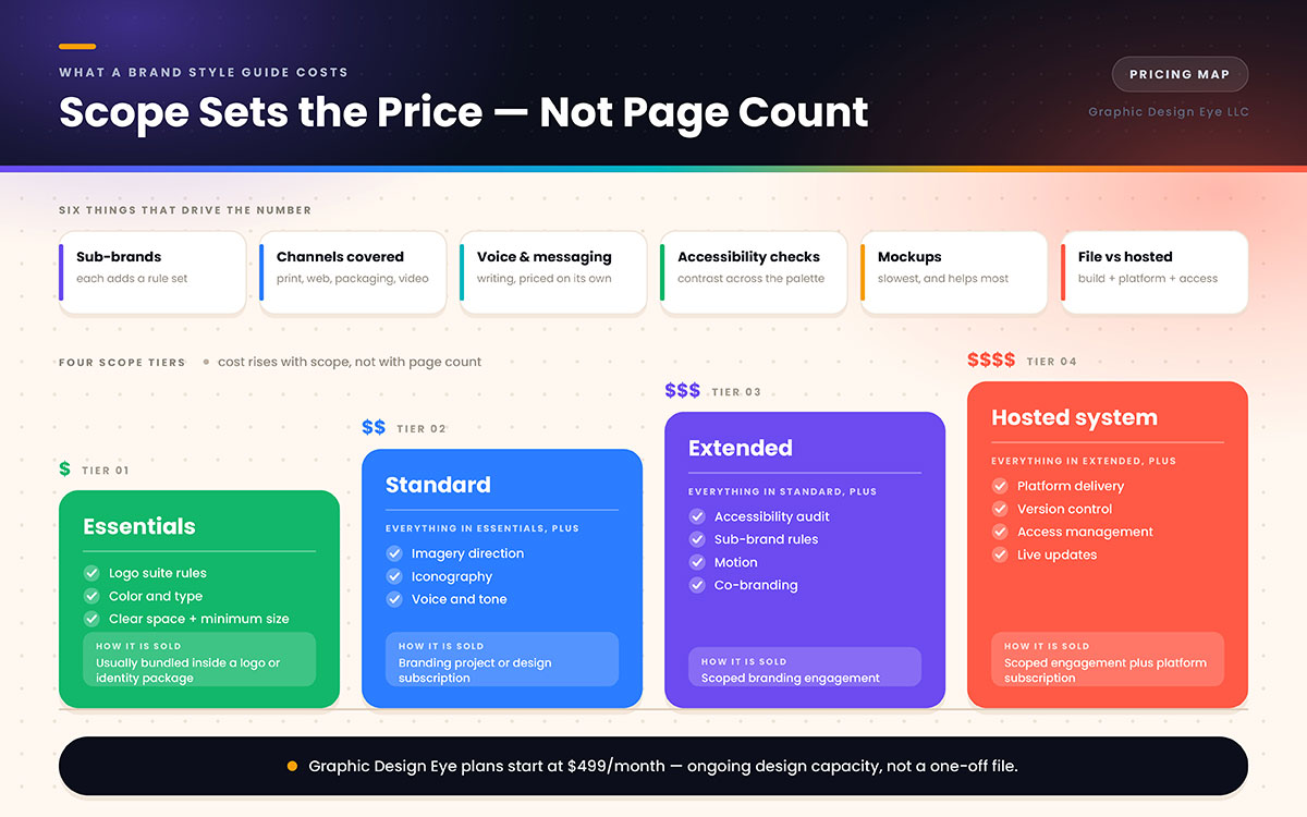
People who ask what a brand style guide is often ask its cost next. So here's the honest truth first. Price depends on the scope and the organization's complexity. It has nothing to do with page count.
A twelve-page guide for three sub-brands can cost more. It can beat a forty-page guide for just one brand. Six things drive the number:
Number of sub-brands: Each one adds a whole new set of rules.
Number of channels covered: Print, web, packaging, signage, video, and social each need their own specs.
Whether voice and messaging are included: This is writing work. It gets priced on its own.
Whether accessibility checks are included: Checking contrast across a full palette takes real time.
Whether mockups are made: Showing the brand on real touchpoints takes the most time. It also helps the most.
Whether it's delivered as a file or a hosted system: A hosted guide adds build time and platform costs. It also adds work managing access.
Market pricing for a professional guide usually starts around a few thousand dollars. It rises fast depending on scope.
Treat this as a general range for American agencies. It's not an exact quote. Standalone style guides are rarely sold on their own anyway.
Scope tier
What it typically covers
Commercial route
Essentials
Logo suite rules, color, type, clear space, minimum size
Often bundled inside a logo or identity package
Standard
Essentials plus imagery, iconography, voice, and application examples
Branding project or design subscription
Extended
Standard plus accessibility audit, sub-brand rules, motion, and co-branding
Scoped branding engagement
Hosted system
Extended, delivered on a platform with version control and access management
Scoped engagement plus platform subscription
There's another pricing model worth knowing. It changes the math, not the price itself.
Some guides come as part of a larger project or a monthly design plan. These get priced as ongoing capacity, not a single deliverable.
Graphic Design Eye LLC's plan starts at $499 per month. This buys ongoing design work, including a brand style guide. It also covers the subsequent application work.
This is a different setup from a fixed fee. It's not just a cheaper version of the same thing. It suits companies that make branded work all the time, not just once. If a brand is still being built, the guide usually comes from a branding design service. It's not bought separately.
One thing to avoid is the nine-dollar template. A template gives you a layout. It can't make decisions, and decisions are what matter. Buy one, and you'll get a nice-looking document that specifies nothing. Every question it should answer still needs to be answered.
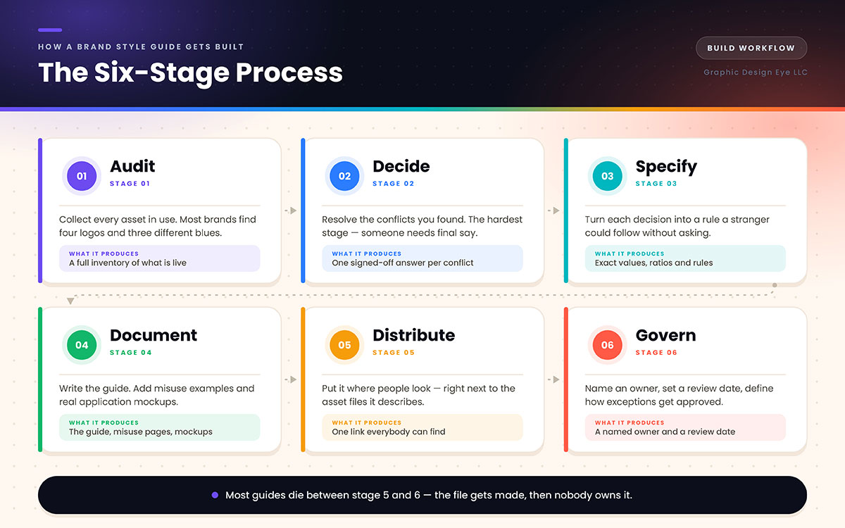
How a brand style guide gets built
Think of it like packing for a long trip. You lay everything out first. Then you decide what actually goes in the bag. You label it so someone else could find the charger.
Here's how that looks in practice.
Audit first: Collect every asset your brand uses now. Most businesses find four versions of their logo. They also find three shades of blue. Just finding this out helps a lot.
Decide next: Fix the conflicts you found. This step is the hardest one. Clients often underestimate it. Someone needs final say and must use it.
Specify after that: Turn each decision into a clear rule. A stranger should follow it without asking questions.
Document everything: Write out the brand style guide. Add examples of misuse. Create mockups showing real applications.
Distribute the guide next: Put it somewhere people will find it. Keep it near the asset files it mentions.
Govern it long term: Pick someone to own it. Set a schedule for reviews. Decide how people can request exceptions.
Most brand style guides fail between stage five and stage six. The document gets made. Everyone likes it on the call. Then nobody takes charge of it. Six months later, a new agency asks for the guidelines. Three people have to dig through email just to find the link.
9 Mistakes that make a brand style guide fail
You do not need to avoid all nine on day one. But every one of these has quietly killed a guide that somebody paid good money for.
Documenting only correct usage: Wrong examples teach more than right ones. They name mistakes people would make anyway.
Publishing hex codes with no CMYK or Pantone values: The guide breaks the moment you print anything.
Listing colors without contrast checks: A palette that can't hold readable text still gets used for text.
Specifying fonts the team does not have a license for: License info belongs in the guide, near the type scale.
Writing voice guidance as just adjectives: Confident, friendly, and human describe almost every brand out there. A table showing what to say and what not to say describes yours.
Building it as a PDF and forgetting to update it: Version four spreads for years while version seven sits unused.
Making it pretty instead of useful: A guide is reference material. Someone stressed at 4:55 on a Friday should find things fast.
Assigning no owner: A document with no owner has no power. A rule nobody enforces is just a suggestion.
Mixing up the guide with the asset library: Rules and files do different jobs. They belong in different places, linked together.
Brand style guide FAQs
Brand style guide questions tend to repeat across founders and marketing teams. They cover what to include, who writes it, and how often to update it. Clear answers save time on every new project or vendor handoff. Find your question below and get a straight answer. For any queries that are troubling you and are not listed below, feel free to contact us for an answer.
It needs six things. A logo suite with clear space and minimum size. Color values in HEX, RGB, CMYK, and Pantone. A type scale with license terms. Misuse examples. Imagery direction. Voice rules. Everything else builds on those six.
Basically, yes. People use these terms consistently across the industry. When there's a difference, a brand book focuses on strategy and story. A style guide focuses on details and rules.
It takes two to six weeks once the identity is settled. It can take longer with sub-brands, accessibility checks, or mockups involved. Delays usually come from unresolved decisions, not design time.
Yes, just at a smaller scale. Any business working with a designer, a print vendor, or another content creator needs written rules. Yours might be two pages instead of twenty. Two pages still count.
Designers write the visual specifications. Marketing usually writes voice and messaging rules. One named owner should approve and maintain the entire document, regardless of who drafted each part.
Review it every year at least. Update it right away when a new channel, sub-brand, or font license appears. Date and version the file so people know which copy is current.
Templates can organize a brand style guide. They can't make the decisions the guide is meant to record. The real value is in the specifications. Templates come with those specifications blank.
Use a layered source file, a PDF for sharing, and ideally a hosted version too. Asset files should come with it in EPS, SVG, PNG, and print-ready formats. Store them where people can actually find them.
Endnote
Was the discussion clear and easy to follow?
Hopefully, you now understand what a brand style guide is. You also know what goes inside it, how long it should be, and what it might cost.
The stretched logo wasn't a design failure. The person who did it wasn't careless either. It was a documentation problem. These problems get fixed with one afternoon of writing down decisions.
The main idea fits in one line. A brand style guide doesn't make a brand better. It makes a brand repeatable. Repeatability turns a design into a reputation.
So your next step is smaller than it sounds:
Open a blank document.
Write down the correct hex value.
Write down the correct typeface and where you are licensed to use it.
Write down the three things nobody is allowed to do to the logo.
Date it, put your name on it, and send the link to everyone who touches the brand.
That page is already a brand style guide. Everything after it is refinement.
Still, if you are in any confusion, or the assets have drifted far enough that an audit needs to come first, contact us right now. We are 24/7 ready to hear your words!
Graphic Design Eye LLC is a full-service creative agency built for brands that demand more than design — they demand vision. From strategic branding to complete visual identity, we partner with startups, agencies, and growing businesses as a dedicated creative force. With flexible subscription and project-based models. Let's start with us today!