The top social media advertising examples show how brands turn simple posts into big sales. They also show how to gain attention. If you feel stuck on what actually works, the right examples will give you clear ideas. You can test and tweak these in your own campaigns.
Think about the last time an ad stopped you mid-scroll. Not because it was loud or intrusive, but because it felt like it was made just for you. That feeling is not an accident. It is the result of a brand that actually understood where you were, what you needed, and how to speak to you in your own language.
That is the soul of great and right social media advertising.
And in 2026, modern brands winning market share do not always possess the largest budgets. Instead, they succeed by merging an emotional branding strategy with a deep understanding of platform culture.
A LinkedIn campaign utilizing a clean layout design speaks directly to professional ambition. In contrast, a TikTok ad featuring professional product photos in a real-world setting captures a user's late-night curiosity. Both methods rely on strategic copywriting to build a lasting connection with the audience.
This guide is your invitation into their world.
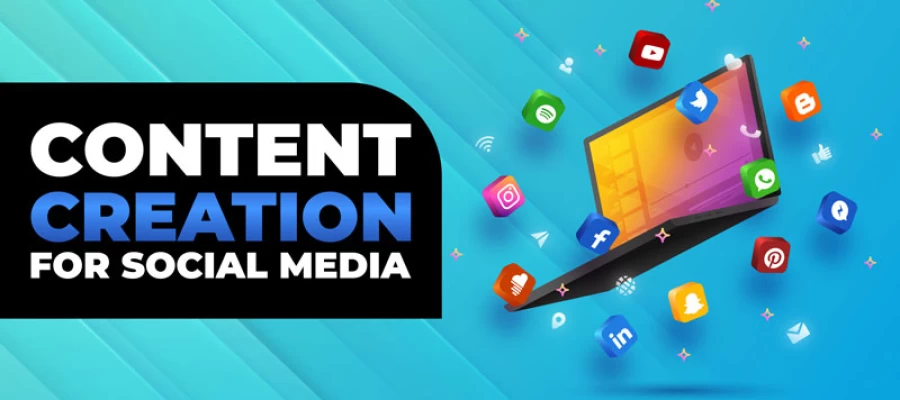
We analyzed 14 exceptional advertising examples. These case studies come from some of the most celebrated brands on modern platforms. Our study shows how typography and layout design work with strategic copywriting. These elements must align to capture the audience's attention. When these components match, they drive higher engagement and better brand recall.
Keep reading. Your next great campaign begins here!
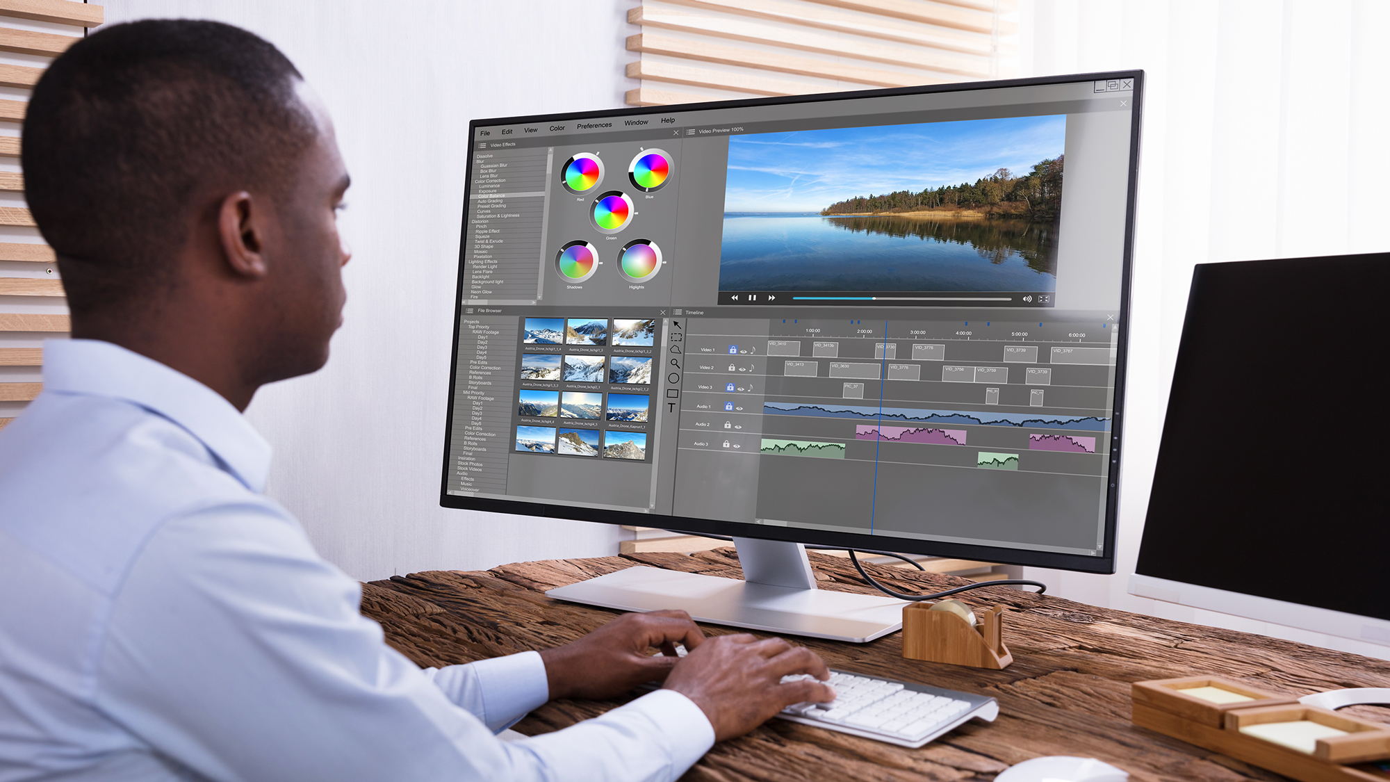
Creative Design Services
Graphic Design Eye LLC can help you create beautiful graphic designs. Fast, simple & affordable.
Top 14 Social Media Advertising Examples at a Glance
These top social media advertising examples span six platforms and eight ad formats. They include brands that range from small disruptors to global icons. All of these ads answered a specific search in a way their audiences never forgot. Because of this, they offer a great lesson for your own brand.
What they shared was not a massive budget or a famous agency. It was the courage to meet their audience exactly where they were, with exactly what they needed to hear. Through smart and creative layout design and persuasive product descriptions, they turned a simple scroll into a connection.
But before we dive into each example in detail, here is a quick reference overview:
Brand
Platform
Ad Format
What Made It Work
Nike
Instagram
Stories Video
Vertical video + swipe-up CTA driving product page traffic
Retargeting with browsed products + price anchoring
Apple
YouTube
Non-Skippable Pre-Roll
Cinematic 15-sec spot for iPhone product launch
Glossier
Instagram
Feed Photo (UGC)
User-generated content repurposed as native ads
Slack
LinkedIn
Message Ads
Personalized InMail for SaaS free-trial signups
Warby Parker
Facebook
Lead Ads
In-app home try-on form with zero friction
Red Bull
Snapchat
AR Lens
Branded AR filter driving Gen Z brand awareness
Shopify
TikTok
Spark Ads
Boosting organic creator posts as paid ads
Casper
X (Twitter)
Promoted Tweet
Witty copy + meme format for brand awareness
Peloton
YouTube
Masthead
Full homepage takeover for new product launch
Canva
Facebook
Video Ad
Problem/solution format driving freemium signups
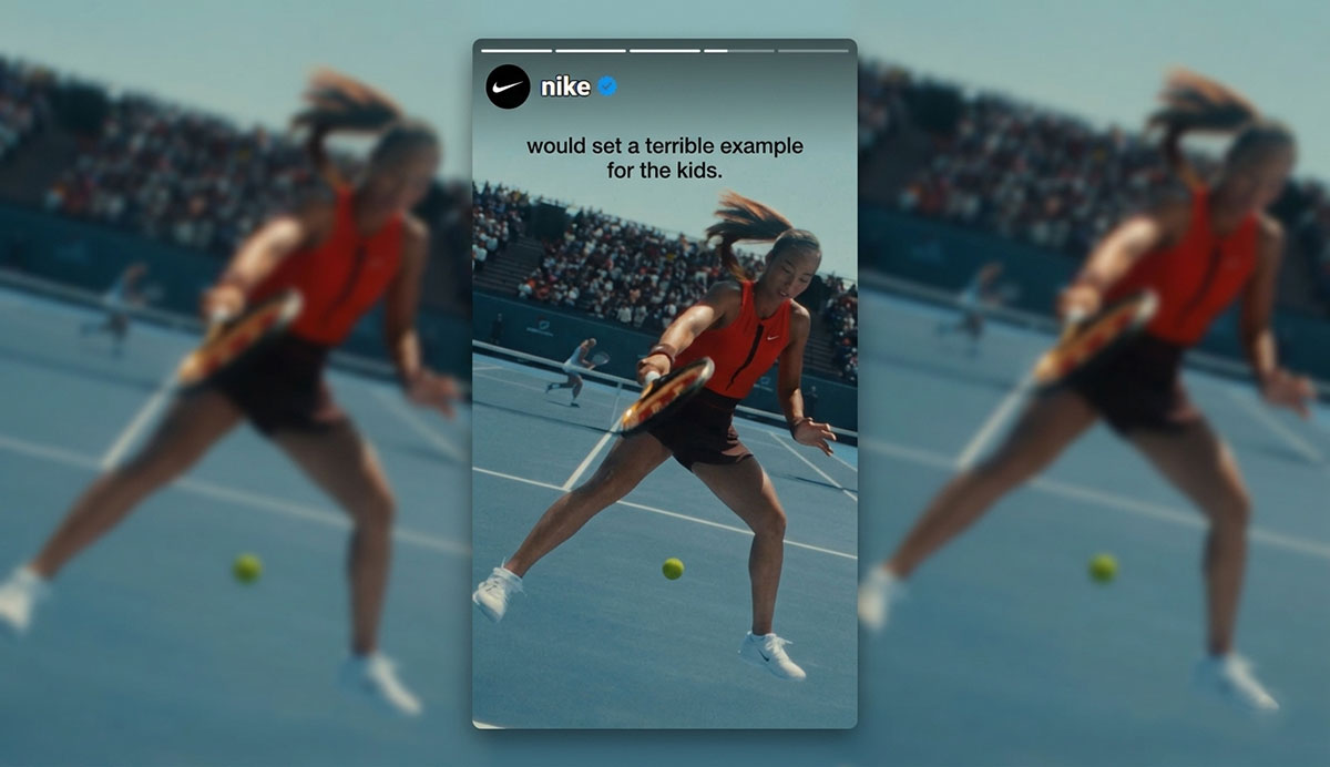
1. Nike — Instagram Stories Video
There is something quietly powerful about a Nike ad that greets you before you have even had your morning coffee. It does not interrupt, it inspires. As one of the most effective social media advertising examples, Nike's Instagram Stories campaigns carry that same energy. This is a prime example of a social media growth strategy in action.
Every frame is shot natively in the 9:16 vertical format, filling your screen completely and pulling you into a world where athletes push harder, move faster, and never settle. That immersive quality is no accident. Nike's team understands content creation for social media at its highest level, something many advertisers miss entirely: when an ad feels like it belongs on the platform, people do not resist it. They lean in.
Nike's Instagram Stories ads
Nike's Instagram Stories ads are a masterclass in vertical visual design. The creative fills the entire 9:16 screen edge to edge, no white borders, no dead space, with high-contrast footage of athletes in explosive motion. The Nike Swoosh appears as a clean white overlay in the bottom-left corner, small but unmistakably confident. Bold, sans-serif text overlays are placed in the lower third of the frame, sized large enough to read in a single glance on a small screen.
The color palette is intentionally minimal. It uses deep blacks, stark whites, and one accent color to match the featured product. This shows careful attention to brand colors and combinations.
The color palette is intentionally minimal. It uses deep blacks and stark whites. Every design choice communicates the same thing Nike's copy does, precision, power, and no unnecessary noise.
Why Nike's Campaign Succeeded
Nike’s campaign success can be attributed to several key creative and strategic decisions that resonated deeply with its audience and maximized the impact of every impression.
Platform-native vertical format: Shot specifically for Stories, not repurposed from a TV or YouTube ad. The full-screen experience eliminates distractions and signals quality.
Athlete-first hook: The first 2 seconds feature a recognizable athlete in motion. The brand appears at second 3, after the hook has already earned the viewer's attention.
Frictionless CTA: A single link sticker routes directly to the relevant product, not the homepage. Removing one navigation step meaningfully improves conversion rate.
Sound-off design: Text overlays and on-screen action communicate the message without audio, critical since the majority of Stories are watched with the phone on mute.
Steal This: Shoot your video creative specifically for the placement format. A vertical Stories ad repurposed from a landscape YouTube video will always underperform a video shot natively for Stories. Budget $500 for a native Stories shoot before spending $5,000 promoting landscape content that was never designed for the format.
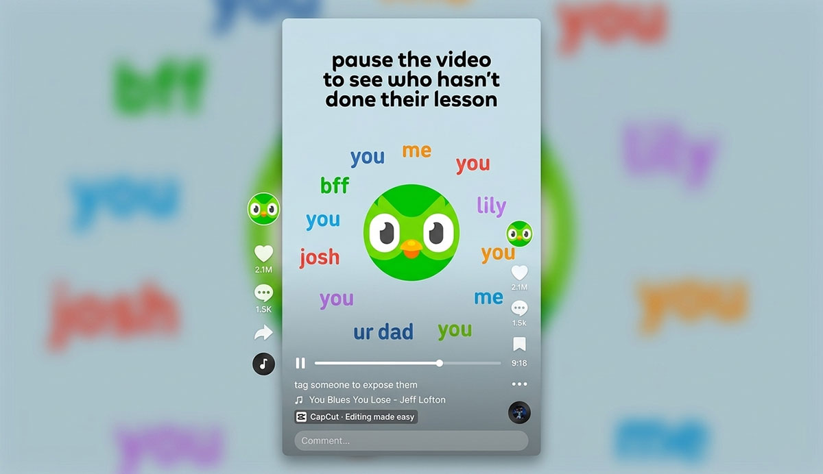
2. Duolingo — TikTok In-Feed Video
Who would have thought that a slightly unhinged green owl would become one of the most beloved brand characters on the internet? Duolingo bet on something most advertisers are too afraid to try: being genuinely, joyfully weird.
On TikTok, a platform that punishes anything smelling like a corporate production, Duolingo threw away the script entirely. Duo showed up in absurdist skits, jumped on trending sounds, and made people laugh out loud. Users watched the ads willingly. They shared them. They tagged their friends. And quietly, in the background, app installs climbed. It was beautiful chaos with a strategy.
Duolingo TikTok Ad Design
Duolingo's TikTok creative is deliberately designed to look like it was made by a real person on their phone, and that is the entire point. The videos feature Duo the owl mascot in low-fi, handheld-camera footage with slightly shaky framing, bright natural lighting, and fast jump cuts timed to trending audio. Text overlays use TikTok's native caption style rather than polished brand typography, helping the content blend seamlessly into the organic feed.
The color palette centers on Duolingo's signature lime green, but it is used in context, on a hoodie, on a prop, in an on-screen graphic, rather than as a formal brand frame. The design philosophy is deliberate anti-design: every choice that makes it feel less like an ad makes it perform more like one.
Why Duolingo's Campaign Succeeded
Duolingo’s campaign success can be attributed to several key factors that aligned perfectly with TikTok’s culture and consistently turned viewers into engaged, loyal users.
UGC aesthetic over production value: Shaky cameras and fast cuts make the content feel real. Trending audio and humor help it blend into the feed. It does not look like a corporate ad. This builds trust with your audience fast.
Mascot as a cultural character: Duo the owl became a recognizable, meme-able character across hundreds of ad variations, giving the brand a consistent creative anchor at scale.
Trend participation: Duolingo's team consistently hijacked trending TikTok formats and sounds. This is a smart and low-budget marketing idea. They rode organic waves with paid amplification.
Cost efficiency: UGC-style creative is significantly cheaper to produce than studio content, freeing more budget for media spend and testing velocity.
Steal This: On TikTok, polish is a liability. Ads that look like ads get skipped. Ads that look like organic TikToks get watched. Lean into lo-fi, fast, humor-driven creative that participates in platform culture rather than interrupting it.
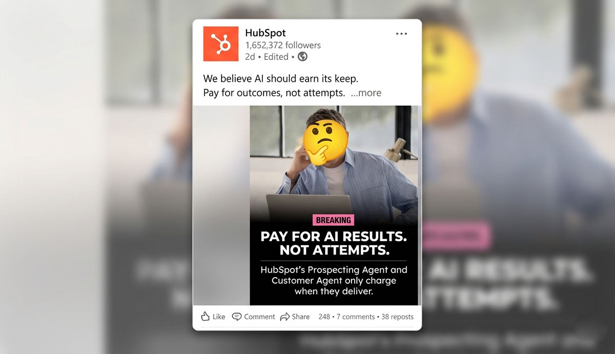
3. HubSpot — LinkedIn Sponsored Content
There is a particular kind of trust that a marketing professional feels when they discover a resource that answers the exact question they have been wrestling with for months. HubSpot has built their entire LinkedIn presence around that moment of recognition. They do not interrupt a decision-maker's feed with a hard sell. They arrive with something genuinely useful, a state-of-the-industry report, a strategy template, a piece of research that makes someone's job easier today.
And in that act of giving first, they earn something far more valuable than a click. They earn credibility. They earn a relationship.
HubSpot LinkedIn Sponsored Content
HubSpot's LinkedIn Sponsored Content ads follow a clean, authoritative visual language that mirrors the professional context of the platform. The ad image is typically a bold, high-contrast report cover, deep navy or rich orange backgrounds (HubSpot's brand colors) with large white headline text that states the report title clearly and prominently. A small HubSpot logo sits in the corner, understated rather than dominant.
The accompanying ad copy follows a strict structure: one sentence that names the audience's pain, one sentence that introduces the asset, and one direct CTA. The overall design feels less like an advertisement and more like a professional resource being shared by a trusted colleague, which is precisely the emotional register HubSpot has always aimed for.
Why HubSpot's Campaign Succeeded
HubSpot’s campaign success can be attributed to several key factors that established genuine authority on LinkedIn and converted professional audiences into high-quality leads.
Value-first offer: HubSpot gives away high-quality research for free. The perceived value of the asset must exceed the perceived cost of sharing an email address and HubSpot consistently clears that bar.
LinkedIn lead gen forms: Auto-populating forms that use LinkedIn profile data reduces friction to near zero. Users submit without typing a single character, dramatically increasing conversion rates.
Audience precision: LinkedIn's job title and company size targeting lets HubSpot reach the exact decision-makers who influence their purchase cycle, a level of B2B precision unavailable on most other platforms.
Consistent creative testing: HubSpot runs multiple creative variants simultaneously, rotating headline, image, and offer to identify the highest-performing combination and reinvest accordingly.
Steal This: On LinkedIn, the quality of your gated asset directly determines your lead volume and quality. When studying B2B social media advertising examples, remember that a weak whitepaper produces weak leads. Invest in the asset first, the ad is just the delivery mechanism.
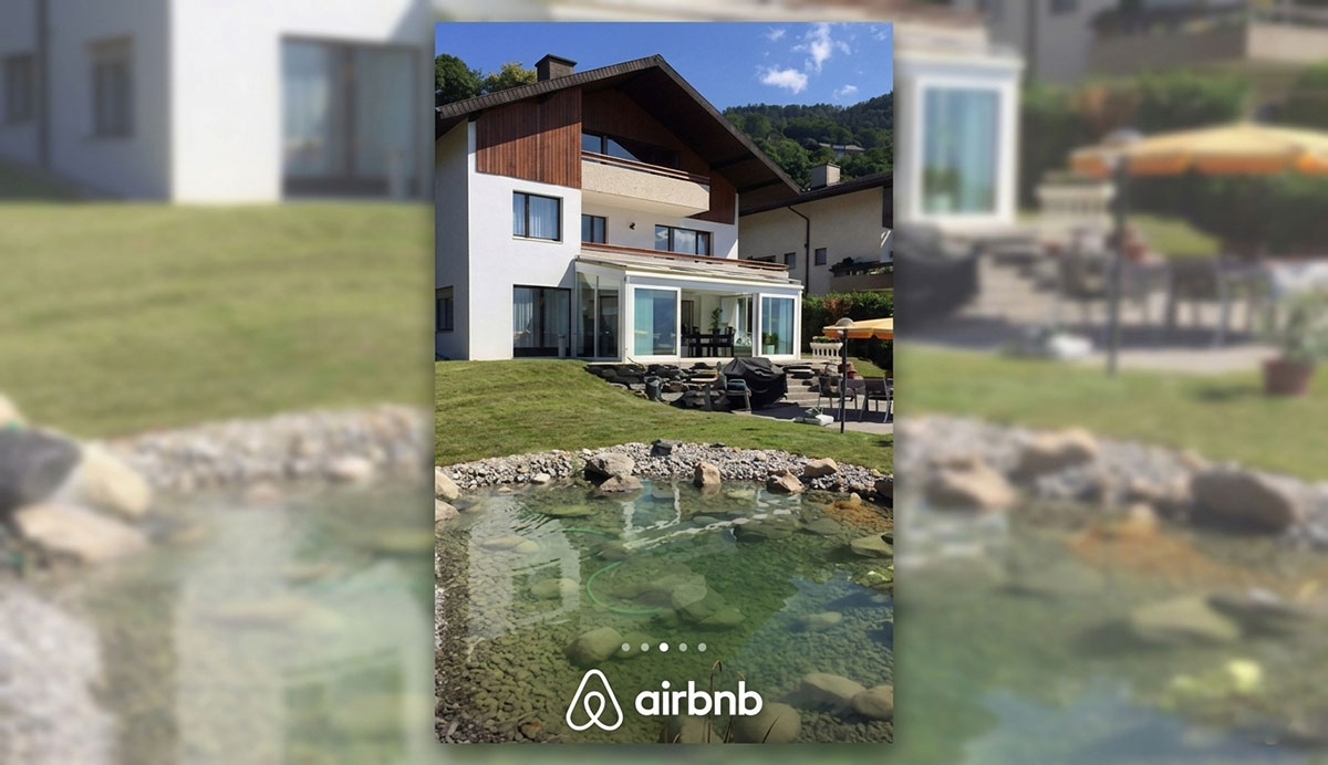
4. Airbnb — Pinterest Idea Pins
Close your eyes and imagine a cobblestone street in Lisbon at golden hour, or a tiny cabin surrounded by snow in the mountains of Iceland. Feel the pull of it, the quiet longing to be somewhere entirely different, somewhere beautiful.
That is exactly the emotional territory Airbnb claimed with their Pinterest Idea Pins campaign.
They did not show you a booking form. They showed you a dream. And in doing so, they captured the full attention of an audience already in the mood to be inspired, people actively searching for places to go, things to experience, and memories to make.
Airbnb Pinterest Ad Design
Airbnb's Pinterest Idea Pins are breathtaking in their visual simplicity. Unlike louder social media advertising examples, each Pin opens with a full-bleed destination photograph, golden-hour beaches, mist-covered mountains, cobblestone alleyways bathed in warm lamplight, chosen specifically for their emotional pull rather than their informational value. The Airbnb logo appears as a small, clean coral-red symbol in one corner, never competing with the image.
Text overlays, when used, are minimal: a destination name in a light serif typeface, or a single evocative line like 'Where will you wake up next?' The multi-page Idea Pin format lets each visual breathe across its own full screen, building a sense of journey rather than presenting a grid of information. The design speaks to wanderlust before it ever speaks to commerce.
Why Airbnb's Campaign Succeeded
Airbnb's campaign success can be attributed to several key factors that resonated with its target audience and maximized the impact of its message.
Intent alignment: Pinterest users search for 'bucket list destinations' and 'weekend getaways.' Airbnb's content matched that search behavior perfectly, appearing at the moment of maximum receptivity.
Content-first format: Idea Pins work like editorial content. Multiple pages offer tips and images. Users engage with them as useful resources because they do not feel promotional.
Long shelf life: Unlike feed ads that vanish after 24 hours, Pinterest Pins can drive traffic for months or years as they accumulate saves and re-pins from organic distribution.
Steal This: Pinterest is the only major platform where ad content compounds over time. If your product has a visual, aspirational, or planning dimension, Pinterest Idea Pins can generate long-tail traffic that feed or Stories ads never will. Think of them as SEO for visual search.
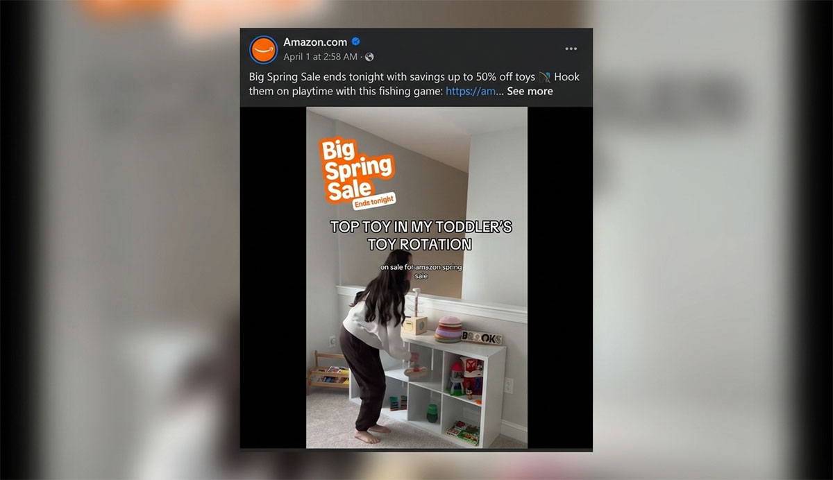
5. Amazon — Facebook Dynamic Product Ads
Have you ever browsed a product, closed the tab, and then seen that exact item reappear in your Facebook feed the very next day, as if the internet was gently reminding you of something you had not quite finished deciding?
That is Amazon's Dynamic Product Ads at work, and it is one of the most quietly effective pieces of advertising psychology in digital history. It does not push. It remembers. It waits. And when you see that familiar product again, paired with a subtle price comparison that makes the value feel undeniable, something in your mind shifts from maybe to yes.
Amazon's Dynamic Product Ads Design
Amazon's Dynamic Product Ads are built for one thing: frictionless recognition. The ad design is clean and transactional, with a white or light-grey background that lets the product image take complete visual priority. The product is shown in high resolution against a neutral backdrop, exactly as it appears on Amazon's own product pages, which creates an immediate sense of continuity for the viewer.
Beneath the Amazon product image, a bold price and a subtle urgency signal, such as a small badge reading 'Back in your cart' or 'Only 3 left', are rendered in Amazon's familiar typography. The overall layout is deliberately understated; Amazon knows that the power of this ad is not in its design beauty but in the uncanny relevance of showing someone exactly what they were already thinking about buying.
Why Amazon's Campaign Succeeded
Amazon’s campaign success can be attributed to several key factors that combined personalization, automation, and urgency to deliver one of the highest-performing retargeting strategies in e-commerce.
Hyper-relevant creative: The ad shows the exact product the user viewed, not a generic category ad. Relevance drives click-through rates that generic creative simply cannot replicate.
Price anchoring: Showing the viewed product alongside a similar item at a lower price reinforces the perceived value of both options, nudging users toward a purchase decision.
Automated scale: Dynamic ads run across millions of product SKUs without requiring manual creative production for each one, the product catalog does the creative work.
Urgency triggers: Copy like 'Limited stock remaining' or 'Price reduced since your last visit' uses scarcity and change signals to prompt immediate action.
Steal This: If you run an e-commerce store with more than 50 SKUs, Dynamic Product Ads should be your first paid social campaign. The combination of personalized creative, catalog automation, and warm retargeting audiences makes them the highest-ROAS placement in most DTC ad accounts.
6. Apple — YouTube Non-Skippable Pre-Roll
Fifteen seconds. That is all Apple asks for. And in those fifteen seconds, no dialogue, no clutter, no distractions, they make you feel something you cannot easily explain. Maybe it is the way a camera captures light at the precise moment it turns golden.
Maybe it is the music, swelling in your chest before you even realize you are moved. Apple's YouTube pre-roll campaigns are not advertisements in the traditional sense. They are small pieces of cinema that happen to feature a product. And because every single frame has been crafted with extraordinary discipline, not a moment is wasted.
Apple Advertising Design
Apple's YouTube pre-roll ads are among the most cinematically refined pieces of advertising ever created. Each 15-second spot is shot on a pure black or pure white background, a visual environment so controlled that the product or subject becomes the only thing the eye has anywhere to go.
The cinematography is extraordinary: macro close-ups that reveal textures invisible to the naked eye, slow-motion sequences that transform ordinary moments into visual poetry, and lighting so precisely crafted that every surface of the product seems to glow from within.
There is no text on screen during the main visual sequence; Apple trusts the image entirely. The brand name appears only in the final second, in their iconic San Francisco typeface, in crisp white or black. The design does not describe the product. It makes you feel it.
Why Apple's Campaign Succeeded
Apple’s campaign success can be attributed to several key factors that transformed a premium ad placement into a cinematic brand experience unlike anything else on the platform.
Guaranteed 100% completion: Non-skippable ads guarantee a 100% completion rate. Every served impression is a watched impression. This is critical for brand awareness because partial views dilute your message.
Cinematic production quality at scale: A $500,000 production budget equals $0.01 per view at 50 million impressions. This offers a cost per quality view that no other format can match.
Sound-on design: Unlike most social environments, YouTube is predominantly sound-on. Apple's ads use music and sound design as a primary emotional driver, not an optional bonus.
Single-idea focus: Each 15-second Apple ad communicates exactly one idea. Focus prevents creative dilution and ensures the message is retained after the ad ends.
Steal This: Non-skippable pre-roll is worth the premium cost when visibility matters. You should pair it with a skippable campaign. This lets you reach the same audience twice. You reach them once with force and once with choice. This provides full coverage for your brand.
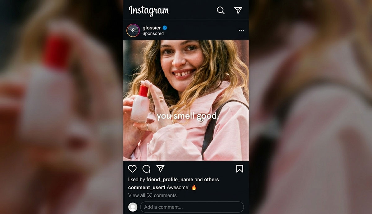
7. Glossier — Instagram Feed Photo (UGC)
There is a kind of beauty that no studio can manufacture, the kind that exists in real morning light, on real faces, in real moments that were never staged. While some social media advertising examples rely on high-production budgets, Glossier found beauty in their own community and had the extraordinary wisdom to recognize it as their most powerful marketing asset.
Their Instagram ads are not polished photoshoots. They are real customers, living real lives, with Glossier products woven naturally into their world. And when those images appear in your feed, they do not feel like ads at all. They feel like a glimpse into someone's life that you genuinely want to be a part of.
Glossier Instagram Advertising Design
Glossier's Instagram feed ads are visually indistinguishable from the organic posts of their most photogenic customers, and that is the greatest compliment you can give them. The images are warm-toned, softly lit photographs taken in real spaces: a bathroom vanity with morning light coming through a frosted window, a bedroom mirror selfie with natural afternoon light, a kitchen counter with a coffee mug and a tube of Glossier balm sitting casually beside it. There is no formal product staging, no pristine white backdrop, no dramatic lighting rig.
The Glossier logo appears only in the 'Sponsored' tag above the image. The products themselves are present but not posed. They exist in the frame the way they exist in real life, as a natural part of someone's morning ritual. The design is honest, and that honesty is the most powerful design choice Glossier has ever made.
Why Glossier's Campaign Succeeded
Glossier’s campaign success can be attributed to several key factors that leveraged authentic community content to build trust and drive results at a fraction of the cost of traditional production.
Authenticity over perfection: Glossier's ads look like a friend's Instagram photo, not a studio shoot. In a feed full of over-produced content, that authenticity is the pattern interrupt that stops the scroll.
Implicit social proof: A real customer using a product is social proof embedded in the creative. Studio photography of a product alone cannot replicate that signal.
Cost efficiency: UGC is cheaper to acquire than studio production. Glossier's creative costs are a fraction of competitors who produce original campaigns for every seasonal launch.
Feed-native aesthetic: Content that looks like it belongs in the feed faces lower resistance from the viewer, translating directly into higher engagement rates and lower CPCs.
Steal This: Ask your happiest customers for permission to use their photos in paid ads. A collection of authentic customer images will almost always outperform a studio shoot and cost 90% less to produce. Start by searching your brand hashtag for high-quality organic posts.
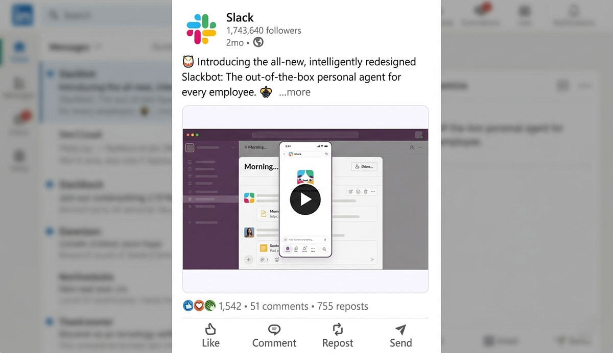
8. Slack — LinkedIn Message Ads
Imagine arriving at work on a Wednesday morning, opening LinkedIn, and finding a message that seems to understand, with almost unsettling accuracy, the exact frustration your team has been dealing with for the past three months. It mentions your name. It references your company size. It does not ramble or oversell. It simply says: here is a better way, and here is how to start. That is the quiet genius of Slack's LinkedIn Message Ad campaign. It did not shout into the feed. It arrived privately, thoughtfully, in a space where people pay real attention, and it made each recipient feel uniquely understood.
Slack's LinkedIn Message Ad Design
Slack's LinkedIn Message Ads strip away almost every traditional design element, and that restraint is their greatest creative decision. The message arrives as plain text in the LinkedIn inbox, formatted exactly like a personal message from a professional contact.
There is no banner image, no elaborate layout, no brand color blocking. The Slack logo appears only as the sender's profile picture, a small, instantly recognizable multicolored hash symbol that provides brand identification without breaking the conversational feel of the message.
The copy itself is the design: short paragraphs with clear line breaks, one bold anchor phrase that names the recipient's specific pain point, and a single blue CTA button at the bottom. The message feels human precisely because it does not try to look like an ad.
Why Slack Campaign Succeeded
Slack campaign success can be attributed to several key factors that made a broadcast message feel like a one-to-one conversation and significantly outperformed standard LinkedIn placements.
Inbox placement: Message Ads arrive in the LinkedIn inbox, a space users treat differently from the feed. Open rates are significantly higher than standard Sponsored Content at comparable spend levels.
Personalization tokens: LinkedIn allows dynamic insertion of the recipient's name and company name, making a broadcast message feel like direct, one-to-one outreach.
Role-specific copy: The message addressed the recipient's specific pain point (team communication overhead) rather than a generic SaaS product pitch applicable to no one in particular.
Single CTA: One button, one outcome, start a free trial. No homepage link, no 'learn more' fallback. Reducing optionality increases the conversion rate for the desired action.
Steal This: LinkedIn Message Ads have a higher CPM than standard Sponsored Content, but their inbox placement and open rates often produce a lower cost-per-lead for high-ticket B2B offers. Always test them alongside Sponsored Content and compare cost-per-lead, not cost-per-click.
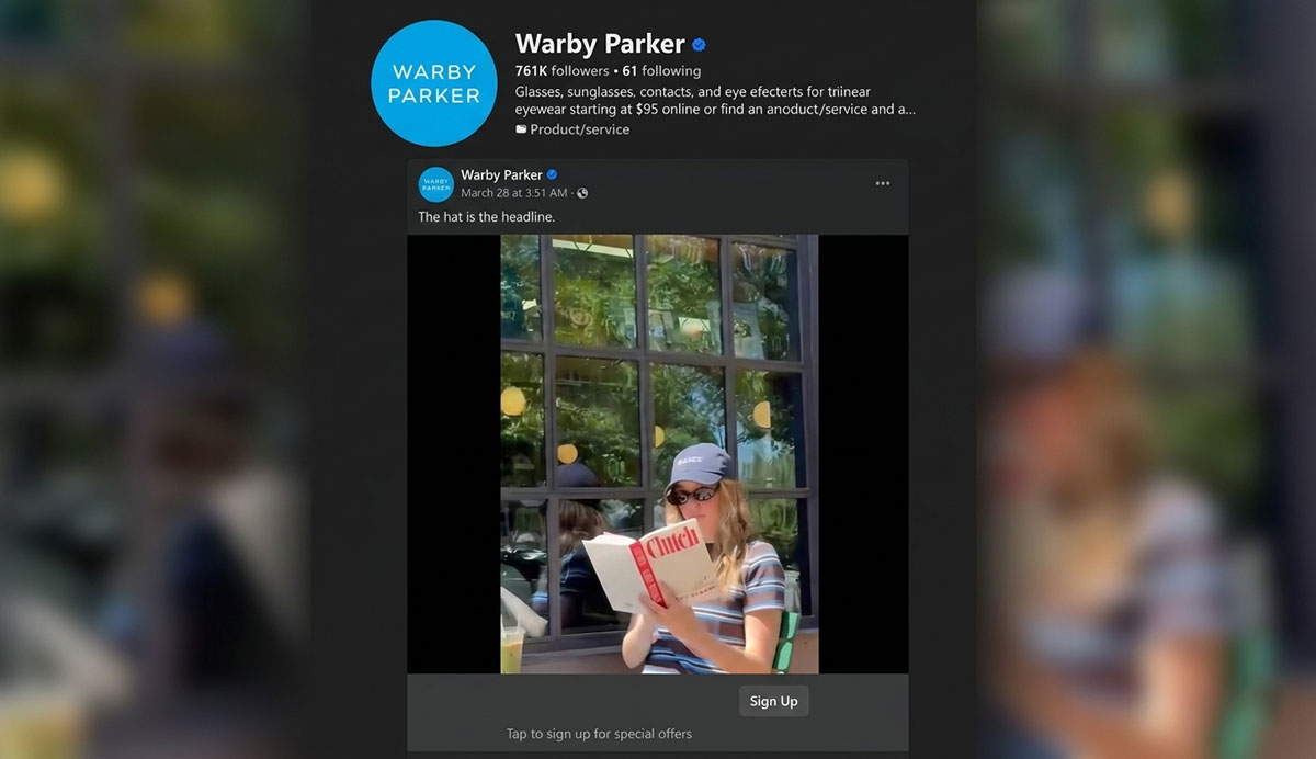
9. Warby Parker — Facebook Lead Ads
There is a quiet anxiety that comes with buying eyewear online, the nagging uncertainty of whether a frame that looks beautiful on a model will actually look right on your face, in your home, in the light you actually live in. Warby Parker saw that anxiety clearly, and instead of dismissing it, they built their entire campaign around dissolving it. Five frames. Delivered to your door. Try it in your own mirror.
No risk whatsoever. And to make the journey from interested to committed feel as effortless as possible, they placed a native Facebook Lead Ad form directly in their audience's path, no redirects, no forms to fill manually, just one simple tap.
Warby The Ad Design
Warby Parker's Facebook lead Ads are warm, approachable, and thoroughly on-brand. The creative typically features a lifestyle photograph, a young professional in soft natural light, wearing a pair of Warby Parker frames, looking relaxed and confident rather than modeled or posed. The background is clean but lived-in: a café, a home office, a sunlit window.
The Warby Parker wordmark, in their signature clean serif typeface, appears at the top of the image in white. The headline copy below the image is short and benefit-forward, centered on the home try-on offer.
When the Lead Gen form opens, it carries the same visual language, clean white interface, Warby Parker blue as the accent color, and forms fields that feel light and effortless. The entire design experience communicates the same thing as the offer itself: this is easy, low-pressure, and made for you.
Why the Warby Parker Campaign Succeeded
Warby Parker's campaign success can be attributed to several key factors that eliminated friction at every stage of the customer journey and made converting as effortless as a single tap.
Zero-friction offer: 'Try 5 frames at home for free' is an offer with no perceived risk and high perceived value. The creative barely needs to work because the offer does the heavy lifting.
Native form eliminates drop-off: The single largest source of lead form abandonment is the transition from ad to landing page. Lead Ads eliminate that transition entirely, keeping users inside Facebook's app.
Auto-populated data: Facebook pre-fills name and email from the user's profile. Submission takes a single tap, cutting completion time from 2 minutes to 5 seconds.
Retargeting integration: Non-converting leads were re-entered into a retargeting sequence featuring testimonial content and limited-time urgency messaging to recover hesitant prospects.
Steal This: If your conversion goal is lead capture, test Facebook Lead Ads against a traditional landing page before assuming a dedicated page is better. For mobile audiences, native forms routinely outperform external pages by 30–50% on lead volume at the same ad spend.
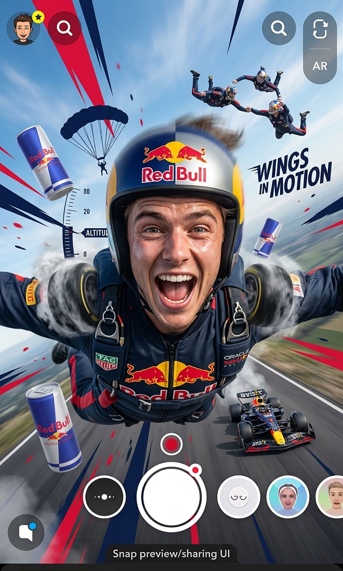
10. Red Bull — Snapchat Branded AR Lens
What if, for just a few breathtaking seconds, you could feel what it is like to free-fall from 15,000 feet with a Red Bull logo on your chest or tear around a Formula 1 circuit at impossible speed? Red Bull gave an entire generation exactly that experience through a Snapchat AR Lens, and in doing so achieved something most advertisers only dream about: they made their audience the hero of their own story.
Nobody was forced to engage. Nobody was interrupted. People chose to play, chose to record, chose to share. And in doing so, they became willing ambassadors of a brand they genuinely felt connected to.
Red Bull The Ad Design
Red Bull's Snapchat AR Lens is a marvel of experiential design. When a user activates the lens, their camera environment transforms instantly, the screen fills with motion graphics, extreme sports scenery, or a first-person perspective effect that places them at the heart of a Red Bull sporting moment.
The Red Bull color system, bold red and deep navy, frames the experience without overpowering it, appearing on branded elements like helmets, jerseys, or floating logos that feel part of the scene rather than stamped on top of it.
The user's face and body are integrated into the AR experience using real-time face and body tracking, creating a sense of genuine immersion. When the Snap is captured and shared, the resulting image carries the Red Bull visual identity organically, in a context that feels earned rather than forced, because the user chose to create it.
Why Red Bull's Campaign Succeeded
Red Bull’s campaign success can be attributed to several key factors that transformed passive viewers into active brand participants and generated organic reach far beyond what paid impressions alone could achieve.
Participation over interruption: A lens invites users to play with the brand rather than passively watch an ad. Active engagement produces stronger brand recall than passive viewing at every frequency level.
Organic amplification: Every Snap shared with a branded lens is an earned impression. The cost of the lens is amortized across every organic share it generates beyond the paid reach.
Brand-to-lifestyle alignment: Red Bull stands for extreme sports and high energy. An AR lens puts users inside a sporting moment. This creates perfect brand alignment. Because the medium is the message, it builds a deep connection with the audience.
Gen Z platform fit: Snapchat reaches over 90% of 13–24 year olds in the US. For brands targeting this demographic, Snapchat AR is one of the most cost-efficient awareness channels available.
Steal This: Branded AR lenses have a higher production cost than static or video ads, but the organic amplification they generate makes the effective CPM far lower than the headline cost suggests. Calculate cost per total earned impression, not cost per paid impression, when evaluating the format.
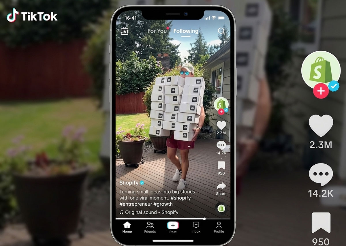
11. Shopify — TikTok Spark Ads
Picture a young woman sitting at her kitchen table, filming herself on her phone, genuinely emotional as she describes the moment her first online sale came through at 2 AM. She is not an actress. There is no script. The tremble in her voice is real, and so is the joy.
Shopify saw videos like this appearing organically across TikTok, real merchants sharing real turning points in their lives, and made a decision that changed their advertising strategy forever. Instead of creating polished brand content, they simply amplified what already existed. The most human stories, told by the people who had actually lived them, are delivered to millions.
Shopify The Ad Design
Shopify's TikTok Spark Ads intentionally look nothing like Shopify's brand guidelines, and that is the entire creative strategy. The content comes directly from real merchant creators: vertical smartphone videos with authentic settings, natural lighting, and the slightly imperfect framing of someone filming themselves in their own home or workshop.
The Shopify brand appears only in context, visible on a merchant's laptop screen, referenced in dialogue, or shown briefly as a website dashboard. There are no lower-third graphics, no polished brand overlays, no agency-produced transitions.
What makes these ads visually compelling is not production quality but emotional texture: the joy on a creator's face when they describe their first sale, the pride in a maker's hands as they package an order, the authenticity of a real person sharing a story that changed their life.
Why Shopify Campaign Succeeded
Shopify campaign success can be attributed to several key factors that harnessed the authenticity of real merchant stories and amplified them to reach millions of new potential customers.
Authentic origin: The content came from real merchants who genuinely used Shopify. Audiences recognize the difference between a paid actor and a real business owner and respond to authenticity accordingly.
Social proof accumulation: Because engagement accrues to the original post, a Spark Ad with 50,000 views and 3,000 likes looks far more credible than a standard ad with the same metrics starting from zero.
Creator-platform alignment: TikTok's algorithm rewards content that feels native. Creator-originated content gets better algorithmic distribution than brand-created content at the same bid level.
Cost efficiency: Partnering with mid-tier creators ($500–$2,000 per post) and boosting their organic content produces better results than spending the same budget on original brand production.
Steal This: Before creating new ad content for TikTok, search TikTok for organic mentions of your brand or product category. The best-performing organic content about your space is your creative brief, and often your best first Spark Ad candidate.
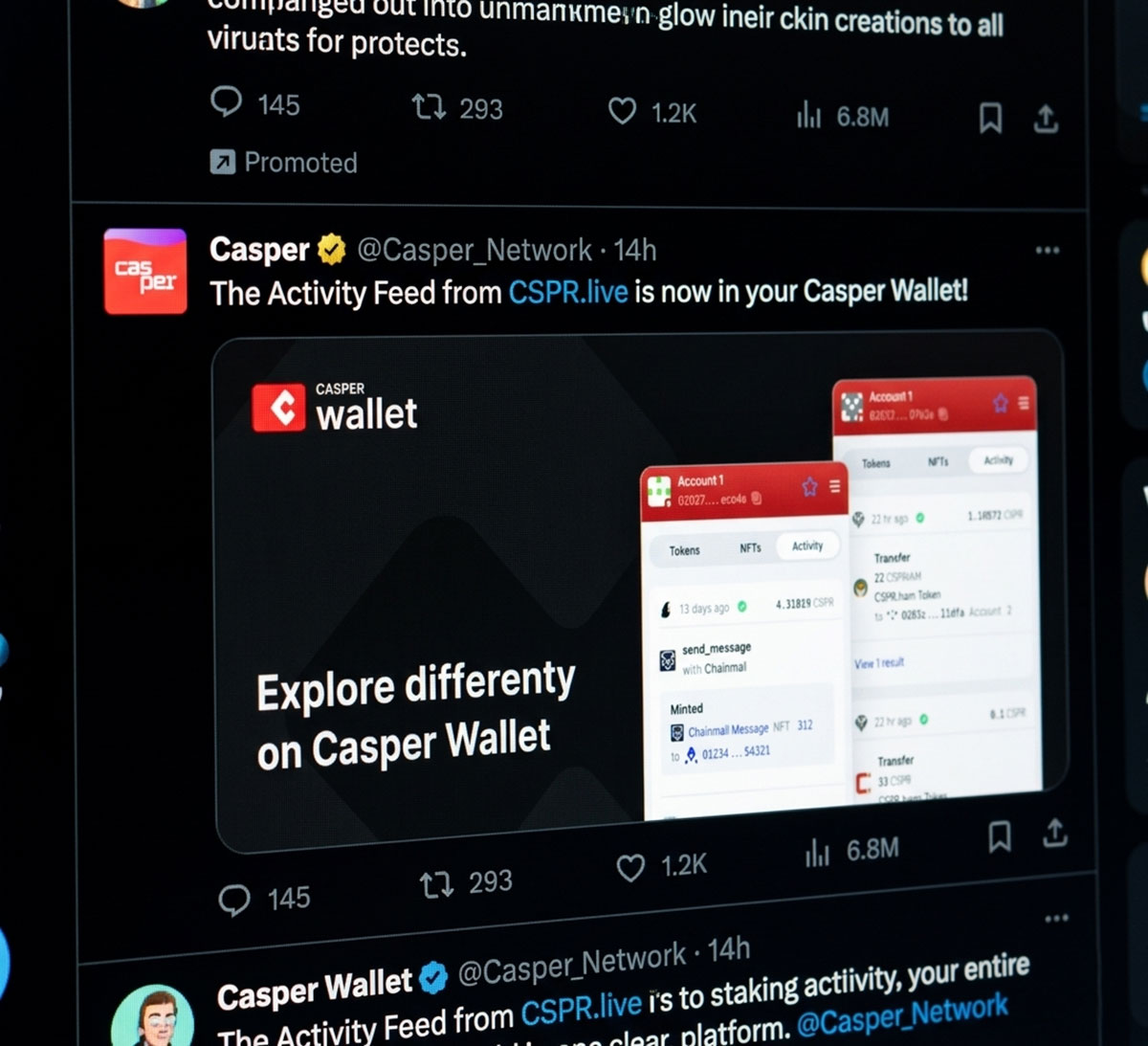
12. Casper — X (Twitter) Promoted Tweet
Most mattress companies talk about springs and foam densities and percentage-off sales. Casper decided to talk about the universal, deeply relatable experience of lying awake at 3 AM and overthinking absolutely everything. That decision to be genuinely human and funny instead of clinical and promotional transformed a mattress brand into a personality that people actually enjoy following.
On X, where audiences have a finely tuned radar for anything that sounds like a press release, Casper's wit landed like a message from a friend. People liked their tweets, retweeted them, and laughed out loud. And quietly, that laughter built a brand worth sleeping on.
Casper X (Twitter) Ad Design
Casper's X promoted creative is designed to look like it was written by a very funny, very tired human, not a brand. The text-based tweets use no formal design elements whatsoever: no custom imagery for most posts, no brand color blocking, no logo in the tweet itself. The visual identity is carried entirely through voice, dry wit, relatable sleep observations, and the occasional meme-format image that uses widely recognized internet templates (think: distracted boyfriend, two buttons, expanding brain) with Casper's own sleep-related captions written over them.
When images are used, they are simple, flat-design graphics with a soft ivory or pale blue background, colors that evoke a well-made bed and a good night's sleep, and minimal text in a friendly, rounded sans-serif typeface. The design whispers comfort. The copy makes you laugh. Together, they build a brand you actually want to spend time with.
Why Casper's Campaign Succeeded
Casper’s campaign success can be attributed to several key factors that turned a conversational brand voice and platform-native humor into a consistently high-performing awareness strategy.
Platform voice: X rewards wit and brevity. Casper's copy is written in the voice of a smart, slightly irreverent friend, not a marketing department issuing an announcement.
Meme-format creative: Casper's image creative often uses widely recognized meme formats with sleep-related captions, making the ad feel culturally relevant rather than commercially promotional.
Organic testing first: Casper tests copy organically before promoting it. Top-performing organic posts get promoted, minimizing the risk of paying to distribute content that doesn't already resonate.
Competitive CPM: X's ad inventory is generally more affordable than Facebook or LinkedIn. For awareness campaigns measured by earned engagement, the cost-per-engagement can be highly competitive.
Steal This: On X, test your ad copy organically before promoting it. A tweet that earns 100 organic retweets is almost guaranteed to perform as a Promoted Tweet. A tweet with zero organic engagement will not improve because you paid to distribute it.
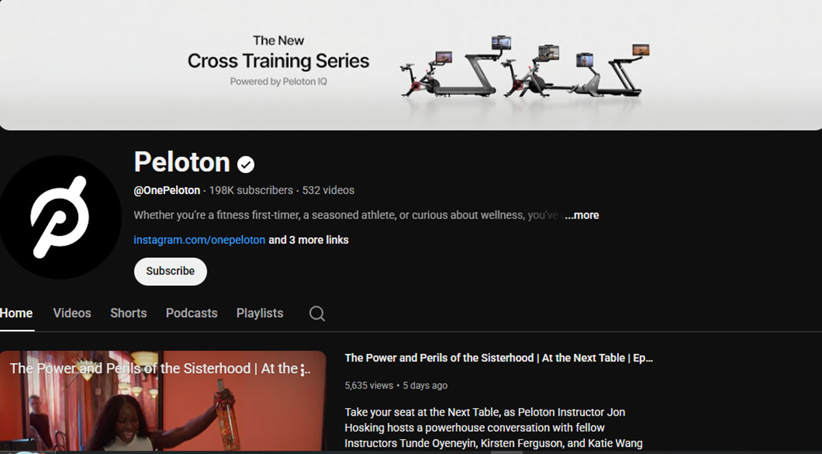
13. Peloton — YouTube Masthead
There are moments in a brand's story that demand to be heard by everyone, all at once, on the same extraordinary day. A new product that redefines a category. A launch that took years to build. A moment that simply cannot be whispered, it must be announced. Peloton understood this deeply. When they had something world-changing to share, they did not rely on the slow burn of targeted campaigns reaching small audiences over many weeks. They commanded the entire YouTube homepage for 24 hours, tens of millions of people, one unmissable moment, the kind of brand presence that does not merely inform an audience but moves culture itself.
Peloton YouTube Ad Design
Peloton's YouTube Masthead creative is engineered for maximum visual impact at the largest possible scale. The full-width autoplay video opens with a sweeping, high-production cinematography shot, riders in motion, dramatic studio lighting, endorphin-charged faces, and an original music score that builds from ambient to triumphant within the first three seconds.
The color palette is Peloton’s signature. Deep black backgrounds make neon and white elements stand out. These are accented with the vivid red of their effective logo design. Product names and a clean sans-serif CTA appear in the lower third as the music peaks. This choice shows deliberate typography in logo design. Every element of the design is calibrated for the moment when attention is total, and nothing in the frame is wasted.
Why Peloton's Campaign Succeeded
Peloton’s campaign success can be attributed to several key factors that combined mass reach, cinematic creative, and precise timing to make their product launch an unmissable cultural moment.
Guaranteed mass reach: The Masthead can deliver 50–100 million impressions in a single day. No targeting-based campaign can match that reach velocity for a simultaneous awareness moment.
Launch-day dominance: New product launches need instant awareness. A gradual rollout is not enough. The Masthead creates a cultural moment. Everyone sees it on the same day. This amplifies press and social conversation for your brand.
Autoplay with engagement option: The Masthead autoplays without sound. Users who lean in get the full sound of experience. This creates a natural way to select users. It identifies high intent viewers for your brand.
Search synergy: Masthead campaigns consistently produce a measurable lift in branded search volume on launch day, as users who see the ad then search for the product on Google.
Steal This: The masthead is specifically for moments when simultaneous, mass awareness creation matters, product launches, seasonal events, or major announcements. For always-on advertising, standard TrueView campaigns will always be more efficient per impression.
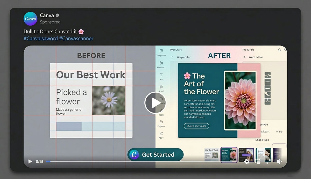
14. Canva — Facebook Video Ad
Every person who has ever stared at a blank slide deck and felt the creeping dread of not knowing how to make it look professional, Canva made that video for them. Not for designers. Not for agencies. For the teacher preparing a parent presentation at 10 PM.
For the small business owner trying to make their social media look like they have an entire marketing team behind them. Canva's Facebook video campaign opened with that exact feeling of inadequacy, held it honestly for just a few seconds, and then dissolved it entirely. Anyone can design. Three words that felt like a personal invitation, and for millions of people, that was all it took.
Canva Facebook Ad Design
Canva's Facebook video ad design uses the product itself as the hero of the creative, and it could not be more fitting. The video opens with a painfully relatable scene: a frustrated person staring at a blank, ugly presentation or a poorly designed social media graphic. The visual language in these opening seconds is deliberately dull, flat colors, misaligned text, the kind of design that makes your eyes hurt. Then Canva appears on screen, and the transformation is immediate and visceral.
Vibrant templates materialize. Colors harmonize. Typography aligns. The before-and-after contrast is so dramatic that it functions as its own emotional argument for the product. The Canva brand identity, bold teal, playful rounded typography, and the simple 'C' logo, appears consistently throughout as both a design element and a trust signal.
By the final frame, you have not just been told that Canva is easy and powerful. You have seen it, felt it, and believed it entirely.
Why Canva's Campaign Succeeded
Canva’s campaign success can be attributed to several key factors that connected with a broad audience through relatable emotion and a frictionless offer that made trying the product feel like a natural next step.
Problem-first hook: The ad opens by naming the viewer's specific frustration before showing the product. This creates immediate identification. The viewer feels the ad is for them. Because of this, watch time and click-through rates increase.
Freemium CTA removes risk: 'Start for free' is the easiest CTA in SaaS. The conversion event is a signup, not a purchase, dramatically lowering CPA relative to direct-to-paid campaigns.
Demonstration over description: Canva's video shows someone using the product to create something beautiful in real time. Seeing a product work is more convincing than any headline or bullet point.
Broad audience with algorithmic optimization: Canva’s use case spans students, freelancers, and small businesses. Because of this, their targeting is intentionally broad. This allows the Facebook algorithm to find high-value signups within a large pool.
Steal This: For freemium or free-trial SaaS products, structure your video ad as: Problem (5 sec) + Solution demo (15 sec) + Social proof (5 sec) + CTA (5 sec). This framework is the most consistently effective format in performance marketing and translates across virtually every product category.
How to Apply These Social Media Advertising Examples to Your Campaigns
You have seen fifteen paths that lead to real wins. Now, the most vital plan is the one you build. The ideas in this guide do not need a big pile of cash. Any brand can use them by knowing their crowd and using each site with a clear goal. This way, your work stays true and brings in the best gain.
The Path to Growth:
Pick the Best Platform: Go where your crowd spends their day. Do not just pick what you like. Your work must feel at home on the site you choose. Your content creation for social media must feel native to each space.
Set One Clear Goal: Know if you want folks to see you, think of you, or buy from you. Each step needs its own plan and its own look.
Use Good Tips: Pick a past win that fits your goal and site. Copy the core idea but change the look to fit your brand.
Make Native Work: Match the tone and style of the site. Work that fits the flow of the feed will always do better than a stiff ad.
Test Before You Grow: Run a small test with two types of the same ad. Change only one part so you can see what truly works.
Watch One Main Count: Fix your eyes on one key mark like CTR, CPA, or ROAS. Use this to guide your next move.
Scale the Wins: Put more cash into the ads that win and cut the ones that fail. Keep testing to stay on top.
Social Media Advertising FAQs
Every marketer has eventually wondered: Am I doing this right? Am I spending time in the right place? Is there a smarter way?
We often hear these questions from business owners and growth teams. These leaders want to invest in social media ads with clarity and confidence. We have answered each question honestly.
Our advice draws on the exact principles that made the campaigns in this guide exceptional. Read them carefully. One right answer could change the direction of your next campaign entirely.
Meta (Instagram & Facebook) is best for most consumer ads due to reach and strong targeting tools. TikTok works best for younger audiences, LinkedIn for B2B, and YouTube for long-term growth through search and video content.
Social media ad costs vary by platform, audience, and competition. Here are average ranges:
Facebook: CPM $8–$15 | CPC $0.50–$2
Instagram: CPM $10–$20 | CPC $0.70–$3
TikTok: CPM $6–$12 | CPC $0.20–$1.50
LinkedIn: CPM $25–$60 | CPC $5–$15
Pinterest: CPM $5–$15 | CPC $0.30–$2
YouTube: CPM $10–$30 | CPV $0.03–$0.15
Snapchat: CPM $5–$12 | CPC $0.30–$1.50
Costs change based on industry, targeting, and ad quality. Finance and insurance usually cost more, while retail is cheaper. Better ads can also reduce costs.
A social media ad goes viral when it triggers strong emotion and is easy to share. The first few seconds must grab attention instantly with a bold hook, or people scroll away.
Success is measured mainly by ROAS, Conversion Rate, CTR, and CPA, not just likes. ROAS and conversions show real profit impact, while CTR and CPA show how well the ad attracts and converts users.
Yes, small businesses can run effective social media ads even with a $5–$10 daily budget. The best results come from targeting warm audiences and using short, authentic videos to build trust quickly.
Endnote
We have reached the end of these 14 social media advertising examples. You can now see a common thread. A platform is not just a place to post a message. It is a culture. Your ad either fits that culture or it fights against it.
Every campaign in this guide started with a simple question. We asked how to make people feel something. When an ad moves someone or makes them smile, it does more than just convert. It creates a connection. Over time, that connection turns a business into a brand people remember.
These examples are an invitation and not a limit. You do not need a huge budget to get results. You need a clear understanding of your audience. You need the right platform and the courage to be human. The best ad you will ever create makes your audience feel understood.
You can also join our creative brief to stay ahead. We share fresh ideas and simple tips. We send these straight to your inbox so you always have something new to test.
Every brand in this guide became unforgettable because they found a way to speak to real people with real emotion, in the right place, at the right moment.
Lastly, ready to turn these strategies into scroll-stopping ads? At Graphic Design Eye LLC, we have proven social media advertising frameworks.
Graphic Design Eye LLC specializes in platform-native ad creative across static, video, carousel, and stories formats, plus UGC-style content production, and full-funnel visual ad strategy for your brand growth.
Your Story Deserves to Be Seen. Let Us Help You Tell It! 🎉🥂
Graphic Design Eye LLC is a full-service creative agency built for brands that demand more than design — they demand vision. From strategic branding to complete visual identity, we partner with startups, agencies, and growing businesses as a dedicated creative force. With flexible subscription and project-based models. Let's start with us today!