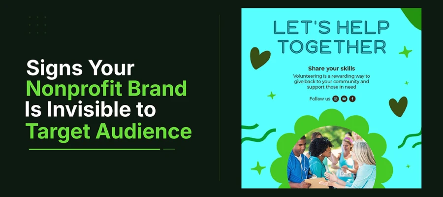
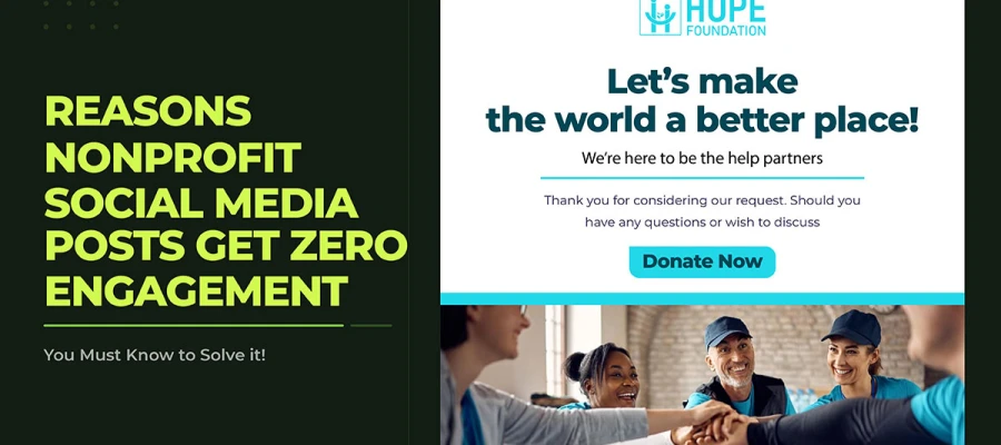
Your nonprofit brand is invisible to your target audience when donors confuse you with other groups. Social posts get views but no shares. Taglines say nothing specific. Search visibility stays weak. This article covers 8 signs behind that invisibility, the data behind each one, and the fixes to reverse it.
These signs show up quietly. They sit between your work and the recognition it deserves. You spent months on the campaign. The cause is real. The work is urgent. Still, the response was silence. It wasn't angry or critical. It was the quiet kind that means people never noticed at all.
That silence has a name: brand invisibility. For most organizations, this happens more often, costs more, and can be fixed more easily than anyone realizes. It's a design and strategy problem, and every such problem has a diagnosis.
The people who built the brand see it clearly. A stranger seeing it for the first time usually does not. This article covers 8 signs that show where recognition breaks down, the real cause behind each, and the fixes that make your brand memorable, shareable, and trusted.
8 Signs your nonprofit brand is invisible to your target audience
Every nonprofit starts with a spark. Someone believes in a cause so much they build an organization around it. But belief alone does not get attention. Many great nonprofits do amazing work while staying invisible to the donors, volunteers, and supporters they need most.
Invisibility is a quiet problem. It does not show up with warnings or big failures. It looks like fundraising that falls short, social posts nobody answers, and a mission people forget. Meanwhile, weaker organizations with more visibility keep getting the support your cause deserves.
The good news is that invisibility can be fixed. It has clear signs, and once you spot them, you can act. This article covers 8 signs your nonprofit brand is invisible to your target audience, so you can see where you stand and start becoming visible.
Sign 1: People Confuse You With Another Organization
Your nonprofit brand is invisible if people keep confusing you with another group. That means your look is not distinct enough to stick in their memory.
Think about the last time someone praised your group for another nonprofit's campaign. Or a new supporter asked if you were linked to a bigger name doing similar work. These feel like small mix-ups. They are not. They show your brand has not carved out a look and tone that gets remembered as yours.
Our brains recognize things through difference. We remember what stands out, not what blends in. Many nonprofits use the same visuals: soft blues, green leaves, clasped hands, a sunrise over a field. This gives people nothing to tell you apart from thirty other groups doing similar work. None of these visuals are bad on their own. The problem is when they all appear together, they just say "this is a nonprofit." They do not say "this is us."
What it looks like:
Donors compare your campaign to a competitor's when they congratulate you.
New supporters ask if you're linked to another nonprofit doing similar work.
Your logo, colors, or tagline look so much like another group's that you have to explain the difference.
The real cause: Your visual identity follows generic nonprofit design instead of a unique nonprofit branding strategy built to distinguish your organization from others in the same field. You lack a strategy showing what makes your organization look and sound different from others in the field.
Data: Groups with a unique look, colors, and logos unlike their five closest peers get twice the recall on a second exposure.
The fix: Compare your visual identity to your top five competitors. If a donor could confuse your materials with theirs, fix that first before spending more on campaigns.
Sign 2: Your Social Media Posts Get Seen But Not Shared
Your nonprofit's posts get views but few shares. That means you reach people who already follow you, but you are not moving them to endorse you to new people.
Viewing and sharing are different. Viewing is passive. It just takes a moment of attention. Sharing means something more. When someone shares your post, they tell their friends this matters, and they want to be linked to it. That endorsement is what helps your message reach new people. Without shares, your content stays inside your own circle. With shares, it reaches beyond it.
Most nonprofit posts aim to update current supporters. Program news. Statistics. Event announcements. This works fine for people who already follow you. But it gives no reason for a new person, someone seeing your post for the first time, to feel strongly enough to share it.
Before posting anything, ask one simple question: would a supporter feel proud to share this on their own feed? Not just willing. Proud. That answer decides whether your content stays local or spreads further.
What it looks like:
Consistent post reach within your current followers, almost no shares to new people
Supporters like the posts but do not share them
No organic reach beyond your existing followers
The real cause: Content informs current supporters. It doesn't push new people to act. No mechanic gives followers a reason to share. Visuals look like an announcement rather than the kind of nonprofit social media graphics that encourage supporters to share your message with their own networks.
Data: Posts with a shareable action, like a challenge, pledge, or template, get 3x more reach than plain informational posts. (Nonprofit Tech for Good)
The fix: Ask honestly for every post: would a supporter feel proud to share this on their own feed? If not, the post only informs. That gap separates posts that stay with your current audience from posts that reach new people.
Sign 3: Your Logo Does Not Work at Small Sizes
A nonprofit logo that gets unclear at small sizes, on a phone screen, social media picture, or printed label, disappears exactly when people need to recognize it most.
Most logos are approved at sizes where you can see every detail. But most places a logo actually builds recognition are not full size. Think of a social media picture at 40 to 50 pixels wide. An app icon. A label on a tote bag. An email signature. These are the spots where people see your brand again and again, slowly turning strangers into people who know you.
If the logo disappears at these sizes, each viewing adds nothing to that recognition. People see it, but they do not register it. And recognition that does not build up cannot turn awareness into trust. A simple icon version of the logo, made for small and square spaces, is not extra. It does most of the work in building recognition.
What it looks like:
The logo turns unreadable as a profile picture, usually shown at 40 to 50 pixels.
Fine details and small text vanish at label or app icon size.
There is no simple icon version. The full wordmark is the only choice.
The real cause: The logo was made at full size. No one tested how it scales. There is no simple icon version for small or square spaces.
Data: Brand recognition grows through repeated exposure. But each exposure only counts if it works. A logo that disappears at small size wastes every small-scale view.
The fix: Test your logo at 40px, 100px, and 400px before approving it. If it is not clear at 40px, make a simple icon version too.
Sign 4: Your Brand Looks Different Everywhere
When a nonprofit's Instagram, website, emails, and print materials all look different, people never learn to trust the brand. Consistent recognition never gets a chance to grow.
Recognition grows through repeated exposure. This is how memory works, not just marketing. When your content looks the same each time, people remember it. That builds familiarity. Familiarity builds recognition. Recognition builds trust. When content keeps changing, nothing adds up. Each encounter feels new instead of building on the last one.
The small mistakes behind this are often invisible to the team. A social post uses a color close to the brand color, but not quite right, because it was adjusted for the platform. An email uses the secondary font instead of the main one, since an old template was never fixed. The logo in emails looks slightly different from the one on the website. Each mistake seems small. But together, they stop people from recognizing the brand across channels. Months of consistent work never pay off.
What it looks like:
Social posts, the website, and email headers all use different colors.
Team members use different fonts, logos, and photo styles across channels.
Donors who follow the org on Instagram would not recognize its emails without the name in the subject line.
The real cause: No brand style guide or one that exists but isn't used consistently. Without a documented brand identity system, every channel gradually develops its own visual style.
Data: Brands with clear, consistent guidelines get recognized more easily. They are 3.5 times more likely to stand out. (Lucidpress Brand Consistency Report)
The fix: Make one page. List hex codes, fonts, logos, and photo style. Give it to everyone making content. Then use it everywhere, every time.
Sign 5: Your Tagline Does Not Tell Anyone What You Do
A vague nonprofit tagline like "building a better tomorrow" or "empowering communities" gets ignored. It says nothing specific enough to remember or act on.
Nonprofits often reach for inspiring language. Words that sound meaningful. Words that hint at change and hope. Words that make staff feel proud of their mission. This makes sense. But it is also a top cause of brand invisibility in the sector.
If your language does not say who you serve, what changes for them, or why your group causes that change, strangers will not understand it. "Building a better tomorrow" could fit a hundred groups. "Empowering communities" could fit five hundred more. A tagline that fits any nonprofit does not fit yours. And a tagline that is not specifically yours cannot build recognition for you.
What it looks like:
New website visitors can't explain what the group does after reading the headline.
The tagline could fit dozens of other nonprofits without any change.
Staff describes the group differently in person than the tagline does in print.
The real cause: taglines written for internal stakeholders, not real visitors. Inspirational words get picked over clear ones that show who you help and what changes.
Data: In studies on nonprofit websites, visitors given 15 seconds correctly described the group's work 78 percent of the time when headlines were specific. Only 31 percent got it with vague, inspiring language.
The fix: Try the stranger test. Show your homepage to someone who has never heard of you. Ask them to describe what you do and who you serve. If they cannot answer in 15 seconds, the tagline is broken. Rewrite it to show who you serve, what you do for them, and what changes.
Sign 6: New Donors Cannot Find You Online
If a new donor searches for your cause and your nonprofit brand is invisible to your target audience on the first page, you are invisible to the biggest source of new donors most nonprofits have.
Google's Nonprofit Impact Report says 55 percent of people who engage with nonprofits online find them through organic search first. That is not a small channel. It is the single biggest source of new donor discovery for most groups. But if a nonprofit has no content built around what its audience actually searches for, this channel brings in nothing.
There is a key difference between people who search for the organization's name and people who search for the cause it addresses. The first group already knows the organization exists. The second group, people typing things like 'how to help children in food poverty in my city' or 'what nonprofits address climate change locally,' are the new supporters the organization cannot yet reach. They are searching. The question is whether the content lets them find you. For most nonprofits, it does not.
What it looks like:
Searching your cause shows competitors, news, and reports. Not your site.
Your website has no blog, no FAQ, no resource pages. It does not answer what your audience searches for.
Most organic traffic comes from people searching your name. Few search by cause.
The real cause: No SEO or content strategy targets the search terms your audience actually uses. Brand invisibility in search is a structural problem, not a media spend problem. It needs SEO-optimized content rather than ads, so your organization appears when people search for causes like yours.
Data: 55 percent of people who find nonprofits online first discover them through search. This is the biggest organic discovery channel for most groups. (Google Nonprofit Impact Report)
The fix: Find five questions your audience asks about your cause. Write a full, clear answer to each one. Each piece builds search visibility that ads cannot replicate or sustain once the budget stops.
Sign 7: Your Imagery Looks Like Every Other Nonprofit
Stock photos of clasped hands, crowds, or sunrises show effort, not identity. People cannot form a real connection without seeing who you actually are.
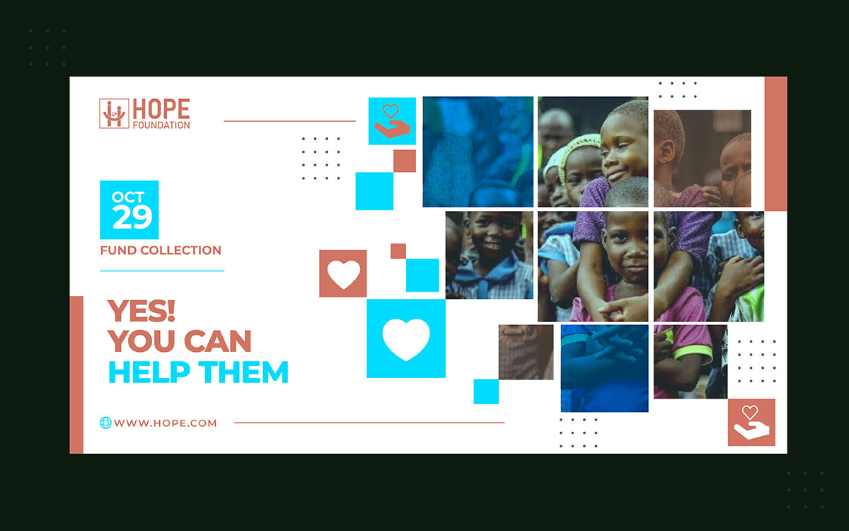
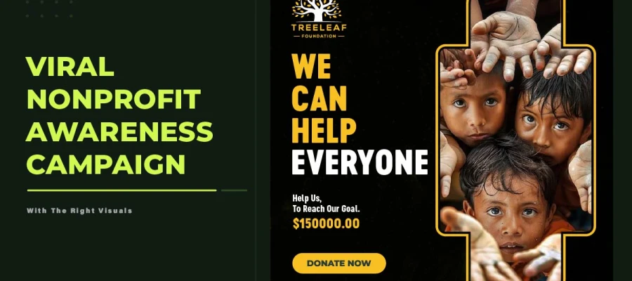
Stock photos are usually well made. Good light. Good composition. Likeable subjects. But they show other people, not your beneficiaries, staff, volunteers, or real moments from your work. People who see nonprofit content often recognize these images from other groups. So instead of showing your mission, the photos make your group look just like everyone else.
Real photos of your actual people do something stock photos cannot. They show something specific. A photo of one child in one program at one moment belongs only to your organization. It shows that instantly, before anyone reads a word, in the split second people decide if an image is worth their attention.
What it looks like:
Campaign materials use stock photos. Real images are hard to find, take too long to source, or seem less polished.
The photos could belong to any group in the same field.
The faces in these materials have no real link to the group's mission, programs, or community.
The real cause: The design process values visual polish over real representation. The organization has no plan for real program photos or a consistent visual storytelling process, something often addressed through dedicated creative services for nonprofits.
Data: Posts with real photos of beneficiaries, staff, or program moments get more engagement. They beat stock photos by 38 percent. (HubSpot Social Media Research)
The fix: Spend one day each quarter taking real photos of programs, staff, and the people served, with consent. Build a library of 30 to 50 real images. This can cover a full quarter without repeats or stock photos.
Sign 8: Your Visual Identity Has Not Changed in Over Five Years
If your nonprofit brand is invisible to your target audience for five years, it's probably because you haven’t changed the visual identity over those years. The programs have changed. The audience has changed. The digital tools have changed too.
Visual identities age. The organization behind the brand changes over time. Programs shift. Audiences shift. Digital channels evolve past what an old logo can handle. A five-year-old brand now carries a mission it wasn't built for.
There's also a problem with audience expectations. What feels timeless to founders and longtime leaders often looks outdated to new staff, younger donors, and partners. An untouched eight-year-old brand doesn't read as classic to a young first-time supporter. It shows the organization hasn't kept up with the world around it.
What it looks like:
The logo was made before social media became a main channel.
The colors do not match the group's current image or audience.
New staff, younger donors, and partners see the brand as dated. Long-time supporters still find it familiar.
The real cause: Founders or long-term leaders feel emotionally attached to the original brand. There is no set schedule for brand reviews. So the look ages on its own instead of updating on purpose.
Data: Studies show brand refreshes boost audience trust by 22 percent on average. This works when the updated identity matches what audiences expect today. A refresh here means evolving the identity, not a full rebrand.
The fix: Audit your brand every three years. Survey your audience on recognition, association, and trust. A brand refresh means updating the identity to match who you are now and who you want to reach.
Now that you have read all eight signs, it is time to be honest with yourself. Go through each item below. Check what's true for your organization today. Through this self-assessment, you can overcome nonprofit branding mistakes.
Category
Self-Assessment Item
Recognition
Supporters occasionally confuse us with another similar nonprofit
Our logo is not legible at 40px or as a social media profile picture
Our brand looks visually different across two or more of our channels
We do not have a documented brand style guide that all content creators use
Message
A stranger cannot explain what we do after reading our homepage headline
Our tagline uses language like 'empowering' or 'building a better world' without naming who we serve
Our staff describes the organization differently in conversation than our official materials do
Reach
Our social content generates views but almost no shares from non-followers
We rely on stock photography because we do not have authentic program imagery
New donors cannot find us through organic search for our cause area
Our visual identity has not been reviewed or refreshed in five or more years
We have never surveyed our target audience on brand recognition or association
Nonprofit brand visibility FAQs
When your nonprofit brand is invisible to your target audience, you might ask the following questions. This happens when you realize people aren't noticing your work. Below are answers about nonprofit brand recognition.
A nonprofit brand is invisible when people can't recognize it again. They can't recall it on their own. They feel no pull to donate, share, volunteer, or speak up for it.
Your brand is not reaching people when shares stay low. Visuals look different across channels. The tagline stays vague. Donors mix you up with similar groups. And search visibility is weak.
Audit your brand every three years. Refresh the visual identity every five to seven years. Do it sooner after a big change, like a new plan, new programs, or a new audience. This updates the identity without a full rebrand.
Recognition builds up over many exposures. If your posts, website, email, and print materials all look different, each exposure starts from zero. Consistent organizations are 3.5 times more likely to be recognized.
Start with a brand audit. This is a structured review of your visual identity, message consistency, and how people see you from outside.
Endnote
Your nonprofit brand is invisible to your target audience until you choose to fix that. You can make that choice today. The eight signs in this guide are not permanent. They have clear causes, and each one can be fixed with the right design and strategy.
Spotting the signs is easy. Fixing them is where most nonprofits get stuck. Building a strong visual identity, real program photos, and a message people remember takes time and skill most teams do not have to spare. Investing in effective graphic design for nonprofits helps organizations create a recognizable brand that earns trust and long-term support. That is where Graphic Design Eye comes in. Our unlimited design subscription rebuilds your logo, brand guidelines, social content, and campaign materials into one consistent identity.
No need to hire an in-house team or juggle freelancers for nonprofit visual identity problems. Start with the self-assessment checklist. Find your most urgent sign. Take that first step toward a brand people remember, share, and trust.
Your mission deserves to be seen. So does the brand behind it.
Graphic Design Eye LLC is a full-service creative agency built for brands that demand more than design — they demand vision. From strategic branding to complete visual identity, we partner with startups, agencies, and growing businesses as a dedicated creative force. With flexible subscription and project-based models. Let's start with us today!