Why nobody is reading your nonprofit newsletter, even as the list keeps growing every quarter? The honest answer is design, not mission, writing, or subscriber attention. A dated subject line, flat header image, dense paragraphs, tiny mobile text, no visual hierarchy, a buried call to action, and inconsistent branding push readers away. None of this needs a big budget, just a story-led subject line, a real photo header, scannable text, one bold button, and a consistent look across every issue. Fix these seven things and open rates follow.
Most organizations think the fix is better storytelling or a bigger list. So they rewrite copy, chase new subscribers, and open rates still stall in the high teens. The real problem stays hidden until someone points it out: a newsletter can hold the most urgent work in the sector and still go unread. Nothing in its design tells readers to stop scrolling.
That is the gap this guide closes, and where thoughtful newsletter design earns its keep. It breaks down seven specific, fixable reasons nonprofit newsletters lose readers before the first paragraph. It also covers the exact fixes: subject line structure, header style, font sizing, and call to action placement. These turn a newsletter people skim past into one they open on purpose.
By the end, you will know exactly which reason is costing you readers now. And what to fix before your next issue. So, let’s jump in.
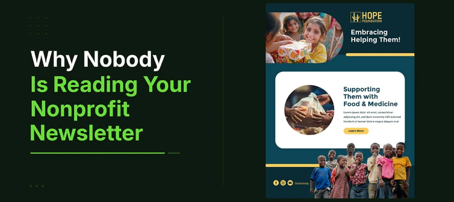
Why nobody is reading your nonprofit newsletter
Nonprofit newsletters go unread for seven design reasons: a guilt-trip subject line, a header image that says nothing, a wall of text, mobile text that nobody can read, no visual hierarchy, a vague call to action buried too late, and an inconsistent visual identity.
Look at each reason why nobody is reading your nonprofit newsletter. To fix your unread newsletter, first admit which design flaw is costing you readers. Don't look for reassurance. Look for the problem. The nonprofit email design tips below only work once you admit the reason.
Let’s see which reason is holding you back.
Reason 1: The subject line signals obligation, not story
A subject line like "March Newsletter from [Organization Name]" isn't really a subject line. It's just a filing label. It tells the subscriber this is a routine email from a group they support. It gives no reason to open it today.
The subject line is the most read part of the whole newsletter. More people read it than open the email. More people read it than see the header image, the lead story, or the call to action. Yet most nonprofit newsletters get their subject line written last, in a rush, just to send the thing out.
Subject lines with above-average open rates share two traits, the same instincts covered in how to tell your nonprofit story visually. They name a clear emotion or spark curiosity. And they stay under 50 characters, so they show fully on any phone screen. "March Newsletter" does neither. "Maria waited three years for this phone call" does both. One gets opened. The other gets archived.
Subject line solution
Rewrite every subject line with a story-first approach. Name the person, moment, or emotional hook before the organization or month. Then test two subject lines on 20 percent of your list first. The winning open rate is real data. It tells you more than any focus group.
The subject line is the door. If it does not open, nothing else matters.
Reason 2: The header image communicates nothing
The header image is the first thing a reader sees after opening the email. For most nonprofit newsletters, it is just a logo on a white background. Or a generic banner from two years ago. Neither one tells the reader anything.
A header image with no message is worse than none at all. It wastes the best visual spot in the email. It tells the reader this newsletter is generic and probably just like the last twelve. It sets the mood for everything after it, and that mood is flat at best, off-putting at worst.
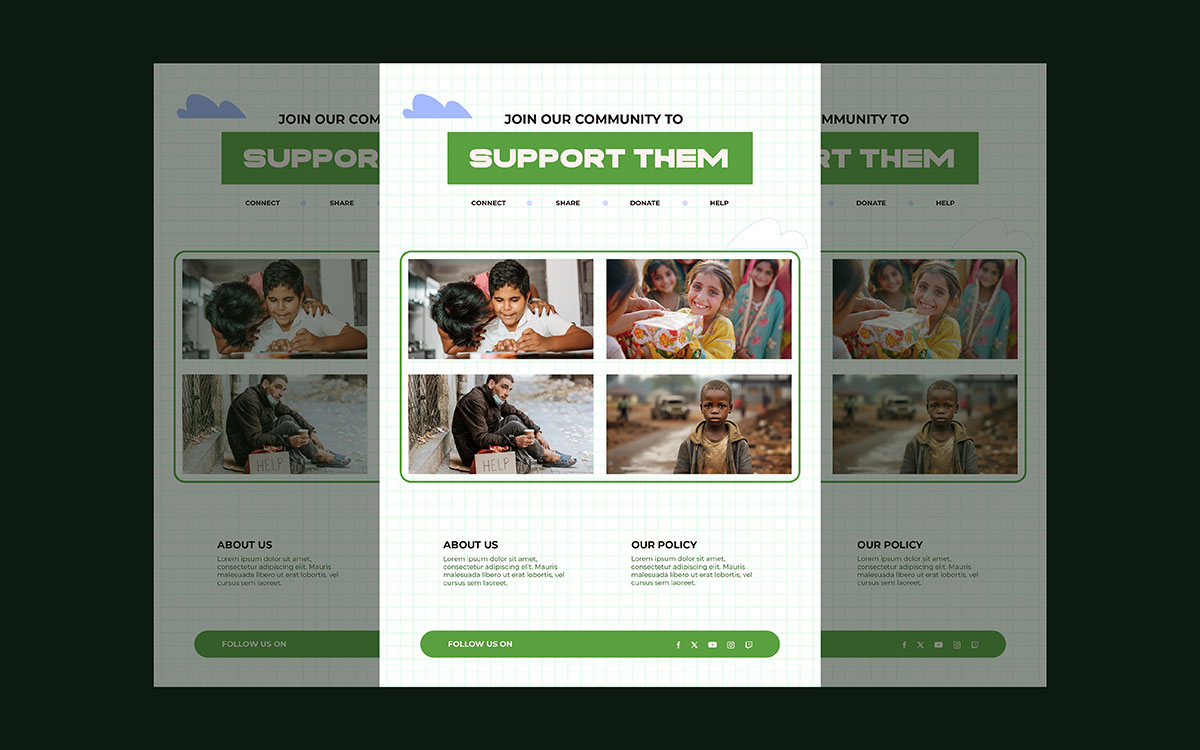
Create an emotional connection to the lead story before the reader even starts the first paragraph. A real photo of a real person from the organization's work, stretched across the full width, with the headline overlaid in large, bold text, tells the reader what the email is about. It makes them feel something in the instant it takes the brain to read an image. That is the header's real job. Showing the logo is not.
Header image solution
Swap the static logo header for a full-width real photo from the organization's latest program. Overlay the lead headline in high-contrast color, at least 32 points. Size the image 600 by 300 pixels so it displays the same way in every email client. Change the header image every issue. New story, new header.
The header is the handshake. Make readers want to stay.
Reason 3: The body is a wall of text
Pull up the last three newsletters your group sent. Check the layout. Now picture reading that on a phone, in a queue, with 47 other emails waiting. How far would you read before closing it? That is what your subscribers face. For most nonprofit newsletters, the answer is: not far. This is why nonprofit newsletter not being read much.
A wall of text creates a cognitive load problem. The brain reads a solid block of text differently than a page with breaks, hierarchy, and scannable parts. Solid text signals hard work ahead. A broken-up, structured page signals a quick, easy story. Most subscribers scan your newsletter like a story, not read it like a report. Design it for scanning.
The rule for newsletter body design takes discipline, not complexity. Keep paragraphs under four lines on mobile, about 80 words. Add an image or visual break every 150 words. Use subheadings before each new topic, sized bigger than body text. Treat white space as a real design tool. These four rules cut the mental effort of reading and help more subscribers reach your call to action.
Body text solution
Redesign the newsletter layout before writing the next issue. Cap paragraphs at 80 words. Add an image or divider every 150 words. Put a bold subheading before each section. Set line spacing to at least 1.5 in the template. Make these changes permanent, not just for one issue.
Nobody reads a wall. Design a path instead.
Reason 4: The typography is unreadable on mobile
Most nonprofit email newsletters use 12 to 13 point body text. At 12 points on a phone held at arm's length, text is barely readable. It needs a still hand, good light, and full attention. Few readers have all three. Most just close the email.
Typography in email affects accessibility. Almost half of all emails open on mobile. Many nonprofit donor lists include subscribers over 55, who often have vision issues. A newsletter with 12-point text on white excludes many people it wants to reach.
Nonprofit newsletters read on mobile need body text of at least 16 points. Headlines should be 24 points or larger. Text and background colors should meet WCAG 2.1 AA standards, a contrast ratio of at least 4.5 to 1. Dark gray text, around hex #333333, on white gives a ratio near 12 to 1. It stays comfortable in almost any light. These are readability standards, not style choices.
Typography solution
Update the email template before the next issue, solid email template design makes this a one-time fix, not a recurring headache. Body text: 16 points minimum. Headline: 24 points or larger. Line height: 1.6. Text color: dark gray, #333333 or darker, on white background.
Test it by sending a preview to a phone. Read it outdoors in natural light. Don't zoom. If you need to zoom, the typography isn't ready.
If they can't read it, they won't read it. Typography isn't decoration. It's access.
Reason 5: There is no visual hierarchy
Open a recent newsletter issue. Ask one question: where does the eye go first? Not where you want it to go. Where does it actually go in the first two seconds?
If the answer is "nowhere" or "not sure," the newsletter has no visual hierarchy. That means every element competes for attention. So no element gets full attention. The lead story, the call to action, the key moment; they all get equal attention. Which means: not much. And this is why nobody is reading your nonprofit newsletter.
Visual hierarchy shows readers what matters most, what matters second, and what can wait. It comes from size, weight, color, and whitespace. A big headline says: start here. A colored subheading says: new section. A bold button after the lead story says: do this. Small gray footer text says: extra info. Without these signals, readers build their own hierarchy. They scan until something catches their eye, or give up.
Map your newsletter's hierarchy before designing any issue. Ask: what must every reader see? Make it the biggest, boldest element. Ask: what action should every reader take? Make it a bold button, visible on the first mobile scroll. Everything else supports. Design it to support, not compete.
Visual solution
Draw a hierarchy map before opening the email template. Use three levels. Primary: lead headline and hero image. Secondary: supporting story, impact stat, community update. Tertiary: event announcement, social links, footer. Use size, weight, and color to make each level clear at a glance.
Hierarchy is about sequence, not importance. It tells the reader where to go next.
Reason 6: The call to action appears too late and asks too little
Most nonprofit newsletters end with a blue link that says "click here" or "donate now." It shows up after 600 to 800 words, right when the reader's interest has already dropped. It asks for money, but gives no reason, no urgency, and no link to the story just read. That's not a call to action. That's just hope.
The psychology behind email calls to action is well known, and it's the same psychology behind why donors keep forgetting your nonprofit after a vague first ask. People act when the ask is specific, timed to their peak interest, and tied to a clear result. "Click here to donate" fails all three. "Give Maria another year of school meals" hits all three.
A nonprofit newsletter's call to action should appear twice. Once right after the main story, before readers move on. Once at the bottom, for those who scan straight to the end. Each should be a button, not a link. The button text should name the exact result, tied to the main story. It should be at least 44 pixels tall, so it's easy to tap on mobile. And its color should stand out clearly from everything else in the email.
Call to action solution
Turn every link CTA in the newsletter into a button. Write button text as [action] plus [result]. Use a bold color not used elsewhere in the email. Put the main CTA right after the lead story, before other content. Keep the second CTA at the bottom for skimmers.
A late, vague ask feels like an afterthought, not a real call to action. Move it up. Make it clear. Make it a button.
Reason 7: The newsletter has no consistent visual identity
Your newsletter is just one touchpoint donors see. They also see your social media, emails, website, and mailed letters. If each one looks different, you never build recognition. Readers won't turn into loyal supporters. A newsletter that looks nothing like your emails or Instagram posts isn't building your brand. It starts from zero every time.
Visual identity means looking like the same organization every time, not looking expensive or polished. Same colors, same fonts, same header style, same button color, same footer, every issue and channel. Consistency builds recognition over time. People trust a familiar newsletter more than a strange one. Trust leads to clicks, reads, and gifts.
Before your next issue, make a one-page design guide as part of your broader nonprofit branding strategy. List the hex codes for your two or three colors. List your two fonts for headlines and body text. Note the approved header image style, button color and shape, and footer layout. Lock these into your email template. Don't change them issue to issue. Update your content every month. Update your design standards once a year, on purpose, not because someone on the team liked something different.
Consistent solution
Build the newsletter design guide this week. Don't wait for free time. Lock the template. Brief every team member who touches the newsletter on the standards. Consistency isn't just a design choice. It's how trust builds over time.
Every inconsistency resets recognition. Consistency makes trust grow.
Nonprofit newsletter design FAQs
Nonprofit newsletter design brings up real questions before every issue goes out. Below are answers to why nobody is reading your nonprofit newsletter, from fixing low open rates to picking the right mobile layout. Each answer starts with a direct fix you can use before your next send.
Most nonprofit newsletters go unopened for three reasons. The subject line sounds like routine news, not a real story. Readers don't recognize the sender. Or the list has too many unengaged subscribers. The first fix is always the subject line. Swap the date and org name for the human story inside.
A good open rate for a nonprofit newsletter is 25 to 35 percent. That beats the sector average of about 21 to 22 percent. Groups that hit above 30 percent share three things. Their email lists stay healthy. Their subject lines feature specific stories, not dates. They send on a steady schedule. This trains subscribers to expect the newsletter.
A nonprofit newsletter needs a mobile-first design. Use a single column layout, max 600 pixels wide. Add a full-width, authentic header image. Body text should be at least 16 points. Keep paragraphs under 80 words. Build a clear visual hierarchy. Place a high-contrast CTA button after the lead story. Stick to a consistent palette of no more than three colors.
A nonprofit newsletter's lead story should run 400 to 500 words. The whole newsletter should take three to four minutes to read. Most people spend under a minute on an email. So one full story, with well-organized extra content, gets the most readers to the call to action.
To boost newsletter click rates, use bold buttons instead of text links. Place the main button right after the lead story. Make button text say exactly what happens next. Keep buttons at least 44 pixels tall for phones. These four changes usually show results within two or three issues.
Endnote
The question of why nobody is reading your nonprofit newsletter was never really about the mission behind it; it was about whether the design gave that mission a fair chance to be seen. Every reason covered here points to the same truth: readers do not skim past a cause they do not believe in; they skim past a layout that makes belief harder to reach.
Knowing the seven reasons is only useful once it changes what your next issue looks like. So the real question now is not what else to learn, but which of these seven fixes gets applied first, this week, before the next send goes out.
If your team has the stories, the mission, and the urgency, but not the design hours to rebuild a subject line, header, or template from scratch, Graphic Design Eye LLC builds newsletter systems, email graphics, and visual templates that turn these seven fixes into a ready-to-send newsletter, so your donors receive something worth opening.
Start with one issue. Redesign one subject line, one header, one call to action button. Then watch what happens when the newsletter finally looks as urgent as the work it describes. Your donors are not tired of your mission. They are just waiting for a newsletter that shows it.
The subscribers on that list are waiting for a newsletter worth opening. Go give them one.
Graphic Design Eye LLC is a full-service creative agency built for brands that demand more than design — they demand vision. From strategic branding to complete visual identity, we partner with startups, agencies, and growing businesses as a dedicated creative force. With flexible subscription and project-based models. Let's start with us today!