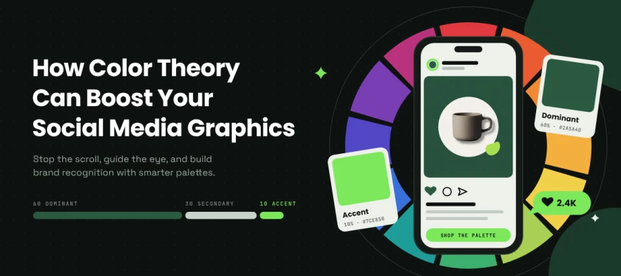
How color theory can boost your social media graphics when your posts keep getting scrolled past? Use contrast to stand out, proportion to guide the eye to your call to action, and consistency to build recognition. The 60/30/10 rule pulls all three together. Give 60 percent of your design to a dominant color, 30 percent to a secondary color, and 10 percent to an accent.
You spent time on the design. The palette was harmonious, the layout was clean, and the post looked good on your screen. Then it went live, and nobody stopped. A good-looking graphic can still get lost in a busy feed, and it’s hard to tell why when nothing looks wrong.
Often the problem is how the color is used, not which colors you picked. The accent shows up on six elements, so nothing stands out. The palette shifts from week to week, so no one recognizes your posts after a hundred scrolls. The call to action blends into the background. These small slips quietly cost you attention across every social media graphic design decision you make.
This guide explains how to use color theory in ten color schemes and helps your social media graphics get noticed, remembered, and shared.
Without further ado, let’s keep reading!
How color theory can boost your social media graphics
Color theory boosts social media graphics when each color scheme is matched to a job, such as stopping the scroll, building cohesion, or making a call to action easy to find. The right scheme depends on your content, your audience, and how your posts look next to everything else in the feed.
The ten color schemes below show how color theory can boost your social media graphics, so you can pick the palette that fits your brand and get your posts noticed.
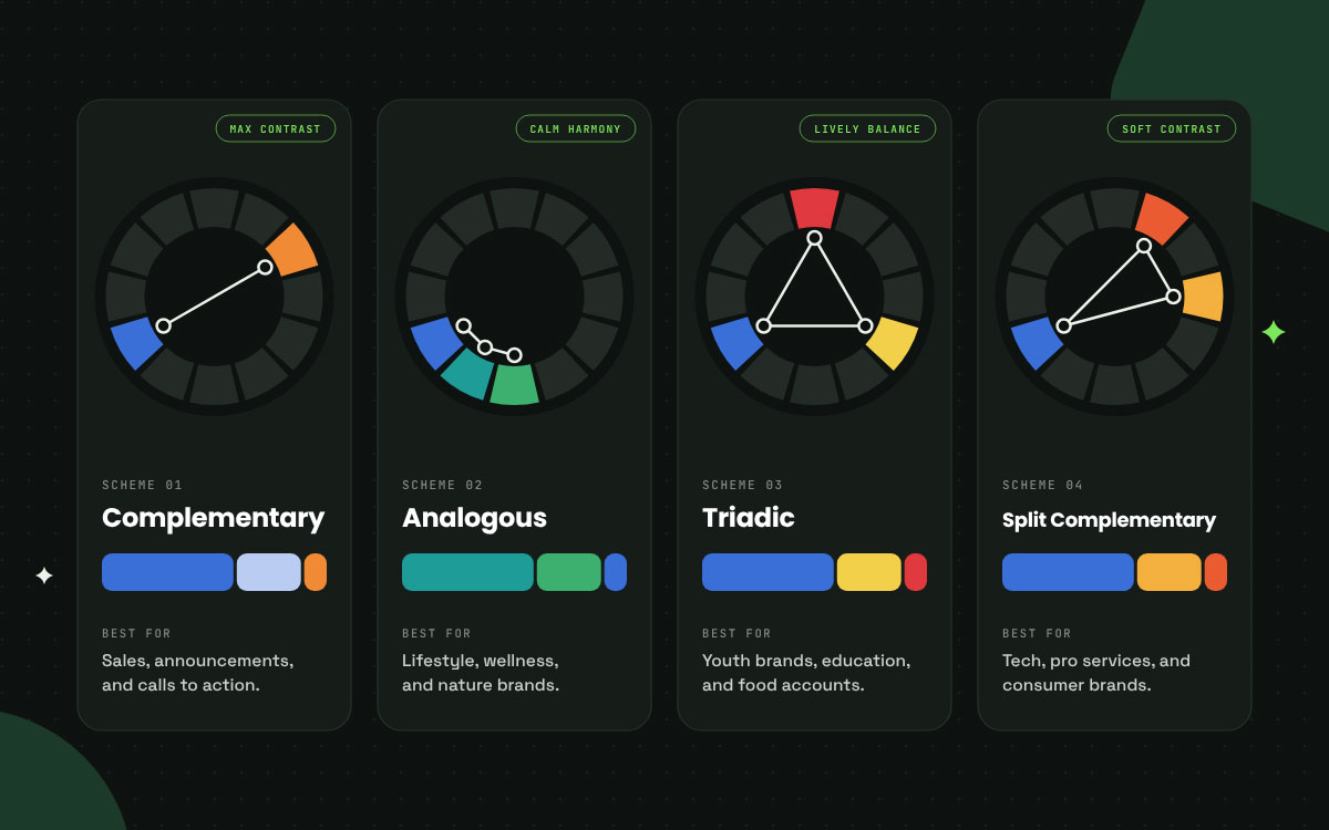
Scheme 1: Complementary
Two colors sit opposite each other on the color wheel, such as blue and orange, red and green, or purple and yellow.
Why it works: This pairing gives you the strongest contrast around, which makes it the most dependable way to stop a scroll. The pull between the two colors creates a visual energy that softer schemes just can't fake.
The caution: Pick one color to lead and let the other play a small supporting role. Split them 50/50, and the colors seem to buzz against each other, which makes everything tough on the eyes.
Best for: Sale posts, announcements, calls to action, and any content that exists to grab attention on purpose.
Scheme 2: Analogous
Three colors that sit side by side on the color wheel, like blue, blue-green, and green.
Why it works: These shades share an underlying pigment, creating harmony and calm. It is the most forgiving scheme for building a cohesive feed, since nothing in it can clash with anything else.
The caution: Contrast runs low by nature, so add a near black or a deep neutral for your type. Analogous schemes trip up on legibility more often than any other scheme here.
Best for: Lifestyle, wellness, nature, and any brand that values cohesion over shock value.
Scheme 3: Triadic
Three colors spaced evenly around the wheel, such as red, yellow, and blue, or orange, green, and purple.
Why it works: The mix feels lively and balanced. You get more variety than a complementary pair, and any two of the three still play off each other with strong contrast.
The caution: Let one color take the lead, using the other two as light accents. Give all three equal weight and the design turns into a circus, which is a mistake nearly everyone makes with this scheme.
Best for: Youth brands, education, food, and any account that needs plenty of energy across a varied mix of content.
Scheme 4: Split complementary
A base color plus the two colors sitting next to its complement.
Why it works: You get most of the contrast of a complementary scheme with far less tension. That makes it easy to keep going across many kinds of content without tiring anyone's eyes.
The caution: Let the base color take the lead and give the two neighbors the supporting roles. Each accent can speak for a different content category.
Best for: Brands that want contrast without harshness. Professional services, technology, and thoughtful consumer brands all fit nicely here.
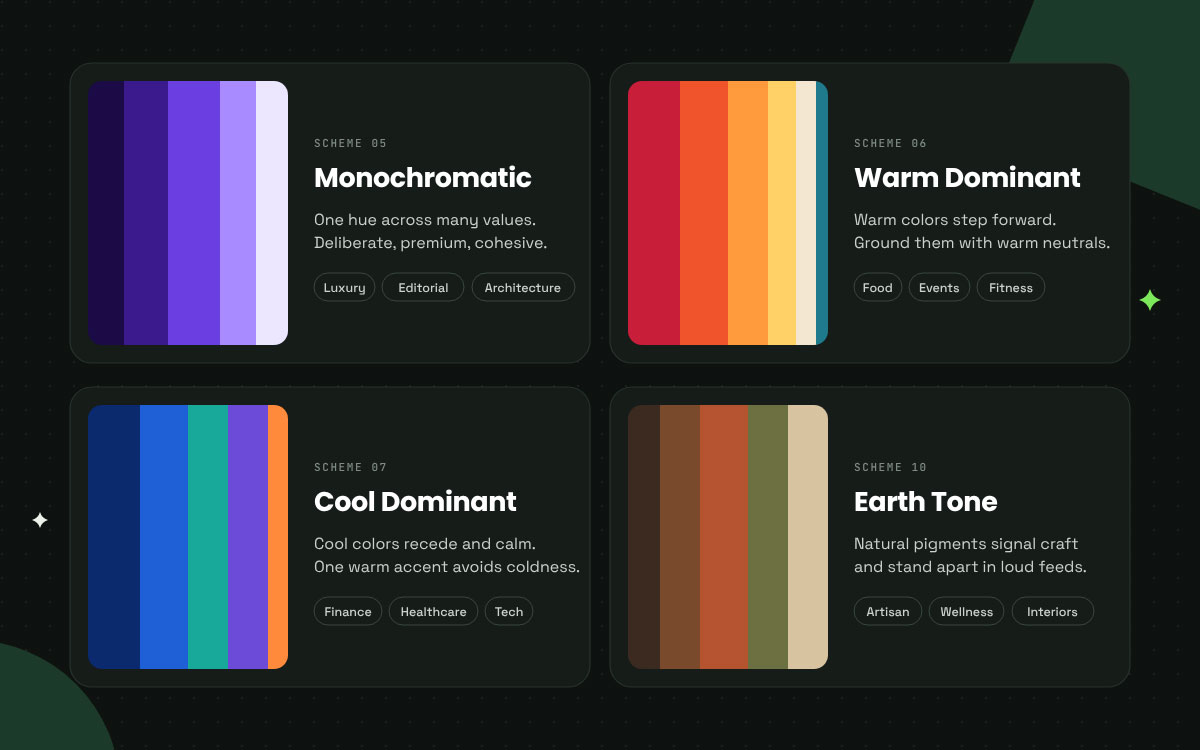
Scheme 5: Monochromatic
One hue shown in many tints, shades, and saturations.
Why it works: It gives you the strongest cohesion around, and it looks deliberate and premium. That makes it a natural match for a thoughtful brand identity design. Hierarchy comes easily too, since the value differences handle the heavy lifting for you.
The caution: Your single hue needs enough range to work with. Bring in a near black and an off-white to stretch the value scale. Without them, the whole design sinks into a hazy blur.
Best for: Luxury, architecture, editorial, and photography. It also suits any brand that builds its whole position on restraint.
Scheme 6: Warm dominant
Reds, oranges, and yellows take the lead, while cool colors show up only as small accents.
Why it works: Warm colors seem to step forward, so they look closer to the viewer. That pull makes them a great fit for urgency, appetite, and energy.
The caution: Warm palettes can feel like too much once the saturation climbs. Ground the design with a warm neutral like cream, sand, or warm gray, and skip the pure white.
Best for: Food, hospitality, events, sales, and fitness.
Scheme 7: Cool dominant
Blues, greens, and purples take the lead, with a few warm accents joining in.
Why it works: Cool colors seem to recede, creating a sense of calm and space. People also tend to link them with trust, stability, and competence, and that link is unusually strong.
The caution: A cool palette can come across as cold or clinical, and hardly any brand wants that. One warm accent fixes the problem and gives the eye a cozy place to rest.
Best for: Finance, healthcare, technology, professional services, and B2B in general.
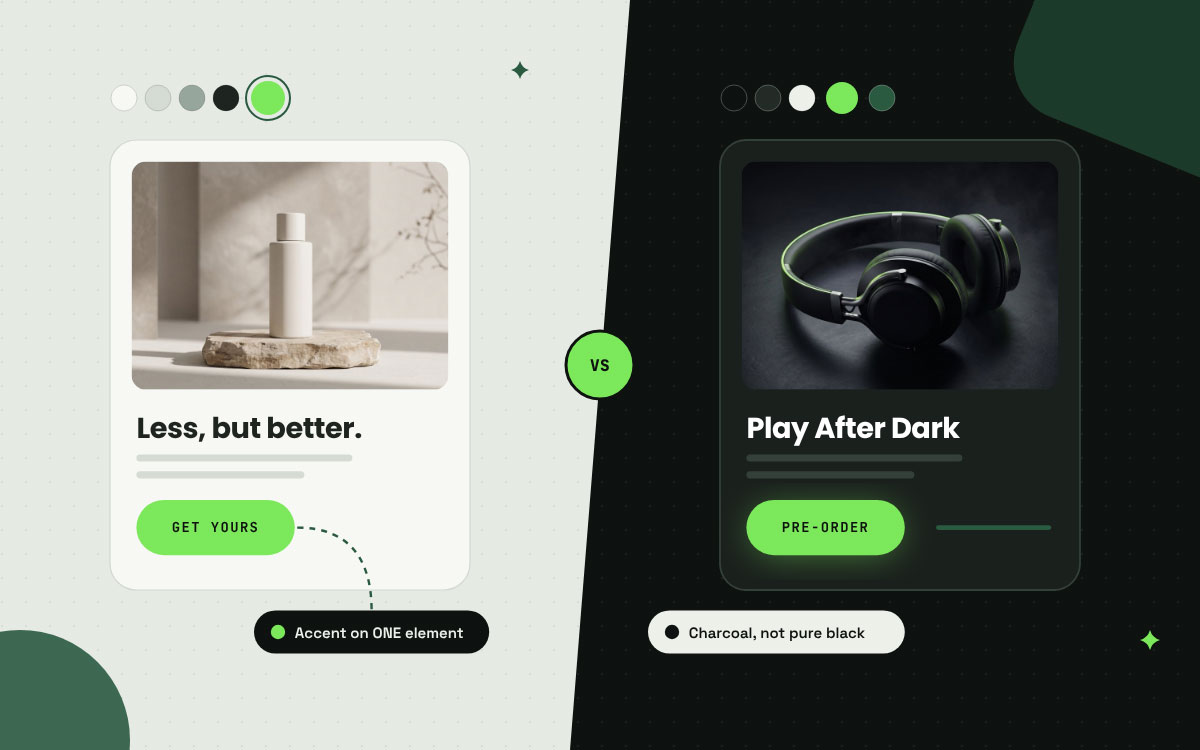
Scheme 8: Neutral plus one
A full neutral palette with one bold, saturated accent color.
Why it works: This is the strongest accent placement you can choose. A single color set against a neutral field draws the eye with no competition. It works best when the accent comes from a truly fixed palette, so picking your brand colors with care must come first, never as an afterthought.
The caution: The accent has to stay rare and show up on just one element per design. Put it on three, and it stops acting as an accent and turns into decoration.
Best for: Any brand that wants a clear call to action and a calm baseline.
Scheme 9: High contrast dark
Deep, near-black backgrounds that carry one or two glowing accent colors.
Why it works: It fits right in with the dark-mode screens where so much social scrolling happens these days, and it brings real drama even when the design is small.
The caution: White text on a pure black background can appear to glow or blur for some readers, especially in dim rooms. Not everyone sees it that way, though. A few studies find that black text on white is easier to read in low light. A deep charcoal with an off-white will look much cleaner and easier on the eyes.
Best for: Gaming, technology, finance, music, and any account whose audience browses in dark mode.
Scheme 10: Earth tone
Muted browns, terracottas, olives, and sands taken from natural pigments.
Why it works: These shades signal authenticity, sustainability, and craft. They stand out for a simple reason. Most social design still leans on loud, saturated brights, so a calm earthy look gets noticed.
The caution: Earth tones tend toward muted colors, but that doesn't mean they're low in contrast. What matters is how far apart the text and its background sit in relative luminance. Pick a pair that reads easily. A deep brown or near-black can do the job nicely, though neither is required.
Best for: Sustainable brands, artisan goods, wellness, hospitality, and interiors.
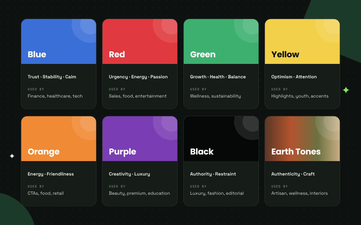
Color associations: A starting point, not a rule
Associations differ from culture to culture and shift with context, so treat the table below as a nudge toward thoughtful choices and not a recipe to follow word for word. Proportion and contrast still matter most when it comes to the big decisions.
Choosing well from that table is the easy part. Applying the choice with discipline is where color theory in social media graphics either works or quietly stops working, and where our guide to social media post ideas picks up the same thread across formats.
Color theory FAQs
Most color questions come down to three choices. Which scheme fits the post, how many colors to use, and how much to trust color psychology all tend to pop up first. These color theory FAQs answer the most common ones briefly, so you can pick colors for your social media graphics with confidence. Have other questions that aren’t covered below? Contact us directly to address your concern.
Color theory helps social media graphics in three ways. Strong contrast stops a scroll, good proportion guides the eye to the key element, and steady color choices build brand recognition across posts. How much of each color you use, through the 60/30/10 rule, usually affects performance more than which colors you pick.
The 60/30/10 rule gives about 60 percent of a design to a dominant color and 30 percent to a secondary color that adds structure. The last 10 percent goes to an accent, saved for the one element you most want noticed. This setup builds a hierarchy on its own and avoids the flat look that comes from using equal amounts of every color.
Complementary schemes work well for posts that need to interrupt a scroll, since opposite colors create the strongest contrast. Analogous and monochromatic schemes help a feed feel cohesive. A neutral base with one accent makes calls to action easy to spot. Pick the scheme that fits the job at hand, because no single favorite wins every time.
Color psychology is real, though people often overstate it. Color can shape mood and carries cultural meaning. Claims that a specific color lifts conversions by a set percentage, however, don’t have strong support. Make your final calls based on contrast, proportion, and how well you stand apart from competitors, and leave the claimed psychological effects out of it.
A social media graphic should use at most three colors, applied using the 60/30/10 rule. Past three, the accent loses its power to create emphasis, and the design becomes visual noise rather than a clear hierarchy. If your palette lacks sufficient contrast for readable text, add a near-black for the typography on its own.
Endnote
At last, it’s a wrap on color, and you now have everything you need to put it to work!
Together, these ten color schemes show how color theory can boost your social media graphics. Some are built for contrast, like complementary and high-contrast dark. Others are built for cohesion, like analogous and monochromatic.
Warm and cool palettes set the mood, a neutral plus one scheme makes your call to action easy to spot, and earth tones bring warmth and authenticity. Behind each of them lies the 60/30/10 rule, which keeps one dominant color, one secondary color, and a small accent in balance.
Key takeaway: Choose fewer colors, use them in steady proportions, and keep your accent for the one or two things you most want noticed.
If you’d rather spend your time on strategy than on testing palettes and rebuilding templates, our social media design service can help. Graphic Design Eye LLC builds consistent, on-brand social graphics, so every post you publish looks like it belongs to the same brand.
Thanks for reading! Your ideas deserve to be seen, and we’re cheering you on!
Graphic Design Eye LLC is a full-service creative agency built for brands that demand more than design — they demand vision. From strategic branding to complete visual identity, we partner with startups, agencies, and growing businesses as a dedicated creative force. With flexible subscription and project-based models. Let's start with us today!