Six design rules and seven challenge formats explain how to create a viral nonprofit awareness campaign. Virality comes from careful design. People must feel proud to share it. The campaign needs one visual style that people recognize right away. Human faces and matching emotions should lead. Every post must carry the campaign hashtag. Sharing should be made easy through a simple activity.
Every nonprofit team behind a campaign that took off has asked what made it work. Was it timing? Luck? The right cause at the right moment? These things matter sometimes. But campaigns that spread again and again share one thing. They were built to be shared.
The mechanics behind viral nonprofit content are not a mystery. You can learn them, repeat them, and improve them each time. Content spreads when it stirs strong feelings, so sharing feels like expressing who you are. It spreads when supporters can join in easily and feel part of something bigger.
Creating a viral nonprofit campaign starts with seeing virality as a design problem. Groups that build campaigns with real reach treat visual design as a core skill. They build participation that makes sharing the easy choice. They create a visual style their community feels proud of.
This guide covers it all: six visual principles for shareable assets, and seven challenge formats that drive user content and community participation.
How to Create a Viral Nonprofit Awareness Campaign
A viral nonprofit campaign needs six design principles before you post anything. Make content people want to share. Keep a consistent visual style. Show human faces with matching emotions. Put the hashtag on every graphic. Give people an easy way to join in. Design for the scroll stop. All the charity challenge campaign design ideas come with examples below.
01. Design for the Share, Not Just the View
A view is passive. A share is an endorsement. When a supporter shares your campaign content, they're telling their network: this deserves your attention, and I want people to know I support it. This social endorsement is how to create a viral nonprofit awareness campaign and reach people beyond the organization's own audience. Designing for the share means asking a different question than most nonprofit content teams ask.
Instead of asking "does this communicate our message?", ask "would a supporter feel proud to post this on their personal Instagram?" The second question is harder to answer, but it leads to content people actually share. A graphic that communicates a message is useful. A graphic that makes a supporter feel good about sharing it goes viral.
Apply it:
✔ Ask if a supporter would be proud to share this on their own feed?
✔ Show your graphic to people outside the organization. Ask them if they would share it without being asked?
✔ Design square at 1080x1080px first. It works on every platform without cropping or reformatting.
✔ Remove anything that makes the graphic feel like an organization announcement instead of a community statement.
02. Create a Campaign Visual Language
A viral campaign looks like a movement. That's because of a campaign visual language. This is a set of visual rules chosen on purpose. They make every piece of content instantly recognizable, no matter who shares it or where it appears, which is why many organizations invest in creative services for nonprofits when building campaign systems.
Here's why that matters. Say a supporter shares your campaign graphic. A week later, their friend sees the campaign again, in a different format. If the visuals are consistent, that friend recognizes it. That recognition builds awareness.
Without a visual language, each post starts from zero. Nobody connects it to anything else. With a visual language, every post builds on the last. The impression grows the whole way through the process of how to create a viral nonprofit awareness campaign.
Apply it:
✔ Pick one color palette (two to three colors) with exact hex codes before designing anything
✔ Choose one display font and one body font. Use them for the whole campaign
✔ Pick one image style: documentary photos, illustrated graphics, or bold text only
✔ Build three to five reusable templates before launch, one for each post type
✔ Every piece of content should be instantly recognizable as part of the campaign, even as a small thumbnail
CASE STUDY: The Power of a Campaign Visual Language
Problem: A wildlife conservation nonprofit ran six campaigns in a row. None of them had a consistent visual identity. Donor surveys showed the problem: campaign recognition was low. Even supporters who had seen several campaigns didn't recognize them as connected.
Solution: In year seven, the team changed its approach. Before producing a single asset, they locked in a campaign visual language. It had three parts: a deep teal and warm sand color palette, one bold sans-serif display font, and documentary photography with a consistent warm orange vignette.
Result: Recognition among existing donors went up significantly. Share rates on social posts rose by over 40 percent compared to the year before. Supporters shared more because the content looked like something worth sharing. The visual language drove that increase, not the message.
03. Lead With Faces and Emotion
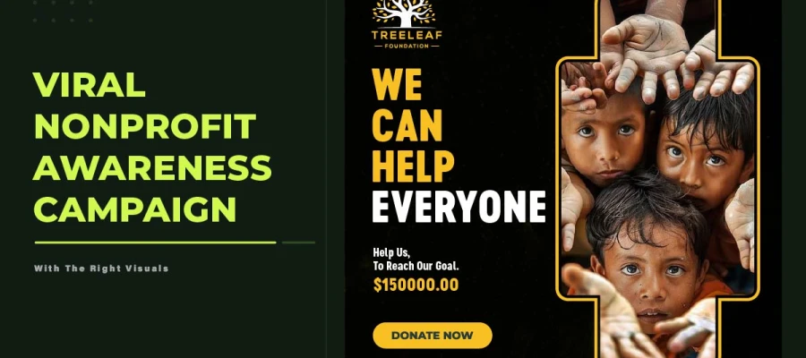
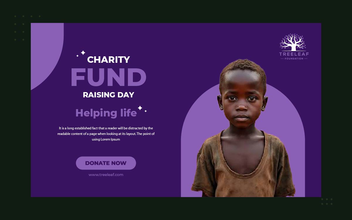
The data on this principle is clear. Social posts with human faces get 38 percent more likes and 32 percent more comments than posts without them. There's a reason for this. The brain processes faces before text, before logos, before almost anything else, making effective nonprofit social media graphics one of the strongest drivers of engagement. So a campaign that leads with a human face has already made its most effective design decision, before anything else is even considered.
Emotion matching is the second part of this principle. Different campaign goals need different emotions in the imagery. An urgent donation campaign works best with imagery that creates sadness and empathy. An awareness campaign works best with imagery that creates hope, joy, or awe. A behavior change campaign works best with imagery that creates surprise or mild discomfort. Matching the emotion to the goal isn't manipulation. It's communication design.
Apply it:
✔ Put human faces front and center on the hero graphic, not off to the side
✔ Emotion order for sharing: joy and hope get the most shares; surprise and awe get the most comments; anger and sadness bring in the most donations
✔ Match the emotion to your goal: use sadness and empathy for urgency campaigns, surprise and awe for awareness, and hope for donation campaigns
✔ Use real photos of actual beneficiaries, staff, and volunteers whenever you can
04. Design the Campaign Hashtag Into Every Asset
A campaign hashtag is a distribution infrastructure and should be planned alongside your overall nonprofit social media content strategy. If the hashtag only appears in the caption, it's indexable, but nobody sees it. If it's designed into the graphic itself, that changes. It becomes part of every screenshot, every reshare, and every piece of user-generated content built from the campaign asset.
Hashtag selection is a strategic decision. Make it before designing any asset. A good campaign hashtag has three qualities. It's specific to the campaign. It's short enough to read at small size in a graphic, under 20 characters. And it isn't already in use by another campaign or community. Before launch, test the hashtag on every major platform. Make sure it's clear.
Apply it:
✔ Make the hashtag big enough to read on the graphic itself.
✔ Keep the hashtag under 20 characters so it fits on one line.
✔ Check if the hashtag is free on Instagram, X, TikTok, and Facebook first.
✔ Set up a Story Highlight or social hub to collect all campaign content and show participants their impact.
05. Create a Participation Mechanic
User-generated content is exactly how to create a viral nonprofit awareness campaign. Every share reaches a network the organization can't otherwise access. But this only happens when participation is easy, rewarding, and feels safe.
Participation mechanics are design choices that make sharing simple, following many of the same principles used in successful fundraising campaign design. A charity challenge with a template you can personalize and share in three taps works well. A campaign needing forms, email confirmation, and multiple links discourages participation. Lower barriers mean higher participation. Higher participation means wider organic reach.
Apply it:
✔ Create a branded template supporters can personalize and share in three taps or less on mobile
✔ Offer different ways to join in: photo challenges, word overlays, pledge graphics, story continuations, five-day challenges
✔ Pre-fill captions, pre-size graphics, and pre-write posts where you can
✔ Publicly reward early participants by featuring their content on the campaign's official channels
CASE STUDY: The Participation Mechanic That Doubled Campaign Reach
Problem: An environmental nonprofit ran an annual awareness campaign. It got steady engagement from current followers but barely reached new people. The campaign depended on followers sharing the group's content instead of making their own.
Solution: The team made a branded word overlay template. It was a simple graphic. Supporters could add one word about what the environment meant to them. Then they shared it on Instagram Stories in under a minute.
Result: Over 600 supporters made and shared their own versions in the first 72 hours. The campaign reached more than 45,000 accounts with no past link to the group. Most of this reach came through the networks of supporters who made and shared their own versions.
06. Design for the Scroll Stop
On a social media feed, people scroll past almost everything by default. A scroll stop happens when a graphic grabs enough attention to break that habit. It holds the viewer long enough to take in the message. Research says this window is about 0.3 seconds.
Scroll stop comes from visual contrast. The graphic must look different from the posts around it. Bold color combinations, striking images, big text, and pattern breaks all work better than polish or refinement. A subtle, well-designed graphic that blends in gets fewer scroll stops than a bold one that stands out.
Apply it:
✔ Bold color contrast beats visual polish for scroll stops in a crowded feed
✔ Try the scroll stop test. Put your graphic in a grid of nine random posts. Does it stand out right away?
✔ Use oversized text. A headline at 60px or bigger on a 1080x1080px canvas grabs attention fast.
✔ Use surprising images. Try a bold crop, an unusual angle, or an unexpected combo.
CASE STUDY: Scroll Stop in Practice
Problem: A humanitarian aid nonprofit made campaign graphics. The team thought they looked polished and professional. But after the campaigns ran, engagement stayed below the sector average.
Solution: The team ran a redesign session using the scroll stop test. They found every graphic used muted, earthy colors. These blended into the same look as followers' feeds. New graphics used bold, contrasting colors and bigger headline text.
Result: The new graphics boosted average post engagement by 62 percent. They also cut the cost per click on paid social ads by 38 percent. The visual style made the difference. The message stayed the same.
Charity Challenge Campaign Design Ideas: 7 Formats That Work
Seven challenge formats work best in the process of how to create a viral nonprofit awareness campaign. Each one includes a real example and the psychology behind why it works. Use this as a starting point for your campaign's participation idea.
01) The Photo Challenge
Participants post a photo of themselves doing something tied to the cause, using the campaign hashtag. This format fits Instagram and TikTok, needs no design skill, and creates real, varied images showing how wide the campaign's community is.
Example:
CleanBeachDay: Supporters photograph themselves picking up litter at a beach, park, or waterway.
NoMeatMonday: Supporters photograph their plant-based meal each Monday.
Why it works: Photo challenges succeed because the content feels personal and real. Seeing the supporter's own face and setting makes it feel genuine, so people share it more with their network.
02) The Word Overlay Template
Participants post a photo of themselves doing something tied to the cause, using the campaign hashtag. This format fits Instagram and TikTok, needs no design skill, and creates real, varied images showing how wide the campaign's community is.
Example:
CleanBeachDay: Supporters photograph themselves picking up litter at a beach, park, or waterway.
NoMeatMonday: Supporters photograph their plant-based meal each Monday.
Why it works: Photo challenges succeed because the content feels personal and real. Seeing the supporter's own face and setting makes it feel genuine, not promotional, so people share it more with their network.
03) The Pledge Graphic
A shareable badge or frame that says "I pledged to [action]" or "I support [cause]." It takes almost no effort. It creates a public commitment. This makes people more likely to follow through. It also brings lots of campaign shares.
Example: An #IWillVote style pledge graphic made for a nonprofit: "I pledge to reduce single-use plastic this month." Supporters can share the badge anywhere.
Why it works: Public commitment triggers consistency bias. People tend to follow through on things they promise publicly. The share spreads the campaign and pushes real behavior change.
04) The Transformation Post
A before-and-after format shows the impact of the organization's work in a single image. It tells a full story in two frames. It needs no caption. The contrast between before and after creates an emotional response.
Example: An environmental nonprofit shows a photo of a damaged habitat, then one after restoration. A housing nonprofit shows a family's situation before and after support from its programs.
Why it works: These posts satisfy our need for closure, a problem introduced and solved. The visual contrast sparks emotion and drives people to share out of hope and belief in the cause.
05) The Gratitude Tag
Here's a format that mixes personal thanks with tagging friends: "I'm grateful for [cause], and I nominate [three friends] to learn more." This nomination spreads the campaign. Each person brings in at least three new people from their network.
Example: A health nonprofit runs a Gratitude Tag campaign. Past participants share what the program meant to them and nominate three friends to learn about the group's work.
Why it works: Gratitude tags mix real personal stories with gentle social pressure. Being nominated feels like a warm introduction, much better than seeing an ad from a brand you don't know.
06) The 5-Day Challenge
Five days of actions, one prompt and graphic each day. This builds community through shared daily habits. One creative effort makes five days of content. It builds lasting momentum, not just a quick spike.
Example: A nutrition nonprofit runs a 5 Day Plant-Powered Challenge. Each day has one task and a graphic.
Day 1: Swap your breakfast
Day 2: Try a new vegetable
Day 3: Cook a meatless dinner
Day 4: Share your favorite plant-based recipe
Day 5: Post your reflection. People share their task and return for the next.
Why it works: five-day challenges build habits and community spirit. Daily engagement keeps the campaign visible in feeds for five days, all from one signup.
07) The Milestone Celebration Graphic
When the campaign hits a big milestone, like 500 donors or 1,000 signatures, the group posts a celebration graphic. It invites the community to share it as co-owners of the win. It turns a progress update into a community moment.
Example: A literacy group posts "We did it: 1,000 books donated." It adds: "Share this if you're one of the 1,000 who made it happen." The graphic shows the milestone and the people behind it.
Why it works: These graphics spark shared ownership. A donor sharing this is celebrating their own success. That shift boosts share rates a lot.
Pre-Launch Visual Campaign Checklist
Finish every item on this checklist before you publish the first campaign content. Unchecked items are known risks for poor campaign results.
VISUAL IDENTITY
Campaign colors locked with exact hex codes as part of a consistent branding design system.
Display and body fonts confirmed
Image style defined and written down
Logo rules for campaign assets confirmed
Hashtag picked, tested on all platforms, and available
ASSET PRODUCTION
Hero square graphic (1080x1080px) made and approved
Three graphic versions (hero, stat, countdown) made
Story format (1080x1920px) with CTA in top third
Template for the challenge activity made
Sharing kit for board and ambassadors with captions ready to use
SCROLL STOP TEST
Test the hero graphic in a grid with nine other posts. Does it stand out?
Main message reads clearly at 200px wide (thumbnail size)
Color contrast meets WCAG 2.1 AA using Adobe Color
CTA shows above the fold on a 375px mobile screen
Three outsiders saw the hero graphic on their own and would share it
AMPLIFICATION READINESS
At least 10 board members or ambassadors ready to share on day one
Partners given a clear request and deadline to share
Sharing kit sent to all sharers 48 hours before launch
Some ad budget set aside, even just $5 to $10 a day
Hashtag page or Story Highlight made and live before launch
Nonprofit Viral Campaign FAQs
When you come to know how to create a viral nonprofit awareness campaign, it raises some questions before every launch: what makes content spread, which formats work best, what budget is needed, and whether strong visuals can make up for a small distribution network. The answers below cover each one directly.
Focus on the images that match the mood. Find a way for supporters to join in with three taps. Keep a visual style that stands out and stays recognizable, and a network of sharers ready to post on day one.
The most shareable formats are short beneficiary videos, charity challenges with templates supporters can personalize, story campaigns that follow one person's progress, and pledge graphics people share as public commitments. The right choice depends on your audience and platform.
Strong ideas include hashtag photo challenges, word overlay templates supporters can personalize, and pledge badges showing public commitment. Also, five-day action challenges with daily prompts, and milestone graphics supporters share as achievements. Each makes joining easy and rewarding.
Visuals drive shares the most. Posts with custom graphics get three times more shares than plain text ones. A consistent visual style gets recognized faster too. It reaches new people beyond your usual audience.
Spend your budget on three to five strong core graphics, not many weak ones. Use free design tools with templates for consistency. Ask volunteers for photography. Get staff, board, and partners to share first, before paying to boost reach.
Endnote
Knowing how to create a viral nonprofit awareness campaign requires intention. The six principles and seven formats in this guide only work if you apply them before launch.
Reading the principles is easy. Turning them into real graphics, templates, and challenge assets on a tight timeline is where teams lose momentum. That is where Graphic Design Eye's unlimited design subscription helps. You get a dedicated designer who builds your campaign visuals, hero graphics, and templates on demand. Nothing sits waiting while your launch moment passes.
You do not need a bigger team or budget to make a campaign spread. You need the right visuals, made consistently, by people who know what makes supporters share.
Explore Graphic Design Eye's design subscription plans. Give your campaign the visual foundation to reach beyond your own audience.
The cause deserves to be seen. Design it so it will be.
Graphic Design Eye LLC is a full-service creative agency built for brands that demand more than design — they demand vision. From strategic branding to complete visual identity, we partner with startups, agencies, and growing businesses as a dedicated creative force. With flexible subscription and project-based models. Let's start with us today!