How to make the best YouTube thumbnails starts with the specification. Set the canvas at 1280 by 720 pixels on a 16: 9 ratio, use one clear subject, three to five words of heavy, high-contrast type, and colors that separate from the YouTube interface. Keep faces and text out of the bottom right corner. Export as JPG under 2MB, then test one variable at a time.
A good upload can still fail quietly. Great research, patient editing, clean audio. Yet the views barely move. Most creators blame the algorithm or the topic. The real problem usually sits in one small rectangle, fighting for attention among twenty others in a crowded feed.
This guide covers a ten-step process you can repeat on every upload. Layout formulas that keep view counts steady on top channels. You will also learn small mistakes that quietly cost clicks, and a simple testing method that replaces guesswork with real data from your audience. So, let’s go and discover them right now!
How to make the best YouTube thumbnails
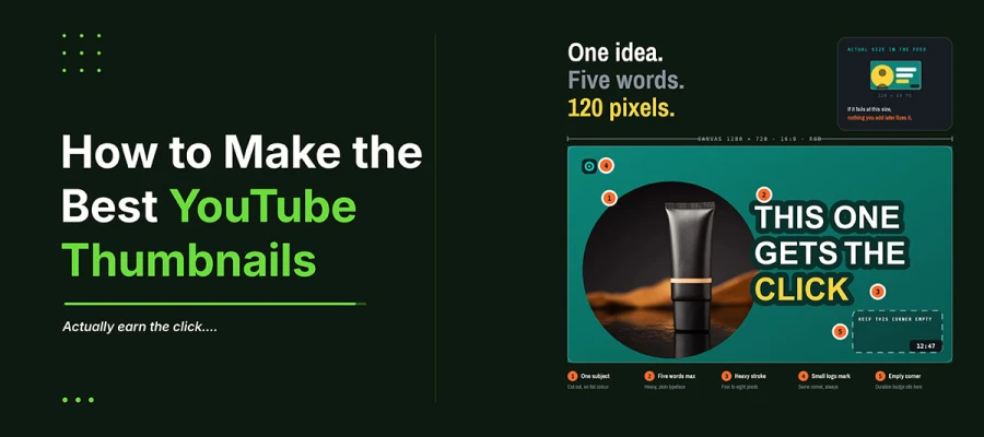
The process of how to make the best YouTube thumbnails follows ten steps. Pick one clear idea. Build the canvas at 1280 by 720 pixels. Shoot a dedicated hero image. Isolate the subject. Add bold type and strong contrast. Use a protective stroke. Keep branding small. Test the design at thumbnail size. Export under 2MB. Lastly, track click through rate before changing anything. Keep reading.
Step 1. Decide the single idea the thumbnail must communicate
Write one sentence about what viewers should get at a glance. Focus on the promise, not the topic. If you can't compress it into one line, the thumbnail won't either. Stick to one promise per thumbnail. If a frame needs two ideas, fix the title or concept instead.
Step 2. Set the canvas to 1280 by 720 pixels
Start a new document at 1280 by 720 pixels in RGB. Enlarging a smaller image later causes blur; no filter fixes. Working at the right size keeps type, strokes, and margins accurate after compression.
Step 3. Choose or shoot the hero image
The best thumbnails use images shot on purpose, not pulled from footage. Take a few stills right after filming, while lighting is set. Photograph products against a plain wall. Frames from compressed video show blur once scaled up.
Step 4. Isolate the subject from the background
Cut out the subject and place it on a clean background. This helps a face or product survive shrinking to about 120 pixels wide, since viewers see a clear shape, not clutter. Many social media post design ideas use cutouts on flat color for this reason. Feather the edge slightly so it looks natural.
Step 5. Build contrast between subject, background, and interface
Squint at your layout. If the subject blends into the background, the thumbnail already fails. Strong contrast, light against dark, helps small-scale visibility more than color tricks. Avoid red, white, and near black, since they blend into YouTube's own interface.
Step 6. Add three to five words of heavy type
Choose a bold and plain typeface, nothing decorative. Keep text to three to five words. Make it raise a question. The video answers. Set the type large enough to fill part of the frame. Never repeat the title word for word.
Step 7. Add a stroke or shadow so the type survives any background
Legibility should never depend on the background image. Add a contrasting outline. Dark type gets a light stroke, light type gets a dark one. Keep it about four to eight pixels wide at full size. A soft shadow underneath adds separation. This step alone keeps type readable over busy backgrounds.
Step 8. Place branding without letting it compete
A small mark in a fixed upper corner is enough. Branding works like a signature there, small and quiet. Anything bigger pulls attention from the subject. Consistent placement matters more than size, since repetition builds recognition. If your logo cannot hold up at small scale, hunt for a logo design service. Keep branding out of the lower right corner. The duration badge sits there.
Step 9. Check the composition at thumbnail scale
Shrink the image to about 120 pixels wide and look honestly. Better yet, view it on a phone at arm's length. This catches most problems: illegible type, blank faces, clutter near the duration badge. If it fails at that size, nothing you add later will fix it.
Step 10. Export, verify the file size, then upload and test
Export as JPG at eighty-five to ninety percent quality. Keep the file under 2MB. Upload through YouTube Studio. Record the click-through rate before changing anything, since that starting number makes later comparisons meaningful. Use the native test and compare tool. Change one element at a time and wait for enough impressions before judging.
7 Design rules behind every high-performing thumbnail
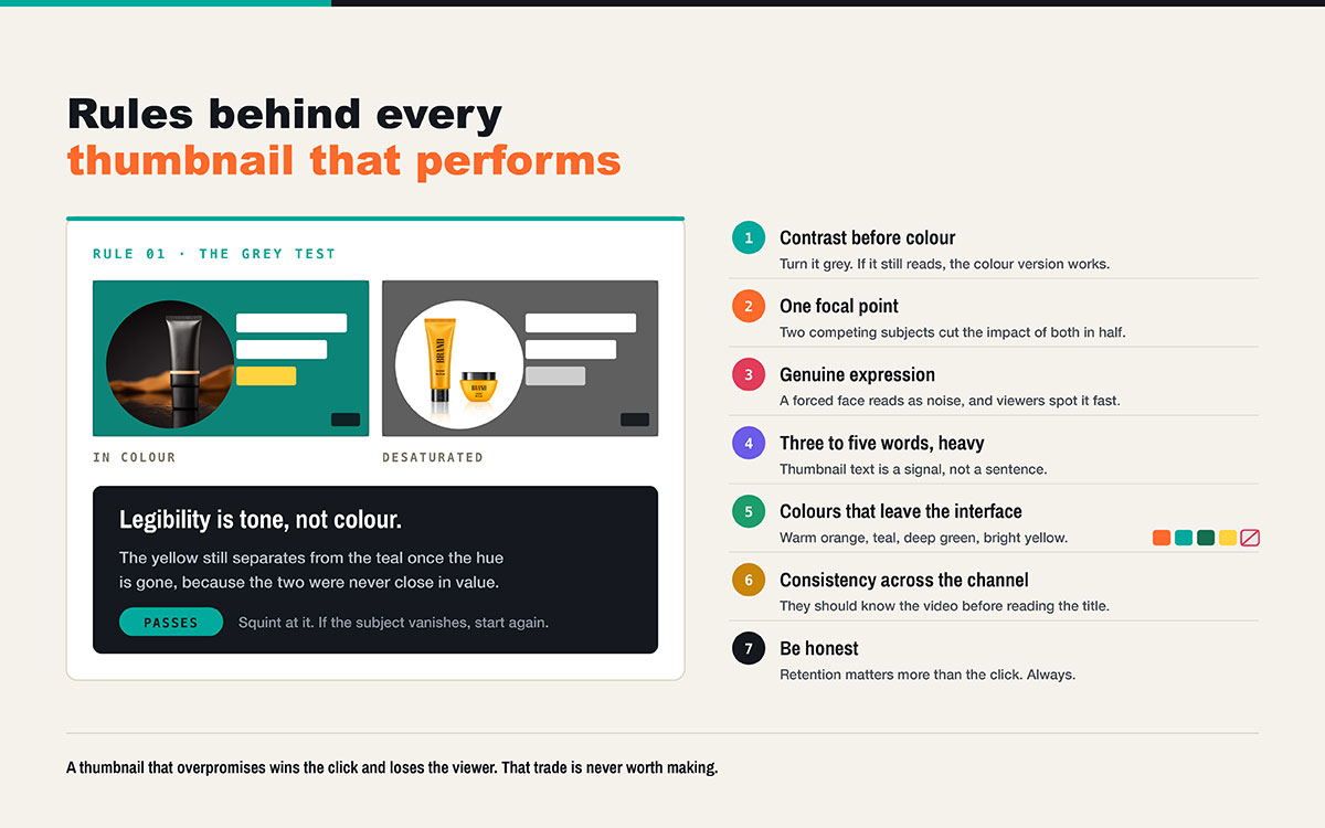
Seven rules separate strong thumbnails from weak ones. Prioritize contrast over color. Keep one focal point. Use real facial expressions. Limit text to three to five bold words. Choose colors that stand out from the interface. Stay visually consistent across your channel. And never mislead viewers with false promises.
This is how to make the best YouTube thumbnails for your hard-worked content:
1. Contrast before color
Legibility at small size is about tone, not color. Turn your thumbnail gray. If it still reads, the color version works.
2. One focal point
Two competing subjects cut the impact of both. Decide what the eye sees first. Make everything else support that.
3. Human faces earn attention when the expression is genuine
A genuine expression that fits the content draws the eye. A forced expression reads as noise. Viewers spot it fast.
4. Three to five words, set heavy
Thumbnail text is a signal, not a sentence. Longer text turns into texture at feed size.
5. Choose colors that separate from the interface
Warm orange, teal, deep green and bright yellow pop against the platform. Plain red and white blend in.
6. Design for consistency across the channel
Viewers should know your video before reading the title. Same fonts, same crop style, and same colors build that over time.
7. Be honest
A thumbnail that overpromises gets the click but loses the viewer. Retention matters more than the click. One misleading thumbnail can break trust built over months.
6 Thumbnail layout formulas that work
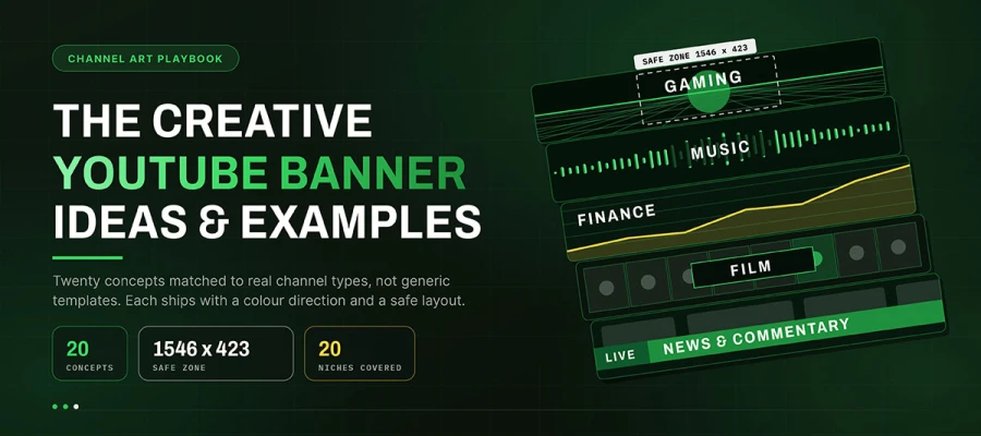
Most high-performing thumbnails are variations on a small number of compositional structures. Learning them shortens production time and gives a channel visual coherence, the same way studying YouTube banner ideas by channel type reveals recurring structures rather than unique inventions each time.
Layout formula
Best used for
Composition note
Subject left, type right
Tutorials, commentary, talking head content
The most reliable structure, mirroring natural reading direction
Split screen comparison
Before and after, versus content, product reviews
Divide vertically and keep both halves tonally distinct
Close-up expression
Reactions, storytelling, personal channels
Crop tight enough that the expression reads at 120 pixels
Object isolation
Unboxing, product demonstrations, gear reviews
One object, clean background, strong rim separation
Numbered or listed
Roundups, rankings, tips content
A single large numeral carries further than a full sentence
Annotated frame
Analysis, tutorials, breakdowns
A circle or arrow directing the eye, used once and only once
Subject left, type right
The classic layout. The eye enters left, meets a face or product, then flows into the copy. It works for almost any spoken content. Use it when unsure.
Split screen comparison
A vertical split creates instant tension. That's why before and after content works so well. Keep both halves different in tone so it reads even when small.
Close-up expression
Crop tight so the face fills the frame. It relies on genuine and clear emotion. Good lighting matters most here.
Object isolation
One object, one clean background, and soft light or shadow lifting it. Simplicity is the goal. Product shots usually fail from clutter, not bad photography.
Numbered or listed
One big number says as much as a sentence. It survives shrinking well. Add two or three words with it, nothing more.
Annotated frame
A circle or arrow points to what matters. Use only one. Two annotations create noise instead of focus.
9 Mistakes that ruin a YouTube thumbnail
These 9 mistakes usually ruin YouTube thumbnails. Text or faces in the lower right corner. More than five words of text. Thin fonts. Colors that blend into the interface. Low-resolution images. Cluttered designs. Misleading claims. Inconsistent styles across videos. Ignoring file size limits. Each one takes minutes to fix once you spot it.
Placing text or faces in the lower right corner: The duration badge covers that spot. You can't move it. Leave that corner empty.
Using more than five words of copy: Longer lines turn into blur at feed size. Cut down to the main point.
Choosing thin or decorative typefaces: Thin strokes disappear under compression. Use bold fonts. Let the image show your style.
Building on plain red, white, or near black: These colors blend into the platform interface. Your thumbnail fades into the page. Change the palette.
Pulling low-resolution stills from the timeline: Compressed video frames have flaws that get worse when scaled. Capture stills on purpose instead.
Overcrowding the composition: Three or four competing elements leave viewers no clear starting point. Keep one subject as the focus.
Promising what the video never delivers: Viewers click, then leave within thirty seconds. That tells the platform your video is worse than getting no clicks at all.
Styling every upload differently: Without a consistent look, even loyal viewers need to check the channel name to recognize you. That small effort adds up.
Ignoring the file size limit: Finding an upload error at publish time, with a release already scheduled, causes a delay you could have avoided.
Make the best YouTube thumbnails FAQs
This FAQ answers common questions about how to make the best YouTube thumbnails. It covers ideal dimensions and file size, JPG versus PNG, why custom thumbnails get rejected, what drives clicks, word limits, whether faces help, custom covers for Shorts, A/B testing, and free design tools. Each answer clears up a spec detail or a design instinct worth checking.
For further queries, you can always contact us. Your concern is our concern as well.
The best size for a YouTube thumbnail is 1280 by 720 pixels, a 16 by 9 ratio. YouTube allows a minimum of 640 pixels, but that size looks soft on modern screens because YouTube scales images up, not down.
A YouTube thumbnail can be up to 2MB under the standard limit. YouTube is rolling out a 50MB allowance for TV and 4K thumbnails, with podcast thumbnails capped at 10MB. Until that applies to your account, stay under 2MB, ideally 200KB to 1MB.
JPG works best for photo thumbnails, since it gives smaller files at the same quality. PNG suits thumbnails with sharp graphic edges or text. PNG files grow fast at 1280 by 720 and can pass the size limit.
The most common reason is an unverified channel. Add and confirm a phone number in YouTube Studio, then refresh the upload page. If you're verified, the rejection is likely due to file size or dimensions.
Strong contrast, one clear focal point, a readable expression, and three to five words of bold text all help. Most of all, it needs a promise the video actually keeps. Clicks earned by exaggerating get returned fast and hurt performance.
Use three to five words. Thumbnails can shrink to about 120 pixels wide on mobile, where longer text turns unreadable. Treat the words as a signal, something that raises a question the video answers.
Yes, since people are wired to notice expressive faces. But the expression must match the content. Exaggerated emotion is now so common that viewers discount it, weakening the effect.
Not directly. Shorts use a frame pulled from the clip during upload instead of a custom image. Plan a strong, well-lit frame while filming so a good cover exists before editing.
Yes, YouTube Studio's test and compare tool lets you A/B test thumbnails on real viewers and shows the results. Change one thing per test, whether it's the expression, the text, or the background, and wait for enough views before deciding.
Use template-based tools such as Canva, Photopea, or GIMP. Popular free templates show up on thousands of channels, so you need original photos, a distinct palette, and confident text to stand out.
Endnote
Learning how to make the best YouTube thumbnails is what closes the gap between the effort you put into a video and the attention it actually earns. The specifications and rules above give you a repeatable system. What remains is applying that system consistently, upload after upload, without the process eating into the time you should be spending on the content itself.
If isolating a clean subject, correcting color, or polishing a hero image is the part slowing you down, Graphic Design Eye LLC provides thumbnails, background, template and social media design services handle that production work in a one-time package and subscription pricing. With our service, your every thumbnail can reach the standard this guide describes.
Start with your next upload. Apply the ten-step process, check the composition at thumbnail scale, and let the design carry the promise your video keeps.
The thumbnail takes minutes to make but decides whether the hours behind it were ever seen at all.
Graphic Design Eye LLC is a full-service creative agency built for brands that demand more than design — they demand vision. From strategic branding to complete visual identity, we partner with startups, agencies, and growing businesses as a dedicated creative force. With flexible subscription and project-based models. Let's start with us today!