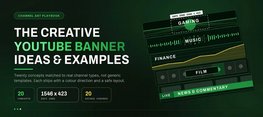
The best YouTube banner ideas start with the channel's content type. A gaming audience and a finance audience read visuals very differently. This guide shares 20 banner concepts by channel type. Each one has a creative direction, a colour palette, and why it fits that audience. Every concept keeps key elements inside the 1546 x 423 pixel safe zone. A selection framework follows to help you choose.
If you search for YouTube banner design ideas, you'll find hundreds of nice rectangles. But they share a similar problem. They are made as design exercises. A gradient with a channel name looks fine. But it could fit any channel. Swap the name, and it works for crypto, knitting, or true crime too. That means it does no real work.
A banner that earns a subscribe does more. It shows the content type before anyone reads a word. Visual styles differ a lot between niches. Gaming audiences expect neon colours, high saturation, and bold shapes. Finance audiences see the same style as untrustworthy. Cooking audiences expect warmth and natural light. Tech audiences expect precision and dark mode. These aren't random preferences. They're learned patterns. Working with them beats fighting them.
The 20 YouTube banner design ideas below follow this idea. Each one starts with what an audience already expects, then adds its own creative twist. You’ll also get the creative concept here. For where elements should sit, check the companion guide on YouTube banner layouts and safe zone specifications. It covers the full-size table and device crop details. Let’s dig into exploring more.
20 YouTube banner ideas
All the best YouTube banner ideas require a different banner strategy. Gaming channels use neon grids, cooking channels use ingredient flatlays, and finance channels use rising data lines. Below are 20 YouTube banner concepts matched to specific niches, each built with a clear concept, colour direction, and safe zone placement for mobile crops. Hmm, read on.
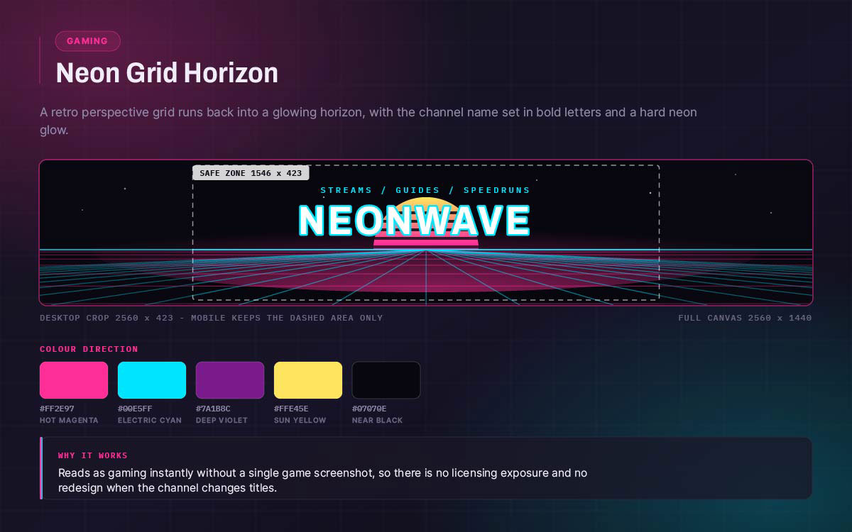
01. Gaming, neon grid horizon
A retro grid lines up and fades into a glowing horizon. The channel name sits in bold letters with a glow around it.
Colour direction: Bright magenta and cyan on near black. Bold and clearly artificial.
It feels like gaming right away, with no game images used. This also avoids licensing problems.
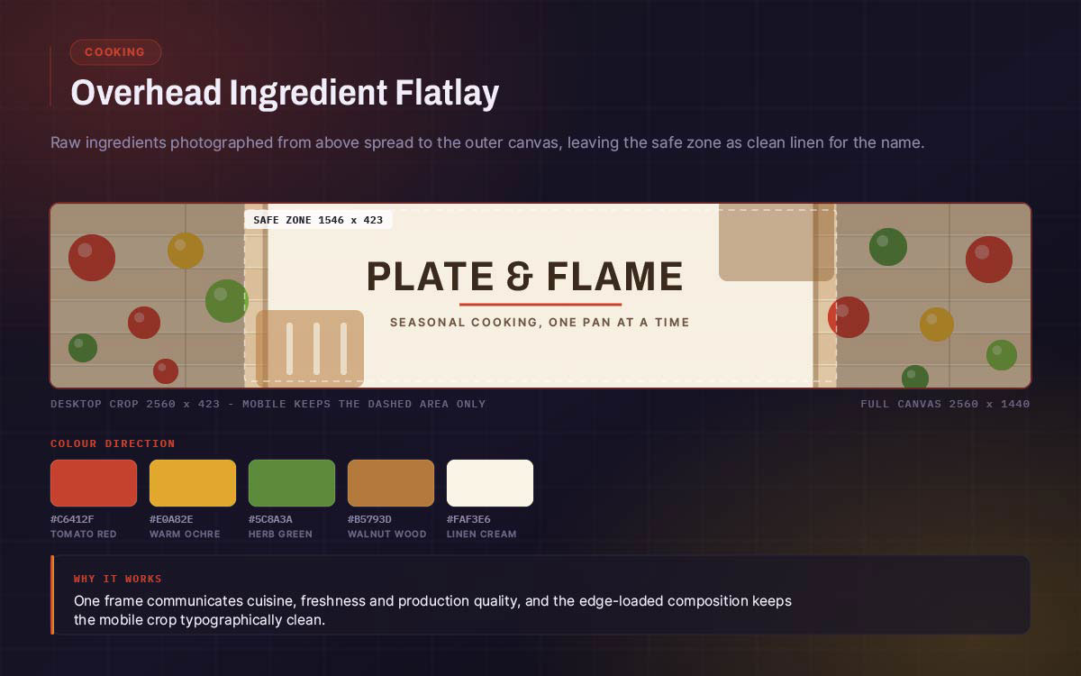
02. Cooking, overhead ingredient flatlay
A photo from above shows raw ingredients spread across the canvas. The safe zone stays empty so the channel name sits on clean space.
Colour direction: Warm natural tones. Wood, linen, green, and red produce. The photo carries the colours. It shows the cuisine, freshness, and quality in one shot.
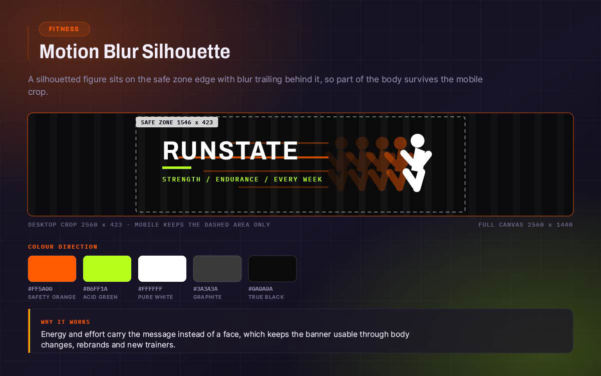
03. Fitness, motion blur silhouette
A silhouetted figure moves with motion blur trailing behind. It sits on the safe zone edge. Part of the figure survives the mobile crop. The text stays clear of it.
Colour direction: High-contrast black and white. One bold accent colour, like safety orange or acid green.
Shows energy and effort without a face. This keeps it usable for a long time.
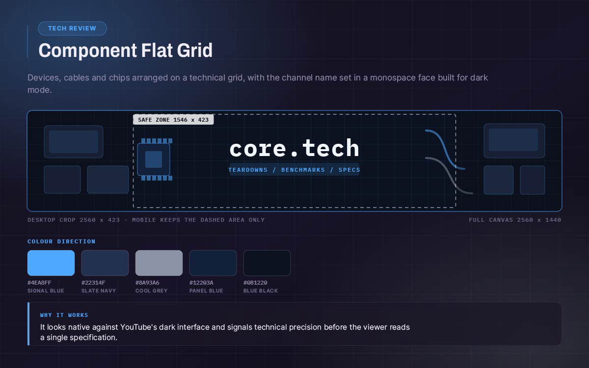
04. Tech review, component flat grid
Product shapes like devices, cables, and chips. Arranged on a technical grid. Channel name in a monospace font.
Colour direction: Cool greys and deep blue-black. One bright accent colour. Built for dark mode.
Feels technically precise. Looks right on YouTube's dark interface.
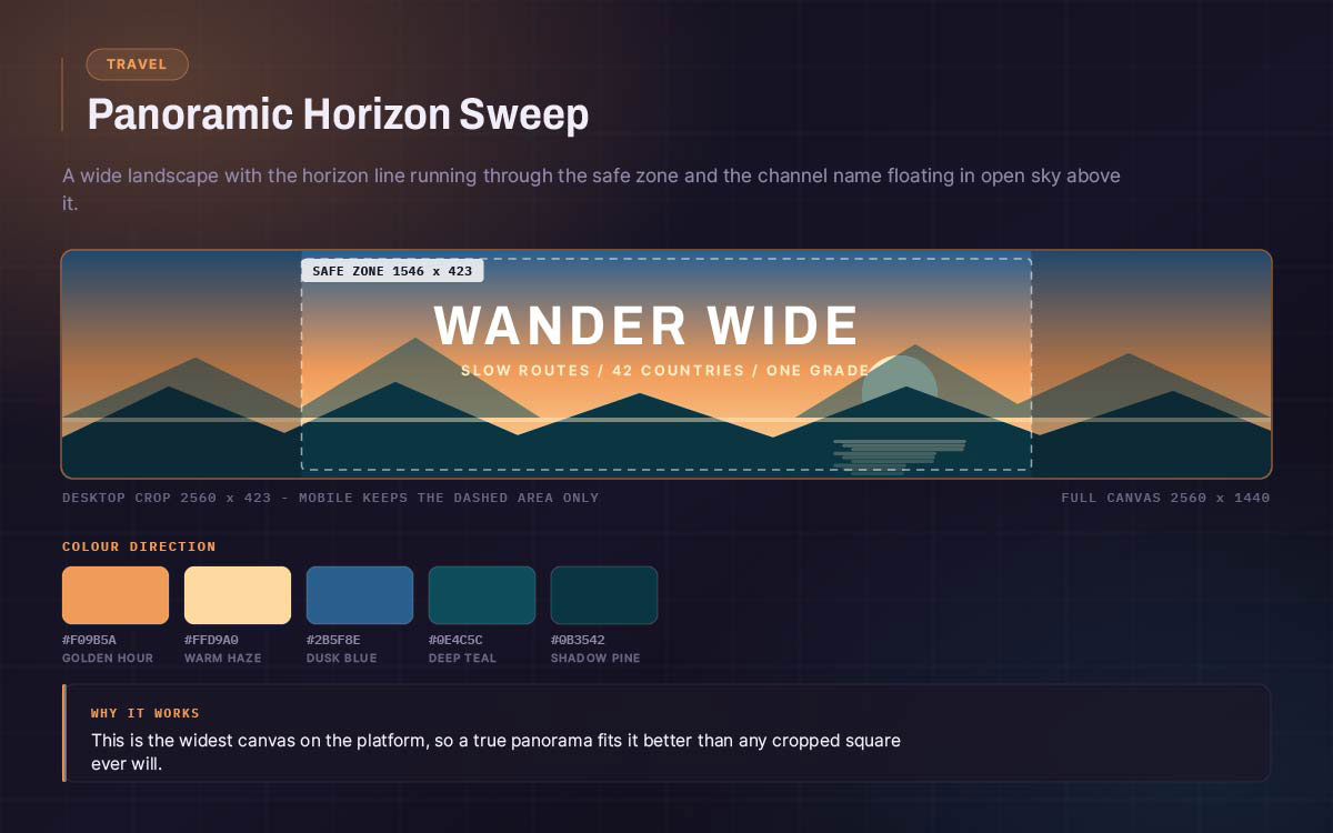
05. Travel, panoramic horizon sweep
A wide landscape photo. The horizon sits in the safe zone. The channel name sits in the sky above it.
Colour direction: Use whatever the landscape gives. Keep one grade across every refresh.
This format is the widest on the platform. It suits panoramic photos best.
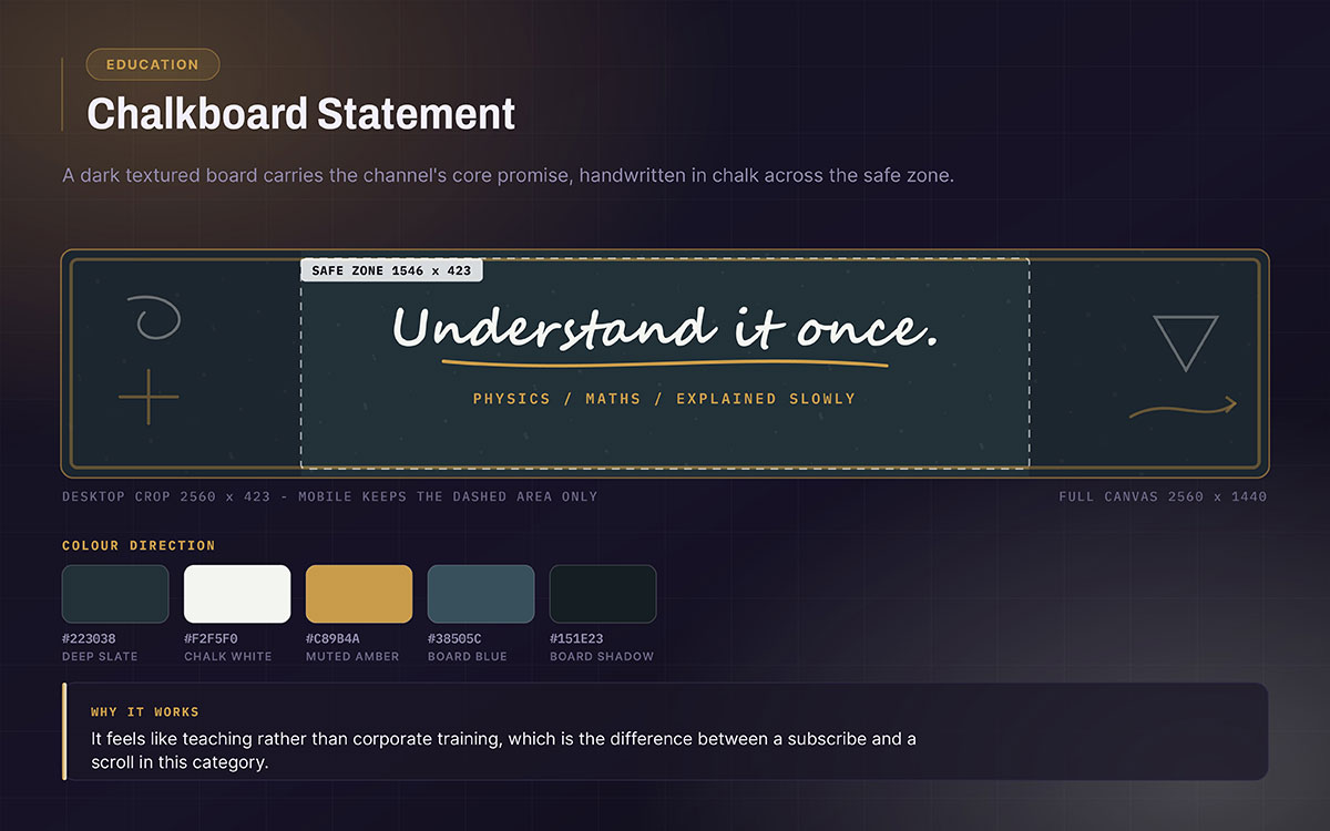
06. Education, chalkboard statement
A dark, textured background. The channel's main promise is handwritten in chalk style across the safe zone.
Colour direction: Deep slate background, chalk white, one muted primary accent.
It feels like teaching right away. Not corporate. Not clinical.
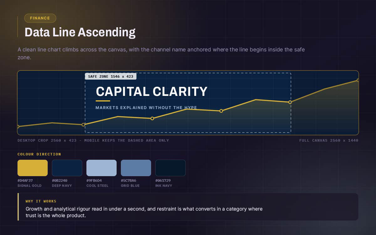
07. Finance, data line ascending
A clean line chart rises across the canvas. The channel name sits where the line starts, inside the safe zone.
Colour direction: deep navy or forest background. One gold or green line. Simple and trustworthy.
Shows growth and sharp analysis. In this category, trust matters most for conversions.
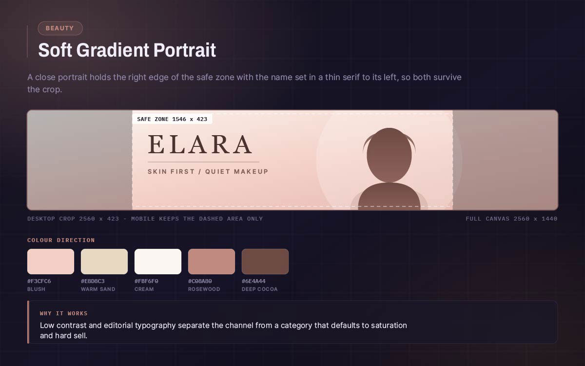
08. Beauty, soft gradient portrait
A close-up portrait sits at the right edge of the safe zone. The channel name sits to the left in a thin serif font. This way both the face and the name survive the mobile crop.
Colour direction: Blush, sand, and cream, with one deeper tone. Low contrast. High sophistication.
Editorial, not commercial. This sets it apart from the category norm.
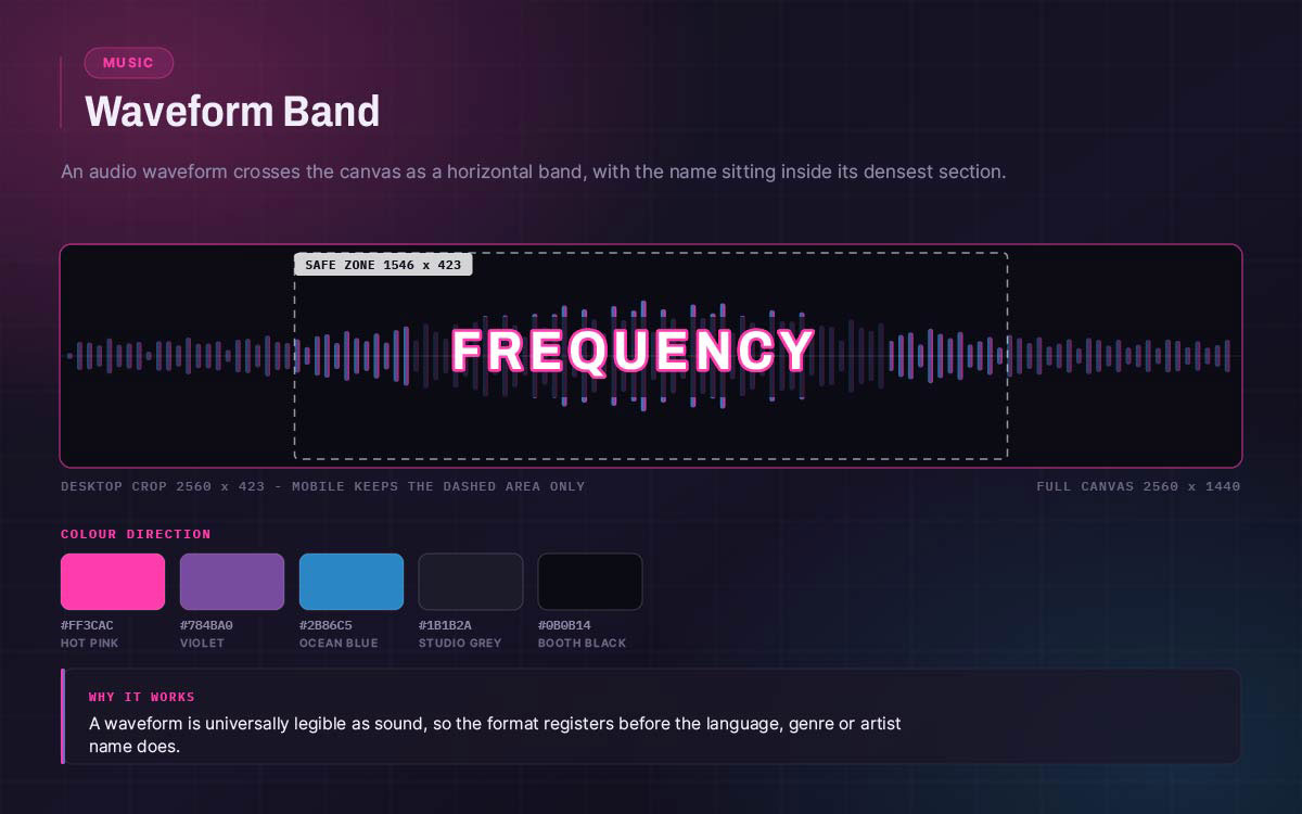
09. Music, waveform band
An audio waveform crosses the canvas as a horizontal band. The channel name sits inside the densest part, within the safe zone.
Colour direction: Dark background with a bright gradient through the waveform.
Anyone, anywhere, can tell it's audio content.
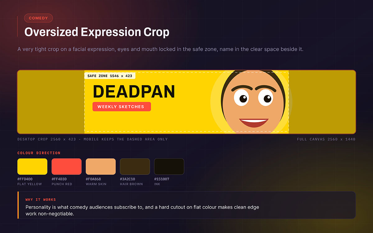
10. Comedy, oversized expression crop
A very close crop on a facial expression. The eyes and mouth sit in the safe zone. The channel name sits in clear space beside them. The expression is the whole signal. It cannot get cropped out.
Colour direction: A bright and bold flat background behind a cutout portrait.
A tight cutout on a flat background shows every flaw. Rough edges around hair and jaw show up clearly. This concept is as much a background removal task as a compositional one.
It is personality forward. That is what comedy fans actually subscribe to.
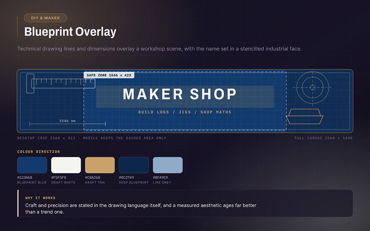
11. DIY and maker, blueprint overlay
Technical drawing lines and measurements over a workshop photo. Channel name in a stencilled industrial font.
Colour direction: Blueprint blue, kraft tan, and white lines.
Shows craft and precision. Ages well.
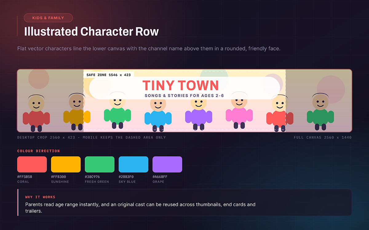
12. Kids and family, illustrated character row
Flat vector characters sit across the bottom. The channel name sits above in a rounded, friendly font, inside the safe zone.
Colour direction: Five or six bright, fully saturated colours. Made to feel joyful.
Stock character art hurts this concept fast. Parents spot generic clip art. It signals low production care. A small cast produced through illustration and character design can be reused on thumbnails, end cards, and trailers. This spreads the cost across the whole channel.
It shows parents right away that the channel fits their child's age.
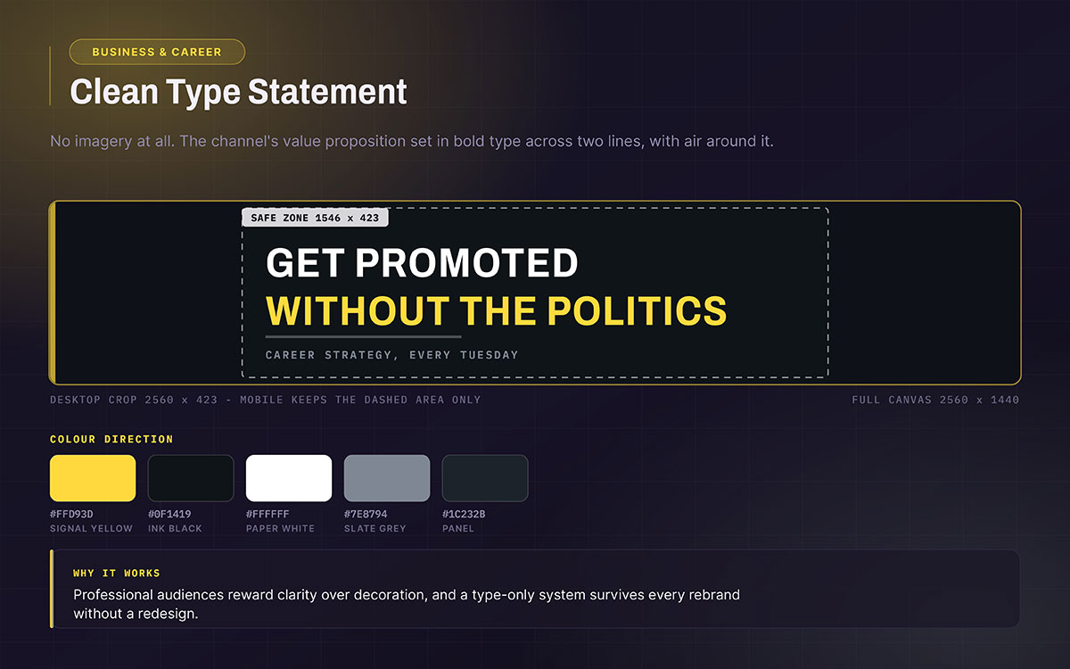
13. Business and career, clean type statement
No pictures. The channel's value shown in bold text across two lines, filling the safe zone with plenty of space around it.
Colour direction: Just two colours. Dark background, one bright colour on a keyword.
Professional viewers like clear over fancy.
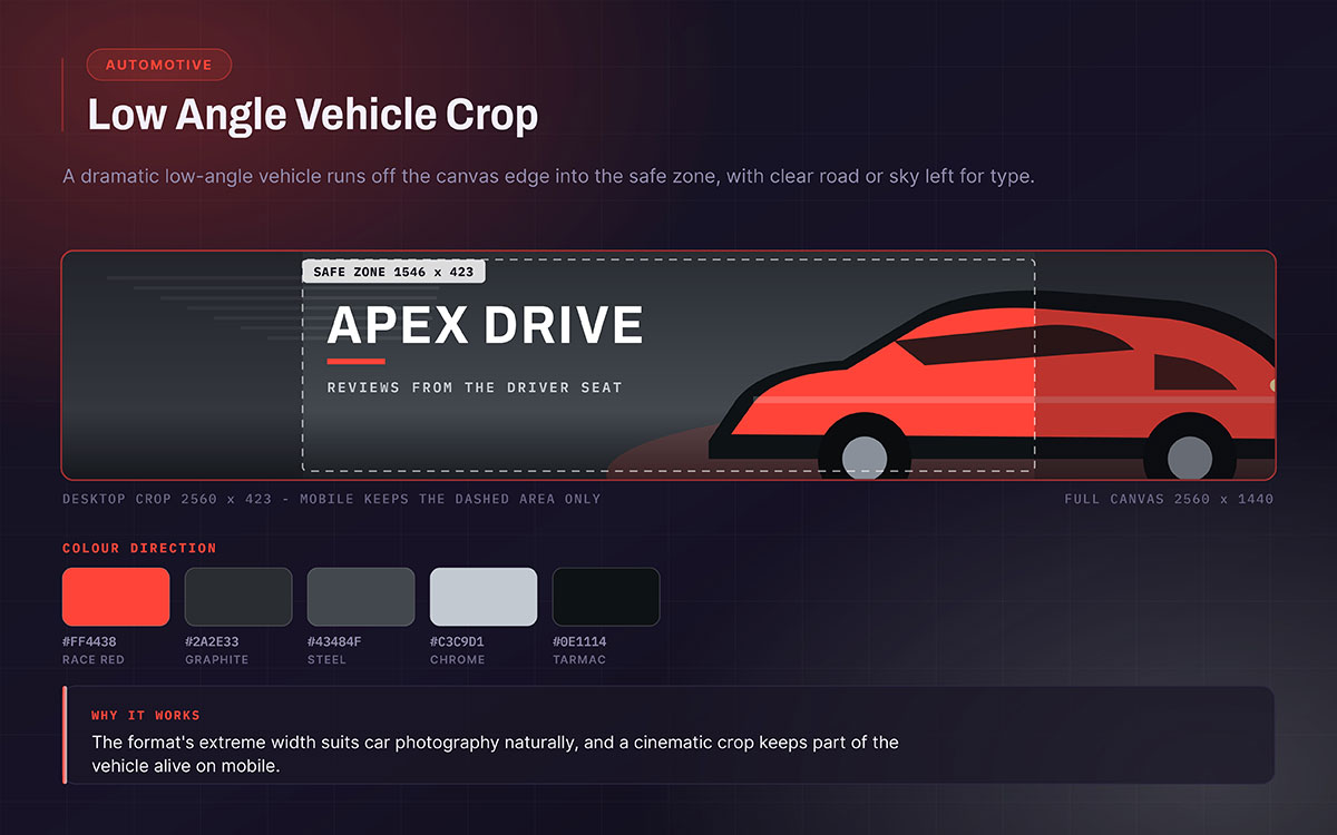
14. Automotive, low angle vehicle crop
A dramatic low-angle car photo. Crop it so the car extends past the canvas edge into the safe zone. Leave clear sky or road for text. Keep part of the car visible on mobile.
Colour direction: Mute the background. Add one bright colour pulled from the car.
Cinematic. Wide format suits car photos naturally.
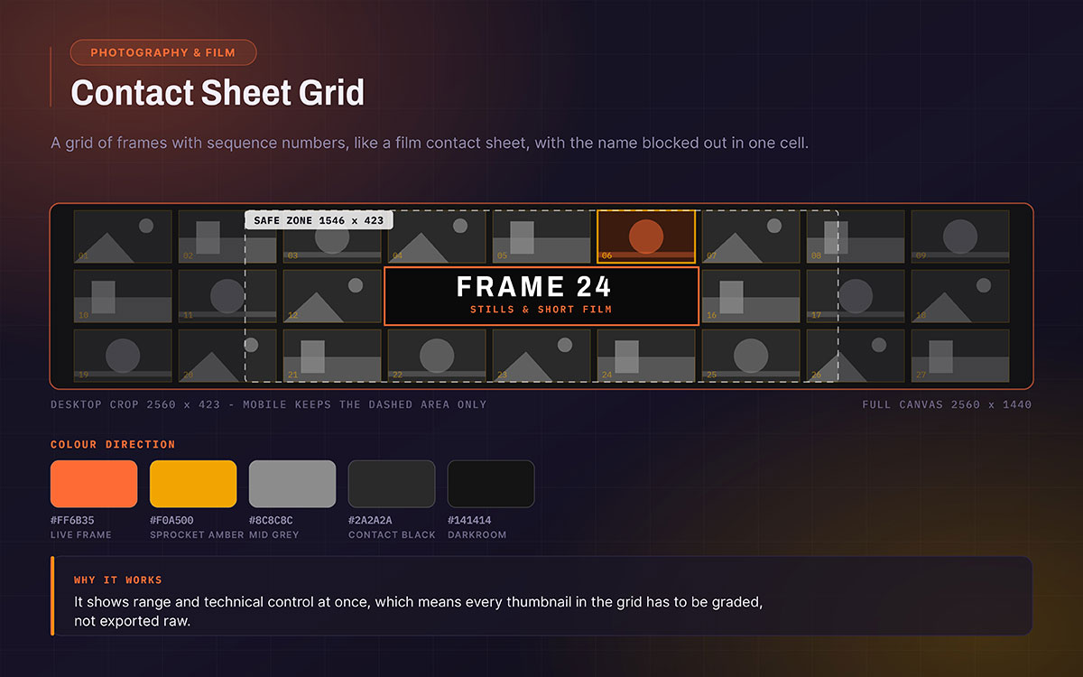
15. Photography and film, contact sheet grid
A grid of small photos with frame numbers, like a film contact sheet. The channel name sits in one blocked-out cell, inside the safe zone.
Colour direction: The grid is black and white. One photo stays in full colour as the focal point.
This only works as a portfolio if each small photo still looks good. So use properly graded images, not raw exports. That is normal photo retouching, just done at a smaller size.
It shows both portfolio range and technical skill at once.
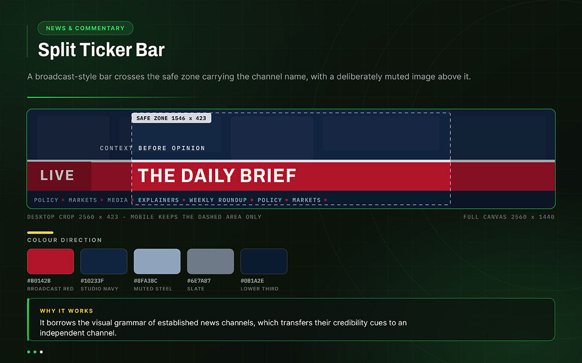
16. News and commentary, split ticker bar
A news-style bar crosses the safe zone. It shows the channel name. A dull background image sits above.
Colour direction: Deep red or navy bar. The background stays muted. This follows real broadcast style on purpose.
It borrows the trusted look of real news channels.
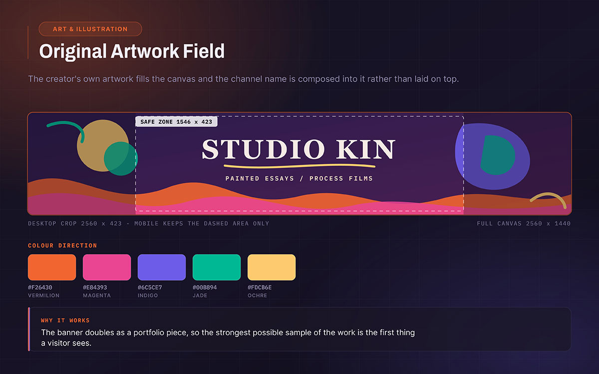
17. Art and illustration, original artwork field
The creator's artwork fills the whole canvas. The channel name blends into the design instead of sitting on top. Keep the artwork's main part inside the safe zone.
Colour direction: Use whatever colours the artwork has.
The banner works as a portfolio piece. It shows the best of what the channel makes.
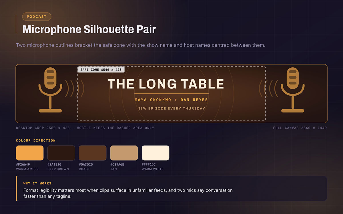
18. Podcast, microphone silhouette pair
Two mic outlines sit on each side of the safe zone. The show name and host names sit centered between them.
Colour direction: warm amber on deep brown, or one flat silhouette colour.
This shows the format fast. That matters when clips show up in random feeds.
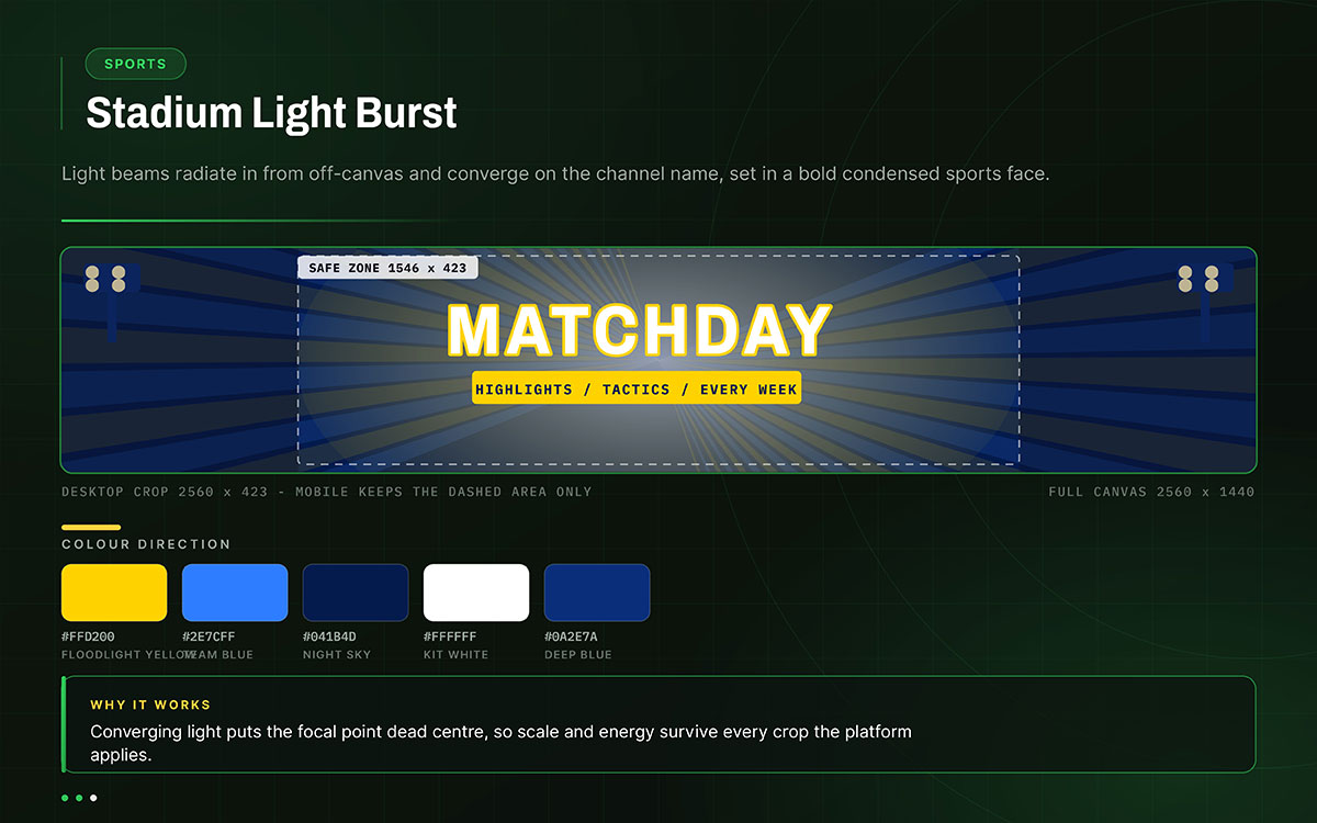
19. Sports, stadium light burst
Light beams radiate from off-canvas. Channel name sits at the point where they meet, in a bold condensed sports font.
Colour direction: Bright, team-style colours with strong contrast in one direction.
Energy and scale built to survive any crop.
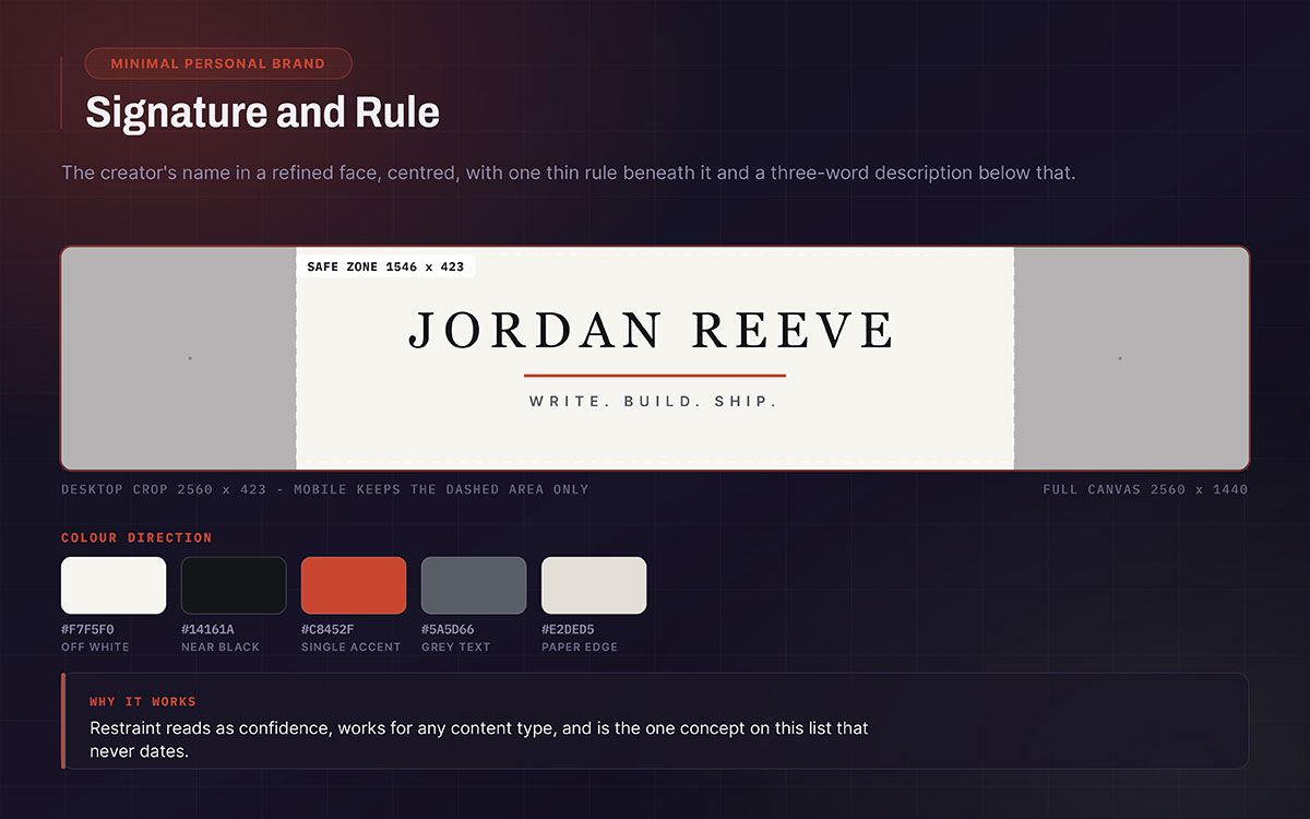
20. Minimal personal brand, signature and rule
The creator's name in a refined font, centred in the safe zone. Below it, one thin line. Below that, a three-word description.
Colour direction: Off-white background, near black text. One accent colour, only on the line.
Confidence through restraint. Works for every content type. Never goes out of style.
How to choose the right idea for your channel
Choosing the best YouTube banner ideas comes down to four filters applied in order. Match what your niche audience already recognizes, pick a design you can actually sustain, favour concepts that survive a rebrand, and test the layout at mobile scale before committing. These filters usually narrow twenty options down to two.
Start with what your audience already recognizes
Look at the ten most successful channels in your niche. Note what their banners share. The goal is to spot patterns your audience already knows.
Someone who has watched two hundred hours of finance content knows what a credible finance channel looks like. A banner that breaks those expectations has to explain itself first.
Pick a concept that fits these patterns. Do not fight them. Stand out through execution instead.
Choose based on what you can sustain
Original art banners work great for illustration channels. But they are hard to keep up if you cannot draw.
Portrait banners need new photos when your look changes. Product banners need updates when the product changes. Modular and text-based designs last the longest.
That matters since the alternative is redesigning every year. If a channel makes banners, thumbnails, and end cards often, check what social media design costs first. It’ll help you before picking a concept that needs a pro every time it changes.
Prioritize concepts that survive a rebrand
Channels change. They rarely warn you first. Concepts tied to one game, product type, or season need swapping fast. That swap wastes any recognition built up.
Concepts built on a font style or colour system survive these shifts. No redesign needed. They show who the channel is, not just what it covered that year.
Test the concept at mobile scale before committing
Make a rough draft at 1546 x 423 pixels. Check it on a phone before starting the full design. This quick test answers one key question. Does the idea work at the size most people will see it? If not, good production quality won't fix it. It's much cheaper to find this out before you commission the artwork than after.
YouTube banner idea FAQs
These FAQs answer questions you face when picking the best YouTube banner ideas. They cover what to include, whether to show your face, and how to stand out in a crowded niche. Each answer is direct. This helps you pick a design before spending hours making it.
The best YouTube banner examples make one clear promise about what viewers can expect. It uses only two or three elements, so it stays easy to read. It follows visual styles your audience already knows. Everything readable must fit inside the 1546 x 423 safe zone, so nothing gets cut off on mobile.
Include your channel name, a short line about your niche, and one visual clue that shows your category right away, like a waveform for audio or a chart line for finance. This clue makes your banner feel unique, not generic.
Good gaming banner ideas include a neon grid fading into a glowing horizon, a diagonal energy band, or a dark layout with one bright accent colour. These feel natural to gaming fans and avoid game asset licensing problems.
Pick a concept tied to your specific content, not a generic gradient. Limit your design to two or three elements. Make one clear promise about what your channel offers. Less is more, since most banners fail by adding too much.
Add your face if your channel is about you, like commentary, coaching, vlogs, or comedy. Faces build recognition faster than text alone. Keep your face inside the safe zone, not centred on the full canvas, or it will get cropped on mobile.
Think about the one object, texture, or shape your audience connects with your topic instantly. Every niche has one, like a tool, instrument, or chart shape. Build your design around that clue, then use your category's usual colours.
Yes, but only in colour and font, not layout. A banner and a thumbnail do different jobs, so matching layout is not needed. Sharing two colours and one font helps viewers recognize your channel fast.
Yes, but be careful. Check the tool's rules for commercial use, since they differ. Art, illustration, and photography audiences often notice AI images quickly. In those niches, original work builds more trust.
Endnote
The best YouTube banner ideas are never really about the banner. They are about whether a stranger scrolling past can tell, in a single glance, exactly who a channel is for. That clarity is what separates channel art from channel branding, and it is the thread running through every concept in this guide.
Knowing this is different from building it. Reading twenty strong ideas helps. But a banner still needs design work. It must be tested on mobile screens. It must match your thumbnails and end cards. This production work is where most creators lose momentum, and this is where Graphic Design Eye helps. We precisely build a finished banner for your niche. We size it correctly for the safe zone and check it on a phone screen before it goes live. Lastly, we match it to your thumbnails and end cards.
If a channel is ready to stop looking like everyone else in its niche, that is the moment to start. Approach branding design agencies today, and give your channel a banner that could not belong to anyone else.
Give your channel a banner nobody else could have made.
Graphic Design Eye LLC is a full-service creative agency built for brands that demand more than design — they demand vision. From strategic branding to complete visual identity, we partner with startups, agencies, and growing businesses as a dedicated creative force. With flexible subscription and project-based models. Let's start with us today!