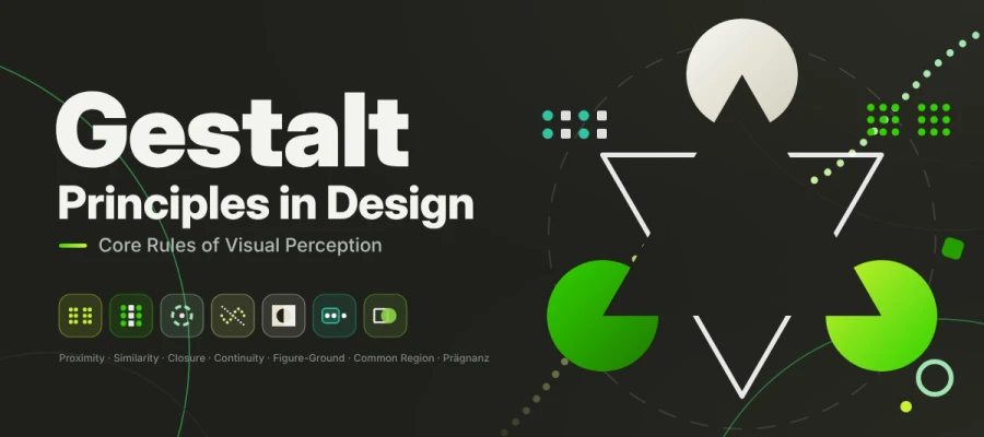
Gestalt principles in design are rules from early 20th-century German psychology that explain how the brain groups separate visual elements into unified wholes. The seven most used rules are proximity, similarity, closure, continuity, figure-ground, common region and Prägnanz. Designers use them to control grouping, hierarchy and meaning in any layout, from a logo to a checkout form.
Have you landed on a web page someday and immediately knew which button to click before reading a single word? That wasn't luck. Your brain was quietly doing the heavy lifting!
And it works fast. Really fast. MIT neuroscientists found the brain can identify an image seen for just 13 milliseconds (MIT News, 2014). People also judge a website's look in about 50 milliseconds (Lindgaard et al., 2006). Your layout talks before your headline gets a chance. The brain sees the whole picture first, groups related things, and fills in what's missing. German psychologists mapped these shortcuts over a hundred years ago. Today, we call them the Gestalt principles in graphic design.
As a designer, marketer, or UX pro, you surely want to understand these rules and use them in your work. Sounds a bit academic? Don't worry! We'll keep it plain and simple.
This guide explains the seven gestalt principles in graphic design with plain definitions, famous logos, real UI examples, and a cheat sheet, so you can understand each rule and apply it to your layouts, UI designs, and logo designs.
So, without further ado, let’s dive in and see how they work!
What are Gestalt principles in design?
Gestalt principles in design are rules of perception. They show how your brain turns separate visual elements into one whole. People do this on their own, before they read a word. Spacing, colour and repetition tell the eye what belongs together, what stands apart and what matters most. Designers still use these rules to guide attention, often hand in hand with a clear typographic hierarchy.
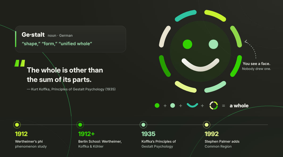
The idea began in Berlin. Psychologists Max Wertheimer, Kurt Koffka and Wolfgang Köhler developed it from 1912 onward. Gestalt is German for "shape", "form" or "unified whole". Your eyes don't build a scene piece by piece like a jigsaw. Your brain sees the whole picture first, then the parts.
It all started with a simple experiment. In 1912, Wertheimer published his study of the phi phenomenon. Two lights flash one after the other. You see a single light moving between them. Nothing really moves, yet everyone sees it! That tiny trick showed that the mind adds structure the eyes never received. Later, in his 1935 book Principles of Gestalt Psychology, Koffka put it neatly. He wrote that "the whole is other than the sum of its parts."
Why does this matter for your business?
Viewers group elements on their own, whether you planned it or not. Spacing, color, and repetition show people what belongs together before they read a single word. Get it right, and you can guide attention right where you want it. Get it wrong, and your audience sees clutter and confusion. The brand feels "off," and they can't say why.
Principles or laws?
The original German literature called them Gesetze, meaning "laws". Most designers now see them as strong tendencies that depend on context. They aren't treated as absolute rules anymore. Two principles can pull in different directions, and the stronger cue usually wins. You'll see "Gestalt laws" and "laws of visual perception" used for the same ideas.
Where do they apply?
Almost anywhere your audience looks. That covers print pieces like brochures, websites, app interfaces, packaging, signage, data visualization, and motion graphics. Researchers have added a few cousins to the classic seven. One is common fate, where things moving together belong together. Another is uniform connectedness, where things joined by a line belong together. We'll touch on common fate in the UX section below.
The 7 rules of visual perception
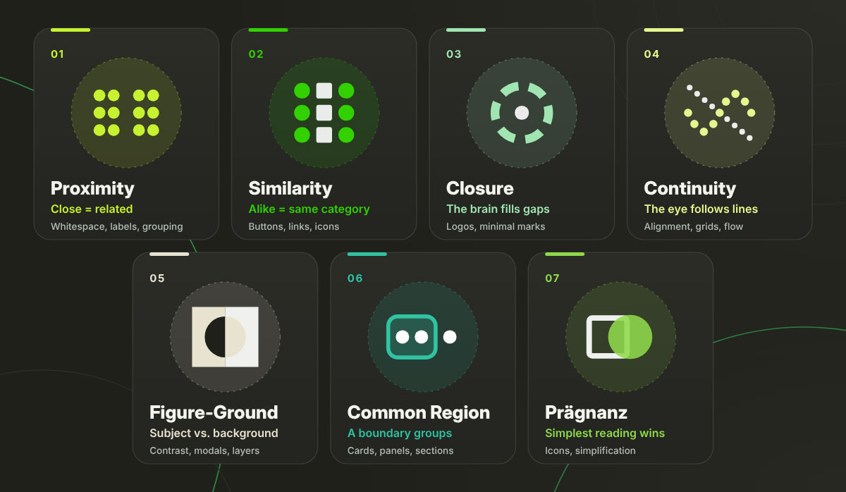
Rules of visual perception are the brain's core shortcuts for grouping scattered shapes into meaning. Some rules decide what looks related. Others decide what stands out or feels complete. Viewers apply them in a fraction of a second, so every layout, logo and landing page is read through them.
This section explains the 7 rules of visual perception one by one, so you can use each one to shape how people read your designs.
Principle
One-line rule
Primary design use
Proximity
Close = related
Whitespace, form labels, content grouping
Similarity
Alike = same category
Buttons, links, iconography, data series
Closure
The brain fills gaps
Logos, truncated content, minimal marks
Continuity
The eye follows lines
Alignment, grids, carousels, reading flow
Figure-Ground
Subject separates from background
Contrast, modals, elevation, layering
Common Region
A shared boundary groups
Cards, panels, table striping, sections
Pragnanz
Simplest reading wins
Simplification, icon design, information density
Rule 1: Proximity
Why do some things just feel like they go together? Usually, they sit close to each other.
Definition: Things placed close together look like a group, no matter their shape, size, or color.
How the brain uses it: Closeness is the strongest grouping cue you have. When it clashes with similarity, closeness usually wins.
Design application: A form label is closer to its input field than to the one above. A caption sits nearer to its image than to the next paragraph. This is the heart of whitespace management.
Real-world example: On a Google search results page, each title, URL, and snippet huddle tightly. A bigger gap separates one result from the next. You never wonder which snippet belongs to which link.
Pro tip: Squint at your layout. Whatever clumps together will look related to your viewer.
Rule 2: Similarity
Same look, same job! That's the promise similarity makes to your audience.
Definition: Elements that share visual traits such as color, shape, size, orientation, or texture are considered to belong to the same category.
How the brain uses it: Similarity groups things together across distance. Two links on opposite sides of a page still read as the same kind of thing if they share styling.
Design application: All primary buttons look identical, and all links share one color. Breaking similarity signals that one element is different. A destructive action like Delete account gets a red button for this reason.
Real-world example: On Wikipedia, every blue word is a link. Readers learn this within seconds and never need a tooltip.
Watch out: Styling plain text like a link makes a false promise. Users click, nothing happens, and trust drops.
Rule 3: Closure
Ever "seen" a circle that wasn't fully drawn? Congratulations, you've met closure!
Definition: Your brain fills in missing parts of a shape. You see a whole figure even when only bits are there.
How the brain uses it: Closure lets a design hint at things without spelling them out. Viewers like this because it helps complete the picture.
Design application: Minimal logos, icon sets, and cut-off card text all use closure. A card that stops mid-sentence quietly says, "there's more, tap me."
Real-world example: The WWF panda has no full outline. Its head and back stay open, and your brain draws the missing edges for free.
Constraint: Closure breaks down if too much is removed. The fragments must lead to one obvious ending.
Rule 4: Continuity (Continuation)
Our eyes are a little lazy, in a good way. They love the smoothest road.
Definition: The eye follows the smoothest path it can find. Things placed on a line or curve look related and seem to keep going in that direction.
How the brain uses it: Continuity lets a layout guide attention without the need for arrows or instructions.
Design application: Aligned form fields get scanned faster than staggered ones. Horizontal carousels hint at more content off-screen. Alignment across a layout is continuity used on purpose, and it makes grid systems work.
Real-world example: Netflix rows cut off the last poster at the edge of the screen on purpose. Your eye follows the row, expecting more, so you swipe.
Rule 5: Figure-ground
Which part is the hero, and which is the backdrop? Your brain picks in a flash.
Definition: The visual field automatically splits into a figure (the subject) and a ground (the background).
How the brain uses it: If viewers can't tell which is which, the design fails before anyone reads the content.
Design application: Modal windows dim the page behind them so the modal stands out as the figure. Strong contrast, drop shadows, and elevation all shape figure-ground.
Real-world example: The hidden arrow between the "E" and "x" in the FedEx logo shows figure-ground at work. The background takes on the shape of its own.
Keep in mind: Ambiguous figure-ground, like Rubin's famous vase that doubles as two faces, takes real skill and is done on purpose. Using it as a default is risky.
Rule 6: Common region
Draw a box around things, and boom, they’re a team!
Definition: Elements within a shared boundary appear to form a group. They do, even when they sit far apart or look different.
How the brain uses it: A common region can beat proximity. A border or background panel can group things that are far apart.
Design application: Cards, panels, zebra-striped table rows, bordered form sections, and grouped navigation. The whole card-based UI pattern is common region at work.
Real-world example: On a Trello board, each card and each list has its own container. Tasks feel grouped by column, even when they scroll far apart.
Good to know: Psychologist Stephen Palmer added common region to the standard set in 1992. Wertheimer's original list did not include it.
Rule 7: Pragnanz (Law of good figure / simplicity)
Last but definitely not least, the boss of all the rules!
Definition: The brain interprets confusing or complex images in the simplest form it can.
How the brain uses it: Pragnanz is the big principle that the other six work for. It also explains why people remember complex logos as simpler shapes.
Design application: Simplifying your design matches how people already see things. Think cleaner icons, fewer competing elements, and less information packed in. It's also why minimalism keeps showing up in the latest graphic design trends.
Real-world example: People see the Olympic rings as five simple circles linked together. They don't see a tricky mix of overlapping arcs.
Practical implication: If users keep describing your interface wrong, they're simplifying it in their heads. Get there first and design the simple version yourself.
How to apply gestalt principles in UI-UX design
Applying Gestalt principles in UI and UX design means arranging spacing, styling, and containers so users can understand a screen at first glance. Interfaces that follow these cues feel obvious. Ones that skip them leave users guessing what goes with what. Most grouping problems come from small choices in spacing and styling.
This section shows you how to apply Gestalt rules in UI and UX design, so you can build clear screens and check them for grouping problems.
Navigation
Users group links by how close they sit and whether they share a space. Uneven spacing in a nav bar makes false groups. Suddenly Pricing looks like it belongs with Log in instead of Features. Keep gaps inside a group tight. Make gaps between groups clearly wider.
Forms
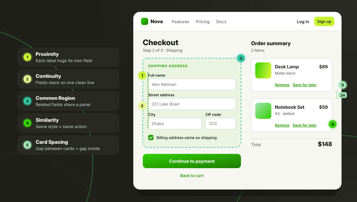
Forms are the best place to use Gestalt principles in design. Three moves do most of the work.
Proximity: Put each label right next to its own field.
Continuity: Stack fields in one clean vertical line so the eye runs straight down.
Common region: Group related fields, such as Shipping address, into a shared panel.
Together, these cut the "which box is this label for?" moments that cause errors.
Data visualisation
Charts are Gestalt playgrounds. Similarity assigns each category its own color, so a series reads as a single line. Common fate handles animated transitions. Bars that move together look like one group. Proximity determines whether a legend feels like part of its chart or drifts off on its own.
Card layouts
Card layouts use three rules at once. The card border creates a common region. Every card follows the same template, so they look alike, which is exactly what a shared design system keeps consistent from screen to screen. Items inside a card sit close together. The golden rule? The spacing between cards must be clearly larger than the spacing inside a card. If the two are equal, users can’t tell where one card ends and the next begins.
Accessibility first
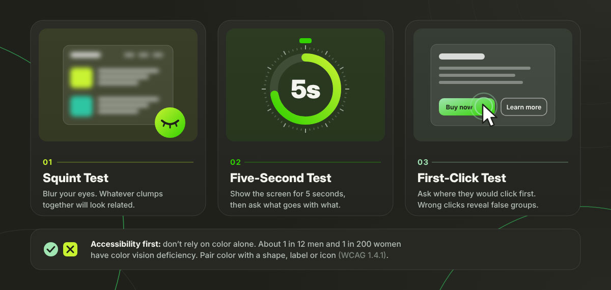
Don't rely on color alone to show meaning. About 1 in 12 men and 1 in 200 women have some form of color vision deficiency (Color Blind Awareness). The W3C's WCAG Success Criterion 1.4.1 says the same thing. Add a shape, label, icon, or position next to the color. That way everyone can still see the grouping.
How to test for Gestalt problems
You don't need a lab. These three quick methods spot grouping problems faster than a long design review. You can run them on anything from a rough mockup to a clickable prototype.
Squint test: Blur your eyes and see what clumps together.
Five-second test: Show the screen for five seconds. Then ask people what they remember and what goes with what.
First-click test: Ask users where they would click to finish a task. Wrong first clicks often point to a false grouping.
For deeper reading, the Nielsen Norman Group has excellent guides on proximity, similarity, and common region.
How do famous logos use gestalt principles?
Gestalt principles help a logo say more with less. That matters a lot when your logo shrinks down to a favicon. Closure, figure-ground, and Pragnanz turn simple shapes into ideas people remember. Want proof? Just look at some of the world's most famous logos.
This section shows how famous logos use Gestalt principles in design, so you can spot each rule at work and apply it to your own logo designs.
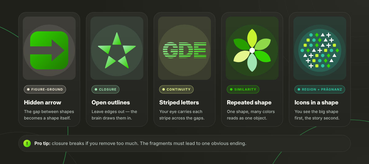
FedEx: figure-ground + closure
Look at the white space between the "E" and the "x" in the FedEx wordmark. An arrow is hiding there! Lindon Leader designed it at Landor Associates in 1994. Once you spot the arrow, you can't unsee it. That little "aha" moment creates the kind of emotional connection that helps the brand stick.
WWF: closure
The WWF panda is built from black shapes that don't touch. Its head and back have no outline. Still, everyone sees a whole panda. Closure fills in the edges that were never drawn.
IBM: closure + continuity
The IBM logo is made of eight horizontal stripes. You still read three solid letters instead of dozens of bars. Your eye carries each stripe across the gaps, finishing the letters.
NBC: similarity
The NBC peacock has six feathers with the same shape and different colors. The matching shape ties them into one object. The colors keep it lively, proof that bold logo color combinations can still feel unified.
Unilever: common region + Pragnanz
The Unilever "U" is made of 25 separate icons, from a hand to a lock of hair. They sit inside one letter shape. You see a simple "U" first and a story second.
Gestalt principles are the perception rules that explain why viewers group some elements and separate others. Most questions about them come down to how the rules differ, which one wins in a conflict, and where they show up in real work. This section answers the most common Gestalt principles FAQs, so you can get a quick answer before your next design decision. If any of your questions are missing below, reach out to us anytime for an answer.
The seven main Gestalt principles are proximity, similarity, closure, continuity, figure-ground, common region, and Pragnanz. Each one shows how the brain groups separate visual elements into one whole before you think about it.
German psychologists Max Wertheimer, Kurt Koffka, and Wolfgang Köhler developed them in Berlin around 1912. Wertheimer's 1912 phi phenomenon study is seen as the start. Koffka's 1935 book provided the theory's best-known summary.
They explain how viewers group elements before reading anything. Designers who use them on purpose control what looks related, guide attention, and lower mental effort. Ignoring them creates accidental groupings that feel cluttered or confusing.
Proximity groups elements by how close they sit. Common region groups them within a shared boundary, such as a card or panel. Common region is stronger. A border can group far-apart elements, overriding proximity.
No. Koffka wrote that the whole is other than the sum of its parts. He reportedly corrected students who said "greater". His point was that a perceived whole has its own existence. It does not simply add up to more.
UX designers use them to shape navigation, group form fields, lay out cards, and build data visuals. Proximity and common region set groupings indicate shared function, and figure-ground handles contrast, modal windows, and layering.
Endnote
And just like that, we've reached the end of our guide. Thanks for sticking with us!
Gestalt principles in design show how your brain turns scattered visual bits into one whole. There are seven rules. They are proximity, similarity, closure, continuity, figure-ground, common region and Pragnanz. Designers use them to guide grouping, hierarchy and attention in logos, forms and layouts.
Here's what to carry with you.
Three Berlin School psychologists shaped Gestalt theory from about 1912 to 1935. Meet Max Wertheimer, Kurt Koffka and Wolfgang Köhler.
Koffka's famous line is "the whole is other than the sum of the parts". Many misquote it as "greater than", a version he rejected.
These rules work before you even think. They work for everyone, design-savvy or not.
When proximity and similarity clash, proximity wins. Spacing is your strongest grouping signal.
Every principle groups things or separates them. A cluttered design usually has a grouping problem.
Gestalt principles let you work with your audience's brain. You never have to fight it. Start small. Squint at your next layout and tighten a few gaps. Box related items together, then cut out one element you don't need. You'll be amazed at how much clearer everything feels!
Need a hand turning these rules into a logo, website, app interface or branding design that clicks at first glance? The Graphic Design Eye LLC team is always ready to help you design with purpose and with the viewer’s brain in mind.
That's all for now. Keep noticing the small things. Your eyes will thank you.
Graphic Design Eye LLC is a full-service creative agency built for brands that demand more than design — they demand vision. From strategic branding to complete visual identity, we partner with startups, agencies, and growing businesses as a dedicated creative force. With flexible subscription and project-based models. Let's start with us today!