Looking for suggestions on the best menu fonts? Your menu is doing more than listing food. It is telling a story, and the fonts you choose are the very first words of that story. You are a restaurant owner, a branding professional, or a designer crafting a dining identity from scratch, this guide is written for you.
Because behind every great restaurant, behind every table that feels like an event, behind every dining room that makes guests lean in and linger, there is a layer of design that most people never consciously notice.
But they feel it. They feel it in the way a menu makes them trust a kitchen, in the way a typeface makes them slow down and savor the choices in front of them, in the way a single heading makes an ordinary dish sound like something worth remembering.
That layer is typography. And it begins with the fonts on your menu.
This is not a superficial decision. The font you place on your menu communicates your restaurant’s entire philosophy to a guest before they have read a single word. It tells them whether this is a place of celebration or everyday comfort, of heritage or innovation, of quiet luxury or joyful noise. Typography, used with intention, is one of the most powerful branding tools available to any restaurateur and one of the most overlooked.
In this guide, you will find the top menu fonts available today, organized by style and purpose, with clear guidance on where each one belongs and why.
Now, let’s get into it.
Creative Design Services
Graphic Design Eye LLC can help you create beautiful graphic designs. Fast, simple & affordable.
Well, a menu is more than a list of dishes. It is the voice of your restaurant.
Before a single bite is taken, before a guest even glances at the prices, your typography has already spoken. It has set expectations, shaped perception, and ignited emotion. It has whispered elegance, shouted excitement, or wrapped your guests in the warm comfort of something familiar.
The right font is not decoration. It is communication. It is the difference between a guest who feels at home and a guest who feels lost. It is the difference between a menu that feels trustworthy and one that feels careless. And in the deeply competitive world of dining, that difference matters more than most restaurateurs dare to admit.
Here are the top 25 best menu fonts that do not simply look good. They feel right. Each one has been selected for its ability to elevate a dining experience and leave a lasting impression.
Now, let's move forward and explore.
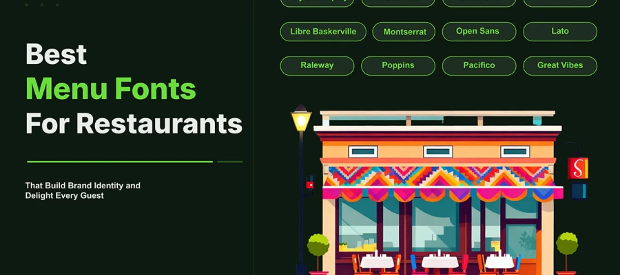
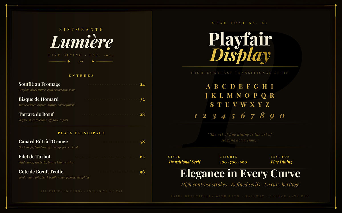
1. Playfair Display
Sophisticated, refined, and utterly timeless. Playfair Display was born for upscale dining, for candlelit tables, for wine lists that require contemplation, for menus that feel like an event in themselves. Its high contrast between thick and thin strokes communicates luxury without ever needing to announce it. This is a font that understands its own worth.
Best For: Fine dining, upscale bistros, wine and cocktail menus.
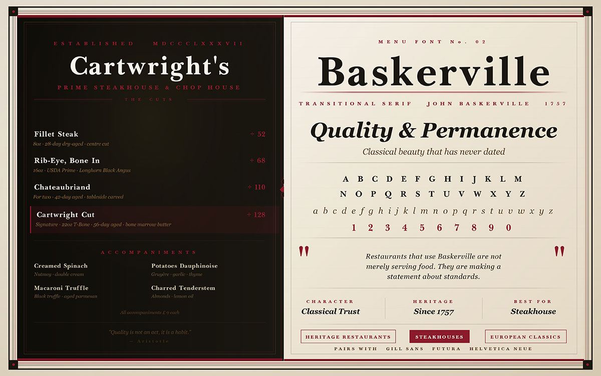
2. Baskerville
John Baskerville spent decades perfecting his typeface, and it shows. Baskerville carries a classical beauty that has never dated. It builds trust the moment it is read, communicating quality and permanence in every character. Restaurants that use Baskerville are not merely serving food. They are making a statement about standards.
Best For: Heritage restaurants, steakhouses, classic European dining.
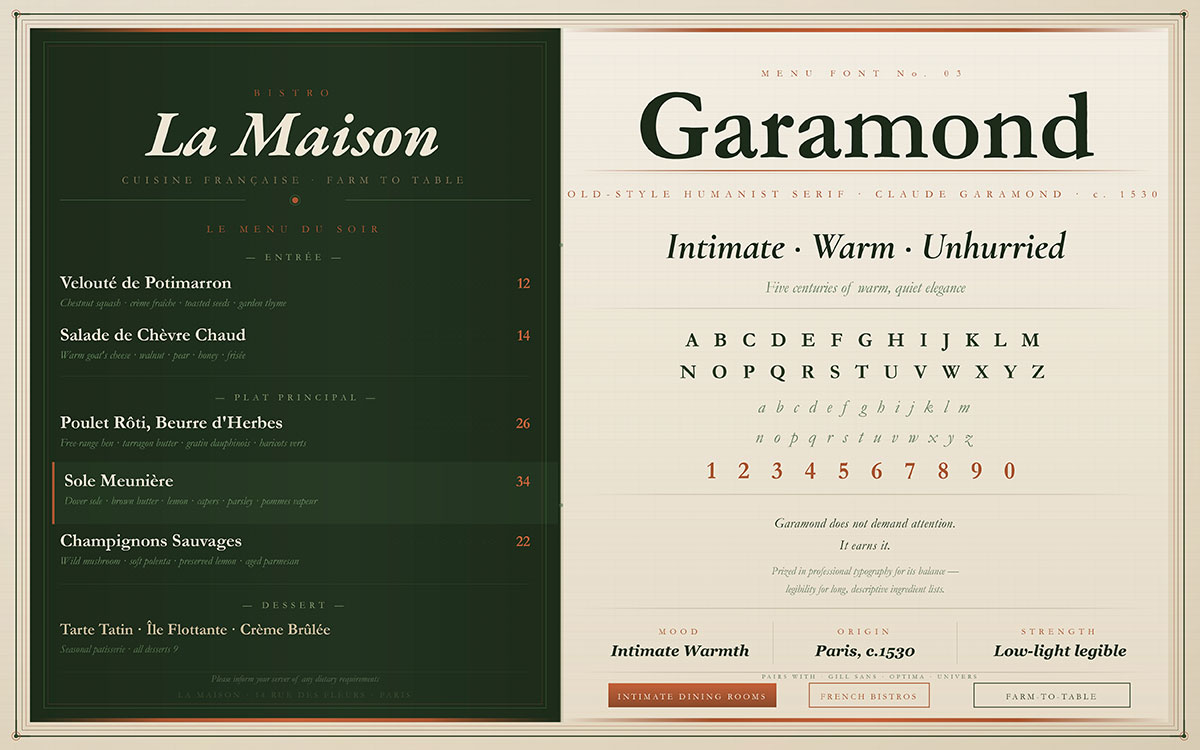
3. Garamond
Warm, readable, and quietly elegant, Garamond has graced the pages of literary masterpieces for over five centuries. On a restaurant menu, it creates a sense of intimate dining, the kind of place where time moves gently and every dish is given the care it deserves. Garamond does not demand attention. It earns it. Legibility in low light is a genuine consideration, and the best fonts for dim dining environments are worth knowing before you commit. In professional typography in menu design, Garamond is prized for its balance. It provides the legibility needed for long, descriptive ingredient lists.
Best For: Intimate dining rooms, French bistros, farm-to-table restaurants.
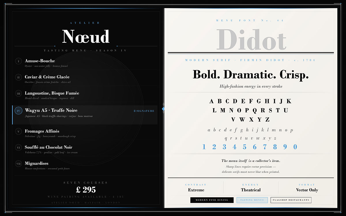
4. Didot
High-fashion energy lives in Didot. It is bold in its contrasts, dramatic in its serifs, and entirely unforgettable. Didot belongs in restaurants where the experience is theatrical, where the plating is art and the menu itself is a collector’s item. Because of its sharp lines, you must understand raster and vector graphics to keep the edges crisp. This ensures the delicate serifs don't blur when printed.
Best for: Modern fine dining, tasting menus, flagship restaurants.
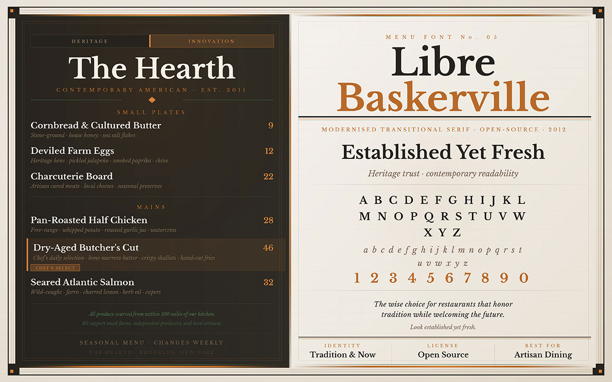
5. Libre Baskerville
A modern interpretation of classical beauty, Libre Baskerville balances the trustworthiness of traditional serif design with a readability that suits the demands of contemporary menus. It is the wise choice for restaurants that honor tradition while welcoming the future, establishments where both heritage and innovation are on the menu. Using clean, updated typefaces is one of the top restaurant branding trends. It helps your business look established yet fresh.
Best For: Contemporary American dining, elevated casual, artisan establishments.
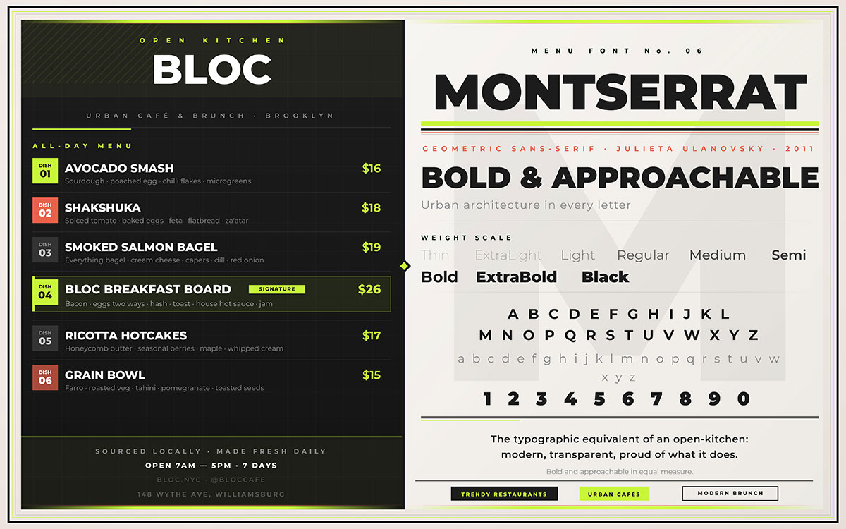
6. Montserrat
Confident, contemporary, and unmistakably stylish, Montserrat carries the spirit of urban architecture in every letter. It is the typographic equivalent of an open-kitchen restaurant: modern, transparent, and proud of what it does. Trendy cafés and creative dining concepts find in Montserrat a voice that is both bold and approachable.
Best For: Trendy restaurants, urban cafés, modern brunch spots.
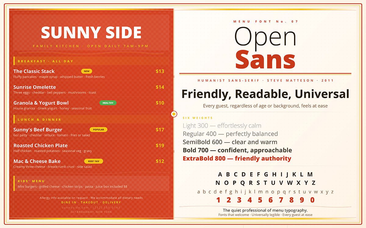
7. Open Sans
There are fonts that shout and fonts that welcome. Open Sans is firmly in the welcoming category. It is friendly, highly legible, and universally appealing, a font that ensures every guest, regardless of age or background, feels equally at ease. It is the quiet professional of menu typography.
Best For: Family restaurants, casual dining, food courts, digital menus.
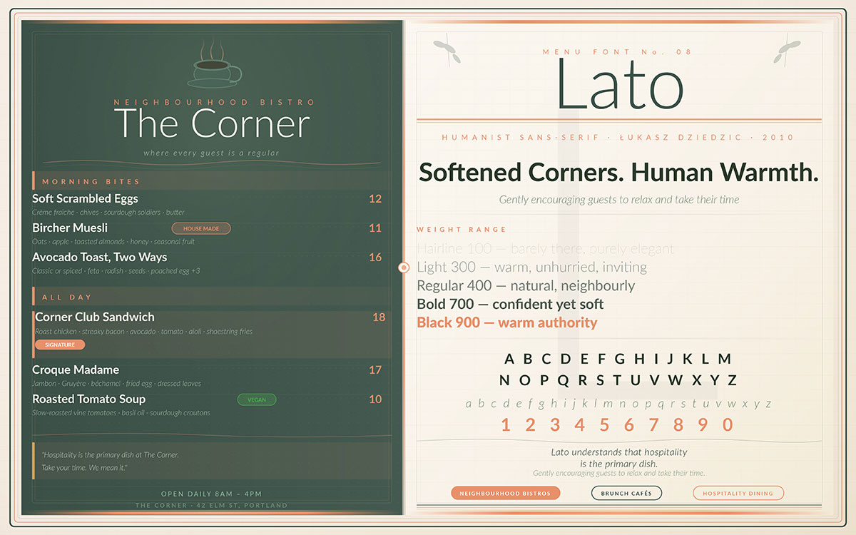
8. Lato
Lato was designed with warmth in mind, and it shows. Its softened corners and human proportions create a sense of invitation, as if the menu itself is gently encouraging guests to relax and take their time. For restaurants where hospitality is the primary dish, Lato understands that assignment perfectly.
Best For: Neighbourhood bistros, brunch cafés, hospitality-forward dining.
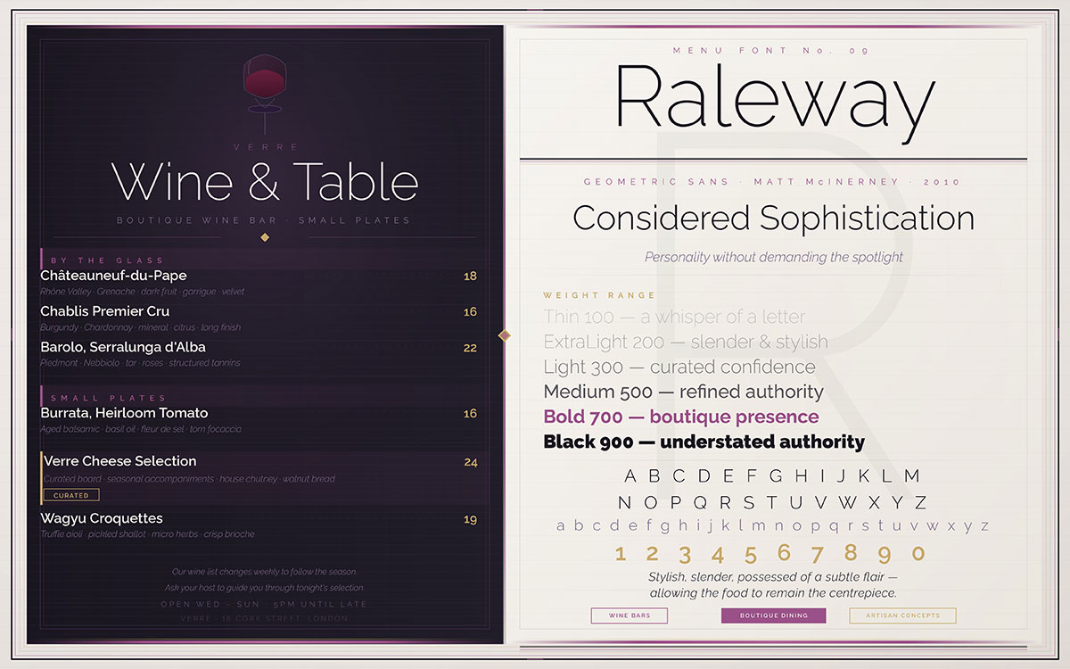
9. Raleway
Stylish, slender, and possessed of a subtle flair that elevates without overwhelming, Raleway is the choice of restaurants that want their menus to feel curated. It adds personality without demanding the spotlight, allowing the food itself to remain the centrepiece while the typography lends an air of considered sophistication.
Best For: Wine bars, boutique restaurants, artisan food concepts.
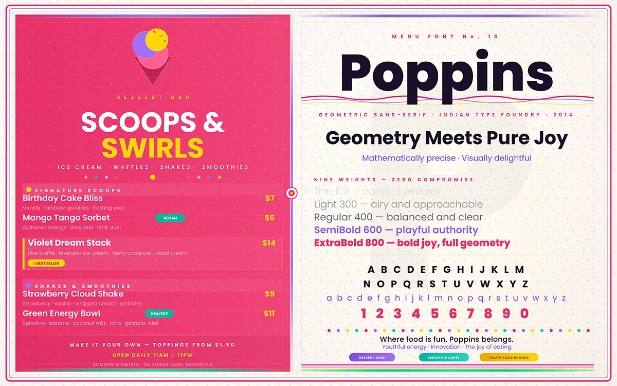
10. Poppins
Playful geometry meets modern design philosophy in Poppins, a font that is as mathematically precise as it is visually delightful. It carries a youthful energy that makes it perfect for brands built on innovation, colour, and the joy of eating. Where food is fun, Poppins belongs.
Best For: Dessert bars, smoothie cafés, youth-oriented food brands.
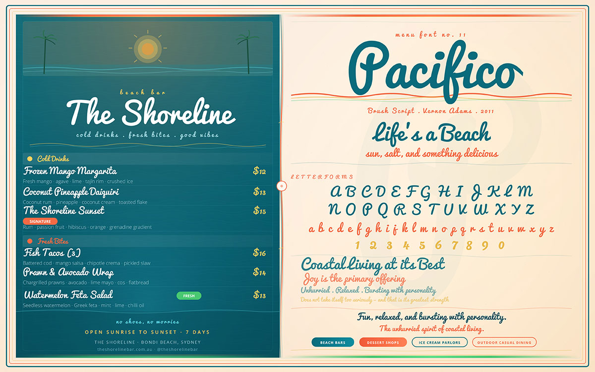
11. Pacifico
Fun, relaxed, and bursting with personality, Pacifico carries the unhurried spirit of coastal living. It is the font of beach bars and dessert counters, places where joy is the primary offering and the atmosphere is as important as the menu. Pacifico does not take itself too seriously, and that, in many contexts, is its greatest strength.
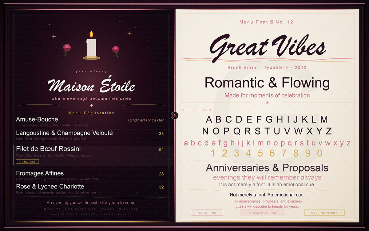
Romantic and flowing, Great Vibes was made for moments of celebration. It is the typographic choice of restaurants that know their guests arrive for anniversaries, proposals, and evenings they will describe to friends for years afterward. For fine dining establishments and wedding venues, Great Vibes is not merely a font. It is an emotional cue.
Best For: Fine dining, romantic restaurants, wedding venues, special occasion dining.
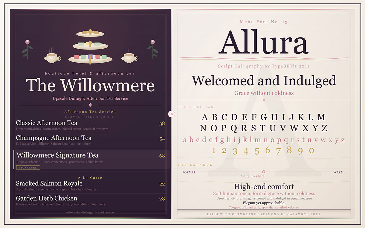
13. Allura
Elegant yet approachable, Allura adds a soft, human touch to any menu. It possesses the grace of formal calligraphy without the coldness that formal typography can sometimes carry. It is the choice of restaurants that want their guests to feel both welcomed and indulged, a combination more difficult to achieve than it might appear. Achieving this balance is a key part of user-friendly branding. It creates a sense of high-end comfort.
Best For: Upscale casual dining, afternoon tea rooms, boutique hotels.
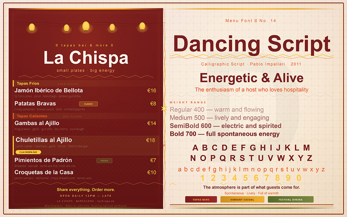
14. Dancing Script
Energetic, lively, and full of warmth, Dancing Script carries the enthusiasm of a host who genuinely loves hospitality. It suits restaurants where the atmosphere is electric and the experience is meant to feel spontaneous, places where the energy of the room is part of what guests come for.
Best For: Tapas bars, vibrant casual restaurants, festival dining concepts.
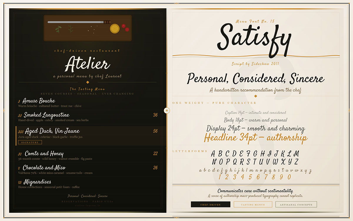
15. Satisfy
Smooth, charming, and intimate, Satisfy reads like a handwritten recommendation from the chef: personal, considered, and sincere. It communicates care without sentimentality and gives any menu a sense of authorship that mass-produced typography simply cannot replicate.
Best For: Chef-driven restaurants, tasting menus, artisanal concepts.
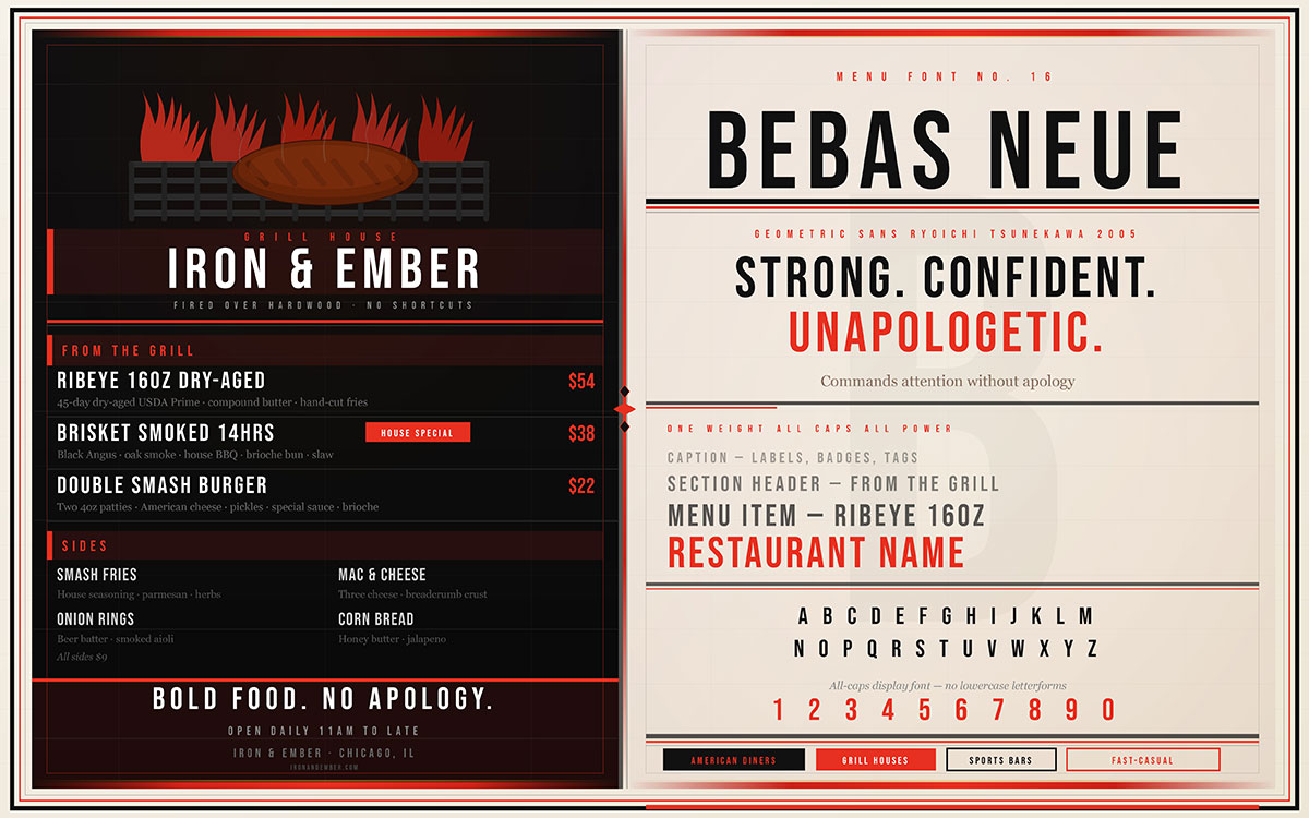
16. Bebas Neue
Strong, confident, and unapologetically powerful, Bebas Neue commands attention without apology. It is the typographic equivalent of a restaurant that knows exactly what it stands for, a place where the food is bold, the portions are generous, and there is no ambiguity about what makes this establishment special.
Best For: American diners, grill houses, sports bars, fast-casual concepts.
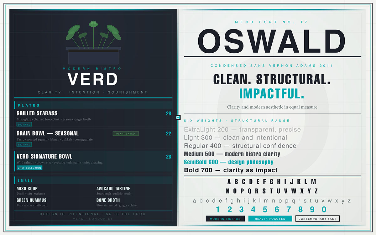
17. Oswald
Clean yet genuinely impactful, Oswald brings structural confidence to menu design. It is the choice of restaurants that value clarity and modern aesthetic in equal measure, establishments where the design philosophy is as intentional as the culinary one.
Best For: Modern bistros, health-focused restaurants, and contemporary fast casual.
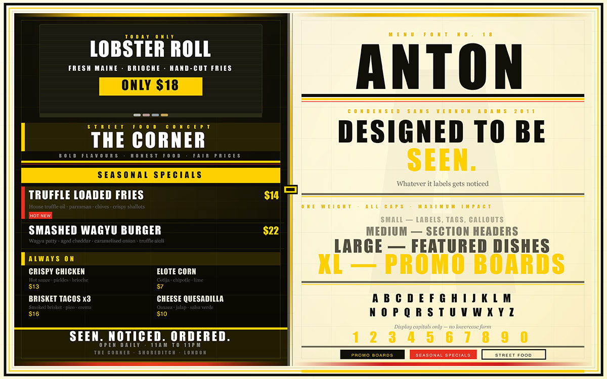
18. Anton
Anton is designed to be seen. Bold, attention-grabbing, and commanding, it is the natural choice for promotional elements, featured dishes, and menu sections where emphasis is not merely desired but required. Anton ensures that whatever it labels gets noticed.
Best For: Promotional boards, seasonal specials, street food concepts.
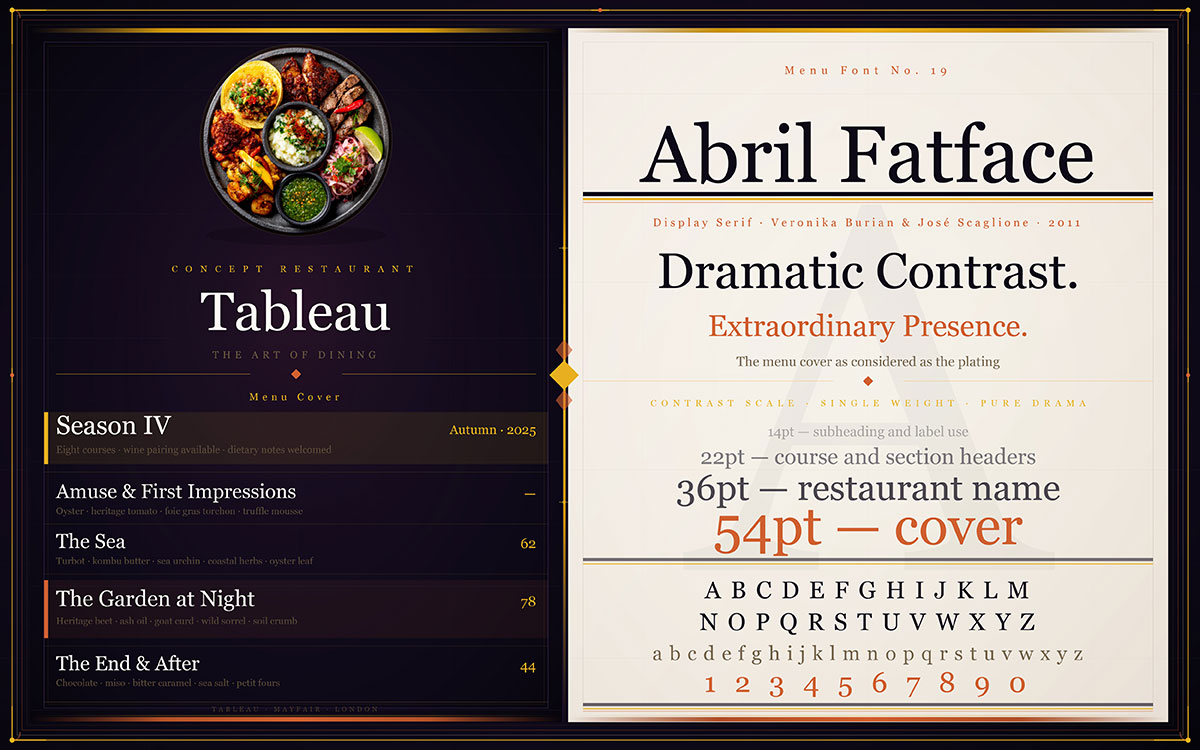
19. Abril Fatface
Dramatic contrast and extraordinary visual presence define Abril Fatface. It is the choice of restaurants that treat every aspect of the dining experience as an art form, where the menu cover is as considered as the plating, and where visual identity is understood as a competitive advantage.
Best For: Concept restaurants, high-design dining experiences, menu covers and headers.
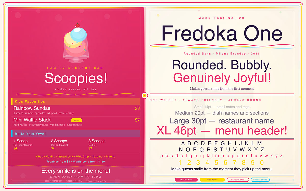
20. Fredoka One
Rounded, bubbly, and genuinely joyful, Fredoka One brings a sense of delight to any menu it graces. It is the natural voice of family-friendly restaurants, children’s menus, and dessert-focused brands where the primary goal is to make guests smile from the moment they pick up the menu.
Best For: Family restaurants, children’s menus, dessert bars, yogurt shops.
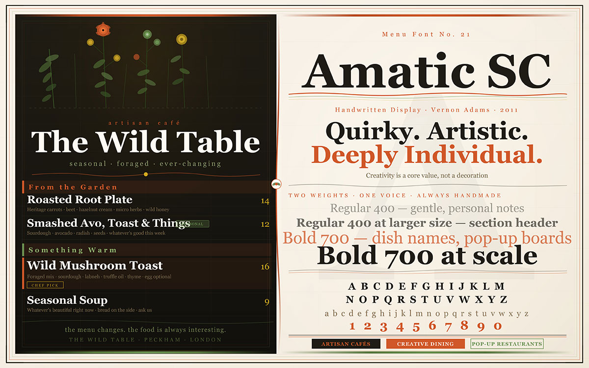
21. Amatic SC
Quirky, artistic, and deeply individual, Amatic SC is the typographic voice of spaces where creativity is a core value. It suits restaurants where the decor is eclectic, the menu changes with the seasons, and the philosophy centres on the belief that food should be as interesting as it is delicious.
Best For: Artisan cafés, creative dining spaces, pop-up restaurants.
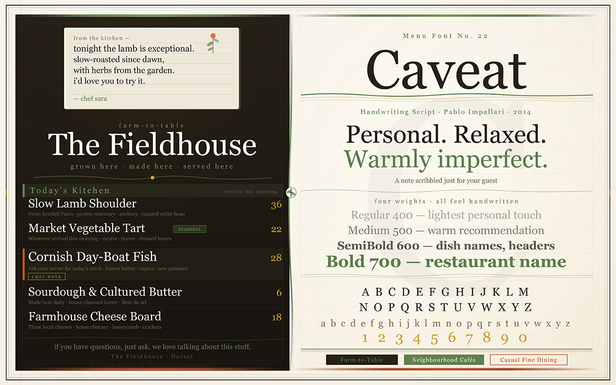
22. Caveat
Personal, relaxed, and warmly imperfect, Caveat feels like a note scribbled just for your guest, as if the chef stepped out of the kitchen to write a recommendation by hand. In a world of digital menus and printed uniformity, Caveat offers something genuinely rare: the sense of being personally attended to.
Best For: Farm-to-table restaurants, neighbourhood cafés, casual fine dining.
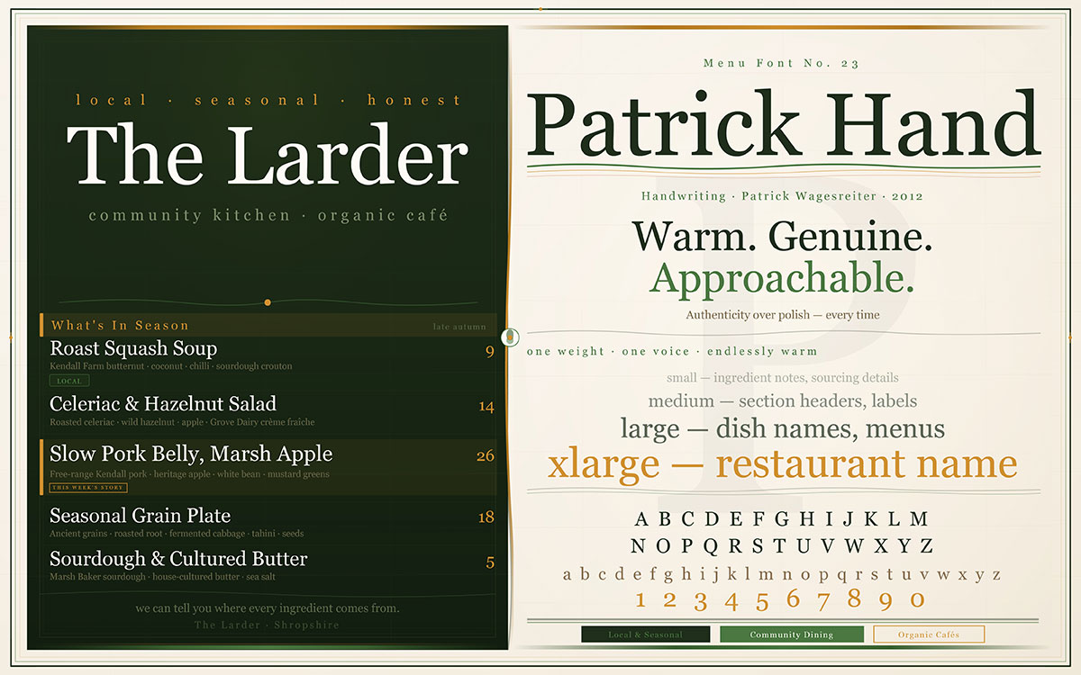
23. Patrick Hand
Warm, genuine, and approachable, Patrick Hand adds authenticity to menus that would otherwise risk feeling overly polished. For restaurants whose identity is built on honesty, on seasonal ingredients, local sourcing, and the stories behind the food, Patrick Hand is a natural and credible choice.
Best For: Local and seasonal restaurants, community-focused dining, organic cafés.
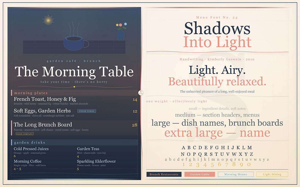
24. Shadows Into Light
Light, airy, and beautifully relaxed, Shadows Into Light creates an atmosphere of ease and leisure. It is the perfect companion for morning menus, brunch cards, and dining experiences designed around the unhurried pleasure of a long, well-enjoyed meal in good company.
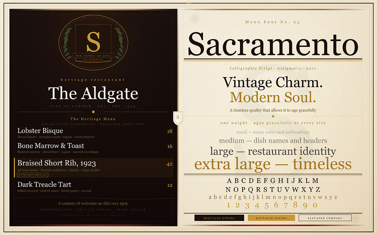
Sacramento carries vintage charm and modern soul in equal measure. It is subtle where Pacifico is bold, refined where Dancing Script is exuberant, and possesses a timeless quality that allows it to age gracefully alongside the restaurant brand it represents. For establishments where longevity is part of the vision, Sacramento is a profoundly wise choice.
Best For: Heritage-inspired restaurants, boutique dining, elevated comfort food.
How to Choose the Best Fonts for Your Restaurant Menu
Choosing a menu font is not an aesthetic exercise. It is a strategic decision, one that communicates your restaurant’s identity to every guest before they have tasted a single dish. The best menu fonts above each carry a distinct personality, and the following principles will help you determine which one belongs on your menu.
1) Begin with your brand identity
Ask yourself what feeling your restaurant is designed to create. Elegance? Warmth? Excitement? Adventure? Every font carries emotional weight, and the typography you select must align with the emotional promise your restaurant makes. A rustic farmhouse restaurant that uses Didot sends a confusing message. A Michelin-starred establishment that uses Pacifico sends a more confusing one. Your typeface should reinforce your restaurant branding strategy, not contradict it.
If you are struggling to define your look, looking at restaurant branding examples can provide clarity on how successful businesses pair their voice with their visuals. Modern hospitality is shifting, and staying updated on Restaurant Branding Trends will ensure your menu doesn't feel dated.
2) Prioritize readability above all else
A menu that cannot be comfortably read is a menu that creates friction, and friction is the enemy of hospitality. This is especially critical in low-light environments, where highly decorative or script-heavy fonts can quickly become illegible. If guests are squinting, the typography has failed regardless of how beautiful it might appear. The best fonts for readability in dim lighting are covered in detail further in this guide.
3) Pair fonts with purpose and restraint
The most effective menus use no more than two complementary typefaces, one for headings and one for body text. A serif paired with a clean sans-serif, or a display font paired with an elegant body typeface, creates hierarchy without chaos. More than two fonts in a single menu begins to feel unintentional. The question of how many fonts belong in a single menu design has a clear professional answer worth knowing.
4) Consider your medium
Digital menus and printed menus have different requirements. Script fonts that render beautifully in print can become difficult to read on a backlit screen. If you operate across both formats, prioritize fonts that perform well in both environments, or maintain separate typographic systems for each. The differences between digital and print menu typography are worth understanding before you commit to a typeface across both.
5) Align font weight with content hierarchy
Use bolder, more expressive fonts for section headers and featured dishes. Reserve lighter, more legible weights for descriptions, prices, and dietary information. Clear hierarchy guides the guest’s eye and makes the menu a pleasure to navigate rather than a puzzle to decode.
Best Menu Fonts FAQs
The answers gathered here represent the most frequently asked, most practically important questions in menu typography, addressed with the same directness and professional depth that your restaurant deserves. You are designing your first menu or rethinking one that has served you for years, these answers are your foundation.
For print menus, 10–12pt is best for body text, while headers usually sit between 18–28pt. For digital menus, 14–16px works well for body text, with larger sizes for headings.
Two fonts is the professional standard, one for headings and one for body text. Using three can work with clear hierarchy, but more than that usually creates visual clutter and reduces menu readability.
Script fonts are good for menus only as accent or decorative elements like headers or highlights. They are not suitable for body text because they reduce readability, so clean serif or sans-serif fonts should be used for information.
Clean sans-serif fonts like Open Sans, Lato, and Montserrat are best for readability in dim lighting. Serif options like Garamond and Libre Baskerville also work well, while script and display fonts should be limited to headings only.
It’s best to keep a unified font system for both digital and print menus. Print can use finer, more detailed fonts, while digital menus need higher contrast and larger, more readable typography.
Yes, free fonts are often good enough for professional menus if they are well-designed and properly licensed for commercial use. Many high-quality options like Playfair Display, Montserrat, Garamond, and Lato are free and widely used in professional work.
Match fonts to the emotion of your restaurant experience. Serif fonts suit heritage and fine dining, sans-serif fits modern casual concepts, script adds warmth and personality, and display fonts work for bold, energetic branding.
The most common mistake in menu typography is prioritizing aesthetics over legibility. Decorative fonts may look attractive, but they often reduce readability for real guests in real dining conditions.
Endnote
If you are still reading, you are clearly someone who notices the small things. Not just how a menu looks, but how it quietly shapes a guest’s first impression. That quick glance… that instant feeling… it happens before a single word is fully read.
You have just explored the top 25 best menu fonts for restaurants. But this is bigger than picking something that looks nice.
Because typography is not decoration. It is direction. It tells your guest what matters, where to look, and what to feel first. A refined serif can suggest elegance. A clean sans-serif can feel simple and modern. Either way, the goal is the same, you want your menu to pull people in, not slow them down.
And if your current menu feels crowded or a bit off-balance, that feeling is real. Your food might be excellent. But the presentation is not helping it shine the way it should.
That is why we keep sharing ideas like this.
You can subscribe to our design newsletter. Each week, we break things down into simple, useful insights. Font pairings. Spacing tricks. Easy ways to make your menu feel cleaner and easier to follow.
But sometimes, you do not want to keep testing and tweaking. You just want a menu that feels right from the very first look. Look at our menu design service and explore how expert typography and layout can transform your restaurant’s identity.
Because the best menus do not just present dishes. They guide decisions without effort!
Graphic Design Eye LLC is a full-service creative agency built for brands that demand more than design — they demand vision. From strategic branding to complete visual identity, we partner with startups, agencies, and growing businesses as a dedicated creative force. With flexible subscription and project-based models. Let's start with us today!