Looking at how typography affects food menu readability? Typography controls how fast guests read your menu, what they notice first, how trustworthy your restaurant feels, and ultimately what they order. It is not a design afterthought. It is a decision-making tool that works silently on every guest, at every table, every single service.
There is a moment, just before a guest reads a single word, when your menu has already spoken.
Not through the dishes it lists. Not through the prices it shows. Not through any photograph or illustration placed carefully on its surface. It speaks through the shape of its letters, the weight of its headings, the breath of space between its lines. It speaks through typography, and what it says in that first unspoken second will determine everything that follows.
A guest picks up your menu. A decision is already forming. And the font you chose, whether you thought about it for five minutes or five weeks, is the reason.
Most restaurateurs spend months perfecting a dish and minutes choosing a font. They agonize over the sourcing of a single ingredient and accept the default typeface on a design template without a second thought. This guide exists to close that gap, because what lives on your menu is not merely text. It is the first language your restaurant speaks, and it deserves the same attention you give every other element of the experience you have built.
Typography is not decoration. It is communication. It is the silent architect working beneath the surface of every great dining experience, shaping how guests feel before they have consciously processed a single word. And understanding how it works is one of the most important and most overlooked investments a restaurant owner, designer, or brand professional can make.
In this guide, you will find a complete framework for understanding how typography affects food menu readability, how font choices drive customer decisions and spending, the seven typography mistakes that quietly cost restaurants revenue, and a step-by-step process for choosing the right typeface for your specific brand and dining context.
However, you are designing your first menu or revisiting one that has served you for years, what follows was written for you.
So, let’s see what’s inside.
What Is Menu Typography and Why Does It Matter?
Menu typography is the selection and arrangement of typefaces, sizes, weights, spacing, and hierarchy used across a restaurant menu to communicate brand identity and guide the reading experience.
It is a broader discipline than most people assume, and a more powerful one. Typography encompasses font choice, yes, but also font size, line spacing, letter spacing, color contrast, and the deliberate hierarchy of visual information from category headers down to price points. Every one of these elements influences how a guest reads, how quickly they decide, and how they feel while doing both. Change any one of them and the guest's experience changes with it, often in ways neither the guest nor the designer can fully articulate.
It is worth distinguishing typography from menu design. Menu design concerns itself with layout, structure, imagery, paper stock, and visual composition. Typography lives inside that structure, governing how words perform once they have been placed on the page. The two are deeply intertwined, but typography operates at a more fundamental level. It determines whether your words land or disappear entirely.
Here is why this distinction matters in practice. Research shows that guests spend an average of 109 seconds reading a restaurant menu. In those 109 seconds, typography controls what they see first, what they skip entirely, and what lingers with them after the menu has been returned to its holder. A mismatched or poorly considered font does not merely look wrong. It signals inconsistency, and inconsistency is the enemy of trust. Trust, in the restaurant business, is everything.
Typography is the first and most persistent message your restaurant sends. It deserves the same care as your sourcing, your service, and your kitchen.
How Typography Affects Food Menu Readability
Ask any guest what made a menu easy to read and they will struggle to answer. They will mention the food, the atmosphere, the warmth of the room. They will rarely mention the font. And yet the font is almost always the reason.
Readability is not a feeling, even though it produces one. It is a measurable outcome shaped by specific, quantifiable typographic choices. When a menu feels effortless to read, it is because someone made deliberate decisions about size, spacing, contrast, and hierarchy that the guest will never consciously register. When a menu feels difficult, those decisions were either not made or made carelessly. The guest pays the price in effort. The restaurant pays it in revenue.
The six elements below define how typography affects food menu readability. Each one is entirely controllable. Each one matters more than most designers acknowledge. And together, they determine whether your menu is an experience your guest moves through with ease and pleasure or a puzzle they quietly abandon before reaching the dish you most want them to discover.
Now, let’s get into it.
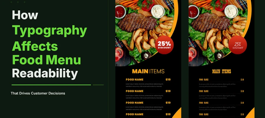
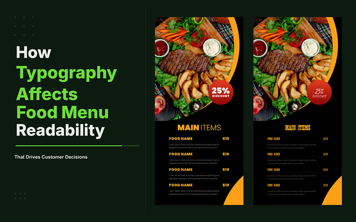
1. Font Size
Use 10–12pt for print body text and 14–16px for digital menus. Below these thresholds, reading becomes effortful rather than enjoyable. The eye works harder. The pace slows. The guest, without knowing why, begins to disengage. In dimly lit dining environments, the effective minimum rises to 12–14pt for print. If your current menu uses 8pt or 9pt body text to fit more content on the page, you are trading your guest's ease for your own convenience, and in that transaction the guest always loses.
2. Line Spacing (Leading)
Optimal line spacing sits between 120% and 145% of the font size. Below 120%, lines begin to visually bleed into one another, creating a density that discourages close reading and communicates, however subtly, that the menu was made to be printed cheaply rather than read thoughtfully. Above 145%, the eye loses its sense of text as a connected, coherent unit and struggles to track from line end to line start. Most design software defaults to line spacing that is too tight for menu use. Always override it deliberately.
3. Letter Spacing (Tracking)
All-caps headings, common in menu category titles, require increased letter spacing of between 50 and 100 additional units to remain comfortably legible. Capital letterforms sit closer together by default, and the visual compression that results is subtle but real. It is the kind of friction a guest never identifies but always feels. Open the tracking on any all-caps headline and the improvement in legibility is immediate.
4. Contrast Ratio
The WCAG AA accessibility standard requires a minimum 4.5:1 contrast ratio for body text. In restaurant environments, where warm ambient light softens and flattens the visual field, dark text on cream or warm white performs consistently better than pure black on white. A menu that reads beautifully on a designer's calibrated monitor may become nearly invisible in candlelight. Test your contrast under actual dining conditions, at your actual tables, before a single copy is printed.
5. Column Width
The optimal line length for comfortable reading falls between 50 and 75 characters per line. Shorter lines disrupt reading rhythm and feel fragmented, as though the menu was assembled in haste. Longer lines require the eye to travel too far and lose its place, introducing a fatigue that accumulates across the length of the menu. Descriptions that sprawl across a full page width sacrifice the guest's ease for the appearance of detail.
6. Font Weight Hierarchy
A clear and deliberate distinction between heading weight, subheading weight, and body weight reduces cognitive load and gives the guest's eye the guidance it needs to move naturally through the page. When every piece of information on a menu appears at roughly the same visual weight, the eye has no map and no navigation. The result is decision fatigue, and decision fatigue defaults to the familiar rather than the interesting, to the safe choice rather than the profitable one.
How Font Choice Influences Customer Decisions and Spending
Typography does not only determine how easily a menu is read. It determines what guests feel as they read it. And feeling drives behavior in ways that deliberate, conscious reasoning rarely can match. The relationship between typeface and purchase decision is well established in design psychology, and its practical implications for restaurant operators are more significant than most realize.
1. Trust Formation
Serif fonts trigger deep, largely unconscious perceptions of tradition, reliability, and quality. Guests presented with menus set in Garamond, Baskerville, or Playfair Display consistently rate dishes as higher quality and demonstrate greater willingness to pay premium prices. The explanation is psychological and deeply human: serif letterforms carry centuries of association with scholarship, authority, and craft. The brain transfers those associations to the food before the food is described. The font is working on the guest before the guest knows it.
2. Perceived Value
Elegant, well-spaced typography increases the perceived value of every dish it describes. This is not a marginal or theoretical effect. A menu with generous line spacing, considered hierarchy, and a refined typeface makes a ten-dollar dish feel like a fourteen-dollar one. The typography signals that care was taken, and in the mind of the guest, care always signals quality. It is a powerful menu design concept that costs nothing but intention to implement.
3. Reading Speed and Order Behavior
Guests who move through a menu quickly, because the typography makes reading effortless but unguided, tend to default to familiar choices. They order what they already know and trust. The high-margin specials, the seasonal dishes, the items you have most carefully developed and most want your guests to discover, require typographic emphasis to earn the attention they deserve. Without deliberate hierarchy, those items are functionally invisible.
4. Emotional Priming
Script fonts activate emotional and deeply personal associations in the reader. Guests who encounter script typography on menus report feeling more personally welcomed, more cared for, and more inclined to linger at the table. This is the emotional priming effect: a typeface sets a mood before the content it carries has the opportunity to reinforce it. Used in the right context and at the right scale, a script font is one of the most emotionally potent tools in a menu designer's repertoire.
5. Price Perception
Removing currency symbols, placing prices inline with descriptions rather than in a right-aligned column, and setting price figures in a lighter, smaller weight than the dish name all reduce price sensitivity in measurable ways. Cornell University's research on menu engineering found that guests who encounter prices presented in these ways spend more per head and report greater satisfaction with the value they received. The typography of the price column is not an aesthetic decision. It is a revenue lever.
6. Attention Anchoring
Bold display fonts, heavier weights, and contrasting typefaces applied to high-margin items draw the eye before the conscious mind engages with the decision. This is attention anchoring, and every well-engineered menu uses it deliberately.
Research Note: Cornell University's menu engineering research found that strategic item placement and typographic emphasis can increase the sales of targeted dishes by up to 27%. That is not a coincidence. That is typography doing exactly what it was designed to do.
How to Choose the Right Typography for Your Menu
Choosing typography for a restaurant menu is a strategic act, not a stylistic one. It requires understanding your brand, your guest, your environment, and your goals before a single font is selected or a single character is placed. The following seven-step framework provides a structured path from blank page to considered, purposeful decision.
1. Define your brand emotion
What feeling should a guest have the moment they pick up your menu? Warm and personal? Sophisticated and aspirational? Energetic and contemporary? Every subsequent font decision must serve that answer without exception. If you cannot articulate the emotion your restaurant is designed to create, your typography will be incoherent. This is the foundation of a strong restaurant branding strategy; your fonts must serve the brand's "voice" without exception.
2. Choose a heading font
Select one typeface that expresses your brand personality as its primary typographic voice. Serif fonts carry heritage, authority, and trust. Display fonts carry boldness and unapologetic confidence. Script fonts carry warmth, intimacy, and the feeling of the handmade. This font will appear on section headers, the restaurant name, and featured dish callouts. It carries the brand.
3. Choose a body font
Select one highly legible typeface for descriptions, prices, and all secondary information. In most dining contexts, a clean sans-serif performs best here: it is fast to read, versatile at small sizes, and does not compete with the character of the heading font. The body font serves the guest. The heading font serves the brand. Both are essential.
4. Test in real conditions
Print the menu at its actual intended size. Place it at your tables. Read it under your actual lighting, at arm's length, as a guest would. Not on a monitor. Not at the designer's desk. At the table, in the room, in the light. What is effortful to read at the table is a problem that will never reveal itself in a PDF proof.
5. Verify contrast and size
Check every text element at arm's length in low light. If any text requires effort to read, increase the size, increase the weight, or increase the contrast. The test is simple and unforgiving: if a guest over fifty, seated at your dimmest corner table on a busy Friday evening, can read the menu without tilting it toward the candle, it passes.
6. Apply hierarchy deliberately
Ensure category headers, dish names, descriptions, and prices occupy visually distinct typographic levels with clear, unmistakable size and weight differences between them. Never allow them to compete at equal visual weight. The hierarchy is the navigation. And navigation, in a restaurant, is the experience.
7. Adapt for digital
If your menu appears on a website, a QR code, or a digital display, verify that the same fonts render correctly on mobile devices and on backlit screens. Increase minimum sizes. Strengthen contrast. Where the print version uses a delicate script, the digital version may require a bolder interpretation of the same typeface to remain fully functional.
7 Menu Typography Mistakes That Drive Customers Away
Each of the following mistakes is common, consequential, and entirely avoidable. They appear with painful frequency in restaurant menus that underperform their true potential, not because the food is wrong, but because the typography fails the food before it has had the chance to speak.
1) Too many fonts
More than two typefaces in a single menu creates visual chaos and, more damagingly, signals amateur design. The guest's eye reads inconsistency as incoherence, and incoherence quietly undermines confidence in the kitchen. Limit your menu to one heading font and one body font, chosen to complement each other and to reinforce, not contradict, your brand identity. This kind of discipline is often emphasized in graphic design tips and tricks followed by experienced designers.
2) Script fonts for body text
Script fonts are genuinely beautiful in small doses and deeply expressive as accent typography. They are not suitable as primary body fonts. Extended passages of script fatigue the eye, slow reading speed considerably, and make descriptions feel effortful to absorb at the exact moment when absorption should be effortless. Reserve them for restaurant names, section headers, and single-line callouts.
3) Insufficient contrast
Light gray text on a white background may look refined and minimal on a screen. In a restaurant dining room under warm ambient light, it becomes nearly invisible. Always test your menu under your actual lighting conditions before a single copy is printed. If any guest at any table would need to strain to read it, the contrast has failed the guest and, by extension, the restaurant.
4) Font size too small
Reducing body text to 8pt or 9pt to accommodate more items on fewer pages is a false economy with real consequences. It costs you every guest over the age of forty, every dimly lit table, and every guest whose attention you lose the moment reading requires any effort at all. Go larger. Your content should earn its space on the page, not be compressed into it.
5) No typographic hierarchy
When category headers, dish names, descriptions, and prices all appear at roughly the same visual weight and size, the menu has no navigation. The guest's eye does not know where to begin or where to focus. The result is decision fatigue, a reliable path to the safe choice, the familiar order, the item that needs no persuasion because it requires no discovery.
6) Mismatched brand voice
A casual neighborhood burger restaurant using ornate calligraphy, or a Michelin-level tasting menu set in rounded, playful type, sends conflicting signals that erode trust in both the food and the experience before a single dish is placed on the table. Typography must be coherent with every other brand touchpoint: the interior design, the uniforms, the service style, the plating philosophy, the story you are telling. This consistency is a defining factor in modern restaurant branding trends.
7) Ignoring digital requirements
A typeface that prints beautifully at 12pt on quality uncoated stock may render as a blurry, illegible approximation on a mobile screen. Digital menus require higher contrast, larger minimum sizes, and fonts tested across device types. If your menu exists in both print and digital formats, it requires a typographic system designed to perform well in both.
Best Menu Typography FAQs
Typography raises practical questions that deserve direct, practical answers. Every restaurateur, designer, and brand professional working on a menu will encounter these decisions, often under time pressure and without the clarity this subject deserves. What follows is the clearest guidance available.
Yes, font choice affects what customers order by shaping attention and perceived value. Strategic typography can highlight high-margin items and increase their selection rate, while also making dishes feel more premium.
Open Sans, Lato, and Garamond are the most readable fonts for restaurant menus in both print and digital formats. Their clean structure and strong legibility make them perform well at small sizes and in low-light conditions.
Typography shapes how guests judge a restaurant’s quality before the food arrives. Consistent, well-chosen fonts build trust and professionalism, while poor typography signals carelessness and lowers perceived quality.
Use 10–12pt for print body text and 14–16px for digital menus, with larger sizes in low-light settings. Headers typically work best between 18–28pt for clear readability and hierarchy.
Yes, typography can increase restaurant revenue by guiding attention toward high-margin items and reducing price sensitivity. Studies show typographic emphasis alone can increase the order rate of a targeted dish by up to 27%.
Endnote
By this point, you already understand that typography on a food menu is not decoration. It is a system that quietly controls how people move through choices. What often gets missed is how sensitive that system is in real conditions, where guests are not studying the menu, they are scanning it under time pressure.
In practice, how typography affects food menu readability is less about appearance and more about mental effort. Small details such as line spacing, letter density, and contrast do not just change how a menu looks. They change how long it takes to process information. And when processing slows down, guests stop exploring and start narrowing their choices too early.
This is why two menus with the same dishes can perform in completely different ways. One feels immediate and clear. The other feels slightly tiring without anyone being able to explain why. That difference is not subjective. It is structural.
At scale, these small typographic decisions influence what gets noticed first, what gets skipped, and what gets ordered most often. Guests do not analyze typography, but they respond to it through behavior, especially when they are deciding quickly.
Ready to bring this thinking to your restaurant's menu? Explore our menu design service and you will find us designing food menus where typography is not just selected, but engineered for readability. From font pairing and spacing systems to visual hierarchy and print clarity, every detail is built to make menus easier to read and easier to choose from.
Because when typography works properly, guests do not think about it at all… They simply read, decide, and enjoy.
Graphic Design Eye LLC is a full-service creative agency built for brands that demand more than design — they demand vision. From strategic branding to complete visual identity, we partner with startups, agencies, and growing businesses as a dedicated creative force. With flexible subscription and project-based models. Let's start with us today!