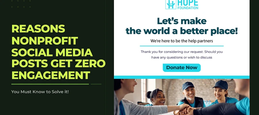
Why do your nonprofit social media posts get zero engagement even when the mission is a good one? The cause is almost never the cause you'd assume. It's design. This guide names the 7 fixable design mistakes behind it, each with the evidence and a concrete fix.
There is a particular kind of frustration that nonprofit communicators know well. You write the post. You choose the photograph. You schedule it at the time someone once told you was optimal. You publish it. And then nothing happens. No shares. No comments. A handful of likes from board members and the same three volunteers who always show up. The reach counter climbs slightly, then stops.
That result is not a verdict on your mission. It's a signal about a set of decisions, most of them unexamined, sitting between the work your organization does and the people who should be moved by it. Which platform to use. What you're actually asking people to do. Whether the visual identity looks like it belongs to the same organization from post to post. Each of those decisions has a measurable effect on whether content earns engagement or disappears into a feed.
If you're a nonprofit communicator, a volunteer running the Instagram account, or a strategist supporting a mission-driven organization, the seven reasons are built around the platforms and benchmarks specific to your work.
7 Reasons nonprofit social media posts get zero engagement
You post. You wait. You check the numbers. And there it is again, a handful of likes from board members and a reach count that tells you the algorithm showed your content to almost nobody outside the people who already follow you. Seven reasons explain why nonprofit social media posts get zero engagement, and none of them are the cause's fault. Every single one is a design and strategy problem. And every single one is fixable.
01. Your Graphic Looks Like a Flyer, Not a Social Post
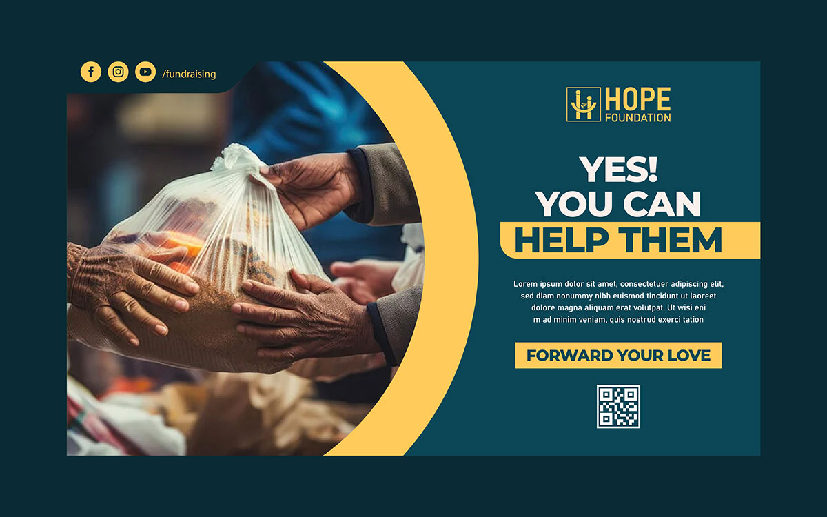
A strong social post has one dominant visual element and a hierarchy readable in a single glance. Most nonprofit graphics carry three or more competing elements, the exact opposite of what a scroll-stopping post requires.
This is the single most common design mistake behind zero-engagement posts. A nonprofit's communications team has usually spent years producing printed materials: event posters, donation leaflets, annual reports. When the same team moves to social media, it brings the same instincts. Center everything. Put the logo at the top. List every detail. In print, that reads as professional. In a feed, it reads as static and indistinct from the fifty other posts someone scrolled past to get to yours.
Print is built to be held and read at leisure. Social media is built to stop a thumb mid-scroll in a fraction of a second on a six-inch screen. Those are two different disciplines, and treating them as one is the root of this failure.
What Actually Changes Between the Two Formats:
Hierarchy: Print can hold five or six pieces of information at equal visual weight. Social needs exactly one focal point.
Reading distance: Flyers are read at arm's length in good light. Feed posts are judged in under a second, often outdoors, often with one eye on a conversation.
Native scale matters: A graphic designed at A4 and shrunk to fit a phone screen loses fine detail, small type, and thin lines before it ever reaches the viewer.
Real-world reference: Organizations like charity: water built their entire visual identity, the yellow jerry can, minimal typography, one image per post, around this exact principle: one idea, instantly legible, before any words are read.
The Fix:
Design every social graphic natively at 1080x1080px or 1080x1350px from the first sketch, not as a shrunk version of a print document, following proven social media post design ideas that are built for mobile-first viewing.
Pick one dominant visual element per post: a human face, a bold number, or one powerful headline.
Move any information that can live in the caption out of the graphic entirely.
Build a social-first template system instead of adapting print templates for digital.
Print-First Design
Social-First Design
Centered layout, logo at top
Bold headline or human face leads
All event details included
One message, one visual priority
Brand colors on white background
High-contrast, mobile-tested palette
Landscape or A5 proportions
Square (1:1) or portrait (4:5 or 9:16)
Designed at A4 scale, scaled down
Designed natively at 1080x1080px
Typography built for print reading
Headline minimum 60px, two typefaces max
CTA buried in body copy
Single CTA, visually dominant
02. You're Leading With Your Logo, Not Your Mission
Eye-tracking research consistently shows audiences skip logo-led imagery, a learned response researchers call banner blindness. It happens before the viewer consciously registers what the logo even is.
Putting the logo at the top of every graphic is an instinct inherited from brand guidelines written for press releases and sponsorship decks. On social media, it works against you. The brain registers a logo-led image as an advertisement and quietly stops paying attention to it, an unconscious response that fires before the viewer even finishes scrolling past.
Your mission is far more scroll-stopping than your logotype, which is why a strong nonprofit branding strategy puts the cause before the brand mark in social content. A child's face. A number that represents lives changed. One sentence that captures the cause in plain language. People share stories and impact, not brand marks.
Where This Shows Up in the Real World:
What performs: A beneficiary quote, a before-and-after, or a single striking statistic consistently outpulls a branded announcement graphic on organic reach.
Real example: Movember built a global campaign almost entirely on one image, the mustache, with the logo appearing nowhere near the front of the visual. The idea led. The brand followed.
The 15 percent rule: Design teams that cap logo size at roughly 15 percent of the image width, placed in a corner, report the mission element gets noticed first because there's nothing else competing for the eye.
The exception: Co-branded partnership content and sponsor-visibility posts are the one context where logo-forward design is genuinely required. Everywhere else, it's a habit, not a rule.
The Fix:
Rebuild your templates so every post leads with the mission: a face, a statistic, a beneficiary quote, or an image that communicates impact before it communicates brand.
Move the logo to the bottom-right corner at no more than 15 percent of the image width.
Run the same post two ways, logo-led and mission-led, and let one content cycle's engagement data settle the debate.
Save full logo prominence for partnership announcements and event co-branding, where sponsor visibility is a genuine requirement.
03. Your Color Palette Has No Contrast
WCAG 2.1 sets a minimum contrast ratio of 4.5:1 for normal text and 3:1 for large text. Most nonprofit social graphics fall short of it, and roughly 2.2 billion people worldwide live with some form of visual impairment that low contrast actively excludes.
A graphic that can't be read doesn't exist in the feed, and low contrast is the most common reason nonprofit graphics fail to read, which is why thoughtful social media post color combinations matter for both accessibility and engagement. Step outside on a bright day and open your phone. Pale blue on white, yellow on cream, light text on a mid-toned background: these combinations can look fine on a calibrated desktop monitor and disappear completely on a phone screen in direct sunlight.
This isn't only a stylistic issue. It's an accessibility one, and it's one of the few design mistakes on this list with a hard, testable standard behind it rather than a matter of taste.
How to Check Your Contrast Ratio:
Use the WebAIM Contrast Checker at webaim.org/resources/contrastchecker.
Enter your text color and background color as hex values.
Aim for 4.5:1 or higher on all text in social graphics.
Test the final file on a physical phone, in natural light, before publishing.
The Fix:
Audit your current palette against the WebAIM Contrast Checker before designing anything new.
Where the brand palette produces a low-contrast pairing, add a solid overlay at 60 to 80 percent opacity between the image and the text.
Make high-contrast text a mandatory rule in the template system, not an optional variant a busy volunteer can skip.
Test every graphic on a phone in natural light as the final step before it goes out.
04. You're Posting at the Wrong Dimensions
A 1200x628px landscape image posted to Instagram gets auto-cropped to a square, which routinely cuts off the headline, the subject's face, or the CTA before a single person sees the full graphic.
A graphic that's well designed but wrong-sized for its platform gets cropped in ways that quietly ruin it. Every platform has its own recommended dimensions, and every platform crops differently across feed, preview, mobile, and Stories. This is one of the easiest problems on this list to fix and one of the most commonly ignored, because the crop is invisible to the designer working at desktop scale and glaringly obvious to everyone viewing it on a phone.
2026 Platform Dimension Reference
Platform
Format
Recommended Dimensions
Aspect Ratio
Instagram
Feed (Square)
1080x1080px
1:1
Instagram
Feed (Portrait)
1080x1350px
4:5
Instagram
Stories / Reels
1080x1920px
9:16
Facebook
Feed Post
1200x630px
1.91:1
Facebook
Stories
1080x1920px
9:16
LinkedIn
Feed Post
1200x628px or 1080x1080px
1.91:1 or 1:1
TikTok
Video
1080x1920px
9:16
X (Twitter)
In-feed Image
1600x900px
16:9
The Fix:
Design a dedicated version of each graphic per platform instead of cross-posting one file everywhere.
On Instagram, default to 1080x1350px (4:5) for feed posts; it claims more vertical screen space than a square.
For anything running across multiple platforms, use 1080x1080px as the safe universal base and build platform-specific variants from there.
Preview every graphic on an actual phone before publishing, not just inside the desktop design tool.
05. Your Typography Is Unreadable on Mobile
Most feed content is viewed at roughly arm's length, on a screen a few inches wide. Headline text under 60px on a 1080px canvas routinely fails to clear that distance.
Pull up one of your recent posts on your phone and hold it at arm's length. If any text on the graphic requires leaning in, squinting, or tapping to zoom, that text has already failed its job, because the audience won't lean in. They'll scroll.
Nonprofit social graphics tend to fail in three specific ways: text set too small, too many typefaces crammed into one graphic, and full paragraphs of body copy placed inside the image itself, problems that are easier to prevent when every project starts with a clear social media design brief.
Nonprofit Typography Standards for Social Graphics
Headline text: minimum 60 to 80px on a 1080x1080px canvas.
Supporting text: minimum 36px, used sparingly, one short line at most.
Maximum two typefaces per graphic: one display font, one supporting font.
Avoid light-weight styles (Thin, Light, ExtraLight); they vanish on mobile screens.
Never place a full paragraph of body copy inside a social graphic.
The Fix:
Apply the arm's-length test to every graphic before it goes out. If any element takes effort to read, make it bigger, bolder, or cut it.
Lock a minimum text size into the template system so every person on the team is working from the same standard by default.
Move body copy, event details, and extended information into the caption, where it can be read at any size and picked up by platform accessibility tools.
Limit graphic typography to one headline and one supporting line, maximum.
06. Your Posts Have No Single Clear Call to Action
Posts asking for more than one action, donate and share and sign up and tag a friend, reliably underperform posts built around a single, low-effort ask.
Look back at your last five posts. How many asked the audience to do more than one thing? That's several separate cognitive requests delivered in a single scroll-past moment, and the usual result of stacking that many asks is that people take none of them. Not because they're disengaged, but because responding has become harder than scrolling on.
This starts as a design problem before it's a copywriting one. If a graphic has no single dominant focal point, the whole post loses structural clarity. A good social graphic works like a signpost: you are here, and the next step is this.
What One Clear Ask Looks Like in Practice:
The gold standard example: The 2014 ALS Ice Bucket Challenge succeeded almost entirely because the ask was singular and visual: pour water, post it, nominate someone. No competing instructions, no secondary CTA.
Low-effort beats high-effort: A poll sticker or a one-tap share consistently earns more responses than a caption asking people to visit a link, fill a form, and then donate.
Visual hierarchy does the asking: The most visually dominant element on the graphic should be the one that leads to the CTA, not a headline that has nothing to do with the action requested.
Secondary asks aren't gone, just relocated: Additional links or requests belong in the caption, where they don't compete with the graphic's single visual instruction.
The Fix:
Decide on one CTA before opening the design file: comment, share, click, donate, or RSVP. Pick one.
Build the graphic's visual hierarchy around that single CTA, so the most dominant visual element leads to or reinforces it.
Cut secondary CTAs from the graphic and, if they're genuinely necessary, move them to the caption instead.
Use built-in platform features (polls, question stickers, link stickers) to lower the effort required when the ask is engagement-based.
07. You're Inconsistent, and Your Audience Doesn't Recognize You
Brand recognition is a split-second pattern match. Inconsistent visual identity resets that recognition to zero with every single post, no matter how large or established the account is.
Scroll back through your organization's last three months of posts. Do they look like they came from the same organization? Consistent palette, consistent headline treatment, consistent visual tone? If the honest answer is "sort of," that inconsistency is directly costing engagement.
Brand recognition is nothing more mystical than a pattern-recognition shortcut. When someone sees your post in a crowded feed and it matches what they've seen from you before, it triggers an almost involuntary association: I know this organization, I trust them, I'll stop scrolling. Without that consistency, every post starts from zero.
What Consistency Actually Looks Like:
Real example: Charity: water has published thousands of posts across a decade with essentially one visual system: the yellow jerry can, clean sans-serif type, a consistent photo treatment. That repetition is precisely what makes a single post instantly recognizable as theirs before the logo is even visible.
Where inconsistency comes from: Most nonprofits land here for an understandable reason. Several people are creating content, each pulling from a different template, a different font pack, and a different reading of the brand guidelines, which is why many organizations turn to creative services for nonprofits to build a single, consistent visual system.
The fix isn't more rules: It's a locked, simple system that makes consistency the default rather than something that depends on everyone remembering it.
It compounds: A locked system doesn't just look better in month one. Every additional month of consistent posting deepens recognition, so the payoff grows over time rather than staying flat.
What a Nonprofit Social Media Brand System Includes:
A locked color palette: One primary, one secondary, one accent, hex codes embedded in every template.
A typography system: One headline font, one body font, both locked into the template files.
Three to five core post templates: Announcement, stat or impact, quote, campaign, event.
A defined photography treatment: Consistent filters, consistent cropping, consistent subject positioning.
A one-page brand reference card shared with every content creator on the team.
The Fix:
Build a locked template set covering your core post types, not an open file where every element can drift.
Limit publishing access until the system is in place and everyone using it is trained on it.
Run a monthly feed audit: scroll back 30 days and check whether the posts read as one coherent identity.
Treat visual consistency as a performance metric, not a taste preference.
How to audit your nonprofit's engagement
Reading the seven reasons above is useful. Knowing which one or two actually apply to your organization is more useful. This audit takes about 30 minutes and produces a clear priority for your next design decision.
1) Pull your last 20 to 30 posts and calculate engagement rate per post
Engagement rate = (total engagements ÷ total reach) x 100. Record this for each post individually, not as an average. Which posts landed above your average and which fell below tells you more than the average number ever will.
2) Tag each post against
For every post that underperformed, note which of the seven reasons applies. Does the graphic look like a flyer? Is the logo leading? Is the type too small to read on a phone? Is there more than one CTA? A pattern usually shows up within the first ten posts reviewed.
3) Identify your single biggest pattern
Most nonprofits that run this audit find that one or two of the seven reasons account for most of their underperforming posts, rarely all seven at once. Finding the biggest pattern first keeps you from trying to fix everything simultaneously, which makes it impossible to tell what actually worked.
4) Fix the top one or two issues for 30 days before touching anything else
Apply the specific fix and track engagement rate against your baseline for a month. One focused change produces data you can actually attribute. Several changes at once just produce confusion.
Nonprofit social media engagement FAQs
Nonprofit social media engagement raises the same questions from every communications team trying to understand why their content is not connecting. The answers below address what teams ask most often, from diagnosing low engagement to understanding what post formats actually work, with a direct response in the first sentence so you can find what you need and act on it immediately.
Nonprofit Facebook posts most often get no engagement for one of three reasons: posting too infrequently to stay visible in the algorithm, posting content that's entirely promotional rather than community-oriented, or leaving out a clear call to action. Organic reach for nonprofit Facebook pages has declined sharply since 2018, per Facebook's own reporting on organic distribution, which makes content quality, format, and genuine engagement reciprocity matter more than ever.
A solid nonprofit engagement rate runs roughly 0.07 to 0.37 percent on Facebook, 0.60 to 1.73 percent on Instagram, and 1.5 to 5 percent on LinkedIn, in line with the ranges reported by nonprofit-sector benchmark studies such as M+R Benchmarks. Smaller accounts typically outperform larger ones on this metric. Compare against nonprofit-specific benchmarks rather than commercial brand averages for an accurate read.
Aim for two to three posts a week on Facebook, four to seven on Instagram, and two to three on LinkedIn. TikTok rewards five or more posts a week. Treat these as starting points, not fixed rules, and let your own account's analytics confirm what cadence actually works for your audience.
On Facebook, yes, posting multiple times a day tends to split audience attention and lower per-post engagement. On Instagram and TikTok, higher frequency is generally rewarded by the algorithm instead. Applying one blanket posting schedule across every platform is almost always the wrong move for at least one of them.
Carousels and short-form video consistently earn the strongest engagement on Instagram. On Facebook, video and multi-image albums outperform single static posts. Across every platform, storytelling built around real beneficiaries, volunteers, and staff outperforms promotional or announcement-style content, especially when it includes one specific, low-effort ask.
No. A small nonprofit with limited staff time is better served focusing on the one or two platforms where its actual donors and supporters show up, and publishing consistently strong content there, than spreading thin across five platforms with inconsistent output. Consolidating platforms almost always improves both content quality and engagement rate for resource-constrained teams.
Most nonprofits that implement one focused fix from this guide, switching from logo-led to mission-led graphics, or correcting color contrast across the template system, see measurable improvement within 30 days. Rebuilding an entire brand system takes closer to 60 to 90 days to produce stable new benchmarks. The one thing that matters most is changing one variable at a time so you can actually tell what worked.
Endnote
Zero engagement is not a verdict on your mission. It is a signal that something in the delivery needs adjustment, and every one of the seven reasons in this guide is fixable without a rebrand.
The organizations that build real social media communities are rarely the ones with the biggest budgets or the largest teams. They are the ones that post with intention, ask for one specific response at a time, and show up consistently enough that their audience learns to recognize them at a glance. None of that requires a five-figure design retainer. It requires knowing which of the seven patterns is actually working against you, and fixing that one first.
Most nonprofits struggling with low engagement are affected by one or two of these seven reasons, not all of them at once. Find your pattern. Apply the fix. Measure it for 30 days. Then move to the next one.
Building and maintaining that kind of consistent template system is exactly where most volunteer-run and understaffed comms teams run out of hours, not ideas, and a structured social media design system is often what keeps content recognizable across every channel. Graphic Design Eye LLC works with nonprofits to build locked, mission-led template systems: the color palette, the typography, the contrast standards, and the platform-specific sizing, so every person on your team is publishing from the same system instead of rebuilding it post by post.
A project-based package gets you a defined template set and a clear starting point if you're building this from scratch. If your organization is already posting regularly, subscription pricing keeps your design output consistent without a fresh decision every week.
Your cause is worth being seen! Give it a design that earns the stop!
Graphic Design Eye LLC is a full-service creative agency built for brands that demand more than design — they demand vision. From strategic branding to complete visual identity, we partner with startups, agencies, and growing businesses as a dedicated creative force. With flexible subscription and project-based models. Let's start with us today!