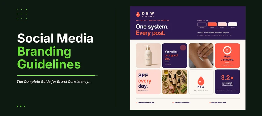
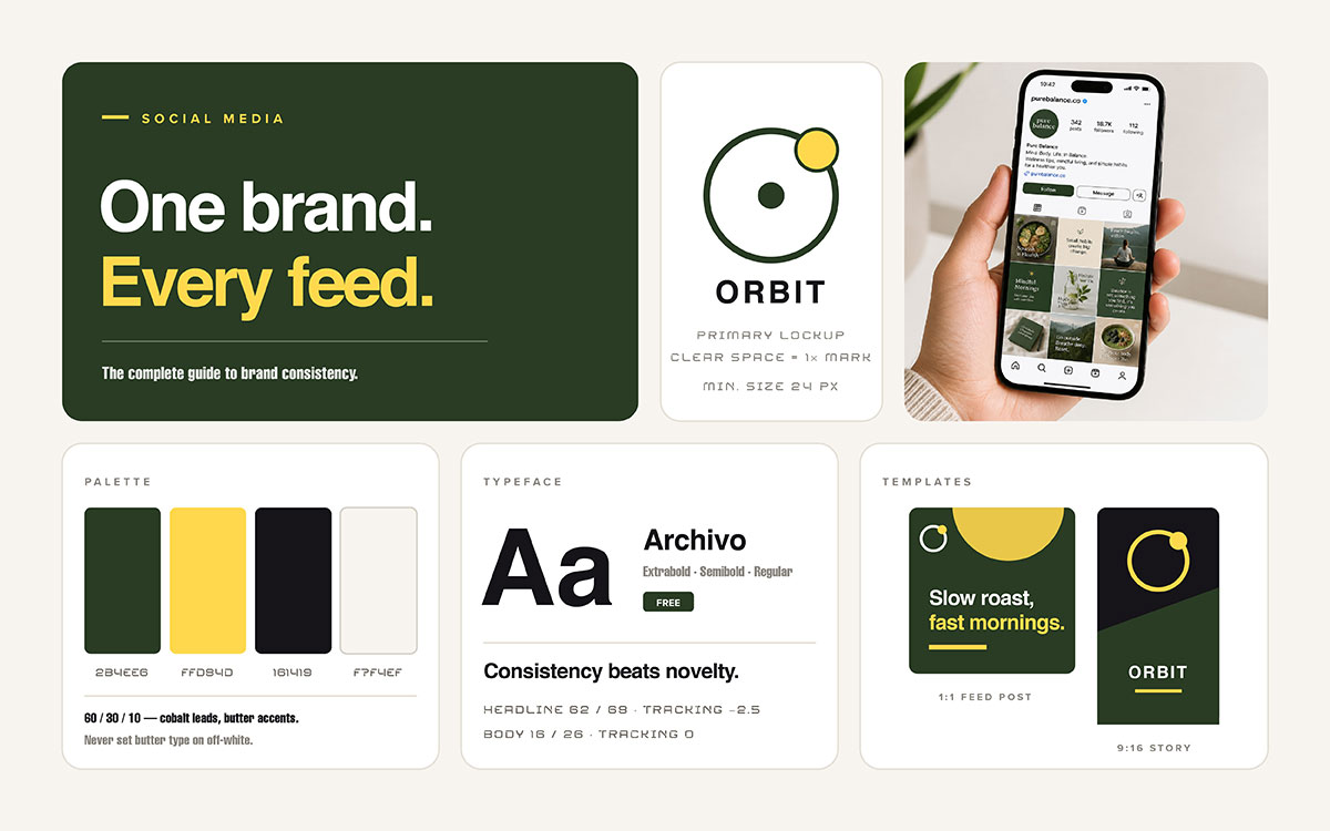
Social media branding guidelines are written rules for how a brand looks, sounds, and acts on every platform. This covers logo use, exact colours, fonts and minimum sizes, photo style, voice and tone, platform sizes, hashtag rules, accessibility, and approval steps. A full document has ten sections. But rules only work if people use them. That depends on a one-page reference card and locked templates, not on how long the document is.
Have you ever wondered why four different social media accounts belonging to the same company end up looking like four different companies? The answer is almost always that the social media branding guidelines exist somewhere, but nobody actually follows them. A logo file sits in a shared drive. A colour palette lives in someone's memory. A tone of voice changes depending on who happens to be posting that day. The guidelines were never the problem. The system around them was.
This article is all about that gap. You'll see the ten parts social media brand standards need. Exact hex codes. Platform safe zones. Accessibility rules teams often forget until it's too late.
But a document alone won't change anything. So you'll also learn what most guides leave out: how to get people to actually use your guidelines. Including a quick test you can try on your team this week to see if your rules are working or just sitting there unused.
You'll also learn five specific mistakes quietly breaking brand consistency right now, maybe in your own accounts, and how to fix each one. By the end, you'll know what to write down, what to build instead, and where to start.
10 Social media branding guidelines
Our social media brand guidelines show how a brand looks, sounds, and acts on every platform. It usually has ten parts: brand foundation, logo use, colour palette, typography, image standards, voice and tone, platform specs, hashtag rules, accessibility needs, and approval steps.
01. Brand foundation and purpose
A one-page summary of who the brand is, who it serves, and what it stands for. It gives the context that every other rule in the document protects.
This section is short on purpose. It states the mission in one sentence. It names the audience in specific terms, not vague groups. It lists three to five brand values. It names the one idea the brand wants to own in people's minds. It gives a principle to use when the guidelines don't cover something.
The biggest failure here is length. No one reads a three-page brand essay. Keep it to one page. A new freelancer should read it in ninety seconds and get what the brand is about.
WHAT TO INCLUDE
Mission stated in one sentence. Who the brand is for, described clearly. Three to five brand values. One sentence naming the idea the brand wants to own. A short list of words that describe the brand. A short list of words the brand avoids.
Every rule after this builds on this page. Get this right, and everything else makes sense.
02. Logo usage on social platforms
These rules say which logo version goes where. They cover minimum size, clear space, and when to skip the logo.
Social media asks more from a logo than print ever does. A profile picture is a circle, 320 by 320 pixels. In a feed, it often shrinks to about 40 pixels. A wide wordmark becomes unreadable at that size. That's why most brands need an icon-only or monogram version just for profiles. A Story overlay needs a version that stands out on photos. A co-branded post needs its own lockup rule.
This section should name the exact file for each context. Name the file. A community manager should read "profile picture: use logo-icon-white-320.png" and just use it. No guessing needed. Unclear rules are the top cause of mismatched logos across accounts. This usually happens when a logo design comes as one file, rather than a full set built for every place it needs to work.
WHAT TO INCLUDE
Approved logo versions, with exact file names for each use. Minimum display size in pixels. Clear space rules in pixels, not proportions. A short list of banned changes, with pictures. Rules for co-branded and partner logos.
Name the file, not the idea. Files get used the right way. Ideas get guessed at.
03. Colour palette with exact values
Show the full brand colour system in the colour modes social media actually uses. Explain which colours should lead in each context. State which combos pass accessibility contrast tests.
Social media only uses RGB and HEX. CMYK values here are useless. List every approved colour with its HEX code and RGB values. Split the palette into three tiers: primary colours for brand identity, secondary colours for support, and accent colours for calls to action and emphasis.
Also cover proportion. Without it, every colour fights for attention. Use the 60/30/10 rule: 60 percent background colour, 30 percent secondary colour, 10 percent accent colour for the one element that needs attention most.
WHAT TO INCLUDE
Every approved colour, with its HEX and RGB values. Colours split into three tiers: primary, secondary, accent. Guidance on how much to use each. A chart showing which text colours work on which backgrounds. All pairings meet WCAG 2.1 AA's 4.5:1 minimum contrast.
A palette needs proportion rules. Without them, it's just paint.
04. Typography rules for social formats
Approved fonts, their weights, and the smallest sizes that stay readable when platforms shrink your content.
Typography fails on social media brand guidelines in one common way. Designers build the asset full size on a big screen. There, 18-point text looks plenty big. But once it shrinks to thumbnail size in a feed, that same text becomes unreadable. And people won't zoom in to read it.
So set your minimum sizes based on how the asset will actually be viewed. Then test it at 50 percent scale before you publish. If the main message isn't readable at that size, the text is too small. For a 1080 pixel square asset, headlines should start around 60 points. Body text should rarely go below 32 points.
WHAT TO INCLUDE
Approved fonts, each with a licensed web-safe backup. Allowed weights. Minimum sizes for each asset type. A set order for headline, subhead, body, and caption. A required test: check readability at 50 percent scale before publishing.
If you can't read it at thumbnail size, it wasn't made for social media.
05. Photography and imagery standards
Rules about what the brand photographs, how photos get treated, and what images are banned. This section shapes whether a feed looks cohesive at a glance.
People see a feed as a grid first, then as single posts. So image consistency matters more on social media than anywhere else. Nine posts in a grid show inconsistency instantly. Nine print ads never would. This section makes the grid feel intentional.
The most important rule here is treatment: one consistent grade, contrast, and warmth across every photo. Applied consistently, it makes photos from different photographers, days, and conditions look like one body of work. It is the highest leverage rule in this whole section. It does more for a feed than smart social media post ideas used inconsistently ever could.
WHAT TO INCLUDE
Guidance on what the brand photographs. A written photo style guide with camera settings or a preset file. Preferred composition rules. A clear policy on stock photos. A list of banned images. Alt text rules for accessibility.
The grid gives the first impression. Treating photos the same way makes nine different pictures feel like one brand.
06. Voice and tone by platform
The brand has one fixed personality. It shows up differently on each platform, but it never turns into a different personality.
People often mix up voice and tone, but the difference matters. Voice is the brand's fixed personality. It stays the same on LinkedIn and TikTok, just like a person's personality stays the same at a board meeting and at a dinner party. Tone is how that voice adjusts to the moment: more formal for an announcement, warmer in a community reply, more careful during a sensitive time.
This section should describe the voice using three to five adjectives, each with an example sentence. Then it should show a tone matrix comparing platforms and how the register shifts. It should also list things the brand never does, no matter the platform: never sarcastic at a customer's expense, never engages with trolls, never comments on unrelated news.
WHAT TO INCLUDE
Voice shown in three to five words with example sentences. A tone chart for each platform. Words allowed and words banned. Emoji rules for each platform. Rules for replying to good comments, bad comments, and questions. A short list of things the brand never says.
Voice shows who the brand is. Tone shows how it reads the room. Voice stays the same. Tone changes.
07. Platform-specific dimension specifications
Every platform needs exact pixel sizes, ratios, and safe zones for each asset type. This is the most used part of any social media style guide.
People check this section every week. It should be a table, not paragraphs, since people just look up one fact at a time. Someone making an Instagram Story needs to spot 1080 by 1920 in three seconds, not read about video strategy. If you hire an outside designer, send this page first. It stops many revision requests before work even starts.
Safe zones matter as much as size. A 1080 by 1920 Story has about 250 pixels blocked at the top and bottom by app menus. TikTok blocks about 140 pixels on the right for its buttons. Anything placed there gets hidden or cut off, no matter how good the social media design is. Platforms change these numbers sometimes, so check them each time instead of trusting old data.
WHAT TO INCLUDE
A full table of sizes for every platform and asset type the brand uses. Aspect ratios. Safe zone sizes in pixels. Max file sizes. Recommended file formats. A note on which platforms crop previews differently from the full display.
This is the page the team really uses. Make it a table. Keep it updated. Put it where people can find it fast.
08. Hashtag, handle, and link standards
Rules for branded hashtags, campaign hashtags, handle use across platforms, and link formatting and tracking.
Hashtag inconsistency is a small but real problem. #OurBrandCares and #ourbrandcares still group together on most platforms. But #OurBrandCare does not. That splits your campaign content in two. The fix: write down the exact hashtag once, where everyone can see it.
Hashtag numbers also change by platform. Instagram allows up to 30 hashtags. It works best with a few relevant ones, not the max. LinkedIn rewards three to five. X rewards one or two. Using Instagram's style on LinkedIn makes a brand look out of place. That small mistake hurts more than it seems.
WHAT TO INCLUDE
The branded hashtag, with exact capital letters. The naming rule for campaign hashtags. How many hashtags to use per platform. The official handle for each platform. How to format links and UTM tags. Rules for tagging partners and mentioning others.
One wrong letter in a hashtag splits your campaign. Write down the exact tag.
09. Accessibility requirements
These standards make social content usable for people with visual, hearing, or cognitive disabilities. It's now a legal must, not just an ethical one.
The social media brand guidelines need to cover four accessibility basics.
Alt text on every image, describing what it shows. Captions on every video, since many people watch with sound off. Colour contrast meeting WCAG 2.1 AA rules, at least a 4.5:1 ratio for normal text. And camel case for multi-word hashtags, like #SocialMediaBranding instead of #socialmediabranding, so screen readers read each word correctly.
Brand guidelines often skip these rules. Then teams handle them inconsistently, or not at all. Writing them down makes them standard practice, not something only one team member remembers to do.
WHAT TO INCLUDE
Alt text rules, plus a short writing guide. Captions and subtitles required for videos. A minimum contrast ratio, using an approved color chart. A rule for camel case hashtags. Advice against using image text as the only way to share info. Emoji limits so screen readers stay clear.
Accessible content reaches more people. That's the whole point, and it's enough.
10. Approval workflow and governance
This section covers who can publish, who approves what, how guidelines get updated, and what happens when things go wrong.
A guideline document without this section is just a suggestion. This section makes it a real standard. It should name roles, not people, so it still works when staff changes. The community manager publishes routine content without approval. The marketing director approves campaign content. The executive director approves anything tied to a public event or controversy. Groups running ongoing content marketing need this most. High volume turns small unclear points into daily problems.
This section should also cover crisis steps: who can pause scheduled posts, who drafts replies to public complaints, and what to do when something gets posted by mistake. These calls go badly under pressure unless they're planned ahead of time.
WHAT TO INCLUDE
Publishing permissions by role. Approval steps by content type. Guidelines reviewed regularly, usually every quarter. Version number and last update date on the document. Plan for handling crises and errors. One named person owns the document.
Without governance, guidelines are just suggestions. Governance turns them into standards.
How to make brand guidelines actually get followed
Social media brand guidelines fail when people don't follow them. Bad writing isn't the problem. The real fix is treating adoption as its own design task, apart from the guidelines themselves. Four things help guidelines stick: a one-page quick reference card, ready-made templates, a named owner who reviews them regularly, and proper onboarding for every new contributor.
1) Build a one-page quick reference card
Keep the full guideline document. But make the daily one a single page.
One reference card should have the hex codes, fonts, minimum sizes, size chart, branded hashtag, and approval tiers. That covers most daily decisions.
Share it as a PDF. Also pin it as an image in the team's chat app.
2) Build templates, not just rules
The best way to enforce brand rules is to make the right choice the easy choice. Lock a template library in Canva or Adobe Express, with colours, fonts, and sizes already set. Then a team member working fast still makes on-brand content by default. Rules need memory and discipline. Templates need neither. Building that library usually costs less than teams expect. Weigh that against the ongoing cost of off-brand work. That is why it helps to know what social media design really costs before deciding to build the system in-house.
3) Assign a named owner and a review cadence
Guidelines go stale. Platforms change sizes, brands evolve, and campaigns add things nobody wrote down. Give one person ownership of the document. Review it every quarter to keep it accurate. A guideline with old dimensions teaches the team not to trust it. And nobody checks a document they don't trust.
4) Onboard every new contributor deliberately
Every new employee, freelancer, agency partner, or intern who creates content should get the quick reference card. They should also get a 15-minute walkthrough before their first post. This is the single most useful step you can take. Yet almost everyone skips it.
THE ADOPTION TEST
Ask three team members, without warning. Ask for the brand's main hex code. Ask for the smallest headline size for Instagram.
If fewer than two answer right, the guidelines aren't working. It doesn't matter how well written they are.
Fix distribution and templates first. Then write more documentation.
5 Social media branding mistakes
The five most common social media branding mistakes all share one cause: following the guidelines was harder than ignoring them. These are writing guides too long to use, listing colours without proportion rules, designing at full scale instead of feed scale, treating every platform identically, and never updating the guidelines as things change.
Mistake 1: Writing guidelines that are too long to use
What happens: The organization pays for a huge 60-page brand guide. It covers the brand's history, philosophy, and reasons for every choice. It looks great. But after the launch meeting, nobody opens it again.
The truth: Longer guides get used less. Someone needing a hex code at 4:47 pm won't scan 60 pages for it. They'll just pick a colour that looks close enough.
The fix: Write the full guide if it's useful. But pull a one-page cheat sheet from it. Make that sheet the main tool. Share it everywhere the team works.
Mistake 2: Specifying colours without specifying proportion
What happens: The guideline lists eight approved brand colours with hex codes. It gives no rule on how much of each to use. Each designer picks a different mix. Every post ends up looking like a different brand.
The truth: A palette alone is not a system. Without proportion rules, eight colours can create endless visual identities. All technically compliant.
The fix: Use the 60/30/10 rule. Name one dominant colour, one secondary colour, and one colour just for calls to action. Cut the palette down if it has more than five colours.
Mistake 3: Designing at full scale and never testing at feed scale
What happens: Designers work on big monitors at full size. Everything looks clear and balanced. But on a phone feed, at thumbnail size, the headline is unreadable. The logo is just a smudge.
The truth: People view social content much smaller than it was designed. If you have not checked an asset at real size, you have not really checked it.
The fix: Always test at 50 percent scale before posting. View each asset at half size first. If the main message is not instantly readable, make the text bigger and simplify the design.
Mistake 4: Treating every platform identically
What happens: The same 1080 by 1080 square gets posted everywhere. Instagram, LinkedIn, X, TikTok. No time to make different versions.
The truth: Drop a square into a vertical 1080 by 1920 space. Over 40 percent of the screen stays empty. It shows the brand doesn't really use the platform. Native formatting builds trust. It's not just a nice touch.
The fix: Design the master asset first. Then export crops for each platform. Plan the crop zones early. The design should hold up in every size, no redoing it later.
Mistake 5: Never updating the guidelines
What happens: The guideline document was finished two years ago. Since then, three platforms changed their size rules. The brand added a second colour. The document still lists a font the organization no longer owns.
The truth: An outdated guideline hurts more than no guideline at all. It teaches the team not to trust the document. Once that trust breaks, people stop using it.
The fix: Pick one person to own it. Set a review every quarter. Add a version number and last updated date on the cover. Then anyone can check if it is current at a glance.
Social media branding guidelines FAQs
Social media branding guidelines cover how a brand looks, sounds, and acts online. This includes logos, colours, fonts, tone, sizes, and approvals. The questions below cover what to include. They also cover document length, ownership, and update frequency. Plus whether small businesses need one too.
These are written rules for how a brand looks, sounds, and acts on social media. They cover logos, exact colours, fonts and their sizes, photo style, voice and tone, platform sizes, hashtag rules, accessibility, and who approves posts. This keeps the brand recognisable everywhere.
They should have ten parts: brand purpose, logo rules for social, colours with exact HEX codes, fonts with minimum sizes, photo standards, voice and tone per platform, size specs for each platform, hashtag and handle rules, accessibility rules, and approval steps.
People recognise brands through repeated exposure. Inconsistent posts break that recognition each time. A Lucidpress (now Marq) study found consistent branding raised revenue by about 23 percent. A later version found 33 percent. Both numbers come from marketer surveys, not audited records.
Have a full guide of 15 to 25 pages, plus a one-page quick reference card. The card is what people use daily. It should show hex codes, fonts with sizes, size specs, the branded hashtag, and approval levels. Longer documents get used less.
Review it every quarter. Update it when a platform changes its size specs, the brand adds new visuals, or a campaign creates a rule worth keeping. Give it a named owner. Show the version number and last update date on the cover so readers know if it's current.
One named role should own it, usually a brand or marketing manager. They approve changes and handle the quarterly review. Name the role, not the person, so ownership stays even when staff changes. Shared ownership usually means no real ownership, and the guide goes out of date unnoticed.
A social media brand guide covers the whole identity, across print, packaging, and physical spaces. It focuses on what social platforms need: RGB and HEX values, minimum text sizes for feeds, profile logo versions, safe zones, tone, hashtags, and posting approval. The social guide follows the master guide and never contradicts it.
Yes, often more than large ones, since small teams share posting duties with non-designers. A one-page card with five hex codes, two fonts with sizes, size specs, the branded hashtag, and approval steps gives most of the benefit. The full guide can come later, once the card shows which rules are missing.
Endnote
Social media branding guidelines only matter once a team treats them as infrastructure. They should get used daily. The real work was never writing the rules. It was making people actually want to use them.
So don't start with a blank document and all ten sections at once. Build the one-page card first. Test it with your team this week. Let thirty days of real use show you the biggest gaps.
Building this system works best with a branding design team. Graphic Design Eye LLC handles all ten sections together: exact hex and RGB values from your brand, fonts sized for feeds, and a dimension table updated as platforms change specs. Most teams skip the most useful part. A locked template library in Canva or Adobe Express keeps work on brand even for a rushed freelancer or intern. Graphic Design Eye LLC builds that library alongside the guide, so both stay in sync.
Take one small step today. Write your five hex codes. Name your two fonts. Put your dimension table somewhere easy to find. A brand people recognize instantly isn't luck. It's a system, built once and trusted every day.
A brand that shows up the same way everywhere is simply the one people remember without having to think twice.
Graphic Design Eye LLC is a full-service creative agency built for brands that demand more than design — they demand vision. From strategic branding to complete visual identity, we partner with startups, agencies, and growing businesses as a dedicated creative force. With flexible subscription and project-based models. Let's start with us today!