How to create an aesthetic Instagram feed comes down to three decisions: one consistent photographic treatment applied to every image, a fixed palette and typeface set, and an Instagram grid layout pattern planned in advance. This guide walks through 10 proven grid patterns, the five mistakes that quietly undo an otherwise cohesive feed, and the planning habits that keep a grid looking intentional month after month.
Most Instagram posts get made one at a time. A caption for that post. An image for that post. A design for that post. Then it lands in a grid nobody planned, next to eleven other posts made the same way.
But that's not how visitors see it. They land on a profile and see nine or twelve posts at once. They judge it instantly, before opening anything. That moment decides if they follow or scroll away.
This isn't about being more artistic. It's about a few clear patterns that turn scattered posts into a real identity, plus the small mistakes that ruin that identity even after months of consistency.
Keep reading to learn which patterns work, which habits to drop, and how to build a feed that looks as intentional as the content in it.
How to create an aesthetic Instagram feed
There are 10 Instagram grid patterns for a nice-looking feed: a consistent color tone, alternating post styles, three post rows, content columns, rotating main colors, white-space spots, the same crop style, matching Reels covers, repeating text cards, and colors that shift with the season. Each pattern keeps the look consistent in its own way.
To see how to create an aesthetic Instagram feed in details, follow us till the end.
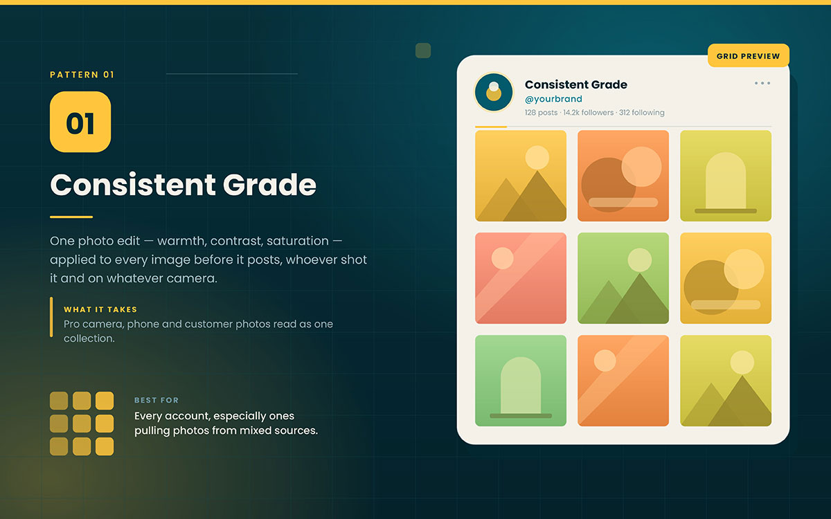
Pattern 1. Consistent grade
Use the same photo edit, warmth, contrast, and saturation on every image before posting. It doesn't matter who took it or with what.
What it requires: This is the biggest style choice you can make. It makes photos from a pro camera, a phone, and customer photos look like one collection.
Best for: Every account, especially ones using photos from different sources.
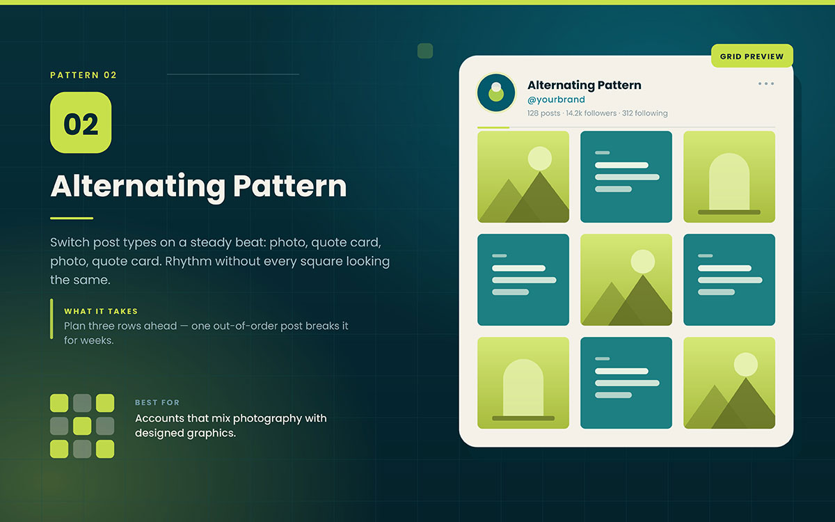
Pattern 2. Alternating pattern
Switch post types in a steady pattern: photo, quote card, photo, quote card. This gives the grid rhythm without making every post look the same.
What it requires: Plan three rows ahead to keep it going. One out-of-order post breaks the pattern for weeks.
Best for: Accounts that mix photos and graphics.
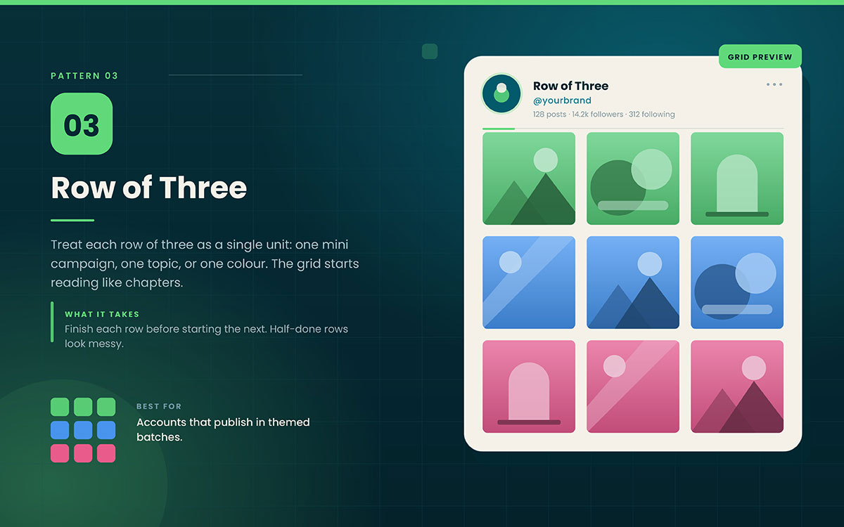
Pattern 3. Row of three
Treat each row of three as one unit. One mini campaign, one topic, or one color. This makes the grid feel like chapters.
What it requires: Plan in threes. Finish each row before starting the next. Half-done rows look messy.
Best for: Accounts that post in themed batches.
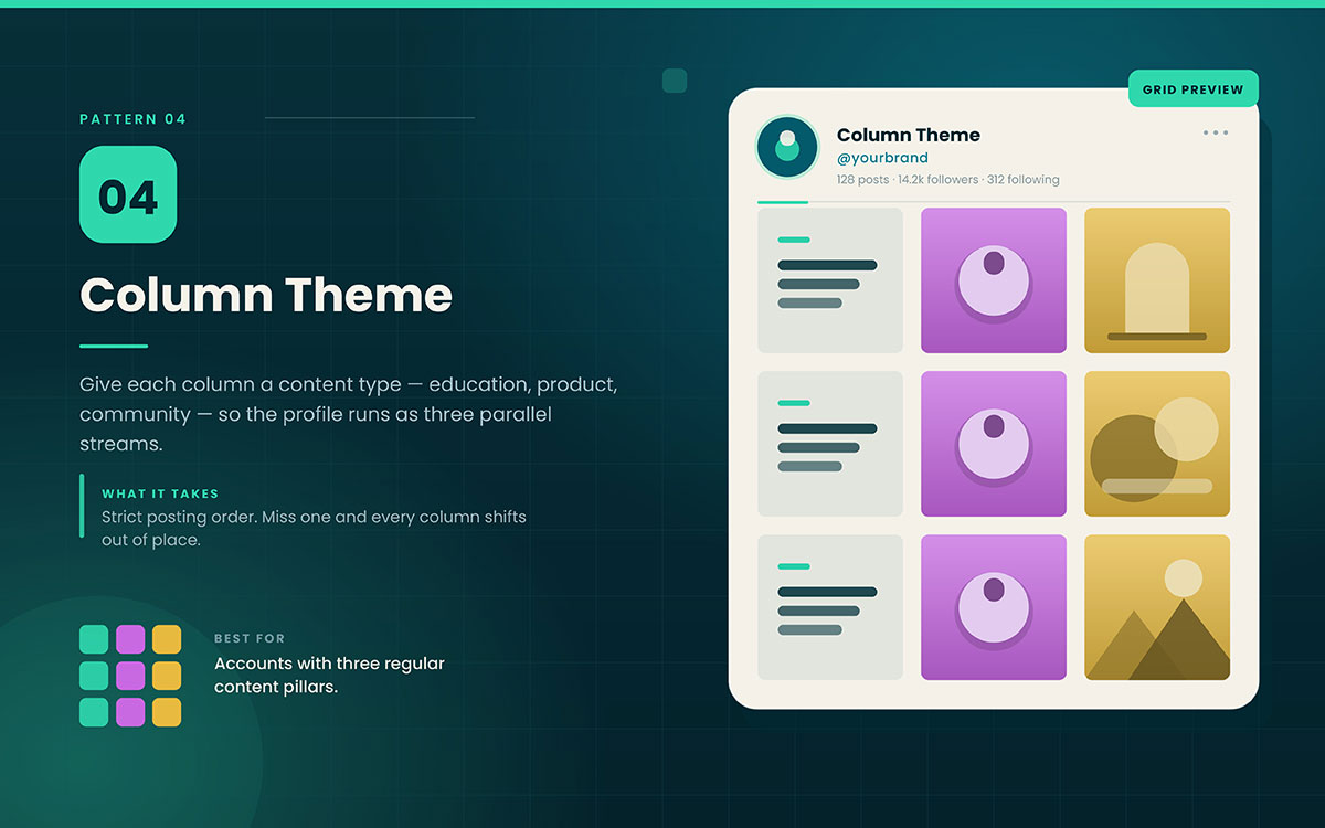
Pattern 4. Column theme
Give each column a content type. Column one is education, column two is product, column three is community. This creates three parallel streams.
What it requires: Strict posting order. Miss one post and every column shifts, breaking the structure.
Best for: Accounts with three regular content pillars.
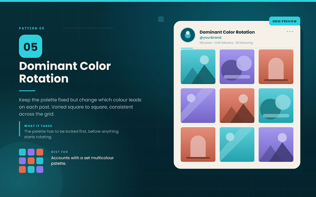
Pattern 5. Dominant color rotation
Keep the same colors, but change which one stands out each post. This keeps the grid varied but consistent.
What it requires: Your palette must be fully set first. If it's not, choose brand colors before rotating.
Best for: Accounts with a set multicolor palette.
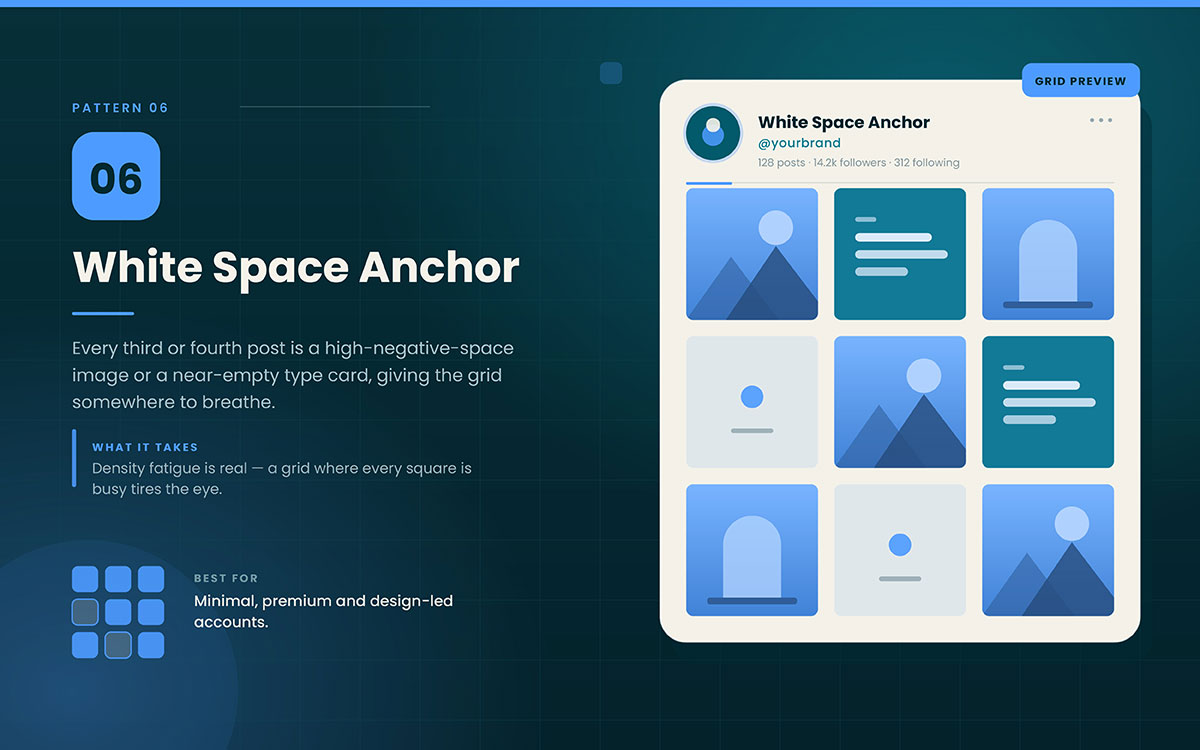
Pattern 6. Whitespace anchor
Every third or fourth post is a high-negative-space image or a near-empty type card. This gives the grid room to breathe.
What it requires: Density fatigue is real. A grid where every square is busy tires the eye, even if each post is strong.
Best for: Minimal, premium, design-led accounts.
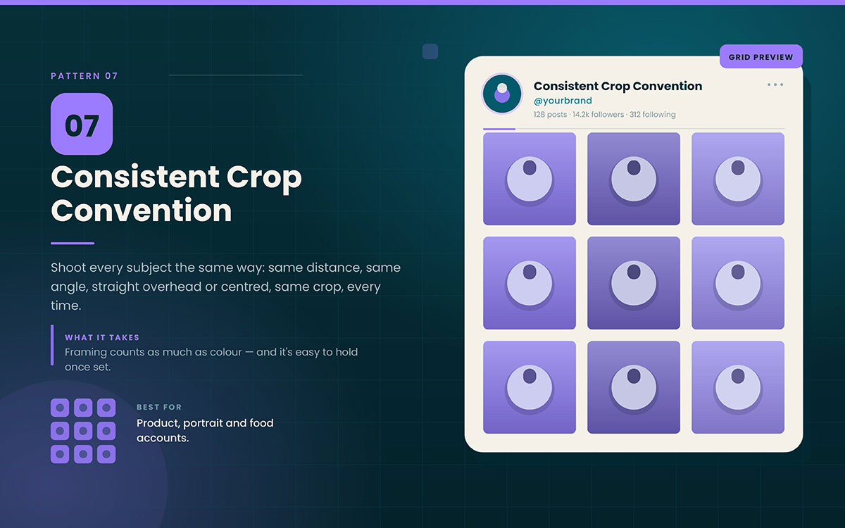
Pattern 7. Consistent crop convention
Shoot every subject the same way: same distance, same angle, straight overhead, centered, same crop.
What it requires: Consistent framing matters as much as consistent color. It's easier to keep once you set the rule.
Best for: Product, portrait, and food accounts.
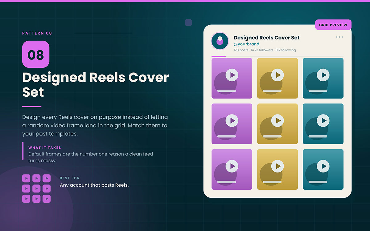
Pattern 8. Designed Reels cover set
Design every Reels cover on purpose. Don't use a random video frame. Make covers match your Instagram post templates so they fit with the static posts.
What it requires: This is the top reason a feed looks messy. Default frames have random colors, crops, and layouts.
Best for: Any account that posts Reels.
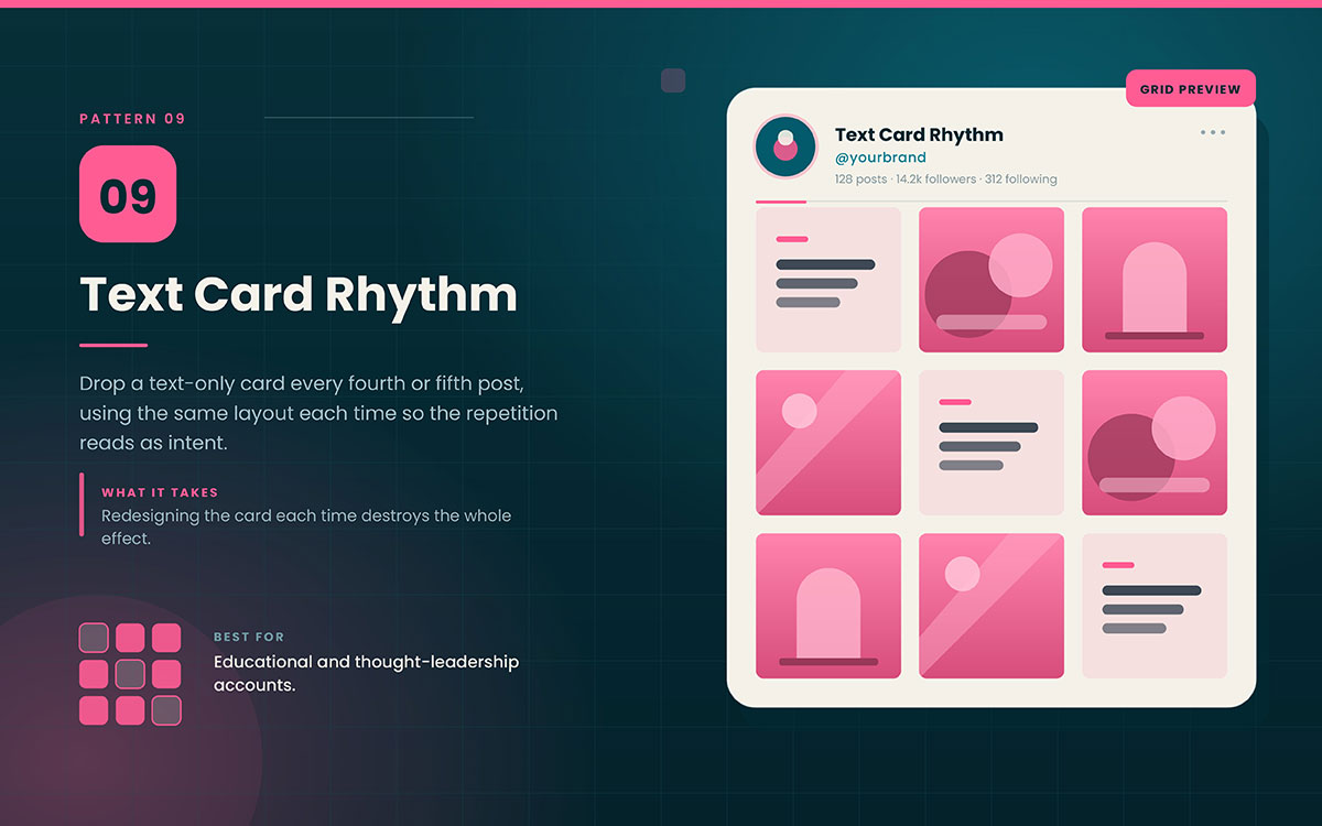
Pattern 9. Text card rhythm
Add a text-only card every fourth or fifth post. Use the same layout each time.
What it requires: The repeated layout makes it feel intentional. Changing the design each time ruins the effect.
Best for: Educational and thought leadership accounts.
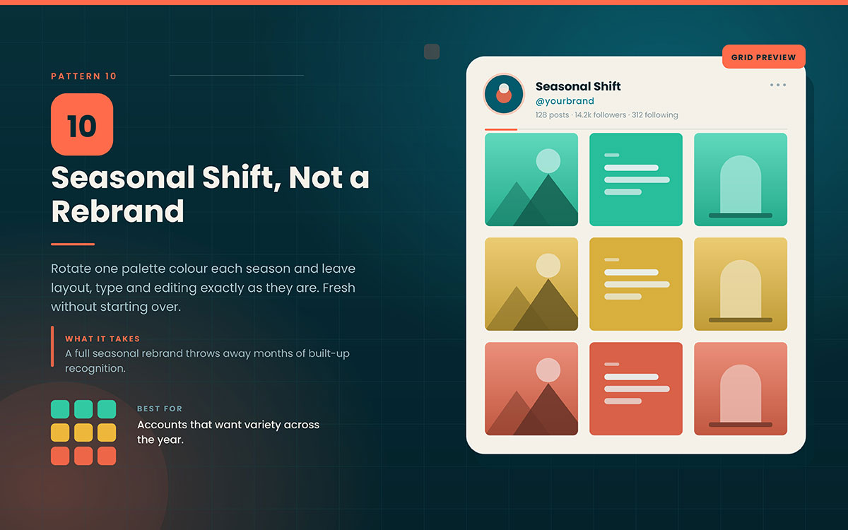
Pattern 10. Seasonal shift, not the rebrand
Change one palette color each season. Keep the layout, fonts, and style the same. Just rotate the accent color.
What it requires: It keeps the grid fresh without losing the recognition built up over months. Full seasonal rebrands waste that.
Best for: Accounts wanting variety across the year.
5 Mistakes that undo a cohesive feed
The 5 mistakes that can ruin a cohesive Instagram feed are planning posts one by one, using default Reel covers, choosing the wrong aesthetic, changing your style, and focusing on looks. But don’t worry, each one has a simple fix.
Mistake 1: Planning post by post instead of grid by grid
What happens: Each post gets made and posted on its own. So the grid only comes together after the fact.
Why it matters: A visitor sees nine to twelve posts at once. Making posts one by one ignores the fact that almost no one else sees them.
The fix: Use a grid preview tool, such as Later or Planoly, or a simple nine-square mockup. Plan every post before you publish.
Mistake 2: Letting Reels covers default
What happens: Reels get posted without a custom cover, so the grid ends up with random video frames.
Why it matters: Default frames have random colors, crops, and layouts. A few of these can wreck a clean grid fast.
The fix: Make a Reels cover template. Use it for every Reel, no exceptions.
Mistake 3: Chasing an aesthetic that does not suit the brand
What happens: A brand chooses a muted beige look because it seems trendy, even though it is actually bold and colorful.
Why it matters: A borrowed look might seem nice, but it says nothing true about the business.
The fix: Build the look from your brand awareness on social media. A look that's truly yours builds recognition over time. A copied one just starts over.
Mistake 4: Rebranding the feed every few months
What happens: The team refreshes the palette and style whenever they get bored with it.
Why it matters: Teams see their feed way more than followers do. Feeling bored doesn't mean followers need a change.
The fix: Stick to one visual system for at least twelve months. Rotate an accent color each season if you truly need variety.
Mistake 5: Prioritizing beauty over legibility
What happens: Soft colors and light text make a pretty grid, but you can't read anything.
Why it matters: A look that can't be read is chasing profile visits rather than posts that actually communicate.
The fix: Use a near-black or dark neutral for all text, even if it's not in your color palette.
Aesthetic Instagram feed FAQs
The questions below cover how to create an aesthetic Instagram feed, from planning the Instagram grid to how often the look should change. Each answer is written to stand on its own for quick reference. Some other questions bothering you for too long? Reach out to us to get a free consultation anytime.
To create an aesthetic Instagram feed, use the same photo editing style across all images. Choose five colors or fewer and two typefaces. Pick one grid pattern and stick to it. Use a grid preview tool to plan your posts before publishing.
Use a preview tool like Later or Planoly, or create a simple nine-square mockup in your design tool. Place each post where it will appear before publishing. Plan at least three rows ahead to keep your grid pattern consistent.
Consistent photo editing is one of the biggest factors in a cohesive Instagram feed. It makes photos from different sources look like they belong together. A fixed color palette, consistent fonts, well-designed Reels covers, and a clear grid pattern also help.
Keep your Instagram aesthetic for at least 12 months before changing it. You see your feed more often than your followers do, so it is easy to get bored with it. If you want some variety, change one accent color while keeping the layout, fonts, and editing style the same.
An Instagram feed aesthetic can help turn profile visitors into followers because people often judge a profile by its grid. However, it does not directly increase reach. Reach mainly comes from watch time, saves, and shares. So, combine a cohesive feed with strategies to grow an Instagram business page.
Endnote
Once you understand how to create an aesthetic Instagram feed, the grid stops feeling like a mystery and starts feeling like a system you actually control. Yet, knowing the patterns is one thing. Holding them consistently across months of posting, product launches, and busy weeks is where most feeds quietly fall apart.
This is exactly where Graphic Design Eye LLC's social media design service steps in. Our professional branding design team builds your grid system from the ground up, so every new post fits the pattern automatically, rather than relying on someone to remember the rules.
If your feed still feels like a pile of good posts rather than one considered profile, that's a planning gap. This gap is worth closing before another quarter of inconsistent posting goes by.
So, let us build a grid that does the convincing before a single caption gets read. A feed that looks planned earns trust before you've said a word.
Graphic Design Eye LLC is a full-service creative agency built for brands that demand more than design — they demand vision. From strategic branding to complete visual identity, we partner with startups, agencies, and growing businesses as a dedicated creative force. With flexible subscription and project-based models. Let's start with us today!