Wondering how to design nonprofit event materials that make guests want to give? Build one visual identity for nonprofit event materials. Use a single color palette, two fonts, and one main image. Apply this across all eight pieces: ticket, program, bid sheets, signage, table cards, banners, sponsor display, and closing impact message. Start the identity guide eight weeks out. Finalize the ticket at six weeks. Send everything else to print two weeks before the event.
Every nonprofit fundraiser design can go two ways.
In one, the cause is real, and the event runs fine. But the materials, ticket, program, bid sheets, signage, and banners look cheap because design came last. The event raises money but not much. Guests judge how competent the organization seems partly from these materials.
In the other, only the materials change. The ticket feels worth keeping. The program tells a story before anyone speaks. Bid sheets are colour coded, with clear minimum bids and working QR codes. The banner shows the mission in text big enough to photograph. Every sponsor gets visibility matching their support. Same room, same cause. But people give more, because the materials show this organization means business.
Designing nonprofit event materials that sell out a fundraiser is about fundraising psychology. Every physical detail should speak before anyone takes the stage. They must create the emotional environment where giving decisions happen. Design that environment on purpose and the giving follows.
This guide picks up from there, once guests are inside the venue and the materials take over. Let’s learn nonprofit event program design from top to bottom.
How to design nonprofit event materials
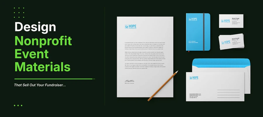
Approaching how to design nonprofit event materials requires treating ticket, program, bid sheets, signage, sponsor display, and post-event card as one connected argument. Start with a unified visual identity applied across every piece. Make that choice before opening any file. It turns seven items into one clear statement about the organization.
Below is the nonprofit event materials checklist for you to complete.
1. A unified visual identity system across every material
The biggest design choice for any nonprofit fundraiser is using one consistent look across every piece at once.
An event's visual identity isn't the whole brand system. It's a design layer added on top of the brand for that event: two or three campaign colors, a display font for headings that gives the event its own personality, one main image or illustration, and a consistent tagline or event name. Apply these four things the same way to the ticket, program, bid sheets, signage, and banners, and the room feels designed. It's the same idea behind a nonprofit's branding strategy, just narrowed down to one evening and one room.
The takeaway is simple. Set the event's visual identity before designing anything else. Pick the colors, the headline font, the main image, and the event name style. Write these choices on one page. Share it with everyone making materials for the event. Follow it every time.
APPLY IT
Make a one-page design guide before you open any design software. Only four decisions: the campaign color palette with exact hex codes, two approved fonts, the main event image, and the event name style. Apply these to the ticket first. Then use them the same on everything else.
A room where everything matches shows an organization has its act together, before anyone says a word.
2. An event ticket that feels like a keepsake
An event ticket is usually the first physical thing guests hold. It's their first design impression of your event. But most nonprofit tickets are plain text on white card stock, showing only logistics. So you must learn how to design nonprofit event ticket.
A ticket does more than share logistics. The endowment effect shows people value things more once they own them. A ticket that feels worth keeping raises how much guests value the evening before it even starts. A ticket with striking design, good finish, and a look worth keeping builds more excitement than one that reads like a receipt. This won't save a badly run event. But a ticket sets expectations, and expectations are hard to undo later.
A keepsake ticket doesn't cost much to make. Use a full-color front with your main event image, the event name in large type, and the date and time in a contrasting color. Add a tear-off stub for admission, with a QR code for fast scanning. Keep your event's visual style consistent on both the face and the stub. Choose card stock heavy enough to feel substantial in hand.
APPLY IT
Make the ticket a 3.5 x 8.5 inch perforated card on at least 16pt stock. The front side is full color, with the event image taking up at least 40 percent of it. Event name in the display font, at least 28 points. Date, time, and location in the secondary color. The tear-off stub is 3.5 x 2.5 inches, with the QR code and admission number. Print at 300 DPI. Order at least 20 percent more than the registered headcount.
The ticket is the first impression. Make it feel like something worth the whole evening.
3. A program booklet structured as a story, not a schedule
The event program is the most read piece of paper at any fundraising event. Every guest holds it from arrival through dinner. Most nonprofits just list a schedule, times, and events, instead of telling a story that builds the case for giving.
How the program is built shapes the whole night's feeling before the first speaker even talks. A program that opens with a message from the director, lists the schedule, the auction items, then sponsor thanks, is just a document. A program that opens with one beneficiary's story across four paragraphs beside a full-page photo opens up a feeling. Guests who read that before dinner already feel connected to the cause by the time they're asked to give. It's visual storytelling aimed at a captive audience with nothing else to look at.
The story follows a set order: a cover with the main event photo and name; an opening spread with the beneficiary's story and photo; a mission page that connects the story to the bigger picture; the schedule on one clean page; auction items with descriptions and starting bids; a sponsor thank you page with logos sized by tier; and a closing page with a specific impact statement and a giving link or QR code.
APPLY IT
Make the booklet saddle stitched, 5.5 x 8.5 inches, at least 16 pages. Use 100lb gloss text paper inside and 100lb gloss cover stock. Set body text at 11 points minimum since many readers will be in dim venue lighting. Use the display font for headers and the brand font for body text. On the opening story spread, use a full spread photo with text over a semi-transparent color band.
A program that tells a story before the first speaker even starts has already begun the fundraising conversation.
4. Auction bid sheets designed for speed and clarity
The bid sheet at a silent auction is the most important piece of design at any fundraiser with an auction. If a sheet is confusing, has unclear minimum bids, or is too small to write on while standing, it gets fewer bids and less money.
Auction bidding runs on quick decisions and competition. If someone picks up the pen and the sheet confuses them, maybe the next bid amount is unclear, the current bid is hard to read from a distance, or there's no room to write a name and number, they'll walk to the next item instead of figuring it out. That bid is gone for good. The sheet's job is to make bidding the easiest, fastest thing a person can do the moment they're interested.
A good bid sheet gets five things right. Big, readable text for the item name and description at the top. A bold, sized minimum opening bid. A clearly labeled minimum increase between bids. Numbered lines for bidders with plenty of room for name, number, and amount, in alternating colors so eyes can scan easily. A QR code in the corner for bidding by phone. And a clear fair market value, since giving people a reference point is one of the most proven tricks in behavioral economics. This is how to design nonprofit event materials.
APPLY IT
Design bid sheets 8.5 x 11 inches, matching the event colors. Item name in bold, 24-point font. Minimum opening bid in bold 20-point font, inside a box with a contrasting color. Bidder lines at least 0.5 inches tall. Alternate line colors with a light tint of the event colors. Label the minimum increment on every line. Put a QR code in the upper right for mobile bidding. Print single-sided on 60lb text paper. Heavier paper isn't needed and clips to displays worse.
An easy bid sheet gets more bids. More bids mean higher closing prices. Higher prices mean more auction revenue.
5. Event signage that communicates the mission while directing traffic
Event signs at a fundraiser do two jobs at once. They guide guests around the room, and they talk about the cause the whole time. Most nonprofit signs guide people fine but skip the second job completely.
Every directional sign is a moment in the emotional space of giving. A sign that says "Auction Items This Way" just points people along. A sign that says "See the impact your bid makes. Auction Items This Way" points people along and reminds them why they're there, right when they're already paying attention. The mission message costs nothing extra to print, since the sign gets made anyway. It adds to the mood guests feel before you ask them to give.
Directional signs need to be readable from ten to twenty feet away, while still matching the event's look. Arrows should use the main event color, be big enough to spot across a room, and sit at eye level or higher. Mission messages should go below the arrows, in a different style so they stand out from the directions. Every sign should have the event logo in one corner to keep the look consistent.
APPLY IT
Make floor signs on A-frame or foam board. Use 18 x 24 inches minimum.
Arrows and labels: at least 72 points.
Mission messages: use event body font, 24 to 36 points.
Keep the color palette consistent throughout. For big venues, add pull-up banners at 33 x 80 inches. Place them at entrances and key transition spots.
Guests read signs anyway. Make every sign part of the mission.
6. A sponsorship recognition display that makes sponsors visible enough to return
The sponsorship display does two jobs. It meets contract terms. and sells next year's sponsorships. A sponsor whose logo looks good in a well-designed space sees their investment paid off visually.
Most nonprofit displays are just names or logos on foam board. Same font for everyone. No sense of which tier is greater. Placed where few people walk by. This meets the contract. But it tells sponsors their brand is just paperwork, not a real partnership.
A better display shows the tiers clearly. The top sponsor looks much bigger than gold. Gold looks different from silver. It sits at the busiest entrance or the spot most people photograph. It looks good enough that sponsor teams want to share pictures of it. That's when the design banner earns back its cost many times over, through free exposure.
APPLY IT
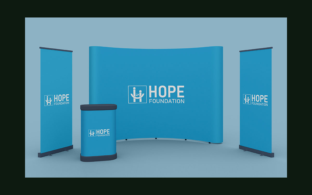
Make the display a full colour banner or foam board, at least 36 x 48 inches. Place it at the venue entry or photo backdrop area. On a 36 x 48 board, size the presenting sponsor logo about 10 inches wide. Gold tier gets 7 inches, silver gets 5 inches, and bronze is text only. Each tier should shrink 30 to 40 percent from the one above.
Use the event's visual identity as the background. Add the event name and date so people can share it as a photo.
Sponsors renew when they see their logo displayed proudly.
7. A post-event print piece that closes the fundraising loop
The fundraising loop does not end when the auction closes. It ends when donors get a message showing what their presence and gift made happen.
Most events send a thank you email and a receipt. Donors just get proof their payment went through. They rarely get something that links their gift to a real outcome. This gap is well documented. The Bloomerang Engagement Amplified report surveyed over 250 fundraisers and 1,000 donors in 2025. It found 58 percent of fundraisers have no post-event strategy at all. The post-event piece, an impact card mailed within two weeks or an email sent within five days, ends the event system and starts the next campaign.
This piece follows a clear structure. One full bleed photo from the event, showing real attendees capturing the night's energy. A headline stating the impact: what was raised and what it makes possible. A short note from the executive director. One forward-looking element, like next year's save-the-date or early access. It all uses the event's visual identity, so recipients instantly see it as part of the evening, not paperwork. As a printed postcard, it costs little yet lands with real emotional weight.
APPLY IT
Make the impact piece a 5x7 postcard on 16pt stock, back on 100lb text. Or make it a designed HTML email at 600px wide.
Send the email within five days. Emotions are freshest then. Mail the postcard within ten days.
Include one clear impact number. Add one real photo from the event. Add one forward-looking element.
The gift deserves a proper response that honours it. That response also becomes the best marketing for the next event.
Nonprofit event materials design FAQs
These answers address how to design nonprofit event materials. Stock weight, type size, material quantity, and timeline should be made under a close print deadline. Each answer starts with a clear, ready-to-use answer. Then it gives reasons. These reasons help justify the choice to a board or planning committee.
Start with one visual identity: a single color palette, two fonts, one main image, and one event name style. Use it on every piece, from ticket to program to bid sheet to thank you card. This ties logistics and cause together.
A fundraising event needs eight core pieces: the ticket, program booklet, silent auction bid sheets, signage, table number and centerpiece cards, banners and backdrops, a sponsor display, and a closing impact card or email. Together they shape the space where people decide to give.
Design the program like a story, not a schedule. Open with a beneficiary story and photo. Add a mission page, then one clean schedule page. Include auction photos with impact statements and sponsor listings by tier. Use body text at least 11 points for dim lighting.
A nonprofit event ticket should be 3.5 by 8.5 inches, with a perforated 3.5 by 2.5 inch stub. Use card stock at least 16 points thick. The event image should cover about 40 percent of the front. Set the event name at 28 points and the date in a second color.
Bid sheets should be 8.5 by 11 inches. Set the item name at 24 points and show the fair market value clearly. Put the minimum bid in a colored box that stands out. Add alternating row colors, bidder lines spaced half an inch apart, and a QR code for mobile bidding.
Print quantity affects cost more than design does. A small fundraiser can still afford all eight pieces. Print tickets, bid sheets, and table cards digitally in short runs. Save offset printing for the program booklet only. Use foam board instead of rigid signage material.
Start the identity guide eight weeks before the event. Finalize the ticket six weeks out so it's ready at registration. Send the program booklet, bid sheets, signage, and sponsor display to print two weeks before. Leave one week for proofing.
Both, but each has its role. Tickets, programs, bid sheets, table cards, signage, and sponsor displays work best in print, since guests hold and photograph them under venue lighting. Registration confirmations, reminders, and the closing message work best digitally, for speed and low cost. Keep the visual identity the same across both.
Endnote
Knowing how to design nonprofit event materials comes down to one shift in thinking. Seven print pieces become one message when they share the same look. Guests respond to that before any speaker talks. It turns a good event into one that raises what the cause deserves. This guide gives you the specs for all seven elements.
Most nonprofits are not missing knowledge. They are missing the time to apply it across eight pieces on a tight deadline while running the event. That is where Graphic Design Eye LLC helps. Our expert designers build one identity guide and apply it to every ticket, program, and bid sheet for your nonprofit. This frees you to focus on the event while the materials work quietly in the room.
You do not need to be a designer to run a fundraiser that looks like the serious organization you already are. You just need the right identity, used consistently, from the moment doors open. Start with us. Let the room do the rest of the convincing.
Every well-designed detail tells guests this cause is worth their trust. Give them that reason.
Graphic Design Eye LLC is a full-service creative agency built for brands that demand more than design — they demand vision. From strategic branding to complete visual identity, we partner with startups, agencies, and growing businesses as a dedicated creative force. With flexible subscription and project-based models. Let's start with us today!