Why your nonprofit event is not getting enough attendees usually comes down to marketing design. Cluttered flyers, subject lines that just announce the event, registration pages that bury the date, text-heavy social graphics, missing urgency, and mismatched branding all quietly shrink turnout. Fix it with one face, one headline, one date, and one action, used the same way everywhere, starting eight weeks out.
People who support causes do show up to events. They just don't go to every one they hear about. They go to the ones where the marketing made them feel they couldn't miss it, right then.
That feeling comes from design choices most teams never look at closely. It also depends on people recognizing the name on the invite. If the organization isn't well known locally, that's a problem to fix first.
This guide covers seven design mistakes that quietly shrink attendance. Some flyers get a glance. Some follow-up messages never get sent. Each mistake comes with a clear fix for your next promotion, plus a full breakdown of what changes when design works well.
Why your nonprofit event is not getting enough attendees
Not having appropriate marketing design is the reason why your nonprofit event is not getting enough attendees. Seven common failures block potential attendees at each step: a flat flyer, a weak email subject, a cluttered registration page, text-heavy social posts, missing urgency, inconsistent branding, and no follow-up after the event. Fixing these stages turns interest into signups.
1. The event flyer has no visual urgency and no human face
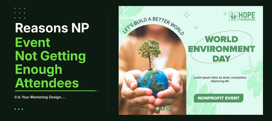
An event flyer with a logo, event name, some details, and a plain background tells you what the event is. It doesn't tell you why missing it would matter.
Visual urgency in event design means elements that say: this is happening soon, spots are limited, and it's worth your time. A generic flyer says none of this. It just says an event exists and here's the info. The viewer decides based on their own motivation, not the flyer.
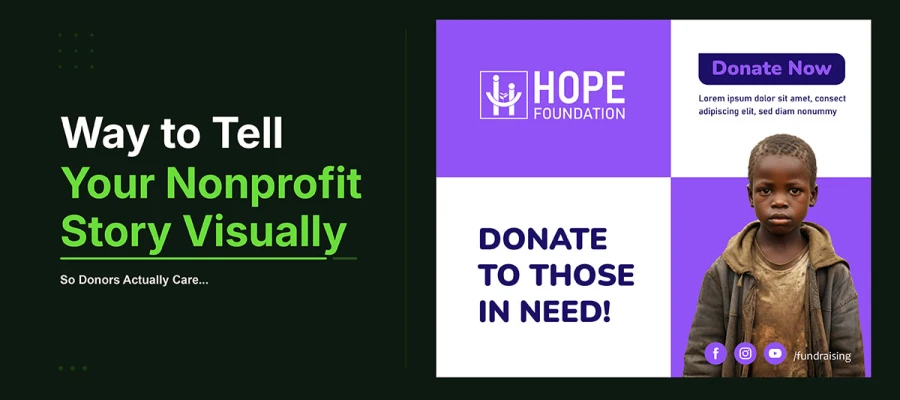
The strongest tool for creating urgency isn't a countdown timer or seat tracker, though those help. It's a human face. A real photo of someone tied to the event, shown big and bold, creates a feeling that plain design can't match. Paul Slovic's research on the Identifiable Victim Effect shows this again and again. One real person gets a stronger response than numbers or symbols ever could. This is why donor appeals work, and it's why event flyer design works too. People respond to people.
THE DESIGN FIX
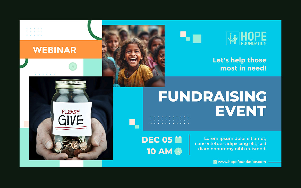
Redesign the main event graphic around one big human face, from a past event or the real program. The face should fill at least 40 percent of the space. Put the event name and date in large, bold text over or next to the image. Place the signup button at the bottom in a color that stands out. Cut any text that doesn't answer three quick questions: who it's for, when it is, and where to sign up.
If a flyer could work for any event or group, it's failing. Make it clearly yours.
2. The email subject line announces the event instead of creating fomo
A subject line like "Join us for our Annual Spring Gala, April 12" just tells people what the event is. It doesn't make them feel like skipping the email would be a mistake.
Email still converts best for nonprofit event marketing, but only when the subject line earns the open. People get dozens of emails every day. A subject line that just announces an event has to compete with every other announcement in the inbox. A subject line that gives a specific, time-bound reason to care stands out. Not because it's louder, but because it's specific.
FOMO, the fear of missing out, is a real psychological trigger that event marketers use on purpose. In email, it shows up through scarcity language ("Only 12 seats left"), deadlines ("Registration closes Friday"), and curiosity ("Something new is happening at this year's gala"). Each of these needs to be true. Seats must really be limited. The deadline must be real. Fake scarcity gets noticed fast and costs more trust than it earns sign-ups. When the signal is real, urgency and scarcity beat neutral announcements on open rate.
THE DESIGN FIX
Rewrite every event email subject line using one of three frameworks before sending.
Scarcity: "Only [number] seats left for [event name] on [date]."
Deadline: "[Number] days left to register for [event name]. Then the list closes."
Curiosity: "Something is happening at [event name]. You will not want to hear about it secondhand."
Test two versions on 20 percent of the list. Send the winner to the other 80 percent.
An announcement says an event is happening. FOMO says missing it is a mistake. Only one of these gets people to register fast.
3. The registration page buries the most important information
A registration page that starts with history, event description, and a venue photo before the date, time, and registration button is built for the organization. The person doesn’t find any interest in it. And this is why your nonprofit event is not getting enough attendees.
The event landing page gets traffic from every other marketing channel. It's the highest intent moment in the funnel. The person arriving from an email, social post, or flyer is already interested. The page's job is to turn that interest into a completed registration as fast as possible, ideally before the first scroll on mobile, since that's where most traffic lands. Conversion drops with every extra scroll needed to reach the registration button. That's why landing page design deserves as much care as the flyer that brings people to it.
The hero section, the part visible before scrolling, must show the event name, date and time, location or format, price or free admission, and a clear, high-contrast registration button. Everything else, like speaker bios, the full programme, and organizational history, goes below the fold. Visitors can find it if they want more, but it should never block the registration action.
THE DESIGN FIX
Check the registration page with the above-the-fold test. On a mobile phone, without scrolling, can visitors see the event name, date, location, ticket price, and registration button all at once? If not, fix the page before the next promo email.
The registration button needs its own colour, unused elsewhere on the page. It should be at least 44 pixels tall for easy tapping. Repeat it at the bottom too, for visitors who scroll all the way down.
Someone who clicks to sign up has already half decided. Don't make them scroll to finish.
4. The social media graphics are text-heavy and not designed for the feed
A graphic with every event detail crammed in all in one 1080x1080 square is really just a flyer. People will look at it for about three seconds.
Feeds aren't for reading. They're for feeling. A graphic earns a tap, save, or share when it sparks a feeling fast. Packing in info doesn't do that. If people have to zoom in to read your graphic, they won't bother. They'll just scroll past. What works in three seconds is big text, strong contrast, one strong image, and one emotional hook.
Think of the graphic as the opening scene, not the whole story. Its only job is to earn a tap, a save, or a share. Anything extra just weakens the impact. None of it helps people act. The rule stays the same: one image, one headline, one action.
THE DESIGN FIX
Redesign every event graphic to pass the thumb-stop test. Would someone scrolling stop for it without reading any text? If the text has to be readable for it to work, the graphic failed.
Use one big image that matches the event's mood. Make the event name and date at least 48 points. Add one hook sentence as a subtitle. Put everything else in the caption.
The graphic gets the tap. The caption gets read closely. Design each for its own job.
5. The event promotion has no countdown and no scarcity signal
Marketing an event without deadlines gets a flat response. Most people register right before an event. That's not human nature. It happens when marketing gives no reason to act sooner. Without early bird deadlines, seat counts, countdowns, or urgency cues, people put off deciding. Many never come back to finish signing up, even if they meant to. And that’s why your nonprofit event is not getting enough attendees.
There are three types of urgency design. Calendar urgency sets clear deadlines: early bird pricing that ends on a set date, a registration cutoff before the event, or VIP access that closes before general signup opens. Scarcity urgency uses limited seats, since "Only 18 seats left" shows that waiting means you might miss out. Countdown urgency uses visual timers in emails, posts, and the landing page to make deadlines feel real.
THE DESIGN FIX
Add a countdown plan to your marketing calendar. Send one email at 30 days to introduce the event. Send one at 14 days with an early bird deadline. Send one at 7 days showing open seats. Send one at 48 hours as the final notice. Each email needs a countdown visual: a number and unit in bold, large type. Add a seat counter to the landing page hero. None of this needs complex tech.
People need a reason to sign up. Give them one at every stage of the promo.
6. The visual identity is inconsistent across every channel
An event might use one look on the flyer, a different one on the email, mismatched colors on Instagram and Facebook, and yet another style on the landing page. People see separate messages, not one clear campaign.
Event marketing builds recognition through repeat exposure. Say a supporter sees the graphic on Instagram Monday, gets the email Wednesday, sees a flyer at the library Friday, then gets a reminder Sunday. That's four contacts with the same campaign. If all four look alike, recognition grows. By Sunday, signing up feels familiar and safe. If each looks like different people made it, every contact starts over. This is the same rule as nonprofit branding, just squeezed into eight weeks.
A campaign needs four decisions before making anything: one main photo style for the whole campaign, one palette of two or three colors with exact hex codes, two fonts (one for headlines, one for body text), and one tagline that appears word for word in every message. Decide these once, write them on one page, and you remove the mix-ups that scatter recognition.
THE DESIGN FIX
Make a one-page event design guide before you create any promo material. It should include the main campaign image, two or three approved hex codes, two approved fonts, and the campaign tagline. Share it with everyone making promotional content, including board members helping with social media. Use it on every channel and message during the promotion, no exceptions.
Recognition builds through consistency. Every inconsistent asset resets that clock.
7. There is no post-event design loop building momentum for the next one
An event marketing plan that stops when the event ends builds no momentum for next time. The follow-up message is your first ad for next year's event.
The Bloomerang Engagement Amplified report found that 58 percent of fundraisers have no follow-up plan at all. This is one of the biggest, most fixable mistakes in nonprofit event marketing. Someone who already attended is your best prospect for the next event. They already said yes once. They lived the experience. And right after the event, they're more emotionally engaged than at any other point.
A strong follow-up message follows a clear pattern. Start with the impact story: what happened because people showed up, told in real human terms. Add photos from the event they were part of. Include one clear next step, like a save-the-date, a survey, a volunteer ask, or early registration. Present it all as one designed piece that feels like part of the evening. It takes the same skill as telling a nonprofit's story visually, just aimed at people who just lived that story firsthand.
THE DESIGN FIX
Send a designed impact email within five days of every event. Include one photo of real attendees, one specific result from the event, and one look ahead: a save the date for next year, or early access to register before it opens to everyone. This email is both your most important retention message and your first ad for next year's event.
The best marketing for next year’s event is showing this year’s attendees what happened because they came.
What design can transform in every event marketing asset
Nonprofits often settle for flyers, emails, and pages that just state facts rather than driving action. Good design flips each one around. A plain flyer becomes one face and one clear action. A generic subject line becomes a seat count with a deadline. A thank you email becomes a story.
The following table shows why your nonprofit event is not getting enough attendees and what design can change.
Marketing Asset
Before: What Most Nonprofits Produce
After: What Design Makes It
Event flyer
Logo on white, six lines of text, no image
One face, one headline, one date, one action, all legible at arm’s length
Social media graphic
Text-heavy square in the organization colours
Bold countdown, event name at 48pt or larger, hook line as subtitle
Email subject line
"Join us for our Annual Gala, April 12"
"Last 12 seats. Will you be at the table on April 12?"
Email header image
Static banner with logo and event title
Full-width photograph from last year: real people, real energy
Event landing page
Paragraph about event history and purpose
Hero image, single headline, registration button above the fold
RSVP button / CTA
"Register Here" or "Click to RSVP"
"Reserve My Seat" or "Yes, I’ll Be There, Save My Spot"
Countdown/urgency
No deadline, no scarcity signal
"Only 18 seats remaining" or "4 days left to register"
Post-event follow-up
Thank-you email with a receipt attached
Story email: "Here is what happened because you were there"
Nonprofit event attendance FAQs
Nonprofits keep asking how to increase nonprofit event attendance. This FAQ covers plus flyer design, email timing, urgency, and no-shows. It ends with the question most teams are afraid to ask: does design actually matter, or is it all about the cause?
Low turnout usually comes from design, not lack of interest. A flyer with no real face, a subject line that just states the event, or a signup button that's hard to find can quietly push people away. Fixing these often helps more than any extra budget.
Build your main graphic around one real face. Write subject lines with deadlines or scarcity. Put the event name, date, and signup button near the top on mobile. Add urgency throughout and keep one visual style everywhere.
Start 6 to 8 weeks out with a save the date. Move to full promotion with urgency at 4 to 6 weeks. Add scarcity and countdowns at 2 weeks. Send a final reminder 48 hours before.
A good nonprofit event marketing design centers on one real face. It shows the event name in large, bold type you can read without zooming. It adds one short hook line as a subtitle. Everything else goes in the caption or landing page, so the graphic grabs attention fast.
Use one real photo of a real person as the main image. Set the event name and date at 48 points or bigger so it reads across a room. Add one urgency line, like limited seats. Cut any text that isn't essential.
Plan 6 to 8 emails over eight weeks: a save the date, a launch email, a story email, an early bird deadline, a seat update, a final call, and a thank you after. Each one needs its own reason to land in the inbox.
No-shows often happen when there's a long gap between signing up and the event, with no contact in between. Send a reminder 48 hours before and one more the morning of. Use the same visuals as the rest of the campaign, plus venue details and what to expect.
Both matter, just at different points. The cause decides if someone wants to attend. The design decides if they notice the invite and act on it in the few seconds it has their attention. A strong cause with a weak flyer often loses to an average cause with a clear one.
Endnote
Why your nonprofit event is not getting enough attendees rarely traces back to the cause or the people behind it. It traces back to marketing materials that inform instead of move. And design is the one variable inside your control the whole time.
Knowing the seven mistakes only helps once you spot them in your next promotion. Don't just read the list and forget it.
The fastest fix is to build your flyer, email, social posts, landing page, and follow-up message as one campaign with Graphic Design Eye LLC. We ensure that every piece shares the same face, urgency, and look. Our team builds flyers, email graphics, social posts, and landing pages just for nonprofits. So we already know how to design around a human face, add urgency to a layout, and keep the registration button visible on mobile. Those are the exact fixes your nonprofit might need.
Start with your next event. Pick the photo that will anchor it. Write a subject line that earns the open. Put the registration button above the fold before your first email goes out. None of this needs a bigger budget. It just needs a clear decision about whose attention you're trying to hold.
A full room doesn't happen just because the cause deserves it. It happens because someone felt sure they couldn't miss it. Give people that feeling, and the seats will disappear early this time.
Graphic Design Eye LLC is a full-service creative agency built for brands that demand more than design — they demand vision. From strategic branding to complete visual identity, we partner with startups, agencies, and growing businesses as a dedicated creative force. With flexible subscription and project-based models. Let's start with us today!