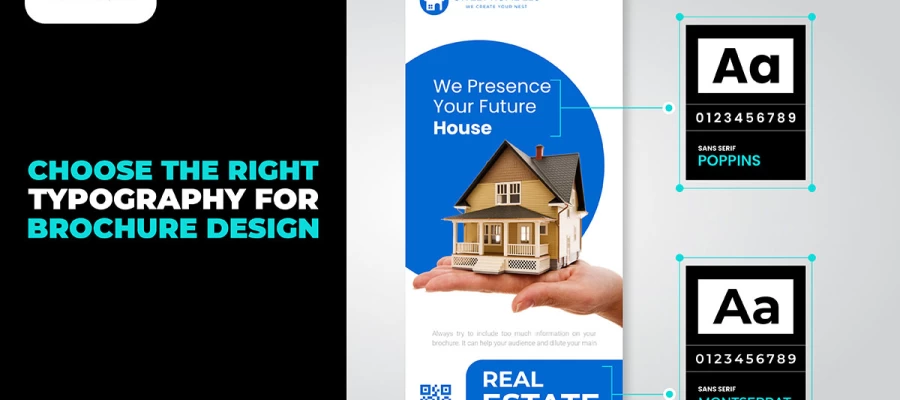
How to design nonprofit community outreach materials starts with one truth: your flyers, brochures, and banners are often the first impression your organization ever makes. Clarity beats cleverness every time. Lead with a single clear message, use authentic photographs of the people you serve, keep colors and fonts consistent, and make the next step impossible to miss. Design for where the material will actually live. When your materials look trustworthy, your community trusts you.
Designing nonprofit outreach materials people actually read comes down to attention. Attention is the scarcest resource in any community setting.
Someone who picks up a flyer at the library makes a snap visual judgment before reading a word. Does this look worth my time? Design alone answers that question. This is why graphic design matters so much for nonprofits.
This guide explains why that happens and what fixes it. You will learn six design rules that separate outreach material people act on from material people ignore. It includes a simple test you can run before every print run, so you catch problems while they are still cheap to fix.
So, without delaying much, let’s begin to read.
How to design nonprofit community outreach materials
Ready to know how to design nonprofit community outreach materials? Follow 6 design principles in order. First, write the headline. Aim for people to understand it in five seconds. Use one real image. Stick to your visual identity, no exceptions. Include one clear call to action. Test the material where it will actually be seen.
Principle 1: Write the headline first, design around it
The headline is the most important design choice in any nonprofit outreach material design, the starting point of good flyer design. The biggest mistake is treating it as a label rather than a hook.
A label just names the thing: “Summer Youth Program” or “Community Health Fair, June 15.” A hook tells readers why it matters to them: “Free summer activities for kids ages 6 to 14, starting June 15 in your neighborhood” or “Get your free health check this Saturday, no appointment needed.” This is not just better wording. A label answers “what is this?” A hook answers “what's in it for me, and do I care?”
Write the headline before starting any design work. It shapes the visual hierarchy of the whole piece. Once you finalize it, make it the biggest thing on the page. Use the highest contrast colors. Put it where eyes land first. Everything else should support the headline, not compete with it.
Apply It
Write three headlines before you open any design software. Try the five-second test: show someone who doesn't know the project your headline. Ask what it offers and who it's for. Pick the headline that gets the fastest, clearest answers, and design around that one.
Design can't fix a bad headline. A good headline barely needs design at all.
Principle 2: Design for five-second comprehension
Someone picks up a flyer at a service counter. They glance at it and put it back. That took about five seconds. In those five seconds, the flyer must say enough that the person can still act on it later.
Five seconds is enough only if the design is very simple. One headline. One image. One action. Everything else is detail. That belongs on the website, not the flyer. Most outreach materials fail because they try to say everything the organization wants people to know. They should say only the one thing people need to know to take the next step.
Test every flyer before printing. Show it to someone who knows nothing about the program. Give them five seconds, then take it away. Ask them: What is being offered? Who is it for? What should they do if interested? If they cannot answer all three, simplify the flyer before printing. This test costs nothing. It can save an entire print run from being wasted.
Apply It
Cut anything that isn't quick to understand. Save it for the back, a QR code, or a separate insert, the same layering good brochure design relies on. The front only has one job: earn those extra seconds that make people read the details.
Five seconds is enough time to say one thing clearly. It's not enough time to say three things.
Principle 3: Use one authentic image that carries the story
The image in outreach material isn't just decoration. It's what grabs the reader's interest before they even read the headline.
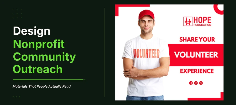
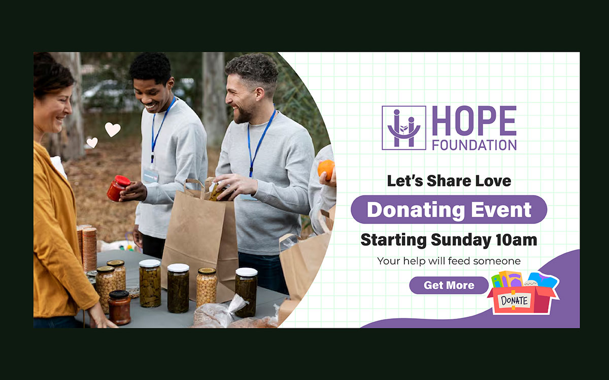
A real photo of a real person tied to the organization's work does that. Generic stock photos of clasped hands, smiling strangers, or symbolic sunrises don't. Real human faces get more engagement than stock photos, and in printed material, this effect is even stronger. Someone who picks up a flyer and sees a real face, someone who looks like they could be from the neighborhood, is more likely to keep reading than someone who sees a stock photo. This is the same idea behind telling your nonprofit's story visually everywhere: one real face moves people more than any symbol can.
Use one image, not three. A single big photo tells a clearer story than three small ones competing for attention. Show a person, not a program. A child in the summer program, not a photo of the building. A family getting help, not the organization's office. The human face is what draws readers in emotionally. Choose your image with that in mind.
Apply It
Set aside one day each quarter to take real photos of your programs and people. Use these photos in outreach first, before anything else. If you must use stock photos, pick real people in clear, specific moments, not symbols or abstract images. A real photo of a child reading beats a symbolic picture of a book.
The image is what draws people in. Make sure it looks like the neighborhood it's shared in.
Principle 4: Apply the organization's visual identity without exception
Community outreach material that looks different from the organization's website, social posts, and past campaigns starts with zero recognition every time someone sees it.
Keeping visuals consistent across outreach material builds trust. When someone picks up a flyer and recognizes the logo and colors from a banner they saw at the farmers market last month, that recognition sends a message: this is a real organization I've seen before. That earlier moment, even if brief, makes this new encounter mean more. The material gains from the trust that earlier exposure already built.
Putting this into practice is simple but demanding. Every piece of outreach material uses the same logo version, the same colors with the same hex codes, the same two fonts, and the same image style. Not close. The same. A flyer made by a volunteer board member in a different font isn't a small difference. It's a visual break that costs the organization a chance at recognition with everyone who sees it, and it weakens the branding strategy every other channel is trying to build.
Apply It
Make a one-page brand guide — the foundation of solid branding design, before designing any new outreach material. Include exact hex codes for two or three approved colors, the two allowed fonts with size guidelines, the approved logo versions and rules for using them, and one example of the approved image style. Share this guide with everyone who might ever make outreach materials for the organization: staff, volunteers, board members, and outside designers.
Principle 5: Include one clear call to action, not three
A community material asking readers to call, visit a website, follow social media, and register is asking for four decisions at once. Most people make none and put it down.
The call to action is the most important part of a community outreach piece. It bridges interest and action. The more specific and singular it is, the better it works. One clear action, with everything needed to do it right away, turns readers into participants. Four actions, each needing a different effort, just create confusion.
Call to action effectiveness follows a clear pattern. An in-person action at a set time and place works best. A phone call works better than a website visit. A QR code straight to a registration page works better than a URL people must type out. In every case, specific beats general, immediate beats eventual, and single beats multiple.
Apply It
Pick the one most important action for the reader. Make it stand out most, right after the headline. Cut every other call to action from the front.
If you still need more contact options, put them on the back or in a QR code. Test one CTA against many CTAs. See which one people remember better right away.
One clear door invites more than five doors with no signs. This is how to design nonprofit community outreach materials.
Principle 6: Test the material in its actual distribution environment
A flyer might look great on a designer's screen. But pinned to a crowded board, it could be hard to read. Stacked with other flyers, it might get lost. Under harsh laundromat lighting, it might be unreadable.
Most nonprofits skip testing the material where it will actually be seen. This test is simple. It takes under two hours.
Print one copy at the final size. Take it to three real locations. Place it exactly how it will appear. Step back to the distance people would first see it. Ask: Can you read the headline from here? Does the image make sense in this light? Does it stand out from everything else nearby?
It reveals problems you can't see on a screen. A headline that looks fine on screen may be too small up close. Colors might blend into the board behind them. An image that looks sharp on a monitor may look blurry under real lighting.
You can fix these before printing.
Apply it
Test every new outreach piece in its real setting before you approve the final print file. Bring a printed test copy to three locations. Take photos there. Check the photos on a small screen, not a big monitor, to see what people will actually see. Fix problems before printing the full run.
People see this material out in the community, not on a screen. Design for that.
Nonprofit community outreach materials FAQs
Knowing how to design nonprofit community outreach materials brings up the same questions before every print run, usually from a team deciding what to cut. This FAQ answers what people ask most: how to make materials people actually read, what belongs on a flyer, why materials fail, how to format them for different channels, and how to test one before printing.
To design community outreach materials for nonprofits, write the headline first and make it stand out most. Design for five-second understanding, with one message and one action. Use a real photo, not stock images. Keep the design consistent with the group's visual identity. Test the material where it will actually be shown before printing it in full.
A nonprofit flyer needs one clear headline. It should say what's offered and who it's for. Add one real photo. Keep program details brief. Include one clear call to action with everything needed to act now. Put everything else on the back panel, a QR code, or a separate insert.
Nonprofit outreach materials usually fail for one reason. They try to say too much at once. A flyer with six equal pieces of information gives readers no starting point. No clear action either. The five-second test catches this early. If the main message isn't clear in five seconds, simplify the design.
Format each nonprofit outreach piece for where it'll be seen. Print flyers: 8.5 x 11 inches, 300 DPI, CMYK. Posters: 18 x 24 inches, made to read from 10 feet away. Social media graphics: 1080 x 1080px. Email headers: 600px wide. Each format needs its own headline size for its viewing distance.
Test nonprofit materials by printing one copy. Take it to three real distribution spots. Place it where people will actually see it. Step back to a normal viewing distance. Check that the headline is easy to read and the CTA stands out. Also do the five-second test with people who don't know the program yet, before approving the full print run.
Endnote
Now that you know how to design nonprofit community outreach materials that actually get read, the real work is deciding which piece you will fix first. The six principles here are not separate tricks. They are one discipline: earn attention before you ask for anything else, and let every design choice serve that single goal.
Knowing the principles is the easy part. Applying them under a real deadline, with a volunteer board member's font preferences pulling one way and a program director's list of "must include" details pulling another, is where most organizations lose the thread. That is the moment a flyer quietly turns back into a label instead of a hook.
If you would rather hand that discipline to people who apply it daily, Graphic Design Eye LLC designs nonprofit outreach materials, from flyers to full campaign systems, built around a single clear message, real photography, and a visual identity your community will recognize on sight.
Start smaller if you need to. Pick one flyer, run the five-second test this week, and see what a stranger cannot answer. That gap is your starting point.
The community is already paying attention. Give them a reason to stop.
Graphic Design Eye LLC is a full-service creative agency built for brands that demand more than design — they demand vision. From strategic branding to complete visual identity, we partner with startups, agencies, and growing businesses as a dedicated creative force. With flexible subscription and project-based models. Let's start with us today!