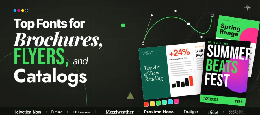
The best fonts for brochures, flyers, and catalogs balance readability, brand character, and clean reproduction in print. Serif fonts work well for longer copy, sans serifs suit structured information, and display fonts can give covers and headlines more character. Start body text around 9 to 11 points and always check the type at its final printed size.
A brochure is picked up from a trade show table. It is held for roughly four seconds. It is put back down. Nothing about that decision was conscious, and almost none of it involved the words.
The reader saw a page that looked inviting or a page that looked like work, and the typeface made that judgement on their behalf before a single sentence was read.
Print is unforgiving in a way that screens are not. A colour that reads badly on a website can be corrected in a minute and nobody remembers. A typeface set too tightly across ten thousand printed copies cannot be corrected in the same way. It sits in a box in a storeroom, failing on every copy, because the deadline passed before anyone noticed.
That permanence is exactly why font choice deserves attention before the deadline is close. A typeface has to work at the size you set it, alongside the images and information on the page, and under the conditions in which someone will actually read the finished piece.
In this list, we have at ten fonts that work across brochures, flyers, and catalogs, with the strengths, limitations, sizes, and pairings that matter when you put them into a finished layout. You’ll also find practical guidance on choosing a font for your business type, avoiding common print mistakes, and checking the licence before the file goes to press.
So, keep reading!
10 Best fonts for brochures, flyers, and catalogs
The best font depends on what the piece needs to accomplish, from carrying long product descriptions to giving a luxury cover its character. A font that works beautifully at headline size can struggle in a dense catalog, so each choice needs strengths and limits.
The ten fonts below follow the same six-part structure, making it easier to compare them before choosing one for your project.
Let's look at them.
Font
Type
Best format
Best use
Licence
Helvetica Now
Grotesque sans
Brochure
Corporate body and headline
Paid
Futura
Geometric sans
Flyer
Covers and headlines
Paid
EB Garamond
Old style serif
Brochure
Long body copy
Free
Merriweather
Text serif
Catalog
Dense body copy
Free
Proxima Nova
Humanist sans
Catalog
Full hierarchy in one family
Paid
Frutiger
Humanist sans
Catalog
Spec tables and price lists
Paid
Didot
Display serif
Brochure
Luxury covers only
Paid
Bebas Neue
Condensed display
Flyer
Large headlines
Free
Source Sans 3 and Source Serif 4
Superfamily
All three
Complete system on a budget
Free
Georgia
Screen serif
Digital brochure
Editable templates and PDFs
Free
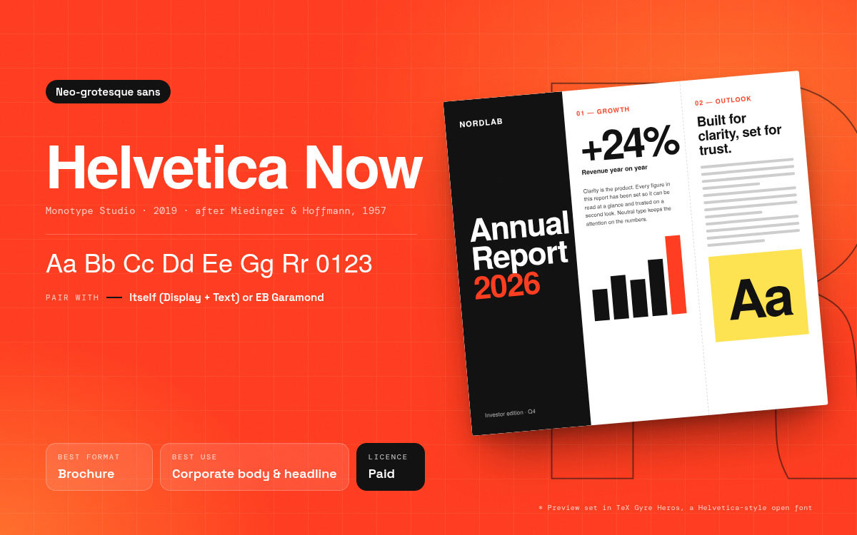
1. Helvetica Now
Classification: Neo-grotesque sans serif.
Designer and year: Released by Monotype in 2019, Helvetica Now is a redrawn and updated version of the Helvetica introduced in 1957 by Max Miedinger and Eduard Hoffmann. The new family was developed by the Monotype Studio team.
Where it works: Corporate brochures, annual reports, investor material, product catalogs, and other printed pieces where clarity and a neutral tone matter. Helvetica Now comes in three optical sizes, Display, Text, and Micro, so the family can handle large headlines, running copy, and very small supporting text with size-specific adjustments.
Where it fails: It can feel too neutral for brands that need warmth, tradition, or a more distinctive editorial voice. For a brochure built around storytelling or heritage, a serif with more visible character may create stronger contrast.
Pair it with: Itself, using Display for headlines and Text for body copy, or with EB Garamond when the paragraphs need more warmth and contrast.
Licensing: Helvetica Now is a commercially licensed type family, with desktop and other licensing options available through Monotype. Check the licence that matches your intended use before production, especially when fonts need to be shared or embedded in production files.
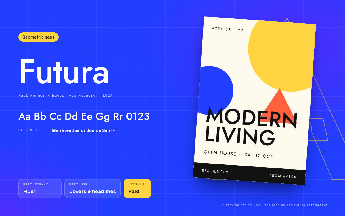
2. Futura
Classification: Geometric sans serif.
Designer and year: Paul Renner, released by the Bauer Type Foundry in 1927.
Where it works: Covers, section dividers, and flyer headlines for architecture, property, fashion, and premium consumer brands. Its geometric circles and unusually long ascenders give a page an immediate sense of order, and that order reads as confidence long before the reader processes the message. Set large, in a single weight, it still looks contemporary almost a century after it was drawn.
Where it fails: Long body copy. Its x-height is small relative to the cap height, so at 9 or 10 points, some cuts can look thin and become harder to read. A full brochure panel set in Futura can be admired and abandoned.
Pair it with: A high x-height text face such as Merriweather or Source Serif 4 for the paragraphs beneath it.
Licensing: A commercial licence is required for most commercial uses, with the appropriate licence depending on the specific Futura cut and its foundry or distributor. Jost is a close open-source alternative available under the SIL Open Font Licence.
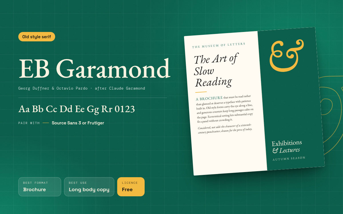
3. EB Garamond
Classification: Old style serif.
Designer and year: Georg Duffner and Octavio Pardo, a digital revival based on Claude Garamond's sixteenth-century type designs and released under the SIL Open Font Licence.
Where it works: Text-heavy brochures, cultural institutions, universities, heritage brands, and any piece that needs to feel considered rather than sold. It sets economically, fitting substantial copy into a panel without making the page feel crowded, and gives long passages a formal, literary character. For copy that must be read rather than glanced at, it is a strong free option.
Where it fails: Reversed type and very small sizes on uncoated stock, where its delicate serifs can lose definition as ink spreads. It can also feel too restrained for a flyer competing for attention across a room.
Pair it with: Source Sans 3 or Frutiger for captions, callouts, and specification lines.
Licensing: Available for commercial use under the SIL Open Font Licence and distributed through Google Fonts. The licence permits use, modification, and embedding subject to its terms.
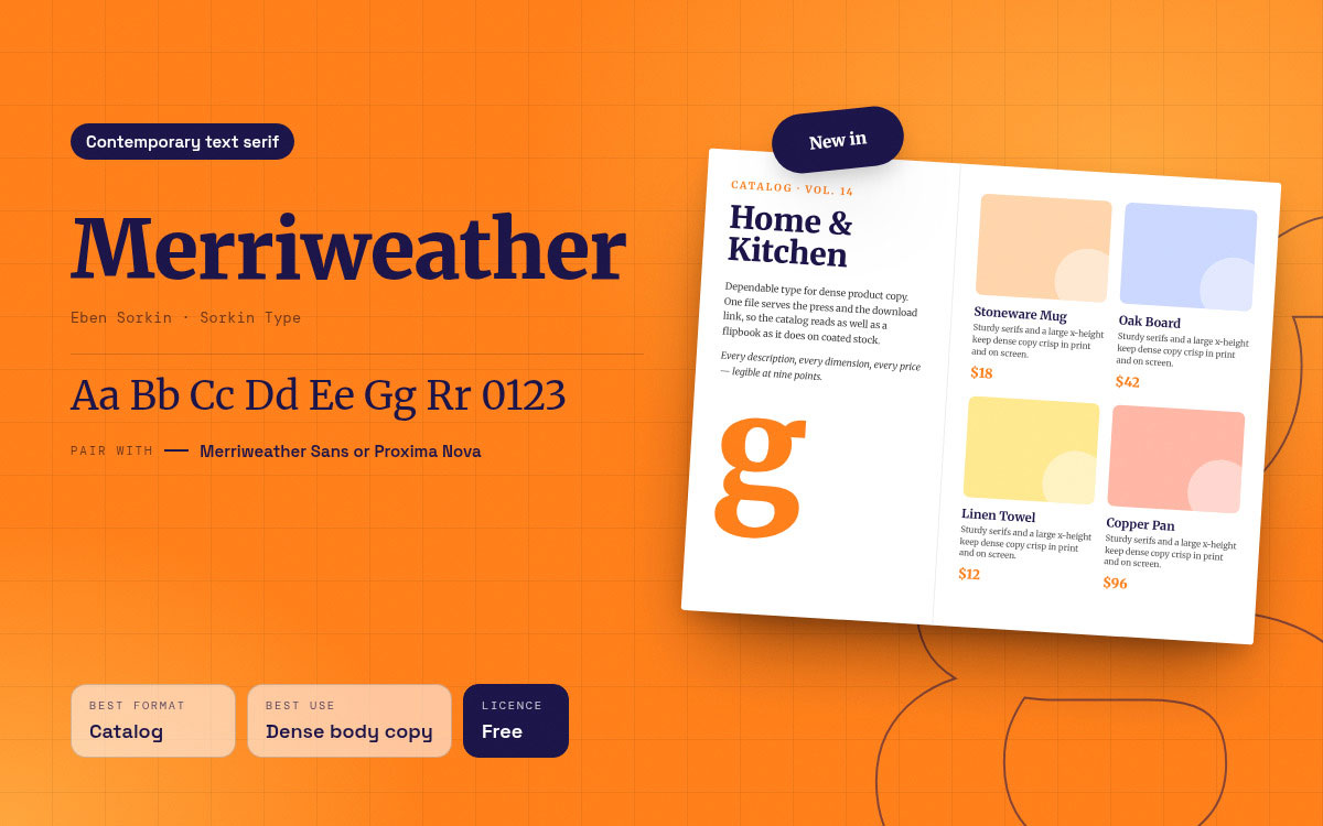
4. Merriweather
Classification: Contemporary text serif with sturdy, bracketed serifs.
Designer and year: Eben Sorkin of Sorkin Type, released under the SIL Open Font Licence.
Where it works: Dense catalog body copy and brochures that will also be published as a PDF or flipbook. It was designed with screen legibility in mind, with a large x-height and open apertures, and that same robustness can help it hold up well in smaller text and demanding print conditions. When one file has to serve both the press and the download link, this can reduce some of the problems that arise between print and digital use.
Where it fails: Elegant, high-end positioning. It reads as dependable rather than refined, which can make it less suitable for some luxury brands, and its sturdiness can feel heavy across a full spread of narrative copy.
Pair it with: Its own companion, Merriweather Sans, or Proxima Nova when the tone needs to feel more commercial.
Licensing: Free for commercial use under the SIL Open Font Licence and available on Google Fonts, subject to the licence terms.
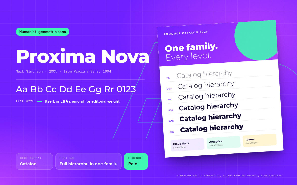
5. Proxima Nova
Classification: Humanist and geometric hybrid sans serif.
Designer and year: Mark Simonson, released in 2005 and developed from his 1994 Proxima Sans.
Where it works: Modern corporate brochures, product catalogs, and service flyers. The family offers a wide range of weights and widths, which means a designer can build an entire hierarchy within one typeface and keep the visual system consistent across a longer piece. For a client with a long document and little appetite for design debate, it is a reliable answer.
Where it fails: Distinctiveness. It has been widely used, so it may not give a brand a particularly unusual or memorable voice on its own.
Pair it with: Itself across an entire piece, or with EB Garamond when a section needs editorial weight.
Licensing: Commercial licence from Mark Simonson Studio. Proxima Nova is also available through Adobe Fonts for desktop use under Adobe's licensing terms.
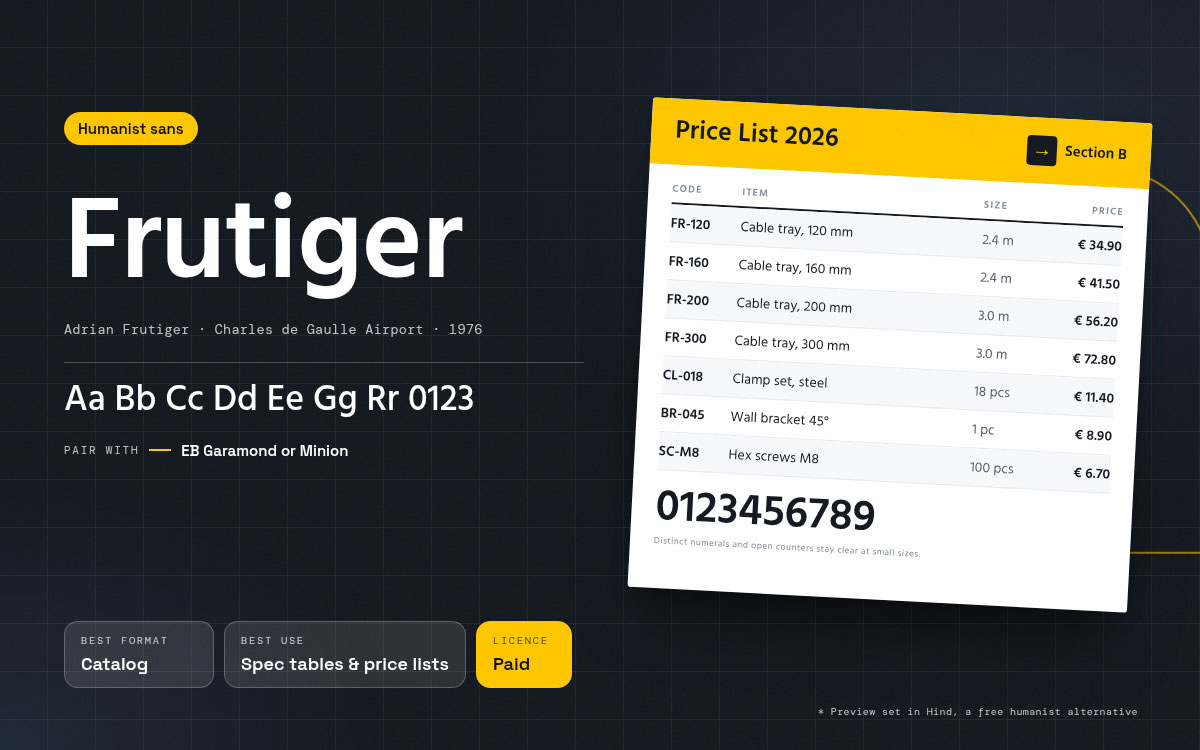
6. Frutiger
Classification: Humanist sans serif.
Designer and year: Adrian Frutiger, drawn between 1975 and 1976 for the signage system at Charles de Gaulle Airport in Paris and released commercially in 1976.
Where it works: Catalog specification tables, price lists, technical brochures, and healthcare or public sector collateral. It was designed to remain legible at small sizes and from different viewing conditions, which suits the demands of dense product tables. Its numerals stay distinct, and its open counters help the letterforms remain clear when text is set small.
Where it fails: Fashion, luxury, and lifestyle work. Its clarity can be read as institutional, which is a strength in a hospital brochure and a liability in a jewellery catalog.
Pair it with: EB Garamond or Minion for the narrative sections that surround the tables.
Licensing: Commercial licence from Linotype or Monotype, depending on the version. Humanist alternatives with open-source licences include Open Sans and Noto Sans.
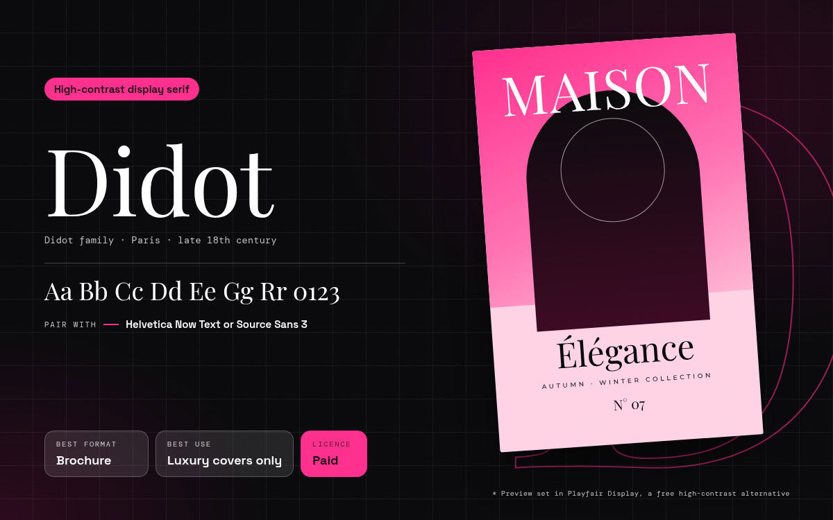
Designer and year: The Didot family of Parisian printers in the late eighteenth century, with widely used twentieth-century digital revivals including Adrian Frutiger's Linotype Didot.
Where it works: Covers and full-page statements for fashion, beauty, jewellery, hospitality, and luxury property. The extreme contrast between thick stems and hairline serifs can give a page a high-end, fashion-oriented character before a single word has been read, which is why it remains a strong choice for premium print.
Where it fails: Small text and reversed type on dark backgrounds, where its fine hairlines can lose definition depending on the size, weight, paper, and printing process. It is primarily a display face rather than a practical choice for long body copy.
Pair it with: A neutral sans such as Helvetica Now Text or Source Sans 3 for supporting copy.
Licensing: Commercial licence from Linotype or the relevant foundry, depending on the specific revival. Playfair Display, available under the SIL Open Font Licence, is a free alternative with a similar high-contrast character, though its letterforms and overall feel are different.
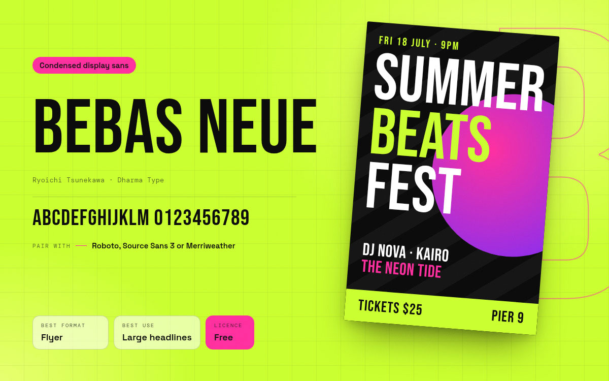
8. Bebas Neue
Classification: Condensed display sans serif, uppercase-focused.
Designer and year: Ryoichi Tsunekawa of Dharma Type, released under the SIL Open Font Licence.
Where it works: Flyer headlines, event promotion, price callouts, and section dividers where the words must be large and the space is short. It packs a remarkable amount of impact into a narrow column, which makes it well suited to event and retail promotion. On a poster read from across a room, it does exactly what a display face needs to do.
Where it fails: Long sentences and lowercase-heavy settings. The original release had no lowercase, and even versions with lowercase are better suited to headings than paragraph-length copy, where the condensed forms can become tiring to read.
Pair it with: Roboto, Source Sans 3, or Merriweather for the supporting information beneath the headline.
Licensing: Free for commercial use under the SIL Open Font Licence and available on Google Fonts, subject to the licence terms.
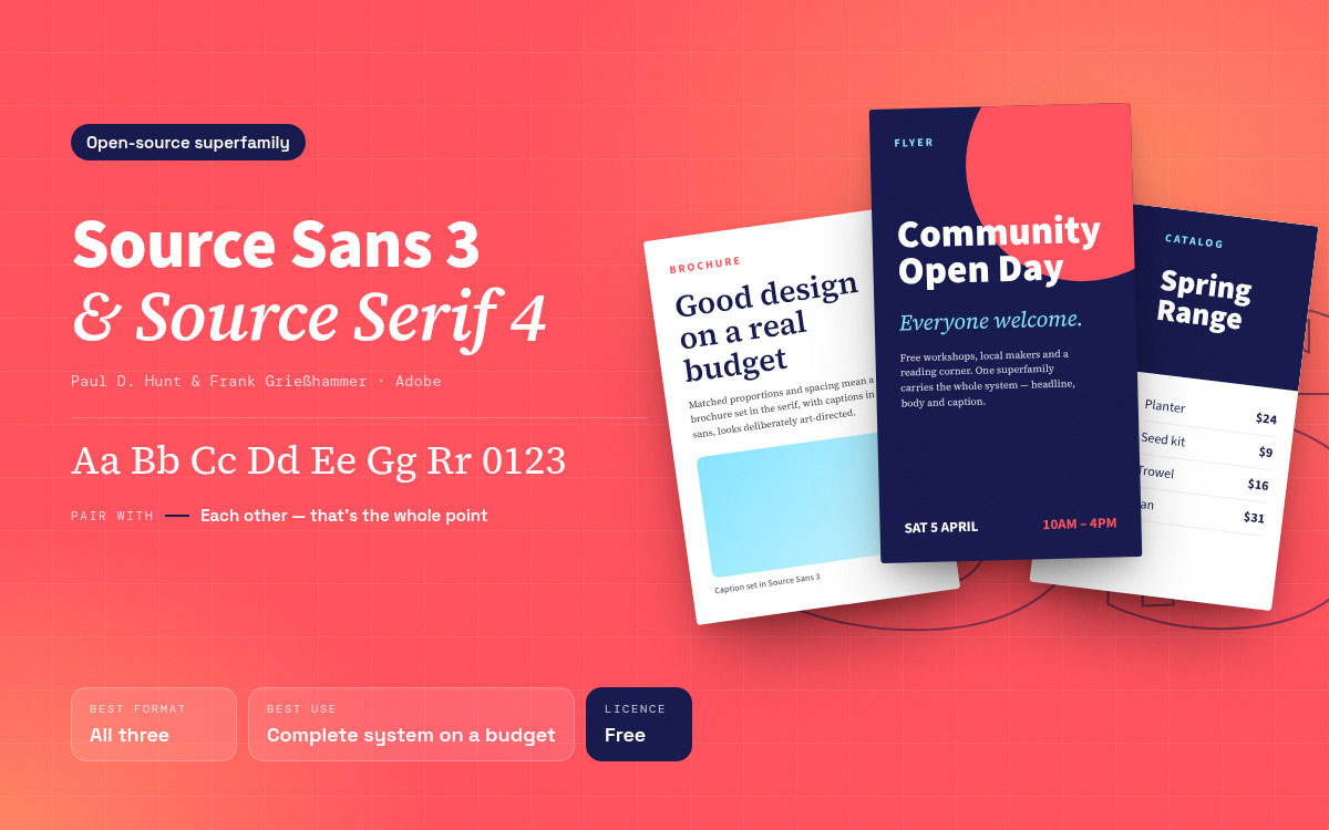
9. Source Sans 3 and Source Serif 4
Classification: Matched open-source superfamily, humanist sans and transitional serif.
Designer and year: Paul D. Hunt and Frank Grießhammer for Adobe, released under the SIL Open Font Licence.
Where it works: Any project with a genuine budget constraint and a genuine quality requirement, which describes a great deal of nonprofit, education, and early-stage business print. The two families are designed as companions, with related proportions and spacing, so a brochure set in Source Serif with Source Sans captions looks deliberately art-directed rather than assembled from whatever was free that afternoon.
Where it fails: Strong personality. This is a professional, versatile choice rather than a signature type system, so it may not give a brand a particularly distinctive voice on its own.
Pair it with: Each other. That relationship is the entire reason the superfamily exists.
Licensing: Both are available under the SIL Open Font Licence for commercial use, subject to its terms. They are available through Google Fonts, while availability through Adobe Fonts may depend on Adobe's current font library and licensing terms.
10. Georgia
Classification: Screen-first transitional serif.
Designer and year: Matthew Carter, commissioned by Microsoft and released in 1996, with hinting by Tom Rickner.
Where it works: Digital brochures, PDF-first collateral, and any template a client will edit themselves after handover. Its wide availability on common desktop systems can reduce font-substitution problems that can affect editable templates once the file leaves the studio. For a sales team updating a price sheet each quarter, that reliability can be worth more than novelty.
Where it fails: Premium print positioning. Its familiarity can make it feel safe, and its lining figures can appear slightly large in dense tables.
Pair it with: Verdana, its screen-first sibling from the same commission, or Proxima Nova for a more current feel.
Licensing: Georgia has been bundled with Microsoft software and is also available through other licensed channels. For distribution beyond ordinary desktop use, confirm the licence terms for the specific version and intended use rather than assuming that installation grants every type of licence.
Which font fits your business type
The font that fits your business depends on the image you need to communicate and the people reading the brochure. Healthcare, finance, fashion, and technology each call for different typographic cues, but the choice still needs to work at the actual reading size and distance.
The table below gives you a starting point for matching font styles to common business types, before testing the choice against your brochure.
Industry
Headline
Body
Reasoning
Luxury retail and fashion
Didot
Helvetica Now Text
High contrast signals price point, neutral body keeps focus on imagery
Architecture and property
Futura
Merriweather
Geometry mirrors the built form, sturdy serif carries specification copy
Healthcare and clinics
Frutiger
Frutiger
Legibility at small size matters more than personality in patient information
Universities and museums
EB Garamond
Frutiger
Heritage voice with clear labelling and wayfinding quality captions
Technology and SaaS
Proxima Nova
Proxima Nova
Single family hierarchy reads as contemporary and keeps files simple
Events and entertainment
Bebas Neue
Source Sans 3
Maximum headline impact in minimum horizontal space
Warm and credible without appearing to have spent money on type
Industrial and manufacturing work is where format choice and typeface choice collide most often. A specification heavy document set in a warm editorial serif will feel wrong to an engineer, and a sales narrative set in a signage face will feel cold to a buyer. Deciding first how a catalog and a brochure differ in purpose usually settles the typography argument in a single meeting, because the reading behaviour of the document is what dictates the register.
7 Font mistakes that ruin printed collateral
The font mistakes that damage printed collateral are usually simple choices made without considering how type behaves on the page. Poor sizing, weak contrast, crowded spacing, and mismatched typefaces can make even strong content harder to read. The seven font mistakes below show what to check in brochure design tips before a file reaches print.
Using more than three typefaces: The page loses a visual centre and starts to read as unplanned. Reduce to two families and build hierarchy with weight, size, and case instead.
Setting a display face as body copy: Futura, Didot, and Bebas Neue are display-oriented and can become difficult to read at small sizes or in long passages. Reserve them for headlines and set paragraphs in a face drawn for text.
Ignoring the measure: A full-width A4 panel at 10 pt can run well past 100 characters per line, making it harder for the eye to find the next line. Break the panel into columns or increase the point size.
Setting leading too tight: Designers often tighten leading to fit copy that should have been cut. The result is a grey, exhausting block that few readers want to finish. Cut the copy instead.
Reversing hairline serifs out of dark backgrounds: The thin strokes can fill in or lose definition on press. Switch to a sans serif or step up one weight for any reversed panel.
Setting small text in a four-colour build: Any registration shift on press can create a coloured halo around the letters. Set small black text in 100% K where appropriate, particularly below 10 pt.
Using a font without the right commercial licence: A desktop licence may exclude embedding, distribution, or certain commercial uses. Confirm the licence terms before the file leaves the studio, not after the invoice arrives.
Best fonts for brochures FAQs
Choosing a font for a brochure can seem simple until readability, hierarchy, brand style, and print quality start pulling the decision in different directions. These are some of the questions that come up when those details need to work together. If you are still unsure about a font choice after reading these answers, we are happy to help you find a practical direction.
There is no single best font for every brochure. Helvetica Now, EB Garamond, and Proxima Nova can suit different needs, but the choice should follow the brochure’s purpose, reading distance, brand style, and amount of copy. A text serif can suit copy-heavy pages, while a humanist sans can work well for corporate or technical content.
Brochure body text usually works well around 9 to 11 points, depending on the typeface, layout, and reading distance. Smaller text may be suitable for captions or legal information, but readability should come first. Line spacing also matters, with around 120% to 145% of the font size often providing comfortable reading.
Either can work, depending on the content and visual direction. Serif fonts can suit longer passages, while sans serif fonts often work well for headings, specifications, captions, and information-heavy layouts. Many brochures combine both, using one family for body copy and another for headings or supporting information.
Two typefaces are usually enough for a brochure, with one handling headings and the other body copy. A third can work for a specific recurring element, such as prices or pull quotes, when it has a clear purpose. You can create plenty of hierarchy through weight, size, spacing, and case.
Many Google Fonts can be used commercially, but the licence depends on the individual font. Several families use the SIL Open Font Licence, which permits commercial use and embedding under its terms. Before sending a brochure to print, check the licence included with the specific font rather than assuming every Google Font has identical terms.
No font is universally forbidden, but some choices can work poorly in a professional brochure. Novelty fonts, overly decorative faces, and very thin type can reduce readability or weaken the intended tone. Even familiar fonts such as Comic Sans or Papyrus can feel out of place when their character does not suit the brand or audience.
Endnote
Finally, we have reached the last page of the best fonts for brochures! Did the right font start to feel a little less like a matter of taste?
Return to that brochure on the trade show table, held for four seconds and set back down. The reader met a page that either invited them in or asked them to work, and the typeface helped decide which one it was. That is why choosing the best fonts for brochures, flyers, and catalogs is not about finding the prettiest face. It is about finding one that lets the message, products, and page structure do their jobs without making the reader fight through them.
However, the font is only one decision on the page. What happens around it matters too. Graphic Design Eye works across catalog, brochure, and flyer design, bringing typography into the wider layout alongside product imagery, image editing, and other visual elements, so the finished piece reads as one piece rather than a collection of separate choices.
Have a brochure, flyer, or catalog waiting for its design? Share the project with Graphic Design Eye and tell us what types of design the piece needs to communicate.
Now, choose the font with purpose, and let the page do the rest!
Graphic Design Eye LLC is a full-service creative agency built for brands that demand more than design — they demand vision. From strategic branding to complete visual identity, we partner with startups, agencies, and growing businesses as a dedicated creative force. With flexible subscription and project-based models. Let's start with us today!