How to design a nonprofit infographic that gets shared comes down to six sequential decisions made before any design tool is opened, from the one insight at the center to the platform-specific format that makes sharing effortless. This guide covers all six steps, the technical specs for production-ready output, and five common mistakes that quietly kill shareability.
Most nonprofit infographics fail not because the cause isn't compelling or the data isn't strong, but because they are built to inform rather than to travel. There is a real difference between a graphic someone glances at once, and a graphic someone feels compelled to pass along to their own network, the exact difference good infographic design is meant to create. And that difference is entirely within your control.
Here, you will find the six nonprofit infographic design tips that turn a data-heavy report into one clear insight, along with the technical specifications that keep your infographic readable on every platform it lands on. You will also see the five mistakes quietly killing shareability across most nonprofit content today, the same mistakes that are simple to fix once you know where to look.
By the end, you will have a complete framework for producing infographics your supporters actually want to share. Let's start with the one decision that determines everything else: the insight itself.
How to design a nonprofit infographic
To design a nonprofit infographic that people actually share, choose one central insight, match the infographic type to the data, build a visual hierarchy around that insight, apply a color palette that carries the cause's emotion, embed the attribution and share prompt into the graphic itself, and format the design for every platform where it will travel.
The six steps below follow that exact order, because each decision constrains the ones after it. Work through them before opening any design tool. Let’s keep reading.
Step 1: Choose the one insight the infographic must communicate
First, pick the one most important insight. Design the whole infographic around showing that clearly.
Most nonprofit infographics fail to get shared. The problem usually isn't bad design. It's that they try to say too much at once. Annual reports are the worst offenders: 12 stats, 6 program areas, 4 regions, plus a full year timeline, all crammed onto one page. That makes a report, not a story. People file reports. They share stories, which is the whole premise behind learning how to tell your nonprofit story visually.
A shareable infographic needs one headline stating the main insight in eight words or less. It needs one strong visual that makes the point clear before anyone reads the data. Everything else should support that one insight, not compete with it. Ask yourself: what should someone remember after five seconds? If you can't answer in one sentence, you don't have a clear insight yet.
Apply it: before opening any design tool, write one sentence: "After seeing this infographic, the viewer will know [one thing]." If that sentence needs "and" or a semicolon, you have two insights. Pick one. The rest becomes support.
One clear insight beats ten confusing ones.
Step 2: Choose the right infographic type for the data
Step two is picking the format that shows the main insight most clearly. Different data works better with different visuals. Using the wrong one is a common mistake in nonprofit visual content strategy.
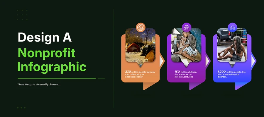
Use a timeline when the insight shows change over time. Use a comparison chart for differences between two groups. Use a map for how need or impact spreads across a region. Use a process flow for steps in a program, from donation to outcome. Use a statistical visual for one powerful number that needs scale to feel real.
Picking the format is a content choice, not a design choice. Make it before any design work, based on the insight's structure. A timeline for one data point wastes the format. A statistical visual for a process confuses viewers.
Apply it: Match the insight to the format using this decision: Does the insight show change? Use a timeline. Does it show difference? Use a comparison. Does it show location? Use a map. Does it show sequence? Use a process flow. Does it show scale? Use a statistical visualization with a dominant number and contextual supporting data.
The right format for the data makes the insight feel inevitable. The wrong one makes it feel confusing.
Step 3: Design the visual hierarchy around the central insight
Visual hierarchy tells the eye what to look at first, second, and last. Without it, everything looks equally important, so the eye has no path. With strong hierarchy, the eye moves on its own. First the main idea, then the data, then the credit and share prompt.
Size, color, and contrast build hierarchy. The main visual, whether a number, chart, image, or headline, should be the biggest thing on the page. The strongest color contrast should point to it. Everything else should stay visible but simple, not competing with it.
Here's a simple test. Cover everything except the headline and main visual. Can someone still get the main idea? If yes, the hierarchy works. If not, the headline needs to be clearer, or the visual needs to say more on its own.
Apply it: Plan three levels before adding anything. Level 1 is the headline and main visual, at least three times bigger than body text, in the strongest color contrast. Level 2 is the supporting data, in the secondary brand color, pulled straight from your nonprofit branding strategy. Level 3 is the credit, logo, and share prompt, smaller and lighter. Use these levels the same way in every section.
Hierarchy shows the viewer where to look. Without it, they look nowhere.
Step 4: Apply a color palette that communicates the cause's emotional register
Color shows emotion before it shows information. Viewers feel a color palette's emotion in a split second. This happens before they read any text or data. For a nonprofit infographic, color is the cause's first message. Choose colors for the content's emotion. Don't just copy the brand's usual colors.
Different causes need different emotions, so different colors. Food poverty infographics need urgency and seriousness. Try deep reds, warm golds, or dark high-contrast tones. Environmental progress needs hope and growth. Try greens, blues, and warm earth tones. Child education needs warmth and possibility. Try bright primaries, warm yellows, and oranges. Using the brand's usual colors without adjusting wastes a chance.
The 60/30/10 rule keeps colors disciplined. Use 60 percent background color. Use 30 percent brand or insight color. Use 10 percent high-contrast accent. Save the accent for key numbers and calls to action. Check every text and background pair. Make sure it meets WCAG 2.1 AA contrast. Use a contrast checker before finishing.
Apply it: Pick the main emotion the infographic should create. Choose urgency, hope, pride, or surprise. Choose the dominant color for that emotion first. Do this before brand guidelines. Then adjust the palette to fit brand recognition. Keep it within that emotion.
The right color makes viewers feel the cause first. They understand the data after. That feeling makes them share.
Step 5: Embed the share prompt and attribution into the design
If an infographic has no attribution, logo, or share prompt built in, it loses its connection to the organization once shared the same kind of forgettable first touch covered in why donors keep forgetting your nonprofit. When someone downloads, screenshots, or shares it, no caption or link travels with it. Only what's inside the graphic survives.
The share prompt is part of the design, not a caption. Put it in the footer, below the main content. Use a short line like “Share this if it matters to you” or “Share to spread the word,” along with the logo, website, and data source. Place the logo in the lower right corner. Make it visible but not distracting.
Try this test: screenshot the infographic alone, no caption or context. Show it to someone who doesn't know the organization. Ask who made it and how they'd learn more. If they can't answer from the graphic alone, the attribution isn't enough.
To apply this: add a footer to every infographic. Include the logo in the lower right (10 to 15 percent of the canvas width), a small readable website URL, a footnote-style data source, and a one-line share prompt in your brand voice. Design this footer at step five, before finishing the graphic, not as an afterthought.
If the attribution isn't in the graphic, the organization doesn't travel with the share.
Step 6: Format for the platform and optimize for sharing
An 800-pixel-wide infographic looks different on Pinterest, Instagram, LinkedIn, and X. It also looks different when printed or projected. Formatting for each platform decides if your infographic gets seen where people actually share it, or only where you first posted it.
Each platform likes its own shape, which is why social media design work treats every platform as its own canvas. Pinterest wants tall infographics, a 2:3 or 1:2 ratio. Instagram wants a cropped main visual, with the full version linked in your bio. LinkedIn wants a wide, short design that reads well without tapping to expand. X wants a 16:9 ratio for feed posts. One master infographic, 800 pixels wide and 2000 to 3000 pixels tall, can make all these versions if you plan your crop zones early.
Map out your crop zones first. The top 30 percent needs the headline, main visual, and key insight. This part shows up in feed previews and square crops. The middle 50 percent holds your supporting data. The bottom 20 percent holds your credit, logo, and share prompt. This structure lets every version work for its platform without a redesign.
Apply it: Once your master infographic is done, make three more files: a square crop of the top 30 percent for Instagram, a 1200x628px horizontal crop for LinkedIn and X, and a 1000x1500px vertical crop for Pinterest. Export them all as PNG. Add platform names to the file names to keep things organized.
An infographic made for one platform only reaches one audience. Format for every platform, and let people share it for you.
Nonprofit infographic technical specifications
The process of how to design a nonprofit infographic follows specific technical standards: 800px fixed width, 2000 to 3000px height, 72 DPI resolution, RGB color mode, and PNG format for sharing. These specifications ensure the design displays correctly, reads clearly at smaller sizes, and meets WCAG 2.1 AA accessibility standards across every platform.
Spec Element
Recommended
Why It Matters
Width
800px fixed
Displays correctly across platforms; wide enough to read at shared size
Height
2000 to 3000px
Long enough for depth; short enough to view without excessive scrolling
Resolution
72 DPI at final size
Screen-optimized; keep a 300 DPI version for print use
File format for sharing
PNG (lossless)
No compression artifacts on text and fine lines
File format for embedding
SVG (where supported)
Infinitely scalable and future-proof
Color mode
RGB
Correct for all screen displays
Font minimum size
16pt body, 24pt+ headline
Readable when shared at smaller sizes on social
Color contrast
WCAG 2.1 AA minimum (4.5:1)
Accessible to all audiences; a design best practice
Brand logo placement
Bottom right, below main content
Present without dominating the visual story
Source attribution
Bottom, small but visible
Credibility and verification signal for sharers
Sharing CTA
Embedded in graphic footer
Prompts reuse and preserves attribution
5 Design mistakes that kill nonprofit infographic shareability
How to design a nonprofit infographic usually fails in five common mistakes. They cram in a whole annual report instead of one clear insight. They use too many colors. Font sizes shrink until they can't be read once shared. They skip attribution and a share prompt. They're designed for desktop, ignoring mobile.
Each mistake is easy to spot and fix before you publish.
Mistake 1: Designing an annual report, not an insight
What happens: The infographic has 12 stats, 6 program highlights, and 4 regions on one canvas. Every point gets equal weight. The eye has no starting point or path.
The truth: An infographic with no main insight is just a report with icons. People file reports. They share insights. Viewers scan for three seconds, feel overwhelmed, and close the tab.
The fix: Pick one central insight before opening the design tool. Everything else supports that one thing. For full annual report data, make a series of infographics, one per insight.
Mistake 2: Using too many colors
What happens: Five brand colors, two chart colors, and a different background per section. The result looks busy. It shows organizational chaos, not the focused, credible message good branding design is supposed to protect.
The truth: Color speaks before information does. Too many colors show disorganization. A chaotic infographic makes viewers think the organization does not know what it wants to say.
The fix: Use only three colors, max. Follow the 60/30/10 rule. One background. One main color for data. One bold accent for the key number or CTA. Everything else stays white space.
Mistake 3: Font sizes that are unreadable when shared
What happens: The infographic looks great on a desktop screen. But shared on Instagram, cropped in a screenshot, or shown in a LinkedIn preview, the text gets too small to read without zooming.
The truth: People won't read an infographic if they have to zoom in. And if they don't read it, they won't share it either.
The fix: Make body text at least 16 points and headlines at least 24 points, based on an 800-pixel output width. Test it at 50 percent scale before you publish. If any text is hard to read at 400 pixels wide, make the font bigger.
Mistake 4: No attribution or share prompt in the graphic
What happens: The group posts the infographic with a full caption. It links to their site and names the source. Someone shares it. The caption gets left behind. After three shares, no one knows who made it.
The truth: Every share without the group's name wastes a chance to reach new people. A viral infographic without credit builds awareness for the data, not for the group behind it.
The fix: Always add the group's logo, website, data source, and a short share prompt in the footer. Make this a fixed design rule. Build it in at step five of production, not as an afterthought.
Mistake 5: Designing for desktop and ignoring mobile
What happens: The infographic is made full width for big screens. Text is sized for that. Details are readable there. On a phone, the text shrinks. Details get lost. Finding the main point takes effort.
The truth: Most social media use happens on phones now. An infographic not built for mobile will flop on most platforms it's shared on.
The fix: Design at 800 pixels wide. Test at 400 pixels before publishing. If any part needs zooming at 400 pixels, it's not mobile ready. Redesign those parts first.
Nonprofit infographic design FAQs
These five FAQs cover the key decisions on how to design a nonprofit infographic. This includes picking the right insight and format, sizing it for every platform, and reaching new audiences. Each answer stands alone for readers searching these exact questions.
Pick one main insight. Choose the right infographic type for it. Build a clear visual hierarchy. Use colors that stir emotion. Put your logo and a share prompt in the footer. Make versions for each platform.
A nonprofit infographic is shareable when it communicates one clear, emotionally resonant insight in under 30 seconds, needs no caption to make sense on its own, and gives viewers a reason to share it. The most effective elements are a single striking statistic, a before and after visual, and an unexpected scale comparison.
Make it 800 pixels wide. Height should be 2000 to 3000 pixels for standard vertical format. Use 72 DPI for screens, 300 DPI for print. Keep the headline and main insight in the top 30 percent. That part shows up in feed previews and crops.
Nonprofits work best with a few infographic types. Statistical impact graphics show outcome numbers with human context. Before and after graphics show change. Process flow graphics explain how donations create impact. Comparison graphics show scale and surprise. Timelines track progress. Maps show regional relevance.
Put the share prompt, logo, and website URL right on the graphic. That way credit travels with every share. Send it to board members and partners first. Ask them clearly to share it. Then submit it to sector publications. Make separate versions for each platform. They should fit each feed properly.
Endnote
Now you know how to design a nonprofit infographic people actually share. It was never about budget or a dramatic cause. It was one clear insight, shown with intention, built for where people see it.
Knowing the framework is one thing. Using it every time, on every campaign, platform, and deadline, is where teams run out of time. This is where a design partner can help. Give your team's data and deadline to Graphic Design Eye LLC. Our specialists will turn it into a shareable, platform-ready infographic. You get the reach without spending your own hours on it.
You already have the insight your supporters need to see. You do not have to design it alone. See what a nonprofit design partner can take off your plate. Turn your next data point into a graphic that travels beyond your usual circle.
Your mission deserves to reach more than the people who already believe in it. Design the infographic that makes that happen.
Graphic Design Eye LLC is a full-service creative agency built for brands that demand more than design — they demand vision. From strategic branding to complete visual identity, we partner with startups, agencies, and growing businesses as a dedicated creative force. With flexible subscription and project-based models. Let's start with us today!