A catalog redesign can improve engagement and sales when it removes the things that make browsing harder, such as too many products competing for attention, weak visual hierarchy, inconsistent imagery, buried information, and no obvious next step. The strongest redesigns make products easier to understand and the buying path easier to follow.
There is a particular kind of silence that follows a catalog nobody needed.
It arrives. It is opened. A thumb moves across four or five spreads at speed. Then it is set down and stays there until somebody tidies up. Nothing broke. And yet nothing happened either, which is the more expensive outcome, because a catalog that fails loudly at least tells you where it failed.
Most teams reach for catalog redesign examples at exactly this moment, when the book is technically fine and commercially inert, and when they need something more persuasive than instinct to carry into a budget meeting. What follows is not a gallery. It is a record of what ten organisations changed, what followed, and how confident anyone should be about the connection between the two.
One thing becomes uncomfortable quickly. The redesigns that worked rarely began with design. They began with subtraction, and with somebody willing to say that a page selling twelve products was selling none of them. If your own book is underperforming, the first honest look belongs to the elements a catalog page needs rather than to the moodboard.
This guide gives you ten catalog redesign examples to help you see why certain changes worked, what evidence supports the reported results, and which catalog ideas you can take into your own redesign.
Each example follows the same five parts: context, the problem before, the redesign moves, the reported outcome with its evidence tier, and the transferable lesson. Where a figure could not be sourced, the number is omitted. Two entries are labelled composites and carry no figures at all.
Let's look at what changed.
10 Catalog redesign examples
These ten catalog redesign examples show what organisations changed, what followed, and how strong the evidence is behind each outcome. Eight are named organisations documented in trade press, company statements, or public reporting. Two are labelled composites and carry no figures.
Each entry states its evidence tier and notes when other changes may have influenced the outcome. The goal is to show what can be learned from each redesign without treating every reported result as proof of causation.
Before and After at a Glance
Brand
Before
After
Evidence tier
IKEA
200m copies at peak, falling to 40m
Format retired, investment moved to digital
Company-confirmed
Patagonia
Conventional product pressure
Close to half the space non-selling editorial
Publicly observable
Aerosoles
Print and web operating separately
Catalog published online first, shoppable in motion
Company-reported to trade press
Murad
80 SKUs, repetitive copy
Merchandising, layout and copy rebuilt together
Trade press reported
Restoration Hardware
3lb mailing (2011)
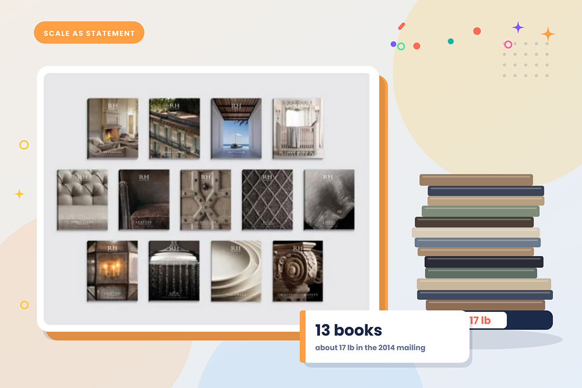
17lb, 13 books, 3,300+ pages (2014)
Financials reported, causation contested
J.Crew
13 mass-mailed editions a year
3 opt-in editorial editions, QR codes, film photography
Company-stated rationale
Lands' End
Heritage classic positioning
Fashion-forward covers and assortment
Well documented failure
Wayfair
Millions of SKUs, online only
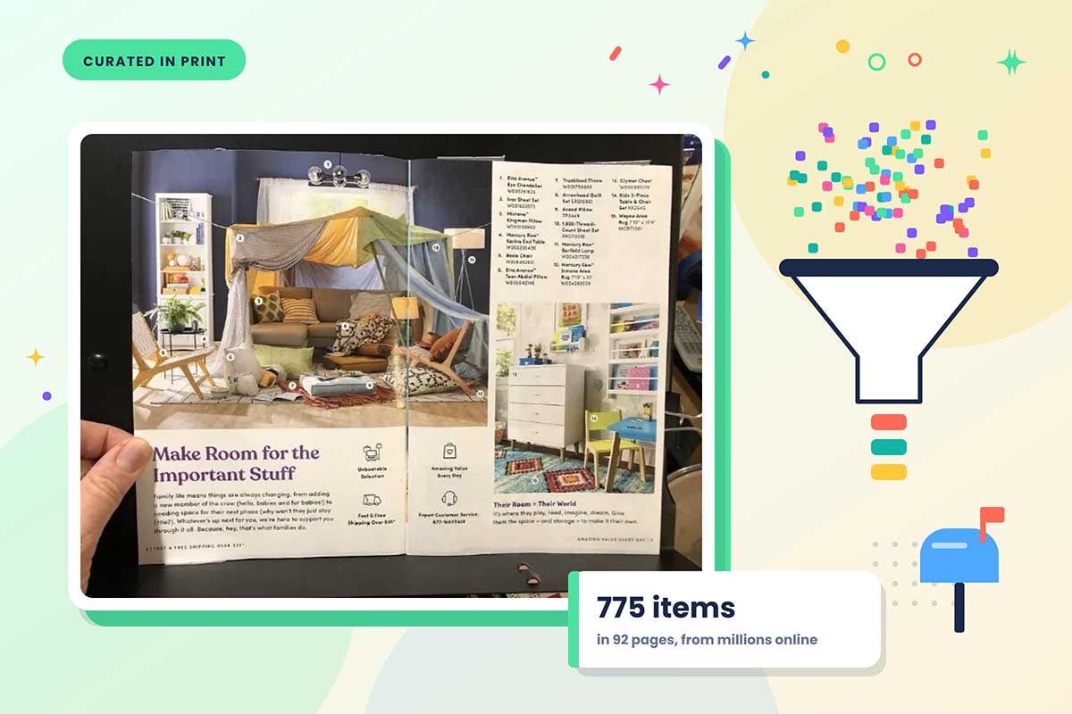
92 pages, ~800 curated items, targeted mailing
Strategy documented
B2B distributor
600-page SKU reference
Curated core book, long tail online
Illustrative composite
Regional retailer
Static PDF
Shoppable, tracked digital edition
Illustrative composite
1. IKEA: when the redesign is the format itself
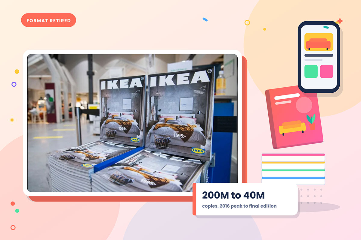
For seventy years, the IKEA catalog was a major part of how the brand presented its products. Store openings were scheduled around its distribution, and product launches were planned around its print deadlines.
The problem before: Scale had become the liability. At its 2016 peak, the catalog reached 200 million homes across 50 markets in 32 languages, but by 2020 IKEA produced only 40 million copies. The catalog had also lost its role as a primary source of inspiration as customers gained easier access to products online.
The redesign moves: IKEA did not restyle the catalog. It retired it. In December 2020, the franchisor announced that it would end both the print and digital versions, citing changed customer behaviour and media consumption. Investment moved to the website, apps, and smaller printed pieces.
Reported outcome: In the year before the decision, IKEA online retail sales rose 45% worldwide and ikea.com received more than four billion visits. Those figures reflect the wider shift to digital and the pandemic period, so they cannot be treated as an effect of retiring the catalog.
Evidence tier: company-confirmed, with major confounding variables.
The lesson: A catalog redesign does not always mean changing the layout. Sometimes the evidence points to changing or retiring the format itself. The important part is proving that the change matches how customers now discover and buy products.
2. Patagonia: the catalog that stopped selling first
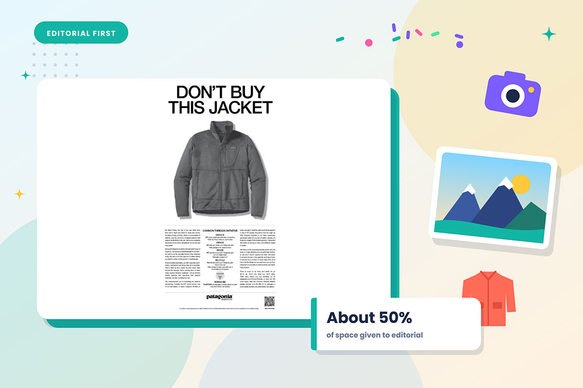
Patagonia's catalog takes an editorial approach to product presentation, giving substantial space to stories, photography, environmental subjects, and outdoor experiences alongside merchandise.
The problem before: The commercial pressure on any catalog is to fill every page with product. Patagonia treated that pressure as the problem.
The redesign moves: The catalog gives close to half its space to non-selling editorial content, including environmental and sport essays and photographs of wild places rather than merchandise. Since 1980, customers and wilderness photographers have also been invited to submit their own images, with submissions now reaching roughly 60,000 a year. The photographic standard is curated to maintain a consistent visual voice.
Reported outcome: The commercial effect cannot be isolated from four decades of brand building. What can be observed is the catalog's lasting editorial role, including a 2010 retrospective of its photography.
Evidence tier: publicly observable, no isolated sales figure.
The lesson: Product does not have to occupy every page. Editorial content can give the catalog a stronger point of view and change how readers approach the product pages that follow.
3. Aerosoles: extending the book into the browser
Aerosoles had mailed a print catalog since 1992 and also sold through a substantial store network.
The problem before: Print and web behaved like separate channels. Photography was shot for one and rebuilt for the other, while the catalog's useful life ended soon after it reached mailboxes.
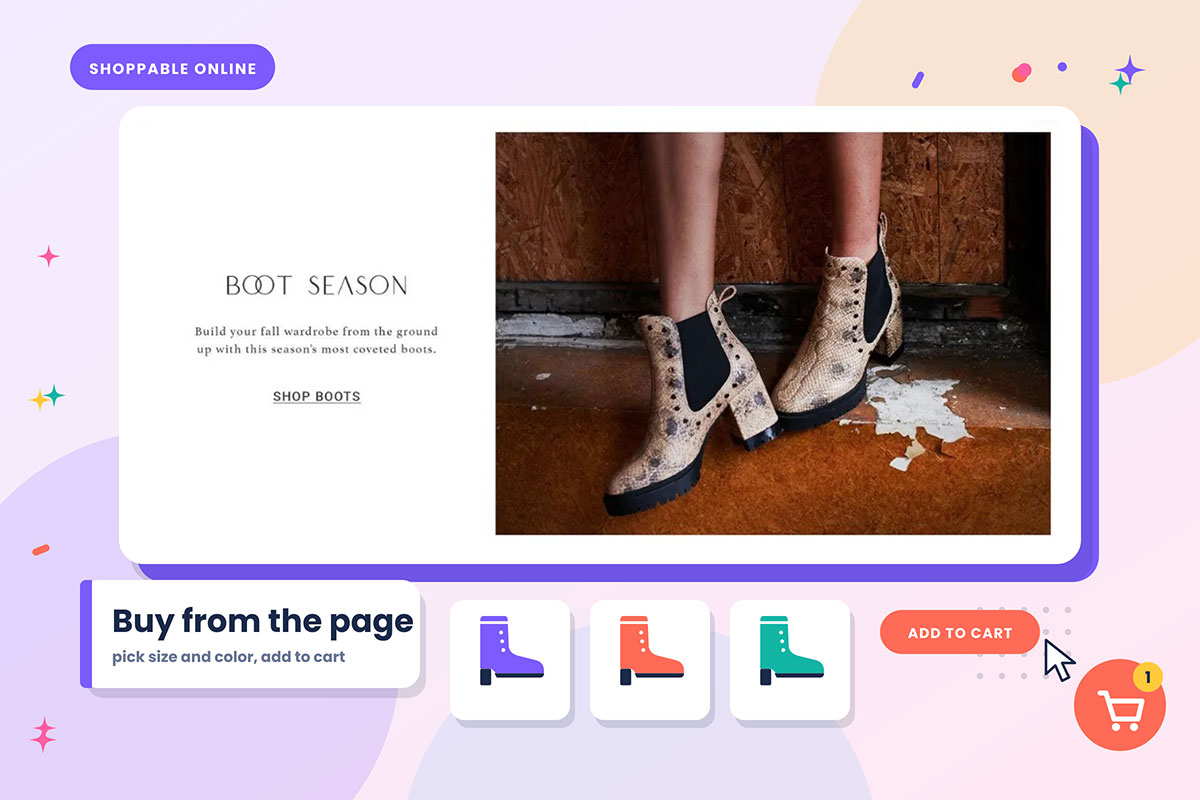
The redesign moves: Aerosoles rebuilt the catalog as an online experience rather than a PDF. Rotating promotions were placed in the left navigation, the catalog was published on the site before it reached mailboxes, and email campaigns explained how to use it. Print photography was reused for on-site merchandising, and several editions stayed live at once. A later version made the catalog shoppable in motion, allowing customers to click a shoe inside a video, choose a size and colour, and add it to the cart.
Reported outcome: Aerosoles reported online conversion rising by 15% to 20% and average order value rising by 10% to 15% after putting the catalog online. Online-catalog users made up 12% to 20% of the customer base.
Evidence tier: company-reported to trade press, single-source, historic.
The lesson: Digitising a catalog is not scanning it. Aerosoles connected browsing with navigation, product pages, and ordering, giving the catalog a longer and more measurable role in the buying journey.
4. Murad: rewriting the copy before restyling the page
Murad sells skin, hair, and body care directly across catalog, web, and broadcast channels.
The problem before: A narrow range was being shown repeatedly. The company described selling roughly the same 80 SKUs, with the same top 15 products featured again and again, while copy became stale quickly.
The redesign moves: Murad gave the catalog a complete makeover covering merchandising, layout design, and copy, followed by a more user-friendly website. The company stressed that the book had to sell rather than rely on decorative design or flowery copy. Offers were reinforced inside as well as on the cover, while themed spreads and bundles created new reasons to browse a range that had not changed much.
Reported outcome: Murad reported record March sales, its highest monthly sales in twenty years, while catalog sales ran 14% above the equivalent period the previous year. Several changes happened at once, so the sales increase cannot be attributed to the catalog redesign alone.
Evidence tier: trade press reported, confounded by simultaneous changes.
The lesson: Copy can change how a product is understood and sold. Murad's example shows why product claims, offers, bundles, and merchandising deserve attention alongside the visual layout.
5. Restoration Hardware: scale as a positioning instrument
RH used its Source Books to present furniture as a considered, physical purchase that could not be fully represented on a screen.
The problem before: In a category where competitors could look similar online, RH needed the catalog to create a stronger physical distinction.
The redesign moves: The book grew deliberately, year over year. The 2011 mailing weighed a little over three pounds, the 2013 mailing six pounds, and in May 2014 the delivery nearly tripled to 17 pounds, arriving as 13 separate Source Books. The 13 volumes ran to more than 3,300 pages of curated design. The company mailed once a year, using forest-certified paper and carbon-neutral shipping.
Reported outcome: The results are mixed, which makes the example useful. After the 2013 escalation, RH posted revenue growth of 33% and same-store sales growth of 27%. The 2014 edition then drew public criticism over waste and unsolicited delivery. One creative director praised the art direction while arguing that the result had become too large to communicate effectively.
The lesson: Scale can make a catalog feel substantial, but too much of it can overwhelm the product and the reader. A larger catalog is not automatically a stronger one.
6. J.Crew: retiring a catalog, then rebuilding it
The J.Crew Style Guide helped define the brand's visual identity before the catalog was discontinued in 2017 during a wider restructuring.
The problem before: Frequency had become difficult to justify. J.Crew was producing 13 editions a year and mass-mailing them while the merchandise was moving away from its core customer.
The redesign moves: The autumn 2024 relaunch replaced 13 editions with three, using a deliberately editorial format and QR codes to connect readers with the app. The book was developed with a Paris-based creative studio and built around long-form editorial, including an interview with its cover subject. It was no longer mass-mailed, with customers able to collect it in stores or opt in to receive it. Every photograph was shot on film, and thicker paper stock reinforced the shift toward a keepsake format.
Reported outcome: The company framed the relaunch as a response to consumer demand, pointing to an Instagram account devoted to the original catalogs that had gathered close to 82,000 followers. Published sales figures cover the wider business rather than the catalog itself, so they do not establish the relaunch's direct sales effect.
Evidence tier: company-stated rationale, no isolated catalog attribution.
The lesson: J.Crew changed the catalog's frequency, distribution, editorial approach, and physical treatment instead of simply bringing back the old format. The redesign shows how a catalog can be rebuilt around a more selective audience and a clearer role.
7. Lands' End: the redesign that lost its reader
Lands' End was a heritage American brand that became independent and hired a luxury-fashion chief executive in 2015 as it tried to reach younger customers.
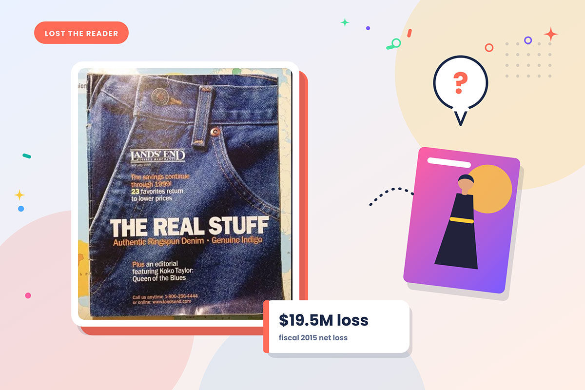
The problem before: The business was already in decline, with annual sales falling from $1.7 billion in 2012 to $1.55 billion in 2015.
The redesign moves: Lands' End relaunched its website, introduced its first digital catalog, and revamped its print catalogs with a more fashion-forward look. Campaigns in fashion titles featured stylish young men and women, while covers began showing slimmer models in clothing that looked deliberately different from the brand's established style.
Reported outcome: The repositioning did not reverse the decline. The chief executive departed after 19 months, the share price had fallen by almost half, and the company reported a 2015 loss approaching $20 million. On a later earnings call, the company said the assortment had moved too far from its classic offering and confused customers. Commentary at the time focused on the pace of the fashion shift and the distance from the brand's established customer.
Evidence tier: well documented, publicly reported outcome.
The lesson: This is useful because the redesign shows what happens when catalog presentation moves too far from customer expectations. A stronger visual direction cannot fix an assortment that no longer matches what the existing customer came to buy.
8. Wayfair: a digital native choosing paper
In 2016, online-only home retailer Wayfair introduced a print catalog despite having millions of products available online.
The problem before: A huge online assortment gave customers plenty to search through, but the catalog needed to solve a different problem: helping shoppers discover a smaller set of products worth considering.
The redesign moves: Wayfair used radical subtraction as an editorial exercise. The catalog ran to 92 pages and showed close to 800 items, a small fraction of the products available online. Buyers and editors selected the products using the company's own analytics. A companion private-label book was mailed every six weeks to 500,000 shoppers. Targeting combined high-value customers with households that had recently moved into particular neighbourhoods, giving the catalog a specific audience rather than treating it as a mass mailing.
Reported outcome: No isolated catalog response rate has been made public. The strategy is still useful as a documented example of an online retailer using print to narrow a very large assortment into a more manageable browsing experience.
Evidence tier: strategy publicly documented, outcome not isolated.
The lesson: A catalog does not need to show everything a business sells. Wayfair's example shows how a carefully selected range can give a large digital assortment a clearer starting point for discovery.
9. A B2B distributor cutting the SKU dump (illustrative composite)
This example is a composite drawn from common patterns in industrial and technical catalog work. It is not a single documented client, and no performance figures are attached.
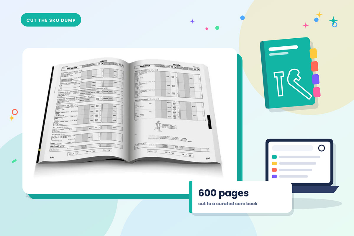
The problem before: A 600-page annual reference was organised by internal part numbers rather than by how customers searched or bought. Sales teams used it as a price list, while customers had to work through hundreds of pages to find the right part.
The redesign moves: The range is cut to a curated core book containing the products that matter most to the business, with the long tail moved to a searchable online database. Products are grouped by application rather than supplier, while line drawings replace inconsistent supplier photography so product details are easier to compare. Running heads, a contents page, and category markers are added. This approach is also visible in our Kincrome case study.
The lesson: In a B2B catalog, navigation is part of the selling job. Grouping products around how buyers search can make a large technical range easier to use and easier to act on.
10. A regional retailer moving to a shoppable edition (illustrative composite)
This example is also a composite and carries no performance figures.
The problem before: A print catalog was exported as a PDF and posted to the website. It was difficult to use on a phone, offered limited search, and provided little information about which products or pages generated action.
The redesign moves: The PDF is rebuilt as a responsive digital edition with tappable hotspots on product pages, unique tracking codes by placement, and search across the book. Layouts are reworked for vertical screens rather than simply reproducing the print spread. Page-level analytics then show which sections receive attention and which are skipped, giving the next edition evidence to work from. Consistent product data across formats can be supported by our guide to eCommerce product catalog management.
The lesson: A digital catalog needs to work as a digital experience, not as a print file placed online. Search, interaction, and page-level measurement give the next redesign evidence that a static PDF cannot provide.
What the ten redesigns have in common
The ten redesigns have more in common than their visual styles suggest. The strongest changes focus on how products are selected, presented, found, understood, and bought, rather than on decoration alone. Read enough catalog redesign examples in sequence and the pattern becomes clear. Seven moves recur, and they recur in roughly this order.
Fewer products, more space: Successful redesigns cut the range before touching the layout. Wayfair reduced millions of items to eight hundred, while J.Crew went from thirteen editions to three.
An editorial opening: The first spread stops selling and starts positioning. Patagonia built an identity on it, while J.Crew rebuilt one around it. The opening sets the tone.
One photographic standard: Mixed sources, mismatched lighting, and inconsistent shadows can make excellent products look careless. One lighting and styling language creates a more consistent range.
Navigation, added deliberately: A contents page, category markers, running heads, and consistent page furniture help readers find their way without making them work for basic information.
Ordering paths repeated everywhere: Contact details, order routes, QR codes, and tracking references should appear close to the buying decision, not only at the back.
Copy rewritten around objections: Murad states it most clearly. Feature lists describe, while objection-led copy answers questions that can stop a purchase. Useful claims beat empty adjectives.
Customer truth over designer taste: Lands' End shows the risk of moving away from customer expectations. Stronger examples use imagery and presentation that reflect how customers actually live and buy.
How to run your own catalog redesign
You can run your own catalog redesign by moving through eight steps, from identifying the problem to testing and measuring the new edition. The sequence matters because each decision affects the next, and skipping an early step can create problems later. The eight steps below give you the order to follow and what to check at each stage.
Audit the current book page by page against sales data: Look at revenue per page and, where the data supports it, revenue per spread or square inch. Some pages are carrying the book. Others are costing money without earning their space.
Cut the range before you redesign it: Several of the examples here subtracted first. Design applied to an uncut range can simply arrange the problem more attractively.
Define the customer the catalog is actually for: Not the aspirational customer. The one who buys, or the customer segment you are deliberately trying to reach.
Set one photographic standard and commit to reshooting where needed: Decide the lighting, angles, backgrounds, and styling, then bring the existing images to that standard or reshoot the ones that fall short.
Rebuild the structure before styling anything: Sequence, categories, contents page, running heads. The skeleton first, then the visual treatment.
Rewrite the copy to a template: Use a fixed pattern of objection, evidence, specification, and next step where it suits the product, then apply it consistently across the range.
Add ordering paths and tracking codes from the first layout: Measurement is harder to add later when the page structure is already fixed. Build trackable paths into the design from the start.
Hold back a control group where practical: Without one, you can observe a result but have a harder time showing how much of that change came from the redesign itself.
The full production sequence, from brief to press, is a larger subject than this article covers. Our walkthrough of how to create a persuasive catalog goes deeper into the execution, and a managed route is available through our catalog design service.
Catalog redesign example FAQs
Catalog redesign example FAQs answer the questions that usually come up when a team is deciding what to change and whether the change is worth making. A few questions tend to return in almost every redesign conversation. The answers below keep things short while giving you the reasoning behind each decision.
A structural redesign can make sense when performance, product range, or brand presentation has changed, while lighter refreshes can handle smaller issues between major editions. There is no useful fixed schedule. A catalog still producing healthy response may not need rebuilding simply because it has reached a certain age. Let performance and customer behaviour guide the decision.
Start with the product selection and structure before visual styling. Removing weak or irrelevant products and deciding which items deserve attention gives the layout a clear job. Styling an uncut range can consume the budget without fixing the underlying problem. Layout can direct attention, but it cannot decide which products deserve it in the first place.
Falling response rates, declining revenue per page, rising customer-service questions the catalog should answer, or a visual identity that no longer matches the brand can all signal a need for review. One weak result does not prove a redesign is necessary. Look for repeated performance or usability problems, then identify whether the catalog itself is causing them.
A redesign can be measured, but accuracy depends on the test setup. In digital, a split test can compare versions under controlled conditions. In print, a matched holdout group can provide a stronger comparison because mailings, promotions, seasonality, and site changes may overlap. A single before-and-after result shows correlation, not necessarily that the redesign caused the lift.
Not automatically. The decision should follow how customers discover, browse, and buy your products, along with the cost and measurement available in each channel. Print can support tactile or considered purchases, while digital can make frequent updates and broad distribution easier. If both serve different customer needs, a redesign can adapt the same system for both formats.
A substantial catalog redesign can take several weeks to several months, depending on page count, product data, photography, copy, approvals, and production requirements. The design work itself may be relatively quick when the content is ready. Delays often begin earlier, when the product range, images, or structure are still changing. Set those decisions early to protect the schedule.
Endnote
Finally, take a breath. If you came here looking through catalog redesign examples for an answer to what actually makes a redesign work, the answer is not hiding in the prettier cover or the cleaner spread. It is in the decisions made before those things.
The most useful thing about studying catalog redesign examples is not the finished result. It is seeing what each team was willing to give up, because a successful redesign often begins with a difficult question: what no longer earns its place?
IKEA gave up seventy years of a format it had built its calendar around. Patagonia gave up half its selling space. Wayfair gave up the appearance of infinite choice. J.Crew gave up ten editions a year. Lands' End gave up its own customer, which is the one sacrifice on this list that nobody should imitate.
That is the pattern underneath the pattern. A redesign is not an act of addition. It is a sequence of decisions about what no longer earns its place, defended in a room where somebody will always argue for one more product on the spread. Layout, typeface, photography, and paper stock come after those decisions. They are the consequences, not the substance.
So, when you look at your own catalog, start with the spread that makes you hesitate. Maybe it carries too many products. Maybe it gives valuable space to something customers barely notice. Maybe it is trying to do several jobs at once. Check what the numbers and customer response tell you, decide what deserves to stay, and let the redesign follow the answer.
If you are weighing up that work, Graphic Design Eye can help with the catalog design itself, from page layouts and product presentation to the visual details that carry the new structure consistently across the book. Explore the wider catalog design work at Graphic Design Eye, and when you are ready, bring that difficult spread with you.
You probably already know which page needs the conversation.
Graphic Design Eye LLC is a full-service creative agency built for brands that demand more than design — they demand vision. From strategic branding to complete visual identity, we partner with startups, agencies, and growing businesses as a dedicated creative force. With flexible subscription and project-based models. Let's start with us today!