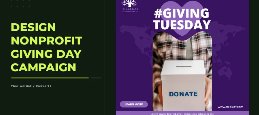
How to design a nonprofit giving day campaign that works comes down to seven steps. First, define the campaign idea 6 to 8 weeks before launch. Build a 3-level messaging structure. Then, create a visual identity and full set of assets. After that, design a high-converting donation landing page and build a pre-launch sequence. Lastly, activate a network to spread the word, and track and improve results as you go.
For many small and mid-sized nonprofits, the giving day is the fundraising event. GivingTuesday, end-of-year campaigns, and community giving days can bring in 30 to 40 percent of a group's total yearly fundraising when done right. What separates a giving day that works from one that flops is how the campaign was planned and run.
Most nonprofit teams run at least one giving day campaign that fell short. The graphics got made. The emails went out. The social posts stayed on schedule. But the money raised was far less than hoped. Looking back honestly usually shows the same issues: the message wasn't specific or emotional enough, graphics showed effort but no urgency, the donation page worked on desktop but not mobile, and the plan leaned almost entirely on the organisation's own channels.
This guide covers all seven steps to plan and run a nonprofit giving day campaign, from defining the idea to measuring and improving results on the day itself. Each step covers the key decisions to make, the materials to create, and the common mistakes that hurt campaigns at that stage.
How to design a nonprofit giving day campaign
Governing how to design a nonprofit giving day campaign needs more than nice graphics and a well-timed email. Every part of the campaign, from the concept to the donation page to the amplification network, must be built in the right order with the right choices at each stage.
The seven steps below cover the whole process, starting six to eight weeks before giving day and running through the day after, with clear deliverables at each stage to keep the campaign on track.
Step 01: Define the Campaign Concept
6 to 8 weeks before giving day
A giving day campaign that works starts with an idea, not a design. The biggest mistake organizations make is opening a design tool before answering the questions that decide if the campaign will succeed: what one story are we telling this year, what dollar goal are we asking donors to help reach, and what real impact that donation will have on a real person.
The campaign idea is the base everything else is built on, following the same strategic principles used in successful fundraising campaign design. Without a clear idea, a campaign ends up with generic graphics, unfocused messaging, and a donation experience that fails to create the urgency and purpose that make people want to give. With a clear idea, a campaign produces materials that feel coherent, specific, and worth sharing.
✔ Pick one campaign theme: One story, one type of beneficiary, one specific moment the campaign centres on
✔ Set a clear, public dollar goal: A named goal motivates more than an unnamed one, and showing progress toward a specific goal converts better than a general donation ask
✔ Get a matching gift partner: Even a $500 match builds urgency and social proof that noticeably boosts conversions
✔ Give the campaign a memorable name that signals a special moment, not a routine donation request
Deliverable: A one-page campaign brief covering theme, goal, audience, key message, and matching gift details. This document guides every decision that follows.
Step 02: Develop Your Campaign Messaging Hierarchy
5 to 6 weeks before giving day
Donors decide with emotion and justify it with logic. A messaging hierarchy that respects this order serves both needs correctly: emotional connection first, rational justification second, action third. Every piece of campaign communication, from the email subject line to the donate button, should follow this hierarchy.
The 3-level messaging framework is the structure for every message in the campaign.
Level 1 is the headline: Five words max, the emotional hook that stops the scroll or opens the email.
Level 2 is the sub-message: Fifteen words max, the specific impact of a gift tied to a real dollar amount.
Level 3 is the CTA: Three words max, the single action you're asking the audience to take.
✔ Level 2 sub message (15 words max): "Your $25 feeds a child for a week through our school meal program"
✔ Level 3 CTA (3 words max): "Feed a child"
✔ Use this hierarchy on email subject line, social caption, graphic headline, landing page headline, and donate button text
Deliverable: A messaging document with Level 1, Level 2, and Level 3 copy confirmed and approved. No graphic gets designed until this document exists.
The 3-Level Messaging Framework
Level
Max Length
Purpose
Example
Level 1 - Headline
5 words
The emotional hook
One meal changes everything
Level 2 - Sub-message
15 words
The specific impact of a gift
Your $25 feeds a child for a week through our school meal program
Level 3 - CTA
3 words
The action you want taken
Feed a child
WHY THIS WORKS
Donors decide with emotion and justify it with logic. Level 1 speaks to the emotional brain: a headline that creates an instant feeling before any information is processed. Level 2 speaks to the rational brain: a specific, concrete impact statement that gives the donor a reason to trust their feeling. Level 3 removes friction from the action: a CTA so short and specific that completing it takes no further thought.
Step 03: Create the Campaign Visual Identity and Asset Suite
4 to 5 weeks before giving day
A giving day campaign's visual identity does two jobs at once, which is why many organizations rely on creative services for nonprofits to build a consistent campaign experience across every touchpoint. It tells existing supporters that something special is happening. And it gives every piece of content a consistent, recognisable look that builds recognition across every touchpoint. The visual identity does not need to replace the organisation's existing brand. It needs to complement it while adding enough campaign-specific energy to signal urgency and importance.
Choosing whether to extend your existing brand or create a new campaign sub-brand is a strategic decision. Extending the existing brand costs less and keeps things consistent, but the campaign might feel like just another routine message. A campaign sub-brand with its own colours, fonts, and images stands out more and feels more shareable, but takes more design work. For most nonprofits, the best option is to keep the brand's main logo and fonts, but add a campaign colour accent that says "this is different" while still staying recognisable.
✔ Social media square in three variations (1080x1080px): Hero image, impact statistic, and countdown versions designed for effective nonprofit social media content across multiple platforms
✔ Social media Stories and Reels cover (1080x1920px): Vertical format with CTA visible in the top third
✔ Donation page hero image (1200x630px minimum): No text in the center to allow page headline overlay
✔ Goal thermometer or progress graphic: Updatable template format preferred
✔ Board and ambassador sharing kit: Pre-sized graphics and pre-written captions ready to send
Deliverable: A complete campaign asset suite, approved and organised by format, ready to deploy at each stage of the launch sequence.
Giving Day Campaign Asset Checklist
Asset
Dimensions
Notes
Email header graphic
600px wide
Primary campaign image + headline
Social media square (x3 variations)
1080x1080px
Hero, impact stat, and countdown versions
Stories and Reels cover
1080x1920px
Vertical format, CTA visible in top third
Donation page hero image
1200x630px min
No text in center; allow page headline overlay
Thank-you email graphic
600px wide
Warm, celebratory, shows impact achieved
Goal thermometer graphic
Variable
Updateable template preferred
Ambassador sharing kit
1080x1080px + 1080x1920px
Pre-sized, pre-captioned, ready to share
Step 04: Design the Conversion-Optimized Donation Landing Page
3 to 4 weeks before giving day
The donation landing page comes as savior if the fundraising campaign graphics not inspiring action. A donor who liked the email, believed the social post, and wanted the matching gift offer still won't donate if the landing page feels confusing or untrustworthy at that key moment. Over 70 percent of giving day donations happen on mobile. If a landing page is mainly built for desktop, it will lose most of its donations.
A donation landing page that works well isn't complicated, but small mistakes hurt it badly. Every extra element on the page is a risk. A navigation menu at the top gives donors a way to leave at the worst time. If the donate button is below the fold on mobile, donors have to scroll to find it, and many won't. Too many donation amount options make people freeze up instead of feeling generous.
✔ Campaign headline above the fold: The Level 1 message is the first thing the donor sees, before any navigation, images, or explanatory text
✔ Progress bar showing percent of goal reached: Even at 0 percent, a visible goal creates accountability and urgency that boosts conversion
✔ Specific impact amounts: "$25 = X, $50 = Y, $100 = Z" ties the donation to a real outcome and makes the giving decision concrete
✔ Matching gift badge where it applies: Placed prominently near the donate button, not buried in the page body
✔ Social proof elements: Donor count and scrolling recent donor names build community momentum
✔ Mobile-optimised layout with the donate button visible above the fold on a 375px screen
✔ No navigation menu: The page has one exit and one action, donate
Deliverable: A published donation landing page tested on mobile at 375px, with all impact amounts confirmed, the progress bar live, and the donate button visible above the fold.
LANDING PAGE MISTAKES THAT KILL CONVERSIONS
The three biggest conversion killers on giving day donation pages are:
A visible navigation menu, which gives donors an exit at the moment of decision.
A donate button below the fold on mobile. 70% of donations happen on mobile, and if the button needs scrolling, most donors won't scroll.
More than four giving amount options. Decision paralysis is real, so cap options at four and make the suggested amount the one tied to your campaign's specific impact story.
Step 05: Build and Execute the Campaign Launch Sequence
2 weeks before through day after giving day
A giving day campaign is a series of communications built to move donors through awareness, consideration, and action over two to four weeks. Each message in the series serves a different purpose, reaches the donor at a different point in their decision-making, and needs its own creative treatment and nonprofit social media graphics that reinforce the campaign message.
The launch sequence starts four weeks before giving day with a save-the-date to existing donors and ends the day after with a results announcement and thank you. The two most important messages in the sequence are the launch email on giving day morning, which sets the tone and states the goal, and the evening urgency email, which converts donors who were interested but hadn't acted yet, using scarcity and progress momentum.
✔ Week minus 4: Save the date email to existing donors, campaign theme introduced
✔ Week minus 2: Teaser campaign on social media, campaign visual identity introduced
✔ Week minus 1: Matching gift announcement email, urgency established
✔ Giving day 6 am: Launch email with full campaign, specific ask, and goal progress visible
✔ Giving day 12 pm: Midday social media push with a real-time progress update
✔ Giving day 6 pm: Urgency email, 12 hours left, current total, and the specific gap left to reach the goal
✔ Day after: Thank you email and results announcement to all donors
Deliverable: A complete campaign calendar with every communication scheduled, every asset assigned, and every send confirmed.
Recommended Campaign Launch Timeline
Timing
Action
Week -4
Save the date email to existing donors
Week -2
Teaser campaign launches on social media
Week -1
Matching gift announcement email
Giving Day 6 am
Launch email: full campaign, specific ask, goal visible
Giving Day 12 pm
Social media midday push, progress update
Giving Day 6 pm
Urgency email: 12 hours left, current total
Day after
Thank-you email and results announcement to all donors
Step 06: Activate Your Giving Day Amplification Network
1 week before through giving day
Most giving day campaigns with great creative and a solid launch plan still miss their goal. The real problem usually isn't the message or landing page. It's distribution. An organization's own social media and email list only reach people who already know the organization, no matter how well they're managed. The donors who actually push a campaign past its goal almost always come through the networks of its supporters, board members, and partner organizations.
An amplification network is the group of people and organizations who agree ahead of time to share the campaign through their own channels on giving day, a strategy that also helps build a viral nonprofit awareness campaign. What separates a campaign that reaches 500 people from one that reaches 5,000 usually isn't better creative. It's how big and active that amplification network is. A board member with 800 LinkedIn connections who shares the campaign on giving day morning can reach more potential donors with one social post than the organization's own LinkedIn page might reach in a week.
✔ Board members: Make sharing part of their board duties and put it in the board agreement
✔ Major and recurring donors: A personal email from the executive director asking for a share works better than a mass email
✔ Staff and volunteers: Give them the sharing kit before giving day and make sharing easy and clear
✔ Partner organizations and community champions: Reach out personally instead of sending bulk emails
✔ Sharing kit contents: Three ready-made social posts in different lengths, two graphic sizes, a sample email for personal networks, and a clear sharing deadline
Deliverable: A list of at least 10 people who've agreed to share the campaign, each with a sharing kit and a set deadline.
When a board member shares the campaign on LinkedIn on giving day morning, that one action raises more money than most other board work. Make it easy, make it specific, and make it required.
Step 07: Measure and Optimize in Real Time
Giving day through day after
A giving day campaign that can't adjust based on live data is losing donations it could have gotten. The data that matters is available within hours of launch. Low email open rates by 10 am mean you should act before noon. If a social post is doing much better than others by midday, put $20 into paid promotion right away. If a donation page gets lots of traffic but few conversions, simplify it before the evening urgency email sends more traffic there.
Real-time optimisation doesn't need a big team or advanced analytics, but it does benefit from a well-planned content marketing strategy that supports continuous campaign improvement. It needs three things: benchmarks set before launch, someone assigned to watch performance all day, and response plans agreed on in advance for each underperformance scenario. Making these decisions on the spot during giving day, under pressure, leads to worse choices than planning them ahead of time when things are calm.
✔ Donation conversion rate benchmark: 2 to 5 percent of page visitors. If it's below this, simplify the page and check the mobile layout.
✔ Email open rate benchmark: 25 to 35 percent. If it's low by 10 am, resend with a different subject line to non-openers.
✔ Email click-to-donation rate benchmark: 3 to 5 percent. If it's low, the problem is the email CTA or landing page.
✔ Social reach and shares: Watch the trend, not the number. A post gaining early momentum should get paid amplification right away.
✔ Goal progress: If you're more than 50 percent behind pace by midday, activate emergency outreach to board members and major donors.
Deliverable: A performance report after Giving Day compares actual results to benchmarks on every metric, and includes lessons learned and recommendations for the next campaign, written while the data is still fresh.
Giving Day Metrics and Benchmarks
Metric
Nonprofit Benchmark
What Low Performance Signals
Donation page conversion rate
2 to 5% of visitors
Page friction, weak CTA, poor mobile optimisation
Email open rate
25 to 35%
Subject line weakness, list fatigue, poor send timing
Email click-to-donation rate
3 to 5%
Weak email design, unclear CTA, no urgency
Social reach and shares
Varies; watch trend
Low content quality or insufficient amplification network
Giving day campaign design: Agency or DIY?
Choosing between running a giving day campaign yourself or hiring a nonprofit campaign design agency comes down to resources and risk, not style preference. The right choice depends on your campaign goal, your team's design skills, and how much is riding on the result.
When DIY Is the Right Choice
DIY campaign design works when the goal is under $5,000, and the campaign's success won't affect the organization's operations for the year. It also works if the organization has an in-house designer who has made campaign assets before, or if they're reusing proven assets from a past giving day that worked well. Reusing a successful design with small updates is a smart, efficient choice.
When to Invest in a Nonprofit Campaign Design Agency
It's worth paying for professional campaign design support when the giving day goal is over $2,000 and missing that goal would seriously hurt the organization's programs and operations. It's also worth it when the organization has no in-house designer, when past giving day campaigns have kept falling short of their goals, when the campaign needs a full set of assets for email, social, web, and print, or when the organization wants materials so compelling that supporters share them on their own.
Nonprofit giving day campaign FAQs
Once you approach knowing really how to design a nonprofit giving day campaign, it’ll trigger some questions inside your head. The answers below cover what communications teams ask most. Each answer starts with a direct response so you can find what you need and use it right away.
A nonprofit giving day campaign is a short fundraising push, usually lasting 24 hours to two weeks. It centers on an event like GivingTuesday or a community giving day, using matching messages and visuals to bring in a burst of donations.
Common reasons a nonprofit giving day campaign underperforms include late planning, generic messaging, no visible donation goal, missing partner amplification, and poor mobile optimisation, though over 70 percent of donations happen on mobile.
Good fundraising graphics that get people to act use one strong emotional photo, a headline of eight words or fewer, a clear statement showing what a donation amount actually does, and a bold call to action that shows up on mobile without scrolling.
Start planning a nonprofit giving day campaign 6 to 8 weeks before launch. Use the early weeks for concept and messaging, the middle weeks for visuals and building the donation page, and the final weeks for partner activation and warm-up communications before the campaign.
A good donation conversion rate for a nonprofit giving day campaign is 2 to 5 percent of visitors. Campaigns with matching gifts, clear impact amounts, a visible progress thermometer, and mobile optimisation often exceed 5 percent.
Endnote
A nonprofit giving day campaign usually isn't just one fundraiser among many. For most organizations, it decides whether they hit their yearly revenue goal, whether the next program gets funded, and whether the community gets the support it deserves. What separates a campaign that works from one that quietly flops isn't luck, donor generosity, or the size of an email list.
It comes down to seven things. The strength of the concept. The precision of the messaging. The professionalism of the visuals. The readiness of the donation page. The reach of the amplification network beyond the organization's own channels. The clarity of the launch sequence guiding donors from first touch to donation. And how quickly the team responds to real-time performance data once giving day is underway.
That's the real answer to how to design a nonprofit giving day campaign that converts. Not one clever graphic or viral post, but seven steps done in order, starting six to eight weeks before launch, leaving nothing to chance.
Organizations that treat giving day as a strategic campaign are the ones who see it become 30 to 40 percent of their yearly fundraising total, instead of a disappointing line item to explain at the next board meeting, a mindset rooted in a strong nonprofit branding strategy.
Start with the concept, build the messaging, design the assets, optimize the page, sequence the launch, activate the network, and measure everything. That's what a perfect giving day campaign looks like.
Graphic Design Eye LLC is a full-service creative agency built for brands that demand more than design — they demand vision. From strategic branding to complete visual identity, we partner with startups, agencies, and growing businesses as a dedicated creative force. With flexible subscription and project-based models. Let's start with us today!