Free Facebook event cover templates only work when they follow the platform's actual specifications. This guide breaks down 1920 by 1005 pixels, the safe zone that survives mobile cropping, and twenty distinct layout structures built for different event types. Every template can be built at no cost in Canva, Figma, or Adobe Express, with a full checklist and FAQ section included.
A Facebook event cover gets roughly a second and a half of attention before a reader scrolls past or stops to look closer. In that window, nothing about budget, photography, or design software matters as much as structure. Whether the event name reads clearly at actual display size, whether the date sits somewhere the eye finds fast, and whether the layout survives Facebook's mobile crop without losing its message. The same rules apply to social media post design. Here, they're packed into one wide rectangle with one very specific job.
This article works through twenty layout structures rather than downloadable files, since a fixed file locks a reader into someone else's colours and type choices. What follows also includes a simple framework for choosing between them based on the photos already on hand, the tone of the event, and whether the cover needs to repeat monthly or stand alone.
By the end, picking the right layout will be easier than a breeze. Explore these strategic layout options to build a banner that truly stands out!
20 Facebook event cover templates
Free Facebook event cover templates perform best when the layout matches the event type, from bold date blocks for concerts to minimal corners for premium launches. This list of twenty templates covers layout structure, colour direction, and best use cases, moving from dependable grid-based designs to expressive illustrated and handwritten styles. Check out these options and dive right in!
01. Bold date block
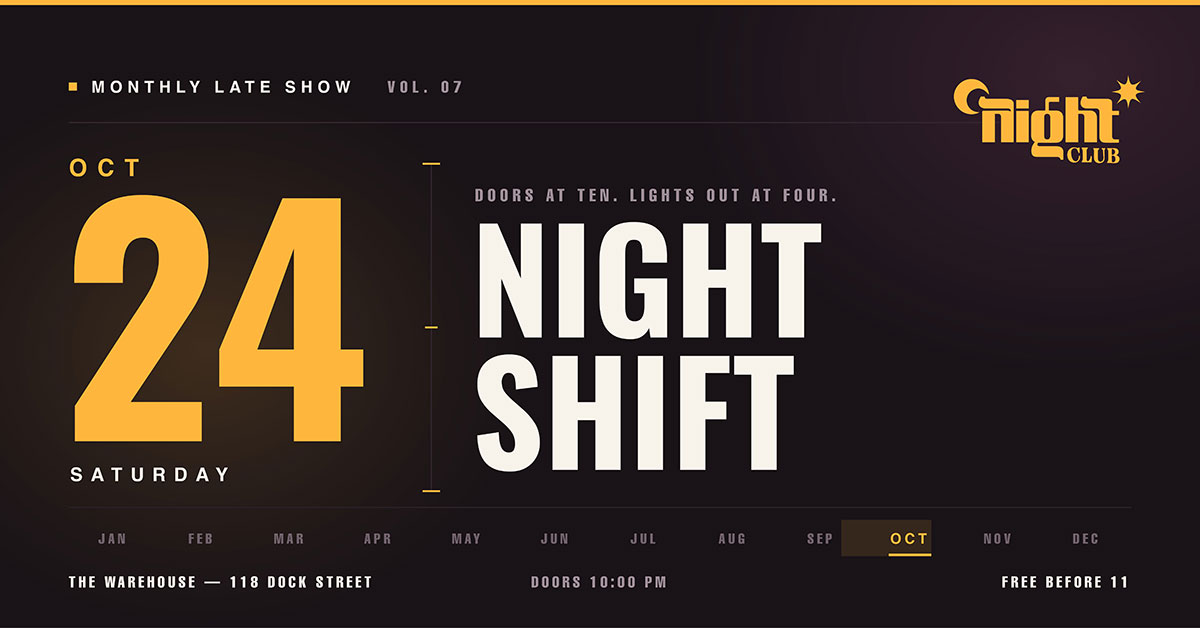
Big date numbers fill the left third, sized 200pt or larger. The event name sits to the right, in two stacked lines. Venue and time run along the bottom in small caps.
Color direction: Use one bold brand colour as the background with white text. Or use dark charcoal with one accent colour on the date numbers only.
Best for: Concerts, launches, recurring monthly events
02. Full-bleed photograph
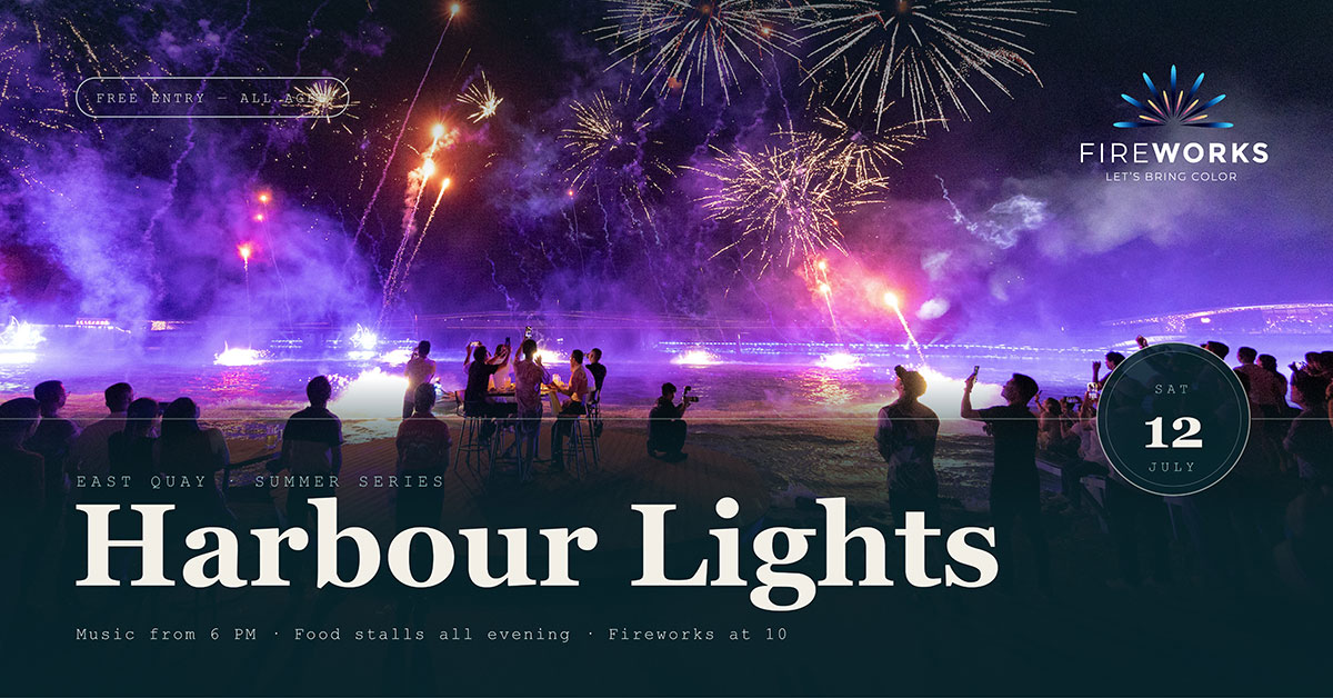
One photo fills the whole canvas. A see-through color layer covers the bottom 40 percent. The event name and date sit inside it, in white.
Color direction: Let the photo set the colors. Make the layer a darker shade of the photo's main color, not plain black.
Best for: Festivals, community events, anything with strong photos already.
03. Split diagonal
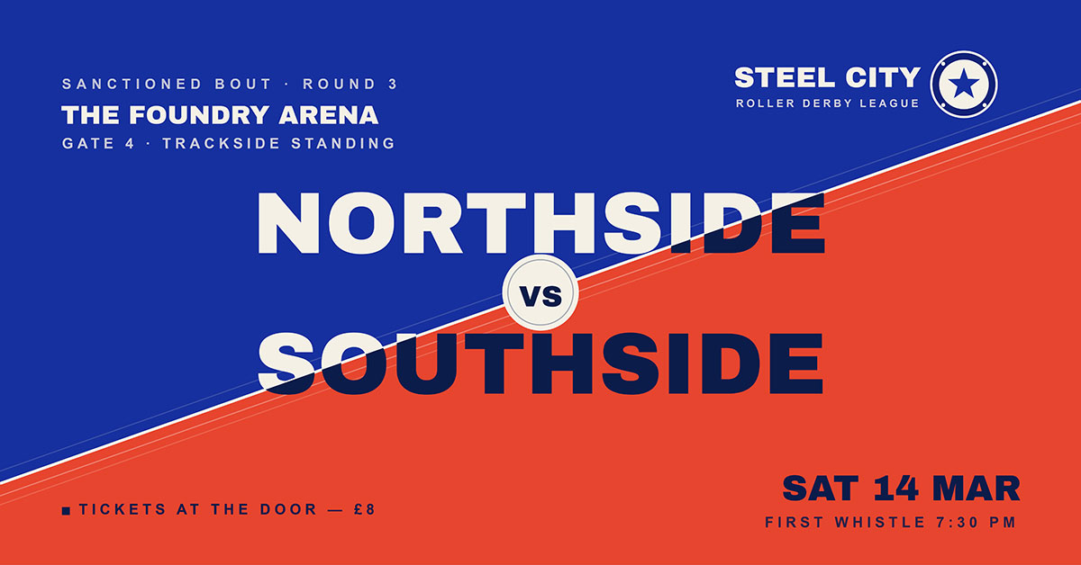
A diagonal line runs from lower left to upper right. It splits two colour fields. The event name crosses the line. The date sits in the lower field. The venue sits in the upper field.
Colour direction: Two contrasting brand colours meet at the diagonal. Keep the text on one side. Or use a knockout where it crosses.
Best for: Sports events, competitions, versus style programs.
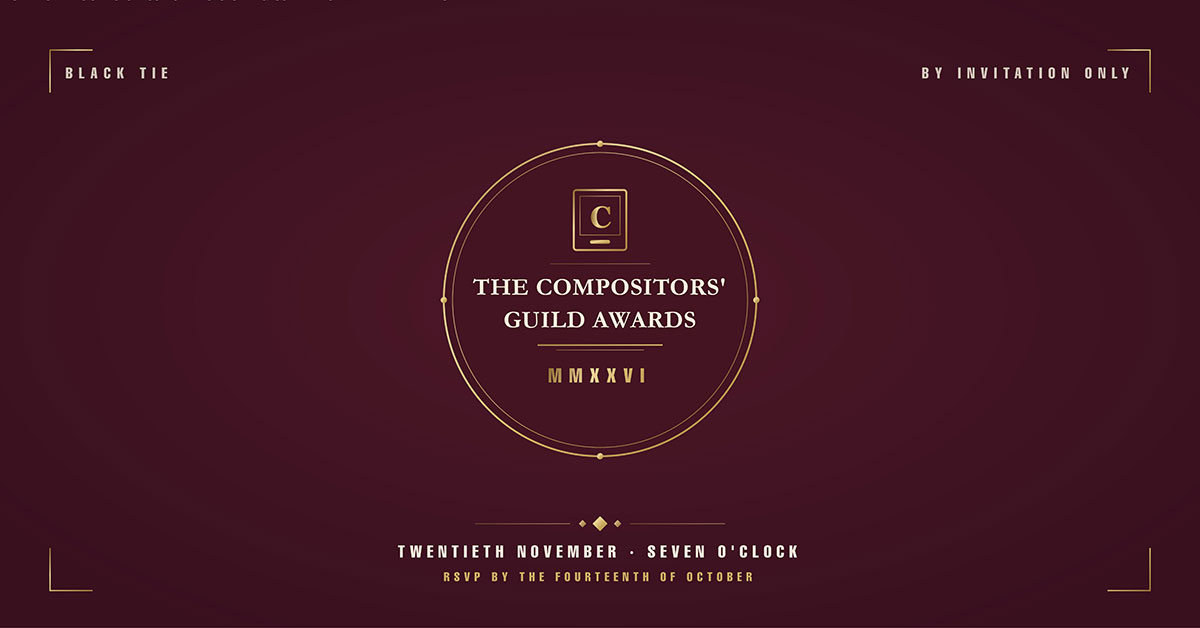
04. Centered badge
A round or shield badge sits in the centre. It shows the event name and year. Small text curves above and below it.
Colour: Use deep colours like navy, forest, or burgundy. Add a metallic or cream badge outline. Keep it formal and simple.
Best for: Anniversaries, award nights, formal galas.
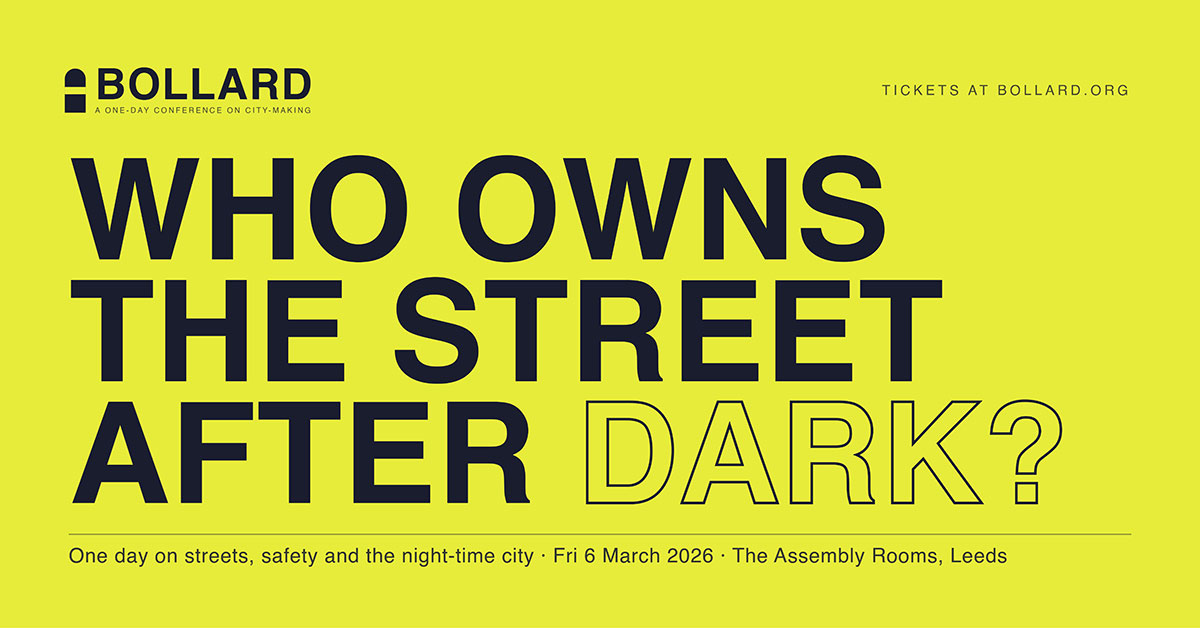
05. Type-only statement
No images. The event name fills 70% of the space in a bold display font, split across three lines with tight spacing. A detail line sits below in a lighter, contrasting weight.
Colour direction: Use only two colours. Try a bold pair like mustard on deep teal, or coral on charcoal. Type alone must hold all the visual interest.
Best for: Talks, panels, conferences, thought leadership events.
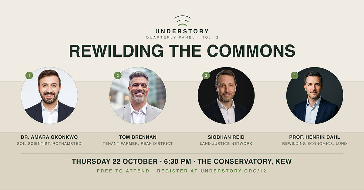
06. Grid of faces
Four circular headshots sit in a row. The event name goes above. Date and registration details go below.
Colour direction: Use a neutral background. Let the headshots bring the colour. Give every portrait the same photo treatment.
Same treatment on every photo matters most. It turns different lighting and formats into one clean band. This is mainly a background removal and retouching task, not layout work.
Best for: Speaker series, panels, multi-performer lineups.
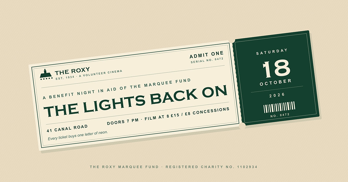
07. Ticket stub
A ticket stub graphic sits at an angle. The event name is on the main part. The date is on the tear-off stub. A dashed line marks the perforation.
Color direction: Warm paper background with one ink colour, like a real printed ticket.
Best for: Fundraisers, benefit nights, ticketed shows.
08. Layered shapes
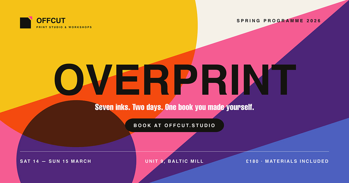
Three or four overlapping shapes in brand colours sit behind see-through type. Shapes go off multiple edges.
Colour: Three brand colours at different opacity levels. This makes extra tones where shapes overlap. Type is white or near black based on shape density.
Best for: Workshops, creative industry events, design-forward brands.
09. Countdown frame
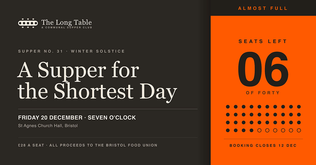
A bold countdown, DAYS TO GO or SPOTS REMAINING, sits on the right third. It stands out in a contrasting block. The event name and date fill the left two-thirds.
Color direction: Use one bold colour just for the countdown. Keep everything else in normal brand colours.
Best for: Events with registration deadlines or limited spots.
10. Photo frame border
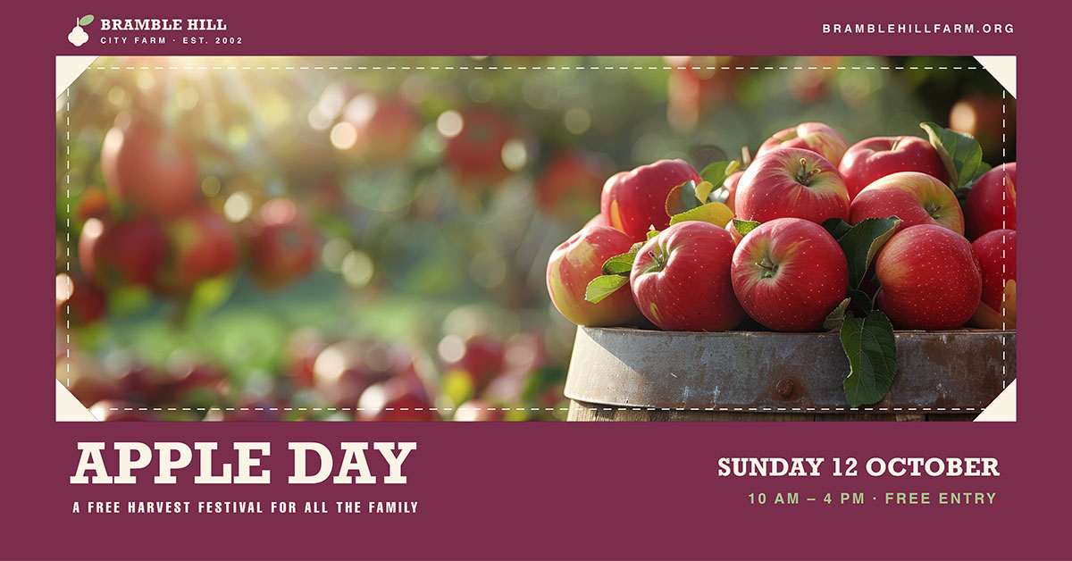
A thick solid border frames a central photo. The event name sits at the bottom inside the border, using it as the background.
Colour direction: Border in the main brand colour. Wide enough for clear text at 40pt or larger.
Best for: Community events, family programs, warm and welcoming brands.
11. Horizontal band
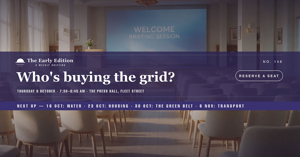
A single horizontal band crosses the middle third. It holds all the text. Photos or textures fill the space above and below.
Colour: The band uses one solid brand colour with white text. Background images are faded so the band stands out.
Best for: Repeating series, weekly shows, professional events.
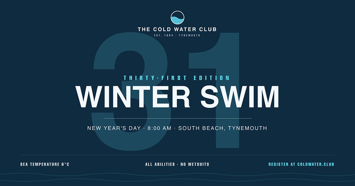
12. Oversized number
The edition number is huge, covering 60 percent of the canvas at low opacity behind the main text. Event name and date sit sharply on top.
Colour direction: Number uses a tint of the background colour at 15 to 20 percent opacity. Foreground text stays at full contrast.
Best for: Editions, seasons, numbered yearly events.
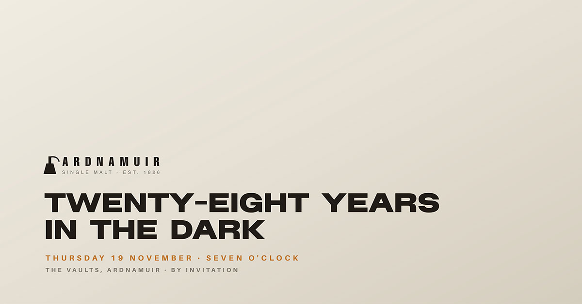
13. Minimal corner
Mostly spaces. Content sits in the lower left corner. Event name in two lines, date below, small logo on top.
Colour direction: One flat colour or soft gradient covers the canvas. Only the date gets an accent colour.
Best for: Premium brands, luxury events, and understated looks.
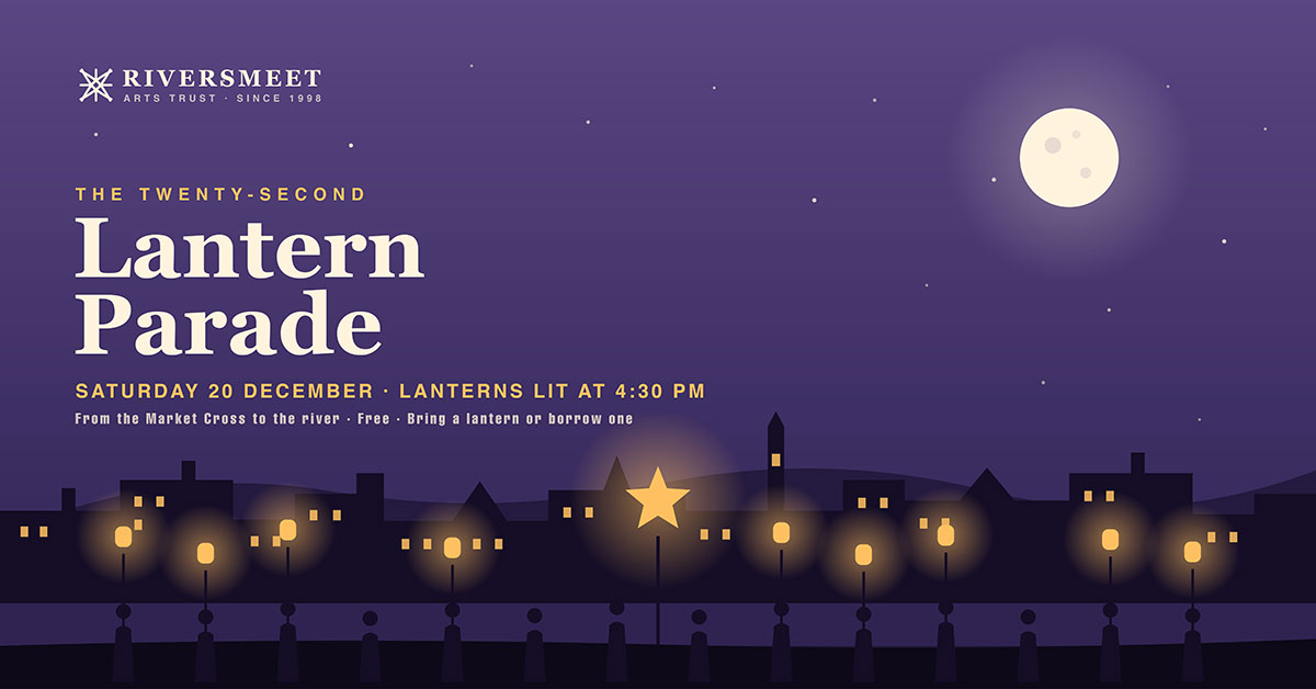
14. Illustrated scene
A flat vector illustration fills the canvas. It could be a skyline, landscape, or event scene. Type sits in the illustration's space.
Colour direction: Use four to five colours from one palette. Keep the space clear enough for type.
Best for: Family events, seasonal celebrations, community festivals.
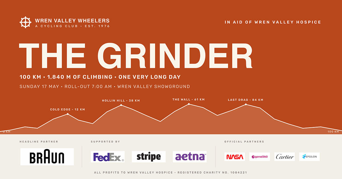
15. Sponsor bar
The main design fills the top 75 percent. A separate bottom bar holds sponsor logos in different sizes, set on a contrasting background.
Colour direction: The bottom bar stays neutral, so sponsor logos show their true brand colours without clashing.
Best for: Sponsored fundraisers, partner-supported events, trade gatherings.
Sponsor logos come in very different formats. They rarely fit together well without adjusting them first. This is the same sizing problem found in any display banner carrying multiple partner marks.
16. Repeating pattern
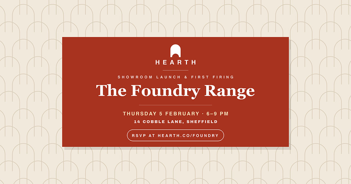
A pattern made from a logo, icon, or shape repeats across the canvas. A solid rectangle sits in the centre and holds all text.
Colour direction: The pattern uses a light tint. The centre rectangle uses a solid brand colour with white text.
Best for: Brand-focused events, product launches, and identity-led campaigns.
17. Before and after split
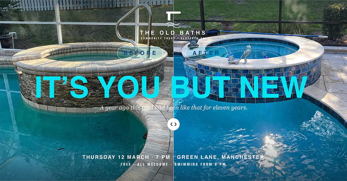
A vertical split shows two different images side by side. The event name stretches across both halves at the centre.
Colour direction: Let each photo keep its own colours. Use white text with a soft drop shadow. This helps it stand out on both sides.
Best for: Transformation-themed events, cause-related fundraisers, impact showcases.
18. Handwritten overlay
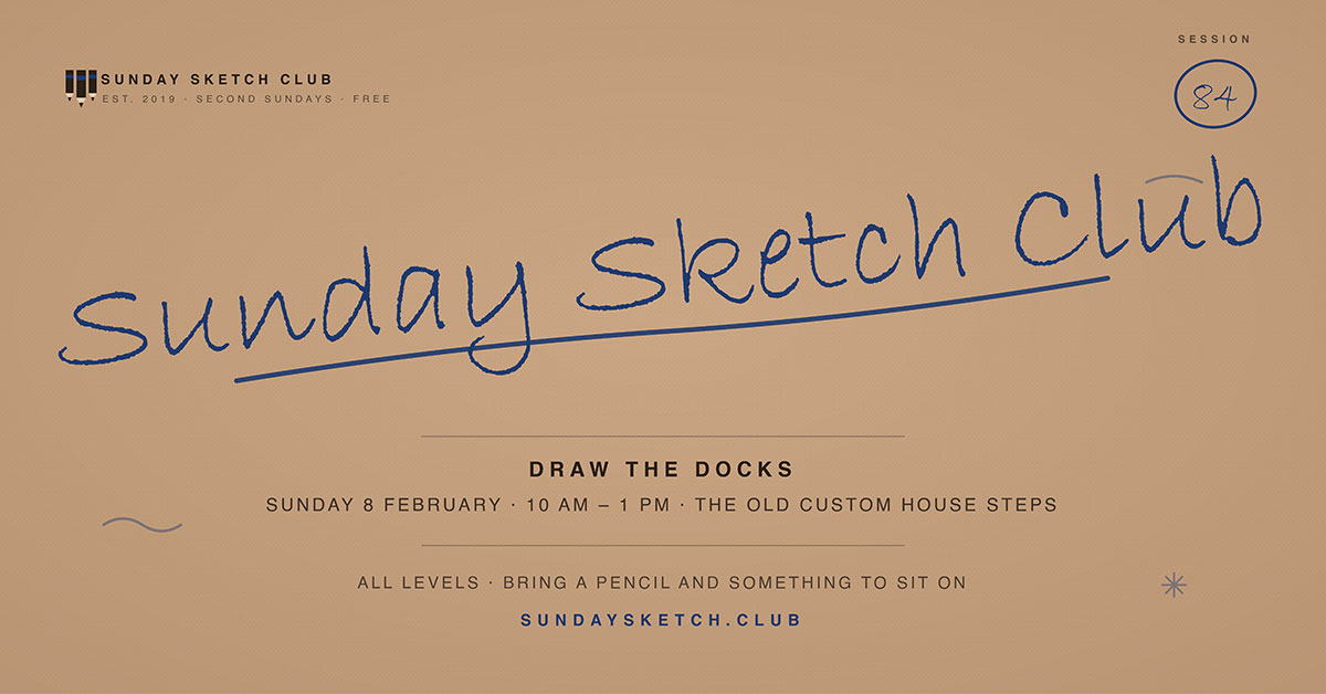
A script or handwritten font shows the event name at an angle over a photo or texture. A clean sans-serif font holds the details below.
Colour direction: Warm and casual. The handwritten part uses one accent colour that stands out from the background image.
Best for: Casual events, creative workshops, personality-driven brands.
19. Stacked information block
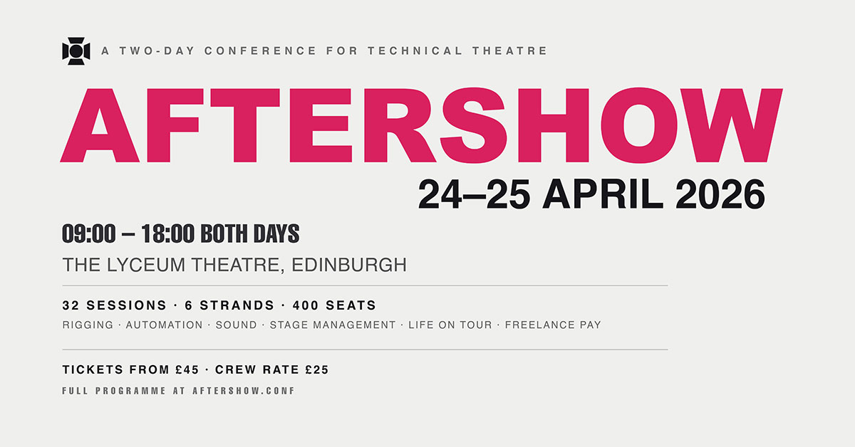
Everything stacked and left-aligned. Event name first, then date, time, venue. Each line has a different size and weight, spaced tightly.
Colour: Mostly black and white. One accent colour, used only for the event name. Size and weight create hierarchy, not colour.
Best for: Events with many sessions, conference agendas, complex schedules.
20. Logo lockup hero
The event logo or wordmark is the main element. Make it large and centred. Put extra details in a tight group below it.
Colour direction: Use the brand colours exactly as the guidelines say. This template puts recognition first, not novelty.
Best for: Big established brands, flagship yearly events, campaigns built on recognition.
This layout only works if the wordmark is strong enough to stand alone on the whole canvas. That is a good test of whether the logo design works at every size.
How to choose the right event cover layout
Twenty Free Facebook event cover templates is a generous problem to have and a paralysing one to face at four in the afternoon with a listing to publish. The choice is easier than it looks, because it is decided almost entirely by four questions answered in order. Work through them and the field narrows to two or three candidates, at which point either will serve.
Start with what you already have
Images are the biggest limit. If the organization has strong photos from a past event, or real photos of the people involved, use the full bleed or photo-led layouts. These almost always work better than an abstract design. Real photos of real people carry more weight than a colour field.
If there are no good photos, don't force it. Stock photos that clearly don't match the event look worse than no photo at all. That is exactly why the type-led layouts exist.
Match the layout to the register of the event
A layout sets the mood before it gives info. A centered badge on a dark plain background feels formal and traditional. That works for a gala or awards night. It does not suit a casual community workshop.
A handwritten overlay feels warm and casual. That works for a craft evening and does not suit a fundraising dinner where guests give big money.
Pick a layout that matches what guests will feel that night. A mismatch between the cover and the event breaks a small promise.
Decide what the second element is
The event name always comes first. What comes next is a real choice. Different layouts handle it differently.
If the date matters most, like a repeat event or a close deadline, use a bold date block or countdown. That puts it second in view. If people are the draw, use a grid of faces instead.
If sponsors need visibility, give them a fixed sponsor bar. Do not just squeeze in logos later.
Decide the second element first. The layout will follow.
Decide whether this is one event or a series
A one-time event can have a custom cover. A monthly or seasonal series should not. For anything recurring, pick a layout with a fixed structure. It should have few changing parts, like a horizontal band, a big number, or a repeating pattern. Then just change the date, accent colour, and photo each time. Repetition builds recognition. A series that looks different every month never builds any.
The table below sums up those four questions by event type. Treat it as a shortlist.
Event Type
What Usually Matters Most
Start With These Layouts
Concert or live performance
Date and lineup recognition
Bold Date Block, Full-Bleed Photograph, Split Diagonal
Conference or panel
Speaker credibility and subject clarity
Grid of Faces, Type-Only Statement, Stacked Information Block
Logo Lockup Hero, Repeating Pattern, Minimal Corner
Deadline-driven registration
Urgency and remaining capacity
Countdown Frame, Bold Date Block
Cause or impact showcase
Transformation and evidence
Before and After Split, Full-Bleed Photograph
Facebook event cover FAQs
Free Facebook event cover templates require sizing and cropping, since both determine whether the design displays correctly on phones. This FAQ section covers the correct pixel dimensions, ideal font sizes, what content to include, and free tools to build a cover that earns clicks.
The ideal Facebook event cover size is 1920 x 1005 pixels, a 1.91:1 ratio. You can also use 1200 x 628 pixels, though the larger size looks sharper. Export in RGB color at 72 DPI and keep the file size under 4 MB.
Open a free tool like Canva, Figma, or Adobe Express and set the canvas to 1920 x 1005 pixels. Pick a layout, apply your own colors and fonts, make the event name larger than 60 points, and export as PNG or JPG.
A Facebook event cover should include the event name, the date, and the venue or format. Skip time and registration details since those already appear in the event listing. Adding more than these three elements makes the cover harder to read quickly.
Facebook crops event covers around the center on phones, cutting off the left and right edges. Anything placed near those edges gets removed. Keep the event name, date, and other key details within the middle 70 percent of the design to avoid cropping.
On a 1920 x 1005 cover, set the event name at 90 points or larger, never below 60 points. Use 36 to 48 points for venue and time details. Shrink the design to 25 percent to test readability before publishing.
No, not without changes. A Facebook event cover is wide at 1.91:1, while Instagram posts are square or 4:5. Reusing the same file crops out text or leaves space. Build one master Facebook event cover design, then create separate versions for each platform.
Redesign the cover for every event, but keep the same layout style each time. For a monthly event, reuse one template and simply change the date, color, or photo. This repetition helps people recognize your posts quickly across a busy feed.
Yes, indirectly. The cover will not make someone care about the topic, but it decides whether they stop to look closer. A cover with a hard-to-read name or hidden date loses potential attendees, which is why clarity matters more than style.
Endnote
Free Facebook event cover templates only earn their place once someone actually sits down and builds one, and that gap between knowing the twenty layouts and having a finished cover ready to publish is exactly where most events lose momentum. The framework, the specifications, and the layout logic in this guide cover the thinking. What they cannot do is hand over a finished file at nine at night when the listing needs to go live tomorrow.
If your organization runs events often but covers turnout inconsistently, the problem is usually no fixed system. Look for social media design companies that hand you a reusable template. Graphic Design Eye LLC's unlimited design subscription puts a dedicated designer only for your project. Our experts build each cover to spec, keep the layout consistent across a series, and adjust it the moment a date or venue changes. Every request comes back within a normal business day. The cover is just ready.
See what an unlimited design subscription looks like for an events calendar that never stops. The best cover is the one made on time, every time, without becoming its own project.
Great events don't wait for a good cover. Neither should you.
Graphic Design Eye LLC is a full-service creative agency built for brands that demand more than design — they demand vision. From strategic branding to complete visual identity, we partner with startups, agencies, and growing businesses as a dedicated creative force. With flexible subscription and project-based models. Let's start with us today!