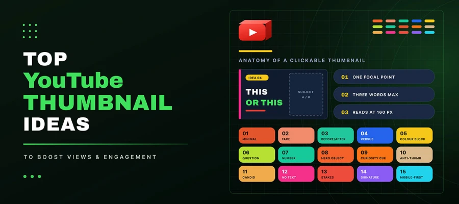
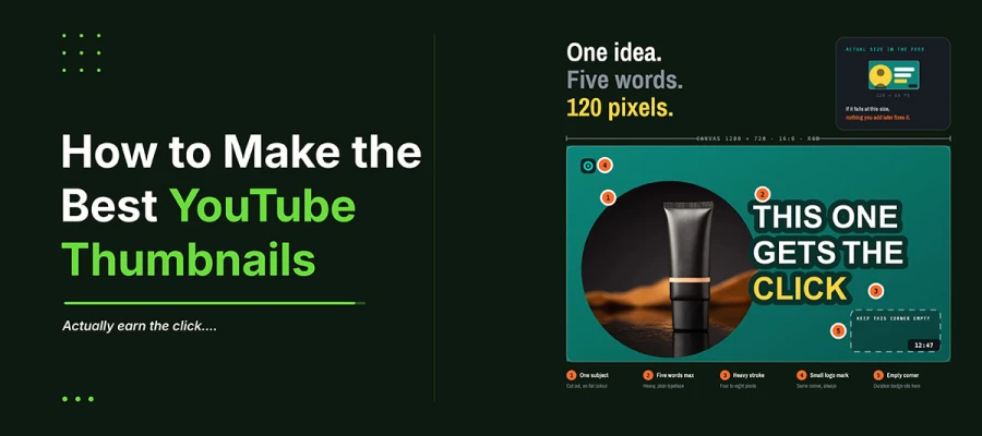
The best YouTube thumbnail ideas are all about keeping things simple. Clean single subjects, real reaction faces, before and after splits, bold color blocks, and question hooks now beat the cluttered style that used to rule YouTube. Three rules stay the same across all formats: one clear focal point, three words of text or less, and a design tested at about 160 pixels where mobile viewers see it.
For most of the last decade, loud thumbnails won. Bright colors, big reactions, arrows on everything. This worked because feeds hadn't caught up. Now they have. When every thumbnail shouts, nobody hears anything. Viewers just scroll past.
This isn't about social media graphic design to copy. It explains why each format earns clicks. It shows which niches each one suits. It covers the five-step process top channels use. You'll also get exact specs, thumbnail CTR tips, and mistakes that quietly kill your click-through rate.
Keep reading to know which format fits your channel, and how to use it right.
15 Best YouTube thumbnail ideas
The best YouTube thumbnail ideas include minimalist designs, genuine reaction faces, before and after comparisons, and bold color blocks. These formats grab attention quickly and stay easy to see on mobile. Use their basic idea, but add your own style to stand out. To properly know how to make YouTube thumbnails, read the following thoroughly:
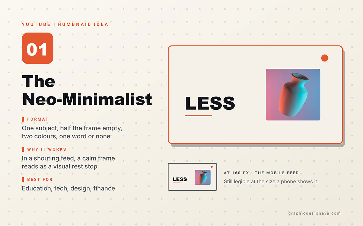
Idea 1. neo-minimalist
One subject. At least 50% space. No more than two colours. Little or no text.
Why it works: Most thumbnails in a feed are loud, bright, and busy. A clean image gives the eye a break. That's why people notice it.
Best for: Education, tech, design, finance, and any niche where people are tired of clickbait.
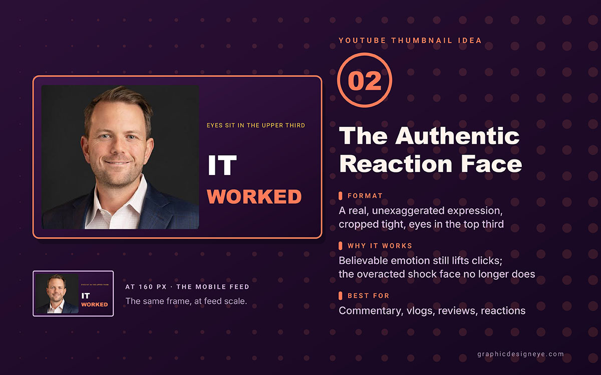
Idea 2. Authentic reaction face
A real, natural facial expression caught mid-emotion. Crop tight so the eyes sit in the upper third.
Why it works: Real emotion boosts click-through rate. In 2026, authenticity matters most. Overacted shocked faces don't work anymore. Believable expressions still do.
Best for: Commentary, vlogs, reviews, reactions, and personality-driven channels of any size.
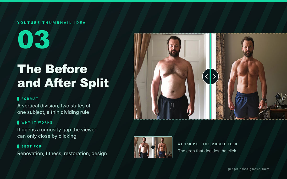
Idea 3. Before and after split
A vertical split showing two states of the same subject. A thin line divides them. No text explains the change.
Why it works: It creates curiosity. Viewers click to find the answer. It shows change without words, so it survives every mobile crop.
Best for: Renovation, fitness, restoration, design, tutorials. Any content with a visual outcome.
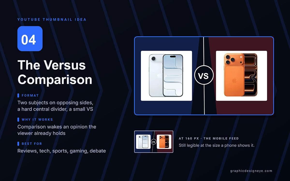
Idea 4. Versus comparison
Two subjects on opposite sides, split by a divider. Often a small VS sits between them.
Why it works: Comparisons spark opinions viewers already hold. They click to check if the video agrees with them.
Best for: Product reviews, tech comparisons, sports, gaming, debates.
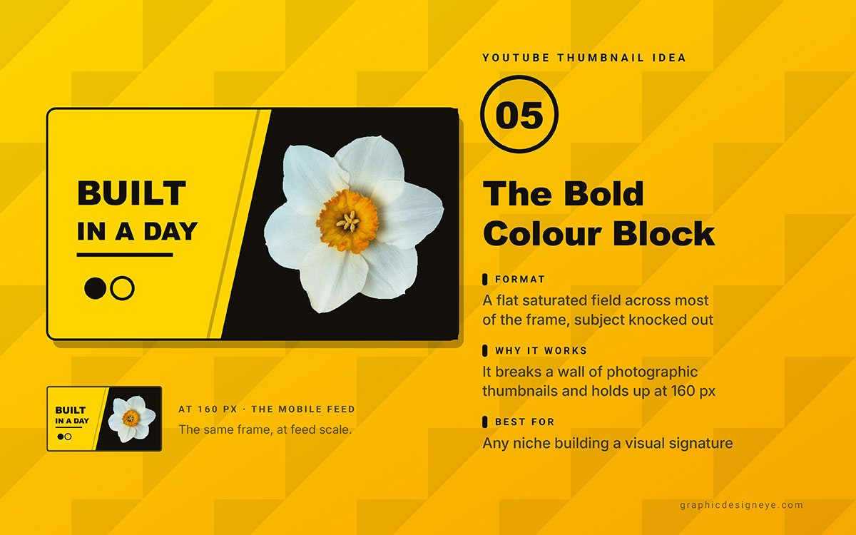
Idea 5. Bold colour block
A solid, bold colour fills most of the frame, with the subject placed on top.
Why it works: Colour blocks stand out from the photo thumbnails around them. They also stay clear even at 160 pixels wide, which is how most mobile viewers see them.
Best for: Any niche, but great for channels building a recognisable look over time.
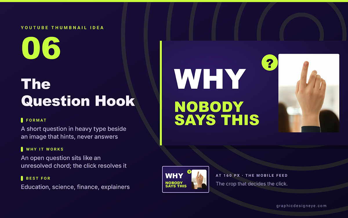
Idea 6. Question hook
A short, bold question next to an image that hints at the answer but doesn't show it.
Why it works: A question left open feels like an unfinished song note. Clicking resolves it. The question must be one people actually wonder about.
Best for: Education, science, finance, health, and explainers.
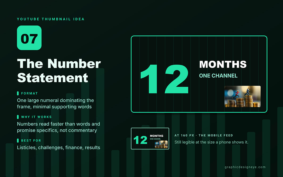
Idea 7. Number statement
One big number fills the frame. A price, count, result, or duration. Little else on screen.
Why it works: Numbers register faster than words. They feel exact. A real number tells viewers the video has real info, not just talk.
Best for: Listicles, challenge videos, money content, results videos.
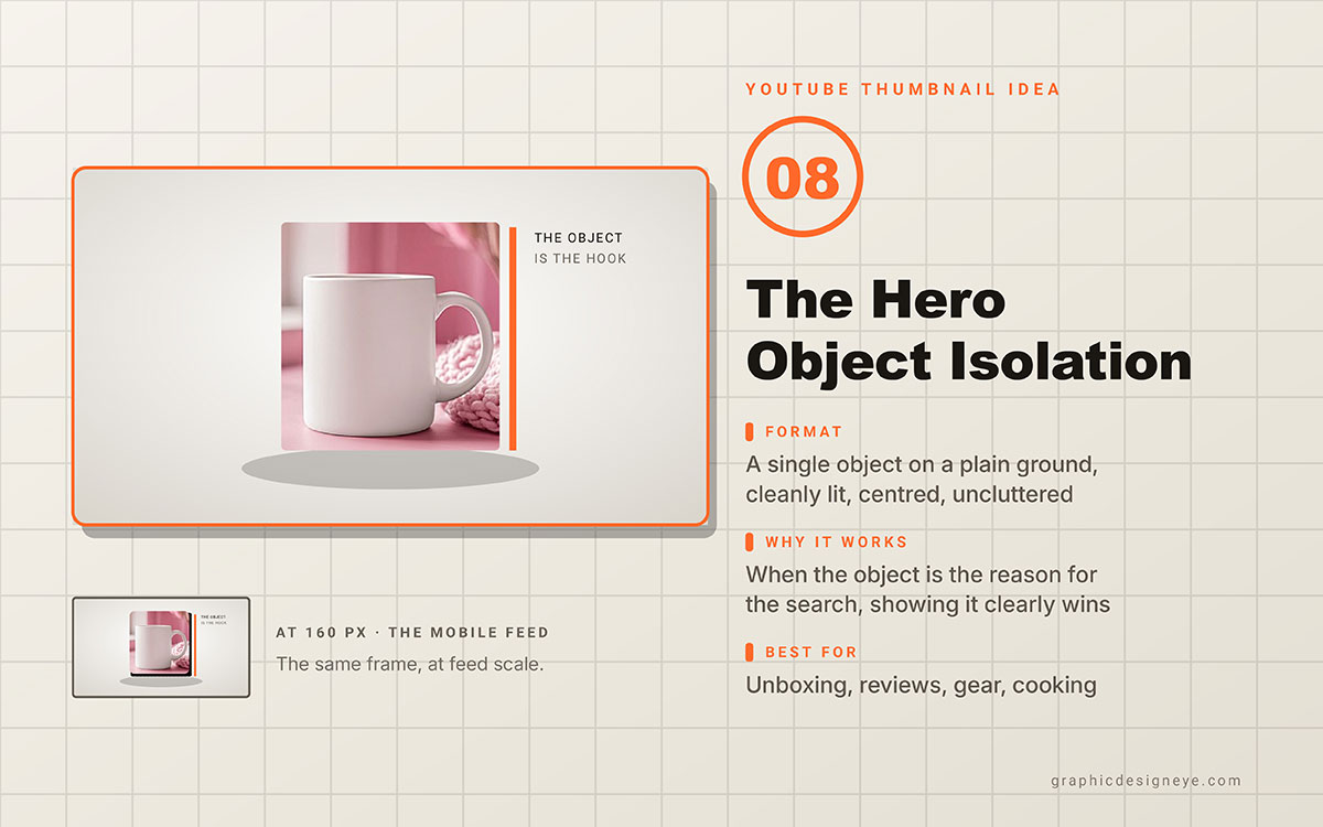
Idea 8. Hero object isolation
One product photographed on a plain background. Bright light. Centered in the frame.
Why it works: If people search for the object itself, showing it clearly beats fancy backgrounds.
Best for: Unboxing, product reviews, gear channels, and cooking content.
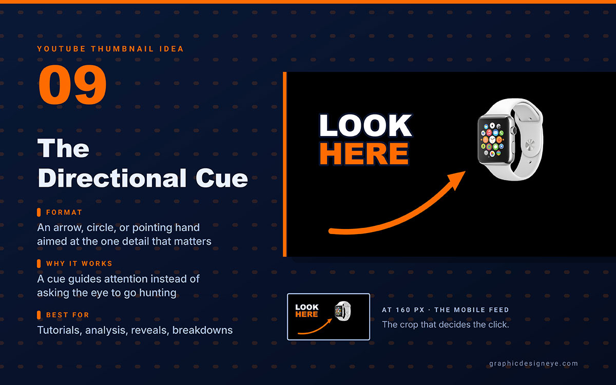
Idea 9. Directional cue
An arrow, circle, or pointing gesture. It shows the eye where to look.
Why it works: Visual cues boost clicks. They guide attention instead of making viewers search. The cue must point to something worth seeing.
Best for: Tutorials, analysis, reveals, and thumbnails with one clear focal point.
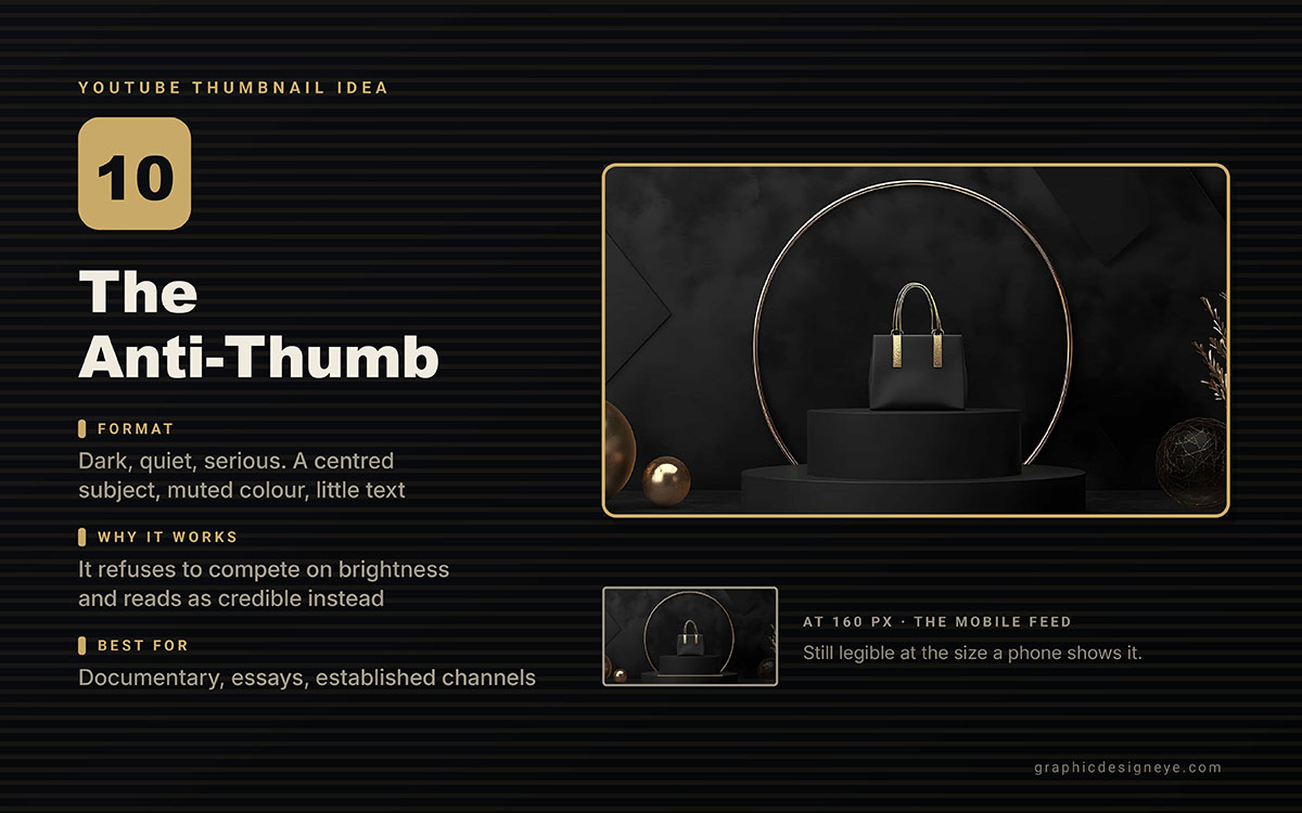
Idea 10. Anti-thumb
Dark, quiet, serious. Centred subject, little or no text, muted colour, deliberate restraint.
Why it works: It wins by not competing on brightness. Next to bright, loud thumbnails, a dark, confident image looks more credible and premium.
Best for: Documentaries, serious analysis, long essays, channels with an established audience.
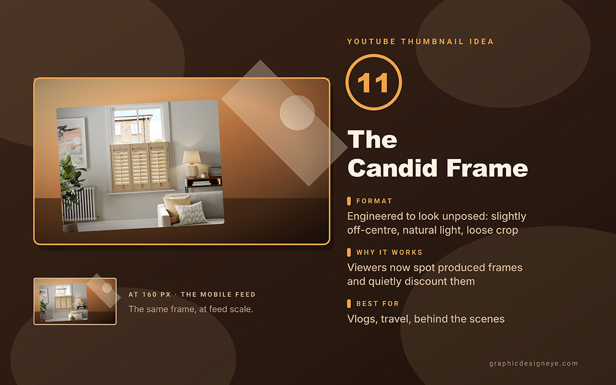
Idea 11. Candid frame
The shot looks unplanned. Slightly off-centre. Natural light. Rough framing.
Why it works: People spot fake, polished thumbnails easily now. They trust them less. A real-looking shot feels more honest.
Best for: Vlogs, behind-the-scenes clips, travel videos, and creator channels.
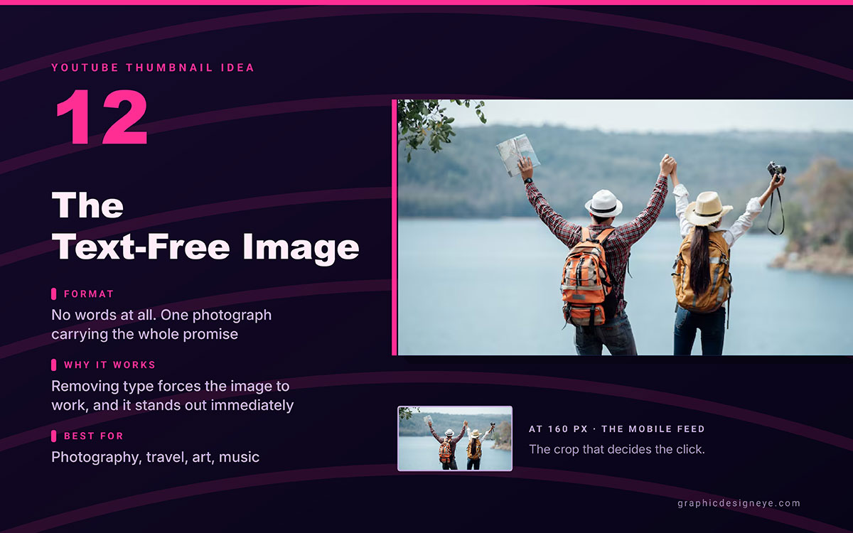
Idea 12. Text-free image
No text. Just one strong photo that shows the video's promise.
Why it works: No text means the image must speak. It stands out in a feed full of headlines.
Best for: Photography, travel, art, music. Any channel that's visual by nature.
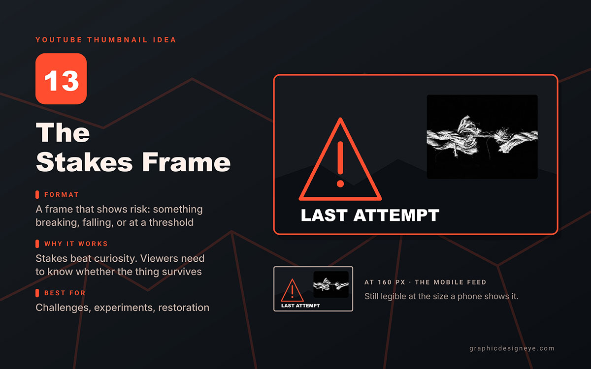
Idea 13. Stakes frame
A visual that shows risk, cost, or consequence. Something breaking, falling, expiring, or about to fail.
Why it works: Stakes create urgency. Viewers want to know if it survives. That pulls harder than curiosity alone.
Best for: Challenges, experiments, restorations, and big projects.
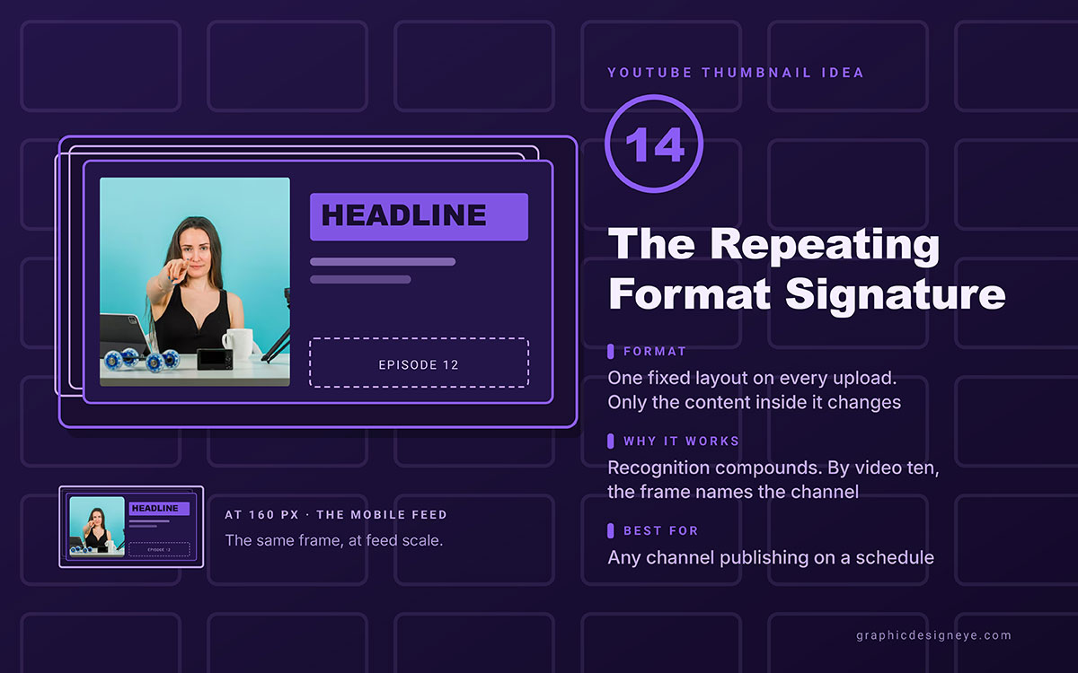
Idea 14. Repeating format signature
A fixed layout for every video. Same subject spot, same colours, same text placement. Only the content changes.
Why it works: Recognition builds up. After ten videos, viewers spot the channel from the thumbnail alone, before reading the title. That beats any single thumbnail's performance. A repeatable visual style works like a recurring series in social media post design ideas. Recognition earns more reach over time.
Best for: Channels that post often, especially series content.
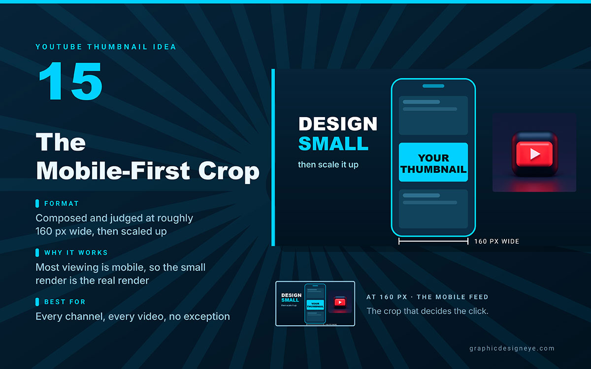
Idea 15. Mobile-first crop
Made and checked at about 160 pixels wide, then scaled up. Not designed big and checked small.
Why it works: Over 70% of YouTube viewing happens on mobile. There, the thumbnail shows much smaller than its real size. Designing at the size people actually see fixes the most common mistake.
Best for: Every channel, every video. No exceptions.
The design process that actually lifts CTR
Choosing the best YouTube thumbnail ideas is only half the work; executing it under real constraints is the other half. The five steps below are the process high-CTR channels follow in practice, and they turn a good idea into a thumbnail that survives the feed. If you would rather hand the execution to specialists, social media design services can build the template once and keep it consistent across every upload.
Design at mobile size first
Open a canvas at 1280 x 720 pixels. Zoom out so it shows at about 160 pixels wide while you work. Choices made at that YouTube thumbnail size hold up after export. Choices made at full zoom often don't.
Limit the palette to two colours
Two strong colours can beat four. Good pairs are warm on dark, like yellow or orange on navy or black. Or opposites, like orange on blue. Fewer colours contrast. More colours make mud.
Cut the text to three words
Write your text. Cut words until three remain. If three words can't carry it, the idea belongs in the title, not the thumbnail. The title has space. The thumbnail doesn't.
Make the thumbnail and title do different jobs
A thumbnail that repeats the title wastes space. The best pairs work like this: the thumbnail asks a question, the title answers it. Or the title makes a claim, the thumbnail shows it.
Test variants in YouTube Studio
YouTube Studio's Test and Compare tool tries up to three thumbnails on real traffic. It shows which gets more clicks. This takes opinion out of the choice, and it's free. Reading the results well is a skill too. Knowing social media analytics stops you from overreacting to one test's noise.
YouTube thumbnail FAQs
Best YouTube thumbnail ideas come down to a few settled facts. Use 1280 x 720 pixels, keep text to three words or fewer, and aim for a 5–10% click-through rate. Faces with genuine emotion help, and minimalist, authentic styles are outperforming exaggerated clickbait in 2026. Everything else is niche-dependent.
For more questions, feel free to reach out to us anytime. We’re happy to give you a free consultation.
A YouTube thumbnail should be 1280 by 720 pixels, a 16:9 ratio. Minimum width is 640 pixels, file size under 2 MB. Use JPG for photos, PNG for text-heavy designs, in RGB colour. Keep key elements 40 pixels from every edge.
A YouTube thumbnail should have three words or fewer. Four or more get hard to read at the small size most phone viewers see. That's why simple text beats cluttered thumbnails for clicks.
A click rate of 5 to 10 percent is usually good on YouTube. This depends on your niche, channel size, and traffic source. Compare your results to your own channel history, not a general target.
Yes, faces showing real emotion boost click rate a lot. In 2026, authenticity matters most. Overly shocked expressions don't work as well anymore, but honest, natural expressions still do. Crop close so the eyes sit in the top third of the frame.
The top styles in 2026 are simple single subject shots, authentic reaction faces, before and after splits, bold colour blocks, and question hooks. Minimalist and authentic styles are growing fastest as exaggerated clickbait fades, especially in education and tech.
Endnote
The best YouTube thumbnail ideas only earn a click when they're actually built, tested, and kept consistent long after the excitement of picking a format fades. Knowing a clean design or a real reaction shot beats clutter is easy. Doing it right at 1280 x 720, in two colors, readable at 160 pixels, every single upload, is where most channels fail.
That's the gap between a good idea and a thumbnail that survives the feed. Close it before your next upload.
If you'd rather hand that execution to a team, Graphic Design Eye LLC's custom branding design service builds your thumbnail template and background once, tests it, and keeps every upload on brand and mobile-ready. You won't need to touch a design file again.
Start with one format from this list, hold to the three-word rule, and let your next thumbnail be the one a viewer remembers before they even read the title.
Great thumbnails aren't louder. They're just harder to scroll past.
Graphic Design Eye LLC is a full-service creative agency built for brands that demand more than design — they demand vision. From strategic branding to complete visual identity, we partner with startups, agencies, and growing businesses as a dedicated creative force. With flexible subscription and project-based models. Let's start with us today!