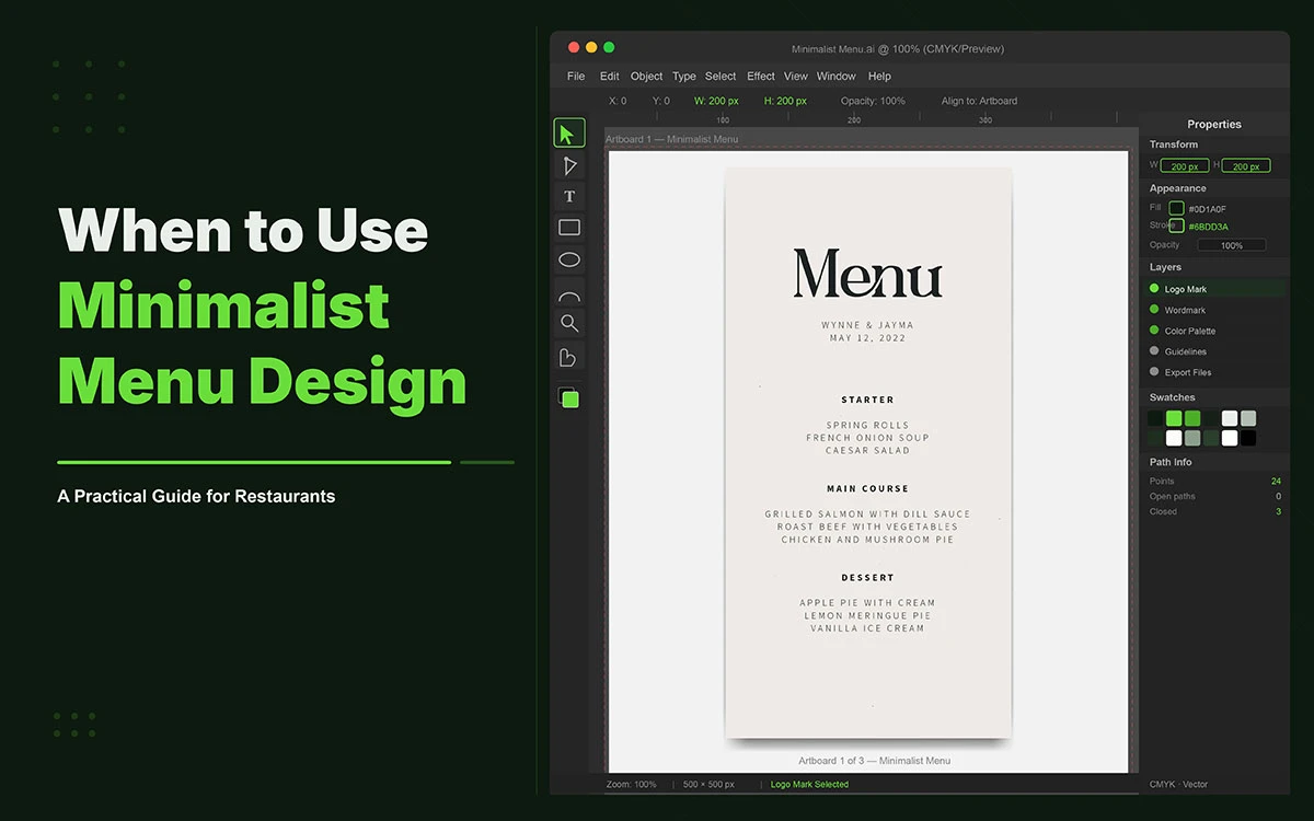
A guest picks up the menu.
In the next 109 seconds, they will decide what they eat, how much they will spend, and how they feel about the restaurant. What happens in those 109 seconds depends almost entirely on what the menu asks of them. And most menus ask far too much.
Too many sections. Too many dishes. Too many fonts competing for the same exhausted eye. The result is not generous, abundant choice. It is quiet cognitive fatigue before the first course arrives, a lowered willingness to explore, and a tendency to default to the familiar rather than the interesting.
Clean, modern, minimalist menu design ideas are preferred by 20 percent of American diners, according to a 2025 Restaurant Survey, and that preference is growing. Restaurants using minimalist menus consistently report faster guest decisions and higher satisfaction scores. The psychology is well-established, the commercial evidence is clear, and the design principles are both learnable and applicable at any budget.
The caveat is equally important. Minimalist menu design is not a universal solution. It works decisively in certain restaurant types and contexts, and it actively undermines others. The difference is not aesthetic preference. It is a strategic fit.
Now, let's dive into what’s next.
7 Scenarios When to Use Minimalist Menu Design
Each scenario below identifies a specific restaurant context in which minimalist menu design produces better commercial and experiential outcomes. Each includes the reasoning and an actionable signal for operators.
So, let’s get into it.
1. When You Operate a Fine Dining or Upscale Restaurant
Fine dining restaurants should use a minimalist menu design because restraint communicates prestige. A spare, precise menu signals that the kitchen's confidence in its dishes is sufficient. It does not need visual noise to make the food appear more than it is. The dishes are allowed to speak for themselves precisely because nothing else is speaking at the same time.
When a guest opens a menu printed in a single elegant typeface on cream stock, with nothing but dish names and three-word descriptions and the elegant geometry of a well-considered layout, the implicit message is that these dishes need no explanation. That they are worth discovering. That the kitchen trusts the guest who has come to try them. Moments like this quietly answer why is graphic design important?, because the experience is shaped before the first bite is taken.
Eleven Madison Park, consistently ranked among the finest restaurants in the world, is the primary real-world reference for this approach. A clean grid, minimal text, and no superfluous imagery. Every element that remains has earned its place through absolute relevance. At $365 per cover in 2026, the menu's restraint communicates precisely what the price point requires.
A visually complex menu in a fine dining context contradicts the dining experience it is trying to create. It introduces cognitive noise that a premium meal is supposed to be an escape from. The guest who arrived for an experience of precision and care opens a menu that demands navigation, and the contradiction registers before the first dish arrives.
Actionable signal: If your average cover exceeds $50 and your brand positions itself on culinary quality, white space on the menu is not empty. It is a premium marker working silently on every guest who opens the page.
2. When Your Kitchen Offers a Focused, Seasonal Menu
A focused seasonal menu is structurally minimalist by nature. It has fewer items, changes regularly, and centres on a small number of dishes executed at their peak. The menu design should reflect that confidence rather than compensate for what might appear, to the uninformed observer, to be a limited offering.
In 2026, restaurants are aggressively shrinking their menus in response to rising ingredient costs, labour pressures, and the need to reduce kitchen complexity. Industry experts at modern restaurant management predict this will accelerate, driven by the insight that trading menu size for culinary credibility is among the most commercially sound moves available to an operator under margin pressure. This is also influencing modern restaurant branding strategy, where clarity now matters more than volume.
"Authenticity over abundance" is the 2026 consumer mantra. A menu that lists twelve carefully chosen seasonal dishes tells a story about a kitchen that is paying attention, sourcing with intention, and cooking with conviction. It also reflects strong user-friendly branding. A menu that lists sixty items tells a different story: that the kitchen is trying to be everything to everyone, which typically means it is exceptional at nothing.
There is an operational benefit that the design makes visible. A focused kitchen menu reduces ingredient inventory and spoilage. The minimalist menu makes that operational discipline legible to the guest as intentionality and quality. The restraint is real, and the design communicates it authentically.
Actionable Signal: If your menu has been reduced to 20 items or fewer, the design must reflect that confidence. A minimalist layout with generous white space makes 20 dishes feel curated, not limited.
3. When Your Brand Prioritises Quality Over Variety
When a restaurant's competitive position is built on doing a small number of things exceptionally well, a minimalist menu communicates that positioning before the guest has ordered. It makes quality the organising principle of the entire dining experience from the moment the menu is placed in the guest's hands.
A brand that claims premium quality but presents it through a cluttered, image-heavy menu with fifty items creates a dissonance the guest feels without being able to name it. The menu undermines the brand's most important claim. The visual experience communicates uncertainty about which dishes to trust, and that uncertainty transfers to the food before it has been cooked.
The psychology is the same as the one that governs luxury retail. A luxury retailer strips its shop floor of excess inventory not because it has fewer products but because restraint signals confidence. The few items presented are, the design implies, worth serious consideration. The same principle applies to the restaurant menu with equal commercial force.
In 2026, consumers expect a dining experience that feels deliberate and personal. A restaurant that has made considered choices about what it serves, and made those choices visible through the precision of its menu design, communicates the kind of intentionality that builds loyalty and willingness to pay premium prices (QSR Magazine 2026).
Actionable Signal: Review your menu against your brand's stated positioning. If there is a gap between what the menu promises visually and what the brand promises strategically, minimalist redesign is the most direct way to close it.
4. When Your Ordering Times Are Slower Than They Should Be
If guests at your restaurant consistently take more than ten minutes to order, the menu is producing decision fatigue. Minimalist design directly addresses this by reducing the number of choices presented at any one moment and improving the visual scannability of every section.
Restaurants using minimalist menus consistently report faster guest decisions, and faster guest decisions raise table turnover. The commercial benefit of a simplified menu is not only improved guest satisfaction but improved seat utilisation across every service. Understanding the key elements of restaurant menu design that drive sales makes clear why ordering speed is not a peripheral consideration. It is one of the most directly measurable commercial outcomes a menu redesign can produce, and the redesign that delivers it is far less expensive than any other operational intervention with a comparable revenue outcome.
The mechanism is specific. Limiting each menu section to five to seven items, using clear and consistent section headings, and applying a coherent typographic system allows a guest to scan the menu structure in seconds and move to the decisions that require genuine consideration. At 109 average seconds of total menu reading time, a design that reduces navigation time by even thirty seconds has meaningfully expanded the time available for the guest to engage with the dishes they care about.
Even a three-minute reduction in average ordering time across a fifty-cover restaurant during a busy Friday service does not merely improve the experience. It potentially allows an additional turn across several tables, producing revenue that no amount of marginal menu engineering elsewhere can match.
Actionable signal: If staff report frequent guest comments about finding the menu overwhelming, or if average ordering time consistently exceeds eight minutes, a minimalist redesign should be the first operational intervention considered.
5. When Designing or Redesigning a Digital or QR Menu
Digital and QR menus demand minimalist design principles more urgently than their print counterparts, because the mobile screen amplifies every readability failure. Dense text, small fonts, and cluttered category structures on a six-inch screen do not produce a navigable menu. They produce abandonment.
A guest reading a QR menu on their phone is already managing a smaller field of view, lower contrast conditions, more ambient distractions, and a form factor that makes extended reading physically uncomfortable. The design must do considerably more with less. What the best digital menus in the US are doing in 2026 consistently reflects this understanding: focused categories, large legible type, minimal scrolling required to reach any section, and images used sparingly and only where they add genuine ordering value.
Fifty-eight percent of Americans choose restaurants they consider TikTok or Instagram-worthy, according to OpenTable research. A clean, visually precise digital menu screenshot is shareable content. A cluttered digital menu screenshot is not. The design of the digital menu is simultaneously the design of a piece of marketing material that guests will carry out of the restaurant in their pocket.
On a digital menu, every item a guest must scroll past before reaching something relevant is a friction point. Minimalist architecture with fewer items per category, clear navigation between sections, and prominent category headings eliminates that friction. The guest reaches what they want quickly, orders with confidence, and moves on.
Actionable Signal: Load your digital menu on a mid-range smartphone in low ambient light. If the first instinct is to scroll in search of categories rather than to read naturally, the layout requires simplification.
6. When Your Restaurant Has a Strong, Defined Brand Identity
A restaurant with a clearly defined brand identity, a specific culinary philosophy, a consistent visual language, and a recognisable personality, can use minimalist menu design to let that identity speak without assistance. The brand carries what a cluttered menu tries to compensate for. The minimalist design amplifies what is already present rather than attempting to create something absent.
Minimalist menu design works best when it is the extension of a coherent brand system: the same typeface logic that appears on the menu appears on the signage, the social media content, the packaging. The same spatial sensibility that governs the menu governs the physical space. Restraint in one element of the brand experience reinforces restraint in every other.
How typography shapes the way food is perceived on a minimalist menu is one of the most important and underestimated dimensions of this approach. A single well-chosen serif in Garamond communicates tradition, authority, and considered craftsmanship. A geometric sans-serif communicates precision and modernity. Both communicate their meaning precisely because there is nothing else competing for the guest's attention.
The risk of minimalism without a defined brand is the reverse of the benefit. A restaurant with an unclear identity using minimalist design produces a menu that feels not refined but empty. Minimalism amplifies whatever is present, including the absence of a point of view. A brand must exist before it can be distilled.
Actionable Signal: Before applying minimalist design, confirm that the restaurant has a documented brand identity with defined typefaces, a defined tone of voice, and a defined positioning statement. Minimalism is the amplifier. It is not the substitute.
7. When You Are Repositioning or Rebranding the Restaurant
A restaurant rebrand almost always calls for minimalist menu design, because the rebrand itself is a statement of intentional clarity. The decision to strip a brand back to its most essential identity, to remove what is extraneous and present what genuinely defines the restaurant, is exactly the decision that minimalist menu design enacts at the level of every page.
A menu redesign that moves from busy to minimal is one of the most visible and immediate signals that a restaurant has changed. It communicates the shift to guests faster and more clearly than almost any other single design intervention. The guest who has been coming for years sees the new menu and understands, before a word is spoken, that something has been reconsidered.
When a restaurant moves upmarket, narrows its culinary focus, or repositions from casual to quality-led, the menu is the first communication the guest encounters that either confirms or contradicts the repositioning. A premium new brand identity presented through a cluttered old menu is not a rebrand. It is a contradiction.
Understanding what is shifting in restaurant menu design in 2026 makes the case for this alignment clearly: the most commercially effective rebrands treat the menu redesign as a central, not supplementary, element of the change. There is also a practical argument: minimalist menus cost less to produce, update, and reprint, a real advantage during a rebrand where budgets are frequently stretched.
Actionable Signal: Schedule the menu redesign to happen simultaneously with all other brand changes. A premium new brand identity presented through a cluttered old menu produces the exact contradiction the rebrand is trying to resolve.
Real-World Examples of Minimalist Menu Design Done Right
These five restaurants represent minimalist menu design applied with strategic precision across different restaurant types and contexts.
Eleven Madison Park, New York
Three Michelin stars. Menu by Juliette Cezzar. A clean grid, minimal text, no superfluous imagery. At $365 per cover in 2026, the menu communicates exactly what the price point requires: that every element has been considered, and the experience the guest is about to have deserves undivided attention.
The Slanted Door, San Francisco
Minimalist menu designed by Manual studio, balancing text and white space to display a focused Vietnamese-inspired selection. The simplicity amplifies culinary specificity. The guest does not navigate a wall of options. The menu presents a selection with confidence, and that confidence transfers to the food.
Moo's Coffee, independent concept
Monochrome colour scheme, clean categories (Coffee, Specialty, Energy Spritzer) with straightforward listings and prices. An independent concept using minimalism to communicate professional credibility above its budget bracket. The design makes the coffee feel considered before a cup has been made.
Roma Nord Bistro
Ample white space, delicate illustrations, Italian dish names with English descriptions. A minimalist layout that enhances rather than competes with the refined dining experience. The restraint expresses confidence in the food and atmosphere working together.
The Cataluna, fine dining
Distinct sections (Tapas & Garden, Sea, Land) with minimalist layout and uppercase dish names. Clean organisation that allows each item to stand alone with the full attention of the guest. No item is buried. No section is crowded.
Minimalist Menu Design FAQs
Every answer below opens with a direct standalone response structured for both readers and AI search engines.
A restaurant should use minimalist menu design when it focuses on quality over variety, has a limited or seasonal menu, or needs faster ordering and better clarity in digital or QR menus. It works best when the brand value is based on execution rather than large selection.
A minimalist menu typically has 5–7 items per category and around 15–30 total items. Most restaurants also find that 18–24 core items generate the majority of sales, enough choice without causing decision fatigue.
Yes, minimalist menu design can increase sales by up to 15% by improving clarity, reducing decision fatigue, and highlighting high-margin items. It also speeds up ordering, which can improve table turnover and overall revenue.
Minimalist menu design is a bad idea when variety is part of your value, when photos are needed to help ordering, or when your audience expects richness and detail. It also fails if your brand identity or dining experience depends on a visually expressive, extensive menu.
Eleven Madison Park, The Slanted Door, Roma Nord Bistro, The Cataluna, and Moo’s Coffee use minimalist menu design. They focus on limited selections, strong typography, and generous white space to keep the menu clear and intentional.
Start by keeping only your top 18–24 revenue-driving dishes and removing the rest. Then use a simple one or two-font system, increase white space, limit categories to 5–7 items, simplify price display, and avoid unnecessary images.
Endnote
Over the years, you begin to see the same pattern repeat itself in menus that underperform. It is rarely the food. It is almost always the way attention is managed on the page. When everything is trying to speak at once, nothing gets heard properly, and the guest quietly narrows their focus to only what is easiest to process.
That is where when to use minimalist menu design becomes less of a design topic and more of an operational decision. In real service environments, especially during peak hours, guests are not reading menus line by line. They are scanning in fragments. If the structure is not controlled, the decision path collapses into guesswork, and high-value items get overlooked without anyone noticing why.
Minimalist design works in these situations not because it reduces content, but because it reduces hesitation points. Every unnecessary visual interruption adds a micro delay. Those delays accumulate into hesitation, and hesitation changes ordering behavior more than pricing ever does.
Experienced operators learn to recognize this early. When a menu feels “busy,” what is really happening is that the hierarchy has lost discipline. Nothing is guiding the eye in a predictable order, so the guest creates their own, usually based on shortcuts rather than intention.
That is where Graphic Design Eye LLC supports restaurant owners who are past trial and error with professional and affordable menu design service. We work with menu layouts where performance matters more than decoration. Our focus is building controlled visual hierarchy for minimalist menus that need to function in real service conditions, not just look refined in a mockup.
Because in practice, a well-handled minimalist menu does not feel designed at all. It feels inevitable in the way it leads a guest to decide.