Learning how to make a logo in Illustrator is one of the most key skills in a world full of visuals. But to craft a logo that really shines, you need more than flair. You need the right tools and a clear path.
Adobe Illustrator stands as the gold standard for logo design. Its strong vector tools give you full scale, sharp precision, and total creative freedom. No other app comes close.
Yet, if you have faced a blank Illustrator artboard, you know it can feel vast. The tools seem endless. The need to get it right can stop you cold.
Here, you will see how to use Illustrator’s vector tools with skill. How to pick the right shapes and fonts. How to turn ideas into a logo that looks clean and sharp. Each step is clear, simple, and exact. From artboard setup to a pixel-perfect export, each stage is covered.
No design degree is needed. No costly courses. Just straight, clear steps that move you from blank canvas to a logo you will truly own.
Ready to make a logo that stands tall? Keep reading!
How to make a logo in Illustrator
How to make a logo in Illustrator is one of the most searched design questions on the internet. You're a complete beginner picking up a stylus for the first time look to sharpen your workflow. Illustrator gives you the precision, flexibility, and scalability that no other tool can match.
That is when Adobe Illustrator turns into a true friend for any designer. Its strong vector design tools let you build logos that stay sharp and clear. They sit on a small card or stretch across a huge tool. At first, new users may find the tool hard to grasp.
But once you know the basic tools, it turns into a strong aid that helps you shape your thoughts into pro-grade designs.
Let's fire up Illustrator and get started!
1. Set Up Your Document
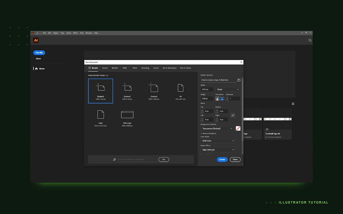
The first step in any logo project is creating the correct document setup. A properly configured artboard ensures your logo will work across print and digital platforms.
Open Illustrator and create a new file.
Go to File → New and choose either a Print preset or a custom artboard depending on your project needs.
For logo design, a square or horizontal artboard usually works best.
Recommended artboard sizes:
500 × 500 px (good for small projects or icons)
1000 × 500 px (ideal for horizontal logo layouts)
Choosing the correct color mode is also important.
Color mode guidelines:
CMYK → best for printed materials like brochures or packaging
RGB → best for digital platforms such as websites and apps
Resolution also plays a role when exporting files for print.
Resolution recommendation:
300 PPI for print exports to ensure crisp output
Good document setup saves time later in the design process.
2. Sketch or Import a Rough Concept
Every strong logo begins with a concept. Jumping directly into vector design often leads to messy ideas. Sketching first helps clarify the direction.
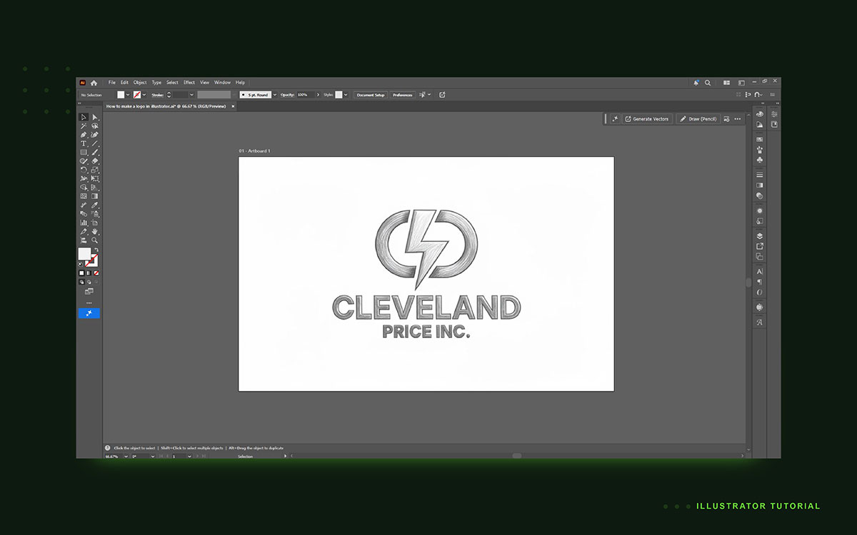
Many designers start with quick sketches on paper. These sketches do not need to be perfect. They simply explore ideas.
Once you have a concept, you can bring it into Illustrator. There are two common methods.
Method 1: Trace a hand-drawn sketch
Scan or photograph your sketch
Import it into Illustrator
Use the Pen Tool to trace the shapes
Method 2: Import a reference image: You can also place inspiration images or symbols.
Go to: File → Place
Then select the reference image
To prevent accidental edits, lock that layer
Best practice tips:
Place sketches on a separate layer
Reduce the image opacity for easier tracing
Lock the reference layer before drawing
This stage helps transform a rough idea into a structured design direction.
3. Create Shapes with the Pen Tool or Shape Tools
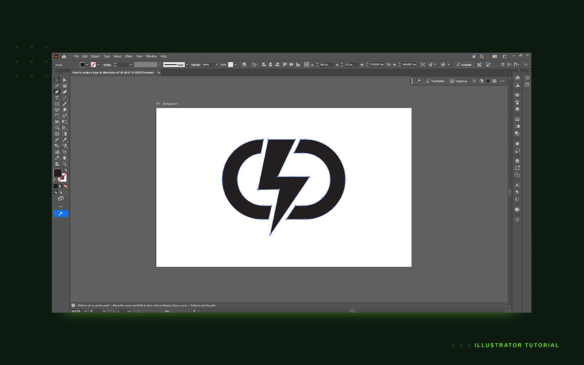
Now comes the core part of logo creation. You will start building vector shapes. Illustrator provides multiple tools for this. The most powerful one is the Pen Tool.
Pen Tool (P)
The Pen Tool allows you to draw precise curves and custom shapes.
It is ideal for:
Custom icons
Letterforms
Abstract shapes
Organic curves
Mastering this tool takes practice, but it offers the most control.
Shape Tools
For geometric logos, the basic shape tools are faster.
Common shape tools include:
Rectangle tool
Ellipse tool
Polygon tool
Star tool
These tools are perfect for modern minimalist logos.
Once shapes are created, you can combine them using the Pathfinder panel.
Pathfinder Panel
This panel allows you to merge or cut shapes.
Common functions include:
Unite – Merges shapes together
Minus Front – Subtracts one shape from another
Intersect – Keeps overlapping areas only
Using Pathfinder helps create complex forms from simple geometry.
Useful drawing tips:
Hold Shift to maintain perfect proportions
Use Alt while dragging to duplicate shapes
Work on separate layers for different elements
Keep shapes simple and clean
Simple shapes often lead to the most memorable logos, especially when you understand the different types of logo design and choose the style that best fits the brand.
4. Add and Customize Typography
Many logos combine symbols with text. This is called a logotype or wordmark. Typography plays a huge role in brand perception.
To add text, select the Type Tool (T) and click on the artboard. Type the brand name or slogan. At this stage, the text is still editable. But when designing a final logo, designers usually convert text into vector paths.
Convert Text to Outlines
Go to: Type → Create Outlines
Or use the shortcut: Shift + Ctrl + O
This turns text into shapes that you can edit like any other vector object.
Now you can reshape letters, adjust spacing, or create custom typography.
Typography adjustments
The Character Panel allows precise text control.
Important settings include:
Tracking – Spacing between letters
Kerning – Spacing between specific letter pairs
Leading – Vertical line spacing
Small adjustments can greatly improve readability.
Typography best practices for logos:
Use a maximum of two fonts
Choose fonts that reflect brand personality. Exploring different best logo fonts can help you identify typefaces that match your brand's character and improve readability.
Ensure readability at small sizes
Avoid overly decorative fonts
Good typography makes a logo feel professional and balanced.
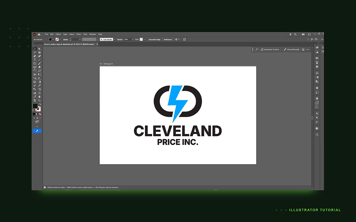
5. Apply Brand Colors
Color is one of the most recognizable elements of a brand. A strong color palette helps people identify a logo instantly. In Illustrator, colors are managed through the Swatches Panel.
Open it by going to: Window → Swatches. From here you can create and manage colors.
Adding custom colors
Double-click a swatch to enter exact values. Depending on your project, you can input:
HEX values for web design
RGB values for digital graphics
CMYK values for print materials
Using consistent color values ensures brand consistency.
Global Swatches
Illustrator also allows global swatches. These are extremely useful for logo design.
If you change a global swatch, every object using that color updates automatically. This makes color experimentation much easier.
Color testing
Always test the logo in different backgrounds. For example:
White background
Dark background
Grayscale version
Single-color version
A strong logo should remain clear even without color.
Color design tips:
Limit the palette to 2–3 colors. Choosing proven logo color combinations helps create a memorable identity while keeping the design visually balanced.
Avoid overly complex gradients
Check contrast for readability
Ensure colors work in black and white
Color simplicity usually creates stronger brand recognition.
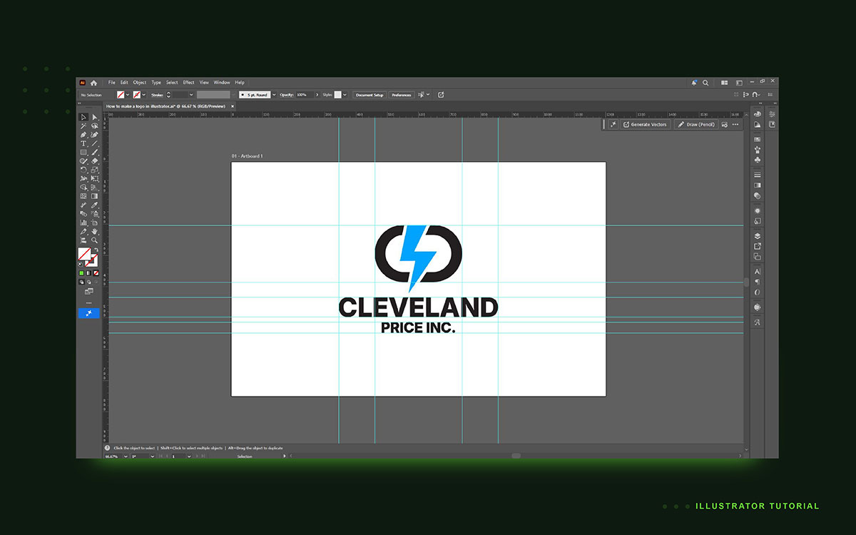
6. Refine and Align All Elements
At this stage, your logo should already resemble the final concept. Now the focus shifts to refinement. Alignment and spacing are critical. Even small misalignments can make a logo feel unprofessional. Illustrator provides precise alignment tools.
Align Panel
Open the panel using: Shift + F7. This panel allows you to:
Center objects
Distribute spacing evenly
Align shapes perfectly
Using alignment tools ensures visual balance.
Smart Guides
Enable Smart Guides for accurate placement.
Go to: View → Smart Guides. These guides help snap objects into position automatically.
Grouping elements
When elements belong together, group them.
Shortcut: Ctrl + G.
Grouping keeps the logo organized and easier to move.
Detail inspection
Always zoom in to check the artwork. Common inspection levels:
100% zoom – Normal viewing size
400% zoom – Check anchor points and curves
Look for:
Uneven curves
Misaligned edges
Inconsistent spacing
Refinement is what separates amateur logos from professional ones.
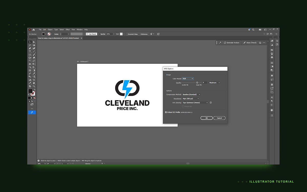
7. Export the Final Logo
The final step is exporting your logo into different formats. Different platforms require different file types. Illustrator allows exporting in multiple formats.
SVG
Export using: File → Export → Export As → SVG
SVG files are ideal for websites because they scale infinitely.
Benefits include:
Lightweight file size
Crisp display on all screen sizes
Compatibility with modern browsers
PNG with Transparency
PNG files are widely used for digital platforms.
Go to: Export for Screens → PNG
You can export multiple resolutions:
1x
2x
3x
PNG supports transparent backgrounds, which is useful for overlays.
PDF for Print
For print materials, PDF works best. PDF preserves vector quality and is widely accepted by printers.
Save the Source File
Always keep the original .AI file. This file allows future edits such as:
Color changes
Layout adjustments
Typography updates
Export checklist:
SVG for web
PNG with transparency
PDF for print
Original AI source file
Proper export ensures your logo works everywhere.
Essential Illustrator tools for logo design
Making a logo in Illustrator needs more than just basic draw skills. You must know which tools to use and how they work. The right tools save time and make your work more exact, no doubt.
Illustrator has many tools that help with logo design. They let you draw shapes, merge forms, and line up parts with care. Here is a clear table of key tools, their shortcuts, and what they do best:
Tool
Shortcut
Best Used For
Pen tool
P
Draw custom curves, letters, and shapes
Anchor point tool
Shift+C
Adjust bezier curve points
Pathfinder panel
Shift+Ctrl+F9
Join or cut shapes
Shape builder tool
Shift+M
Merge shapes by drag
Appearance panel
Shift+F6
Add fills or strokes
Image trace
—
Turn raster sketches to vector
Align panel
Shift+F7
Center and space elements
These tools form the core of a professional logo design workflow, helping designers create scalable, production-ready brand assets with greater accuracy.
The Pen tool gives sharp, exact shapes
Pathfinder and Shape Builder let you form complex shapes from small parts
Appearance adds color or strokes without extra layers
Image Trace changes a sketch into a vector you can edit
Align makes sure all parts are even and neat
When you master these tools, your work becomes faster, cleaner, and exact. You can turn a simple idea into a sharp, professional logo. Each tool has a clear role. By using them well, your logos will look neat on screen and in print. You will also save time and avoid mistakes.
Even new designers can use these tools if they follow the steps one by one. Practice each tool and you will see your designs improve fast.
Avoid common mistakes when creating a logo in Illustrator
Creating a logo might look easy at first, but small mistakes can lead to big problems.
Here are a few common logo design mistakes to avoid so your finished artwork remains professional, scalable, and ready for real-world use.
Not converting text to outlines: If text stays as a font, it may not show up right on other machines. Always convert text to outlines before sending the file.
Using too many fonts: One or two fonts usually work best. Using more than two often makes a logo look cluttered and unorganized. Limit the design to just one or two fonts for clarity.
Designing only in color: A logo has to be effective even when it's not in color. Besides your colored design, create a monochrome version as well. That way, your logo will look great not only on print and merchandise, but also on very simple forms.
Forgetting to expand strokes: Strokes may not scale right if you do not expand them before export. This can bend lines when you resize the logo. Expand strokes to keep lines even.
Saving only as .AI: Clients need more than one file type. Export SVG and PNG files along with your .AI file. These files work on web, print, and other uses.
Using low-resolution images: Low-res images do not scale well. Always trace them into vector shapes. Vector logos stay sharp at any size.
Skipping artboard setup: An incorrect artboard size can cause cuts or misalignments when exporting. Match your artboard size to how you plan to use the logo.
It seems these small steps matter a lot. A clean logo saves time and looks trustworthy across platforms. Hard to ignore how details affect final results. With careful attention, the logo will scale well and be ready for any application.
Make a logo in Illustrator FAQs
Here are some key questions on making logos in Illustrator. Each answer is clear, short, and easy to read so you can learn fast and avoid mistakes.
Illustrator costs money. You need a Creative Cloud plan at $22 per month. You can try it for free for 7 days. Free tools like Inkscape or Canva exist. They let you make logos but give less control. Complex shapes, fine lines, and exact colors are harder. Use these only for simple or test logos.
Time depends on skill and logo type. A plain text logo can take 1–3 hours for a new user, or 30–60 minutes for a pro. Logos with handmade text, drawings, or many parts can take days. You need time for sketches, shape work, color checks, and fixes to match your idea or a client’s request.
Save the main file as .ai to edit later. Export SVG for the web so it scales without blur. Export PNG with a clear background for sites or social media. Export PDF for print. Keep all files. This makes your logo ready for web, print, and other uses, and keeps the shape sharp at all sizes.
Yes. Illustrator uses vector graphics. The logo stays sharp when you scale it. Photoshop uses pixels, so logos blur when resized. Vector logos are standard for cards, web, signs, and merch. Illustrator also gives better tools for shapes and text. Use Illustrator to keep the logo crisp, clean, and easy to change.
Start with 500×500 px or 1000×1000 px. Vector logos do not lose sharpness when scaled. A square board works best for social media, web, and print. You can move or resize the logo later. Board size is just a guide and does not affect the final look of the logo.
Go to File → Export for Screens → PNG. Pick 'Transparent' background. Do not use JPG as it cannot keep clear backgrounds. A clear logo can sit over colors, images, or other designs without a white box. This is best for web, apps, and posts. Always test the logo on different backgrounds.
EndNote
You have now read all the steps to make a logo in Adobe Illustrator. First, look at ideas and sketch shapes. Next, refine forms, pick colors, and finish each part. Each step adds strength and makes your logo clear. This method keeps your logo neat, strong, and ready to use on any platform.
Adobe Illustrator is the main tool for professional logo design because it creates vector graphics that can grow or shrink without losing quality, making every logo suitable for digital and print applications. Each line, curve, and color stays sharp. This gives your brand a clean and pro look that lasts.
For additional ideas or guidance, feel free to contact Graphic Design Eye LLC. We're here to answer your questions and assist you in creating a truly memorable brand logo!
Graphic Design Eye LLC is a full-service creative agency built for brands that demand more than design — they demand vision. From strategic branding to complete visual identity, we partner with startups, agencies, and growing businesses as a dedicated creative force. With flexible subscription and project-based models. Let's start with us today!